25 Best Websites for Brand Inspiration (That Aren’t Just Pinterest)
Most entrepreneurs and small business owners I talk to hear “brand inspiration” and immediately open Pinterest.
They scroll for hours, pin 200 images that all look vaguely the same, and then send that board to a designer (or worse, try to DIY it) and say, “make me this.”
That isn’t inspiration. That’s a recipe for a bland, derivative, and forgettable brand.
As a seasoned brand consultant, this process drives me crazy. It’s my single biggest pet peeve. Before I share my list, let’s clear the air.
- You’re Mistaking “Pretty” for “Smart”. A beautiful logo on a white background is just art. A beautiful logo on a delivery van, a tiny app icon, and a grainy newspaper ad—all while maintaining consistency—that’s a cohesive brand system. Stop looking for pretty logos; start looking for smart systems.
- You’re Ignoring Strategy. Why did that brand choose green? It wasn’t because the founder “likes green.” It was likely a strategic choice about sustainability, finance, or health. Looking at visuals without understanding the why is useless.
- You’re in an Echo Chamber. Pinterest, Dribbble (at times), and Instagram are algorithmic echo chambers. They show you what’s popular, not what’s effective. You’re getting a recycled feed of trends, which is why so many new brands look identical.
- You’re Fixated on the Logo. The logo is one small part. The real inspiration comes from the application, including the typography, tone of voice in the copy, photography style, and packaging materials.
- You’re Looking for a Shortcut. Inspiration is meant to be a spark, not a blueprint. You’re supposed to find an idea, not an answer. Looking for an answer is how you end up plagiarising.
The “inspiration” phase isn’t about finding a logo to copy. It’s about gathering strategic intelligence. It’s the first step in the long, difficult, yet rewarding process of creating a real brand.
This list is different. It’s not just a gallery of pretty things. It’s my personal, curated toolkit of sites that provide strategic and practical inspiration. I’ll tell you what each is good for and, more importantly, how to use it like a professional.
- Stop treating "pretty" visuals as brands; prioritise strategic, real-world application and consistent systems over standalone logos.
- Use curated, analytical sources (Brand New, BP&O, Fonts in Use) to deconstruct the "why" behind designs, not copy styles.
- Do strategy first; use inspiration sites and real-world observation to inform application, not as shortcuts that create bland, derivative brands.
How to Use These Sites (Without Just Copying)
Your goal is to deconstruct, not collect. When you find something you like, don’t just ‘pin’ it. Ask these questions:
- Who is this brand for? (Audience)
- What are they competing against? (Market)
- Why did they choose this typeface? (Is it modern? Traditional? Playful?)
- How does the colour palette make me feel? (Energetic? Calm? Premium? Budget?)
- Where does this system shine? (Is it brilliant in digital, or on packaging?)
- What’s the one thing I can learn? (Is it their clever use of a mascot? Their consistent tone of voice?)
This is the kind of analysis that separates a “look” from a full brand identity. One is decoration; the other is a powerful business asset.
Quick Compare: Top 5 Inspiration Sources by Use-Case
Short on time? Here is the cheat sheet for where to go based on your specific problem.
| Website | Best Used For | Strategy Level | Visual Noise |
| Brand New | Deep rebrand analysis & critique | High (PhD Level) | Low |
| Storing/Organising ideas (Private boards) | Low (Echo Chamber) | High | |
| Behance | Viewing “Process” (Sketches/Mockups) | Medium | High |
| Midjourney | Generating initial mood/texture concepts | Medium (Experimental) | N/A |
| The Dieline | Physical packaging materials & structure | High | Low |
Here are the 25 websites I actually use and recommend for genuine brand inspiration.
The 25 Best Brand Inspiration Websites: A Consultant’s Breakdown
I’ve categorised these sites based on their function. Don’t just stick to one. The best ideas come from cross-pollinating.
Category 1: The Strategic Powerhouses (For Analysis)
These sites are for your brain. They feature in-depth case studies and critiques, focusing on the underlying reasons behind a design.
1. Brand New
- What it is: The premier, non-negotiable resource for brand identity critiques. Run by the design firm UnderConsideration, it reviews high-profile rebrands—and it is brutally honest.
- Best for: Understanding the strategy and public reception of rebranding efforts.
- Consultant’s Take: This is where you go to get smart. You won’t just see the new logo; you’ll also read why it was changed, what the old one failed to achieve, and whether the new one succeeds. The comments section is a goldmine of professional opinion. This is your PhD in branding.
2. BP&O (Branding, Packaing & Opinion)
- What it is: A highly curated gallery of brand identity projects, written and run by designer Richard Baird.
- Best For: Premium, minimalist, and material-focused inspiration.
- Consultant’s Take: Richard has an impeccable eye. The work here is often high-end, with a focus on print, packaging, and tactile materials. The value is in his short, insightful write-ups. He’ll connect the choice of paper stock or a typographic detail back to the brand’s core idea.
3. Identity Designed
- What it is: A clean, curated showcase of brand identity projects from around the world.
- Best For: Pure, high-quality, systematic brand identity examples.
- Consultant’s Take: This is less about critique and more about pure-play inspiration. It’s like a design museum. The quality bar is exceptionally high. Use this to see how a full system (logo, stationery, website, etc.) is rolled out with perfect consistency.
4. Brand Struck
- What it is: A blog that focuses on brand strategy, not just design. It analyses the business thinking behind brand decisions.
- Best For: Connecting the ‘why’ (strategy) with the ‘what’ (visuals).
- Consultant’s Take: Want to know why Dollar Shave Club’s voice was so effective? Or how Red Bull built a media empire? This is the place. It’s essential reading for entrepreneurs who need to remember that their brand is a business tool, not just a logo.
Category 2: The High-Volume Curation (For Browsing)
These are the giants. You know them, but you’re probably using them wrong.
5. Behance
- What it is: Adobe’s massive portfolio platform for all creative fields.
- Best For: Finding in-depth, “process-heavy” case studies.
- Consultant’s Take: This is the 800-pound gorilla. The problem? It’s 90% noise. The most effective way to use Behance is to bypass the homepage and utilise the search function. Search for “Brand Identity” or “Packaging” and then filter by “Most Appreciated” and “Curated Galleries.” Look for projects that show the process—sketches, failed concepts, and application mockups. That’s where the real learning is.
6. Dribbble
- What it is: A “show and tell” site for designers, famous for its small “shots” (screenshots).
- Best For: Very specific, component-level inspiration (icons, logos, app UI).
- Consultant’s Take: Dribbble is a dangerous platform. It’s fantastic for seeing a beautiful icon, a slick animation, or a trendy logo mark. It is terrible for strategic brand inspiration. Most of what you see isn’t real; it’s self-initiated “concept” work. Use it for micro-inspiration, but never for overall brand strategy. It’s the definition of “style over substance.”
Category 3: The Web & Digital Specialists (For Digital-First Brands)
If your brand primarily lives online, these are your go-to options.
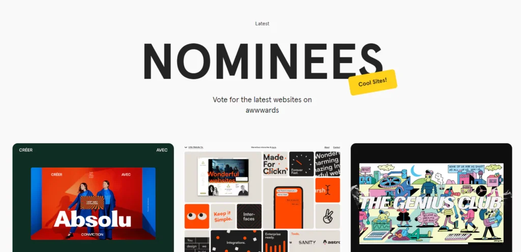
7. Awwwards
- What it is: A competition gallery that awards the best web design in the world.
- Best For: Seeing the absolute cutting-edge of digital branding and web interaction.
- Consultant’s Take: This is where you see what’s possible on the web. Pay attention to how brands utilise motion, typography, and layout to craft an engaging experience. The warning? A lot of this is “awards-bait”—slow, heavy, and impractical for a small business. Use it for ideas on interaction, not as a blueprint for your e-commerce site.
8. Httpster
- What it is: A highly curated, no-fuss gallery of excellent website designs.
- Best For: Clean, usable, and beautiful website design inspiration, minus the “trendy” noise.
- Consultant’s Take: I love Httpster. It’s less ‘showy’ than Awwwards. It’s just a scrolling feed of really solid, well-executed websites. This is fantastic for seeing how different brands (from tech to fashion) structure their information and present their visual identity online.
9. siteInspire
- What it is: Another curated gallery of web designs, but with an excellent, granular tagging system.
- Best For: Filtering by style, industry, or platform.
- Consultant’s Take: The filtering is the killer feature here. You can search for “Portfolio” sites on “WordPress” with a “Minimal” style. This is incredibly practical when you’re trying to find benchmarks in your specific niche.
10. Really Good Emails
- What it is: A massive, searchable gallery of… really good emails.
- Best For: Seeing how brand voice and visual identity translate to email marketing.
- Consultant’s Take: Don’t neglect email! It’s one of the most consistent touchpoints you have with your customer. This site is brilliant for seeing how others do it. Examine their welcome sequences, promotional emails, and transactional messages. It’s a masterclass in brand voice and simple, effective design.
Category 3.5: Motion & Accessibility (The Modern Essentials)
A brand that doesn’t move is a dead brand. And a brand that isn’t accessible is a liability.
Motionographers
- What it is: The leading source for motion design and animation.
- Best For: Understanding how a logo should behave when it enters a screen.
- Consultant’s Take: Look at the “Branding” category. Note how the best brands use motion to convey personality—is the bounce energetic, or is the fade-in elegant and slow?
Sa11y (The A11y Project)
- What it is: A celebration of beautiful, accessible design.
- Best For: Proving that “compliant” doesn’t mean “ugly.”
- Consultant’s Take: High contrast and legible type are not constraints; they are competitive advantages. Use this to find colour palettes that are legally compliant and visually stunning.
Category 4: The Packaging Specialists (For Physical Products)
If you sell a thing, packaging is your most important brand asset.
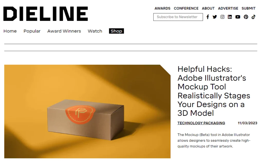
11. The Dieline
- What it is: The world’s leading resource for packaging design.
- Best For: Everything packaging. Materials, unboxing, structure, and graphics.
- Consultant’s Take: This is the “Brand New” for packaging. It features incredible student work, professional case studies, and trend reports. Pay attention to materials. How does a recycled cardboard texture communicate “eco-friendly”? How does a foil-stamped, heavy-stock box communicate “luxury”?
12. Packaging of the World
- What it is: A massive, global gallery of packaging design, updated daily.
- Best For: High-volume, global packaging inspiration.
- Consultant’s Take: Where The Dieline is more “magazine,” this is more “archive.” It’s less curated, but the sheer volume is staggering. This is great for seeing what’s happening in markets outside of your own. Look at what a soft drink looks like in Japan, or a coffee bag in Brazil. It’s a great way to break out of the echo chamber.
Category 5: The Typography Nerds (It’s More Important Than Your Logo)
Your choice of font often says more about you than your logo.
13. Fonts in Use
- What it is: A searchable archive of typography shown in real-world applications (books, websites, posters, etc.).
- Best For: Seeing how a typeface actually feels when used.
- Consultant’s Take: This is my secret weapon. Stop looking at typefaces on a white background. Here, you can see how Merriweather looks on a news website, or how Futura is used on a book cover. It’s the best way to understand the true personality of a font. You can even search by industry.
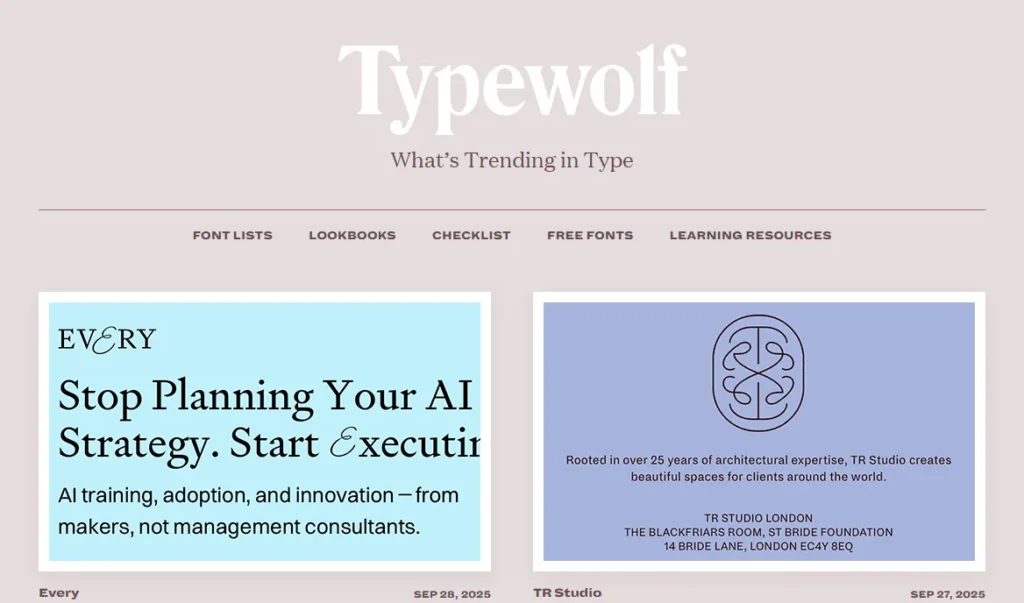
14. Typewolf
- What it is: An opinionated blog and resource for typography in web design.
- Best For: Finding trendy-but-excellent font pairings for websites.
- Consultant’s Take: The author, Jeremiah Shoaf, has a fantastic eye. He doesn’t just show you a site; he tells you exactly what fonts are being used. He also publishes great “Top 10” lists and pairing recommendations. It’s heavily skewed towards the web, but the principles are universal.
Category 6: The Logo & Archive Specialists (For Pure Form)
Sometimes, you just need to look at logos. But do it smartly.
15. Logo Design Love
- What it is: A classic blog by designer David Airey. Part gallery, part thoughtful essays on identity design.
- Best For: Timeless principles of good logo design.
- Consultant’s Take: This is a site about thinking, not just looking. David writes beautifully about the stories behind iconic logos (like the V&A or a simple shell). It’s a calm, intelligent place that reinforces the value of simplicity and meaning.
16. LogoArchive
- What it is: A stunning archive of minimalist, mid-century logos.
- Best For: Inspiration for pure, symbolic, minimalist logo marks.
- Consultant’s Take: This is pure visual adrenaline for a designer. It’s a curated collection of (mostly) black-and-white logos from the 1950s to the 1980s. It’s a powerful reminder that a great idea, executed simply, is timeless. It will cure you of any desire to add gradients, shadows, or fussy details.
17. Brandemia
- What it is: The “Brand New” for the Spanish-speaking world.
- Best For: High-quality case studies from European and Latin American markets.
- Consultant’s Take: Even if you don’t speak Spanish, the visuals are all you need. (Google Translate does the rest). This is a fantastic resource for discovering top-tier work that doesn’t typically appear on US/UK-centric blogs. The quality of identity work for cities, banks, and cultural institutions is often outstanding.
18. Vintag.es
- What it is: A huge blog of vintage… everything. Ads, posters, packaging, photos.
- Best For: “Out of the bubble” inspiration.
- Consultant’s Take: Stop looking at what other designers did last week. Take a look at what a design team accomplished in 1960. This site is a goldmine for vintage colour palettes, typography, and illustration styles. You’ll be amazed at how much “new” design is just a rehash of old ideas.
Category 7: The Colour & Tool Specialists (For Palettes)
Don’t just pick colours you “like.” Build a palette that works.
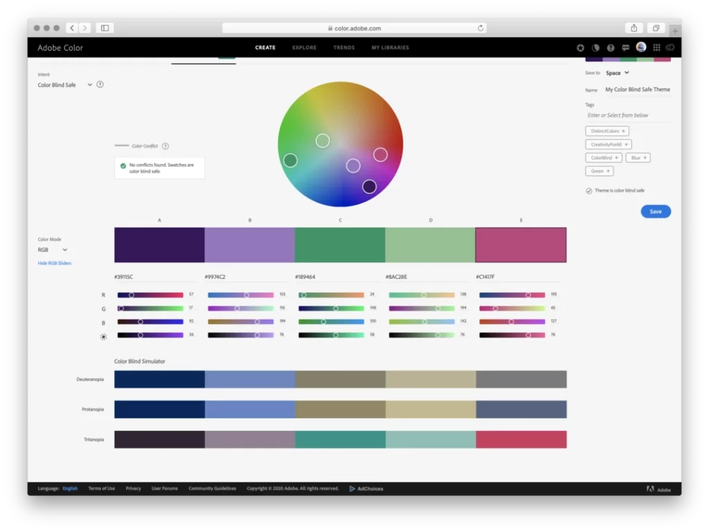
19. Adobe Color
- What it is: A powerful, browser-based tool for creating, exploring, and saving colour palettes.
- Best For: Building harmonious colour palettes from scratch.
- Consultant’s Take: The “Explore” tab is great, but the real power is in the “Colour Wheel.” Use the harmony rules (complementary, triad, etc.) to build a palette that is mathematically balanced. You can also upload a photo (like a landscape or a painting), and it will extract the colour palette for you. This is how you build a professional palette.
20. Coolors
- What it is: A super-fast, simple colour palette generator.
- Best For: Rapidly generating and iterating on colour palettes.
- Consultant’s Take: This is my go-to for speed. You just hit the spacebar, and it generates a new 5-colour palette. See a colour you like? Lock it, and hit the spacebar again. It will find four new colours that work with it. It’s simple, addictive, and brilliant for quick-starting the colour process.
Category 8: The Unconventional & Real-World (My Pro-Tips)
Get out of the design bubble. The best inspiration comes from the real world.
21. Kickstarter
- What it is: The world’s largest crowdfunding platform.
- Best For: Seeing new brands being born in real-time.
- Consultant’s Take: This is a focus group and inspiration gallery in one. You see the product, logo, packaging, brand video, and pitch all in one place. You also get to see what resonates with people, by which projects get funded. Pay attention to the “Design & Tech” and “Food” categories.
22. Product Hunt
- What it is: A daily leaderboard of new tech products and startups.
- Best For: Seeing branding trends in the SaaS, tech, and app world.
- Consultant’s Take: If you’re launching a digital product, this is your competition. Examine the app icons, one-sentence taglines, and website screenshots. You’ll spot trends (and anti-trends) faster here than anywhere else.
23. Your Local Supermarket Aisle
- What it is: A physical, 3D, real-world battleground for brands.
- Best For: Seeing what actually gets a customer’s attention.
- Consultant’s Take: Seriously. Go to the supermarket. Look at the coffee aisle. Look at the craft beer selection. Look at the cereal boxes. Ask yourself: What stands out? What looks cheap? What looks premium? How do they use colour and type to scream “Healthy!” or “Indulgent!” or “Kid-Friendly!”? This is the single best, cheapest piece of brand research you can do.
24. Savee
- What it is: A “mood board” tool for visual thinkers. It’s like a minimalist, designer-focused Pinterest.
- Best for: Collecting your inspiration once you’ve found it.
- Consultant’s Take: This is what I use instead of Pinterest for my own private boards. It’s clean, simple, and not algorithm-driven. It’s just a grid of images you save. It lets you see the connections between images without the UI getting in the way.
25. Pinterest (Yes, Really. But With a Warning.)
- What it is: You know what it is. The global mood-boarding echo chamber.
- Best For: Organising ideas after you have a strategy.
- Consultant’s Take: Okay, here it is. I’m including it at the very bottom with a massive warning. DO NOT start your inspiration search on Pinterest. You will be sucked into a black hole of trends.
- How to use it properly:
- First, go to the other sites on this list.
- Develop your strategy.
- Then, and only then, use Pinterest to create a private board.
- Save images that align with your pre-defined strategy.
- Use it as a collection tool, not an exploration tool.
Category 9: The AI Accelerators (For Sparking Ideas)
In 2026, ignoring AI in your inspiration phase is like refusing to use a search engine. However, the rule remains: Generate to explore, not to execute. These tools are for clearing the fog, not finishing the job.
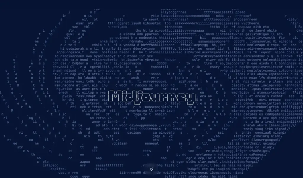
26. Midjourney / sref codes
- What it is: The gold standard for generative visual exploration.
- Best For: Creating “impossible” mood boards and testing lighting/texture combinations instantly.
- Consultant’s Take: Use the
--sref(Style Reference) feature. Feed it a vintage poster from Vintag.es (see #18) and ask it to render a modern coffee shop in that style. It bridges the gap between “abstract idea” and “visual proof” in seconds.
27. Cosmos
- What it is: An AI-powered curator that learns your taste. Think Pinterest, but without the algorithmic junk food.
- Best For: Finding visual connections you would never make on your own.
- Consultant’s Take: Cosmos scans the web for high-quality imagery (excluding memes and low-resolution images). It’s excellent for finding “adjacent” inspiration—such as discovering a specific architectural texture that perfectly complements your brand’s intended typography.
My Personal “Inspiration Stack” for a New Brand Project
To show you how this all comes together, here is my actual process.
- Phase 1: Strategy (No Visuals). I spend all my time on the client’s brief, competitor research, and audience interviews. I don’t look at a single logo.
- Phase 2: Strategic Visuals. I visit Brand New and BP&O, where I look for case studies in the same industry or with the same strategic problem (e.g., “repositioning as premium”).
- Phase 3: Element Exploration. I delve into Fonts in Use to find typefaces that align with the brand’s personality. I use Adobe Color to extract palettes from non-design-related images (like nature or art). I go to LogoArchive for pure, timeless form ideas.
- Phase 4: Application. I look at The Dieline (for packaging) and Httpster (for web) to see how these elements could come together in the real world.
- Phase 5: The “Weird” Input. I browse Kickstarter or Vintag.es to find an “out there” idea that can make the brand distinctive.
Inspiration is never the first step. It’s the step after strategy.
Inspiration is Cheap. Strategy is What Builds Value.
A folder full of ‘inspirational’ JPEGs is not a brand. It’s a homework assignment.
The real work is in the translation. It’s the hard part that comes next: taking all those abstract ideas, filtering them through a solid business strategy, and executing them with skill, consistency, and a ruthless eye for detail.
I’ve seen hundreds of entrepreneurs waste months in the “inspiration” phase, stuck in a loop of indecision. They’re looking for a perfect answer that doesn’t exist.
If you’re tired of scrolling and ready to build a brand that’s built on a real strategy, not just a trend, then maybe it’s time to talk. We’re pretty good at turning that ‘inspiration’ into a ‘brand’ that actually does its job.
You can learn more about our branding services to understand the full process. Alternatively, if you’re serious about getting it done right, you can request a quote directly.
Frequently Asked Questions (FAQ)
What is brand inspiration?
Brand inspiration is the process of gathering ideas, visual cues, and strategic examples to inform the creation of a new brand identity. It’s not just “logo inspiration”; it includes typography, colour, tone of voice, packaging, and digital application.
How do I get brand inspiration without copying?
Focus on deconstructing the strategy, not the style. Ask why a brand made a certain choice. Look at 50 different examples, not just one. The goal is to find a unique idea or approach, not a visual to trace.
What’s the problem with using Pinterest for brand inspiration?
Pinterest’s algorithm creates an echo chamber. It shows you what’s popular, leading to a sea of recycled trends (such as minimalist, pastel, and sans-serif logos). It’s fine for collecting ideas, but terrible for finding original ones.
Where can I find inspiration for a brand’s colour palette?
Start with tools like Adobe Color or Coolors. For a more strategic approach, upload a photo that feels like your brand (e.g., a misty forest, a bustling city market) and extract the palette from it.
How do I find good typography inspiration?
Use Fonts in Use. It shows you how typefaces are used in the real world, which gives you a much better sense of their personality than just seeing them in a list.
What’s the difference between brand inspiration and a mood board?
Inspiration is the process of searching. A mood board is the deliverable—a curated collection of images, textures, and words that sets the intended tone and direction for the brand.
Where can I find case studies of brand strategies?
Brand New and Brand Struck are the two best resources. They dissect the business thinking and strategic goals behind major rebrands, which is far more valuable than simply examining the final logo.
What’s the most overlooked source of brand inspiration?
The real world. Go to a supermarket, a bookstore, or a hardware store. See how brands fight for attention on a crowded shelf. It’s the most honest brand research you can do.
How do I find inspiration for a brand’s tone of voice?
Really Good Emails is a fantastic resource. Read the copy, not just the design. Also, look at Kickstarter campaigns—the pitch is pure, distilled brand voice.
What is “blanding”?
“Blanding” is a recent trend (driven by the echo chamber) where brands, particularly in tech, strip away all personality in favour of a generic, minimalist, sans-serif look. It’s the opposite of distinctive branding.
Should I look at my competitors for inspiration?
You should analyse your competitors, not look to them for inspiration. Your goal is to understand what they are all doing so you can do something different. You are looking for a gap in the market to own.
How many websites should I look at for inspiration?
It’s not about quantity. It’s about quality. Spend 30 minutes reading one in-depth case study on Brand New, and you’ll learn more than you will in 3 hours of scrolling Pinterest.

