Evolution of the BP Logo: A Century of Design & Branding
Most companies redesign their logo to look prettier.
BP spent $211 million on a logo that nearly destroyed them.
That’s not hyperbole. When the Deepwater Horizon disaster spilt 134 million gallons of oil into the Gulf of Mexico in 2010, BP’s bright green “sunflower” logo became the face of environmental catastrophe. A symbol meant to represent sustainability suddenly dripped with oil in protest signs worldwide.
Nobody talks about the brutal truth: BP’s logo journey isn’t just about pretty colours and fancy design trends. It’s the visual evidence of a century-long identity crisis in public. From British imperial oil company to “green” energy pioneer to environmental villain – all captured in the evolution of a single symbol.
I’ve spent the last decade analysing how the world’s biggest companies use visual identity to manipulate consumer perception. What I found in BP’s logo history is a masterclass in both brilliant branding and catastrophic disconnection between image and reality.
For executives, this is the brand evolution story you need to study. For designers, it’s a cautionary tale you can’t ignore. For everyone else, it’s your chance to see how a simple visual mark can carry the weight of corporate promises, geopolitical power shifts, and environmental reckonings.
Let me show you what a century of BP logos reveals about the company that created them – and why their visual journey matters more than you think.
- BP invested $211 million in the Helios logo, aiming for a sustainable image but faced crisis with the Deepwater Horizon disaster.
- The logo's evolution reflects BP's century-long identity crisis from imperial oil to an alleged "green" energy leader.
- Consistency in branding allowed BP to demonstrate accountability post-crisis, stabilising the logo's perception amidst ongoing controversies.
- The Helios symbol represents aspirations of sustainability but faced greenwashing accusations due to ongoing fossil fuel reliance.
- Future branding choices include evolving the Helios symbol or complete rebranding as BP shifts to renewable energy.
The Origin Story: BP Motor Spirit (1909-1920s)
In 1909, BP Motor Spirit, the predecessor to today’s modern BP, introduced a logo that would define the brand for nearly a decade. This early emblem was a testament to the simplicity and boldness favoured in early 20th-century corporate design.
This wordmark was rendered in bold, black, title case letters. The typeface chosen was a robust, rounded sans-serif, which lent the logo a sense of stability and strength – qualities essential for a burgeoning oil company. The bold letterforms ensured legibility, even from a distance, making it ideal for use on motor spirit cans and early advertising materials.
The composition was set against a stark white background, creating a high-contrast effect that enhanced visibility. A square black border framed this clean backdrop, its corners slightly rounded to soften the overall appearance. This subtle touch of curvature added a hint of approachability to an otherwise imposing design.
The logo’s simplicity and strength reflected early petroleum companies’ straightforward, no-nonsense approach. The design spoke to the reliability and power of BP Motor Spirit’s products, setting the stage for the company’s future growth and evolution into the global energy giant we recognize today.
British Petroleum Shield (1920s-1947)
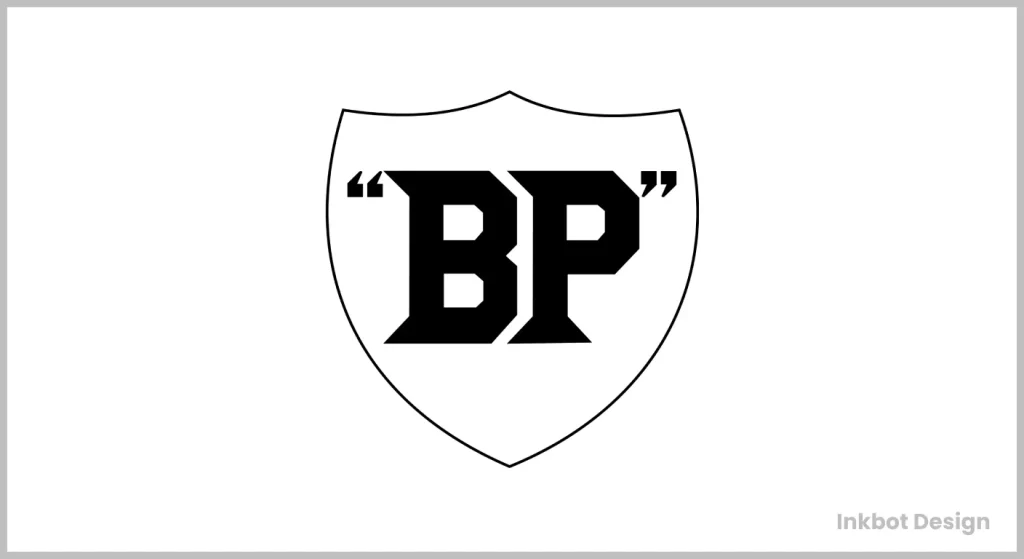
When APOC became British Petroleum in the 1920s, they evolved into a shield featuring the letters “BP” in a bold serif font.
The visual change maintained the shield but incorporated the new name. This logo communicated British imperial strength when the UK was still a global superpower. The company wanted to project authority in international markets where nationalism was rising, especially in the Middle East.
This was less innovation and more power preservation – BP was claiming territory visually as Britain’s oil company when oil became recognised as a strategic national resource.
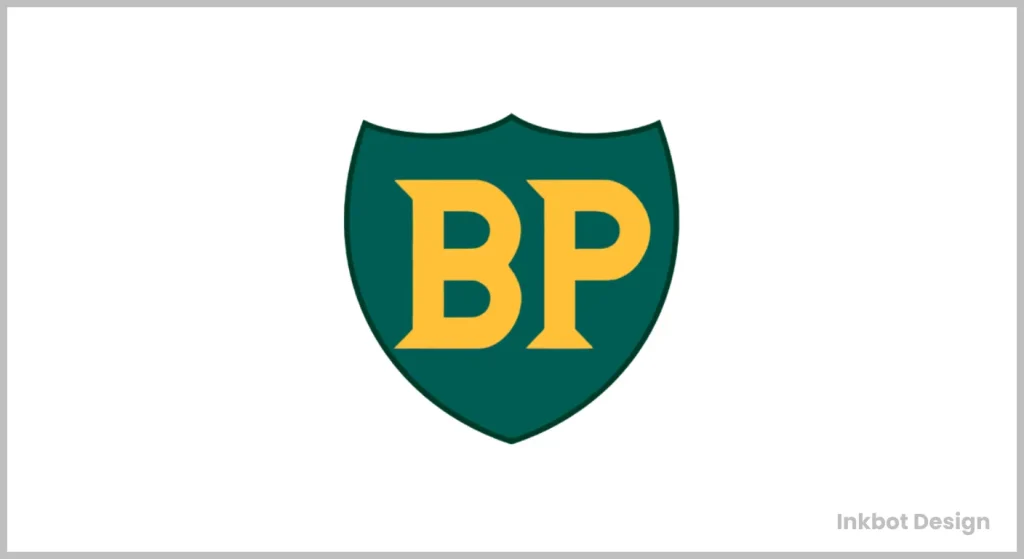
The BP Shield: Evolution Not Revolution (1947-1958)
Post-WWII, BP kept the shield but modernised it. The colours shifted to green and yellow (early versions of their signature palette), and the typography became cleaner.
This subtle evolution reflected post-war Britain’s changing relationship with the empire—the logo needed to maintain continuity while acknowledging the shifting global power dynamics. The company was expanding internationally while dealing with the nationalisation of their Iranian assets in 1951 – they needed visual stability during business turmoil.
The introduction of green began their connection to nature, though this was more about differentiation than environmental consciousness. Green offered distinction in a market where competitors used red (Texaco, Mobil) or yellow/red (Shell).
The BP Shield Goes Global (1958-1989)
In 1958, BP unveiled a more polished shield design. The typography was modernised again, and the green and yellow colour scheme was refined.
This coincided with BP’s global expansion strategy. The logo needed to work across cultural contexts while still carrying British heritage. The refinement aligned with the post-war economic boom and growing consumer culture.
BP’s first truly strategic logo was designed for international recognition in an increasingly competitive global market. The shield remained a powerful symbol of tradition, but the refined execution made it contemporary and versatile for global applications.
Bolder and Brighter (1989-2000)
BP changed their logo in 1989. They made it better. Siegel & Gale did it. These guys are good. They made logos for big names like PlayStation and Pfizer.
The new logo looks fresh. It uses light green and yellow. The letters “BP” now lean to the side. This makes it pop.
Logos matter. They show what a company stands for. A good logo sticks in your head. It makes you remember the brand.
BP’s new look worked. It helped them stand out. People saw the logo and thought, “energy.” That’s what BP wanted.
This change came at the right time. The world was changing. BP needed to keep up. Their new logo showed they were ready for the future.
Remember, looks matter in business. A strong logo can make you millions. BP got it right. They picked the right team. They made the right choices.
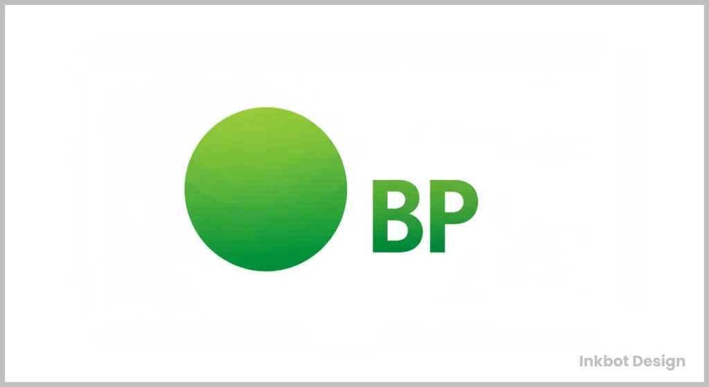
The Helios: Rebranding as “Beyond Petroleum” (2000-Present)
In 2000, BP undertook its most radical rebrand, introducing the “Helios” sunflower symbol designed by Landor Associates for $211 million. The green and yellow colour scheme evolved into a more sophisticated gradient sunburst.
This wasn’t just a logo change; it was a fundamental repositioning. CEO John Browne attempted to transform BP from an oil company to an energy company with the tagline “Beyond Petroleum.
The Helios mark represented:
- The sun – symbolising renewable energy
- A flower – connecting to natural systems
- A pattern of interlocking parts – suggesting integration and systems thinking
The timing aligned with growing climate consciousness and BP’s acquisition of solar company Solarex. But here’s the brutal truth: the rebrand was aspirational marketing far ahead of operational reality. BP was still primarily an oil and gas company making token investments in renewables.
The logo wasn’t the problem – it was beautifully executed and innovative. The disconnect between symbol and substance became the issue.
Deepwater Horizon: Logo in Crisis (2010)
The 2010 Deepwater Horizon disaster created the ultimate brand crisis. Suddenly, BP’s green sunflower logo became a symbol of corporate greenwashing and environmental hypocrisy.
Environmental activists created parodies showing the Helios dripping with oil. Greenpeace launched a logo redesign contest generating thousands of oil-soaked variations.
The logo didn’t change, but its meaning did – permanently. For many, what was designed to symbolise environmental progress became a symbol of corporate deception.
This reveals a fundamental truth: a logo carries the weight of company actions, not just design intent. No visual identity can survive a massive contradiction between symbol and substance.
The Current Logo: Resilience Through Consistency
Despite calls to rebrand after Deepwater Horizon, BP kept the Helios. This was smart for two reasons:
- Changing it would have seemed like trying to escape accountability
- The design itself remains visually strong and distinctive
The logo has maintained remarkable consistency for over 20 years – through multiple CEOs, massive market fluctuations, and catastrophic PR disasters. This stability has allowed BP to use design consistency in its recovery strategy.
The logo now exists in a cleaner, flatter form – aligned with digital-first design trends. The gradients have been simplified, making it more functional across digital touchpoints while maintaining recognition.
The Psychology Behind BP’s Visual Evolution
BP’s colour journey tells a fascinating story:
- Green: Initially chosen for differentiation, later repurposed to signal environmental consciousness
- Yellow: Represents energy, optimism, and, interestingly, sunshine (solar energy)
The shift from shield (protection, tradition) to sunflower (growth, nature) mirrors BP’s attempted transformation from an extractive resource company to an integrated energy provider.
The Helios symbol works on multiple psychological levels:
- Radial symmetry creates a sense of harmony and completeness
- The petal-like sections suggest growth and organic development
- The circular form implies continuity and sustainability
Typography evolved from serif (tradition, authority) to sans-serif (modernity, accessibility), tracking broader cultural shifts in corporate communication.
Competitive Context: Following or Leading?
BP’s logo evolution shows both leadership and reaction:
- 1909-1989: Following industry norms (shields, emblems, official-looking insignia)
- 1989-2000: Catching up to broader corporate simplification trends
- 2000-Present: Genuinely innovative and trend-setting
The Helios mark was revolutionary for the energy sector. While competitors like Shell had simplified their shells and Exxon had modernised, nobody had made such a complete visual departure from industry conventions.
This placed BP in visual conversation with technology and consumer brands rather than industrial companies – precisely what their “Beyond Petroleum” positioning intended.
However, the disconnect between visual innovation and operational reality created authenticity problems that still impact brand perception today.
Controversies and Public Reception
The 2000 rebrand generated immediate criticism for its cost ($211 million for the complete identity system). Environmental groups called it greenwashing from day one – a criticism validated by BP’s continued massive investment in fossil fuels relative to renewables.
The most telling statistic is that 2001 BP spent more on advertising its renewable investments than its actual investments.
The public initially received the design positively – it was fresh, optimistic, and beautiful. Design critics praised its sophistication. The backlash came not from the design quality but from the perception gap between symbol and substance.
The Deepwater Horizon disaster transformed a questionable rebrand into a symbol of corporate hypocrisy. No logo, no matter how well-designed, can survive becoming visual shorthand for corporate disaster.
Looking Forward: What’s Next for BP’s Visual Identity?
BP faces a fundamental brand challenge. Their logo now carries two contradictory associations:
- The intended meaning: sustainable, integrated energy
- The crisis meaning: environmental disaster and greenwashing
As BP genuinely increases renewable investments (now targeting 50GW of renewable generating capacity by 2030), they face an interesting choice:
- Evolution: Maintain the Helios but evolve it subtly as their business mix changes
- Revolution: Complete rebranding once renewable revenue becomes substantial
- Hybrid approach: Maintain the master brand but develop sub-brands for different energy divisions
My prediction? BP will maintain the core Helios symbol but evolve the surrounding identity system. The sunflower metaphor becomes more honest as their renewable portfolio grows, potentially rehabilitating the symbol’s meaning.
The path is a refresh around 2025-2028 that maintains recognition while signalling legitimate business transformation.
Key Lessons from BP’s Logo Journey
- Visual aspiration must connect to operational reality. The gap between BP’s sustainable imagery and fossil fuel dependence created authenticity problems that no design could solve.
- Crisis reshapes meaning beyond designer control. After Deepwater Horizon, the Helios became a crisis symbol despite its design intent.
- Consistency builds resilience. Maintaining the logo through the crisis allowed BP to demonstrate accountability rather than evasion.
- Industry context determines innovation impact. BP’s sun symbol was revolutionary in energy but would have been unremarkable in consumer goods.
- Colour ownership creates recognition. BP’s green-yellow palette created distinctive brand recognition in a category dominated by red.
- Logos carry accumulated meaning. The Helios now contains BP’s entire corporate history, including aspirations and failures.
The ultimate lesson? A logo is a promise made visible. When the promise and reality align, a logo becomes a powerful asset. When they diverge, even the most beautiful symbol becomes a liability.
BP’s visual evolution demonstrates that in brand identity, execution isn’t just about aesthetics but authenticity. Their logo journey reflects the fundamental tension in modern corporate environmentalism: how to represent transition without overpromising or greenwashing visually.
For today’s brands, BP’s example clearly warns that design should follow substance, not lead it. The most successful visual identities don’t create new realities – they honestly reflect emerging ones.
FAQs: The Evolution of the BP Logo
When was the first BP logo created, and what did it look like?
The original logo wasn’t actually “BP” at all. When the company began in 1909 as the Anglo-Persian Oil Company (APOC), they used a simple shield emblem containing the “APOC” initials. The first authentic BP-branded logo emerged in the 1920s when the company became British Petroleum, featuring a shield design with “BP” in a bold serif font.
Why did BP choose green and yellow as their brand colours?
BP primarily adopted green and yellow in the post-WWII period (late 1940s-early 1950s) for competitive differentiation. While competitors like Shell used red/yellow and Mobil used red/blue, BP’s green allowed them to stand out visually at service stations. Only decades later was this colour choice retroactively positioned as representing environmental consciousness during their “Beyond Petroleum” campaign.
How much did the “Helios” sunflower logo redesign cost in 2000?
The complete rebrand, including the Helios sunflower symbol created by Landor Associates, cost BP approximately $211 million. This included the logo design and the implementation across thousands of service stations, corporate materials, vehicle fleets, and a global advertising campaign introducing the new brand positioning.
Did BP change its logo after the Deepwater Horizon disaster?
Surprisingly, no. Despite intense public pressure and the logo becoming a symbol of environmental hypocrisy (with numerous parodies showing the sunflower dripping with oil), BP maintained the Helios design. Marketing experts generally agree this was the right move, as changing it would have appeared as an attempt to escape accountability rather than addressing the actual environmental damage.
What does the current “Helios” symbol represent?
The Helios symbol (named after the Greek sun god) was designed with multiple intentional meanings:
The sun: representing energy, particularly renewable solar energy
A flower: connecting to natural systems and growth
A pattern of interlocking parts: suggesting integration and systems thinking across different energy types. The geometric pattern consists of overlapping petals arranged in a radial pattern, creating movement and balance.
How did BP’s logo compare to its competitors throughout history?
BP’s logo evolution shows them shifting from follower to leader:
1909-1989: BP followed industry conventions with shields and emblems similar to Shell, Esso, and other petroleum companies
1989-2000: BP adopted corporate simplification trends with a wordmark, catching up to broader design movements
2000-Present: The Helios mark was genuinely revolutionary for the energy sector, positioning BP visually alongside technology and consumer brands rather than industrial companies
Has any other major oil company attempted such a dramatic visual rebranding as BP?
No other major oil company has made such a complete visual departure from industry conventions. Shell has continuously simplified its shell emblem but maintained its core visual element. ExxonMobil modernised but kept their distinctive crossed Xs. Chevron maintained their chevron pattern. BP’s complete abandonment of traditional petroleum visual language for the Helios symbol remains uniquely ambitious within the industry.
What psychological principles inform BP’s logo design?
The current Helios symbol leverages several psychological design principles:
Radial symmetry: Creates a sense of harmony, completeness, and perfection
Warm colour palette: Green evokes nature and sustainability, while yellow suggests optimism and energy
Circular form: Implies continuity, wholeness, and cyclical processes (connecting to sustainability)
Petal-like sections: Suggest organic growth and natural development
Dynamic arrangement: The slightly overlapping sections create a sense of movement and transformation
Did BP’s “Beyond Petroleum” rebrand coincide with significant renewable energy investments?
This remains one of the most controversial aspects of the rebrand. While BP acquired solar company Solarex and increased renewable investments around this time, the scale was minimal compared to their fossil fuel operations. In 2001, BP spent more money advertising its renewable investments than its actual investments. By 2013, BP had sold off most of its solar business, contradicting the brand promise implied by the Helios symbol.
How has digital media influenced the evolution of BP’s logo?
The Helios symbol has been subtly simplified over its lifetime to function better in digital environments. The original 2000 version featured more complex gradients that were difficult to reproduce on screens and in small formats. Current versions maintain the basic structure but with flatter colours and cleaner lines that render more effectively across digital platforms. This evolution mirrors broader design trends toward simplification driven by digital media requirements.
What’s the most successful element of BP’s logo history from a design perspective?
Design experts generally agree that BP’s most successful branding achievement was establishing complete ownership of the green/yellow colour palette within the energy sector. Even when the Helios symbol faced criticism, the distinctive colour combination maintained instant brand recognition. This colour ownership has proven more valuable and durable than any specific logo format or symbol they’ve used.
Could BP ever wholly abandon the Helios symbol in the future?
As BP genuinely increases its renewable energy portfolio (targeting 50GW of renewable capacity by 2030), a complete abandonment of the Helios seems unlikely. The symbol was explicitly designed to represent an integrated energy company rather than just a petroleum producer. The more likely scenario is the subtle evolution of the symbol as their business transforms, allowing the visual metaphor to become more authentic as renewable energy becomes a more significant portion of their business.
