5 Best Presentation Tools & Software for Marketers
In marketing, your presentation isn’t just slides—it’s the difference between closing the deal and losing it forever.
I’ve seen $10K proposals tank because of amateur visuals. At the same time, scrappy startups have landed million-dollar accounts with presentations that looked like they cost more than their quarterly budget.
Here’s the brutal truth: Your audience decides about your expertise in the first 30 seconds. Before you finish your introduction, they’ve already decided if you’re worth listening to.
The proper presentation software doesn’t just make you look good—it multiplies your conversion rate. It’s the highest ROI marketing investment you’re probably ignoring.
Today, I’m breaking down the five presentation tools that give marketers an unfair advantage in 2025.
These aren’t just pretty slide makers. They’re conversion machines that elevate your perceived value immediately and help you close more deals with less effort.
- Visual storytelling creates emotional connections and enhances engagement and retention in presentations.
- Choosing the correct presentation software significantly impacts conversion rates and audience perception of expertise.
- Each tool mentioned — Canva, Visme, Beautiful.ai, Prezent, Gamma—offers unique features to cater to different presentation needs.
- Investing time to master these tools substantially enhances your presentations' effectiveness and audience engagement.
The Importance of Visual Storytelling

Visual storytelling is more than just pretty pictures. It’s about conveying ideas in a way that resonates. When you craft a compelling story through visuals, you’re not just sharing facts but creating an emotional connection. Here’s why you should take this seriously:
- Engagement: A well-designed presentation captures attention quickly.
- Retention: People remember information better when it’s illustrated effectively.
- Impact: You can drive your point home with powerful visuals reinforcing your message.
I remember my first big presentation. I relied heavily on text. My audience seemed disengaged. Halfway through, I noticed a few people checking their phones. It was a wake-up call! I needed a better approach. This pushed me to explore design tools that can turn simple ideas into eye-catching narratives.
Choosing the Right Tool
Selecting the proper presentation software is crucial. Not every tool fits every need. Here are some questions to consider:
- What’s your design skill level? Some tools are more user-friendly than others.
- What’s your primary goal? Do you want to inform, persuade, or entertain?
- Do you need collaboration features? Working with a team can change your requirements.
I’ll introduce five standout options to help you find the perfect presentation tool. Each one has unique features, catering to various styles and needs.
Here’s a quick overview of what you’ll find:
| Tool | Best For | Key Features |
|---|---|---|
| Canva | Quick, stylish designs | Extensive templates and elements |
| Visme | Interactive presentations | Infographics and data visualisation |
| Beautiful.ai | Professional touch | Smart slide layouts |
| Prezent | Story-driven presentations | Unique storytelling format |
| Gamma | Data-focused presentations | Easy integration of analytics |
| SketchBubble AI | Fast, AI-powered presentation creation | Instant slide generation, PDF to PPT conversion, export to PowerPoint or Google Slides |
Choosing a tool from this list can dramatically impact your presentations. The right choice turns a mundane slide into a captivating experience. Stay tuned as we break down each tool to find the one that suits your needs. We’re about to dive deeper. Let’s get started!
1 – Canva
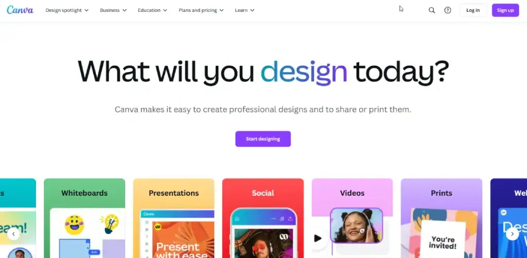
Canva has taken the design world by storm. This is it if you’re looking for a user-friendly platform that offers stunning visuals. It empowers anyone to create impressive presentations regardless of their design experience. Let’s explore what makes Canva an excellent choice for your presentation needs.
Ease of Use
Canva shines with its intuitive drag-and-drop interface. You don’t need to be a tech wizard to navigate the platform. Here’s why ease of use matters:
- Quick Start: You can start designing immediately without steep learning curves.
- Templates Galore: With a library boasting thousands of templates, you can easily find a style that fits your message.
When I started using Canva, I was amazed at how quickly I could assemble a professional-looking slide. I remember putting together a pitch deck in about an hour. That saved me a ton of stress!
Beautiful Templates
One of the standout features of Canva is its impressive collection of templates. You’ll find designs for virtually every occasion, from corporate meetings to educational presentations. Key benefits include:
- Visual Appeal: Professionally designed templates elevate your content.
- Customisability: You can tweak colours, fonts, and elements to align with your branding.
Here’s a brief list of types of templates you might find:
- Business presentations
- Educational slides
- Infographics
- Social media posts
This variety means you can create a cohesive look across different materials, enhancing your brand’s consistency.
Collaboration Made Easy
Another significant advantage of Canva is its collaboration features. Are you working on a project with colleagues? You can invite them to edit, comment, or provide feedback directly within the tool. This makes teamwork smooth and productive.
Here’s how it works:
- Share the Design: Send a link to your teammates.
- Real-Time Edits: Everyone can make changes simultaneously.
- Commenting: Team members can leave comments for specific parts of the presentation.
This feature saved me a couple of times during tight deadlines. I could gather input from my team seamlessly, cutting hours of back-and-forth communication.
Additional Features
Canva offers many additional features, including:
- Stock Photos and Graphics: Access millions of free images to enrich your slides.
- Animations and Transitions: Bring your presentation to life with dynamic effects.
- Export Options: Save your work in multiple formats, such as PDF or PowerPoint.
Overall, Canva is a versatile tool that can meet various presentation needs. Whether you are a novice or a seasoned designer, Canva helps you create stunning presentations quickly and easily. Ready to explore more tools? Let’s move on to the next one!
2 – Visme

If Canva is the jack-of-all-trades in presentation design, Visme is the master of interactive visuals. It’s crafted explicitly to create presentations, infographics, reports, and social media graphics. Let’s dive into what sets Visme apart from the pack.
Interactive and Engaging Content
At the core of Visme’s appeal is its focus on interactivity. Unlike standard slide presentations, Visme allows you to create engaging content that captures attention. Here’s what makes interactivity important:
- User Engagement: Interactive elements keep the audience involved.
- Enhanced Understanding: Complex information becomes clearer through visuals and interactions.
For instance, I once used Visme to present survey results for my team. Instead of just sharing numbers on a slide, I created interactive charts. Viewers could hover over data points for deeper insights. The room instantly perked up!
Customisation Options
Visme gives you the freedom to customise your presentations extensively. The platform provides a variety of templates, but you can also create from scratch. This flexibility is a game-changer. Here’s how you can make it your own:
- Fonts: Choose from a wide selection, or upload your custom fonts.
- Colour Palettes: Create a unique colour scheme that aligns with your brand.
- Graphics and icons: Access an extensive library of stock photos, icons, and shapes to enhance your visuals.
I once needed to align my presentation aesthetics closely with our branding. I achieved that with Visme’s customisation tools, making our slides more professional and on-brand.
Data Visualisation Tools
Visme excels in data visualisation. If your presentation involves data-heavy content, this tool has you covered. You can create:
- Graphs and Charts: Easy-to-use tools to illustrate data points.
- Diagrams: Visual flows and processes to clarify complex concepts.
- Infographics: Combine text and visuals effectively to tell a data story.
I vividly recall a project where I had to present research findings. Thanks to Visme’s data visualisation capabilities, I turned dull numbers into eye-catching visuals. The result? A more compelling narrative that stuck with my audience.
Collaboration and Sharing Features
Collaboration is essential in today’s work environment, and Visme makes it simple. You can invite team members to co-create or review your presentations. And sharing options go beyond just exporting slides. Here’s how:
- Real-time Editing: Collaborators can edit together.
- Share Links: Send a link to anyone, allowing them to view or comment on your work.
- Analytics: Track how your audience interacts with your presentation.
The analytics feature is handy. It lets you see which slides captivate attention and which may need improvement.
Visme is a powerhouse for creating interactive and engaging presentations beyond traditional design. Whether you need to present data or tell a story, this tool has the features to help you make that impact. Now, let’s move on to another excellent option: Beautiful.ai!
3 – Beautiful.ai

After discussing Visme’s interactivity, let’s shift gears and explore Beautiful.ai. This tool simplifies the design process while ensuring your presentations look professional. With its unique approach, Beautiful.ai makes it easy to create stunning slides without getting bogged down in details.
Smart Design Features
What sets Beautiful.ai apart is its innovative design technology. Instead of manually adjusting every element, the platform automatically adjusts layouts and formatting as you add content. This means you can focus on what matters most: your message. Here’s why this is a game-changer:
- Consistency: Every slide maintains a cohesive look.
- Time-Saving: No more fiddling around with alignment and spacing.
I remember the days of manually aligning text and images in presentations. It was tedious! When I first started using Beautiful.ai, I was amazed at how quickly I could compile a slide deck while maintaining a cohesive design. It sparked my creativity and allowed my ideas to flow without interruptions.
User-Friendly Interface
Beautiful.ai is designed with user-friendliness in mind. The interface is clean and intuitive, making it accessible even for those without design experience.
Some key highlights include:
- Drag-and-Drop Functionality: Arrange elements with ease.
- Template Library: Choose from various professionally designed templates that cater to different themes and industries.
This seamless experience helps you stay focused on crafting a compelling narrative.
Customisation Made Simple
While Beautiful.ai does rely on templates, customisation options are still plentiful. You can easily adjust colours, fonts, and photos, allowing for personal touches that fit your style.
- Branding Capabilities: Upload your logo and choose corporate colours to align with your brand.
- Image Integration: Simple options for adding images or icons directly from the platform’s library.
I once had to create a pitch for a new product. Using Beautiful.ai, I uploaded our logo and used our colour palette to create a cohesive narrative. The visuals had an immediate impact, making the presentation feel like an extension of our brand.
Analytics and Presentation Tools
Beautiful.ai also offers valuable features for those who need insights into their audience. Once you share your presentation, you can track engagement metrics. This includes:
- View Counts: See how many people accessed your presentation.
- Interaction Rates: Understand which slides were the most engaging.
These insights are invaluable. They allow you to refine your future presentations based on actual feedback.
In conclusion, Beautiful.ai offers a more guided approach to creating presentations, making the design process effortless while still producing visually stunning results. If simplicity and elegance are what you seek, this is your tool! Next, explore another interesting option, Prezent, designed specifically for storytelling.
4 – Prezent

Having explored Beautiful.ai’s stylish approach to presentation design, let’s now turn our attention to Prezent. This tool stands out for its unique focus on storytelling and narrative flow. If you believe that a compelling story should be at the heart of every presentation, Prezent is the tool for you.
Storytelling-Driven Design
What makes Prezent unique is its emphasis on storytelling. It helps you structure your presentation in a way that guides your audience through a narrative journey. With Prezent, every slide has a purpose. Here’s why this matters:
- Engagement: A well-structured story keeps your audience hooked.
- Clarity: Presenting information in a narrative format makes it easier to understand.
I remember using Prezent to pitch a new concept to our team. Instead of presenting a disjointed collection of slides, I crafted a story that took them from our problem to the proposed solution. It was powerful, and the feedback I received was overwhelmingly positive!
Interactive Features
Prezent incorporates interactive features that elevate your storytelling experience. You can add animations, transitions, and clickable elements to encourage audience participation. Here’s what to look out for:
- Dynamic Transitions: Smooth transitions help maintain the flow of your narrative.
- Engagement Points: Create moments where your audience can engage, such as polls or questions.
These features enhance the storytelling aspect of your presentation, allowing you to connect with your audience on a deeper level.
User-Friendly Interface
Navigating Prezent is a breeze, even for newcomers. The interface is designed for ease of use, enabling you to focus on crafting your story without getting lost in complicated menus.
- Simple Navigation: Move through your presentation intuitively.
- Template Options: Choose from various storytelling templates that guide your design.
When I started using Prezent, I was pleasantly surprised by how quickly I could adapt to the layout. This means less time learning and more time creating.
Feedback and Collaboration Tools
Prezent also offers valuable feedback and collaboration features. Inviting colleagues to co-author or review your presentation facilitates seamless teamwork. Key collaboration features include:
- Commenting: Team members can leave feedback right on the slides.
- Real-Time Editing: Collaborators can edit simultaneously, ensuring everyone is on the same page.
This collaborative approach saved me from back-and-forth emails when finalising a team presentation. The feedback process became much more efficient.
Prezent is an exceptional tool for those who want to weave compelling narratives into their presentations. Look no further if your audience wants to hear and feel what you say. Now, let’s move on to the next innovative option: Gamma!
5 – Gamma

Having discussed Prezent’s emphasis on storytelling, let’s dive into Gamma. This platform makes waves for its innovative presentation approach that blends data with storytelling. If you often deal with complex information and want to communicate it clearly, Gamma is a game changer.
Data-Driven Presentations
Gamma focuses on transforming raw data into visually appealing and easily digestible presentations. This tool is designed for you if you present stats, trends, or performance metrics. Here’s why data-driven design is crucial:
- Clarity: Effectively conveys complex ideas without overwhelming your audience.
- Visual Appeal: Ensures data isn’t just numbers on a slide but a story wrapped in visuals.
I recently used Gamma to present quarterly results to my team. Instead of traditional graphs, I integrated engaging layouts that highlighted key insights. The outcome? The team was more informed and energised to discuss the next steps.
Dynamic Templates and Visuals
Gamma comes with a suite of dynamic templates tailored for data visualisation. These are not your standard slides; they are thoughtfully designed to support storytelling through data. Key features include:
- Custom Charts and Graphs: Create and embed various data visuals easily.
- Interactive Elements: Let your audience explore the data with clickable charts for deeper insights.
This flexibility allowed me to dive into the numbers while keeping the narrative engaging. No one was checking their watches!
Integrating Multimedia
Another standout feature of Gamma is its ability to integrate multimedia elements effortlessly. Every aspect can enrich your presentation, whether videos, animations, or audio clips. Here’s how this enhances your message:
- Rich Content: Diverse formats keep the audience engaged and entertained.
- Enhanced Storytelling: Combine different media to create a powerful narrative.
I remember adding a short video clip explaining a complex process to my presentations. The shift in format captured attention and helped illustrate the concept clearly. The audience could relate better because they weren’t just hearing about the process but watching it unfold.
Collaboration Capabilities
Collaboration is easy with Gamma. Whether working solo or with a team, you can invite others to contribute seamlessly to your presentations. Here’s what to expect:
- Real-Time Collaboration: Multiple users can work on the presentation simultaneously.
- Feedback Tools: Team members can add comments, making the review process straightforward.
This feature proved invaluable when I collaborated with a colleague on a comprehensive market analysis presentation. We could swiftly integrate each other’s input, producing a polished final product.
In conclusion, Gamma caters specifically to those who merge data with narrative. This tool is worth exploring if you must effectively present complex information. As we wrap up, it’s clear that choosing the proper presentation tool can significantly impact how your message is received. Each of these five options offers unique strengths tailored to different needs. It’s time for you to pick the one that resonates most with your presentation style!
Bonus: SketchBubble AI
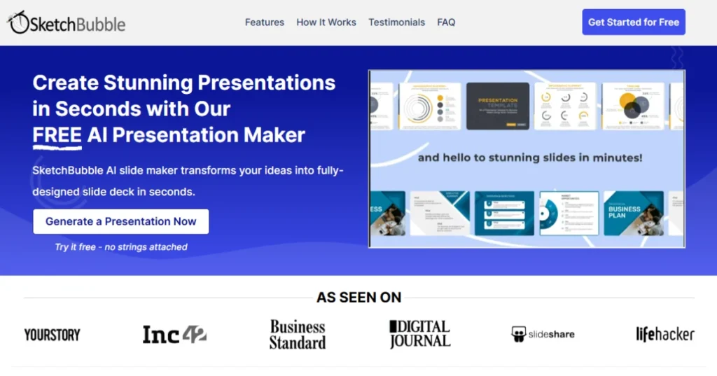
Having looked at Gamma’s focus on data storytelling, let’s shift to SketchBubble AI — a platform built for speed, simplicity, and professional output.
If you want to go from idea to presentation in minutes without sacrificing quality, SketchBubble AI is your go-to solution.
Instant AI-Generated Presentations
SketchBubble AI takes a straightforward approach: you provide a topic or brief outline, and the AI instantly generates a complete, well-structured deck.
This means no more staring at a blank slide or worrying about formatting — the heavy lifting is done for you.
Why this matters:
- Time Savings: Cut presentation prep from hours to minutes.
- Consistent Quality: Slides follow a clean, professional style every time.
I recently used SketchBubble AI to prepare a workshop presentation with less than an hour’s notice. The AI-generated slides gave me a solid structure that I could quickly refine, freeing me to focus on delivering value to my audience.
PDF to PPT Conversion
One standout feature is the AI PDF to PPT Converter, which transforms existing documents into editable presentations. This is a game-changer if you need to adapt reports, research papers, or training manuals into visual formats quickly.
Benefits:
- Repurpose Content: Turn static documents into dynamic slides.
- Editable Output: Fine-tune every element after conversion.
I converted a detailed PDF proposal into a visual deck in minutes during a client pitch. The result? A cleaner, more engaging format that made the discussion flow effortlessly.
Seamless Export and Compatibility
SketchBubble AI doesn’t lock you into one platform. Once your presentation is ready, export it as a PowerPoint file or open it directly in Google Slides. This flexibility is a big plus for teams with mixed workflows.
Advantages:
- Cross-Platform Use: Edit and present anywhere.
- Collaboration Ready: Share instantly with colleagues or clients.
This feature is handy when collaborating with remote teams — no compatibility headaches, just smooth handoffs.
User-Friendly Experience
The most refreshing aspect of SketchBubble AI is its simplicity. The interface is clean, beginner-friendly, yet powerful enough to produce professional results.
There’s no steep learning curve — you can create your first deck within minutes of logging in.
In conclusion, SketchBubble AI is perfect for anyone who values speed, ease of use, and professional presentation quality.
Whether you’re preparing for a last-minute meeting, turning complex documents into slides, or just want a smarter starting point, it’s a tool that consistently delivers.
After exploring these powerful presentation tools—Canva, Visme, Beautiful.ai, Prezent, and Gamma—it’s evident that effective communication hinges on the right platform. Each tool brings something unique, allowing you to tailor your presentations to fit your style and audience’s needs.
Comparison Table
| Tool | Key Strengths | Pricing (Starting) |
|---|---|---|
| Canva | Templates, collaboration, AI design | Free; $12.95/month |
| Visme | Analytics, interactivity, 3D elements | Free; $12.25/month |
| Beautiful.ai | AI automation, privacy controls | $12/month |
| Prezent | Brand compliance, story frameworks | Custom pricing |
| Gamma | Non-linear design, brainstorming tools | Free; $15/month |
| SketchBubble AI | AI slide generation, PDF to PPT conversion | Free; $9.95/month |
Reflecting on Your Needs

Considering which tool is best for you, reflecting on your specific presentation requirements is essential. What is the primary goal of your presentation? Here are a few questions to guide your decision:
- What is your primary audience? Different tools may resonate better with business professionals, educators, or creative teams.
- What type of content will you focus on? If your presentations revolve around data, Gamma might be your best bet. For storytelling, Prezent could be the ideal choice.
- Do you need collaboration features? Tools like Visme and Gamma excel in this aspect.
I remember facing these decisions during a recent project. I had to analyse whether my priority was engagement or delivering complex data. After considering my audience and objectives, I chose a tool that blended both. This level of reflection ensures that your chosen platform aligns with your vision.
The Power of Visual Communication
Never underestimate the impact of visuals in a presentation. A well-designed presentation can significantly enhance understanding, retention, and engagement. Each tool we’ve discussed enables you to create stunning visuals to capture and hold your audience’s attention. Here’s a simple breakdown of what to consider:
| Tool | Best For | Key Takeaway |
|---|---|---|
| Canva | Quick, stylish designs | User-friendly drag-and-drop interface |
| Visme | Interactive presentations | Strong focus on engagement |
| Beautiful.ai | Streamlined design | Smart design features |
| Prezent | Narrative-driven content | Emphasis on storytelling |
| Gamma | Data-focused presentations | Blends data with visual storytelling |
| SketchBubble AI | AI-powered presentation creation | Provides quick formats for Google Slides/PPT |
Investing time in mastering these tools will pay dividends. A few extra hours learning a new platform can enhance your presentations for years to come. The right tool can transform a simple PowerPoint into a memorable visual experience.
Taking Action
So, what’s next? Dive into these tools, try them out, and see what resonates. Many offer free trials, so there’s no risk in exploring their features. As you experiment, you’ll discover how these platforms can elevate your presentations and create a lasting impact.
Remember, effective presentations are not just about delivering information; they’re about engaging your audience and making your message memorable. Don’t hesitate to get creative and inject your personality into your slides. A personal touch makes all the difference!
In conclusion, equipping yourself with the proper presentation tool will empower you to convey your ideas with confidence and clarity. It’s not just about the visuals; it’s about the story you tell. Use the insights gained from these tools to connect with your audience profoundly. Happy presenting!

