What the 25 Best Gas Station Logos Teach Us About Roadside Branding
Most “best logo” lists are a waste of time. They’re put together by designers who judge logos like art pieces in a quiet, white-walled gallery.
That’s useless for a business owner.
A gas station logo doesn’t live in a gallery. It lives on a 100-foot pylon sign next to a motorway, fighting for attention against a dozen other signs, trees, and flashing lights.
Its only job is to be a beacon—to make a tired, hurried driver with a low fuel light decide to pull off the road.
This isn’t about aesthetics. It’s about performance.
So we’re not judging these logos on whether they’re pretty. We’re judging them on whether they work. Here are the only five metrics that matter:
- Instant Recognition: Can you identify it at 70 mph, partially obscured by a lorry?
- Simplicity & Memorability: Is it clean enough to be recalled later? Is it free of useless clutter?
- Timelessness: Does it look dated or built on shapes and ideas that last for decades?
- Versatility: Does it look as good on a mobile app icon as on a massive sign or an employee’s uniform?
- Concept: Is there an idea behind it, even a simple one, or is it just a generic swoosh?
This is a breakdown of the logos that nail these principles. It guides understanding of what makes a brand a roadside landmark instead of another forgettable sign.
- Performance Over Aesthetics: Gas station logos should focus on recognisability and clarity rather than artistic beauty.
- Simplicity is Key: The most effective logos are simple, easily memorable, and devoid of clutter.
- Strong Brand Identity: Unique shapes or colours can create a lasting brand connection and set businesses apart.
The Undisputed Titans: Logos That Defined an Industry
These are the benchmarks. The logos are so iconic that they have become synonymous with filling up your car. They achieved this status through decades of consistency and ruthlessly simple design.
1. Shell
The Shell “Pecten” is arguably the most perfect logo in the industry. The 1971 version by Raymond Loewy is so effective that you could remove the word “Shell” and 99% of people would still know what it is. It’s a simple, bold, and memorable shape that tells a story about the company’s origins. It is the gold standard.
2. BP (The Helios)
Moving from their classic shield to the “Helios” symbol in 2000 was a massive, controversial risk. But it worked. The vibrant, layered flower-like mark was designed to represent energy in all its forms and position BP as a more environmentally conscious company. Regardless of the brand’s politics, the logo is visually distinct, modern, and instantly recognisable.
3. Chevron
This is a masterclass in the power of simple geometry. The two stacked red and blue chevrons create a sense of forward movement and structure. The core concept has remained for nearly a century because it’s fundamentally solid. It’s clean, corporate, and communicates reliability without a single gimmick.
4. Texaco
The “Texaco Star” is pure, distilled Americana. A bold red star inside a white circle. It’s simple, powerful, and a symbol of quality and trust for generations. Like Shell, it barely needs the name alongside it. The design is so timeless that it has required only minor refinements over 100 years.
5. Mobil
The red flying horse, the Pegasus, is a stroke of genius. While other brands used literal symbols of oil or cars, Mobil chose a mythical creature to represent power, freedom, and performance. With its iconic red ‘o’, the modern wordmark is a lesson in how a simple typographic choice can become a world-famous brand asset.
Masters of Bold Geometry & Colour
These brands prove you don’t need a complex symbol to be memorable. You can own a shape. You can own a colour combination. Being the “orange ball” or the “blue and orange one” is a massive commercial advantage in a cluttered landscape.
6. Gulf
The Gulf logo proves a simple wordmark can be iconic if paired with a wholly owned colour palette. The powder blue and orange are legendary, largely thanks to their association with motorsport in the ’60s and ’70s. The brand is the colour. It’s a simple, elegant, and timeless solution.
7. 76
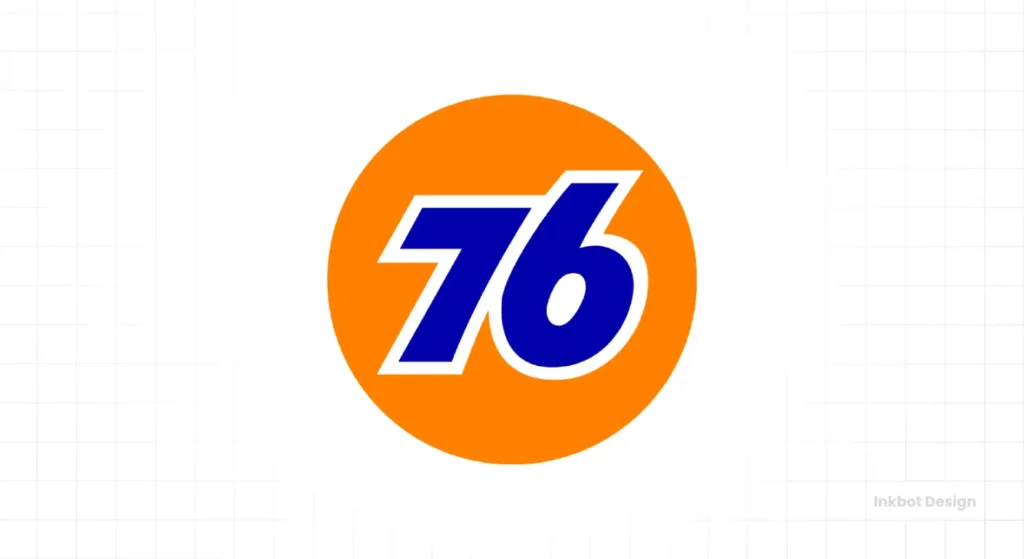
The bright orange ball with a blue “76” is impossible to miss. Choosing a number as your primary brand identifier is a bold move that paid off. The logo is pure, high-impact branding designed to be seen from a mile away. The famous “antenna ball” promotional campaign cemented it as a piece of American pop culture.
8. Citgo
The “Trimark,” designed by the legendary Saul Bass’s firm, is a fantastic abstract design. It’s vibrant, energetic, and stands out brilliantly from the more traditional shapes used by competitors. It’s a clean, modern mark that looks especially striking when illuminated on a sign at night.
9. Sunoco
The red arrow piercing the yellow diamond is dynamic and effective. The slight asymmetry of the design gives it a sense of motion and energy that so many “swoosh” logos fail to achieve. It’s a simple, powerful symbol communicating a brand tied to performance and forward momentum.
10. Arco
Arco’s abstract red symbol—sometimes called the “spark”—is a prime example of minimalist effectiveness. It’s a simple, geometric mark that conveys energy without being literal. Paired with a bold, clean sans-serif font, it creates a modern and efficient brand identity that works perfectly for a value-focused fuel brand.
The Character-Driven Brands: Mascots & Unique Symbols
In an industry that can feel cold and corporate, giving your brand a personality is a powerful differentiator. These logos use mascots or unique symbols to create an emotional connection and a memorable story.
11. Sinclair
Using a green Brontosaurus as your mascot is absolute marketing genius. “Dino” brilliantly connects the fossil fuel product to its ancient origins in a friendly, approachable way. It’s beloved by children and instantly recognisable to adults. Sinclair owns a unique brand asset that no competitor can ever replicate.
12. Eni
The Italian energy giant’s logo is a six-legged, fire-breathing dog. It’s weird, it’s terrific, and it’s completely unforgettable. The myth behind the logo is that the two extra legs represent a car’s four wheels and the driver’s two legs. Whether true or not, the mark is a lesson in being brave and distinctive with your symbolism.
13. Buc-ee’s
The happy beaver in the red cap is more than a logo; it’s a cultural phenomenon in Texas and the southern US. Buc-ee’s isn’t just a gas station; it’s a destination. The logo perfectly captures the brand’s slightly goofy, fun, and over-the-top personality. It promises an experience, and the brand consistently delivers on it.
14. Phillips 66
The shield is a classic symbol of heritage, quality, and protection. It feels authoritative and trustworthy. While many brands have used shields, Phillips 66 has owned this form in the fuel sector for decades. It has been modernised over the years, but its core message of reliability remains intact.
The Modern Minimalists: Clean, Corporate & Clear
These brands project efficiency, scale, and no-nonsense reliability. They rely on strong, often custom, typography and clean lines. There’s no story, just a clear, confident statement.
15. Exxon
The Exxon logo is all about its custom typeface. The interlocking “XX” is one of the world’s most recognised corporate wordmarks. Designed in 1972 by Raymond Loewy, it’s a masterclass in simplicity and visual power. It communicates immense scale and corporate strength.
16. Marathon
With its patriotic red, white, and blue colour scheme, the Marathon logo is solid and dependable. The stylised ‘M’ suggests a runner breaking the tape at a finish line, reinforcing the name. The typography is bold, straightforward, and perfectly suited for large-scale signage.
17. Valero
Valero’s logo is clean and modern. With the distinct notch taken out of the “V” and “A,” the custom typeface gives the brand a subtle but unique visual hook. The gold and teal palette feels fresh and stands out from the typical sea of primary reds and blues.
18. Conoco
The original red “capsule” or triangle logo exemplifies bold simplicity. While the brand has experimented with different looks, the classic red mark is most effective. It may be less evocative than a Pegasus or a dinosaur, but its sheer clarity and intense colour make it a highly effective roadside beacon.
19. Speedway
This logo is one of the rare instances where a “swoosh” element works. Why? Because it’s integrated directly into the brand name and concept. The stylised “S” shape evokes motion and speed, reinforcing the brand name in a way that a random, tacked-on swoosh never could.
The Destination Brands: More Than Just Gas
For these rapidly growing chains, fuel is just part of the offer. The main event is the high-quality food, clean restrooms, and superior convenience store experience. Their logos reflect this, feeling more like modern retail or food brands than traditional gas stations.
20. Wawa
The logo features a Canada Goose in flight. “Wawa” is an Ojibwe word for the goose, native to the area where the company’s first dairy farm was. This is a logo with a real story. It’s friendly, approachable, and evokes a sense of comfort and community, precisely what the beloved brand stands for.
21. Sheetz
The Sheetz wordmark is bold and red, and it has a personality that is as loud as that of its devoted fans. The custom, slightly rounded, and italicised font is energetic, fun, and modern. It screams speed and convenience, perfectly matching the brand’s focus on “Made-To-Order” food and fast service.
22. QuikTrip (QT)
The “QT” logo in its rounded red box is a design classic. It’s compact, friendly, and functions perfectly as a massive sign and a tiny app icon. It feels more like a logo for a retail or tech company than a gas station, which signals that the experience inside is a step above the competition.
23. Kwik Trip
The signature-style “K” adds a crucial touch of personality and a feeling of quality. The overall design feels less like a sterile national chain and more like a friendly, local market. This perfectly aligns with their business model, which often emphasises fresh, locally sourced food items.
24. Maverik
Tagline: “Adventure’s First Stop.” The logo lives up to it. The rugged, distressed font and the stylised mountain/flame icon ideally target a lifestyle audience of outdoor and adventure enthusiasts. This isn’t a brand that sells gasoline; it’s a brand that fuels adventures.
25. Circle K
The modern Circle K logo is a masterclass unifying a massive, global brand. The simple, clean “K” inside a circle is versatile and contemporary. It shed its predecessor’s old-fashioned, western-style look and created a globally consistent and instantly recognisable mark for its sprawling convenience store empire.
Key Takeaways for Your Own Business Logo
These 25 examples reveal a few clear principles for any business owner.
- Focus on the Job, Not the Art: Before you approve a design, shrink it to the size of a postage stamp. Hold it at arm’s length. Is it still clear? If not, it’s too complicated. Your logo’s first job is to be legible and recognisable at a glance.
- Own a Shape or a Colour: You can’t be everything to everyone. Shell owns the pecten. 76 owns the orange ball. Gulf owns the powder blue and orange. Pick a simple, bold element and stick with it until it becomes synonymous with your business.
- Simplicity is Strength: This list’s most timeless and compelling logos are the simplest. Complexity is the enemy of memorability. Every time you think about adding another element, another colour, another swoosh—stop. The strongest choice is usually to remove something.
- Tell a Story (If You Have One): A genuine story will always beat a generic concept. Sinclair’s dinosaur and Wawa’s goose create a powerful emotional connection because they are authentic to the brand. If your business has a story, find a simple, powerful way to tell it visually. Thinking about your own brand? Our logo design services focus on creating these kinds of ownable, strategic assets.
Need a Logo That Stands Out on the Road?
A cheap, generic logo is one of the most expensive mistakes a new business can make. It doesn’t just look bad; it fails to do its job. It costs you visibility, credibility, and customers every single day.
Your brand should be a landmark, not part of the background noise. Don’t settle for a logo that just blends in.
Look at how we approach logo design, or request a quote today from our team at Inkbot Design. Let’s create a brand that gets noticed.
Frequently Asked Questions about Gas Station Logos
What makes a gas station logo successful?
A successful gas station logo is defined by its performance in a real-world environment. Key factors include high visibility from a distance and at speed, simplicity for easy recall, timelessness to avoid frequent rebranding, and versatility to work across large signs, pumps, uniforms, and digital apps.
Why are red, blue, and yellow standard colours for gas station logos?
These primary colours are obvious against most backgrounds, such as a blue sky or a dark road at night. Red often suggests energy and urgency, blue conveys trust and reliability, and yellow grabs attention. The most effective brands, however, usually use unique shades or combinations to stand out.
What is the most famous gas station logo?
The Shell “Pecten” is widely considered the world’s most famous and recognisable gas station logo. Its simple, unique shape has been refined for over a century and is instantly identifiable without the brand name.
How has gas station branding changed over time?
Early branding relied on simple, bold symbols like shields (Phillips 66) and stars (Texaco) to convey trust and quality. Today, branding is more diverse. While legacy brands maintain their iconic marks, newer “destination” brands like Wawa and Buc-ee’s use logos that reflect a broader retail and food experience, not just fuel.
What is the story behind the Sinclair dinosaur logo?
The Sinclair Oil Corporation introduced “Dino,” a Brontosaurus, in the 1930s for a campaign to educate the public about the Mesozoic Era origins of petroleum. The mascot was so popular that it was adopted as the official logo, creating a friendly and memorable brand identity.
Why did BP change its logo to the Helios symbol?
In 2000, BP rebranded from its classic shield to the green and yellow “Helios” symbol. The move was intended to reposition the company as a forward-thinking, environmentally aware energy provider, moving beyond just oil and gas. The symbol is meant to represent energy in its many forms.
Should a new gas station use a modern or a classic logo style?
The choice depends on the brand’s positioning. A classic style with a simple shield or geometric shape can convey trust and reliability. A modern, minimalist style might be better for a brand focused on technology, EV charging, or a premium convenience experience. The key is to be distinct, not to follow a trend.
How important is a mascot for a gas station brand?
A mascot is not essential, but it can be a powerful differentiator. Mascots like Sinclair’s Dino or Buc-ee’s Beaver create a personality and an emotional connection that is difficult to achieve with an abstract logo. It works best if the mascot is unique and relevant to the brand’s story.
What is the meaning of the Eni six-legged dog logo?
The six-legged, fire-breathing dog is a famous and mysterious logo. The most common interpretation is that the six legs represent a car’s four wheels plus the driver’s two legs, symbolising the symbiotic relationship between the vehicle, the person, and the energy Eni provides.
Can a simple wordmark be an effective gas station logo?
A wordmark can be highly effective with strong, unique typography paired with a distinct colour palette. Exxon is a prime example of a powerful wordmark, and Gulf shows how colours can make a simple name iconic. The key is clarity and ownability.

