
The 25 Best Film Company Logos and Why They Work
Forget the Oscars. The first award any film company wins is for grabbing your attention in a dark theatre. That’s the logo’s job. It’s the opening act, the first handshake, the promise of what’s to come, all in a few seconds.
This isn’t just another list of pretty pictures. It’s a strategic teardown of 25 film company logos as hard-working business assets. We will look at why they work, and more importantly, what you, as a business owner, can learn from them.
We’re judging “best” on four practical metrics:
- Memorability: Is it distinct and straightforward enough to remember?
- Timelessness: Does it avoid passing trends that look dated in five years?
- Adaptability: Does it work in black and white, as a tiny favicon, or animated in 4K?
- Promise: Does it effectively set an expectation for the product?
The core idea here is Strategic Simplicity. The most memorable, enduring logos aren’t the most clever or complex. They are the most clear.
- Memorability: Logos must be distinct and simple enough to be easily remembered by audiences.
- Simplicity: Effective logos prioritise clarity over cleverness, using straightforward shapes and ideas.
- Evolution: Logos should evolve with the business while maintaining core identity, ensuring relevance over time.
- Consistency: Consistent use of logos builds recognition and emotional connection with audiences over time.
The Classics: Logos Built on Legacy and Trust
These are the giants. Their logos communicate stability, history, and a particular kind of expected quality. They don’t need to be trendy; their entire brand is built on being the institution.
1. Paramount Pictures: The Mountain of Majesty
The Paramount mountain is one of film’s oldest and most recognisable logos. It’s a symbol of permanence and grandeur. The story goes that the original 24 stars represented the 24 actors signed to the studio in 1916. Now it’s 22. It’s a nice story, but it’s irrelevant. You don’t need to know it for the logo to work.
The Lesson: A rugged, simple symbol of endurance builds immense trust. Consistency over a century creates an asset that money can’t buy.
2. Metro-Goldwyn-Mayer (MGM): The Roaring Experience
Is Leo the Lion even a logo? Absolutely. It’s more than a logo; it’s a multi-sensory event. The roar is as much a part of the brand as the visual of the lion itself. No other studio has so successfully merged sound and image into its core identity.
The Lesson: Your brand identity doesn’t have to be silent. Consider how sound, motion, or other sensory inputs can make your brand unforgettable.
3. Warner Bros.: The Shield of Pop Culture
The “WB” shield is a masterclass in adaptability. It has been stretched, squashed, chromed, turned to stone for Harry Potter, and digitised for The Matrix. Yet the core shape, the shield, remains instantly recognisable. This debunks the myth that a logo must never change.
The Lesson: A strong foundational shape allows creative flexibility without losing brand recognition. It can bend without breaking.
4. Universal Pictures: The Global Promise
The spinning globe tells you everything you need to know about the studio’s ambition: global entertainment. It’s a literal and powerful statement. The logo has evolved dramatically since the 1920s, but the core concept of the globe has remained, communicating scale and reach.
The Lesson: Don’t be afraid to state your ambition literally. A global symbol is a good place to start if you want to be an international brand.
5. 20th Century Studios: The Monumental Fanfare
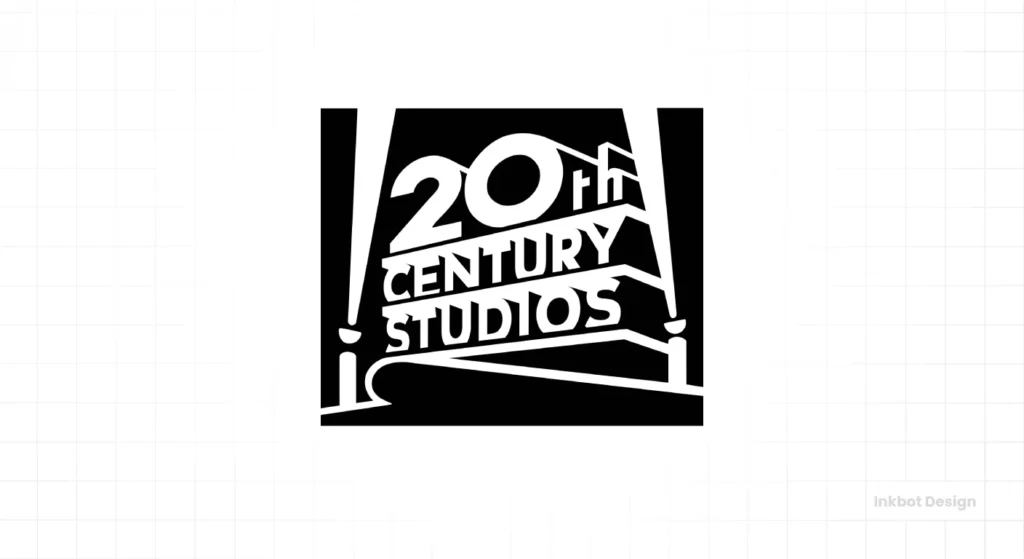
You cannot see this logo without hearing the Alfred Newman fanfare. The towering, monolithic structure is the definition of “event cinema.” It doesn’t just promise a movie; it promises a spectacle.
The Lesson: Your logo and its associated branding can build a sense of occasion. It can make your product feel like an event.
6. Columbia Pictures: The Torch of Aspiration
The “Torch Lady” is a classic symbol of enlightenment, aspiration, and guidance. Using a human-like figure creates a subconscious emotional connection. She feels more like a patron goddess of cinema than a corporate mark.
The Lesson: Human and classical elements can give a brand a sense of timelessness and emotional resonance.
The Modern Mavericks: Logos That Sell a Vibe
These studios, many of them newer, compete by curating a specific taste. Their logo is a seal of approval that tells a niche audience, “This is for you.”
7. A24: The Indie Seal of Approval
Three simple characters. No symbol. Often presented with odd textures or minimalist motion. The A24 logo is the epitome of anti-branding. Its strength is in its utter simplicity. It’s a quiet, confident stamp that says the film is the hero.
The Lesson: When your product or service is the star, your logo can be an understated mark of quality. Let your work do the shouting.
8. Blumhouse Productions: The Mark of Fear
The creepy, floating house and distorted typography tell you one thing: you’re about to watch a horror movie. This logo is a genre-specific masterpiece. It filters its audience instantly, attracting horror fans and repelling those who aren’t.
The Lesson: Niche down. A logo that speaks directly to a specific audience will always be more effective than one that tries to please everyone.
9. Legendary Entertainment: The Shield of the Blockbuster
The intricate, shield-like design based on a Celtic knot communicates strength, mythology, and complexity. It’s a modern take on an ancient symbol, ideally suited for the epic monster movies and fantasy blockbusters the studio produces.
The Lesson: You can borrow from ancient symbolism and mythology to give your modern brand a feeling of weight and history.
10. Bad Robot: The Personal and Playful
The red, blocky robot running through a field, followed by a child’s voice saying the company name is unforgettable. It has personality. It tells a tiny story. It feels like it was made by people who love what they do.
The Lesson: Injecting your brand’s personality is not a risk; it’s a strategic advantage. It makes you memorable and relatable.
11. Annapurna Pictures: The Abstract and Artistic
The logo is an amorphous, ink-blot-like shape that changes and resolves itself. It’s ambiguous, artistic, and intriguing. It doesn’t tell you what to expect, but it signals that you should expect something different, something artful.
The Lesson: An abstract mark can be highly effective if you target a discerning audience that appreciates subtlety and art.
The Dreamers: Logos That Evoke Emotion and Character
These logos connect directly to the heart. They leverage storytelling, whimsy, and beloved characters to build brands that feel less like corporations and more like friends.
12. DreamWorks SKG: The Boy on the Moon
The story of a boy fishing from a crescent moon is pure magic. It’s a miniature fairytale told before the movie even begins. It instantly taps into a sense of childhood wonder and limitless possibility.
The Lesson: A great logo can tell a story. Even a simple image can evoke a powerful narrative and emotion.
13. Pixar Animation Studios: The Character as the Brand
Pixar’s logo is a perfect example of a brand letting its product lead. Luxo Jr., the little lamp from their first short film, hops on screen and stomps on the ‘I’ in PIXAR. It’s playful, innovative, and directly linked to their groundbreaking work.
The Lesson: If your work produces a beloved character or element, embrace it. Let your most tremendous success become your brand ambassador.
14. Studio Ghibli: The Spirit of Imagination
Using the silhouette of Totoro, one of their most beloved characters, instantly connects the studio to the feelings of warmth, wonder, and handcrafted artistry that define their films. It’s a simple, charming, and emotionally potent symbol.
The Lesson: Connect your brand to the emotional core of your most popular product. It creates an instant shortcut to positive feelings.
15. Amblin Entertainment: The Touch of Nostalgia
The silhouette of E.T. and Elliott flying past the moon is not just a logo; it’s a direct portal to 80s nostalgia. It is a personal signature for Steven Spielberg’s heartfelt, wondrous filmmaking brand.
The Lesson: A personal touch or a direct reference to your origin story can forge a compelling and authentic bond with your audience.
16. Lucasfilm: The Power of Simplicity
This is a boring logo. And that’s why it’s brilliant. It’s a clean, perfectly spaced wordmark. It has the authority of a law firm. This logo is proof that you don’t need a clever symbol. When your name is George Lucas and you created Star Wars, your name is the brand.
The Lesson: A strong, confident wordmark is sometimes the most powerful option. Don’t add a symbol just because you think a logo needs one.
Creating a brand identity that tells a story requires more than a good idea; it demands expert execution. The principles seen in these iconic logos are what professional logo design aims to achieve.
The Curators and Craftsmen: Logos of Quality and Niche
For these companies, the logo is a guarantee. It’s a mark telling a specific audience that the product has been curated for their tastes and meets a high standard of quality.
17. The Criterion Collection: The Mark of Prestige
The bold, clean, sans-serif ‘C’ is academic, authoritative, and elegant. For cinephiles, this logo is an instant signal of a culturally significant film, restored with care. It feels more like a museum’s mark than a movie studio’s.
The Lesson: Simplicity equals sophistication. A clean, geometric mark can convey premium quality and expertise more effectively than a complex illustration.
18. Focus Features: The Elegant Blur
The name and the logo work in perfect harmony. The ‘o’ in Focus is blurred, a simple visual trick that suggests perspective, artistry, and focus. It’s clever without being loud or obnoxious.
The Lesson: A subtle visual pun that relates directly to your business name can be incredibly effective and memorable.
19. Searchlight Pictures: The Beacon for Indies
This logo uses a monumental structure like its big brother, 20th Century Studios. But instead of just being a static monolith, it’s a pair of searchlights actively looking. It powerfully communicates the company’s mission: to find and illuminate the best in independent film.
The Lesson: A logo based on your company’s mission can be a powerful daily reminder of your internal and external purpose.
20. Working Title Films: The Understated Mark of Quality

Simple. Clean. Almost corporate. This wordmark doesn’t scream for attention. It calmly assures quality. It has been the mark of well-crafted, intelligent, and successful British films for decades.
The Lesson: Your logo doesn’t have to be exciting if your product is consistently excellent. Sometimes, the most confident brand is the quietest.
The Enduring and Evolving: Logos with Staying Power
This final group represents brands that have successfully navigated decades of change, proving that a strong core concept can endure, evolve, and remain relevant.
21. Lionsgate: The Constellation of Power
The lion’s face within a grand archway, often depicted with celestial or industrial elements, feels powerful and modern. It started as a simple lion head and has evolved into a symbol of a modern blockbuster powerhouse.
The Lesson: A strong central concept—like a lion—can be updated and re-skinned over the years to keep it feeling contemporary without losing its core identity.
22. New Line Cinema: The Celluloid Story
The iconic filmstrip box is a direct nod to the medium of film itself. While the company has grown from a tiny indie distributor to the studio behind The Lord of the Rings, its logo has evolved but kept the celluloid element, honouring its roots.
The Lesson: Your logo can, and should, evolve as your company grows. A refresh can signal a new era while still paying respect to your history.
23. Castle Rock Entertainment: The Lighthouse of Atmosphere
A direct reference to the Stephen King-inspired fictional town. The simple, moody drawing of a lighthouse instantly sets a tone of mystery and suspense. It’s a perfect example of a logo creating an atmosphere.
The Lesson: Match your logo’s mood to your product’s mood. The feeling your logo evokes is its most immediate message.
24. Orion Pictures: The Retro-Futurist Starscape
The star-filled ‘O’ and constellation forming the ‘ORION’ name is a masterclass in 80s design. It promised sci-fi, action, and thrillers, and it delivered. It’s so perfectly of its era that it has become timelessly cool.
The Lesson: A logo that perfectly captures the spirit of a specific time can become an iconic piece of retro design, giving it a second life decades later.
25. Gaumont Film Company: The Daisy of Longevity
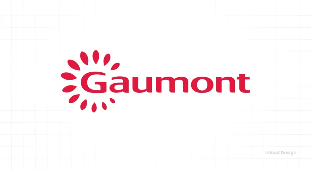
Founded in 1895, Gaumont is the oldest film studio in the world. Its simple, optimistic daisy logo is based on a tribute to the founder’s mother, Marguerite (French for daisy). It’s simple, personal, and has endured for over a century.
The Lesson: The ultimate test of any logo is time. The simplest, most emotionally resonant ideas are the ones that last.
Key Takeaways for Your Business Logo
You don’t have a Hollywood budget, but can use the same strategic thinking.
- Simplicity is Strength: The most common thread here is simplicity. The best logos are built on simple shapes and clear ideas (Lucasfilm, A24, Criterion). They are easy to recognise and remember.
- Set an Expectation: Your logo makes a promise. It should tell your customer what to expect, whether that’s horror (Blumhouse), spectacle (Universal), or indie artistry (Annapurna).
- Don’t Fear Evolution: A logo is not a tattoo. It can grow and change with your business. A thoughtful update can signal progress and keep your brand relevant (Warner Bros., New Line).
- Own a Shape: A simple, ownable geometric form is invaluable. Paramount has the mountain, Warner Bros. has the shield. What simple shape can your business own?
- Consistency is King: These logos are iconic because we have seen them thousands of times, attached to products to which we react emotionally. Whatever mark you choose, use it consistently everywhere.
A logo isn’t the whole story, but it is the cover of the book. It’s your first promise to your audience, setting the stage for everything that follows.
The goal isn’t to copy these giants, but to understand the strategic thinking behind their iconic marks. It’s about choosing clarity over cleverness, and consistency over complexity.
Your business deserves a logo built on strategy, not just fleeting style. If you’re ready to create a mark that sets the right expectation and is built to last, then it’s time to stop guessing. Look at a professional logo design process and see what goes into creating a truly effective brand identity.
Frequently Asked Questions (FAQs)
What is the most essential element of a film company logo?
Memorability. A film logo is seen for only a few seconds. It has failed its primary job if it’s not distinct and straightforward enough to be instantly recognisable.
Why do many old studio logos use shields or circular shapes?
These shapes, like crests or seals, have historical connotations of quality, authority, and legacy. They made new film companies feel established and trustworthy, like a royal seal of approval.
Should my business logo have a hidden meaning?
No. Focus on clarity first. A “hidden meaning” is a fun bonus, but it’s a detriment if it makes the logo more complex or more challenging to understand. A simple, clear message always beats a clever, hidden one.
How often should a company update its logo?
Only when there is a strategic reason to do so. This could be a significant shift in business direction, a merger, or if the logo looks genuinely dated and out of touch with your industry. A refresh every 7-10 years is common, but it’s not a requirement.
What is the difference between a logo and an “ident”?
The logo is the static visual mark. An “ident” (short for identifier) is the animated version of the logo, often with sound, that you see at the beginning of a film or TV show. The MGM lion roaring is a famous ident.
Does my small business need an animated logo?
It’s increasingly valuable in the digital age. An animated logo can make your brand more dynamic on your website, social media videos, and email signatures. It’s no longer just for massive film studios.
Why is the A24 logo so popular with designers?
Because it breaks all the old rules. It’s incredibly minimalist and places all the emphasis on the brand’s reputation and the films it produces, rather than on a flashy symbol. It represents a modern, confident approach to branding.
Is a wordmark (text-only logo) better than a symbol?
It depends on the name. A wordmark is an excellent choice if your business has a short, unique name (like Lucasfilm or Google). If your name is long or generic, a strong symbol can help with recognition.
How can I make my logo feel “timeless”?
Avoid trendy fonts, colours, and effects (like glows, gradients, or 3D effects from a specific era). Stick to simple, strong geometric shapes and clean, classic typography. The simplest logos are often the ones that last the longest.
What’s the most prominent mistake entrepreneurs make with logos?
Trying to tell their entire company story in one small image. A logo is not an infographic. Its job is to be a simple, recognisable symbol for your business. The rest of your branding can tell the story.
Why is sound so important for some film logos?
Sound creates a powerful emotional and memory trigger. The MGM roar or the 20th Century Studios fanfare are instantly recognisable even with your eyes closed, doubling the branding impact.
Can a logo be considered “good” if people initially dislike it?
Yes. Some of the most iconic logos were initially met with public criticism. A logo’s effectiveness is not about immediate popular opinion but its long-term performance as a strategic asset for recognition and consistency.
