Why the Disney Logo Design Is a Business Asset, Not Art
The Disney Logo Design is more than a nostalgic emblem — it’s a strategic business asset that has powered one of the world’s most valuable entertainment brands for a century.
Each redesign, from the 1923 “Laugh-O-Gram” signature to the 2006 3D castle animation, reflects deliberate business decisions tied to market positioning, media innovation, and global expansion.
The logo’s evolution mirrors Disney’s growth from a small animation studio into a multi-billion-dollar conglomerate, proving that effective logo design isn’t art for art’s sake — it’s a performance-driven investment in brand equity.
For entrepreneurs and designers, Disney’s approach demonstrates how disciplined brand management transforms a simple mark into an enduring competitive advantage.
- Logos are strategic business assets, evolving to drive recognition, trust and measurable brand equity rather than being mere art.
- Start authentic, then standardise and simplify your mark so it can scale, work across media and outlive the founder.
- Design logos to promise an experience and adapt them to current mediums—simplicity and responsiveness win long term.
Phase 1: The Founder’s Mark (1930s – 1940s)
When Walt Disney started, there was no “Disney” brand. There was just a man: Walt Disney.

In the early days, the “logo” was just his signature. And if you look at the posters and film cards from that era, it was wildly inconsistent.
Sometimes it was a loopy, cartoonish scrawl. Other times, it was a more formal cursive. It wasn’t a “logo” in the modern sense; it was a literal sign-off—an artist’s signature.
The Business Lesson for You: Authenticity trumps perfection at the start.
When you’re a solo founder or a small team, you are the brand. Trying to create a “timeless” corporate logo when you’re still figuring out your business model is a waste of time and money.
Your initial branding should be authentic. Using a founder’s name or a clean, simple wordmark is direct and honest. Disney started with its core asset: Walt Disney. He was the company, and his name was the mark of quality.
Don’t be afraid to put your own name on the line. It’s the most authentic asset you have.
Phase 2: Standardisation (1950s – 1970s)

This is the most critical step most small businesses miss.
As the company grew from a small studio into a media empire with films, television, and theme parks (Disneyland opened in 1955), that inconsistent signature became a liability.
You can’t build a global brand when your most important visual asset looks different every time people see it.
So, they standardised. They took the essence of Walt’s signature—its whimsy, the unique ‘D,’ the flowing script—and locked it into a single, repeatable asset. This is the “classic” Disney wordmark that generations grew up with.
It wasn’t Walt’s actual signature (a long-running myth), but a carefully crafted piece of commercial art designed to appear authentic. It was designed for recognition.
The Business Lesson for You: Consistency builds trust.
This is the point where your “authentic” starter logo needs to grow up. You must standardise. This means having one official logo file. One set of brand colours. One or two brand fonts.
Why? Because recognition is built through repetition.
Customers learn to trust a brand they can instantly recognise. If your logo is blue on your website, red on your business card, and a different font on your social media, you’re not building a brand. You’re just creating confusion.
This is also where the real work of typography for logos comes into play. The Disney wordmark is a masterclass in custom typography. It’s unique, ownable, and perfectly communicates the brand’s personality (playful, creative, high-quality) without needing a single extra symbol.
Your business needs this same level of thought. Whether it’s a custom script or a carefully chosen font, your typography is your brand’s voice.
Phase 3: The Brand Outgrows the Founder (1980s)
This is a lesson that makes many founders uncomfortable. Walt Disney died in 1966, but his name lived on.
For decades, the brand was “Walt Disney.”
But in the 1980s, the company made a massive strategic pivot. Under new leadership (Michael Eisner), they expanded aggressively into more “adult” media (Touchstone Pictures) and cable television (The Disney Channel).
The “Walt Disney” name, with its strong association with children’s animation, was actually holding them back in these new markets.
The solution? They split the brand.
- “Walt Disney Pictures” was kept for the core family-friendly animated and live-action films.
- “Disney” (the wordmark without the “Walt”) became the name for the broader, modern media corporation.
This was a genius move. It allowed the corporation (“Disney”) to grow and diversify, while protecting the legacy (“Walt Disney”) of its core product.
The Business Lesson for You: Your brand must be able to outlive you.
I often see this with entrepreneurs. They name the business “John Smith Plumbing” or “Sarah’s Brilliant Consulting.” It’s great for Phase 1.
But what happens when you want to sell the company? Or bring on partners? Or expand into areas beyond what “John” or “Sarah” personally does?
The “Walt” had to be dropped so the “Disney” corporation could become a multi-billion-dollar global entity. Ask yourself: Is your business name built for where you are now, or where you want to be in 20 years?
Phase 4: Selling an Experience, Not a Product (1985)
This is my favourite part.
For 50 years, the Disney logo was just a word. However, in 1985, with the release of The Black Cauldron, they introduced a new element that would change everything: the Cinderella Castle.
This wasn’t just a random graphic. The castle was the central icon of the Magic Kingdom. It was the physical, real-world place where the “magic” happened.
By adding the castle to the start of every “Walt Disney Pictures” film, they performed a brilliant strategic trick. They stopped just signing their name to a movie and started making a promise.
The logo now said: “The feeling you get when you’re standing in our theme park? That’s the same feeling you’re about to get from this film.”
It connected their most profitable division (theme parks) with their core product (films) and wrapped the entire thing in emotion. They were no longer just selling movies; they were selling access to the Magic Kingdom.
The Business Lesson for You: What promise does your logo make?
Your logo isn’t just your name. It’s a symbol of the experience a customer will have with you.
- The Nike “Swoosh” promises victory and movement.
- The Apple logo promises innovation and elegant simplicity.
- The Amazon “A-to-Z” smile promises that they have everything, and you’ll be happy.
The Disney castle promises magic and escapism.
What does your logo promise? Reliability? Speed? Luxury? Creativity? If your logo is just your name in a generic font, it’s not making a promise. It’s just a label.
This is the kind of strategic thinking that goes into a professional logo design. It’s not about picking a pretty picture; it’s about encoding your entire business promise into a single, instantly recognisable mark.
Phase 5: Adapting to the Medium (2006)
For 20 years, the 2D, storybook castle logo was the standard. But in 2006, the world had changed.
Pixar, which Disney would soon acquire, had revolutionised animation. 3D was the new standard. The old 2D logo, which resembled a storybook illustration, suddenly appeared dated. It didn’t reflect the high-tech, computer-generated blockbusters that preceded it.
So, in 2006 (with Pirates of the Caribbean: Dead Man’s Chest), the logo was reborn.
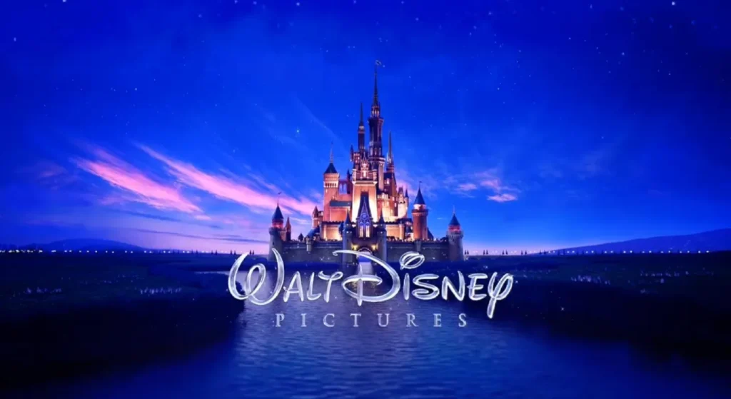
It became a stunning, photorealistic, 3D-rendered event. It wasn’t a static image anymore; it was a mini-film. Fireworks explode. The camera flies through the kingdom—a flag waves on the highest turret.
Why? Because the medium had changed.
The logo was no longer designed for a piece of paper. It was designed for a 40-foot cinema screen with 7.1 surround sound. It had to stand up to—and set the stage for—the technical marvels of Pixar and modern CGI.
It was also a massive business signal. This new logo announced to Hollywood and Wall Street: “We are not a dusty animation studio from the 1940s. We are the undisputed, high-tech leader in 21st-century entertainment.”
The Business Lesson for You: Your logo must work where your customers are.
In the 1980s, a logo had to look good on a business card and the side of a van.
Today? Your logo has to work…
- As a perfect square for an Instagram profile.
- As a tiny 16×16 pixel “favicon” in a browser tab.
- As an animated “bumper” at the start of your YouTube videos.
- On a dark-mode mobile app screen.
Businesses still come to me with overly complex, “detailed” logos that are completely illegible when shrunk down to a social media icon. They’ve designed a logo for a letterhead, forgetting that 90% of their customers will see it on a 5-inch phone screen.
Your logo must be “responsive.” It must be simple and robust enough to work at every size and in every medium. The 2006 Disney logo was the ultimate adaptation to its primary medium: the cinema.
Phase 6: The Inevitable Simplification (2011 – Present)
After the 2006 logo, something interesting happened. The pendulum swung back.
The 3D logo was spectacular… in a cinema. But as a static logo on a website, a toy package, or a business card? It was a mess. It was too detailed, too complex, and had no “Walt” in it.
So, in 2011, they simplified.
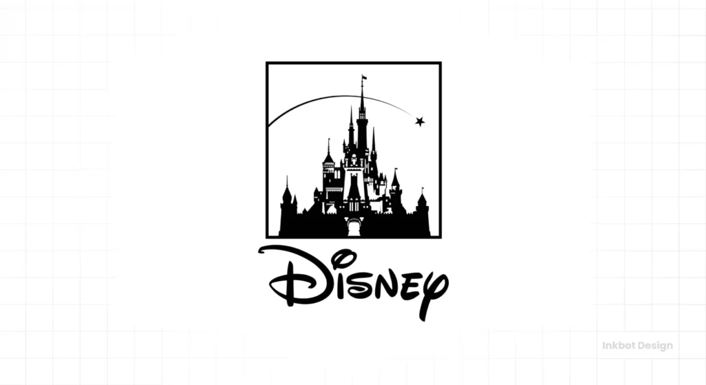
They kept the idea of the castle but rendered it as a clean, flat, one-colour silhouette. They dropped the “Walt Disney Pictures” and just put the iconic “Disney” wordmark under the castle.
This is the logo you see most often today. It’s the ultimate “logo lockup.”
- It has the iconic “Disney” wordmark (Brand Recognition).
- It has the castle silhouette (The Emotional Promise).
And most importantly, it’s simple.
It works everywhere. It’s clean on an app icon. It’s legible on a billboard. It’s easy to embroider on a shirt. It’s the perfect synthesis of 100 years of brand evolution, simplified for the digital age.
We’ve even seen variations, like the “Disney 100” logo for the 100th-anniversary celebration, which swaps the castle for a clean “100.” The brand is so strong that the “Disney” wordmark can now carry any symbol and still be instantly recognised.
The Business Lesson for You: Simplicity scales. Complexity fails.
This is the endgame for all great brands. You earn simplicity.
McDonald’s is no longer “McDonald’s Hamburgers.” It’s a golden “M.”
Nike is a “Swoosh.”
Apple is a piece of fruit.
And Disney is a wordmark and a castle.
The stronger your brand becomes, the less your logo has to say. Your goal as a business owner isn’t to cram your entire mission statement into your logo. Your goal is to build a brand so strong that a simple, clean mark is all you need to communicate everything.
The Disney Logo Evolution: A Strategic Blueprint
Here’s a breakdown of the entire journey, not as a history lesson, but as a business plan. This is the “human effort” table your business needs to understand.
| Era | Logo Element | Business Context | The Takeaway for Your Business |
| 1930s-1940s | Inconsistent Walt Disney Signature | The studio is new. The “brand” is the founder. | Authenticity > Perfection. Use your personal name and reputation. |
| 1950s-1970s | Standardised “Walt Disney” Wordmark | Rapid growth. Theme parks, TV. Need for a consistent, recognisable asset. | Consistency = Trust. Lock down your logo, colours, and fonts. |
| 1980s | “Disney” (Wordmark Only) | Diversification into adult media (Touchstone) and cable (Disney Channel). | The Brand Must Outgrow the Founder. Is your name holding you back from new markets? |
| 1985 | 2D Cinderella Castle + Wordmark | Connecting films to the emotional high point: the theme parks. | Sell an Experience, Not a Product. Your logo must make an emotional promise. |
| 2006 | 3D Photorealistic Castle (Animated) | The rise of 3D/CGI (Pixar). The cinema is the primary, high-tech medium. | Adapt to Your Medium. Your logo must work where your customers are (mobile, web, video). |
| 2011-Present | Simplified Castle Silhouette + “Disney” | Digital-first world. Need for a logo that works as a tiny app icon and a 100-foot billboard. | Simplicity Scales. A strong brand earns simplicity. Is your logo too complex? |
What Your Business Must Learn from This
I’ve watched hundreds of entrepreneurs spin their wheels for months, agonising over their “perfect” logo. It’s a waste of their most precious resource: time.
Your logo is not a tattoo. It’s a haircut. It’s meant to be changed.
Here are the non-negotiable lessons from Disney’s 100-year evolution:
- Start Authentic, Then Standardise. Your first logo won’t be your last. Get something authentic out the door, and then create a professional, standard version once you have traction and know who you are.
- A Logo’s Job is Recognition. The primary job of your logo is to be remembered. The Disney script is one of the most recognisable pieces of typography on earth. Is your logo memorable, or is it a generic “swoosh” or “globe” from a stock logo site?
- Your Brand Is a Promise. The Disney castle means something. It’s a shortcut for “magic, family, quality, and escapism.” Your logo must also be a shortcut. It needs to tell your customers what to expect.
- Evolve or Die. The only constant in business is change. Your customers change. Your products change. The market changes. Your logo must evolve to reflect those changes. Disney’s logo evolved from a man’s name to a 2D castle to a 3D spectacle to a flat design icon. It adapted at every single step to stay relevant.
Refusing to update your logo isn’t “staying true to your roots.” It’s being lazy. It’s telling the world you’re stuck in the past.
The Disney logo is successful not because it’s “magical,” but because it’s been a ruthless, evolving, and highly strategic business asset for a century.
This is the kind of strategic thinking we at Inkbot Design bring to every branding project. We don’t just “make you a logo.” We help you create a robust visual asset that’s designed to evolve with your business.
If you’re tired of guessing and want to build a brand identity with a real strategy, it’s time we talked.
FAQs on the Disney Logo and Brand Strategy
Is the Disney logo Walt Disney’s real signature?
No. It’s a common myth. His real signature was different and, like most people’s, inconsistent. The “Disney” wordmark is a stylised, commercial font (a logotype) designed by the studio’s artists (like animator Sam Armstrong) in the late 1930s to be recognisable, repeatable, and full of character.
What is the font used for the Disney logo?
It’s not a font that can be purchased. It’s a custom-drawn logotype. The original was based on a “crouching” signature style, and it has been refined for decades. There are many fan-made “Disney” fonts, but none are the official asset.
When did the castle get added to the Disney logo?
The castle (specifically, Cinderella Castle) was first used as a logo for “Walt Disney Pictures” in 1985. It has since become a central part of the brand’s identity, connecting the films to the “Magic Kingdom” experience.
Why did Disney drop “Walt” from the logo?
This was a strategic business decision in the 1980s. As the company expanded into more diverse areas (like cable TV and more adult-oriented films), “Disney” was used as the broader corporate brand. At the same time, “Walt Disney” was preserved for the classic, family-friendly animation division.
What is the main lesson for a small business from the Disney logo?
Evolution is survival. Your logo is not a “one-and-done.” It must adapt as your business grows, as your market changes, and as new technologies (like the internet and mobile) become your primary customer touchpoint.
How often should I change my logo?
You shouldn’t change it for the sake of it, but you should “refresh” or “evolve” it when:
Your business model fundamentally changes.
You’re targeting a new audience.
Your logo looks visually dated (e.g., 90s-era “swooshes” or 2000s-era “reflections”).
It doesn’t work well on modern, digital platforms.
Why is the new Disney logo simpler than the 2006 version?
The 2006 3D logo was designed for cinema. The modern, simpler, flat logo (from 2011) is designed for a digital-first world. It’s clean, scalable, and instantly recognisable as a tiny app icon or a website favicon, which is far more critical for a brand in 2026.
What is a “logo lockup”?
It’s a specific, pre-determined arrangement of your logo’s elements. The “Disney” wordmark (logotype) combined with the castle icon (logomark) is a “lockup.” A good brand guide defines these lockups (horizontal, vertical, etc.) to ensure consistency across all platforms.
Is a founder’s signature a good logo for a new business?
It can be. It worked for Walt Disney, Ford, and Kellogg’s. It’s a powerful way to communicate authenticity and personal accountability (Phase 1). But, as Disney’s history shows, you must be willing to standardise it and, eventually, let the brand grow beyond just your name.
How important is an animated logo today?
For any brand that uses video (which is every brand), it’s critical. The Disney 2006 logo was a pioneer. Your “logo reveal” at the start of a YouTube or TikTok video sets the tone. A simple, clean animation is far more professional than a static image fading in.
Final Takeaway
The Disney logo is the world’s most valuable case study in branding. It proves that a brand identity is not a static object but a living, breathing asset that must adapt to survive.
It started as one man’s signature and evolved into a global symbol for an entire universe of experiences.
If you’re still treating your logo like a digital file you bought for £50 and never want to think about again, you’re missing the point. Your logo is your most widely used business tool.
It’s time to ask if that tool is still sharp enough for the job.
If you’re ready to build a brand identity that’s designed for where your business is going, not just where it’s been, then let’s have a proper conversation. You can request a quote here, and we can start building your own 100-year legacy.
