Professional Services Website Design: A 12-Step Process Built Around Buyer Risk
A managing partner rarely rejects a firm because the website looked dated.
They move on because, 90 seconds in, they still cannot tell whether these people have handled a situation like theirs before.
That is the failure that costs enquiries, and it is rarely a design failure.
Selling a professional service is a high-stakes, slow-burning decision. The buyer cannot inspect the product before they commit – there is no test drive for a tax restructuring or a three-year brand programme. So they do the only thing available to them: they hunt your website for evidence that reduces the risk of choosing the wrong option.
When that evidence is missing, buried, or written for the wrong reader, the cautious ones leave. LinkedIn and Edelman found that more than 40% of B2B deals stall due to misalignment in the buying group. And your website is the one asset every member of that group visits privately, on their own time, forming a verdict you never get to influence in person.
That reframes the whole exercise.
A professional services website is not primarily a design project or a lead-generation machine. It is a buyer-risk-reduction system.
Get the process right, and it does one job well: it helps a wary prospect conclude, quickly, “these people understand my situation, can clearly handle the work, and feel safe to contact.” Everything below serves that.
If you’re scoping a rebrand and want a partner who works this way, this is how a specialist web design agency should run the project — not as a picture-making exercise, but as a sequence for removing doubt.
- A professional services website's primary job is reducing buyer risk by surfacing organised, relevant evidence so cautious prospects quickly see you understand their situation.
- Sequence matters: diagnose audiences and positioning before information architecture or visuals, so the site is organised around buyers' needs, not your internal structure.
- Instrument and iterate: set KPIs, track qualified enquiry quality and site performance, then learn and optimise post-launch to improve conversion over time.
How Professional Services Website Design Works
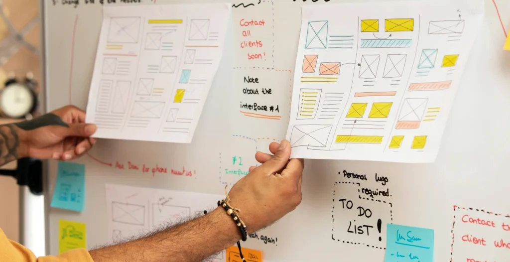
Professional services website design is the process of turning a firm’s hard-to-see expertise into credible, navigable evidence that a cautious buyer can act on, then structuring the site so every audience in the buying group finds what they need to say yes. It runs in twelve steps across four phases: diagnose, define, design and build, and launch and learn.
- Diagnosis comes before design. You cannot organise evidence you have not identified, for buyers you have not mapped.
- Positioning and message architecture are settled before a single wireframe is created. Real messaging shapes layout; placeholder text hides the hard decisions.
- Proof is planned as an inventory rather than gathered as an afterthought. Every priority page is briefed on what it must show and substantiate.
Professional services website design turns a firm’s expertise into navigable evidence that reduces a buyer’s perceived risk before they make contact.
Why Professional Services Websites Fail Before the Design Is Even Seen
Most sites fail at the point where a prospect has to do unpaid work to understand you.
They arrive with a specific worry (an acquisition, a compliance exposure, a growth plan that has outrun the current brand), and they need to know within seconds whether you have met that worry before.
If your homepage leads with “we deliver excellence across a range of sectors”, you have just handed them the work of guessing. Cautious buyers do not guess. They close the tab.
Here is the mechanism, step by step. A high-value professional service is bought under uncertainty, because the outcome is unknowable in advance and the cost of a bad choice is high.
Under uncertainty, buyers substitute evidence of relevance for proof of outcome — they look for signals that you have handled their exact situation, in their sector, at their scale.
A website that surfaces those signals fast lowers perceived risk; lower perceived risk is what actually earns the enquiry. A website that hides them behind generic positioning raises risk, and raised risk is REAL — nobody emails to tell you they left.
This is why the sequence of the design process matters more than the visuals. The evidence a buyer needs has to be identified and organised before anyone chooses a colour palette.
Research reportedly found that 74% of marketers who improved their content performance credited refining their strategy, against 51% who credited new technology — a useful reminder that diagnosis, not tooling, moves the needle.
The firms that struggle with differentiation are rarely short of design budget. They are short of a decision about who they are for and what they will be known for.
“A professional services website earns enquiries in the ninety seconds a cautious buyer spends deciding whether you understand their situation. Design does not win that moment. Organised, relevant, visible evidence does. Every step of a serious process exists to put that evidence within reach before the prospect has to ask for it.”
The 12-Step Professional Services Website Design Process
The value is in the order. Below, the twelve steps are grouped into the four phases they belong to, with what each produces and how each can go wrong.

Phase 1 — Diagnose (Steps 1–3): decide what problem the website is solving
Step 1 — Project alignment. Establish the real reason for the project, who genuinely decides, what success means in commercial terms, and how decisions get made.
Output: brief, governance, timeline, success measures. The failure mode here is the one Hinge Marketing aptly named — the senior “torpedo” who ignores the process and then demands changes at launch. Name the decision-makers and their veto rights on day one, in writing, or you rebuild in month five.
Step 2 — Website and market audit. Understand current performance, content quality, technical constraints, and the conventions of your category.
Output: audit findings, risks, baseline metrics. The failure mode is auditing your own site in isolation. If every competitor in your sector leads with the same three reassurance signals, matching them is table stakes, not differentiation — you need to know the convention before you decide where to break it.
Step 3 — Commercial and audience diagnosis. Identify priority audiences, services, sectors, buying triggers, objections and — critically — the full buying group.
Output: audience priorities and a buyer-decision map. This is where the 40% stat earns its place. Your site is read by the visible sponsor and by finance, procurement, legal, operations and technical specialists who never take your call. Map what each of them needs to see before you design a single page. Skip it, and you build for one reader while five others quietly withhold their yes.
Phase 2 — Define (Steps 4–6): settle the message before the pixels
Step 4 — Positioning and messaging. Convert expertise into a credible, differentiated, buyer-comprehensible narrative.
Output: message architecture and value proposition. The failure mode is deferring this to “we’ll sort the copy later”. Deferred positioning becomes placeholder text, and placeholder text lets everyone avoid the hard argument about what the firm actually stands for — until it surfaces, unresolved, three days before launch.
Step 5 — SEO and content opportunity research. Identify real search demand, topical gaps and the content needed to earn relevant organic visibility.
Output: keyword/topic map and content priorities. Do this before the copy is written, not after, so the language your buyers actually use is baked into the pages rather than retrofitted.
Step 6 — Website strategy and measurement plan. Define the site’s role in business development—including conversion paths, KPIs, and technology requirements—
outputs: strategy, conversion plan, measurement specification. Most firms write this after launch, when it is too late to instrument anything properly. Decide what “working” means now, so Step 12 has something to measure against.
Phase 3 — Design & Build (Steps 7–10): make the evidence easy to evaluate
Step 7 — Information architecture. Organise the site around how prospects assess relevance and confidence — not around your internal org chart.
Output: sitemap, navigation model, page templates. The classic failure is a menu that mirrors your departments. Buyers do not think in your departments. They think in problems, sectors and stages, and the navigation should match that.
Step 8 — Content and proof planning. Decide what every priority page must say, show and substantiate before visual design begins.
Output: page briefs, content plan, evidence inventory. This is the step competitors skip and the one this whole process is built to protect. Reported figures suggest 56% of target buyers and 55% of “hidden” buyers use thought-leadership content when evaluating a firm, which is why specialist insight, named case studies, real team profiles and plainly explained service pages are not decoration. They are the evidence the buying group uses to justify the shortlist.
Step 9 — UX, wireframes and design direction. Create logical journeys and a visual system that makes expertise easier to evaluate.
Output: wireframes, responsive designs, component system. A concrete test for every layout: can a prospect see one piece of relevant proof — a matching sector, a named result, the actual expert who’d handle their work — without scrolling or clicking? If a proof point needs a second interaction to surface, the design has buried your strongest argument. Move it up.
Step 10 — Content production and website development. Produce the pages and build a fast, accessible, manageable, search-ready site—output: approved copy, assets, CMS build, integrations. Send nothing to development until designs and requirements are fully signed off; changing structure mid-build is where budgets and timelines quietly die.
Phase 4 — Launch & Learn (Steps 11–12): validate, ship, improve
Step 11 — Quality assurance and launch readiness. Validate content, usability, forms, analytics, redirects, accessibility, performance and indexability.
Output: tested launch checklist and go-live plan. Treat Google’s Core Web Vitals as a formal pass/fail gate, not an aspiration: Largest Contentful Paint within 2.5 seconds, Interaction to Next Paint below 200 milliseconds, Cumulative Layout Shift under 0.1. A site that fails these frustrates the exact senior visitor you most need to keep.
Step 12 — Launch, learning and continuous improvement. Monitor the live site, fix early issues, and improve qualified conversion over time.
Output: post-launch review, reporting dashboard, optimisation roadmap. A soft launch — live, monitored, unannounced — lets you catch the problems real traffic reveals before you put the new site in front of your whole market.
The Steps Firms Get in the Wrong Order
Intelligent people run this process design-first for a good reason: the website is the visible deliverable, so it feels like the project. The design is what the board reacts to, what gets screenshotted, and what everyone has an opinion on.
Starting there feels like starting with the point.
It isn’t. The single most common sequence error is choosing information architecture (Step 7) before completing the buyer-decision map (Step 3) and positioning (Step 4).
Build the sitemap first, and you inevitably organise the site around your services and departments, because that is the structure you already have in your head.
Then the positioning work (if it happens at all) has to be crammed into a structure that was never built to carry it. The result reads as competent and says nothing, which, for a cautious buyer, is indistinguishable from that of every other firm they are not contacting.
The correction is unglamorous and non-negotiable: diagnosis and message architecture are finished before architecture and design begin.
In seventeen years of brand work, the pattern I see most often is a firm that spent well on design and nothing on the decision about who they are for — and cannot understand why a sharper-looking site changed nothing.
Two objections a sceptical managing partner will raise here, fairly.
First: “We don’t have time for a three-month diagnosis; we need the site live for the funding round.” Valid — but the diagnosis is what stops you from launching a site that quietly underperforms for two years, which is far more expensive than the weeks it takes. Compress the diagnosis; do not delete it.
Second: “Our buyers come from referral, not search — why does any of this matter?” Because a referred buyer trusts the person who referred you, not you, and the first thing they do is open your website to check that the recommendation was sound.
If that check turns up generic positioning, the referral’s warmth cools before your first call. Referral fills the top of the funnel. The site still decides whether the introduction survives contact.
What the 2026 AI Shift Changes About Your Website

The AI question is now a website question, and it moved fast.
Thomson Reuters’ 2026 Future of Professionals report, drawing on more than 1,500 professionals across 27 countries, found organisation-wide AI use in professional services rose from 22% in 2025 to 40% in 2026. Your buyers know this. It changes what your site has to account for.
Three concrete implications. First, “innovative AI solutions” as a homepage claim is now noise — everyone says it, so it doesn’t differentiate anyone.
What differentiates is an honest narrative of delivery: what your firm automates, what remains expert-led, and the controls you maintain for quality and confidentiality.
Thomson Reuters found 77% of clients said it was essential that the firms they work with deliver AI-enabled quality improvements — so silence on this reads as being behind, while vague hype reads as being everyone.
Second, the measurement gap is a warning. Only 18% of respondents in the same Thomson Reuters research said their organisation tracks ROI from AI tools.
The firms adopting fastest are largely not measuring outcomes, which is precisely the failure that Steps 6 and 12 exist to prevent. Do not repeat that mistake with your website itself: instrument it before launch, or you will be optimising on opinion.
Third, buyers increasingly arrive having already asked an AI assistant about their problem — and about you. That raises the value of clear, extractable, genuinely expert content on your site, because that is what those systems surface and cite.
A page that states its claims plainly, attributes its evidence, and answers the real question in the first two lines is a page an AI can quote. A page of throat-clearing is invisible to it.
How to Tell the New Website Is Actually Working
Enquiry volume is a vanity number; enquiry quality is what matters.
A professional services website is working when the enquiries it produces are better-qualified than before — closer to your ideal sector and size, arriving further along in their thinking, and mentioning the specific evidence on the site that reassured them.
That last signal is the tell. When a prospect opens a call with “I read your piece on X and it’s exactly our situation,” the risk-reduction system worked.
Set the baseline before launch (Step 6) so you can see movement: qualified enquiries per month, the proportion matching your priority sectors, assisted conversions from insight content, and the technical health scores from Step 11 holding steady under real traffic.
Give it a full quarter before you judge, and watch one number above the rest: the share of enquiries that name a specific page or piece of insight as the reason they got in touch.
A rising site produces prospects who arrive already half-convinced by something they read; a failing one produces “just getting quotes”. The form of work is not the signal. The sentence they open the call with is.
The Verdict
Design is the part everyone can see, which is exactly why it is the wrong place to start.
A professional services website earns its keep by removing a cautious buyer’s uncertainty faster than the firm they are also considering — and that is a sequencing problem before it is a design problem.
Diagnose who decides and what reassures them, settle what you stand for, plan the proof, then design.
Run it in that order, and the site stops being an expensive brochure and starts being the quiet, tireless part of your business development.
The one action worth taking today: before you brief a single designer, write down the specific worry each member of your buyers’ buying group brings to your site — and ask whether your current pages answer it in the first two lines. Where they don’t, you’ve found the real scope of your rebrand.
If you want that diagnosis done properly, request a free Brand Equity Audit™ — a structured review that pinpoints exactly where your brand is losing commercial ground before a prospect ever enquires, and what to do about it.
FAQs
How long does a professional services website design project take?
Most firm-wide redesigns take four to eight months end-to-end, depending on how much positioning and content work remains unresolved at the start. Diagnosis and message architecture consume more time than the build. Firms that arrive with clear positioning move faster; those settling it during the project take longer.
How much should a professional services firm budget for a website?
Budgets vary widely by scope, but a strategic redesign for a 50–200-person firm is a five-figure investment once positioning, content, and a proper build are included, not a template refresh. The higher cost is usually a cheap site that underperforms for years, not the fee for a considered one.
Should we run an RFP to choose a web design agency?
No — a rigid RFP often hides the very thing that matters, which is whether an agency understands your sector’s buyer and can guide the process rather than take orders. Shortlist on relevant expertise and cultural fit, then interview for how they’d sequence the work.
What is the difference between a professional services website and a normal business website?
A professional services website sells an intangible, high-risk service to a slow-moving buying group, so its main job is to reduce perceived risk with evidence—case studies, named experts, and clearly explained services. A typical business site can lean on product features and price; a firm’s site must earn trust before contact.
Should our website talk about how we use AI?
Yes — but as an honest delivery narrative, not a slogan. State what you automate, what stays expert-led, and how you protect quality and confidentiality. With 77% of clients (Thomson Reuters, 2026) expecting AI-enabled improvements, vague “AI-powered” claims now signal being behind rather than ahead.
When should copywriting start in the design process?
Early — ideally before visual design, once positioning is settled. Designing around real messaging produces layouts that carry the argument; designing around placeholder text hides the decisions you most need to make and forces expensive rework once the real words arrive.
