The Volkswagen Logo: Evolution, Controversy, and Brand Survival
Most small business owners I talk to are obsessed with the wrong part of branding. They'll spend six months picking a Pantone shade, but can't tell you their one-line value proposition.
They want a “big reveal” for their new logo, thinking it will magically fix their failing business.
It won't.
A logo is a mark of identity, not a magic wand. And if you want a real-world, 90-year masterclass in how a logo actually works, you need to look at the roundel on the front of a Volkswagen.
The VW logo is one of the most recognisable symbols on Earth. But it's also a story of surviving controversy, adapting to new technology, and proving one of my core beliefs: evolution always beats revolution.
This isn't just a car badge. It's a case study in survival. And for entrepreneurs, there are valuable lessons to be learned from its history. This is the kind of practical analysis that sits at the very heart of effective logo design and branding.
- Evolution beats revolution: VW preserved its core V-over-W monogram while refining it across decades, protecting brand equity.
- Simplicity equals survival: Stripping political noise, gradients, and 3D effects kept the mark versatile, legible, and timeless.
- Adapt to your medium: The 2019 flat, digital-first logo prioritised scalability, clarity on small screens, and signalled transparency post‑Dieselgate.
The Controversial Origins: The KDF-Wagen (1937-1939)
You can't talk about Volkswagen's history without addressing the elephant in the room.
The company was founded in 1937 by the Nazi regime's “German Labour Front” (Deutsche Arbeitsfront). The goal was to build the KdF-Wagen (Kraft durch Freude-Wagen, or “Strength through Joy Car”), which would later become the Beetle.
The very first logo from this era, designed in 1937, is almost unrecognisable. It featured the V-over-W monogram surrounded by a cog wheel, with the arms of the swastika-like “Strength through Joy” symbol spinning around it.
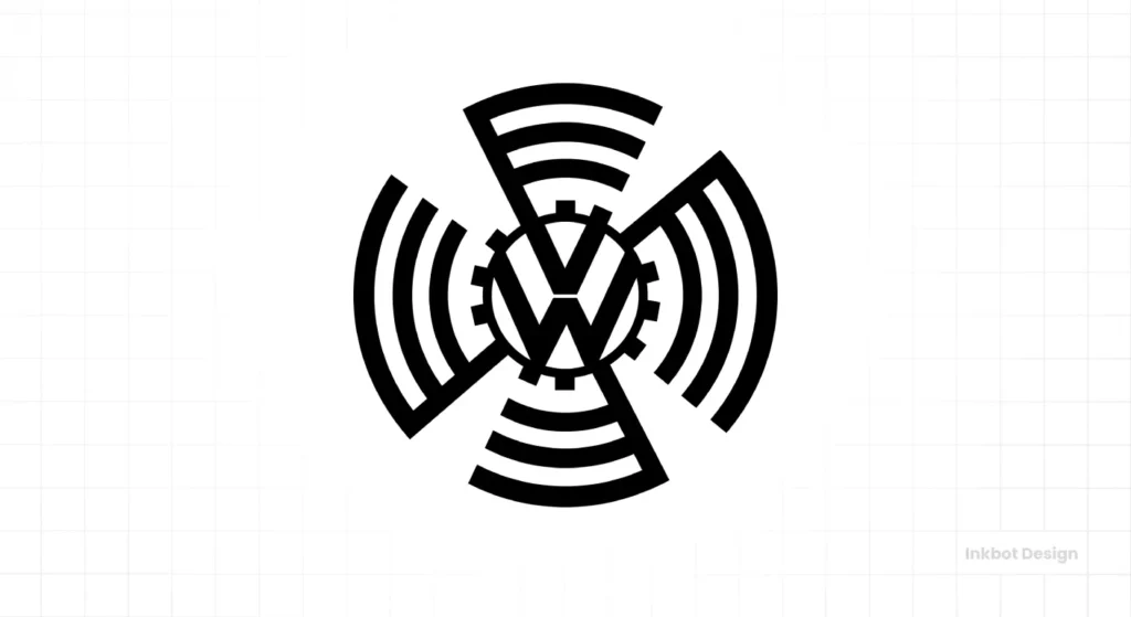
This was pure political iconography. It wasn't a commercial brand mark; it was a state-sponsored symbol.
As the car factory was being built, a more “commercial” logo was needed. A competition was held, and two main designs emerged. One was from an engineer named Franz Reimspiess (who famously perfected the Beetle's boxer engine). The other was from a designer named Nikolai Borg.
The history is murky, but the accepted story is that Reimspiess's design—a simple V and W in a circle—was chosen. It was registered as a trademark in 1939. This is the simple yet powerful monogram that would endure for the next century.
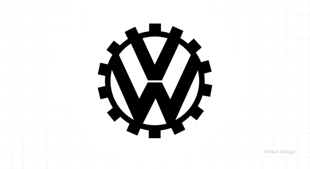
The SBO Takeaway: Your logo's origin story matters, but it doesn't have to be its destiny. This logo was born from the darkest of regimes. Its survival is a testament to radical brand separation and utility.
The Post-War Rebirth: A British “Clean-Up” (1945)
When World War II ended, the Volkswagen factory was in ruins and came under British military control. The company's Nazi ties were a toxic liability. The brand, if it was to survive, needed to be detoxified.
The British task force, led by Major Ivan Hirst, saw the utility of the car and the factory. They restarted production to provide ground transport. But the branding had to change.
In 1945, the logo was “cleaned.”
- The Nazi-era “cog” elements were completely removed.
- The core V-over-W monogram was kept.
- The circle, a simple and universal shape, was reinforced.
This was the first great act of brand subtraction. By removing the political noise, the British revealed the strong, simple core mark that was left. They didn't reinvent it; they liberated it.
This new, cleaner logo became the symbol of Germany's post-war economic miracle and the friendly, reliable Beetle that would conquer the world.
Global Icon, Practical Problems (1960s-1970s)
As the Beetle and the Type 2 (Bus) became global icons, the logo needed to be standardised. The brand was now a global commercial entity, not just a factory.
The 1960 Square
In 1960, Volkswagen put the logo in a box. Literally. A square frame was added around the circle.

Why? This wasn't a creative flourish. It was a practical decision. A square logo was easier to standardise and display in dealerships, on signage, and in print advertising. It created a consistent footprint.
This is a brilliant example of systems thinking in branding. The logo doesn't just reside on the car; it permeates the entire business ecosystem.
The 1978 Return to Simplicity

By 1978, the company had introduced new models, including the Golf (known as the Rabbit in the US) and Passat. The brand was modernising. The square logo was retired, and the core circular logo returned, but now with a defined colour scheme: blue and white.
This simple, two-colour mark was bold, confident, and incredibly versatile. It established the core brand identity that would remain largely unchanged for the next two decades.
The “Bling” Era: A 3D, Gradient Misstep (2000-2012)
Then the internet arrived, and brands went a bit mad.
The “Web 2.0” aesthetic was all about gradients, drop shadows, and glossy “aqua” buttons. Designers were obsessed with making digital things look physical. In 2000, Volkswagen dived headfirst into this trend.
The flat, two-colour logo was replaced with a 3D, chrome-effect logo. It had highlights, lowlights, and a bevelled edge. The blue became a gradient. The idea was to make the logo look more “premium,” like the physical badge on the front of their increasingly upmarket cars.
In 2012, they doubled down, making it even glossier and adding more pronounced shadows.

My honest take? This was a mistake. It was trend-chasing, and it aged like milk.
This 3D logo was heavy, complex, and difficult to reproduce. It looked dated almost immediately. Worse still, it was a usability nightmare in the early days of mobile. It was a fuzzy, unreadable blob on small screens and favicons. It sacrificed its core strength—simplicity—for a cheap, temporary “premium” look.
The 2019 “New Volkswagen” Rebrand: A Digital-First Masterstroke
By 2019, Volkswagen was in crisis. The “Dieselgate” emissions scandal had shattered public trust. The brand came across as deceptive, old-fashioned, and out of touch.
They needed a “Great Reset.” And this time, it wasn't just about a logo; it was about a new brand philosophy. They called it “New Volkswagen.”
The goal was to be “digital-first,” “transparent,” and “human.” And the 2012 logo was the opposite of all those things.
The solution was remarkably simple in its approach. They went flat.
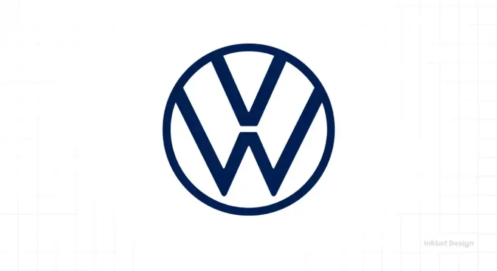
The 2019 logo, designed in-house, is a masterclass in modern branding:
- It's Flat: All 3D effects, gradients, and shadows are gone. It's just two colours (or often, one). This makes it infinitely scalable, legible, and fast-loading. It looks as good on a smartwatch as it does on a stadium.
- It's Light: The lines are significantly thinner than any previous version. This makes the logo feel less bulky and more modern.
- The “Floating W”: This is the most brilliant detail. For the first time, the “W” monogram no longer touches the outer circle. This small gap makes the logo feel more open, “lighter,” and more “digital.” It's a subtle visual metaphor for transparency.
This wasn't just a logo change. It was a system change. The new identity included a “sound logo” (the audio signature), new typography, and a new colour palette. It was designed to be flexible, allowing for more colour and expression—a key part of feeling more “human.”
The Volkswagen Logo Evolution: A Timeline
To see the journey clearly, you have to map it. This is the real-world progression from political symbol to digital icon.
| Year | Key Visual Change | Historical / Business Context |
| 1937 | KDF-Wagen Logo: V/W in a cog, surrounded by swastika-like arms. | Nazi-era political symbol for the “Strength through Joy” car. |
| 1939 | Monogram Birth: Simple V/W monogram in a circle. Arms/cog removed. | Registered as a trademark. Designed by Franz Reimspiess. |
| 1945 | Post-War “Clean-Up”: Proportions refined. Cleaner, bolder lines. | British military control. Brand detoxification for civilian use. |
| 1960 | The Square: Circular logo placed inside a square box. | Practical decision for global standardisation in print and dealerships. |
| 1978 | Blue & White: Square removed. Blue and white (or blue/silver) locked in. | Brand consolidation. Golf/Rabbit success. A confident, modern mark. |
| 2000 | 3D “Bling” Era: Added gradients, bevels, and chrome effects. | “Web 2.0” trend. Attempt to look “premium” and mimic the physical car badge. |
| 2012 | More 3D: Enhanced gloss, shadows, and reflections. | “New Volkswagen” Flat Design: Flat, 2D, thinner lines. “Floating W” was introduced. |
| 2019 | “New Volkswagen” Flat Design: Flat, 2D, thinner lines. “Floating W” introduced. | Digital-first. Post-Dieselgate scandal. A symbol of transparency and flexibility. |
What Every Entrepreneur Must Learn from the VW Logo
This 90-year history isn't just trivia. It's a practical guide for any small business owner who is stressed about their own identity.

Lesson 1: Evolution, Not Revolution
Volkswagen has never thrown away its core asset: the V-over-W monogram. They've cleaned it, boxed it, chromed it, and flattened it. However, the 1939 idea remains.
Your business will change. Your customers will change. Your brand must evolve to stay relevant. But that doesn't mean starting from scratch every five years. Identify your core, undeniable visual asset and refine it to perfection. Don't destroy your own brand equity just because you're bored.
Lesson 2: Simplicity = Survival
The parts of the VW logo that died? The swastika arms, the cog, the square, the chrome, the gradients. All the noise.
The part that survived? The simple, two-letter monogram in a circle.
A complex logo is a fragile logo. A simple logo is an antifragile one. The single most important test for your logo is: does it work in one colour? If it relies on gradients or effects to be readable, it's a failed design.
Lesson 3: Adapt to Your Medium (or Die)
The 1960 square logo was a smart solution for print. The 2000 Chrome logo was a (flawed) attempt to adapt to the early web. The 2019 flat logo is a perfect solution for a multi-screen, digital-first world.
Stop thinking about your logo as a static image. Your logo must work on:
- A 50×50 pixel favicon.
- A circular social media profile.
- A 4K website header.
- A physical embroidered shirt.
- A black-and-white invoice.
The 2019 VW logo excels in all these places. Does yours? This is the kind of strategic thinking that separates a professional logo design from a cheap template.
Lesson 4: Your Logo Is the Anchor, Not the Ship
The VW logo survived its Nazi origins. It survived the Dieselgate scandal. How?
Because a logo is a symbol of identity, not behaviour.
During the emissions scandal, the logo was a consistent anchor. It was the company's actions and messaging that had to change. The new 2019 logo was a visual signal of that change—a promise of transparency.
For SBOs, this is critical. Your logo can't save a bad product or a toxic culture. But a strong, consistent logo can provide stability and recognition while you fix the business's operations.
The Resilient Mark
The Volkswagen logo isn't just a design. It's a timeline of 20th and 21st-century history. It's been a symbol of fascism, a symbol of post-war recovery, a symbol of hippie counter-culture, a symbol of corporate excess, and now, a symbol of digital transformation.
It has survived because its core idea is simple, adaptable, and timeless.
As a business owner, you don't need a logo that's “trendy” or “flashy.” You need one that is simple, appropriate, and resilient. You need a mark that can grow and evolve with you. The VW story isn't just about a car; it's about a brand that took 90 years to learn that the simplest ideas are always the strongest.
If your brand identity feels dated, complex, or isn't working for you in a digital world, perhaps it's time for an evolution.
Thinking about your own brand's evolution? We've helped hundreds of businesses create resilient, timeless identities. If you're ready to build a lasting brand, explore our logo design services or request a quote to speak with us directly.
❓ Volkswagen Logo FAQs
Who designed the original Volkswagen logo?
The most widely accepted story credits Franz Reimspiess, a Porsche engineer, who designed the simple V/W monogram in 1939. However, designer Nikolai Borg also submitted similar designs, so the exact origin of the design is debated.
Why did VW change its logo in 2019?
For two main reasons: 1) To signal a new era of transparency and openness following the Dieselgate emissions scandal. 2) To create a “digital-first” logo that was flat, simple, and worked perfectly on small screens, apps, and websites.
What does the Volkswagen logo mean?
It's an abbreviation. “Volks” is German for “People,” and “Wagen” is German for “Car.” The logo simply combines the V and W from “People's Car.”
What is the controversy behind the VW logo?
The company was founded by the Nazi regime in 1937. The very first logo (the KDF-Wagen logo) incorporated elements of Nazi symbolism. This was quickly removed after WWII.
What is a “flat design” logo?
It's a minimalist design style that removes all 3D elements, such as gradients, shadows, and textures. The 2019 VW logo is a perfect example, using only simple lines and solid colours.
Why is the “W” floating in the new VW logo?
The “W” no longer touches the outer circle. This was a deliberate design choice to make the logo feel “lighter,” more “open,” and more flexible, visually representing the brand's new transparency.
How much did the 2019 VW rebrand cost?
Volkswagen has not disclosed the exact cost. However, the rebrand was a massive undertaking, developed over three years with both the in-house team and external agencies. Rebranding a global company of this scale is a multi-million-dollar investment.
Is a simple logo always better?
For 99% of businesses, yes. A simple logo is easier to remember, more versatile (works in one colour, at any size), and more timeless than a complex one.
How often should a small business redesign its logo?
You should refine your logo as your business evolves, but you should redesign (start from scratch) very, very rarely. A total redesign throws away your brand equity. Think evolution, not revolution.
What's the difference between a logo and a brand?
Your logo is the visual symbol of your business (like the VW roundel). Your brand is the entire experience and reputation of your company—your customer service, product quality, messaging, and visual identity all working together.


