Variable Fonts Explained: Reduce Bloat and Fix Layout Shifts
I see it every day. A client comes to us with a “sleek” new website concept that looks fantastic in Figma but loads like a damp sponge on a 4G connection.
We dig into the waterfall chart, and there they are: twelve separate font files. Thin, Thin Italic, Light, Light Italic, Regular, Bold, Extra Bold… you get the picture.
It is a bloat crisis. You are forcing a user's browser to handshake, download, and parse over 500KB of data just to render a headline. In an era where Google’s Core Web Vitals punish slow Largest Contentful Paint (LCP) times with lower rankings, this is negligence.
The solution has been available since 2016, yet I still see agencies ignoring it. It is called Variable Fonts.
This is not about making text “look pretty.” It is about rigorous engineering efficiency. It is about stripping away the fat of static typography and replacing it with a lean, adaptive system that serves your typography in branding without the performance tax. If you are still commissioning static font families for the web, you are wasting money and bandwidth.
- Variable fonts consolidate many static files into one .woff2, drastically reducing payload and HTTP requests to improve LCP and CLS.
- Axes like wght, wdth, opsz and GRAD enable precise, responsive typography and hover states without layout shifts.
- Proper CSS implementation and fallbacks yield better performance, sustainability, brand flexibility, and measurable conversion gains.
What are Variable Fonts?

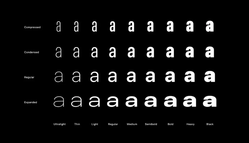
A variable font is a single font file that behaves like multiple fonts. Technically known as OpenType Font Variations, this specification allows a type designer to include the entire range of a typeface's stylistic variations—weights, widths, and slants—within one highly optimised binary file.
Instead of having a discrete file for “Bold” and another for “Regular,” a variable font contains the “master” outline and a set of mathematical deltas (instructions) that tell the browser how to morph that outline between extremes.
The Core Components:
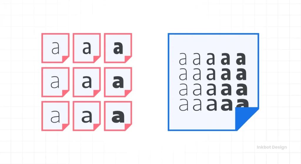
- Single File Source: One file (usually .woff2) replaces the 4, 10, or 20 files you previously needed.
- Axes of Variation: The parameters you can manipulate. Common axes include Weight (wght), Width (wdth), and Slant (slnt).
- Interpolation: The ability to select any instance between the masters. You are not limited to “Bold (700)”; you can opt for “Bold-ish (642)” if it better suits the interface.
Consultant’s Note: Think of static fonts as a staircase—you can only stand on the specific steps the architect built. Variable fonts are a ramp. You can stand anywhere you like.
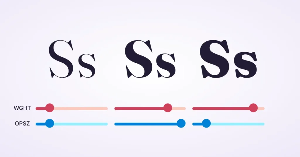
The Technical Anatomy: Axes of Variation
To understand why this matters for your brand, you need to understand the mechanics. Variable fonts operate on “Axes.” There are five registered (standard) axes defined by the OpenType specification, and designers can also invent custom axes.
1. Weight (wght)
This is the most common axis. In a static world, you buy Light, Regular, and Bold. In a variable world, you define a range, say 100 to 900.
- The Benefit: You can fine-tune the visual hierarchy. If a heading appears too heavy on a dark background (due to light irradiation), you can adjust the weight from 700 to 680 to optically correct it without altering the font file.
2. Width (wdth)
This controls the width of the characters.
- The Use Case: Responsive design. As a screen gets narrower (e.g., on a mobile device), you can programmatically reduce the width of the headline font to fit more characters on a line, thereby preventing awkward hyphenation.
3. Slant (slnt) vs. Italic (ital)
There is a technical distinction here. slnt mechanically shears the letters. ital switches between the upright and the cursive (italic) glyph forms.
- Why it matters: A variable font with an Italic axis allows you to switch between roman and italic structures instantly, often with a simple CSS toggle.
4. Optical Size (opsz)
This is perhaps the most underutilised yet powerful feature for professionalism.
- The Problem: Fonts designed for billboards look clunky at 12px. Fonts designed for books look spindly and weak on billboards.
- The Variable Solution: The opsz axis automatically adjusts the stroke thickness and contrast based on the display size. At small sizes, it thickens strokes and opens up counters (the holes in letters like ‘e') for legibility. At large sizes, it sharpens the details for elegance.
5. Custom Axes
This is where branding gets interesting. Type designers can create axes for anything—serif length, emoji happiness, or even “drippiness” for a horror theme.
- Example: The recursive font family has a “Casual” axis that morphs the font from a strict code-style sans serif to a friendly, brush-style marker font.
The Business Case: Why Switch?
You might be thinking, “Stuart, I don't care about stroke thickness. I care about sales.” Fine. Let’s talk about the bottom line.
1. Performance and Core Web Vitals
Google’s algorithm prioritises user experience. A massive contributor to poor experience is the “Cumulative Layout Shift” (CLS) and slow “First Contentful Paint” (FCP).
When you load five static font files, the browser has to make five separate HTTP requests. Even with HTTP/2 multiplexing, this takes time. If the font loads late, the text flashes (FOIT) or swaps (FOUT), causing the page to jump.
The Data:
- Static approach: 5 files × 40KB = 200KB total. 5 Requests.
- Variable approach: 1 file × 80KB = 80KB total. 1 Request.
You are reducing the payload by over 50% and the request overhead by 80%. This directly improves your LCP scores, which correlates with better SEO rankings.
2. Digital Sustainability (The Green Web)
We are increasingly asked about carbon footprints in RFPs. The internet accounts for roughly 3.7% of global greenhouse emissions—comparable to the airline industry. Every kilobyte of data transferred requires energy.
By switching to variable fonts, you can significantly reduce the data transfer on your site. If your site gets 100,000 visitors a month, saving 100KB per visit adds up to massive bandwidth savings and a lower carbon footprint. It is a tangible sustainability win you can put in your annual report.
3. Brand Flexibility
We offer comprehensive Brand Identity Services, and a common friction point is the rigidity of style guides. A static style guide says, “Use Bold for Headers.” But what if “Bold” is too long for a specific banner ad?
With variable fonts, your design team can adjust the width slightly to ensure the message fits perfectly without compromising the brand guidelines. It provides your internal teams with the tools to maintain consistency across all media.
Debunking The Myth: “Variable Fonts Are Too Big”
I often hear developers argue against variable fonts because the individual file size is larger than a single static file.
- “Why would I load a 100KB variable font when my Regular static font is only 30KB?”
This is a false equivalence. It assumes you only ever use one weight of one font.
If your website is a brutalist block of text using only Helvetica Regular, then yes, stick to the static file. But almost no modern brand does that. You use Regular, Bold, Italic, and probably a Display weight for headers.
Let’s look at the math:
- Roboto Regular: ~20KB
- Roboto Bold: ~21KB
- Roboto Italic: ~21KB
- Roboto Bold Italic: ~22KB
- Roboto Black: ~22KB
Total Static Payload: ~106KB + 5 separate requests.
Variable Alternative:
- Roboto Flex (Subset): ~60KB.
Total Variable Payload: 60KB + 1 request.
The variable font wins the moment you need more than two styles. Do not let lazy math dictate your engineering strategy.
Real-World Implementation: The “Right” Way
Simply buying a variable font license isn't enough. You must implement it correctly in your CSS.
The CSS Syntax
In the past, we had to use font-variation-settings, which was a low-level and messy solution. Today, modern browsers (Chrome, Firefox, Safari, Edge) support mapping variable axes to standard CSS properties.
The Modern Standard:
CSS
/* The Old/Messy Way – Avoid unless necessary */
.heading {
font-variation-settings: ‘wght' 700, ‘wdth' 85;
}
/* The Clean/Semantic Way */
@font-face {
font-family: ‘MyVariableFont';
src: url(‘my-font.woff2') format(‘woff2-variations');
font-weight: 100 900; /* Define the available range */
font-stretch: 50% 100%;
}
.heading {
font-family: ‘MyVariableFont';
font-weight: 700; /* Maps to ‘wght' axis */
font-stretch: 85%; /* Maps to ‘wdth' axis */
}
Warning: Always verify the available axes in your specific font file. Just because it is “variable” does not mean it contains a Width axis. You can check this using tools like Wakamai Fondue (What can my font do).
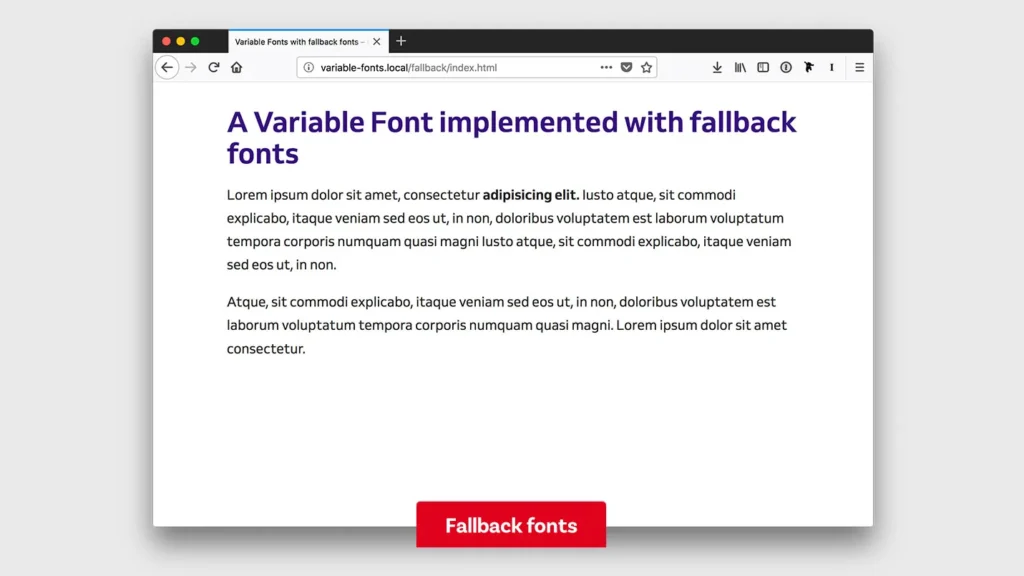
Fallback Strategies for Legacy Browsers
While global support for variable fonts exceeds 94% (according to Can I Use), you may still encounter users on outdated browsers.
The strategy is simple: serve the static woff2 files inside a @supports query or rely on the browser's cascade logic, where it ignores rules it doesn't understand. However, given the high support rate, many of our clients now opt to drop support for non-variable capability to save on hosting complexity, serving a system font (Arial/Helvetica) as the fallback.
The State of Variable Fonts in 2026
We are currently seeing a shift in how variable fonts are priced and utilised.
1. The “Grade” (GRAD) Axis Revolution
A recent frustration in UI design is the “button jump.” You hover over a button, and the text becomes bold; the button also becomes wider because bold letters take up more space. This shifts the layout—a visual bug.
The GRAD axis is the solution. It increases the “weight” (darkness) of the type without changing the character width.
In 2026, we anticipate that the GRAD axis will become a standard requirement for UI-focused typefaces. It allows for high-contrast hover states with zero layout shift.
2. Animation and “Scrollytelling”
Brands are using the interpolation capability to animate fonts based on user scroll. Imagine a headline that gets bolder as you scroll down the page. This utilises the variable axes connected to a JavaScript scroll listener. It creates an immersive, high-end feel that static images cannot replicate.
3. Variable Colour Fonts (COLRv1)
Google and others are pushing the COLRv1 format. This allows for vector-based, scalable colour fonts that are also variable. Think of gradients, layers, and multiple palettes inside a single text file. This is entering the mainstream for emoji and expressive display typography.
Consultant's Reality Check
I once audited a client in the fintech sector. They were haemorrhaging mobile users on their signup page. They blamed the form fields.
I looked at the code. They were loading eighteen different font files. Why? Because their brand guidelines specified “Light” for captions, “Regular” for body, “Medium” for buttons, “Semi-Bold” for subheads, and “Bold” for titles… plus the italic versions of each.
The browser on a standard 4G connection was taking 3.5 seconds just to download the typography. During that time, the text was invisible. Users thought the page was broken and left.
We swapped the entire suite for Inter Variable. We dropped the total font payload from 650KB to 48KB.
The result? The First Contentful Paint dropped by 1.2 seconds. Signups increased by 14% over the next month.
Typography is not just art; it is infrastructure. Treat it with the same respect you treat your server architecture.
Comparison: The Wrong Way vs. The Pro Way
| Feature | The Amateur Approach (Static) | The Pro Approach (Variable) |
| Files Loaded | 4+ (Regular, Bold, Italic, etc.) | 1 (Single WOFF2 file) |
| HTTP Requests | High (Blocking render) | Minimal (Non-blocking via pre-load) |
| Visual Hierarchy | Limited to 400, 700 weights | Infinite (400, 450, 500, 515…) |
| Responsiveness | Text reflows or breaks | Text width adjusts (wdth) to fit |
| Hover Effects | Causes layout shift (Bold expands) | No shift (Grade axis usage) |
| CSS Code | Bloated with multiple @font-face | Clean, semantic, scalable |
The Verdict
Variable fonts are no longer “experimental.” They are the industry standard for responsive, performant, and sustainable web design.
If you are currently undertaking a rebrand or a website refresh, you must insist that your design agency provides a variable font strategy. If they look at you blankly, you are hiring the wrong people.
Do not let nostalgia for static font files slow down your business. The web is fluid; your typography should be too.
Is your brand identity stuck in the slow lane?
Request a quote today, and let us build a visual system that performs as well as it looks.
Frequently Asked Questions (FAQ)
What is the main difference between static and variable fonts?
Static fonts require a separate file for each style (e.g., one file for Bold and one for Light). A variable font contains all styles in a single file, allowing you to generate any variation between extremes using CSS.
Do variable fonts improve SEO?
Yes. Variable fonts significantly reduce the number of HTTP requests and total page size. This improves page load speed and Core Web Vitals (specifically LCP and CLS), which are direct ranking factors for Google.
Can I use variable fonts on all browsers?
Support is excellent. All major modern browsers (Chrome, Safari, Firefox, Edge, Opera) support variable fonts. Global support is over 96%. For older browsers, such as Internet Explorer, you can provide a static font as a fallback.
Are variable font files larger than static files?
A single variable file is larger than a single static file (e.g., 80KB vs 20KB). However, because one variable file replaces 4-10 static files, the total download size for the user is almost always smaller with variable fonts.
How do I control variable fonts in CSS?
You can use standard properties, such as font-weight and font-stretch. For custom axes, or to be more specific, you use the font-variation-settings property (e.g., font-variation-settings: ‘wght' 700, ‘wdth' 85;).
What is the ‘optical size' axis?
Optical Size (Osz) automatically adjusts the font's design based on its size of display. It makes small text thicker and more readable, while making large headlines thinner and more elegant, mimicking traditional print typography techniques.
Are variable fonts more expensive to license?
It depends on the foundry. Some foundries include the variable file in the standard package. Others charge a premium because of the increased utility. However, free open-source options like Google Fonts offer hundreds of high-quality variable fonts at no cost.
Can I animate variable fonts?
Yes. Because the variations are mathematical, you can use CSS transitions or JavaScript to smoothly animate changes in weight, width, or slant. This is impossible with static fonts, which can only “snap” between styles.
What is the ‘Grade' axis?
The Grade (GRAD) axis changes the weight (darkness) of the text without changing the width of the characters. This is vital for UI design, as it allows buttons or links to become bolder on hover without pushing surrounding elements out of place.
How do variable fonts help with responsive design?
They allow for fluid typography. You can link the font width (wdth) to the viewport width. As a mobile screen gets narrower, the font can automatically condense to fit more text on the line, improving readability and reducing weird hyphenation.

