The Kia Logo Evolution: Budget Beaters to the “KN” Controversy
If you have driven down a motorway in the last three years, you have likely squinted at the back of a sleek electric SUV and asked yourself, “Who on earth is KN?”
You are not alone. In the design world, legibility is usually rule number one. If they can’t read it, they can’t buy it. Yet, Kia Motors took a sledgehammer to that rule in 2021.
They traded the safety of their recognisable (albeit boring) red oval for a jagged, rhythmic, handwritten signature that looks more like a tech startup’s favicon than a legacy automaker’s badge.
Why take the risk? Because the old logo screamed “budget rental car,” and the new cars—the EV6, the Telluride—were simply too good to wear a cheap badge.
In this analysis, we aren’t just looking at dates and shapes. We are dissecting one of the most aggressive rebranding strategies in modern automotive history.
We will look at how Kia fits into the pantheon of famous logos, why the “KN” confusion might actually be a calculated win, and what you, as a business owner, can learn about shedding your past to secure your future.
- Kia ditched its safe red oval for a handwritten, tech‑forward logo to shed a "budget" image and position itself as premium and design‑led.
- The 2021 script prioritises rhythm, symmetry and digital‑first use, making it versatile for modern EVs and manufacturing applications.
- Legibility issues caused "KN" confusion, but the buzz served as a successful repositioning tactic, forcing consumers to reassess the brand.
1944–1993: The Industrial Roots (Before the Oval)
Most people assume Kia started making cars in the 90s. In reality, the company has been around since 1944, but they weren’t building family sedans. They were bending steel tubing for bicycles. The logo history reflects this heavy industrial grind before the pivot to consumer vehicles.
1944: Kyungsung Precision Industry
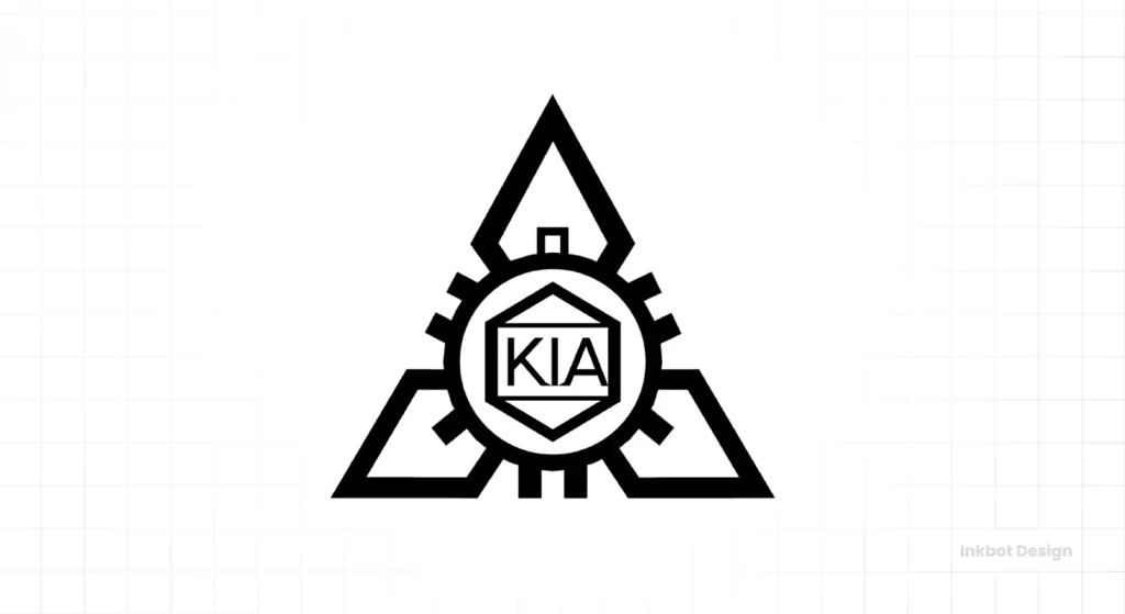
The Design: A triple-diamond pattern with a gear/cog motif.
The Context: This wasn’t a logo for a car grille; it was a stamp for documentation and heavy machinery. It is structurally similar to Mitsubishi’s diamond motif (which is common in Asian industrial conglomerates). It communicated durability, engineering, and raw manufacturing capability. For a company making bicycle parts and steel tubing, it was functional, if forgettable.
1964: The “Q” of Manufacture
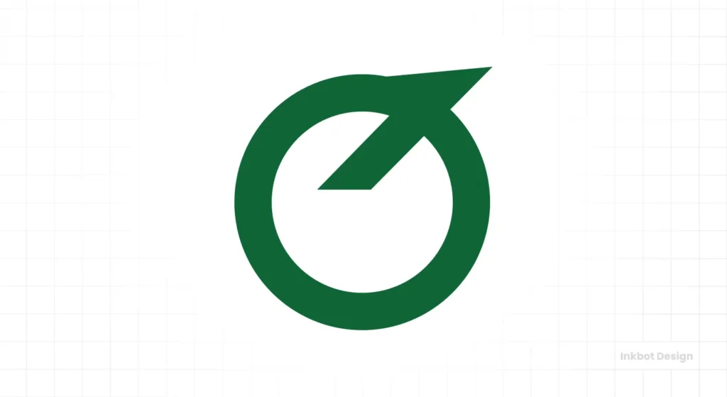
The Design: A green circle with a diagonal line striking through a stylised “Q” shape (resembling an inverted triangle).
The Analysis: As Kia transitioned into complete bicycle manufacturing and eventually motorcycles (with the Honda-licensed C100), they required an emblem. This logo is rarely seen in the West. It resembles an upside-down drop pin or a stylised drafting compass. It feels architectural.
- Design critique: It lacks emotional connection. It’s a “seal of quality” rather than a brand identity.
1986: The “Chimney” Wordmark
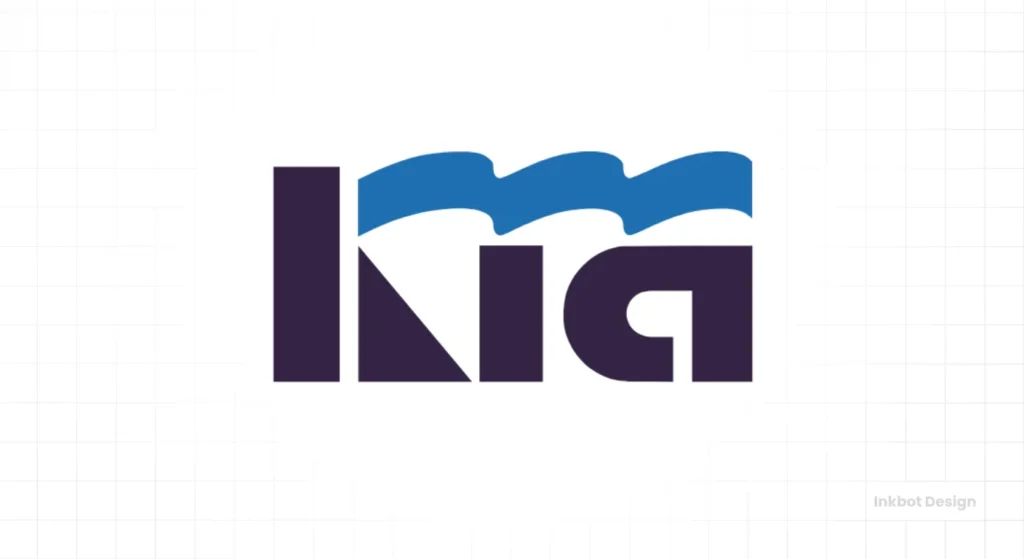
The Design: Thick, blue, stylised lettering. The “K” features a wave-like upper arm.
The Context: This is where the brand begins to awaken. As Kia partnered with Ford and Mazda to produce the Pride (Festiva), they needed a wordmark that could sit on a boot lid. The stylised “K” was often interpreted as a factory chimney with smoke—a nod to South Korea’s booming industrial manufacturing sector.
- The Problem: It was heavy. It looked like a construction company logo, not a consumer mobility brand.
1994–2020: The Red Oval Era (The “Budget” Badge)
This is the logo you know. This is the logo that was on the steering wheel of the rental car you abused on holiday in 2008.
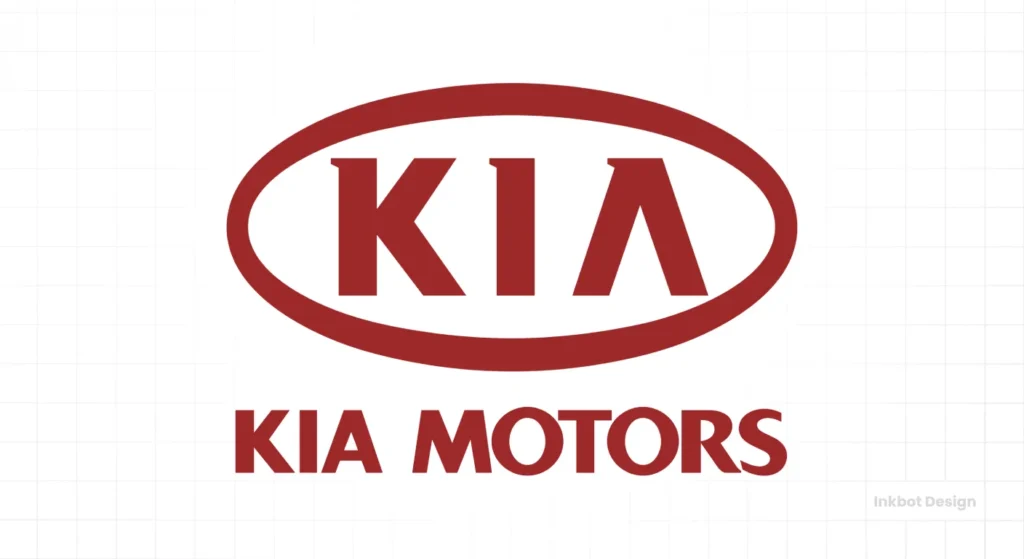
The Design Mechanics
- Shape: An ellipse (horizontal oval).
- Colour: Kia Red (#C21A34).
- Typography: A custom sans-serif where the ‘A’ lacks a crossbar.
Why It Worked (And Why It Failed)
For nearly 30 years, this logo did exactly what it was supposed to do: establish trust. The ellipse is a safe shape. Ford uses it. Land Rover uses it. Subaru uses it. An oval says, “We are a contained, global, reliable entity.”
The missing crossbar on the ‘A’ was the only piece of unique character. It was meant to appear aerodynamic, but in practice, it simply looked like a clean, straightforward wordmark.
The Brand Perception Trap:
By 2015, Kia was making objectively good cars. The Stinger GT was a legitimate rival to BMW. The Telluride was winning awards. But they had a massive problem: Badge Snobbery.
You could build a car better than an Audi, but if it wears the same badge as the $9,000 Rio from 1999, the market won’t pay a premium price. The red oval became an anchor. It represented “cheap and cheerful.” To charge £45,000 for an electric vehicle, the oval had to die.
2021: The “Movement That Inspires” Rebrand
In January 2021, Kia unveiled the new logo with a massive pyrotechnic drone show in Incheon. This wasn’t a tweak; it was a tear-down.

The Concept: Symmetry and Rhythm
The new logo is designed to look like a handwritten signature. It is constructed using a single, unbroken line (conceptually) to represent “movement.”
- Rhythm: The vertical strokes of the K, I, and A are spaced equally.
- Slant: The italicised angle suggests forward momentum.
- Symmetry: The top-left corner of the ‘K’ mirrors the bottom-right corner of the ‘A’.
The Removal of the Oval
Removing the bounding shape (the oval) is a major trend in modern design (think Nissan, VW, BMW). By removing the container, the logo feels less like a “stamp” pressed onto the car and more like an integrated part of the vehicle’s surfacing. It allows the logo to breathe on digital screens and physical grilles alike.
The Colour Shift
Gone is the aggressive “sale tag” red. The new primary colours are Midnight Black and Polar White. When red is used, it is a darker, more sophisticated accent. This is a classic premium signal. High-end fashion and luxury auto brands almost exclusively prefer monochrome identities because they let the product design speak for itself.
Consultant’s Take: This was the right move strategically. You cannot sell a futuristic EV like the EV6 with a logo that looks like a sticker from a budget appliance. The new logo feels sharp, technical, and slightly aggressive. It matches the angular headlights and “Digital Tiger Face” grilles of their modern lineup.
The “KN” Controversy: A Happy Accident?
We have to address the elephant in the room. The new logo is legible… if you know it says “KIA.” If you don’t, it looks remarkably like the letters “KN.”
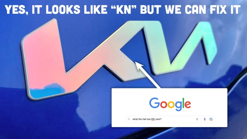
The Data: 30,000 Confused Searchers
Shortly after the rebrand, search data tools (Ahrefs, SEMrush, Google Trends) detected a bizarre spike. Roughly 30,000 people per month were searching for:
- “KN Car”
- “KN car brand”
- “What is the KN car logo?”
Is this a design failure?
Technically, yes. A logo’s primary job is identification. If the customer can’t read the name, the designer failed Typography 101. The connection between the ‘I’ and the ‘A’ is too tight, and the angle mirrors the ‘N’ structure too closely.
However…
Let’s look at it from a guerrilla marketing perspective. Those 30,000 people didn’t just ignore the car. They saw the car, were intrigued by the design, didn’t recognise it (which means they didn’t associate it with “cheap old Kia”), and actively took time to research it.
They went looking for a mystery luxury brand and discovered it was Kia. That is a powerful moment of brand repositioning. It forces the consumer to reconcile the cool car they just saw with their old prejudice against the brand.
If the logo had been perfectly legible, they might have said, “Oh, nice Kia,” and kept walking. The “KN” confusion created a pattern interrupt.
Comparative Analysis: Old vs. New
To visualise the drastic shift in strategy, let’s break down the attributes of the 1994 era versus the 2021 era.
| Feature | 1994–2020 (The Oval) | 2021–Present (The Signature) |
| Primary Shape | Enclosed Ellipse | Open, rhythmic text |
| Legibility | 10/10 (Unmistakable) | 4/10 (Highly stylised) |
| Brand Feel | Safe, Reliable, Budget | Tech-forward, Premium, Edgy |
| Typography | Bold Sans-Serif | Custom Angular Script |
| Dimensionality | Often rendered in 3D chrome | Flat, 2D vector |
| Colour Palette | Bright Red (#C21A34) | Black/White (Monochrome) |
| Ideal Usage | Print ads, dealerships | Digital apps, illuminated grilles |
| Psychology | “I am a car manufacturer.” | “I am a mobility technology company.” |
Lessons for Entrepreneurs: When to Rebrand
As a business owner, you likely don’t have Kia’s billion-dollar marketing budget. However, the principles behind their shift are applicable to your logo design strategy.

1. Don’t Put Lipstick on a Pig
Kia did not rebrand when their cars were bad. They waited until the product was excellent.
The Lesson: If your product or service is subpar, a new logo won’t fix it. It will only highlight the gap between your promise and your delivery. Fix the business first; let the logo be the victory lap.
2. Legibility is a Variable, Not a Law
If you are a new plumbing business, your logo must be instantly readable. You cannot afford the “KN” confusion. However, if you are an established entity seeking to signal a shift in culture, abstraction can be a valuable tool.
The Lesson: Know Your Market Position. High-end fashion brands (like the intertwined letters of Gucci or LV) often sacrifice legibility for distinctiveness. Budget brands cannot afford to do that.
3. Digital-First is Non-Negotiable
The old Kia oval looked terrible on a smartphone screen. The 3D chrome effect was dated, and the red clashed with dark modes. The new logo is strictly 2D.
The Lesson: When commissioning a logo, don’t look at it on a piece of paper. Look at it as an Instagram profile picture, a website favicon, and an app icon. If it fails there, it fails everywhere.
4. The Power of Symmetry
The human brain loves symmetry. It signals order and engineering precision. The new Kia logo relies on the vertical rhythm of the strokes.
The Lesson: If you want to convey high-tech engineering or precision (like in architecture, SaaS, or finance), look for geometric symmetry in your wordmark.
Design Mechanics: Why the “Signature” Works on Metal
One aspect often overlooked by digital designers is how a logo translates to physical manufacturing.
In the automotive world, logos are badges. They are injection-moulded plastic, brushed aluminium, or backlit LEDs.
The old oval was a “puck.” It had to be glued onto the front of the car, interrupting the design lines.
The new script logo is cut out. Because it is just three connected strokes, it can be:
- Flush-mounted into the sheet metal.
- Backlit so the car glows at night (a major trend in EVs).
- Etched into leather seats without looking bulky.
Consultant’s Tip: If you manufacture a physical product, think about how your logo will be applied. Can it be engraved? Can it be embroidered? Can it be stamped? The Kia script is infinitely more versatile in manufacturing than the old enclosed oval.
The Future: Will They Fix the “KN”?
Will Kia change the logo back? Absolutely not.
The “KN” memes will fade. As more of these cars flood the streets (and the sales figures suggest they are selling incredibly well), the symbol will become iconic through sheer repetition. We learn to read logos like we learn to read words. Once the brain associates that jagged shape with “Kia,” the legibility issue evaporates.
We saw this with the Airbnb rebrand (the controversial “Bélo”). Everyone mocked it for a month. Now, it is the standard for the industry.
Kia has successfully moved upmarket. They are no longer the budget option; they are the design-led option. The logo, for all its flaws, signalled that shift perfectly.
Frequently Asked Questions (FAQ)
What does KN stand for in cars?
It doesn’t stand for KN. It is the stylised 2021 logo for Kia. The design connects the letters K, I, and A in a way that merges the I and A, causing it to resemble a capital N.
Why did Kia change their logo?
Kia rebranded to signal a shift away from traditional combustion engines and budget cars toward electric vehicles (EVs) and more premium mobility solutions. They wanted to shed the “cheap” image of the 1990s/2000s.
Is the new Kia logo a failure?
From a pure legibility standpoint, it has issues (evidenced by search data). However, from a business standpoint, it is a success. It successfully repositioned the brand as modern and aggressive, coinciding with record sales and design awards.
Who designed the new Kia logo?
The rebrand was a collaboration between Kia’s internal design team (led by Karim Habib) and the creative agency Blackspace.
What is the font used in the Kia logo?
The logo does not use a commercial font. It is a custom-drawn typographic mark based on a rhythmic, handwritten gesture.
When did Kia introduce its new logo?
The official unveiling was in January 2021.
What do the three lines in the Kia logo represent?
According to Kia, the rising rhythm of the logo represents the brand’s ambitions. The continuous line represents their commitment to bringing moments of inspiration, while its symmetry demonstrates confidence.
Does the Kia logo still use red?
Rarely. While Kia Red remains part of the brand’s heritage, the primary visual identity is now black and white, conveying a more premium and timeless aesthetic.
Is Your Brand Stuck in the 90s?
The Kia evolution proves that even the biggest companies need to look in the mirror and ask hard questions. If your logo reflects where you were ten years ago rather than where you are going, it’s acting as a brake on your business growth.
You don’t need a drone show in Incheon, but you might need a fresh perspective.
Would you like me to audit your current visual identity and provide an honest, no-nonsense assessment of how it compares to those of your modern competitors?
Request a Quote today and let’s sharpen your image.

