What is a Logo? Your Business’s Most Important Asset
If you ask a designer, “What is a logo?” you’ll get a lot of lofty answers about “visual representation” and “brand essence.” That’s all true, but it’s not the practical answer a business owner needs.
For you, the entrepreneur, the startup founder, the small business owner, the answer is far more direct.
A logo is a strategic business tool for identification.
It’s not art. It’s not a “pretty picture” you’re supposed to “like.” It is the single hardest-working, most durable asset you will invest in. It’s the face of your company, and its job is to be recognised, remembered, and trusted.
More than 90% of the problems I see with business branding stem from a misunderstanding of this core fact. This guide is here to fix that. It’s the practical, no-nonsense advice I give to my own clients.
And let’s be clear: a logo is just the start. It’s the most visible component, the “tip of the iceberg,” of your entire logo design and branding ecosystem. However, you must get this first part right, or the entire structure is compromised.
- Logo is a strategic business tool for identification — the face of your company, meant to be recognised, remembered and trusted.
- Good logos must be simple, memorable, scalable, appropriate and timeless — judged against an objective professional framework.
- Use vector master files (AI, EPS, SVG) and deliver raster variants (PNG, JPG) in colour, black and white for all applications.
- Invest in professional, strategic design; cheap or stock-based logos are costly, un-ownable and often legally risky.
What Most People Get Wrong About Logos
After 15 years in this industry, you see the same costly mistakes repeated over and over again. As a design consultant, these are my personal pet peeves, because they can torpedo a business’s potential before it even gets started.
- “My cousin’s son is good with computers.” This approach gets you a £50 logo that looks like it. It’s often technically flawed, impossible to scale, and can’t be used for professional printing.
- The £5 Contest Site. You get what you pay for. This is a lottery ticket, not a strategy. The “winning” design is almost always a recycled template or, worse, plagiarised stock art. This makes it un-trademarkable and a potential legal liability.
- “A Logo is My Brand.” This is the most dangerous one. A logo is not your brand. Your brand is the entire experience, the gut feeling, the reputation you have with your customers. Your logo is just the shortcut to remind them of that feeling.
- “I’ll know it when I see it.” This suggests that you lack a strategy. A logo isn’t a magical object of affection. It’s the result of a strategic process. It’s a solution to a business problem, not an answer to a vague feeling.
A professionally designed logo is an investment, not an expense. Thinking of it as a cost to be minimised is like building a new retail shop and saving money by not putting a sign above the door. It’s commercial suicide.
The Core Function: What is a Logo Supposed to Do?
A logo has four primary, non-negotiable jobs. Everything else is secondary.
- Identify You: This is its primary function. In a sea of competitors, it needs to be the unique flag that says, “This is us.” It’s a visual shortcut to your business name.
- Differentiate You: It must look different from your competitors. If you’re a new tech startup and your logo resembles that of your three main rivals, you’ve failed. You’ve just paid to look generic.
- Build Association: A logo doesn’t mean anything on day one. The Nike ‘Swoosh‘ was just a tick. It gained its meaning (speed, athleticism, victory) by being consistently associated with high-performance athletes and quality products for decades. Your logo earns its meaning over time.
- Signal Quality: A sharp, professional, well-crafted logo subconsciously conveys that the business behind it is also sharp, professional, and committed to quality. A sloppy, pixelated, or amateur logo signals the exact opposite.
That’s it. Notice what’s not on that list? “Explain what you do.” Your logo doesn’t need to show a car to be a car mechanic, or a loaf of bread to be a bakery. The name does that. The logo’s job is to be recognisable.
Deconstructing the Mark: The 7 Types of Logos
When you begin the design process, you’ll encounter unfamiliar terms. Logotype, symbol, combination mark. Understanding these helps you articulate what you want and understand your designer’s recommendations.
Here is a practical breakdown of the seven core types of logos.
| Type of Logo | What It Is | Real-World Example | 💡 Best For… |
| Wordmark | A logo built entirely from the company’s name in a specific, often custom, font. | Google, Coca-Cola, IKEA | Businesses with a short, distinct name. It builds name recognition very quickly. |
| Monogram | A logo made from the company’s initials, typically used when the name is very long. | IBM, HP, NASA, BBC | Long-named businesses, global brands, or industries where simplicity and efficiency are key. |
| Pictorial Mark | A simple, graphic icon that represents the company. It’s what people usually think of. | Apple, Twitter (the bird), Shell | Strong brands that are recognisable without their name. Risky for new businesses. |
| Abstract Mark | A non-representational, conceptual shape. It’s a custom-created visual to be unique. | Nike (Swoosh), BP, Pepsi | Global brands with massive budgets. It creates a unique shape that is highly ownable. |
| Mascot | A character or illustrated person that represents the brand. | Mailchimp (Freddie), KFC (The Colonel) | Brands want to appear friendly, approachable, and family-oriented. Great for customer engagement. |
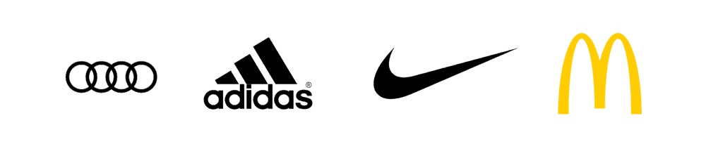
| Combination Mark | A logo that combines a wordmark with a symbol, abstract, or mascot. | Adidas, Pizza Hut, Lacoste | The vast majority of businesses. It’s flexible, builds recognition, and the elements can be used separately. |
| Emblem | A logo where the name is physically inside a symbol or icon, like a badge, seal, or crest. | Starbucks, Harley-Davidson, UPS | Traditional institutions, universities, car brands, or brands wanting to signal heritage and quality. |
For most small businesses, a Combination Mark is the most strategic choice. It gives you the best of both worlds: a recognisable name (the wordmark) and a unique visual hook (the symbol).
The Anatomy of a Logo: What Are the Moving Parts?
A logo is a precise combination of elements. A professional designer is a master of balancing these three components to create a single, cohesive message.
1. Typography (The Font)
The font you choose is not arbitrary. It’s the “voice” of your brand before you’ve said a word.
- Serif Fonts: (Like Times New Roman) Have little ‘feet’ on the letters. They feel traditional, established, trustworthy, and authoritative. Think: law firms, financial institutions, universities.
- Sans-Serif Fonts: (Like Arial or Helvetica) are without serifs. They are clean, modern, approachable, and direct. Think of tech startups, lifestyle brands, and modern services.
- Script Fonts: (Cursive) Feel personal, elegant, or casual. They are often difficult to read at small sizes. Think: wedding photographers, artisanal bakeries.
- Custom Typography: The font is drawn from scratch. This is the holy grail for wordmarks (like Coca-Cola’s) because it’s 100% unique and ownable.
2. Colour Theory (The Psychology)
Colour is the most immediate emotional signal. It’s processed by the brain faster than text or shapes. A professional designer starts in black and white to ensure the logo’s form is strong. Colour is applied later, strategically.
- Red: Energy, passion, urgency, hunger. (Used by Coca-Cola, Netflix, and fast-food chains).
- Blue: Trust, security, stability, competence. (The dominant colour for banks, tech, and healthcare).
- Green: Nature, health, wealth, growth. (Used by Whole Foods, financial services, and eco-brands).
- Yellow/Orange: Optimism, warmth, creativity, warning. (Used by Amazon, Fanta, and warning signs).
- Black/Grey: Sophistication, luxury, authority, neutrality. (Used by luxury fashion, premium tech).
Your logo must work in one solid colour. If it relies on gradients or multiple colours to be legible, it’s a weak design.
3. Shape & Form (The Icon)
This is the silhouette, the pictorial mark or abstract element. Like colours, simple shapes have built-in psychological meanings.
- Circles/Ovals: Community, unity, softness, global.
- Squares/Rectangles: Stability, structure, security, reliability.
- Triangles: Direction, movement, power, a “point.”
- Vertical Lines: Strength, power, dominance.
- Horizontal Lines: Calm, stability, speed.
A strong logo has a “glance test” value. You can see its basic shape in a split second and know what it is.
Logos that Last
Your logos are trendy, but they’re forgettable. You’re guessing at greatness instead of using a system. This book is the fix. An award-winning designer for Nike and Google shares his exact step-by-step process for building iconic logos that stand the test of time. Stop making disposable art.
As an Amazon Partner, when you buy through our links, we may earn a commission.
What Actually Makes a Logo ‘Good’?
This is the crucial part. How do you judge a logo? You don’t ask your partner or your friend. You judge it against a professional, objective framework.
A truly great logo has five qualities. A design is considered “finished” when it satisfies all of these criteria.
- Simplicity: This is number one. A complex logo is a forgettable logo. Can you doodle it from memory? Can you recognise it in one second? The best logos (Apple, Nike, Target) are brutally simple.
- Memorability: This is a function of simplicity and uniqueness. It needs to be distinctive enough to lodge itself in your customer’s brain.
- Scalability: This is the practical test. A good logo looks just as sharp on a tiny website favicon (16×16 pixels) as it does on the side of a 40-foot lorry. This is why vector files (such as AI, EPS, and SVG) are non-negotiable. A logo created in Photoshop (a raster file, such as JPG or PNG) is a useless, unprofessional file that will pixelate and blur when scaled.
- Appropriateness: The logo must be suitable for its target audience and the industry it represents. A “fun” and “wacky” logo for a funeral home is inappropriate. A gothic, complex font for a children’s nursery is inappropriate.
- Timelessness: A logo is a long-term investment. It should last you 5, 10, or even 20 years. A logo that chases current trends (like rose-gold gradients or 90s-style “edgy” fonts) will look dated and ridiculous in 18 months, forcing a costly rebrand.
Red Flags: My Field Guide to a Bad Logo
It’s often easier to spot what’s wrong with a logo. If you’re reviewing a design proposal (or judging your current logo), look for these warning signs.
This table compares a common amateur mistake with the professional solution.
| ❌ Bad Logo Trait (The Red Flag) | ✅ Good Logo Trait (The Professional Standard) |
| Overly Complex: Uses gradients, drop shadows, 3D effects, or multiple fine lines. | Simple & Clean: It is a flat, one-colour silhouette. It’s strong and reducible. |
| Relies on Trends: Uses a font or style that is “hot” right now (e.g., minimalist geometry, ‘rustic’ stamps). | Timeless: Feels classic. It doesn’t scream “this was made in 2026.” |
| Uses Stock Art: The “icon” is a generic graphic pulled from a stock image website. | Unique & Ownable: The design is 100% custom-created for you. It’s unique and can be trademarked. |
| Poor Typography: The font is unreadable, illegible when small, or a common default (e.g., Comic Sans, Papyrus). | Legible & Considered: The font is clear at all sizes and strategically chosen to match the brand’s voice. |
| Raster-Based: The designer only sends you a JPG or PNG file. | Vector-Based: The master file is a vector (AI, EPS, SVG) that can be scaled infinitely without losing quality. |
| Looks Like a Competitor: You mistake it for another business in your industry or niche. | Distinctive: It clearly stands apart from your main competitors. |
The Real-World Cost of a “Cheap” Logo
I’ll tell you a quick story. I once consulted for a local bakery that was doing well. They paid a student £100 for a logo to save money.
The logo they got was a full-colour, complex illustration of a cupcake with text. It was delivered as a single JPG file.
Here’s what happened next:
- Shop Signage: They sent the JPG to a sign-maker. The sign-maker printed it, but because it wasn’t a vector, it was blurry and pixelated when blown up. The colours looked faded. Cost: £600 for a sign that looked amateurish.
- Embroidered Uniforms: They sent the file for embroidery. The machine couldn’t read the gradients or fine details. The result was an unrecognisable, messy-looking “blob.” Cost: £250 for 10 useless polo shirts.
- Business Cards: The logo was wide, but the business card was horizontal. They had to shrink it so small that the text was unreadable.
- The Final Straw: A rival bakery opened up using a very similar cupcake illustration, because it was a common stock image.
Total “savings”: -£850 in hard costs, not to mention the immeasurable brand damage and customer confusion. They had to throw it all out and come to a professional (like me) to start from scratch.
A cheap logo is the most expensive mistake you can make. If you need a professional, strategic mark, our logo design services are built on this exact principle of strategy first.
A Logo vs. Brand Identity vs. Branding: Stop Confusing Them
This is the single most important concept to grasp.
- Your Logo: The ‘face’. It’s the simple, recognisable symbol.
- Your Brand Identity: The entire system of visual assets. It’s the logo, the specific colour palette (your “brand colours”), the official fonts, your photography style, and your “tone of voice.” It’s the “kit of parts.”
- Your Branding: The action. It’s the verb. It’s how you use your brand identity to communicate with the world. It’s the “gut feeling” a customer has when they see your logo, visit your website, or read your emails.
You cannot have effective branding without a consistent brand identity. And the cornerstone of that identity is the logo.
The Professional Process: How is a Logo Actually Designed?
A professional logo isn’t “doodled.” It’s not a burst of inspiration. It’s a rigorous, strategic process. When you hire a professional designer, you’re not paying for 30 minutes of “art”; you’re paying for this multi-stage strategic work.
Phase 1: Discovery & Strategy
- The Brief: This is the most important step. The designer asks you hundreds of questions. Who is your customer? Who are your competitors? What is your unique value? What problem do you solve?
- Research: We analyse your competitors. What do their logos look like? What colours are common? How can we differentiate you?
- Mood Boards: We collect visual references for style—not to copy, but to establish a “vibe” and get on the same page.
Phase 2: Conceptualisation
- Sketching: This is where the magic starts. We start with a pencil and paper, exploring hundreds of rough ideas, shapes, and type combinations.
- Internal Culling: We, the designers, filter out 99% of these ideas. We are looking for the 2-3 concepts that are simple, memorable, and solve the brief.
Phase 3: Design & Iteration
- Digital Creation: We take the strongest sketches and build them as black-and-white vector files. We test fonts, adjust spacing (kerning), and perfect the forms.
- Presentation: We present you with the 2-3 strongest concepts (not 50 “options”). We explain why they work and how they solve the strategic brief.
- Feedback: You provide strategic feedback. Not “Can you make it blue?” but “Concept A feels more aligned with our ‘premium’ goal, but Concept B’s font feels more approachable.”
Phase 4: Refinement & Delivery
- Finalisation: Based on your feedback, we refine the chosen concept. We add colour strategically.
- The “Package”: We create the final logo files. This is a critical step.
- Style Guide (Optional but Recommended): We create a simple one-page document that showcases the logo, colour codes (Pantone, CMYK, RGB, HEX), and brand fonts, allowing you to use your new identity consistently.
This is a collaborative, professional process. If you’re ready to begin, you can request a quote, and we can discuss strategy.
A Practical Guide: What Logo Files Do You Actually Need?
A logo project is “finished” when the designer delivers a zip folder. You must get the following files. If you don’t, the job isn’t done.
1. Vector Files (The “Master” Files)
These are the most important. They are composed of mathematical lines, not pixels, allowing them to be scaled to the size of a planet with no loss of quality.
- .ai (Adobe Illustrator): The native source file. Your designer’s “master” document.
- .eps (Encapsulated PostScript): The universal vector file. This is what you send to a professional printer for signage, van wraps, or merchandise.
- .svg (Scalable Vector Graphic): The vector file for the web. It’s sharp on all screens (especially high-res “retina” displays) and is a tiny file size.
2. Raster Files (The “Daily Use” Files)
These are pixel-based and designed for specific uses, such as websites and documents. They cannot be scaled up.
- .png (Portable Network Graphic): This is the most useful file for you. It’s for web use (your website header, social media profile) and it supports transparency. This means your logo can sit on a coloured background or a photo.
- .jpg (Joint Photographic Experts Group): This is for photos. It does not support transparency (it will always have a white or black box around it). It’s generally less useful for logos unless it’s on a solid background.
You should receive all of these files, in full colour, black, and white (for reverse-out situations).
Your Logo is Done. Now What?
A logo is useless sitting in a folder. Its job is to be out in the world, identifying your business and building associations.
- Protect It: If your logo is unique, consult a solicitor about obtaining a trademark for it. This legally protects your business’s visual identifier from being used by competitors.
- Use It (Consistently): This is the hard part. Include it on your website, social media profiles, email signature, business cards, and invoices.
- Be Consistent: Do not stretch it. Do not change the colours. Do not use a different font with it. The power of a logo comes from repetition and consistency. Every time a customer sees your logo used correctly, it reinforces their memory of you.
A logo is a promise. It’s your visual commitment to your customers that you are a professional, reliable, and trustworthy business.
It’s not an art project. It’s the engine of your brand identity. My advice? Don’t try to build an engine with second-hand parts from a scrap heap. Invest in a new one, built by a professional, and it will power your business for years to come.
In Conclusion: Your Hardest-Working Asset
So, what is a logo?
It’s the face, the signature, the first handshake. It’s the visual shortcut from a customer’s noisy world straight to your business. It carries the entire weight of your reputation on its small shoulders.
It’s arguably the most important single investment you’ll make in your marketing. Don’t treat it like an afterthought.
If you’re ready to move past the “cheap logo” mindset and invest in a strategic asset that generates revenue rather than costs you, we’re here to help.
If you’re still in the research phase, have a look around our blog for more no-nonsense branding advice. If you’re ready to get started, you can explore our logo design services or request a quote for an honest conversation about your project.
Frequently Asked Questions
What is a logo?
A logo is a visual symbol—a mark, icon, or wordmark—used to identify a business, product, or organisation. Its primary job is to identify and differentiate.
What is the difference between a logo and a brand?
A logo is a simple visual identifier (the “face”). A brand is the entire “gut feeling” or reputation a customer has about your business. Your logo is just one part of your “brand identity.”
What are the 7 types of logos?
Wordmark (Google), 2. Monogram (IBM), 3. Pictorial Mark (Apple), 4. Abstract Mark (Nike), 5. Mascot (Mailchimp), 6. Combination Mark (Adidas), and 7. Emblem (Starbucks).
What makes a logo “good”?
A good logo is Simple, Memorable, Scalable (works large and small), Appropriate (for its industry), and Timeless (won’t look dated in 2 years).
Why can’t I just use a logo generator?
Logo generators use a library of pre-made, generic stock icons. Your “logo” will be used by hundreds of other businesses, making it generic, forgettable, and impossible to trademark.
What is a vector logo file?
A vector file (like .AI, .EPS, or .SVG) is the most important “master” file. It’s built with math, not pixels, so it can be scaled to any size (from a pin to a billboard) without losing quality. You must get this from your designer.
What’s the difference between a JPG and a PNG?
Both are pixel-based (raster) files. A JPG does not support transparency (it will have a white box). A PNG does support transparency, making it the correct choice for putting your logo on websites, coloured backgrounds, or over photos.
How much should a logo cost?
It varies wildly. A £5 logo from a contest site is a liability. A freelance designer might charge £300 – £1,500. A full-service agency might charge £5,000 to £50,000 or more for a logo and a comprehensive brand identity system. The price reflects the amount of strategic research, custom work, and experience involved.
How long does it take to design a logo?
The professional process (from briefing to final files) typically takes 2-6 weeks. This allows for proper research, conceptualisation, iteration, and refinement. Anyone promising a “custom logo in 24 hours” is just selling you a template.
What’s the best type of logo for a new business?
A Combination Mark (a symbol + a wordmark) is often the most strategic choice. It builds name recognition (from the wordmark) while also creating a unique visual hook (the symbol).
Why do I need a logo in black and white?
A strong logo’s form should be recognisable on its own. A designer always starts in black and white. If a logo relies on colour or gradients to be understood, it’s a weak design. A black and white version is also essential for items such as invoices, packaging, or use on a dark background.
Can I trademark my logo?
Yes, if it is sufficiently unique and original (i.e., not made from stock art). You should consult a trademark solicitor to protect your logo as intellectual property once it’s finalised.

