40 Geometric Logos: The Power of Shapes in Branding
Let’s be honest. Most conversations about branding are filled with fluff. Vague notions of “brand storytelling” and “emotional connection” leave entrepreneurs with more questions than answers.
You’re told your logo needs to represent your “journey.” Your “values.” Your “why.”
The result? Business owners, paralysed by choice, often end up with a complicated mess. A logo that tries to say everything ends up saying absolutely nothing. It’s forgettable, hard to use, and worst of all, a waste of money.
There’s a more direct path—a more powerful one.
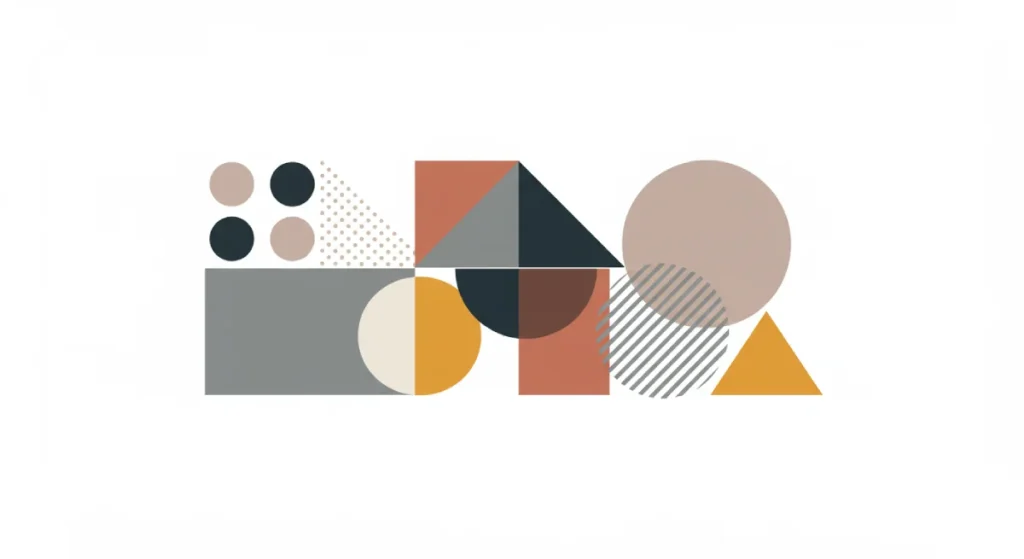
It’s the geometric logo. It’s built on the universal language of shapes and the secret behind many of the world’s most enduring brands. This isn’t about trends. It’s about communication at its most efficient.
- Geometric logos are timeless and avoid the pitfalls of trend-based designs, ensuring longevity and cost savings.
- They promote instant recognition by utilising simple shapes, enhancing memorability and brand recall.
- Versatile across various mediums, geometric logos maintain clarity and effectiveness at any size.
Why Bother with Geometric Logos? Let’s Be Brutally Honest.
Before we look at examples, let’s get straight to the point. Why should a busy entrepreneur even consider this approach? Because it solves real-world business problems.
They’re Timeless (And Won’t Look Dated Next Year)
Trends are the enemy of longevity. Remember the swooshy, 3D, gradient-heavy logos of the early 2000s? They look ancient now. A simple circle, square, or triangle doesn’t age. The Mitsubishi logo has been around since 1870. The Chase logo since 1961. They work today just as they did then. A timeless logo saves you the cost and brand-equity loss of a redesign every five years.
They’re Memorable (Your Brain is Hardwired for Shapes)
Your brain is a pattern-recognition machine. It identifies and remembers simple shapes far more easily than complex illustrations. A child can draw the Target logo. A child can draw the McDonald’s arches. This primal recognition is a huge competitive advantage. Your customers remember you without even trying.
They’re Versatile (From a Billboard to a Favicon)
A great logo must work everywhere. Embroidered on a shirt, printed on a pen, displayed as a tiny 16×16 pixel favicon in a browser tab, or plastered on the side of a building. Complex logos fall apart at small sizes, becoming unreadable smudges. Geometric logos are built for this. They scale effortlessly.
They Communicate Instantly (No Decoder Ring Needed)
This is the big one. Your logo is not a treasure map. Customers shouldn’t have to study it to “get” your hidden meaning. A cross means health. A square implies stability. A circle means community. These associations are subconscious and immediate. A geometric logo does its job in a fraction of a second, communicating a core feeling before the viewer has even processed the company name.
The Basic Toolkit: What Are These Shapes Saying?
Shape psychology isn’t some mystical art. It’s the shared visual language we all understand. Here’s the simple translation.
The Circle: Community, Unity, and Wholeness
Circles have no beginning or end. They suggest inclusion, harmony, and community. They feel friendly, soft, and complete. Think of a group hug, a wedding ring, or the planet Earth. That’s the feeling a circle brings to a brand. It’s welcoming.
The Square: Stability, Order, and Trust
Squares are artificial. They represent structure, reliability, and order. We build with blocks. We trust the foundations of a house. The square feels balanced, professional, and secure. It projects strength and dependability. It’s no surprise that many financial and technology companies use them.
The Triangle: Power, Direction, and Energy
A triangle is dynamic. It points. It suggests movement, power, and hierarchy. Think of an arrow showing the way forward or a mountain peak representing achievement. Triangles can feel aggressive and energetic, making them popular for sports brands or companies focused on innovation and growth.
Lines, Grids, and Crosses: Structure and Connection
Lines create pathways and connections. Horizontal lines feel calm and stable. Vertical lines suggest strength and growth. Grids imply logic, technology, and precision. A cross, one of the most ancient symbols, immediately signals health, help, or integration.
The Gallery: 40 Geometric Logos Deconstructed
Enough theory. The proof is in the execution. Here are 40 examples of big and small brands that use simple shapes to create an outsized impact. This isn’t just a gallery for admiration; it’s a collection of evidence. Observe what they’re doing and why it works.
The Masters of the Circle: Unity and Totality
1. Target
- Shape Focus: Concentric Circles
- The Observation: It’s a bullseye. The most literal and brilliant interpretation of a brand name imaginable. It says “we have what you’re looking for” with zero ambiguity. The circles also create a sense of inclusivity and community. It’s perfect.
2. Starbucks
- Shape Focus: Circle
- The Observation: The modern Starbucks logo is the core of its previous, more complex versions. A siren inside a circle. It feels like a stamp of quality, a classic “roundel” that suggests heritage and a global community of coffee drinkers.
3. Mastercard
- Shape Focus: Interlocking Circles
- The Observation: Two interlocking circles. It’s one of the simplest and most effective marks for a financial company. The red and yellow circles overlapping to create orange in the middle scream “connection,” “partnership,” and “interaction”—the very essence of a transaction.
4. Pepsi
- Shape Focus: Circle
- The Observation: The Pepsi Globe is iconic. The circle’s swirling red, white, and blue gives a sense of dynamic energy and flow within a friendly, accessible shape. It’s been simplified over the decades, proving that stronger brands move towards simpler geometry.
5. Olympics
- Shape Focus: Interlocking Circles
- The Observation: Five interlocking rings represent the five inhabited continents. It’s a direct, powerful symbol of global unity and connection. The use of simple circles makes this message universally and instantly understood.
6. General Electric
- Shape Focus: Circle with Swirls
- The Observation: The cursive GE monogram sits inside a circle adorned with swirling lines that suggest movement, energy, and electricity—the company’s core business. The circle contains this energy, giving it a feeling of control and reliability.
7. Tide
- Shape Focus: Concentric Circles
- The Observation: Another bullseye. Like Target, it’s bold and commands attention on a crowded shelf. The bright colours within the simple, strong circle make it a beacon of cleaning power. You can spot it from ten paces.
8. AT&T
- Shape Focus: Circle (Globe)
- The Observation: The blue lines forming a sphere represent a globe wrapped by electronic signals. Designed by Saul Bass in 1983, it perfectly communicates global connection and telecommunication. The circular shape makes the technology feel accessible and complete.
9. BMW
- Shape Focus: Circle (Roundel)
- The Observation: The “roundel” is a masterclass in heritage. The circle is divided into four quadrants of blue and white (the colours of Bavaria), encased by a black ring. It speaks of precision engineering, balance, and a strong sense of place.
10. Firefox
- Shape Focus: Circle (Globe)
- The Observation: A fox wraps around a simplified blue globe. The overall shape is circular, suggesting global reach and inclusivity. The dynamic animal form provides the energy. It feels both global and nimble.
The Power of the Square: Stability and Structure
11. Microsoft
- Shape Focus: Four Squares (Window)
- The Observation: Four simple coloured squares form a window. It’s a direct nod to their flagship product, Windows. The use of squares communicates stability, structure, and the building-block nature of their software ecosystem.
12. BBC
- Shape Focus: Three Squares
- The Observation: Three solid blocks. It communicates authority, seriousness, and impartiality. There is no flair, no nonsense. It’s a mark of pure information delivery, and its blocky, stable form has conveyed trust for decades.
13. American Express
- Shape Focus: Square
- The Observation: The blue square is instantly recognisable. Often with text reversed out, it acts as a solid container of trust. It feels like a seal of approval or a formal document, perfect for a financial services brand.
14. Chase Bank
- Shape Focus: Abstract Octagon from Squares
- The Observation: A brilliant abstract mark. Four geometric pieces lock together to form an octagon within an implied square. It suggests security, a vault, and different parts to create a secure whole. It’s pure symbolism of trust.
15. The Lego Group
- Shape Focus: Square (with rounded corners)
- The Observation: The wordmark lives inside a bright red, soft-cornered square. It feels fun and accessible, like one of their bricks. The square shape reinforces their product’s “system” and “structure”, while the colour and soft corners make it friendly.
16. Deutsche Bank
- Shape Focus: Square with a Slash
- The Observation: A forward-slash inside a square. It’s called “Growth within a stable framework.” The square provides the security and stability you want from a bank. The slash provides the dynamic sense of growth and return. Genius.
17. Domino’s Pizza
- Shape Focus: Rectangle/Square (Domino)
- The Observation: It’s a literal domino. The three dots originally represented the first three stores. The shape is simple, playful, and directly linked to the name. It’s a brand mark that doesn’t take itself too seriously, yet is built on a solid, stable shape.
18. H&R Block
- Shape Focus: Square
- The Observation: A simple, solid green square. That’s it. It communicates stability, certainty, and a “go” signal (green for money, green for go). This uncomplicated block of solid trust is perfect for a tax preparation company selling peace of mind.
19. GAP (the old one)
- Shape Focus: Square
- The Observation: The classic dark blue square with “GAP” in white is a lesson in strength. It’s solid, confident, and classic. The disastrous 2010 redesign attempt, swapping it for a gradient and a small floating square, showed how much equity was built into that simple, stable shape. They reverted in less than a week.
20. MTV
- Shape Focus: Blocky Square/Rectangle
- The Observation: The big, blocky “M” is a container. The “TV” is scribbled on top. The genius of this geometric mark is that the solid, stable “M” can be filled with any pattern, colour, or video, making it endlessly adaptable and expressive, just like music itself.
The Dynamic Triangle: Direction and Power
21. Adidas
- Shape Focus: Three Stripes / Triangle
- The Observation: Whether it’s the classic three stripes or the trefoil, the modern Adidas logo is three bars forming a mountain. It’s a triangle. It screams “peak performance,” “challenge,” and “achievement.” It’s the perfect shape for a sports brand.
22. Google Drive / Google Play
- Shape Focus: Triangle
- The Observation: Both logos use a triangle to signify “play” or “action.” The Google Drive logo is a Möbius strip-style triangle, representing the continuous syncing of files. The shape says “go,” “start,” and “access.”
23. Mitsubishi
- Shape Focus: Three Triangles (Diamonds)
- The Observation: Three diamonds (rhombuses composed of triangles) come together in the centre. The name “Mitsubishi” translates to “three diamonds.” It’s a direct visual translation of the company name and heritage, conveying precision and quality.
24. Delta Air Lines
- Shape Focus: Triangle (Delta Symbol)
- The Observation: Another literal name translation. The “delta” symbol is a triangle. It also looks like the wing of a jet, suggesting flight, direction, and upward momentum. It’s simple, elegant, and perfectly aligned with the industry.
25. CAT (Caterpillar)
- Shape Focus: Triangle
- The Observation: A simple yellow triangle inside the “A” of CAT. The yellow is the colour of their machinery. Like a pyramid, the triangle subtly cues for strength, power, and stability. It’s a small detail that does a lot of heavy lifting.
26. HSBC
- Shape Focus: Abstract Triangles (Hexagon)
- The Observation: The hexagon mark is made of two red triangles pointing in and two white triangles pointing out. It was derived from the company’s 19th-century house flag. It suggests openness and a two-way relationship, with the powerful red triangles providing a sense of strength and purpose.
27. Toblerone
- Shape Focus: Triangle
- The Observation: The brand identity is built on a triangle. The chocolate is triangular. The box is a triangular prism. The logo features a mountain (the Matterhorn) and a triangle. It’s a complete, consistent use of a single shape to create an unforgettable brand.
28. Doritos
- Shape Focus: Triangle
- The Observation: The product is the logo. The brand name is stylised to fit within the shape of their iconic triangular tortilla chip. It’s a bold, confident move that is impossible to separate from the product itself. The fiery colours add to the “bold” flavour promise.
29. Citgo
- Shape Focus: Triangle
- The Observation: The “Trimark” is a classic piece of mid-century design. Three bold, primary-coloured triangles combine to create a dynamic and highly visible symbol. It feels energetic and optimistic, a perfect beacon for a petroleum company.
30. Reebok (the Delta)
- Shape Focus: Triangle
- The Observation: In 2014, Reebok adopted the Delta symbol. The three sides represent the physical, mental, and social fitness changes. It’s a triangle that aims to communicate a more profound transformation, aiming for the same power as the Adidas mountain.
The Clever Combinations: Grids, Lines, and Negative Space
31. FedEx
- Shape Focus: Negative Space Arrow
- The Observation: The gold standard of negative space. The arrow hidden between the “E” and “x” is formed by the geometric precision of the typography. It perfectly communicates speed, direction, and delivery. It’s a reward for looking closer, but the mark works even if you don’t see it.
32. IBM
- Shape Focus: Lines
- The Observation: The iconic 8-bar logotype designed by Paul Rand uses horizontal lines to convey speed and dynamism. It unifies the three letters into a cohesive block that feels both technological and established.
33. Nike
- Shape Focus: Abstract Shape (Swoosh)
- The Observation: The “Swoosh” is one of the most valuable geometric shapes on the planet. It’s not a standard circle or square, but it’s a simple, fluid shape that perfectly conveys movement, speed, and positive action. It cost $35 in 1971.
34. Amazon
- Shape Focus: Line (Arrow/Smile)
- The Observation: The arrow from “a” to “z” is a simple geometric line with a curve. It brilliantly communicates two things: 1) We sell everything from A to Z. 2) It forms a smile, representing customer satisfaction. Simple, clever, and effective.
35. NBC
- Shape Focus: Abstract Shapes (Peacock)
- The Observation: Six coloured teardrop shapes (modified triangles/circles) come together to form a peacock. Each colour represented a division of the company when it was created. It’s a beautiful, abstract mark where simple shapes combine to create a memorable, meaningful whole.
36. Apple
- Shape Focus: Abstract Shape (Apple)
- The Observation: Based on circles and the golden ratio, the Apple logo is a masterclass in balanced, organic geometry. The bite gives it scale and prevents it from being confused with a cherry. It’s simple, friendly, and a global symbol of innovation.
37. Spotify
- Shape Focus: Circle with Lines
- The Observation: Three curved lines within a circle. It suggests sound waves, streaming, and connection. The mark is clean, modern, and instantly recognisable as belonging to the world of audio.
38. YouTube
- Shape Focus: Rectangle and Triangle
- The Observation: The “Play Button.” It’s a triangle inside a soft rectangle. It is a universal call to action. It’s arguably one of the most clicked icons in the world. Its geometric simplicity is its greatest strength.
39. Airbnb
- Shape Focus: Abstract Shape (The Bélo)
- The Observation: A combination of a heart, a location pin, and the letter “A” for Airbnb. The “Bélo” is a custom geometric shape designed to represent belonging. While the backstory is a bit lofty, the result is simple, unique, and highly scalable.
40. Under Armour
- Shape Focus: Abstract Interlocking Shapes
- The Observation: The interlocking “U” and “A” form a powerful, aggressive mark. It’s symmetrical, sharp, and suggests strength and performance. The geometry is simple, but the combination is unique and energetic.
The Most Common (and Painful) Mistakes to Avoid
Seeing good examples is one thing. Avoiding the traps is another. Entrepreneurs stumble into the same pits over and over.
The “It Looks Too Simple” Fallacy
This is the number one killer of great logo concepts. A client sees a powerful, simple mark and says, “That’s it? I could have done that.” They mistake simplicity for a lack of effort.
True simplicity is complicated. It’s about distilling an idea to its absolute essence. Nike, Target, and Apple logos are revered because they are simple, not despite it. Don’t pay a designer to add clutter; pay them for the clarity to remove it.
Forcing Esoteric Meaning Into a Simple Shape
“The circle represents the unending journey of our customer, and it’s blue because my grandfather’s eyes were blue…” Stop. Just stop.
Your logo’s job is to be recognised and to evoke a basic feeling. A circle feels inclusive. A square feels stable. That’s it. Trying to load it with a dozen secret meanings only you understand is an exercise in ego, not communication.
Picking a Shape Because You “Like It”
Your personal preference is largely irrelevant. The question isn’t “Do you like triangles?” The question is, “Does a triangle communicate the right message—like ‘power’ and ‘direction’—for my specific business and audience?” The logo is a tool for your business, not a piece of art for your living room.
Ignoring Scalability
The logo looks fantastic on your 27-inch monitor. But what about when it’s a tiny icon on a smartphone screen? Or engraved on a pen? Complex logos with fine lines, subtle gradients, or intricate details will become an unrecognisable blob. A geometric logo holds its integrity at almost any size. Always test for this.
So, Is a Geometric Logo Right for Your Business?
It’s not for everyone, but it’s right for more businesses than you’d think. Ask yourself these questions:
- Is clarity and quick recognition a priority for my brand?
- Do I want my brand to feel stable, modern, and timeless?
- Does my brand need to work across various digital and physical media?
- Is my core message simple enough to be represented by a core feeling (e.g., community, strength, growth)?
A geometric approach is likely a powerful fit if you’re nodding along. This doesn’t mean grabbing a shape and typing your name next to it. It means engaging in a process of strategic reduction.
If you’re still unsure how these principles apply to your situation, professional guidance comes in. A designer’s job is to translate your business strategy into a clear visual mark, not just draw pretty pictures. You can see how we approach the process in our logo design services.
A Final Thought. No Fluff.
Shapes are the oldest form of communication we have. They predate written language.
A well-designed geometric logo taps into this ancient, hardwired understanding. It bypasses the brain’s analytical part and instantly communicates a feeling. It’s not about decoration. It’s about ruthless efficiency.
Your brand is what you do. Your logo is the shortcut that helps people remember you. Don’t clutter the shortcut.
If you’re ready to build a mark that works, let’s talk. Request a quote and we’ll give you a straight assessment.
FAQs
What makes a geometric logo “good” or “bad”?
A good geometric logo is simple, memorable, relevant to its industry, and versatile across all sizes. A bad one is generic (a random shape with no thought), overly complex, or uses a shape that sends the wrong psychological message (e.g., a playful circle for a serious law firm).
Aren’t geometric logos too generic and straightforward?
They can be if done poorly. The genius is in the execution. The Chase Bank logo is just squares, but they are arranged in a unique, memorable way. The key is to use simple shapes to build a distinctive, ownable mark.
What is the psychology of logo shapes?
It’s the subconscious emotional and cultural associations we have with basic shapes. Circles often feel communal and friendly, squares feel stable and trustworthy, and triangles feel dynamic and powerful.
Can I use a logo generator to create a geometric logo?
You can, but you’ll likely get a generic result. A generator can spit out shapes, but can’t understand your business strategy, audience, or what makes your brand unique. The result is often a logo that looks like a dozen others.
What industries are best suited for geometric logos?
Tech, finance, and industrial companies often use squares and triangles for stability and precision. Social brands, non-profits, and service industries often use circles for their sense of community. However, any industry can use them effectively with the right creative strategy.
How much does a professional geometric logo design cost?
Costs vary wildly based on the designer’s experience and the project’s scope. It can range from a few hundred pounds for a junior freelancer to many thousands for a full branding agency. The price reflects the strategic thinking, research, and refinement process, not just the drawing.
Does the colour of a geometric logo matter?
Absolutely. Colour adds another layer of psychological meaning. A logo should, however, work perfectly in a single colour (black or white). This ensures it’s versatile. Colour is an enhancement, not a crutch.
What is a “negative space” geometric logo?
This is a clever technique where the space in or around the main shapes forms another image or symbol, like the arrow in the FedEx logo. It adds a layer of depth and discovery.
How is a geometric logo different from an abstract logo?
They often overlap. A geometric logo is built from clear, defined shapes like circles and squares. An abstract logo is a non-representational symbol. The Chase logo is both geometric and abstract. The Nike swoosh is abstract but not strictly geometric in the traditional sense.
What’s the first step to getting a geometric logo designed?
Start with strategy, not drawing. Clearly define your brand’s core message, target audience, and key competitors. A good designer will start here before a single shape is ever drawn.


