
Best Colours for Logos: How Colour Psychology Impacts Branding
Most brands lose customers before they even say a word. Why? Because their logo colour is screaming the wrong message.
Do you think colour is just an aesthetic choice? Think again. Colour is psychology. It triggers emotions, drives decisions, and determines whether someone trusts your brand—or runs in the other direction.
Studies show that up to 90% of snap judgments about a brand are based on colour alone. That means your logo’s colour could make or break your business before you can prove yourself.
In this article, we’re breaking down the science of colour psychology in branding—which colours attract, which repel, and how to choose the perfect palette to make your brand unforgettable.
If you’re serious about building a brand people trust, remember that the right colour isn’t just a choice—it’s a strategy. Let’s dive in.
- Logo colour significantly impacts brand perception and customer trust, as it influences emotions and decision-making.
- Different colours evoke distinct associations, making it essential to choose hues that reflect your brand's identity.
- Testing colour choices with target audiences ensures effective branding by preventing cultural misinterpretations and enhancing recognition.
The Crucial Role of Colour in Logos
Before delving into colour meanings and psychology, it's essential to understand why colour even matters in a logo. Here are some key reasons colour is crucial for branding:
- Brand Recognition: Colour activates parts of the brain that process recognition and memories. According to research, using consistent, distinct colours improves brand recall by 80%.
- Grabs Attention: Colourful logos stand out. Unique colour combinations capture interest better than plain black-and-white logos.
- Conveys Meaning: Different colours communicate different messages and associations to viewers. Leveraging appropriate colour meanings reinforces what your brand stands for.
- Targets Demographics: Colours appeal to different genders, ages, cultures, and target markets. Using colours favoured by your audience helps attract them.
- Communicates Emotions: Colours trigger psychological and emotional responses in people. Brands can leverage this to convey the right sentiment.
As you can see, colour is much more than just aesthetics regarding logos. It plays a significant role in branding and recognition.
By considering colour psychology and symbolism, you can strategically reinforce your brand identity through your logo.
The Psychological Impact of Colours on Purchasing Decisions
Colours don't just make things look good—they make people feel something. And that feeling drives buying decisions. Research proves it: packaging colour alone can make or break product preference.
Why?
Different colours trigger different emotions, shaping consumers' perceptions of quality, trust, and value. Innovative brands don't just pick colours—they engineer them for influence.
Take red—it's not random that fast-food chains and clearance sales love it. Red creates urgency, fuels excitement, and speeds up decision-making. It's why your heart races a little when you see a big red “SALE” sign.
Blue? That's the trust colour. Banks, insurance companies, and tech giants use it to exude security and reliability. When money's involved, you don't want excitement—you want confidence.
Colours do more than evoke emotions; they define context. Earthy tones? Perfect for eco-friendly brands—because brown and green scream “natural” and “sustainable.” Studies show that consumers expect green-branded products to be environmentally conscious. That's not an accident—it's psychology in action.
And then there's yellow—the attention magnet. Optimistic, high-energy, and impossible to ignore. It's why call-to-action buttons, taxis, and caution signs use it. It makes people act.
Bottom line? Brands that understand colour psychology don't just attract attention—they control perception. And perception? That's what sells.
Cultural Context: Colour Associations and Meanings
Before deciding on the best colours for logos, it's essential to understand cultural contexts and consider potential audiences. The same colours can evoke different associations and emotional responses across cultures and demographics.
Here are some of the most common colour meanings to be aware of:
Red
- Passion: Red is often associated with love, energy, and intensity. It can evoke strong emotions and desires, making it a powerful choice for brands that convey enthusiasm and excitement.
- Love and Romance: Red is closely linked to love, romance, and affection. It symbolises warmth and closeness, making it a popular choice for fashion, beauty, and hospitality brands, particularly around Valentine's Day or for businesses targeting couples.
- Boldness and Power: Red is a bold and attention-grabbing colour. It exudes confidence, power, and assertiveness, making it an ideal choice for brands that want to make a solid and memorable impression.
- Action and Energy: Red is often associated with action, movement, and dynamism. It can convey a sense of urgency and excitement, making it a suitable choice for brands in industries such as sports, entertainment, and fitness.
- Attention and Visibility: Red is one of the most visible colours against most backgrounds. It commands attention and can be used strategically to draw focus to specific elements of a logo or brand identity.
- Youthfulness and Vitality: Red is often perceived as youthful and vibrant. It can convey a sense of energy, vitality, and liveliness, making it a popular choice for brands targeting younger demographics or those promoting innovative products or services.
- Warning and Danger: In some contexts, red is associated with warning signs and danger. It can symbolise caution, alertness, and potential hazards, making it a suitable choice for brands in industries such as healthcare, safety, and security.
- Excitement and Celebration: Red is often linked to celebrations, festivities, and joyous occasions. It can evoke a sense of excitement and anticipation, making it a fitting choice for events, parties, and entertainment brands.
- Stimulation and Appetite: Red stimulates the appetite and is commonly used in the food and beverage industry. It can evoke feelings of hunger and indulgence, making it a popular choice for restaurants, cafes, and food-related brands.
- Tradition and Prestige: In specific contexts, red is associated with tradition, heritage, and prestige. It can convey a sense of timelessness and elegance, making it a suitable choice for luxury brands or those with a rich history and legacy.
Orange
- Vitality and Energy: Orange is often associated with energy, vitality, and enthusiasm. It can be used to inject a sense of excitement and dynamism into a brand.
- Creativity and Innovation: Orange is a stimulating colour that can spark creativity and innovation. Brands portraying themselves as forward-thinking or cutting-edge might incorporate orange into their logos.
- Friendliness and Approachability: Orange can convey a sense of warmth, friendliness, and approachability. It can be particularly effective for brands that create a welcoming and inclusive image.
- Youthfulness and Playfulness: The vibrant and youthful nature of orange makes it suitable for brands targeting a younger demographic or those looking to add a playful element to their identity.
- Optimism and Positivity: Orange is often associated with optimism and positivity, making it an excellent choice for brands that want to convey a sense of hope and positivity to their audience.
- Attention-grabbing: As a highly noticeable colour, orange can grab attention and stand out in a crowded marketplace. Brands looking to make a bold statement or differentiate themselves from competitors may opt for orange in their branding.
- Adventure and Exploration: Orange is often associated with adventure, exploration, and the outdoors. Brands related to travel, outdoor activities, or adventurous pursuits can leverage orange to evoke a sense of excitement and exploration.
- Warmth and Comfort: Orange can evoke feelings of warmth and comfort, similar to the glow of a sunset or a cosy fire. Brands in hospitality, food, or home goods may use orange to create a sense of comfort and homeliness.
- Caution and Safety: In some contexts, orange is associated with caution and safety, such as traffic cones and safety vests. Brands in industries related to safety equipment, construction, or emergency services might use orange to convey a sense of reliability and protection.
- Balance and Harmony: Orange combines the energy of red and the joy of yellow, symbolising a balance between the two. Brands seeking to convey harmony, balance, and a holistic approach may find orange a suitable choice.
Yellow
- Happiness and Optimism: Yellow is often associated with happiness, joy, and optimism. Brands that want to convey a positive and uplifting message may choose yellow in their logos to evoke these emotions.
- Warmth and Sunshine: Yellow is reminiscent of sunshine and warmth. It can evoke feelings of comfort, energy, and brightness, making it a popular choice for hospitality, food, and wellness brands.
- Creativity and Innovation: Yellow is also linked to creativity and innovation. Brands that want to showcase their inventive and forward-thinking nature may incorporate yellow into their logos to communicate these qualities.
- Attention-Grabbing and Visibility: Yellow is prominent and attention-grabbing, making it a practical choice for attracting attention and standing out from competitors. Brands that want to make a bold statement or draw focus to their products or services often use yellow strategically in their logos.
- Youthfulness and Playfulness: Yellow is often associated with youthfulness, playfulness, and a carefree attitude. Brands targeting a younger demographic or those wanting to convey a sense of fun and vibrancy may opt for yellow in their branding.
- Caution and Warning: Yellow is typically associated with positive emotions but can also symbolise caution or warning in specific contexts. For example, yellow is commonly used in traffic signs and caution tape to indicate potential hazards.
- Clarity and Communication: Yellow can represent clarity and communication. It's often used in design to highlight important information or to make text and graphics more readable.
- Freshness and Energy: Yellow can evoke freshness, vitality, and energy. Brands in industries like health, fitness, and food often use yellow to convey a sense of revitalisation and well-being.
- Friendliness and Approachability: Yellow is perceived as a friendly and approachable colour. Brands aiming to create a welcoming and inviting atmosphere may incorporate yellow into their branding to make customers feel comfortable and at ease.
- Harmony and Balance: Yellow can also symbolise harmony and balance, particularly when paired with other colours like green or blue. Brands promoting sustainability, eco-friendliness, or holistic wellness may utilise yellow to convey these values.
Green
- Nature and Environment: Green is often associated with nature, representing concepts such as growth, vitality, and renewal. It can evoke feelings of freshness, harmony, and balance. Brands focusing on sustainability, eco-friendliness, or outdoor activities often use shades of green in their logos to convey these values.
- Health and Wellness: Green is also associated with health and wellness, particularly with organic products, healthy living, and holistic practices. Health, fitness, and organic food brands use green to symbolise vitality, well-being, and natural remedies.
- Money and Prosperity: Due to its association with paper currency, green is often linked to wealth, prosperity, and financial success. Banks, finance, and investment brands commonly use green to convey stability, reliability, and growth potential.
- Safety and Reliability: Green can also evoke feelings of safety and reliability, reminiscent of traffic lights signalling “go” or emergency exit signs. Brands in the transportation, security, and technology industries may incorporate green elements to instil trust and confidence in their services.
- Freshness and Cleanliness: Lighter shades of green are often associated with freshness and cleanliness, making them suitable for brands in the cleaning, hygiene, and personal care industries. These shades convey a sense of purity, renewal, and revitalisation.
- Youthfulness and Innovation: Brighter, more vibrant greens can evoke feelings of energy, youthfulness, and innovation. Tech startups, creative agencies, and brands targeting younger demographics may opt for these shades to communicate a sense of innovation, progress, and forward-thinking.
- Calmness and Tranquility: Certain shades of green, notably muted or pastel tones, are associated with serenity, tranquillity, and relaxation. Spa, wellness, and hospitality brands often use these shades to create a serene and peaceful atmosphere, promoting relaxation and rejuvenation.
- Cultural and Symbolic Meanings: Green may hold different symbolic meanings in various cultures. For example, in Western cultures, it's associated with luck (think of a four-leaf clover), while in some Eastern cultures, it symbolises fertility or growth. Brands targeting specific cultural demographics may consider these associations when using green branding.
Blue
- Trustworthiness: Blue is often associated with trust, reliability, and dependability. Brands that want to convey stability and credibility often use shades of blue in their logos.
- Professionalism: Blue is commonly used in corporate branding to convey professionalism and competence. It suggests a sense of authority and expertise.
- Serenity: Lighter shades of blue evoke calmness, tranquillity, and peace. Brands in industries like healthcare, wellness, and relaxation often use these hues to create a soothing atmosphere.
- Confidence: Blue is also linked to confidence and competence. It can instil a sense of assurance and self-assuredness in consumers.
- Communication: Blue is associated with clear communication and clarity of thought. Technology, telecommunications, and education brands often utilise blue to convey effective communication and understanding.
- Loyalty: Blue is frequently associated with loyalty and fidelity. Brands seeking to build long-lasting relationships with their customers may use blue to evoke feelings of trust and loyalty.
- Authority: Darker shades of blue, such as navy blue, are often associated with authority, tradition, and professionalism. They can lend a sense of seriousness and gravitas to a brand's identity.
- Dependability: Blue is also linked to dependability and reliability. Brands that want to reassure customers of their consistency and stability may choose blue as a primary or accent colour in their logos.
- Intelligence: Blue is often associated with intelligence and logic. It can be used by finance, consulting, and technology brands to convey expertise and problem-solving capabilities.
- Harmony: Blue is a harmonious colour that works well with many other hues. It can be used as a versatile base colour in branding, complementing different colours and creating a balanced visual identity.
Purple
- Royalty and Luxury: Purple has historically been associated with royalty, nobility, and luxury. It can evoke a sense of sophistication, elegance, and luxury. Brands that want to convey exclusivity and high quality often use shades of purple in their logos and branding.
- Creativity and Imagination: Purple is often linked to creativity, imagination, and artistic expression. It can appeal to brands in the creative industries such as design, art, fashion, and entertainment. Companies that emphasise innovation and originality may incorporate purple into their branding to reflect these values.
- Spirituality and Mysticism: Purple has spiritual connotations, often associated with meditation, mindfulness, and introspection. It can evoke a sense of mysticism, spirituality, and inner peace. Brands related to wellness, holistic living, yoga, and alternative therapies might choose purple to convey a sense of tranquillity and balance.
- Femininity and Sensuality: In specific contexts, shades of purple can be associated with femininity, romance, and sensuality. Brands targeting female audiences or those promoting products and services related to beauty, romance, or self-care may find purple a suitable colour choice.
- Youthfulness and Fun: Brighter shades of purple, such as lavender or lilac, can exude a playful and youthful energy. Brands aimed at younger demographics or those seeking to convey a sense of whimsy and fun may opt for these lighter hues of purple in their branding.
- Uniqueness and Individuality: Purple is less commonly used than other primary colours, making it a distinctive choice for brands aiming to stand out. It can symbolise uniqueness, individuality, and non-conformity, appealing to audiences who value originality and self-expression.
- Mystery and Intrigue: Purple can evoke a sense of mystery, intrigue, and allure. Brands that want to create a sense of curiosity or captivate their audience's imagination may incorporate shades of purple into their branding to add a touch of enigma and fascination.
- Technology and Innovation: In the tech industry, purple is often associated with innovation, creativity, and futuristic concepts. Brands related to technology, software, and digital services may use purple to convey a forward-thinking and cutting-edge image.
Black
- Elegance: Black is often associated with sophistication and luxury. Using black in a logo can convey a sense of high-end quality and exclusivity, making it suitable for fashion, jewellery, or premium services brands.
- Authority: Black is a powerful and authoritative colour. Brands incorporating black into their logos can communicate a sense of authority, strength, and leadership, making it suitable for corporate entities, professional services, and tech companies.
- Timelessness: Black is a timeless colour that never goes out of style. Brands that use black in their logos can convey a sense of longevity, tradition, and reliability, making it suitable for heritage brands or those aiming for a classic and enduring image.
- Mystery: Black has an air of mystery and intrigue. It can evoke a sense of the unknown, sophistication, and exclusivity, making it suitable for brands that want to convey a sense of enigma or allure, such as luxury perfumes or high-end nightclubs.
- Simplicity: Black is versatile and can complement other colours and design elements. Brands that use black in their logos often convey a sense of simplicity, minimalism, and sophistication, making it suitable for modern and sleek brands in industries such as technology, architecture, or design.
- Contrast: Black can create a solid visual contrast with lighter colours. Brands that use black in their logos can leverage this contrast to create emphasis, draw attention, and make their brand identity stand out, particularly in crowded or competitive markets.
- Professionalism: Black is often associated with formality and professionalism. Brands incorporating black into their logos can convey a sense of seriousness, professionalism, and reliability, making it suitable for corporate brands, law firms, or financial institutions.
- Dramatic Effect: Black can add drama and impact to a logo design. Brands that use black in their logos can create a bold statement, evoke emotions, and leave a memorable impression on their audience, making it suitable for entertainment, nightlife, or creative industries.
White
- Purity: White is often associated with purity and cleanliness. Brands in industries like healthcare, hygiene products, and organic/natural foods may use white to convey a sense of purity and cleanliness.
- Simplicity: White can signify simplicity and minimalism. Brands that aim to communicate simplicity, elegance, and sophistication may use white as a primary colour in their logo and branding.
- Modernity: White is frequently used in modern and contemporary designs. Tech companies, startups, and innovative brands often utilise white to convey a sense of modernity, innovation, and forward-thinking.
- Sophistication: White can evoke a feeling of sophistication and luxury when used in the proper context. High-end fashion brands, luxury goods, and premium services may incorporate white into their branding to convey an air of exclusivity and sophistication.
- Clarity: White is associated with clarity and precision. Brands in industries such as technology, consulting, and education may use white to communicate clarity of purpose, expertise, and professionalism.
- Serenity: White is often linked with feelings of peace and tranquillity. Brands in wellness, spa, and relaxation industries may incorporate white into their branding to evoke a sense of calmness and serenity.
- Versatility: White is highly versatile and can be paired with almost any other colour, making it a popular choice for brands that want flexibility in their branding. It can serve as a neutral backdrop or accent colour, allowing other brand elements to stand out.
- Cleanliness: White is synonymous with cleanliness and sterility, making it a suitable choice for brands in the cleaning, hospitality, and healthcare industries. It can communicate a commitment to cleanliness, safety, and hygiene.
- Timelessness: White is a timeless colour that transcends trends and fads. Brands looking to establish a timeless and enduring identity may opt for white in their logo and branding to ensure longevity and relevance.
- Innocence: White is often associated with innocence and simplicity, making it suitable for brands targeting children or promoting child-like qualities such as creativity and imagination.
Keep these common associations in mind. But also remember that colour meanings vary across cultures and contexts:
- Red = happiness in China, danger in Nigeria
- Green = death in Japan, health in Western cultures
- Purple = mourning in Thailand, royalty in Europe
- White = death & funerals in East Asia, purity in USA and Europe
You must know your target audiences and locales to pick the best colours. Testing colours with cultural advisors or focus groups can prevent messaging mishaps.
Targeting Demographics: Age, Gender, and Preferences
Beyond cultural meanings, certain colours also appeal more to specific demographics. Clever use of demographic targeting can help you catch the eye of your target buyer personas.
Here are some key considerations when targeting different age and gender groups:
Gender Preferences
Men tend to prefer:
- Blue, black, grey
- Muted, darker shades
Women often gravitate towards:
- Purple, pink, red
- Bright, saturated hues
- More colour variety
That said, leaning too heavily into gender stereotypes with colour risks alienating portions of your audience. Tread carefully.
Age-Related Preferences
Younger groups like Millennials and Gen Z enjoy vibrant pops of colour and tend to be more experimental. They're receptive to brighter hues like:
- Lime green
- Bright red
- Neon blue
Middle-age groups often prefer slightly more muted but still impactful colours like:
- Bright purple
- Rich teal
- Vibrant orange
Mature audiences over 55 may respond better to reliable, traditional colours like:
- Navy blue
- Forest green
- Deep red
Consider your target generation's preferences during the design process.
Industry Colour Trends in Logos
Some colours have become widely adopted by specific industries over time. Leveraging industry colour norms can help communicate what your company does at a glance.
Here are examples of well-established industry colour trends:
| Industry | Primary Colours Used | Psychological Associations | Examples |
|---|---|---|---|
| Technology | Blue, Black, White | Trust, professionalism, innovation | Dell, IBM, Intel, Apple |
| Finance & Banking | Blue, Green, Black | Stability, wealth, security | Barclays, HSBC, PayPal, Mastercard |
| Healthcare | Blue, Green, White | Calmness, trust, cleanliness | NHS, Pfizer, Johnson & Johnson |
| Retail & E-commerce | Red, Orange, Yellow | Excitement, urgency, affordability | Amazon, eBay, Target, Tesco |
| Food & Beverage | Red, Yellow, Green | Appetite stimulation, freshness, friendliness | McDonald's, Starbucks, Coca-Cola |
| Luxury & Fashion | Black, Gold, White | Elegance, exclusivity, sophistication | Chanel, Gucci, Rolex |
| Automotive | Black, Silver, Red | Power, speed, prestige | Mercedes, Ferrari, Ford |
| Sports & Fitness | Red, Black, Blue | Energy, power, competitiveness | Nike, Adidas, Under Armour |
| Media & Entertainment | Purple, Red, Black | Creativity, passion, excitement | Netflix, Disney, Warner Bros. |
| Travel & Hospitality | Blue, Green, Gold | Relaxation, adventure, premium service | Hilton, Airbnb, Expedia |
| Education | Blue, Green, Gold | Knowledge, growth, prestige | Harvard, Oxford, Coursera |
| Real Estate | Blue, Green, Grey | Trust, security, professionalism | Keller Williams, RE/MAX, Zillow |
| Environmental & Sustainability | Green, Blue, Earth Tones | Nature, eco-friendliness, balance | Greenpeace, Whole Foods, Tesla |
While you don't need to default to cliches, recognising industry norms can help inform your colour choices. A dash of colours outside the industry standard also enables you to stand out while still signalling your field.
Case Studies of Successful Logo Colour Use
Take Coca-Cola. That red? It's not just bright—it's engineered to burn into your memory. Red triggers urgency, excitement, and passion. It's why stop signs are red. It's why clearance sales use red. Coca-Cola wants to own that mental real estate—and it does.
Then there's Tiffany & Co. That exclusive blue? It's not a colour—it's a flex. It screams luxury, sophistication, and exclusivity. You don't just buy jewellery; you purchase status. That colour alone raises perceived value before you even open the box.
FedEx? Purple and orange. Contrast. Visibility. Movement. It's a masterclass in standing out while signalling trust and speed when your business depends on logistics, being memorable in a split-second matter.
Starbucks? Green. Not by accident. Green = fresh, natural, sustainable. You're not just grabbing a coffee but making an ethical choice. It's psychological framing at its finest.
And McDonald's? Red and yellow—scientifically proven to trigger hunger and fast decisions. Red sparks appetite. Yellow says, “Friendly, easy, quick.” It's why kids love it. It's why you pull in without thinking.
The takeaway? Colour isn't decoration—it's a shortcut to influence. Get it right, and your brand doesn't just stand out; it owns a piece of your audience's mind.
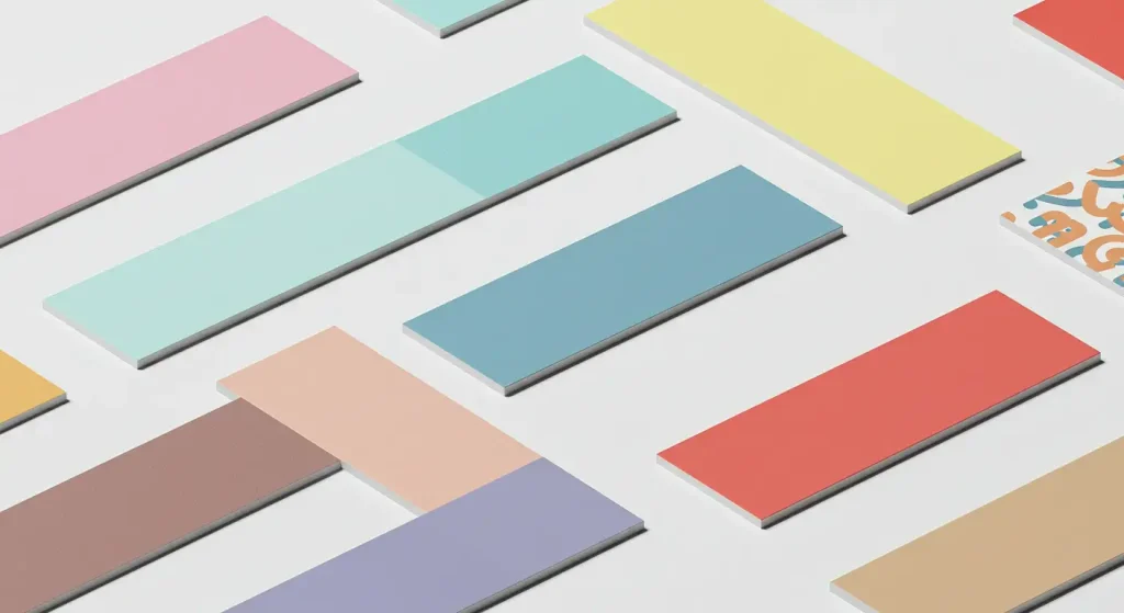
Choosing Multiple Colours and Palettes
Most logos feature multiple colours, whether combining shades of one hue or selecting complementary colours from across the spectrum.
There are a few key considerations when putting together multi-colour palettes:
Table of Colour Harmony Principles
| Principle | Description | Example Colour Combinations |
|---|---|---|
| Complementary | Uses colours opposite each other on the colour wheel, creating high contrast and vibrancy. | Blue & Orange, Red & Green, Yellow & Purple |
| Analogous | Uses colours that are next to each other on the colour wheel, creating a harmonious and cohesive look. | Blue, Blue-Green, Green |
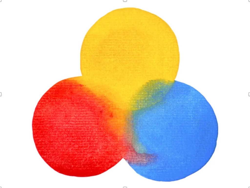
| Triadic | Uses three colours evenly spaced around the colour wheel, offering a balanced yet dynamic effect. | Red, Yellow, Blue |
| Split-Complementary | A variation of complementary, using a base colour and two adjacent to its complement for contrast with less tension. | Blue, Yellow-Orange, Red-Orange |
| Tetradic (Double Complementary) | Uses two complementary colour pairs, creating a rich yet balanced scheme. | Blue & Orange + Red & Green |
| Monochromatic | Uses different shades, tints, and tones of a single colour, creating a subtle, elegant harmony. | Light Blue, Sky Blue, Navy Blue |
These combinations create aesthetic harmony. But it would help if you still accounted for symbolism and audience appeal.
Choose Colours with Purpose
Don't just throw darts at a colour wheel. Think about how each hue contributes to your brand identity and what psychological responses you want to provoke.
For example, a bold red paired with a reliable navy blue conveys excitement, stability, and trust.
Find an underutilised colour niche in your industry to stand out while still signalling your field. A pink-accented technology logo offers a warm, approachable feel compared to the typical clinical blue.
Accessible Colour Combos
Certain colour pairings are difficult for colour-blind viewers to distinguish. Smart colour choices ensure accessibility for this 10% of people:
- Green & Red/Brown
- Green & Blue
- Light Green & Yellow
- Blue & Purple
- Green & Grey
- Red & Black
Running manual checks, tools, and focus groups helps avoid excluding audience members.
By considering these factors holistically, you can develop a cohesive, strategic brand colour palette.
Importance of Colour Testing in Branding
Colour testing plays a significant role in successful branding. This process ensures that colours resonate with target audiences across various media contexts.
Techniques like A/B testing provide insights by showcasing different schemes to consumer segments and gauging their preferences and emotional responses.
Testing helps brands avoid cultural misinterpretations, ensuring the colours chosen are universally understood and recall positive attributes.
Conducting these tests across digital platforms and physical products ensures visual consistency and clarity, reinforcing brand recognition and reliability. When executed effectively, colour testing can significantly increase brand engagement and loyalty.
The process of colour testing often involves a series of steps, including initial brainstorming, developing multiple prototypes, and gathering feedback through consumer surveys.
This approach helps uncover latent consumer biases and preferences.
Testing should encompass various mediums, from digital screens to physical prints, as colours can appear differently across formats.
Testing also involves evaluating competitors, ensuring your brand stands out and elicits intended emotional responses from the audience.
This thorough process ensures that each colour used is not arbitrary but purposefully selected to enhance brand messaging and consumer reception.
Colour and Typography
Colours don't exist in isolation. To maximise colour psychology benefits, you must consider how hues interact with other logo elements like typography.
Follow these best practices when coordinating colours and typefaces:
Aim for Contrast
Pick colours that contrast nicely with your font style to maximise legibility. Darker colours pair better with thin, delicate fonts, while bold colours suit thick, chunky fonts.
Match Tone and Style
Your colour palette and typography should align visually. Formal navy blue fits better with traditional serif text, while playful, bubbly fonts match vibrant pops of colour.
Be Mindful of Vibrancy
Don't let loud colours overwhelm delicate, thin fonts, especially at smaller sizes. Mute colours slightly to keep the focus on light typography.
Consider Potential Backgrounds
Test logo colours and fonts on intended backgrounds like white web pages, packaging, and merchandise. Ensure enough contrast for the logo to pop clearly.
Steer Clear of Red & Green Pairings
Specific colour-deficient viewers struggle to distinguish between red and green. Unless these hues are very light/muted, avoid combining them in ways that affect legibility.
Paying attention to these factors ensures your logo colours and typography unify to support brand recognition and readability.
Legal Considerations of Colour in Branding
Colours in branding bring unique legal challenges and opportunities. Trademark law allows companies to legally protect specific colours as part of their identity if the colour has achieved a distinctive association with that brand.
A prominent example includes the rights over Tiffany Blue, which was protected as a trademark due to its notable character.
A particular shade of red is exclusively part of the Louboutin brand, famously used on their sole designs, securing its unique market presence.
Businesses looking to trademark colours must demonstrate their direct association and that the colour is an identifier for their product or service. Navigating these legal waters ensures brands maintain exclusive rights, supporting their differentiation in the marketplace.
Trademarking a colour involves demonstrating its acquired distinctiveness. Owens-Corning, for instance, holds a trademark for its pink fibreglass insulation, which distinguishes it in the building materials market.
Securing such rights isn't straightforward, with legal precedents indicating that proving a colour's identity can be complex, often requiring substantial evidence of exclusive use and public recognition.
To succeed, companies must show that consumers directly associate the colour with their brand, ensuring it does not serve a functional or generic purpose within the industry.
This legal vigilance protects a brand’s visual identity, preventing others from unfairly capitalising on a similar colour.
Pros and Cons of a Multi-Colour Logo
While a single colour keeps things simple, utilising multiple tones allows transmitting more complex ideas. But just because you can incorporate many colours, should you?
The Benefits of a Multi-Colour Logo
Vibrant logos feel fun, contemporary and innovative. Advantages include:
- Conveys brand's personality
- Communicates diverse messages
- Fits creative business identities
- Appealing and eye-catching
The Downsides of Multi-Colour Logos
Potential pitfalls involve:
- More production effort across contexts
- Can overwhelm viewers
- It looks busy scaled down
- Registration issues if intricate
To leverage colour for maximal impact while overcoming downsides, use rich tones minimally like accents. Famous brands that are executing this well include Target, NBC, and Google.
Key Statistics on Colour and Branding
Still not convinced that colour psychology matters for logos? Here is a snapshot of statistics that demonstrate the concrete impact of colour on brands:
- 80% higher brand recognition when using colour over black and white
- 90% of decision-making is influenced by colour psychology
- Up to 62-90% of brand judgements are based on colours alone
- Participants are willing to pay 16% more for products shown in appropriate colours
- 38% of brands have changed logo colours, searching for a more positive response
- Participants are 30% more likely to share social posts with vibrant colour images
The evidence clearly shows that colour has a sizeable influence on branding perceptions, engagement, and spending. Capitalising on the psychological power of colour is a valuable way to reinforce your desired brand identity.
Top 10 Best Colours for Logos By Industry
Still struggling with narrowing down your logo colour options? Here is a run-down of the ten best colours for logos by popular industries:
| Color | Percentage of Brands |
|---|---|
| Blue | 33% |
| Black | 27% |
| Red | 13% |
| Yellow | 9% |
| Green | 8% |
| Gray | 5% |
| Orange | 3% |
| Purple | 2% |
| Pink | 1% |
| White | 1% |
These percentages are approximate and can vary based on different sources and industries. However, they give a general idea of the prevalence of each colour in logo design.
Technology Logo Colours
- Dark Blue: Reliable, competent, advanced
- Light Blue: Calm, thoughtful, intuitive
- Silver: Sleek, innovative, premium
- Black: Powerful, sophisticated
- Grey: Structured, practical, stable
Food & Beverage Logo Colours
- Red: Energised, appetising, urgent
- Orange: Friendly, hungry, lively
- Yellow: Joy, warmth, positive
- Green: Natural, healthy, organic
- Brown: Genuine, comforting, tasty
Fashion/Beauty Logo Colours
- Pink: Playful, feminine, sweet
- Purple: Luxurious, creative, mystical
- Black: Credible, elegant, empowered
- White: Pure, clean, innocence
- Gold: Extravagant, glowing
Finance Logo Colours
- Blue: Secure, stable, trustworthy
- Green: Growth, wealth, investing
- Grey: Practical, composed
- Gold/Silver: Valuable, outstanding
As you can see, industry norms emerge but with plenty of room for creativity. Use this as inspiration while adding your twist.
Colour Trends for the Upcoming Year

For 2025, emerging colour trends reflect innovation and nostalgia, balancing calmness with vibrancy.
As digital interfaces expand, gentle hues like soft green and pastel pinks emerge, promoting comfort and trust in high-stress environments. This echoes a broader societal desire for calm and sustainability amid rapid technological changes.
In contrast, bright, bold shades like electric blue are harnessed in tech branding to signal cutting-edge advancements, capturing attention in competitive markets.
Both ends of the spectrum show how brands increasingly align colour choices with consumer optimism and forward-looking outlooks, driving engagement through colour trends that tap into collective emotional responses.
By tapping into these directional shifts in aesthetics and consumer sentiment, brands can stay relevant and resonate with changing audience needs. These choices align with consumer fashion and design preferences and underline their brand's innovative essence.
Neon and iridescent colours will appeal to younger demographics, aligning with digital advancements and social media trends. These bold choices satisfy the thirst for novelty and modernity, acting as visual expressions of digital culture and fast-paced lifestyles.
Conversely, shades like muted terracotta and gentle peach are forging connections with authenticity and warmth, ideal for brands aiming to project traditional yet refreshed values.
The juxtaposition of these trends mirrors the varied demands of consumers seeking both innovation and genuine human experience, thus catering to the full spectrum of contemporary desires.
Brands can harness these trends to strengthen their connection with the audience by aligning their visuals with prevailing cultural dynamics and consumer aspirations.
Key Takeaways and Next Steps
We've covered much ground on the art and science behind strategic colour selection for logos. Here are the key learnings to guide your logo redesign:
- Research cultural colour associations for your target regions and audiences.
- Analyse demographic preferences to catch your buyer personas' eyes.
- Recognise industry colour trends, then inject creativity with unique twists.
- Use colour combinations informed by harmony principles and your brand identity.
- Ensure colours complement typography choices for maximum legibility.
- Validate colours work as intended through testing and feedback.
With consideration for symbolism, science, and target markets, you can develop an iconic logo colour palette that makes your brand instantly recognisable while conveying deeper meaning.
Now that you grasp the theory, it's time to start experimenting with colour combinations and collecting feedback. Let colour psychology ignite meaningful connections with your audience.
Frequently Asked Questions
Still, I have some burning questions about colours and logo design. Here are answers to a few common FAQs:
Should I use multiple colours or just one?
Using three colours is the ideal balance for versatility and recognition. Single colours risk blending in, but 4+ colours compete for attention. You can build versatile recognition with a primary colour and 1-2 secondary hues.
How many logo versions will I need?
At a minimum, you should have a horizontal logo, stacked logo, black logo, and white logo. Expand this for contexts like icon logos, merchandise, stationery, etc.
Can I ever change my logo colours later on?
You can adjust logo colours later, but consistency is best for building recognition. Only recolour with careful testing and when reinventing your brand identity.
Should my colours match the meaning of my company name?
Sometimes – it depends. Playful names like Blueberry Consultants can suit colour matches. But the priority should be reinforcing your core brand identity.
Can I survey people to pick colours?
Market research with focus groups and surveys can provide helpful directional guidance. However, balancing feedback with strategy and symbolism around your brand would be best. Go beyond aesthetic preference alone during decision-making.
Conclusion and Final Tips
Crafting recognisable, unique, and meaningful logo colour palettes relies on understanding target markets, colour psychology, industry norms, and your brand identity.
While the process takes effort and iteration, clever leveraging of colour symbolism helps logos convey more in a single glance. This develops instant familiarity and positive brand impressions that foster loyalty and advocacy.
As a final tip, observe competitors but dare to stand apart. See white space in industry trends, then make bold, strategic colour moves others shy away from. Lean on research to support risk while injecting that extra touch of creativity.
Soon, you'll have a polished colour palette ready to carry your brand to new, recognisable heights. So take the plunge and discover the psychology and science powering the best colours for logos and branding here.

