
Real Estate Logo Design Guide for Successful Realtors
Most realtors think their reputation sells homes. Newsflash: It doesn't. Your brand does. And the first thing people see? Your logo. That tiny piece of your brand is either making you money or losing it—before you even say a word.
A potential client scrolls through a list of realtors. They don't know you. They don't care about your years of experience. They're making a split-second decision based on what looks trustworthy and professional.
You've already lost if your logo looks like it was slapped together in five minutes on Canva.
Successful realtors don't just sell houses—they sell confidence, credibility, and authority. And a strong logo is your first handshake with a client before they ever meet you.
In this guide, I'll show you how to design a real estate logo that commands trust, attracts high-ticket clients, and positions you as the go-to expert in your market. Because in this business, perception isn't just reality—it's profit. Let's get to work.
- A logo is crucial for branding; it makes the first impression long before any interaction occurs.
- Effective logos convey professionalism, trustworthiness, and brand identity, influencing client decisions.
- Design elements like colour, typography, and symbols significantly impact how a logo is perceived.
- Scalability and versatility are essential for logos to maintain integrity across various platforms.
- Trademarking and legal considerations protect logos, ensuring brand uniqueness and compliance.
Historical Evolution of Real Estate Logos
Over the decades, real estate logos have transformed significantly. Initially, logos were straightforward, often relying on basic imagery such as houses and keys to signify trust and reliability.
As the industry grew, logos incorporated more abstract designs, reflecting broader branding strategies. The introduction of digital media in the 1990s brought about another shift, as logos needed to be adaptable for online platforms.
Today, in 2025, real estate logos often feature sleek lines and minimalistic symbols, allowing for versatility across different media and devices. This evolution mirrors the changes in consumer expectations and the growing emphasis on digital presence.
Importance of a Well-Designed Real Estate Logo
A logo that has been well-crafted carries excellent weight for businesses in the real estate industry.
This is due to its ability to make a solid first impression and establish credibility.
Should potential clients chance upon a professionally designed logo, it portrays professionalism and reliability, which are crucial when dealing with big estates.
Logos also represent what the brand stands for and how it wants customers to perceive them.
Using symbols, icons or typography, logos can effectively communicate a real estate business's unique selling points and identity.
Remembering your brand is another benefit of having an impressive logo – something that could potentially lead to repeat custom from satisfied clients.
It's a valuable tool when cultivating loyalty within your customer base, mainly if they think highly enough about it that they choose you over competitors offering similar services.
For example, picture someone searching online for an estate agent. They come across two sites featuring different logos: one poorly designed using unappealing colours and amateurish typography; the other sleek, modern and visually appealing.
In this scenario, which business will likely be chosen by the client? The one with the smart-looking logo says professional trustworthiness – all because first impressions count.
And finally – there's much more than just creating an initial impact with logos that have been carefully crafted.
They give brands personality.
There are specific characteristics and qualities businesses in the property sector often want their target audience to associate with them.
For instance, luxury estate agents who wish people looking at their website (and its logo) to think glamour, sophistication and exclusivity… or those focusing on affordable housing who want people drawn to them online (again via their company branding) thinking ‘open', trustworthy' or ‘community-spirited'.
Get any such design right, allowing everything about it to resonate with both ethos/values/clients alike. Bingo! More reasons why good-quality logo design is vital for attracting customers – and why it can help you stand out from competitors.
Branding Psychology in Real Estate Logo Design
Psychological principles are key in crafting real estate logos that appeal to consumers. Colour psychology, for instance, is used to convey specific emotions; blue can inspire trust, while green might suggest sustainability.
Symbols such as rooflines or keys are not merely decorative; they create subconscious connections to stability and security. These elements collectively cultivate a sense of assurance and aspiration, encouraging potential clients to engage with the brand.
By understanding these psychological cues, designers can craft logos that effectively communicate the essence of a real estate brand, building strong emotional ties with the audience.
Elements to Consider in Real Estate Logo Design

Designing a real estate logo requires careful consideration of several vital elements. Symbols, icons, and typography play central roles in creating an impactful design.
Symbols and icons can help create visual connections with potential clients by representing various aspects of the real estate industry—such as houses, rooftops or keys.
They should be chosen deliberately to reflect the values and identity of the brand.
For example, a business specialising in beachfront properties might include a wave symbol or palm tree icon in its logo to evoke its niche market.
Similarly, one focused on commercial real estate could subtly incorporate skyscraper silhouettes or building outlines to convey expertise.
Typography is equally essential when projecting the desired image for a brand.
Clean, modern fonts are often used for their simplicity and professional feel.
The choice of typeface should fit within an overall aesthetic look for the logo and work well alongside any symbols chosen for it—a sophisticated serif font, for instance, to communicate upscale elegance, or something sleeker without serifs if targeting younger customers.
Typography must also be readable in smaller sizes so logos remain effective across different mediums.
Colour significantly influences how brands are perceived emotionally—and therefore plays a significant role in real-estate-logo-design decisions, too.
Different colours carry different associations: blue conveys trustworthiness and professionalism (which is why many firms pick this option); green denotes growth/nature/harmony (so it may suit environmentally progressive property companies well).
Meanwhile, warm colours such as reds/oranges can generate feelings of excitement/energy, though they need to be handled carefully to maintain professionalism.
Colour choices must align with brand identity/values/target audience—that cultural or psychological association with tones are taken into account, so logos communicate effectively what they're supposed to say about brands.

Scalability is another key concern when designing a real estate logo. In other words, will the logo look good and still be recognisable across different media channels and sizes?
These days, companies use logos on all kinds of things: websites, business cards, signs, social media pages … and more.
So your logo must be versatile enough to shine, whether seen on a massive billboard or an itsy-bitsy mobile screen.
If not? Then you'll have a problem.
People might miss – or reject – your brand if they can't read or recognise it properly in small sizes. And if that happens? You've wasted your time and money.
That means testing out how your design looks at smaller sizes (and larger ones too). Is everything clear? Can you still tell what each element is supposed to represent?
To give you an example…
A company wants to create a logo for its property agency showing its commitment to eco-friendly homes.
They decided to include a leaf symbol in the design because it represents nature and sustainability. But how do they make sure this looks awesome at any size?
Simple! They get someone who knows about this stuff involved from the start. A professional designer who understands scalability…
…and making sure that leaf will still look amazing if the company ever has to shrink its new logo down tiny (like for a business card)…or even teenier (like for use as one of those little favicons people see next to website URLs).
By thinking about these issues from the start, our hypothetical property agency can confidently roll out its newly scalable logo across many different platforms – with no worries about consistency or professionalism.
Legal Aspects of Logo Design
Navigating the legal aspects of logo design is necessary for any real estate business. Trademarking a logo ensures exclusive rights and protects against potential infringement.
This legal protection of intellectual property secures the brand image and adds value to a business. Another legal concern involves verifying that the new logo design does not mimic existing ones too closely, avoiding accusations of infringement.
Consulting with legal professionals during the design process can help ensure that all aspects of trademark law are adhered to. This helps protect the logo from legal challenges in the future, safeguarding the brand’s reputation.
Furthermore, a thorough trademark search is essential before designing a logo. This step can prevent the costly mistake of launching a brand only to uncover potential infringement issues later.
Working with trademark attorneys ensures that every design aspect complies with existing laws, thereby protecting the business from future legal disputes.
Additionally, trademark registration defends against infringement and strengthens brand credibility, often comforting clients by demonstrating professionalism and a commitment to quality assurance, which is key in the competitive real estate market.
Examples of Successful Real Estate Logos
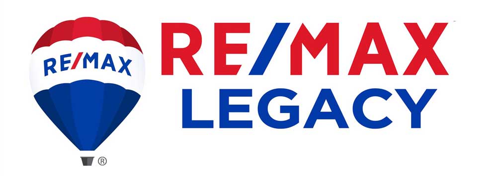
Effective real estate logo designs can be seen in the logos of some successful companies. RE/MAX's logo is a good example: it uses a bold and distinctive balloon symbol which has come to represent the brand, suggesting that customers will go places with RE/MAX.
The Coldwell Banker logo combines a star icon with modern, sleek typography – signalling innovation and tradition – while Century 21's black and gold colour scheme is meant to imply luxury and prestige. These iconic designs have helped make these brands household names.
The RE/MAX logo remains recognisable even from afar thanks to its instantly recognisable balloon symbol, such an integral part of the brand that it has become visually synonymous with it; the image suggests adventure and excitement along with what the company stands for; this design helps give RE/MAX stand out when compared with rivals.
Similarly, the Coldwell Banker branding effectively conveys that their approach is about excellence/innovation rather than a stale old hat: you've got aspirational house iconography mixed in seamlessly with up-to-date fonts, simple yet memorable.
And Century 21? Black and gold suggest high-end property services without being too brashly blingy – just enough opulence to appeal to those searching for luxury property services. All three examples show how a carefully considered design can help get your real estate biz noticed
Tips for Creating a Memorable and Professional Real Estate Logo
Crafting a memorable and sophisticated real estate logo necessitates meticulous deliberation and an eye for detail. To aid you in the process, here are several pointers:
Strive for simplicity: Keep your design clean and uncluttered to ensure swift recognition and legibility. Such a minimalist approach will help people grasp your brand quickly.
Choose contemporary, clean fonts: Opt for typography that is easy on the eye and reflects your company's image – one that is current yet still has a timeless feel.
Incorporate elements or symbols unique to your locale or values: Giving the logo a personal touch can make it stand out from competitors.
Consider versatility: Make sure the logo would work equally well at different sizes – whether shrunk down onto business cards or blown up on billboards.
Seek feedback from colleagues, clients or professionals: Different perspectives can prove invaluable when refining a design.
For example… Say you're designing a logo for an estate agency specialising in holiday homes amid mountainous environs.
You want something that evokes this niche market while appealing to potential clients. In this instance, you might depict mountains as part of your overall motif; aesthetically speaking, perhaps go with clean lines (a bit like handwritten type) but nothing too fancy.
By taking these suggestions, you have created something striking yet professional that sums up what sets you apart from rivals and appeals directly to those you are targeting – job done!
Tackling a logo redesign requires careful consideration to avoid common missteps. One of the most frequent errors is straying too far from the original brand identity.
While refreshing a logo can modernise a brand, it should not alienate existing clients. Consistency with previous design elements helps maintain brand recognition. Another mistake is overcomplicating the design.
A complex logo may lose clarity when scaled down, making it challenging to reproduce across various media. It's important to retain clear, simple lines that effectively convey the core message.
Thorough research and audience testing are crucial before finalising a new design.
Real Estate Logo Ideas and Inspiration
It can be challenging to find inspiration if you're designing a real estate logo. Here are some ideas and sources of inspiration for your real estate logo design:
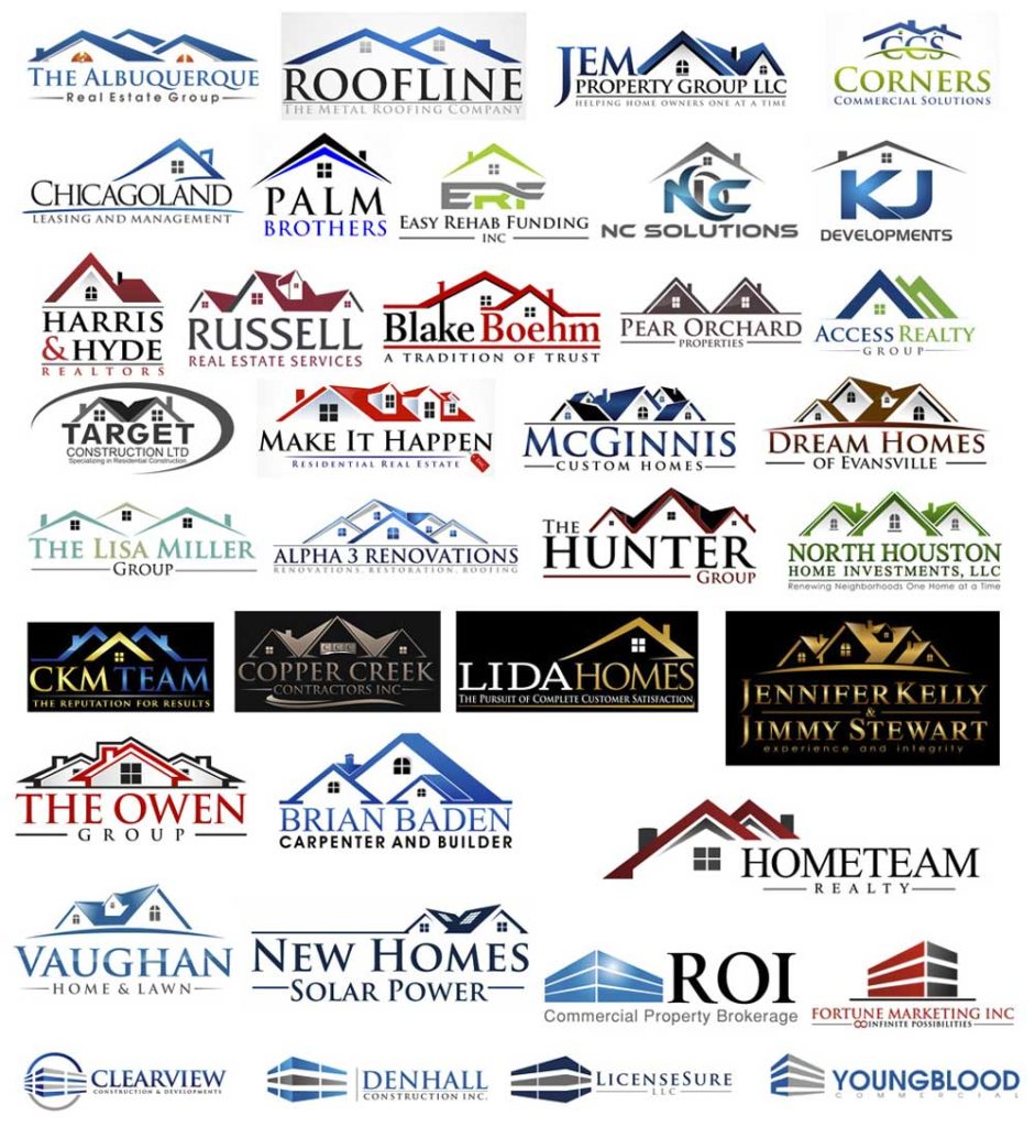
Try different symbols or concepts like rooflines, keys, or city skylines for a unique look instantly recognisable as a real estate logo.
Look at popular successful real estate companies' logos and solid branding in other industries. What do you like about them? Can you adapt any elements to create something new?
Use online platforms that specialise in creating your logo (DIY) or hire professional designers. Usually, they have many templates with fonts and symbols for every industry, making the design process more accessible.
For example, A property developer wants ideas for their luxury condo project logo.
They try out different concepts – and then see a cool abstract skyline logo, which gives them an idea: what if they created a stylised skyline of the city where their project is based? This makes a truly unique and visually appealing logo that's got something special about their condos, too.
Incorporating Real Estate Branding in Logo Design
To ensure a real estate logo matches the brand, it must follow the business's overall branding strategy. It should mirror its mission, values and target market. Keeping consistent visual elements such as a colour palette or design style will help reinforce your brand identity.
Consider your target audience, then think about logos they will resonate with and what emotions you want to evoke when people see it.
For example, if you are a real estate agency focusing on first-time buyers – trust, guidance, and affordability might be at the top of your list to convey.
This means soft blues in your colour scheme could be something to consider including in your logo design because blue can represent trust, while an icon such as a key could also work because keys open doors – in this case, we're talking about the door to their new home.
The typography should powerfully communicate approachability; this reflects how friendly and knowledgeable the staff at our fictional agency are about helping first-time buyers.
By ensuring these elements align with each other and what you generally do as an agency, you'll create a cohesive ‘visual identity' that customers can relate to more easily.
Choosing Colours for a Real Estate Logo
Your expertise in colour choice is crucial when designing a real estate logo. Different colours have different psychological connotations that can influence the brand image you want to create. Here's what some standard colours used in the industry might mean.
Blue: Blue is frequently associated with trust, reliability, and professionalism, and it is famous for its real estate logos. It suggests stability and confidence – qualities buyers look for when making significant transactions.
Green: Green represents growth, harmony and nature. Real estate businesses that use environmentally friendly practices or properties in lush landscapes often use it.
Red: Bold and energetic, red ignites excitement and passion – but it should be used carefully in your real estate logo to maintain an approachable, professional image.
Orange: Warm and vibrant orange exudes energy and enthusiasm – think of the ‘fast food' chain McDonald's famous golden arches. It could work well if your target audience is young or you want to convey creativity/innovation.
When choosing colours for your real estate logo, consider its identity, who its target market is, and which emotions (if any) you're hoping to evoke. Research colour psychology, too, so cultural associations are preserved in translation.
Integrating Digital Aspects into Logo Design
With the increasing reliance on digital marketing, logos must be designed with digital platforms in mind. A well-optimised logo should translate effectively across various digital formats, from websites to social media and mobile applications.
The design must be adaptable, maintaining integrity whether displayed in large formats or as small icons. Using vector graphics ensures scalability without losing quality; a must for responsive web design where logos may appear in different sizes.
Colours should also be web-safe to display consistently across all user devices. Considering these digital elements during the design phase ensures a versatile, future-proof logo ready to meet digital demands without compromising aesthetics.
An additional consideration in digital logo design is the growing importance of animated logos. Animation can add a lively touch to a logo, making it more engaging on digital platforms.
Such designs can capture attention and convey a modern, innovative image through subtle movements or more pronounced animations. It's essential, however, to ensure that any animation used remains on-brand and doesn't distract from the core message.
Testing animated versions across different devices and platforms helps guarantee they are practical and consistent, further enhancing brand visibility and appeal in an increasingly interactive digital world.
Selecting Fonts for a Real Estate Logo
The selection of typography in a real estate logo can significantly impact how the brand is perceived. Here are some popular font styles used in real estate logo design and their potential connotations:
Serif Fonts: Serif fonts, such as Times New Roman, often convey tradition and reliability; they're typically seen with established brands.
Sans-Serif Fonts: Clean and modern sans-serif fonts, like Helvetica, often suggest simplicity and sophistication—making them popular for contemporary-looking real estate logos.
Script Fonts: Script fonts can add elegance and personalisation to a real estate logo—but should be used sparingly and legibly to ensure the design remains readable and professional-looking.
Readability is essential when choosing fonts for a real estate logo design project. The selected font should be easily legible, even in smaller sizes, to ensure the mark works well across different applications or channels.
It should also align with your chosen style or look and feel so that people get the right brand impression from your business.
Common Mistakes to Avoid in Real Estate Logo Design
Are you designing a real estate logo? Please avoid falling into the trap of making common mistakes that can water down its effectiveness. Here are some pitfalls to sidestep:
Using symbols or clichés, everyone else uses: You want your real estate company's logo to be distinct and stand out from competitors in the field. If you use generic-looking symbols or those elements everyone else uses, your logo could blend in rather than pop.
Making it too intricate: Intricate designs look great on large surfaces but may not scale well when reduced. The more complex a design is, the harder it can be to reproduce and recognise at smaller sizes.
Forgetting what makes your target audience tick: A logo represents your business's brand identity – so if it doesn't resonate with potential clients, what good is it? Before you start sketching anything out, ensure you know who you're aiming for.
Think about how small or large your logo will go: Scale-ability affects print quality – forgetting this could lead to logos that don't look as sharp as they should on screen or paper.
By avoiding these traps, businesses in real estate can create a memorable and visually appealing mark that gets their brand noticed by prospects.
Conclusion
In conclusion, a well-crafted logo is vital for real estate companies.
It produces a powerful first impression, builds trust and attracts prospects.
A logo visually represents the values and traits of your brand, conveying its unique selling points and personality to potential customers. Moreover, it boosts client recall and invites repeat business because people remember memorable logos.
Consider symbols, typography, colours, and scalability when designing a real estate logo.
Stick to these principles – while avoiding common pitfalls – if you want to craft something that stands out in an industry crowded with competitors.
Ultimately, by designing an eye-catching logo that sets your company apart from rivals in the long term, you'll be on track for success in the property sector.

