
What is Isometric Design, And Why Is It So Popular?
Isometric design is a visual technique that represents three-dimensional objects in two dimensions using parallel projection, where each axis is separated by 120 degrees.
Popular in digital illustration, branding, infographics, and game design, it bridges the gap between flat design and 3D realism.
By maintaining consistent scale and depth, isometric artwork creates immersive scenes without requiring complex 3D rendering.
Its geometric precision and clarity make it ideal for UI/UX interfaces, architectural visuals, and animated explainer graphics.
The growing popularity of isometric design stems from its ability to capture attention, simplify complexity, and deliver visually rich experiences that communicate both creativity and structure.
What is Isometric Design?

Derived from isometry formulated by Professor William Farish, Cambridge University, the word isometric (coined from a Greek word) is derived from the words iso, which means the same or equal, and metric, meaning measure, giving it overall meaning as “of the same measure” or “having equal measurement”.
Farish realised the need to eliminate optical distortion from the technical working drawings, which is when he formulated isometry, where he used the same scale for height, width, and depth.
Due to the use of the same scale for height, width, and depth, isometric drawings (a form of axonometric drawing) give their two-dimensional (2D) image/design the illusion of three-dimensional (3D) depth. It enables artists and creative designers to render 3D designs in a 2D plane, creating a sense of realism.
Look, the thing is, ‘isometric' is just one player in a bigger team called axonometric projections. It's a fancy way of saying you're drawing a 3D object on a flat 2D surface, but you're doing it in a way that keeps things measurable.
The lines of sight hit the page straight on, perpendicular to it. There are three main types you'll hear about.
First, you've got Isometric Projection. This is the famous one.
All three axes, your x, y, and z, are set at 120 degrees to each other. It means every side is scaled the same, which makes it dead simple, balanced, and easy to work with.
Then there's Dimetric Projection. With this one, only two of the axes have the same angle to the page, so two sides look equally shortened, but the third is doing its own thing.
And finally, Trimetric Projection. You've guessed it; all three axes are at different angles. This gives you a more complex look, which some say is more realistic, but it's a bit more of a hassle to draw.
The reason everyone bangs on about isometric is that it hits the sweet spot. It gives you that clean, 3D illusion without the headache of different scales and angles.
It just works.
When viewing an isometric design, the viewers see all three faces of the object simultaneously, as in an isometric view (orthographic). The surface is not parallel to the projection plane but perpendicular to the lines of sight, making the three dimensions visible on a 2D plane.
You can't really talk about this style without giving a nod to early video games. For a lot of us, that's where we first saw it in action, even if we didn't have a name for it.
Back in the 80s and 90s, before computers had the power to render proper 3D graphics, this was the ingenious workaround.
Games like Q*bert and Zaxxon in the early '80s were pioneers. They used that fixed, angled view to create a sense of depth and space that was mind-blowing at the time.
Then it became the go-to for entire genres. Think about strategy and role-playing games.
Titles like SimCity 2000 or the original Fallout built massive, detailed worlds you could manage and explore, all from that isometric viewpoint. It allowed designers to create complex environments on hardware that would have melted trying to render it in true 3D.
That history is baked into our brains. It's why isometric designs often feel so intuitive and a bit nostalgic.
We’ve been navigating worlds like this for decades.
Now that we know what isometric designs are, let us dive in and find out why they're rising in popularity.
Why Isometric Design Gained Popularity Recently?
The designs and the audience's preferences for visuals have evolved substantially over time. Before isometrics, flat designs were widely used (and are still in use).
Still, they came with their limitations, including overly simplistic 2D objects with typography, grid-based layouts, white space, and contrasting colours. However, these designs lacked depth and detail. Even at times, flat designs can induce confusion or a lack of information.
On the other hand, the isometric design offers the required depth and the ability to add details and versatility through 3D perspective, with less clutter, greater realism, and intricate details.
From logos, hero images, app icons, blog-featured photos, UI UX design, architectural drawings, and more, isometric art styles have taken the creative world by storm.
To better understand the reasons behind the rising popularity of isometric designs, let us explore some of the limitations of flat methods, which helped digital artists overcome them and contributed to their popularity.
Why Isometric Design Shines in Branding and Marketing
The isometric design has gained popularity in branding and marketing due to its ability to create visually appealing and engaging content. Here's why this design style stands out:
- Visual Depth and Interest: Using 3D-like shapes, the isometric design provides a sense of depth that captures attention. This adds an engaging layer to visuals without overwhelming the viewer.
- Clean and Structured Look: Isometric designs are known for their neatness and simplicity. This clarity makes them ideal for conveying messages effectively, aligning perfectly with branding efforts that demand clear communication.
- Professional Aesthetic: The precise lines and angles in isometric illustrations contribute to a polished and professional look. This can elevate a brand's image, making it appear more trustworthy and refined.
- Effective Use of Shadows: Graphic designers often incorporate shadows to enhance the three-dimensional illusion, making objects on a two-dimensional screen appear more realistic and lifelike. This technique enriches the visual narrative and adds depth to the representation of products or ideas.
And this isn't just for arty projects, mate. Major, established brands are utilising this technology to generate substantial revenue.
Have a look at the financial tech sector; they're all over it. How do you explain a ridiculously complicated financial system or blockchain technology without boring everyone to tears?
You draw a clean little isometric city with data flowing between shiny buildings. It makes the abstract feel tangible and, more importantly, simple.
Even the tech giants do it. Microsoft has used clean isometric illustrations for years in its marketing for Azure and Office 365.
It's a brilliant way to show how different cloud services connect or how software features work without just showing boring screenshots. The logistics industry does the same, using isometric maps and vehicles to show a supply chain in a way that a flowchart never could.
It's about taking something complex and making it look so straightforward that anyone can get it instantly. That's just smart marketing.
Combining these elements, isometric design offers a unique blend of aesthetic appeal and functional communication, making it a valuable tool in marketing and branding strategies.
Isometric vs Flat Design: The Limitations of Flat Design
Its isometric designs' unique blend of simplicity and depth makes it popular. However, to truly appreciate its rise, it is inevitable to understand where the flat design falls short. Here are some of the limitations of flat design.
Anti Realism
Although flat designs have gained popularity for their simplicity and minimalism, Apple's UI is a prime example. They adopted a skeuomorphic approach for app icons from the app's inception until 2013, when iOS 7 was unveiled and the UI was revamped to use flat icons instead of the previous ones.
However, this approach may only be practical in some contexts. When it comes to visual elements where a touch of realism(like real-world objects or depth/texture/intricate details) is inevitable, a flat design will not offer convincing visuals. For example, flat designs are the least preferred for the architecture industry.
User Unfriendly
The flat designs may tick the checkboxes of clarity and simplicity in terms of the characteristics of suitable methods. Still, they lack attractiveness and intuitiveness, which are highly desired by the users/viewers.
For a design to balance aesthetics and usability, it is essential to sustain user-friendliness. The lack of shadows and gradients makes it difficult for users to differentiate interactive visual elements, such as buttons or links. Hence, the flat design fails due to its lesser aesthetic appeal and questionable usability, resulting from simple shapes and a lack of depth.
Extreme Minimalism
Just as usability without aesthetics would negatively impact the overall design, so would usability with extreme minimalism. Overly simplistic designs can lead to a lack of visual interest and clarity, leaving the user uncertain about the message the design intends to convey. It can even be challenging for users to navigate through the design as they may not know which section of the design is clickable.
Lack of Usability
The major setback of the flat's design's simplistic visuals is the difficulty of differentiating interactive and non-interactive elements. Due to missing visual cues of depth, the user often can't immediately know what portion of the design is clickable or tapable. As the icons and buttons may not appear clickable, it would leave the users in a state of confusion, hurting the usability of the design.
Bad Topography
Topography becomes crucial as simple design and clean lines are pivotal aspects of flat designs. But it would be an antagonist when not chosen properly or lacks readability. Poor font choice, unstructured text, wrong font size, or disproportionate spatial relationship would frustrate the user experience.
Limits Visual Options
Flat designs are infamous for their lack of creative freedom as graphic designers must stick to narrowly defined visual styles that involve fewer to no gradients, shadows, or intricate details. These straightforward shapes, minimal textures, and restricted colour palettes limit visual diversity or distinctiveness.
A flat design would not be the best fit for a project that requires conveying complex concepts, artistic expressions, or a visually rich user experience.
In a nutshell, isometric designs intend to overcome the limitations of flat designs. Apart from overcoming the limitations of flat designs, here is what more isometric designs have to offer visual designers or artists.
Benefits of Isometric Design

Isometrics enables designers to overcome the limitations of flat design and offers several noteworthy benefits. Here are some benefits that make isometric designs a go-to choice for web and app design, graphics, gaming, marketing, and more.
Emphasises Details
Viewing an isometric design is like zooming in with a magnifying glass on your design's cool stuff. It empowers designers to bring every nook and cranny of the design (objects, characters, textures, and more) to life, from intricate fullscapes to the tiniest characters—this attention to detail elevates the design's richness.
The added visual depth and elevated storytelling nuances offer users or viewers an immersive experience, addressing the concerns of user engagement for digital artists.
Fresh And Creative Approach
Isometric designs add depth and dimension to your stylish makeover, making the overall design stand out with its dynamic and eye-catching visuals. It empowers the designers to add fresh and creative perspectives to the designs' visual appeal with a touch of innovation.
Along with the enhanced creativity and freshness, these designs offer a modernistic visual appeal, keeping the viewers engaged. Viewers can't ignore such graphics and illustrations, especially when the internet is flooded with flat designs.
Adds Depth to Simple Design
Want to make simple things in your design pop even in 2D planes as if they suddenly have become 3D illustrations? Isometric designs are the best choice for you.
Imagine a flat plane image suddenly coming to life with a sense of depth and a whole new dimension. That is what the isometric art style does to the visual elements of the 2D plane. All of this could have been done without the design getting overly complex.
Convey Message Effectively
The effectiveness of communication through visual contexts is crucial when crafting any design, especially game layouts, business infographics, or education diagrams. Whether showcasing a product, presenting data, or explaining a process, a design that effectively conveys your point is a valuable asset in terms of communication through visuals.
Isometric design's three-dimensional perspective conveys depth and detail, ensuring the message is delivered or understood effectively. This is why isometric designs are powerful tools for effective communication in marketing and promotions, which involve storytelling.
View of object/product from all angles
Bring the visual elements of 2D planes to life with 3D glory! Imagine a gaming environment viewed in flat and top views. The latter would provide you with a better understanding of the space and object placement within the visual environment.
The added depth and dimension of isometric design enable graphic designers to present a 3D view of the designs, allowing viewers to grasp how the visual elements appear from different angles. The use of isometric designs allows graphic designers to highlight the desired feature or design details from a desired angle, offering a better understanding of it to the viewer.
Modern and Trendy
It's the cool kid on the block when it comes to designs with modern aesthetics!
It becomes inevitable to keep up with the times when it comes to designs, as obsolete designs are every designer's worst nightmare. Using isometric designs would enable you to stay current and make your designs look trendy, giving them a contemporary edge and added versatility. This added modern flair would make your designs more appealing to today's audiences.
Better Visuals
Isometric design changes the way viewers grasp the visual content. Whether website designs, game environments, or objects, the creations feel realistic with an added sense of space and dimension. Unlike flat designs, isometric ones help enhance the beauty of every visual element in the design, making the overall design visually stunning.
The combination of three-dimensional appearance, sense of depth, and realism results in stunning and highly immersive designs with intricate details and a richer user experience.
However, does replacing flat designs with isometrics make a difference? Well, not every isometric art is great. Let us now understand what makes a tremendous isometric design.
How Does Isometric Design Enhance Typography?
The isometric design brings a unique flair to typography by transforming simple lettering into visually captivating artwork. This design approach enhances typography in several ways:
- Increased Visual Appeal: By rendering letters in 3D, isometric design injects depth and interest that flat typography often lacks. This three-dimensional perspective makes letters pop, drawing the eye more effectively.
- Playful Aesthetic: The simplicity of isometric typography allows for a playful, engaging, and easily digestible style. The design’s simplicity becomes lively and memorable when viewed from various perspectives.
- Enhanced Recognition: When typographic elements are presented in isometric form, they become more distinctive. The added dimension helps make the lettering recognisable at a glance, ensuring the message stands out in any setting.
- Dynamic Viewing Angles: Unlike flat typography, isometric designs can be appreciated from multiple angles. This versatility makes them ideal for applications where seeing text from different perspectives is crucial, such as advertising or packaging.
In summary, the isometric design enhances typography by infusing it with depth, playfulness, and unique recognition, offering a fresh perspective that captivates and communicates effectively.
What Makes a Great Isometric Design?
With core components or elements in isometric design, designers can make an object on a 2D plane appear as 3D without requiring expensive or fancy 3D software. Those core components or features enable the developers to make isometric designs.
Less clutter
Clutter is the biggest enemy of clarity, a characteristic that isometric designs strive to achieve. Too many elements would only confuse. Great isometric designs are those with minimal details that do not detract from the overall message you want to convey through the image or design.
No converging parallel line
Look around, whether it is the horizon or the street, at a distance; you would see the lines converging, and in the case of the horizon, their lines would meet at a vanishing point.
Unlike the human perspective of reality, where the lines appear to recede at a distance, isometrics remain parallel(they never converge or meet).
The 120-degree rule
The eccentric nature of these designs makes the visuals distinctive; however, many pseudo-isometric designs can be easily mistaken for the real ones.
A good or actual isometric design is one in which the objects' x, y, and z axes are at a 120-degree angle from each other, with horizontal lines at 30 degrees from the converging point.
Common Tools and Software for Creating Isometric Designs
Right, so how do you actually make this stuff without tearing your hair out? You’ve got a couple of solid options, depending on what you’re trying to do.
Most people start with Vector Graphics Editors because they’re built for this kind of clean, scalable work. Adobe Illustrator is the big one, of course.
It features tools like the Grid tool and 3D effects, such as ‘Extrude & Bevel', which can get you most of the way there. You set up an isometric grid and trace your shapes onto it.
It's methodical, but it gives you total control. Affinity Designer is another fantastic choice, and some designers prefer its dedicated isometric grid tools.
And if you're a Figma user, you're not left out. The community has built some brilliant plugins that can convert flat shapes into isometric projections with a click.
But if you want to get really fancy, or you're building a whole scene, you might turn to 3D Modelling Software. A program like Blender, which is completely free and incredibly powerful, is perfect.
The other industry favourite is Cinema 4D. The process is different.
You build your objects in proper 3D, then you set up a special orthographic camera and angle it just right to get that perfect, distortion-free isometric shot.
The big advantage here is realism. You get proper lighting, shadows, and textures that are a massive pain to fake convincingly in a 2D program.
Where to Use Isometric Designs?
Isometric designs are all the rage, but the question arises – where are the brands using them? Among others, these designs have a wide range of applications, from logos to infographics and in every type of design where you want to convey information with style and clarity. Here are some of the best use cases of isometric designs.
Logos
Whether you're a startup seeking a logo to establish your brand identity or a well-established business revamping your existing logo, isometric symbols can add a unique and eye-catching impact.
Isometric logos possess added depth and a touch of modernity, making them more memorable. The versatility across platforms, from websites to business cards, makes it stand out from traditional logo designs, empowering your brand to make a bold statement.
Icons
Whether it is a website or mobile app, icons play a crucial role in its usability and aesthetics, as they serve as signposts in the digital world that guide users effortlessly.
The added depth makes the isometric icons more visually appealing and user-friendly. With these icons, you can add creativity to the interface, leaving a lasting impression on the target audience and overall user engagement.
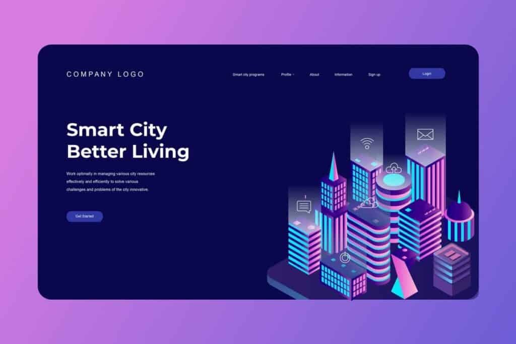
Landing Page Design
From increasing traffic to conversion, landing pages play a significant role in lead generation and sales. As landing pages intend to grab the user's attention and visuals are crucial, using isometric design can work wonders for it.
As these designs are easy to understand, eye-catching, and persuasive, they can effectively hook users on the landing page and guide them to the desired call to action (sign up, make a purchase, or explore further).
The isometric approach enables the designs to transform the flat design into one with an interactive and inviting experience, which can become lucrative in increasing the overall effectiveness of the landing page.
Hero Images
Hero Images are the crown jewels of your website, setting the tone and creating memorable first impressions for visitors. Having a big, attention-grabbing isometric visual as a hero image would make your website stand out, besides instantly engaging the visitor to explore further.
Hero images can make or break a website's bounce rate(a way to measure user engagement). Good hero images can lower the bounce rate. The captivating isometric design of the hero image would positively impact the bounce rate.
Layered Graphics
One of the cons of 3D models is their complexity, which can intimidate the audience. When it comes to technical drawing, such as those created by an interior designer, these drawings or designs have various layers combined to form the entire design.
With its added depth and dimension, the isometric design enables these designers to craft better-layered graphics, giving it the 3D impact without worrying about the complexities of the actual 3D modelling or compromised visual aesthetics.
Architectural Visualisation
The spatial relationships and design concepts can be better represented using the isometric art style, given its 3D perspective. It is an indispensable tool in architecture and construction, allowing architects to bring their architectural vision to life on paper or screens.
From building plans to urban landscapes and interior layouts, isometric designs enable architects and interior designers to present their drawings or designs visually and engagingly. The clients and stakeholders can effectively grasp these designs.
Maps
For any location-based visuals, such as a fantasy world, city layout, or game map, the isometric design enables graphic designers to create map visualisations that are easy to understand and aesthetically pleasing. The angled axis adds a realistic direction to the map, offering a better understanding of the landscape and making it look engaging.
Infographics
Want your infographics to be your visual storyteller? Isometric infographics are the best way forward. Infographics impart crucial stats or information in addition to conceived versions or chunks of a detailed topic—one critical aspect that every designer must consider when designing infographics.
Using the isometric designs offers a 3D perspective to the infographics, making it easy for the audience to understand, navigate through, and memorise without making the design look cluttered or confusing.
Video Games
Let's circle back to games for a moment, as they remain one of the most powerful and popular applications of this style. It works so well for both functional and aesthetic reasons.
The isometric perspective gives players a perfect bird's-eye view of the action. This is absolutely golden for strategy games, simulations, and role-playing games where you need to see the whole battlefield, manage resources, or plan your character's next move.
You get all the spatial information you need without the camera getting stuck on a wall.
It's not just for retro-style games, either. Modern developers use it brilliantly.
Just look at Monument Valley. The entire game is a masterpiece of isometric design.
It uses the perspective to create mind-bending optical illusions and impossible architecture that form the core of its puzzles.
Even in fast-paced action games like Hades, the isometric view is key. It keeps your character and a screen full of enemies clearly visible at all times, which is something you just can't get from a first-person or over-the-shoulder view.
It proves the style is about smart, functional design, not just a nostalgic look.
The use of isometric art is not limited to these categories. The graphic designer can use it in various aspects and industries(architecture, healthcare, etc.), depending on the requirements and the designer's creativity.
Is Isometric Design the Right Choice For Your Brand?
In a world of design choices, isometric designs are the secret ingredient to make your visuals truly stand out. But just because they are great and popular does not mean they will work for all brands. If you are wondering if it is the right choice for your brand, consider the following questions to help you make an informed decision.
- Does your brand align with designs that feature clean lines, a modern aesthetic, and a hint of depth?
- Do you want to tell your users a visual story or guide your users through a journey?
- Are you looking to engage your audience with attention-grabbing visuals?
- Does the design align with your brand's identity and message?
- Are you looking for a design approach that is fresh, eye-catching, and easily adaptable?
- Does the visual perspective align or resonate with your target audience?
- Is your target looking for something new and contemporary?
- Are your competitors using it?
- What limitations do your existing design approaches have?
- Looking for a design approach with a blend of minimalism and visual appeal?
- Want a cost-effective design facet?
- Would isometric design work well across your platforms (website, app, marketing materials, etc.)?
Although there is no such thing as isometric design being inherently bad for a brand, the communication conveyed through isometric design can be either effective or unnecessary. And you surely want to ensure that you are not falling into the latter category.
How to Implement Isometric Design Without Overwhelming Users
When used effectively, isometric design can create engaging and professionally appealing visuals. But striking the right balance is key to ensuring your audience isn’t overwhelmed. Here’s how brands can achieve that balance:
- Simplify the Graphics: Choose a minimalist approach with your graphics. Instead of packing your design with numerous intricate details, focus on creating clean, simple isometric visuals. This helps maintain clarity and direct attention to the essential elements.
- Limit the Use of Colours: Select and stick with a few complementary colours. A restricted palette ensures a coherent look across your design. This not only enhances visual appeal but also prevents the design from appearing too chaotic or cluttered.
- Strategic Use of Icons: Be mindful of the number of icons and illustrations you incorporate. Use them sparingly and purposefully. Each icon should serve a specific role or convey a clear message, avoiding unnecessary distractions.
- Create Visual Hierarchy: Guide your audience’s eyes through your design by establishing a clear visual hierarchy. Highlight the most essential elements using size, colour contrasts, or placement.
- Consider User Experience: Always keep the end user in mind. Ensure your isometric designs are intuitive and user-friendly. Test your designs with real users to understand if any elements are causing confusion or if the message conveyed is clear.
- Balance Between Text and Visuals: Don’t let visuals overshadow critical text. Ensure that any accompanying text maintains its prominence. The visuals should support and enhance the message, not overshadow it.
By following these strategies, brands can harness the power of isometric design to create engaging content that captivates without overwhelming users.
Isometric Design: Concluding Thoughts
In wrapping up our exploration of isometric design, it is clear why this design art style has gained tremendous popularity over time. It is a visual powerhouse that offers design simplicity, depth, and dimension, offering versatility across platforms.
Isometric designs are more than just visually appealing, as they are highly effective in conveying stories, imparting information, guiding users, and providing immersive user experiences.
By opting for isometric designs, you won't just keep up with the trends, but also bring your idea to life visually. Nonetheless, this art style is here to stay, so embrace it, experiment with it, and watch your design captivate your target audience.

