A Brief History of Logos: From Cattle Brands to App Icons
Logos are not art; they are commercial tools designed to answer two questions: “Who made this?” and “Can I trust it?”
The history of logos is not about artistic expression but the evolution of trademarks—from ancient Roman maker’s marks to modern app icons.
This story, driven by technology and commerce, always bends towards simplicity.
Understanding this evolution, from the ornate symbols of the Victorian era to the clean lines of Modernism, gives you a framework to make profitable decisions about your brand identity and avoid costly, trend-driven mistakes.
- Logos serve as commercial tools, answering "Who made this?" and "Can I trust it?" rather than being mere art.
- The evolution of logos reflects a trend towards simplicity, driven by technological advancements and marketplace demands.
- Notable eras in logo history include heraldry, the Industrial Revolution, and the Modernist overhaul prioritising distinction and clarity.
- Today, logos must be adaptable for various contexts, necessitating a focus on functional design over complexity.
A Brief History of Logos: A Guide to Timeless Design Principles
Before “Brands”: The Ancient Roots of Identification (Pre-1300s)
Long before marketing departments and brand strategists, there was a fundamental need to signify ownership and origin.
This wasn’t about persuasion; it was about raw function.
From Cattle Brands to Potter’s Marks
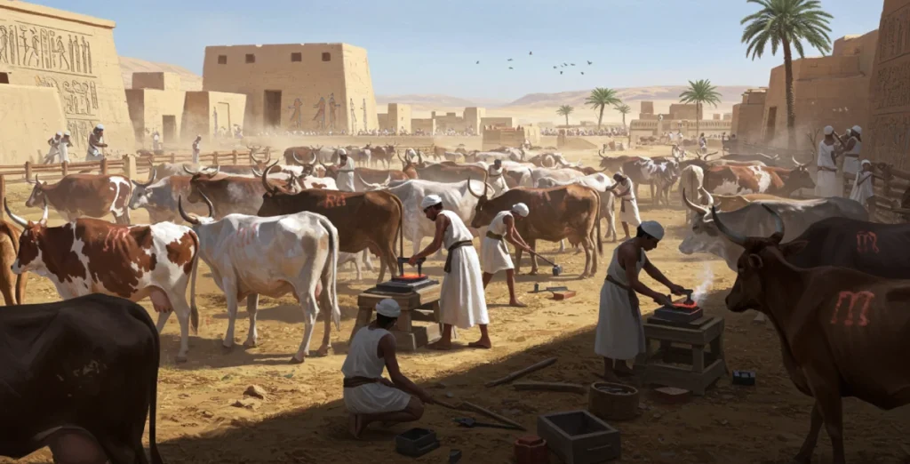
The earliest “logos” were simple marks of identity. Ranchers in ancient Egypt branded cattle to mark them as their property.
Around 1300 BC, potters in the Roman Empire began stamping the bottom of their wares with unique symbols, known as firmalampen.
This wasn’t branding as we know it. It was accountability. If a pot broke, you knew who to blame. If it was exceptional, you knew who to buy from again.
These marks were the first, most basic quality control and producer identification form.
The Rise of Heraldry: The First Brand Guidelines
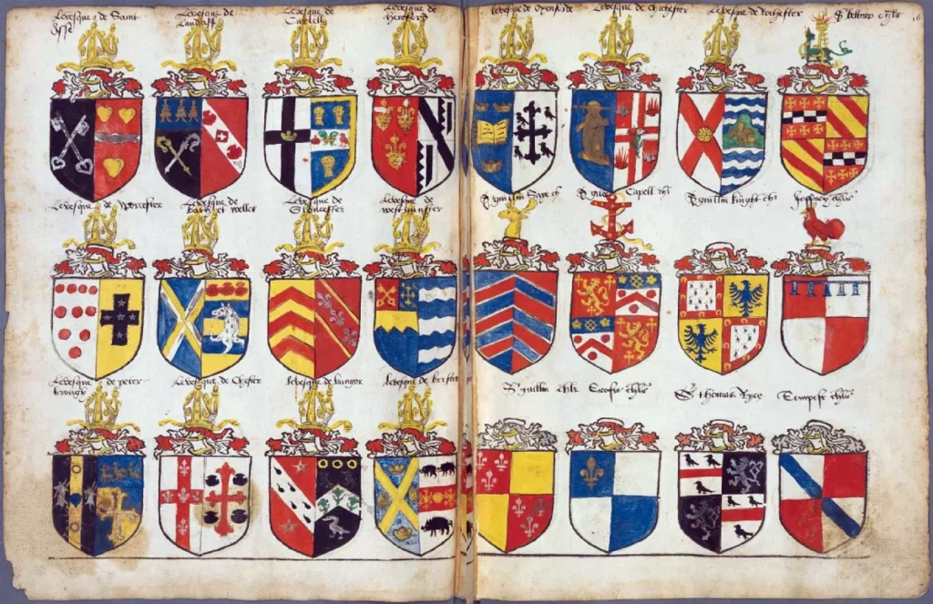
Step into the Medieval era, and you find heraldry. Coats of arms were complex visual systems designed to identify a specific family or noble house.
With a strict set of rules about colours (tinctures), patterns, and symbols, heraldry was essentially the world’s first-ever set of brand guidelines.
It was a system for communicating identity and allegiance at a glance on a chaotic battlefield.
While not commercial, it established the principle that a consistent visual system could represent a powerful entity.
The Dawn of Commerce: Trademarks and the Printing Press (1300s – 1870s)
As trade guilds and merchant classes grew, so did the need for commercial identification. The symbols that emerged were straightforward and designed for a largely illiterate population.
Guild Marks and Shop Signs
A blacksmith’s sign was an anvil. A cobbler’s was a shoe. These weren’t clever concepts; they were literal, pictorial labels that told a potential customer what was for sale.
Guilds also created marks to guarantee that a product met a certain standard of quality, a precursor to modern certification marks.
The Printing Press Changes Everything
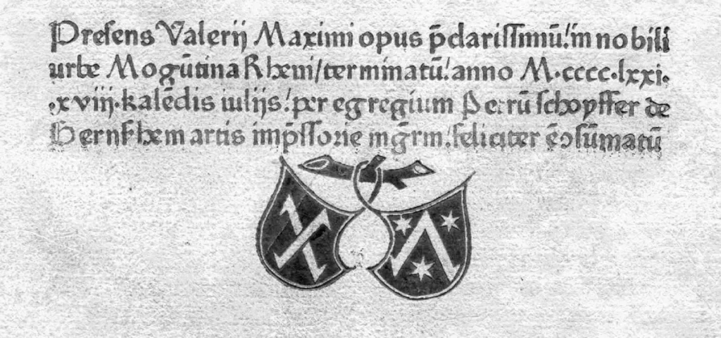
The invention of the printing press around 1440 was a monumental shift. For the first time, a single mark could be replicated identically thousands of times over.
Printers developed their unique marks, or “colophons,” to put on their books. This was a stamp of quality and origin, and one of the first forms of mass-produced branding.
The First Registered Trademark: A Simple Red Triangle
The story of the modern logo truly begins in the 19th century. The Industrial Revolution was in full swing, and trademark laws were being established for the first time to protect businesses.
On January 1, 1876, the Bass Brewery registered a simple, solid red triangle as the first-ever trademark in the United Kingdom. It’s a powerful lesson.
They didn’t choose a complex illustration of barley or a regal lion. They chose a bold, primitive shape.
It was easily seen in a crowded pub, printed on a bottle, and utterly distinctive. It still works today for the same reasons.
The Industrial Revolution: When Products Needed a Face (1870s – 1940s)
With mass production, goods were now shipped far from their place of origin. A consumer in one town had no personal connection to the factory owner in another.
The logo became a proxy for the handshake, symbolising trust and consistency.
The Victorian Obsession with Detail
The Victorian era was defined by ornate, decorative design, and logos were no exception.
They were often incredibly detailed, featuring intricate engravings, flourishes, and multiple typefaces. Complexity was seen as a sign of quality and craftsmanship.
The Coca-Cola script, designed in 1886, is a perfect survivor from this period. By today’s standards, it’s complex.
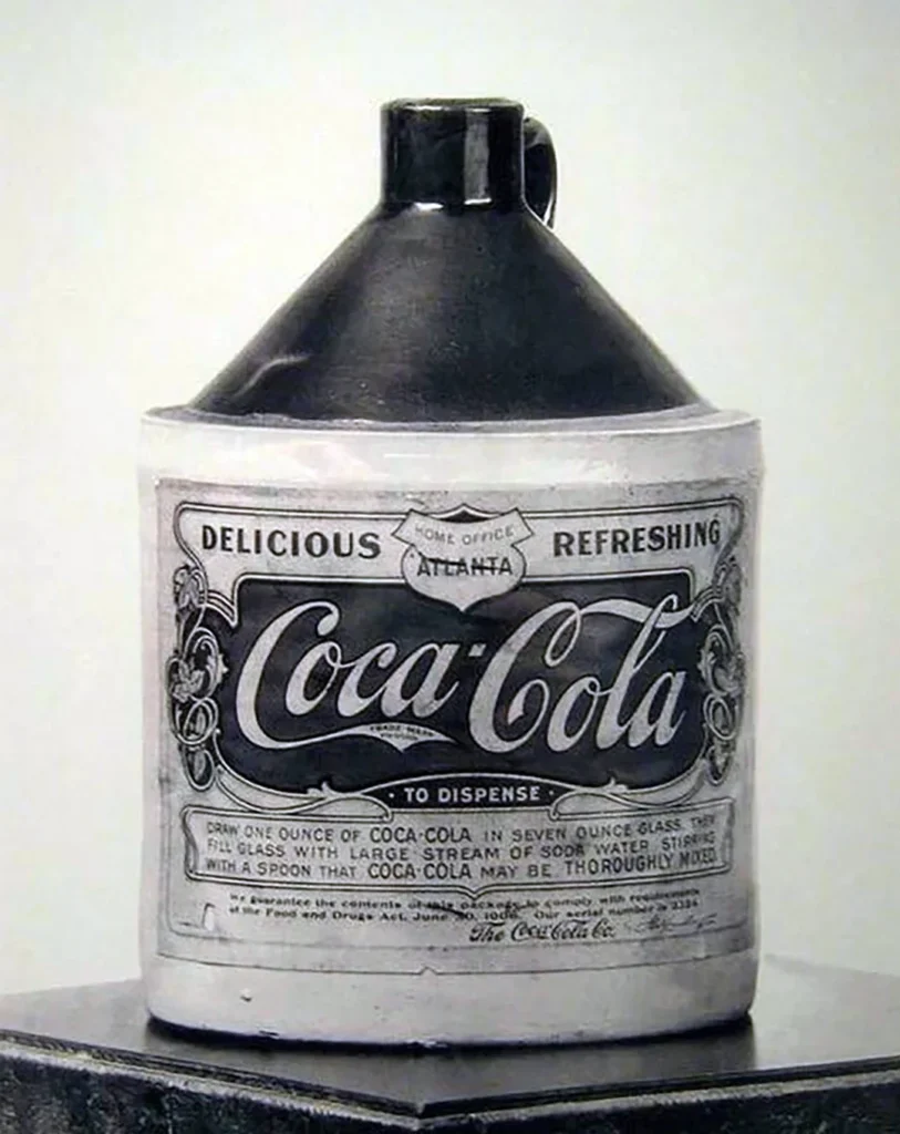
But its flowing, unique Spencerian script made it stand out then, and its consistent use for over 130 years has made it a global icon.
The Birth of the “Brand Name” as Logo
Many early, enduring brands used the founder’s signature as their logo. Companies like Ford and Campbell’s used a personal script to create a sense of authenticity and human connection in an age of impersonal factories.
It was a promise from a real person, even if that person was a distant tycoon.
The Modernist Overhaul: Simplicity as a Business Strategy (1950s – 1980s)
After World War II, the world changed. Globalisation, television, and corporate expansion created a need for a new visual language—one that was clean, universal, and efficient. This was the Modernist era.
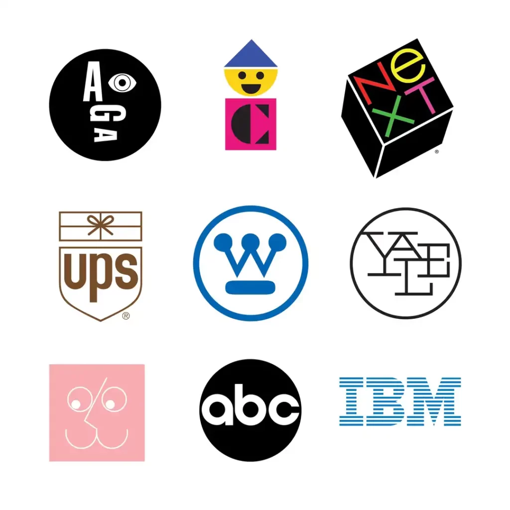
Enter the Giants: Paul Rand and Saul Bass
Designers like Paul Rand and Saul Bass championed a new philosophy: a logo is not an illustration, it’s a symbol. Its job is not to describe the business, but to identify it.
Rand’s work for IBM, UPS, and ABC television redefined corporate identity. He stripped away all that was unnecessary, leaving behind bold, geometric forms that were memorable and versatile.
This is where people drone on about the “golden ratio.” It’s mostly nonsense. These designers had an incredible eye for balance, negative space, and visual harmony.
They didn’t need to trace a seashell to create a balanced design. It was about intelligent simplification, not a mathematical crutch.
The Abstract Symbol Takes Over
This era gave us the truly abstract logo. The 1960 Chase Bank octagon by Chermayeff & Geismar didn’t look like a vault or a dollar sign. It was just a unique, memorable shape.
The most famous example is the Nike “Swoosh.”
In 1971, student designer Carolyn Davidson was paid $35 for it. The symbol meant nothing on its own. It wasn’t a running track or a wing. It was just a shape.
For decades, Nike spent millions of dollars to fill that empty shape with meaning—associating it with athletic victory, rebellion, and determination.
The logo didn’t make the brand; the brand created the logo.
The Digital Age: Logos in Pixels and Motion (1990s – Today)
The arrival of the personal computer and the internet created the most significant disruption for logo design since the printing press.
Suddenly, a logo had to exist on low-resolution screens, as a 16×16 pixel favicon, and on countless digital platforms.
The Challenge of the Pixel
The ornate logos of the past became unreadable, muddy blurs on a computer screen. This technological constraint forced a wave of simplification.
Look at the evolution of the Apple logo. The original 1976 version was a detailed engraving of Isaac Newton under a tree. Impossible.
By 1977, Rob Janoff had designed the iconic rainbow-striped Apple silhouette. It was simple, modern, and reproducible.
Over the years, it shed the rainbow stripes and adopted a flat, monochromatic look ideally suited for its products’ clean, minimalist interfaces.
Responsive and Dynamic: The Logo That Adapts
Today, a single, static logo is no longer sufficient. Brands need a visual identity system that can adapt to any context.
This is the idea behind a “responsive” logo. It might be a full logotype on a website, shrink to a symbol on a mobile app, and become an ultra-minimalist icon for a browser tab.
Google is the master of this. Their core logo evolved from a serif font with a drop shadow to a clean, geometric sans-serif in 2015.
This new design is not only easier to read on small screens but is also built to be dynamic. It can animate, become a microphone icon, or become the playful “Doodles” celebrating global events.
Where We Are Now: Today’s Trends and Traps
The historical currents of technology and simplification continue to shape the logos we see today, leading to brilliant adaptations and questionable trends.
The Great “Blanding”
There’s a reason so many tech and fashion brands have recently switched to near-identical, geometric sans-serif wordmarks.
This trend, often called “blanding,” directly responds to the need for ultimate legibility on digital screens.
While functional, it has also led to a sea of sameness where decades of brand character are erased in favour of a generic, “safe” look.
It’s a classic case of chasing a trend without asking if it sacrifices your most valuable asset: distinctiveness.
Nostalgia and the Return of Character
As a reaction to the blanding phenomenon, some brands are looking backwards. Burger King, for instance, recently revived a version of its groovy, characterful 1970s logo.
It feels fresh, confident, and, most importantly, different from the sterile look of its competitors. This shows a growing understanding that personality can be a competitive advantage.
The Unchanging Truth About Logos
Despite all the changes in style and technology, the core principles of a great logo remain constant. It must be simple, memorable, appropriate, and distinctive.
The relentless trend of history is that designers and businesses often complicate things for their ego, only to eventually be forced back to these foundational truths by the marketplace demands.
What This History Lesson Means For Your Business
You don’t need to be a design historian to have a great logo. You just need to absorb the lessons paid for by thousands of brands over hundreds of years.
- Simplicity Wins. Always. Your logo will have to exist in more places than you can imagine. A complex design will break down, become illegible, and be a constant headache. A simple one will work everywhere.
- Focus on Distinction, Not Meaning. Stop trying to tell your entire company story in one tiny symbol. The Nike swoosh meant nothing at first. A logo’s job is to be recognisably different from your competition. The meaning is built later through your actions.
- Think System, Not Just Symbol. A logo doesn’t exist in a vacuum. Consider how it will pair with your chosen fonts, colours, and photography. A great logo is the cornerstone of a cohesive brand identity system.
- Don’t Fear the Abstract. A unique, abstract shape can be far more memorable and ownable than another generic icon of a lightbulb (for ideas) or a globe (for international).
Your Logo’s Place in History
The history of logos isn’t a straight line, but it bends in one clear direction: toward functional simplicity.
Your job as a business owner isn’t to commission a masterpiece for a museum. It’s to create a hard-working, memorable, and functional tool that identifies your business and sets it apart from the noise.
So, stop asking, “What can my logo say?”
Start asking, “What can my logo do?”
Of course, knowing the history is one thing.
Applying its lessons to create a functional, no-nonsense brand identity is another. That practical application is what our logo design service is entirely focused on.
You are welcome to browse our other blog posts for more insights, or if you’re ready to get practical, you can request a quote directly from our team at Inkbot Design.
Frequently Asked Questions (FAQs)
What was the first logo?
While there’s no single “first” logo, the earliest examples are ancient marks like cattle brands from Egypt and potter’s marks from the Roman Empire used to signify ownership and origin.
What is the oldest registered trademark?
The first registered trademark in the United Kingdom was the simple red triangle for Bass Brewery, registered on January 1, 1876. It is still in use today.
Why did logos become simpler in the 20th century?
Logos became simpler due to the rise of Modernism, which valued function and clarity. Global corporations needed logos that were easy to reproduce across different cultures and media, from print ads to television. Designers like Paul Rand championed this “less is more” approach.
Who is the most famous logo designer?
Paul Rand is widely considered one of the most influential logo designers of the 20th century. He is renowned for creating timeless identities for major corporations like IBM, UPS, ABC, and NeXT.
What is the difference between a logo and a trademark?
A logo is a visual symbol used to identify a business. A trademark is a legal term for a symbol, word, or phrase officially registered to represent a company or product. You can trademark a logo to protect it from being used by others.
Why are so many tech logos sans-serif?
Many tech and modern brands use sans-serif fonts because they are clean, neutral, and highly legible on digital screens of all sizes, from large monitors to small mobile devices.
What is a responsive logo?
A responsive logo is designed to adapt its shape and complexity to fit the space it’s being viewed in. It might appear as a full wordmark on a desktop website but shrink to a simple icon (a favicon) in a browser tab.
How much did the Nike logo cost?
The Nike “Swoosh” was designed in 1971 by graphic design student Carolyn Davidson for just $35. Nike later gave her an undisclosed amount of stock in the company to thank her for her iconic contribution.
Does my logo need to have a hidden meaning?
No. A logo’s primary job is to be distinctive and memorable, not to be a puzzle. While some logos have clever double meanings, this is a secondary feature. A simple, unique shape with no hidden meaning is far more effective than a complex one packed with symbolism.
Is the golden ratio important in logo design?
For the most part, no. The idea that the golden ratio is a secret formula for beautiful logos is a myth. Good design relies on a designer’s trained eye for balance, proportion, and visual hierarchy, not on a rigid mathematical grid.

