The 25 Famous Graphic Designers You Need to Know
Your “Logo Inspo” Pinterest board is a trap.
It teaches you to copy tactics, not to think strategically.
Studying famous graphic designers isn’t a history lesson; it’s a masterclass in how to solve commercial problems with visual systems.
These people didn’t just make pretty pictures; they engineered brand identities that built empires.
This isn’t a list of names. It’s a strategic breakdown of the timeless principles they used to create real brand equity.
- Famous graphic designers turn strategic thinking into visual solutions, driving brand identities that resonate and endure.
- Great design emerges from clarity, organisation, and a solid understanding of business goals and audience needs.
- Timeless principles of simplicity, storytelling, and cleverness elevate brands, making them memorable in a crowded marketplace.
The Pioneers Who Wrote the Rules
These figures took graphic design from a print-shop craft to a strategic business discipline. They defined what a corporate identity could and should be.
Paul Rand (1914-1996)

Rand dragged corporate America into the modern age, convincing executives that design wasn’t just decoration but a serious business asset. He championed simplicity and substance when others were focused on flourish.
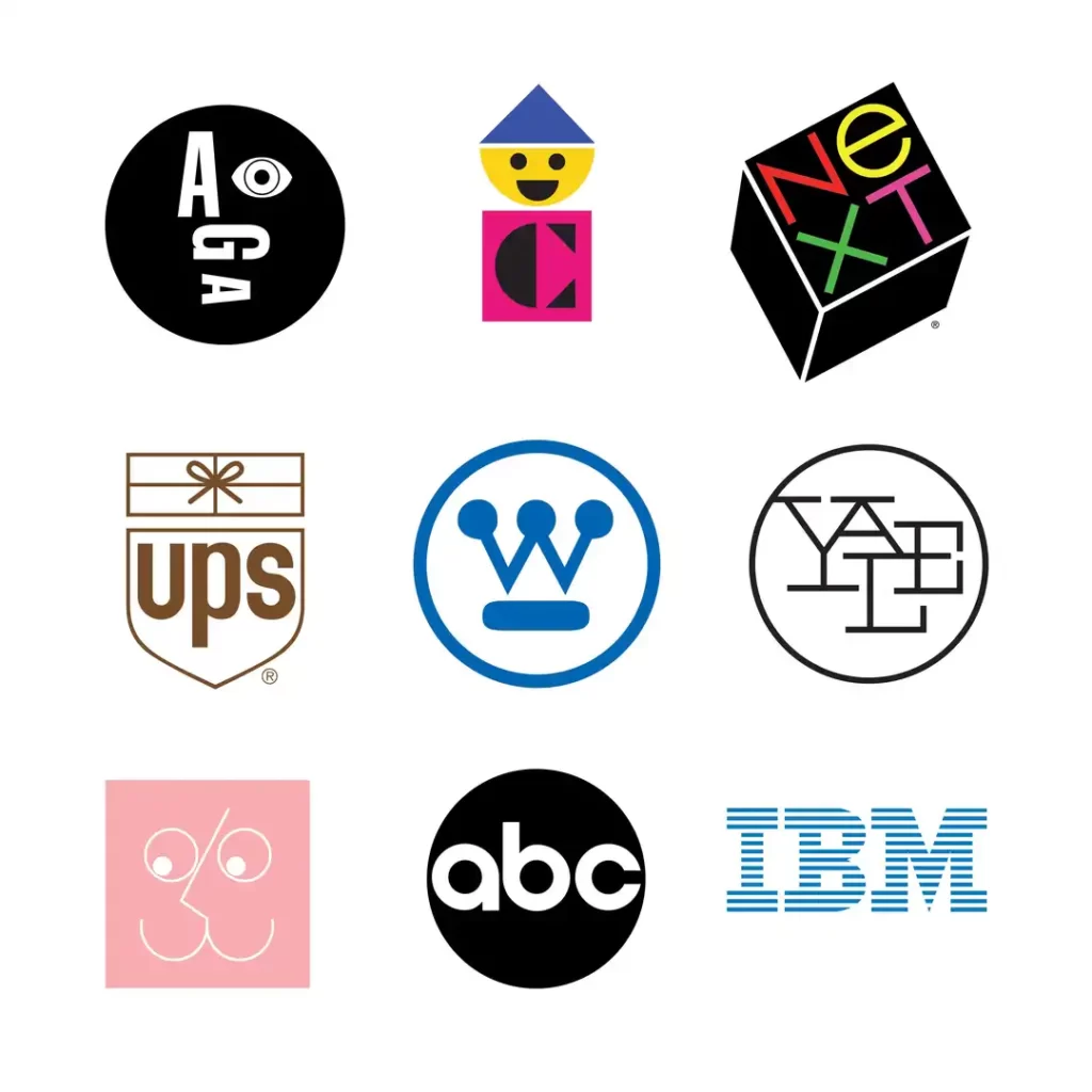
- Famous Work: The iconic, enduring logos for IBM, UPS, ABC, and Westinghouse.
- The Takeaway for Your Business: Simplicity is the ultimate prize of a complex strategic process. Your logo isn’t simple because you couldn’t think of anything else; it’s simple because you’ve distilled your message to its core.
Saul Bass (1920-1996)

Bass was a master of visual metaphor. He created not just logos, but entire visual moods. He’s famous for his film title sequences that set the tone for movies like Psycho and Casino, but his corporate work was just as groundbreaking.
- Famous Work: The original AT&T “bell” logo (1969) and its later “globe” evolution (1983), United Airlines, Girl Scouts.
- The Takeaway for Your Business: A great brand identity tells a story. It should evoke a feeling and make a promise before the customer reads a single word of copy.
Cipe Pineles (1908-1991)

As the first female art director at major magazines like Glamour and Mademoiselle, Pineles shattered barriers. She pioneered editorial design, treating the entire magazine spread as a cohesive visual experience and commissioning fine artists for commercial work.
- Famous Work: Her revolutionary art direction and layouts for Seventeen, Glamour, and Mademoiselle magazines.
- The Takeaway for Your Business: Your brand’s visuals should be consistent across all touchpoints. From your website to your social media to your packaging, it should all feel like it came from the same strategic mind.
Herb Lubalin (1918-1981)
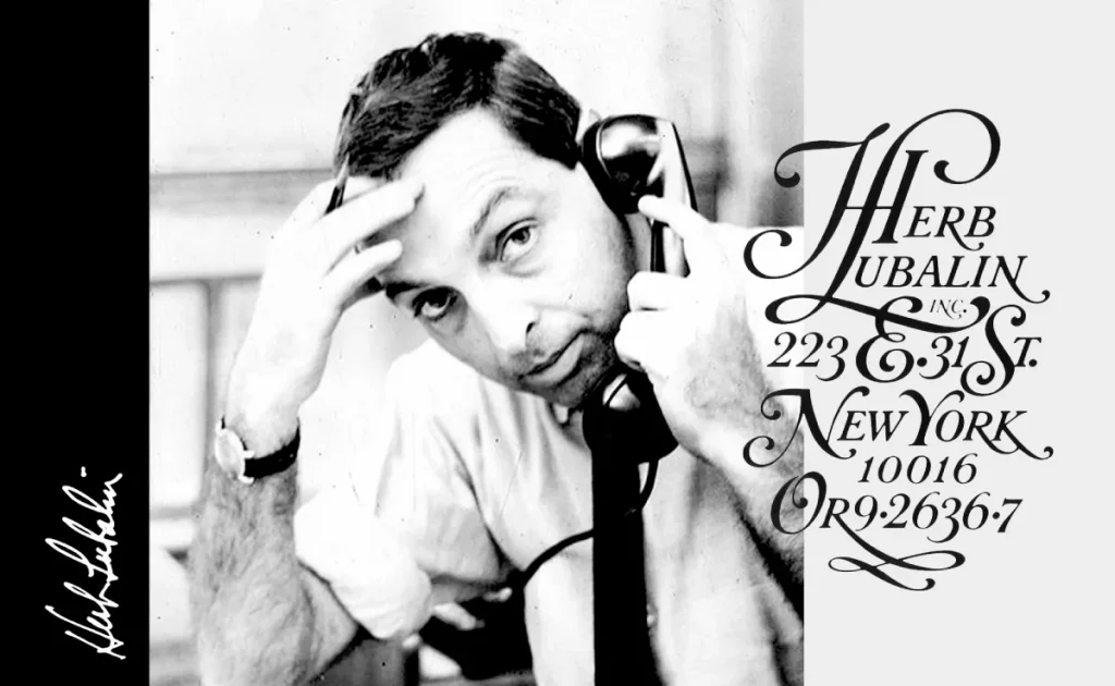
Lubalin saw letters as images and words as visual playgrounds. He bent, broke, and reshaped typography to make it expressive and conceptually powerful. His work was clever and witty, and he pushed the boundaries of what type of communication could be.

- Famous Work: The original PBS logo, the iconic Avant Garde magazine masthead, and the ITC Avant Garde typeface.
- The Takeaway for Your Business: Don’t just choose a font. Think about what your typography says. Is it bold and confident? Elegant and refined? Playful and approachable? Your typeface is a key part of your brand’s voice.
The System Builders: Masters of Clarity and Order
For these designers, the goal was absolute clarity. They created rigorous visual systems, often using mathematical grids, to bring order to chaos and create unified, scalable brand identities.
Massimo Vignelli (1931-2014)
Vignelli’s motto was, “If you can design one thing, you can design everything.” He believed in systematic, grid-based design that could be applied to anything from a business card to a subway system. His work is the definition of clean, modern, and effective.

- Famous Work: The 1972 New York City Subway map, the timeless American Airlines identity (1967), and Knoll.
- The Takeaway for Your Business: A brand isn’t just a logo. It’s a system. Establish clear rules for your colours, typography, and layout to ensure consistency and professionalism everywhere your brand appears.
Josef Müller-Brockmann (1914-1996)
A leading figure of the Swiss Style (International Typographic Style), Müller-Brockmann was obsessed with the grid. He used it to create objective, clear, and universally understandable communication, stripping away all personal expression for clarity.
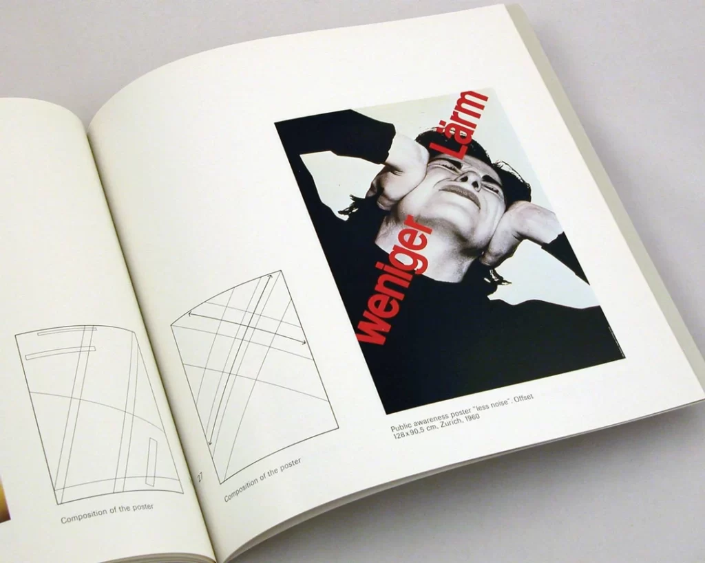
- Famous Work: The “Musica Viva” series of concert posters is a masterclass in grid-based design.
- The Takeaway for Your Business: Structure creates freedom. A solid design grid for your website or marketing materials doesn’t restrict creativity; it provides a framework that makes your content easier to navigate and understand.
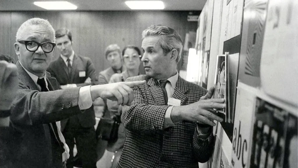
Wim Crouwel (1928-2019)

Known affectionately as “Gridnik,” Crouwel was another Dutch master of the grid system. He designed with an almost scientific precision, creating experimental typefaces and systematic layouts for major cultural institutions.
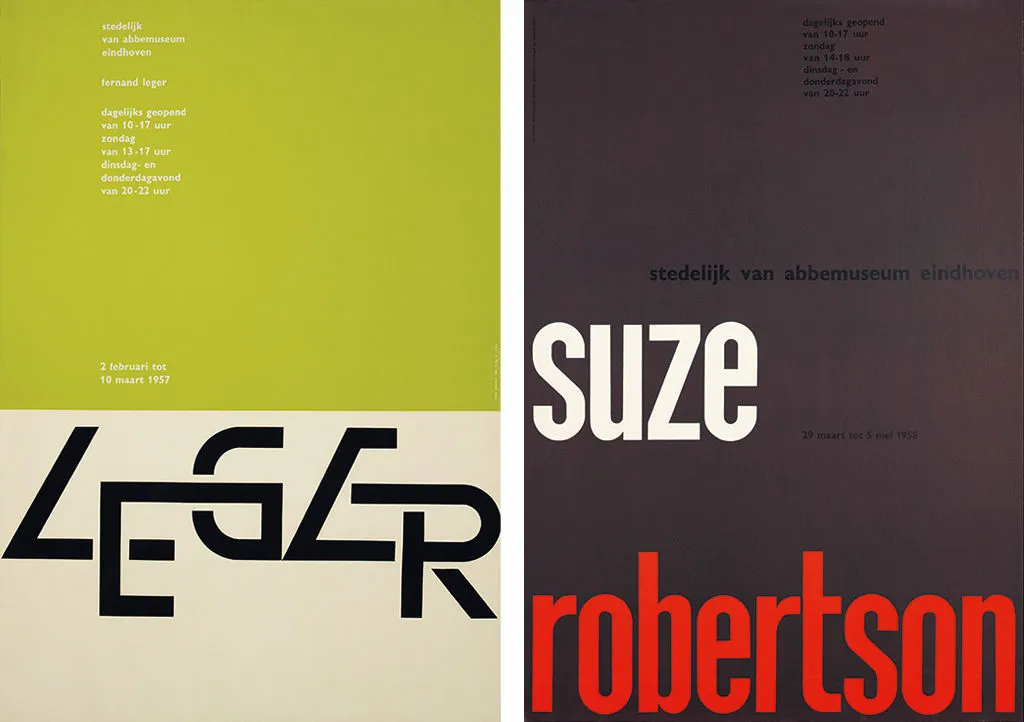
- Famous Work: His posters for the Stedelijk Museum in Amsterdam, and his futuristic “New Alphabet” typeface designed for early computer screens.
- The Takeaway for Your Business: Design for your context. Crouwel designed for the limitations of technology. Your website should be created for a mobile screen, and your social posts for a fast scroll. Function dictates form.
Otl Aicher (1922-1991)
Aicher created one of the most comprehensive and successful brand identity systems in history for the 1972 Munich Olympics. He developed a set of stick-figure pictograms for sports that became a universal language, still influencing icon design today.
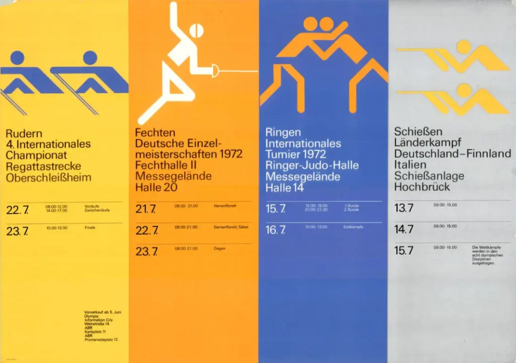
- Famous Work: The complete visual identity and pictogram system for the 1972 Munich Olympics.
- The Takeaway for Your Business: Use visuals to communicate quickly and universally. Well-designed icons can transcend language barriers and make your user interface or instructions much easier to understand.
The Big Idea: Designers Who Made Us Think
These designers focused on the concept, the clever twist, the single visual idea that could instantly communicate a complex message. Their work is brilliant, often witty, and always memorable.
Milton Glaser (1929-2020)

Glaser was a giant of American design, co-founding New York magazine and creating some of the most recognisable symbols of the 20th century. He believed design should be a personal, humanistic act of communication.
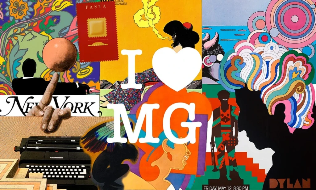
- Famous Work: The ubiquitous I ❤ NY logo (famously sketched in a taxi), his psychedelic Bob Dylan poster, and the DC Comics “bullet” logo.
- The Takeaway for Your Business: The best ideas are often the simplest. Don’t be afraid of a direct, emotionally resonant message. A great idea can be more powerful than a complex execution.
Alan Fletcher (1931-2006)

A founding partner of the legendary design firm Pentagram, Fletcher was a master of visual wit. His work was intelligent and playful, blending European modernism with a uniquely British sense of humour.
- Famous Work: The clever logos for the V&A Museum and Reuters, and his influential book, The Art of Looking Sideways.
- The Takeaway for Your Business: Your brand can have a personality. A touch of cleverness or wit can make your business more memorable and relatable than your more buttoned-up competitors.
Shigeo Fukuda (1932-2009)

Fukuda was Japan’s master of illusion and visual trickery. His posters often contained impossible shapes and clever optical illusions, delivering powerful social and environmental messages with minimal text.
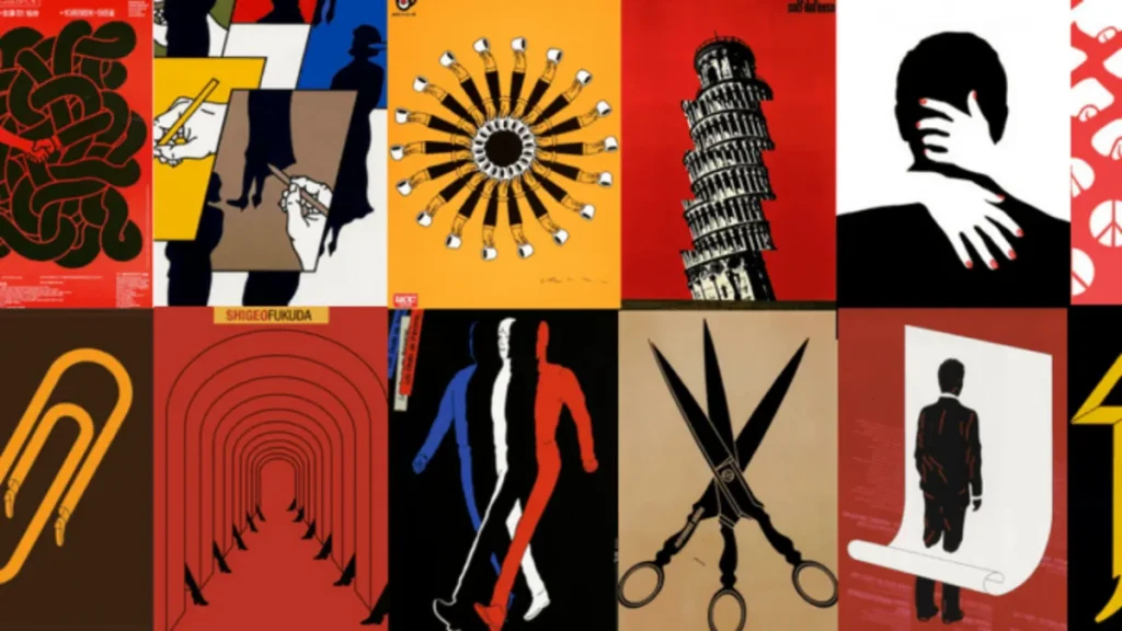
- Famous Work: His stark “Victory 1945” poster depicts a cannonball fired back into the cannon’s barrel.
- The Takeaway for Your Business: Surprise and delight your audience. A clever visual twist can make people stop, look twice, and remember your message long after they’ve scrolled past it.
The Rule Breakers and Provocateurs
When modernism started to feel too rigid, these designers tore up the grid, mixed their typefaces, and injected chaos and raw emotion into graphic design.
Neville Brody (born 1957)
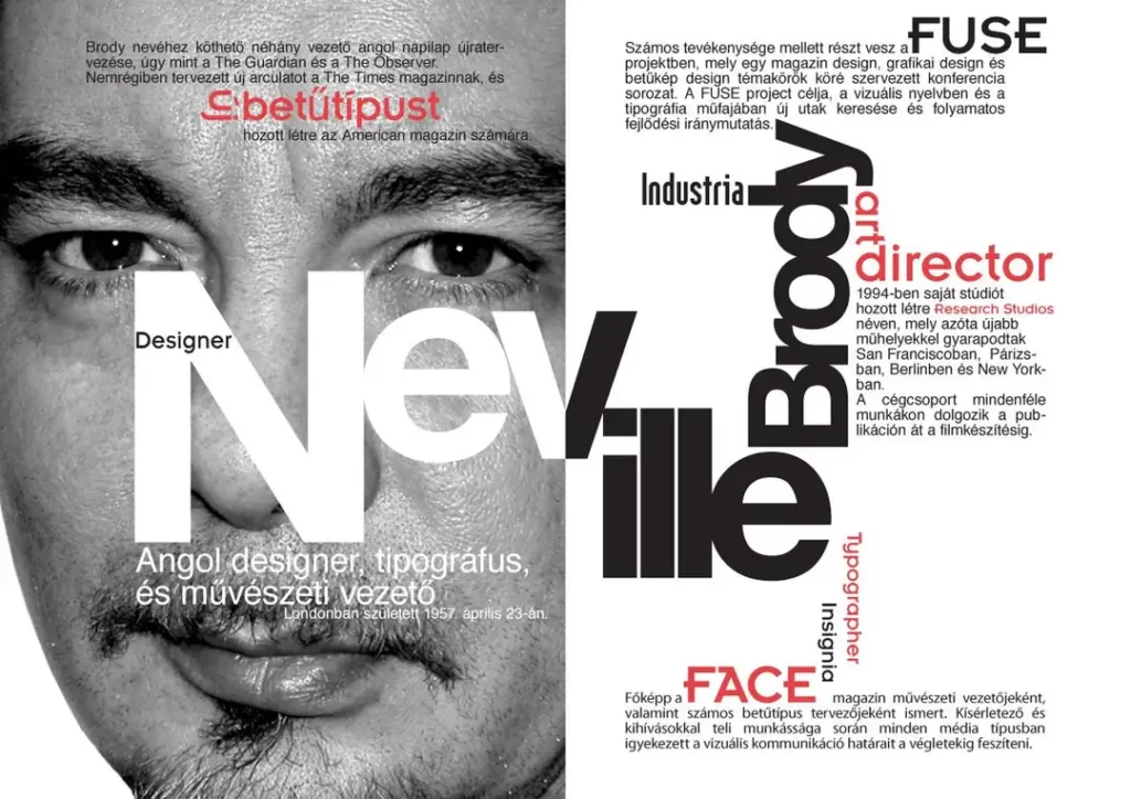
Brody’s work on magazines like The Face in the 1980s defined an entire era of youth culture. He broke every rule of traditional typography, creating a visual language as energetic and rebellious as the music it represented.
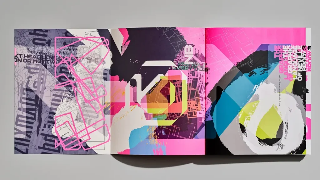
- Famous Work: Art direction for The Face and Arena magazines; numerous custom typefaces.
- The Takeaway for Your Business: Know the rules before you break them. Brody’s chaotic style worked because he had a deep understanding of structure. Purposeful rebellion stands out; random mess just looks unprofessional.
David Carson (born 1955)
Carson took Brody’s rule-breaking to its logical extreme at Ray Gun magazine. He intentionally made text illegible, overlapped photos, and designed based on pure intuition and emotion. His “grunge typography” was controversial but massively influential.
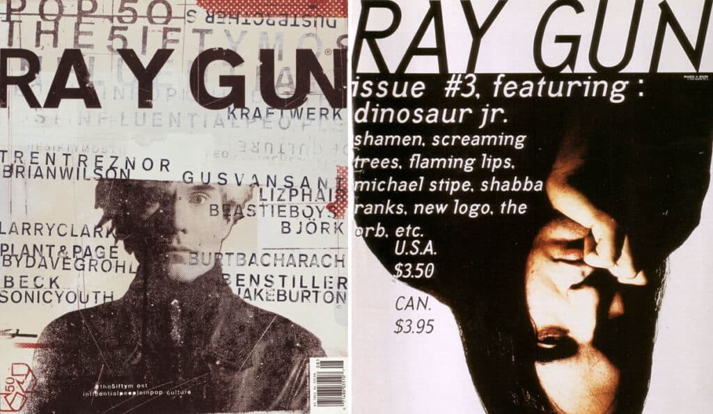
- Famous Work: His experimental and iconic art direction for Ray Gun magazine.
- The Takeaway for Your Business: Emotion is a powerful tool. While you probably shouldn’t make your annual report unreadable, consider how to use visual energy to connect with your target audience on a gut level.
Stefan Sagmeister (born 1962)

Sagmeister is known for his conceptual, provocative, and often deeply personal work. He blurs the line between design and art, using his life and body as a canvas to explore themes of happiness, work, and creativity.

- Famous Work: The AIGA Detroit poster, where he had the event details carved into his own skin; the “Things I have learned in my life so far” series.
- The Takeaway for Your Business: Authenticity connects. People are drawn to brands with an objective perspective and aren’t afraid to be vulnerable. Find your truth and express it visually.
The Digital Frontier: Pixels, Pointers, and Platforms
These pioneers shaped how we interact with technology. They proved that sound design principles apply just as much to pixels on a screen as they do to ink on paper.
Susan Kare (born 1954)

You know Kare’s work if you used an Apple computer in the 80s. She is the artist who made the original Macintosh friendly and approachable, designing the first icons, like the Happy Mac, the trash can, and the wristwatch.

- Famous Work: The original icon set and fonts for the Apple Macintosh.
- The Takeaway for Your Business: Make it human. Kare turned a command-line interface into a friendly “desktop” using simple, metaphorical icons. Simplify complex ideas for your users and make your digital experience intuitive.
April Greiman (born 1948)

Greiman was among the first designers to embrace the computer as a design tool. While others saw it as a cold, technical device, she saw its potential for creating layered, complex, and vibrant new visual styles, bringing a West Coast “New Wave” aesthetic to the digital world.
- Famous Work: Her groundbreaking poster-slash-magazine-issue for Design Quarterly #133, “Does it make sense?”.
- The Takeaway for Your Business: Embrace new tools. Don’t be afraid to experiment with the latest technologies and platforms. The first to master a new medium often defines it for everyone else.
Muriel Cooper (1925-1994)

As the MIT Media Lab co-founder and longtime art director for MIT Press, Cooper was a visionary who explored the possibilities of digital design decades before her time. She pioneered interactive, 3D typographic environments that foreshadowed the web.
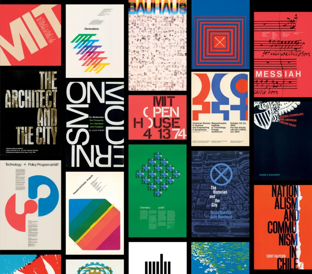
- Famous Work: The classic, minimalist MIT Press “colophon” logo; her influential work on “Information Landscapes” at the MIT Media Lab.
- The Takeaway for Your Business: Think about information architecture. How your information is structured is a design choice. A clear, logical, and intuitive user experience is a competitive advantage.
The Modern Titans: Shaping Brands Today
These designers, many partners at the powerhouse firm Pentagram, continue to define and redefine what branding means for the world’s biggest companies.
Paula Scher (born 1948)
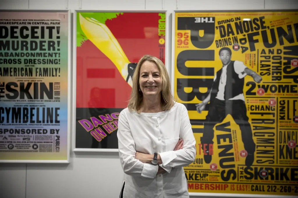
Scher’s work is bold, typographic, and environmental. She “paints with words,” creating vibrant, expressive, and integrated identities into physical spaces. She’s a master of making brands visible and culturally relevant.

- Famous Work: The dynamic identity for The Public Theater; the Citibank logo (famously sketched on a napkin); the Windows 8 logo.
- The Takeaway for Your Business: A great idea can happen anywhere, but it’s born from decades of experience. The “napkin sketch” story is great, but it was backed by immense strategic thinking that made the simple solution possible.
Michael Bierut (born 1957)

Bierut is the ultimate design problem-solver. He practices “demystifying” design, making it accessible and understandable. His work is consistently brilliant, elegant, and rooted in a clear, central idea.

- Famous Work: The Hillary Clinton 2016 campaign “H” logo; the identity for Saks Fifth Avenue; co-founder of the Design Observer blog.
- The Takeaway for Your Business: Good design is good communication. Before you start designing, be clear on what you want to say, who you’re saying it to, and why they should care.
Chip Kidd (born 1964)

Kidd revolutionised book cover design. Before him, covers were often an afterthought. He turned them into miniature works of art and storytelling, creating iconic images that defined the books they wrapped.
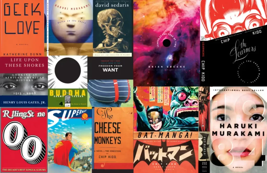
- Famous Work: The unforgettable T. rex skeleton cover for the Jurassic Park novel.
- The Takeaway for Your Business: Your “packaging” matters. The first impression is critical, whether it’s a book cover, a website homepage, or a product box. It must be compelling enough to make someone want to see what’s inside.
Lindon Leader (born 1948)
Leader is the man behind arguably one of the cleverest logos of all time. His design philosophy is “simplicity and clarity,” a principle perfectly embodied in his most famous work.

- Famous Work: The FedEx logo perfectly symbolises speed and precision with its “hidden” arrow between the E and the x.
- The Takeaway for Your Business: Reward a closer look. While your main message should be clear, building in a subtle, clever detail can create a delightful “aha!” moment for your audience, making your brand more memorable.
The New Guard: Influence in the Internet Age
These contemporary designers have built their careers in social media, digital branding, and personal projects, inspiring a new generation.
Jessica Walsh (born 1986)

A former partner at Sagmeister & Walsh, Walsh now runs her own creative agency, &Walsh. Her work is often bold, colourful, surreal, and highly conceptual, pushing brands to be brave and unconventional.

- Famous Work: Her vibrant client work and personal projects like “40 Days of Dating” became a global phenomenon.
- The Takeaway for Your Business: Be bold. A “safe” brand is an invisible brand in a crowded market. Don’t be afraid to develop a strong visual personality that stands out.
Shepard Fairey (born 1970)
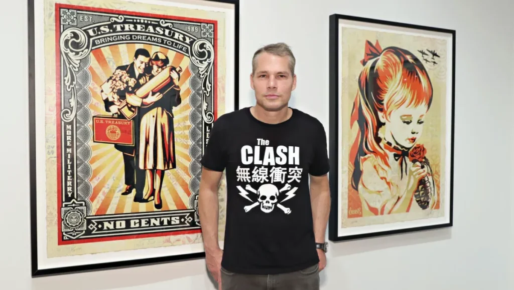
Starting as a street artist with his “Andre the Giant Has a Posse” sticker campaign, Fairey became a household name with his iconic poster for Barack Obama’s 2008 campaign. His work blends art, design, and activism.
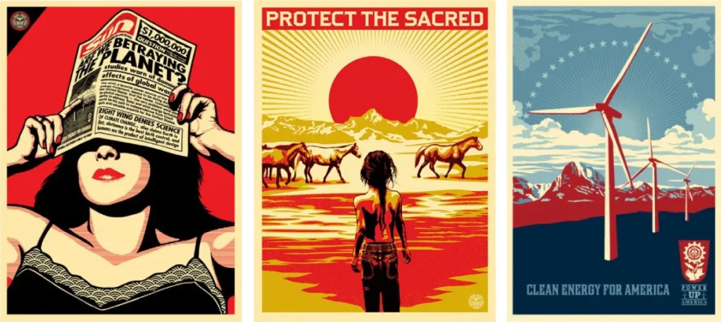
- Famous Work: The OBEY Giant street art campaign; the Obama “Hope” poster.
- The Takeaway for Your Business: A strong message, repeated consistently, can build a movement. Find your core message and share it everywhere.
Kate Moross (born 1986)
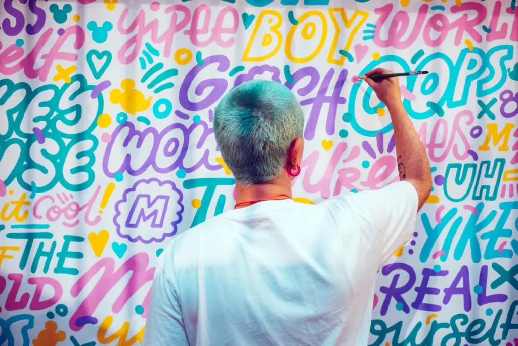
Moross is a London-based designer whose work is an explosion of colour, energy, and free-form typography. She directs a creative studio that champions a playful, illustrative, and inclusive approach to design.
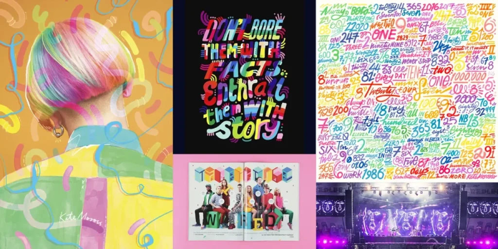
- Famous Work: Her vibrant branding, illustration, and video work for countless music artists and lifestyle brands.
- The Takeaway for Your Business: Joy is a valid brand attribute. If your business is about energy, creativity, and fun, your visual identity should shout it from the rooftops.
Armin Hofmann (1920-2020)

A titan of the Swiss Style, Hofmann’s influence as an educator is arguably as significant as his design work. He taught generations of designers to focus on fundamental principles of form, contrast, and simplicity.
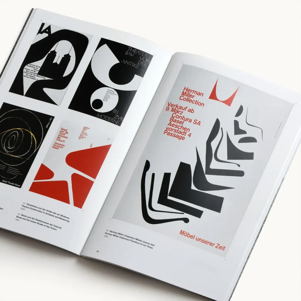
- Famous Work: His poster for the Giselle ballet is a typographic and photographic synthesis masterpiece.
- The Takeaway for Your Business: Master the basics. Before you get fancy, ensure your design is built on a solid foundation of good typography, clear hierarchy, and balanced composition.
The Real Lesson: What All These Greats Have in Common
Looking at this list, you see different styles, eras, and technologies. But the core principles are the same.
- They are problem-solvers first. They didn’t start by asking “What looks cool?” They asked, ” What problem do we need to solve?”
- They embrace constraints. Budget, technology, client demands—they used limitations to fuel creativity, not stifle it.
- They value the idea above all. The execution is brilliant, but it’s in service of a powerful central concept.
Their work has lasted not because it was trendy, but because it was built on a solid foundation of strategic thinking.
Applying These Principles to Your Brand
Understanding these lessons is the first, most crucial step. The second is execution. You can see how focusing on systems, a big idea, or clever typography could transform your business’s perception from amateur to authoritative.
This is where professional design comes in. It’s not about finding someone who can make a pretty picture; it’s about finding a partner who can translate your business goals into a visual language that works.
Whether you’re just starting or feel your current branding is holding you back, a strategic approach is the only path forward.
If you’re ready to build a brand identity based on timeless principles, not fleeting trends, look at how we approach the challenge. Explore our graphic design services to see our process in action.
Stop Chasing, Start Communicating
The lesson from these 25 masters is clear: Great design isn’t decoration. It’s a potent tool for communication. It results from rigorous thinking, a deep understanding of audience, and a clear strategic goal.
So, close your Pinterest board. Stop asking what’s trendy.
Instead, ask: What does my business need to say? And how can I say it so clearly that it can’t be ignored?
Frequently Asked Questions About Famous Graphic Designers
Who is considered the most famous graphic designer of all time?
While subjective, Paul Rand is often cited as one of the most famous and influential graphic designers, mainly for his work defining modern corporate identity with logos for IBM, UPS, and ABC.
What is the Swiss Style of graphic design?
The Swiss Style, or International Typographic Style, is a design movement that emerged in the 1950s. It emphasises cleanliness, readability, and objectivity, using asymmetric layouts, sans-serif typefaces like Helvetica, and a strict mathematical grid. Josef Müller-Brockmann and Armin Hofmann were key figures.
What’s the difference between a graphic designer and a brand strategist?
A graphic designer creates the visual assets (logo, website, etc.). A brand strategist defines the brand’s core message, positioning, and personality that the visuals need to communicate. The best designers, like those on this list, are both.
Can I just copy the style of a famous designer for my logo?
You shouldn’t. Their style was a solution to a specific problem for a particular client at a specific time. Copying the style without the strategy behind it will result in a derivative design and likely be ineffective for your unique business needs.
How did designers create their work before computers?
Before computers, graphic design was a manual process involving sketching, typesetting, paste-up boards, darkroom photography, and physical cut-and-paste. Designers like Paul Rand and Saul Bass created their iconic work by hand.
What did Saul Bass design?
Saul Bass was famous for designing iconic corporate logos like the AT&T “globe” and the United Airlines “tulip,” as well as groundbreaking film title sequences for movies like Psycho, The Man with the Golden Arm, and Goodfellas.
What is Milton Glaser’s most famous work?
Milton Glaser’s most famous work is the “I ❤ NY” logo, which he designed pro bono in 1977 to promote tourism in New York. It has become one of the most recognised symbols in the world.
Who designed the FedEx logo?
The FedEx logo was designed in 1994 by Lindon Leader at Landor Associates. It is celebrated for its clever use of negative space to create an arrow between the “E” and “x”.
Why are there fewer women on historical design lists?
Historically, like many professions, design was male-dominated, and women’s contributions were often overlooked or uncredited. Pioneers like Cipe Pineles, Muriel Cooper, and April Greiman were instrumental in paving the way for the many prominent female designers today, such as Paula Scher and Jessica Walsh.
What can a small business learn from these designers?
The most important lesson is to treat design as a strategic investment, not a cosmetic expense. Focus on clarity, simplicity, and communicating a single, strong idea that solves a business problem.
Who is David Carson?
David Carson is a graphic designer who rose to fame in the 1990s for his experimental and unconventional work as the art director of Ray Gun magazine. He is known as the “father of grunge typography.”
What makes a logo design timeless?
Timeless logos, like those created by Paul Rand, are typically simple, memorable, appropriate, and versatile. They are built on a strong concept rather than a stylistic trend, allowing them to remain effective for decades.
Ready to apply timeless design principles to your business? Don’t leave your brand’s first impression to chance. If you want to build a brand identity based on strategy, not just aesthetics, our team is ready to help.
Request a Quote Today, and let’s create something that communicates, connects, and endures.

