Colour Psychology in Branding: The Science of Influence
Most entrepreneurs choose brand colours the same way they select a tie or a scatter cushion: based on personal preference.
“I like blue,” says the CEO of a disruption-focused tech startup, unwittingly choosing the single most safe, conservative, and ubiquitous colour in the corporate world. By doing so, they signal “establishment” and “safety” rather than “innovation” or “risk.”
This is a fundamental failure of communication.
Colour is not decoration. It is the first thing a human brain processes, often before shape or text. According to research cited by the Institute for Colour Research, users make a subconscious judgment about a person, environment, or product within 90 seconds of initial viewing, and between 62% and 90% of that assessment is based solely on colour.
If you get this wrong, you are fighting an uphill battle with your copy and sales pitch. You are trying to convey excitement while wearing a beige suit.
This guide moves beyond the primary school colour wheel. We are examining the commercial application of colour psychology in branding, the physiological triggers that drive purchasing decisions, and why your favourite colour may be irrelevant to your business success.
- Colour psychology impacts branding: Understanding how colours influence emotions and behaviours is crucial for effective brand identity and consumer connection.
- Choosing brand colours builds recognition: Appropriate colour selection evokes emotions, conveys brand personality, and differentiates the brand from competitors.
- Consider target audience and trends: Aligning colour choices with audience preferences, market trends, and brand values enhances emotional connections and strengthens brand identity.
What is Colour Psychology in Branding?
Colour psychology in branding is the study of how colour determines human behaviour, perception, and decision-making within a commercial context.
It is the strategic use of hue, saturation, and brightness to manipulate the subconscious impression a brand leaves on a consumer.
At its core, it relies on three components:
- The Biological Response: How our eyes and brains physically react to light wavelengths (e.g., red raises heart rates).
- The Cultural Association: The learned meanings of colour based on geography and society (e.g., white is for weddings in the West, mourning in the East).
- The Personal Context: Individual associations based on memory and experience.
Your goal is to align these three layers so that your visual identity reinforces your market positioning rather than contradicting it.
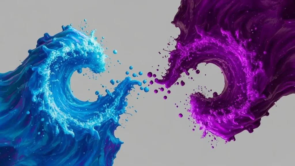
The Myth of Universality (Or, Why Red Doesn’t Always Mean ‘Stop’)
If you Google “colour psychology,” you will find a thousand infographics telling you that yellow means “happiness” and green means “nature.”
Tear those up. They are dangerous simplifications.
Context is the only thing that matters. Green does represent nature, especially when selling organic kale. If you are selling financial services, green represents money and growth. If you are selling meat, green represents rot and bacteria.
The Ecological Valence Theory suggests that our colour preferences arise from how we feel about the objects associated with those colours. We like blue because clear skies and clean water are good for survival. We dislike brown yellows because they are detrimental to survival, often associated with rotting food and waste.
But in branding, appropriateness trumps preference.
A study titled “Impact of Colour on Marketing” found that the relationship between brand and colour hinges on the perceived appropriateness of the colour being used for the particular brand. In other words: Does this colour “fit” what is being sold?
If you launch a funeral home with a bright hot-pink logo, you might argue pink represents “love,” but your market will read it as “disrespectful” or “unserious.” The disconnect between expectations and reality causes cognitive dissonance, and cognitive dissonance negatively impacts conversion rates.
The Primary Hues: A Forensic Analysis
Let’s break down the major colour groups, not by their poetic meanings, but by their commercial and psychological impact.
Red: The Physiological Trigger
Red is the only colour that causes a measurable physical reaction. It has the longest wavelength in the visible spectrum. Exposure to intense red light can increase heart rate and blood pressure. It creates urgency.

The Commercial Application:
- Clearance Sales: Retailers use red for “Sale” signs because it arrests attention and inhibits analytical thinking, encouraging impulse buying.
- Food & Beverage: Red is an appetite stimulant. It’s no accident that Coca-Cola, McDonald’s, KFC, and Pizza Hut all dominate this spectrum.
- The Risk: It can signal danger, debt (in the red), or aggression. For a healthcare provider or a spa, red is usually a strategic error.
Blue: The Safe Bet
Blue is the complementary colour to red. It lowers the heart rate and suppresses appetite (there are very few naturally occurring blue foods). It signals stability, logic, and cold competence.

The Commercial Application:
- Tech & Finance: IBM (Big Blue), Intel, Dell, Facebook, PayPal, Visa, American Express. These companies trade on trust. They hold your data or your money. They cannot afford to look erratic.
- The “Blue Washing” Effect: Because blue is the world’s favourite colour (across almost all demographics), it is safe. But “safe” is often invisible. If you are a new challenger bank trying to disrupt the industry, using the same Navy Blue as Barclays or Chase makes you blend in. This is why Monzo (fluorescent coral) and Starling (teal/purple) broke the mould.
Yellow: The Double-Edged Sword
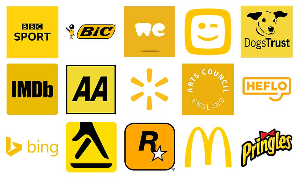
Yellow is the most visible colour to the human eye. It is the first wavelength processed by the retina, which is why hazard signs and taxis are yellow. It grabs attention faster than red but creates eye fatigue quickly due to the high amount of light reflected.
The Commercial Application:
- Disruption & Value: IKEA, Best Buy, McDonald’s (Golden Arches). It suggests affordability and energy.
- Anxiety: Excessive yellow causes anxiety. Babies cry more in yellow rooms. It is a “fast” colour—get in, buy, get out. It is rarely used for luxury brands because luxury requires time and leisure, whereas yellow screams “hurry.
Green: The Bridge
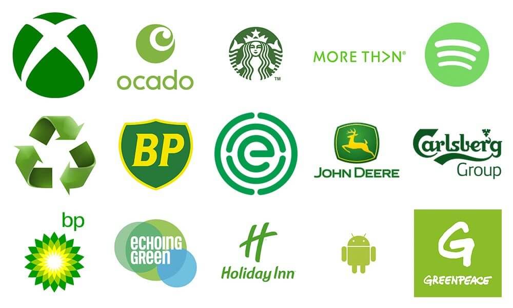
Green sits in the centre of the spectrum. It requires no adjustment of the eye to process, making it a restful experience.
The Commercial Application:
- Wealth vs. Health: Dark forest green is “old money” (Land Rover, Harrods). Bright lime green is “tech start-up” or “energy” (Android, Spotify).
- The BP Rebrand: British Petroleum spent millions rebranding to a sunburst green “Helios” logo, aiming to shift its perception from “oil driller” to “energy company.” It was a psychological play to associate the brand with environmental responsibility—a classic example of using colour to manipulate brand narrative.
The Nuanced Meaning Matrix (Context is King)
Don’t ask “What does Blue mean?” Ask “What does Blue mean in my industry?”
| Colour | In Finance | In Food | In Tech | In Beauty |
| Blue | Trust, Stability (Amex) | Suppressant (Avoid) | Logic, Code (IBM) | Clinical, Medical (La Roche) |
| Red | Debt, Danger (Avoid) | Appetite, Impulse (KFC) | Alert, Error (Avoid) | Passion, Boldness (MAC) |
| Green | Wealth, Growth (Fidelity) | Organic, Fresh (Whole Foods) | Energy, Go (Android) | Natural, Clean (Origins) |
| Black | Premium, Exclusive (Amex Black) | Burnt, Bitter (Avoid) | Hardware, Sleek (Apple) | Luxury, High-End (Chanel) |
| Orange | Cheap, Value (EasyJet) | Citrus, Zest (Fanta) | Friendly, Startup (HubSpot) | Energy, Vitamin C (Garnier) |
The “Isolation Effect” (Von Restorff Effect)
This is a concept many generic marketing guides miss. The Von Restorff Effect states that an item that “stands out like a sore thumb” is more likely to be remembered than other items.
In a sea of blue tech logos, the orange logo wins. Not because orange is “better,” but because it is different.
Case Study: Monzo
When Monzo launched in the UK, it didn’t just build a better banking app; it also released a fluorescent “hot coral” debit card. In a wallet full of dull navy, black, and grey cards from legacy banks, the Monzo card stood out as a visual standout.
Users would pull it out at a bar, and friends would ask, “What is that?”
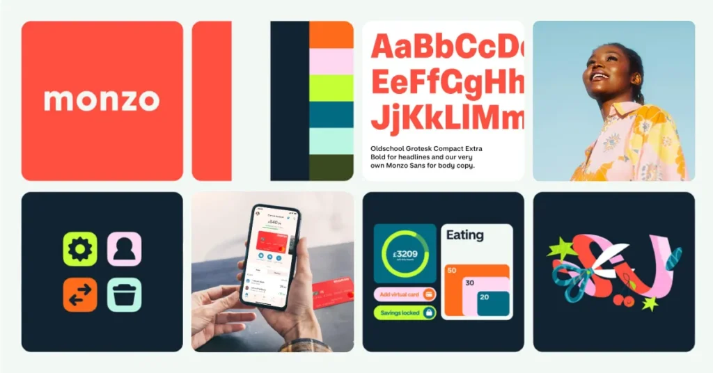
That is the Isolation Effect in action. The colour itself became a marketing channel. It turned a utility object (a debit card) into a conversation piece.
If you are looking for colours for your brand, do not just look at your personality. Look at your competitors. If they all Zig, you must Zag. If the entire industry is blue, you cannot be blue.
Technical Nuances: Contrast, Accessibility, and Vibrancy
Choosing a hue is step one. Step two is ensuring that hue actually works in the real world.
The Contrast Ratios (WCAG)
We live in a digital-first economy. If your brand colours do not comply with the Web Content Accessibility Guidelines (WCAG), you are excluding users with visual impairments and potentially harming your SEO.
Google cannot “see” your brand, but it can read your code. If your text-to-background contrast ratio is below 4.5:1, your site is harder to read. High cognitive load (struggling to read) leads to high bounce rates.
RGB vs. CMYK: The Disappointment Gap
I have seen this happen a hundred times. A client falls in love with a neon electric blue on their MacBook screen. They sign off on the branding. Then they print 5,000 business cards, and that electric blue comes back as a muddy, dull purple-blue.
- RGB (Red, Green, Blue): Additive colour. Light-based (Screens). Capable of millions of bright, neon colours.
- CMYK (Cyan, Magenta, Yellow, Key/Black): Subtractive colour. Ink-based (Print). Much smaller gamut.
The Lesson: Never finalise a brand palette without testing it in CMYK. If your brand relies on a colour that cannot be printed, you will have an inconsistent brand identity.
Gender and Colour: The Data
While we should avoid stereotypes, data from Joe Hallock’s work on colour assignment indicates distinct preferences that marketers should not ignore if they have a gender-skewed target audience.
Blue: The favourite colour for both men (57%) and women (35%).
Purple: The top tier for women (23%) but actively disliked by men (0%).
If you are marketing a power tool to a predominantly male demographic, purple is statistically the single worst choice you could make.
Conversely, if you are marketing a wellness product to women, purple signals luxury and quality, while orange is often cited as the “cheapest” looking colour by female demographics.
However, these lines are blurring. Gen Z consumers are increasingly responsive to “Gender Neutral” aesthetics—earth tones, creams, and acid greens—rejecting the “Pink for Girls, Blue for Boys” binary.
Real-World Case Studies: Success and Failure
The Success: Tiffany & Co.
Tiffany Blue (Pantone 1837) is not just a colour; it is a trademark. You cannot use it. Tiffany & Co. understood that the colour is the brand. The box is so powerful that people sell empty Tiffany boxes on eBay. The colour triggers a Pavlovian response: “Luxury inside.”

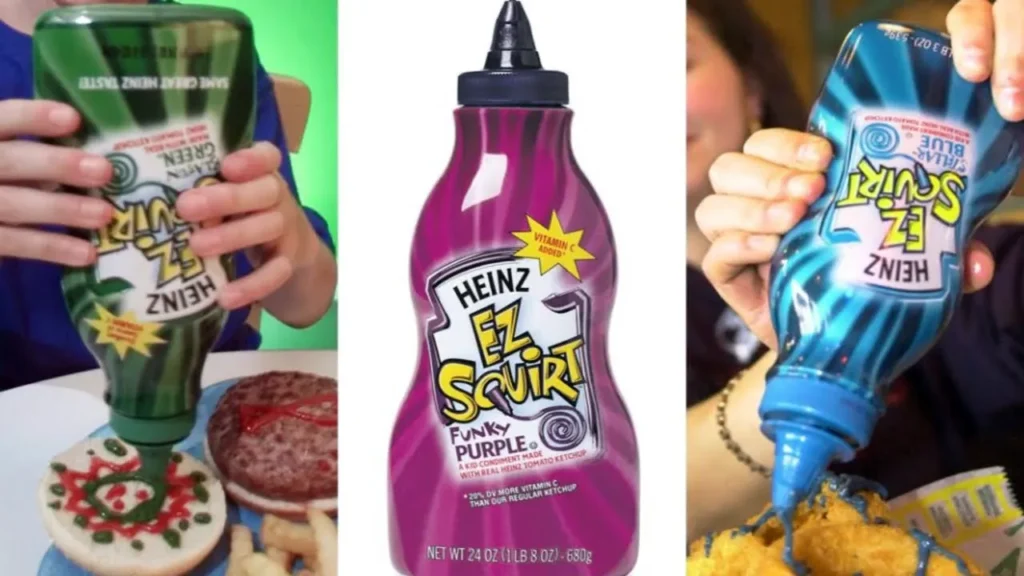
The Failure: Heinz EZ Squirt
In 2000, Heinz released ketchup in purple, green, and blue. It was a novelty hit for kids, but sales eventually collapsed, and the product was pulled. Why? Because adults (the purchasers) have a deep evolutionary aversion to consuming food that appears to have spoiled. We are hardwired to avoid foods with a purple/green hue, well and sauces with similar colours. The novelty could not overcome millions of years of biological programming.
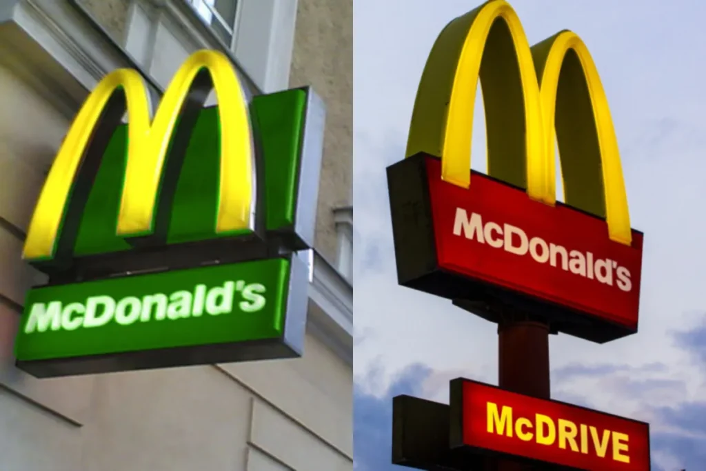
The Pivot: McDonald’s in Europe
Have you noticed that McDonald’s logos in Europe are often yellow on a deep hunter green background, rather than red?
In the 2000s, McDonald’s faced massive backlash regarding health and environmental impact. Red signifies urgency and grease. Green signifies nature and freshness. By changing the background to green, they subliminally softened their image to align with a more health-conscious European market.
How to Choose Colours for Branding
I once audited a law firm that insisted on using a vibrant orange and black palette. They wanted to look “modern.” The problem? In the UK, orange and black are the colours of B&Q (a DIY hardware store) and EasyJet (a budget airline).
The law firm didn’t look modern; it looked cheap.
They ignored the Cultural Semiotics of their market.
Here is the Inkbot Design protocol for choosing a palette:
1. The Competitor Map
Print out the logos of your top 10 competitors. Stick them on a wall.
Group them by colour.
Find the white space. If 80% are blue/grey, you have a strategic opening in deep red or forest green.
2. The 60-30-10 Rule
Do not pick “a colour.” Pick a hierarchy.
- 60% Primary: The anchor. Neutral or semi-neutral (e.g., Charcoal, Navy, Beige).
- 30% Secondary: The brand identifier (e.g., The Tiffany Blue, The Coca-Cola Red).
- 10% Accent: The Call to Action. Used only for buttons and links. It must clash with the other two to create the Isolation Effect.
3. The Context Test
Mock up your homepage. Mock up a business card. Mock up a van wrap.
Does it work in black and white? A logo that relies entirely on colour to be understood is a bad logo.
Does it work on a dark mode screen? (See section below).
The Secret Lives of Colour
You think colour is just decoration. That’s why your understanding is superficial. This book reveals the hidden story. It’s the secret history of 75 colours and their role in war, art, and politics. Stop just looking at shades; learn the power they actually hold.
As an Amazon Partner, when you buy through our links, we may earn a commission.
The Colour Psychology Toolkit
Stop guessing. Use these tools to find data-backed palettes.
- Adobe Color (formerly Kuler): The industry standard. Use the “Extract Theme” tool to upload a photo that matches your “vibe” and get the exact hex codes.
- Coolors.co: Great for generating the “60-30-10” hierarchy. Lock your primary colour and hit spacebar to find matching secondary tones.
- Material Design (Google): A resource for checking how your colours will look in a UI environment (buttons, headers, dark mode).
- Pantone Connect: Essential if you plan to print physical packaging. It bridges the gap between your screen and the ink.
The State of Colour Branding in 2026
We are entering a new era of “fluid identity.”
1. Dark Mode is Default
With over 80% of users preferring dark mode on mobile devices, your brand colours must work on black backgrounds. That pastel yellow you love? It is invisible on a dark background. Brands are now creating “adaptive palettes”—colours that shift slightly in hex code depending on the user’s browser theme.
2. The Revolt Against “Blanding”
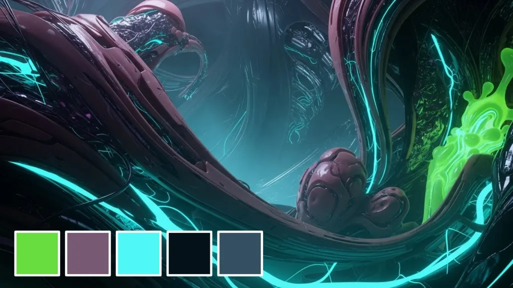
From 2015-2022, we saw “Blanding”—tech startups adopting the same sans-serif fonts and pastel colours. In 2025/26, we are seeing a return to high-contrast, “ugly” aesthetics, and acid tones (Cybergreens, Electric Purples). This is a counter-culture movement against AI-generated genericism.
3. Generative Palettes
Dynamic branding is rising. Instead of one fixed colour, brands like Spotify use a set range of colours that change based on the genre of music or the user’s mood. The “fixed identity” is dying; the “curated mood” is taking over.
Amateur vs. Pro: The Breakdown
| Feature | The Amateur Approach | The Professional Approach |
| Selection Method | “I like this colour.” | “This colour differentiates us in the market.” |
| Palette Depth | One or two colours are used everywhere. | 60-30-10 Hierarchy with neutral anchors. |
| Print Proofing | Trusts the screen. | Checks Pantone/CMYK conversion values. |
| Accessibility | Ignores contrast ratios. | Tests against WCAG AA standards. |
| Psychology | “Blue means trust.” | “Blue means ‘banking’—do we want to fit in or stand out?” |
| Flexibility | Breaks on dark mode. | Adaptive palettes for light/dark environments. |
Checklist: Do You Need to Change Your Colours?
Changing colours is expensive (signage, uniforms, digital assets). Only do it if you hit one of these triggers:
- The Merger: You merged with another company and need a neutral new ground.
- The Category Shift: You used to sell “Budget” (Orange) but now sell “Premium” (Black/Gold).
- The Legibility Fail: Your current colours fail WCAG accessibility tests, and you are losing SEO/Legal standing.
- The “Sea of Sameness”: A new competitor has launched using your exact colour palette.
The Verdict
Colour is not about making things look pretty. It is a tool for manipulation, differentiation, and communication.
If you treat it as an afterthought, you are signalling to your customers that your business is an afterthought. You can have the best product in the world, but if your packaging is brown and yellow in a luxury beauty market, you will fail to stand out.
Stop guessing. Stop picking colours because your partner likes them. Start treating colour as data.
Is your brand identity working for you or against you?
If you are unsure, it is likely the latter. At Inkbot Design, we build identities based on strategy, not guesswork.
Request a Quote today, or explore our Brand Identity Services to see how we turn businesses into brands.
Frequently Asked Questions (FAQ)
Can I trademark a brand colour?
Yes, but it is extremely difficult. You must prove the colour has acquired “secondary meaning” and serves as a unique identifier for your goods (e.g., Tiffany Blue, UPS Brown, Cadbury Purple). You cannot trademark a functional colour (e.g., green for lawnmowers).
How many colours should a brand have?
A standard rule is 1-2 primary colours and 2-3 secondary/neutral colours. Too many colours create visual chaos and dilute brand recognition. The 60-30-10 rule is the industry standard for application.
What is the most expensive colour to print?
Historically, metallic foils and specific Pantones (spot colours) are more expensive than standard CMYK mixing. In digital printing, the amount of toner coverage affects the cost, but in offset printing, the number of plates (colours) dictates the price.
Why do so many tech companies use blue?
Blue is associated with intellect, communication, and trust. It is non-threatening and historically linked to permanence. For companies handling intangible data or money, blue compensates for the lack of physical product by signalling stability.
Does colour psychology work on everyone?
No. Cultural background, gender, and personal experience play huge roles. For example, white represents purity in the UK but death/mourning in parts of Asia. There is no universal “translate” button for colour.
What is the difference between RGB and CMYK for branding?
RGB is for screens (light); CMYK is for print (ink). RGB allows for brighter, more neon colours. CMYK is flatter. You must define your brand codes in both to avoid your bright orange logo looking brown on a business card.
How does colour affect conversion rates?
High-contrast call-to-action (CTA) buttons generally convert better. If your site is blue and your “Buy Now” button is also blue, it blends in. A contrasting orange or green button draws the eye (The Isolation Effect), increasing click-through rates.
What is the best colour for a food brand?
Red and yellow are the classic triggers for hunger and impulse (fast food). Green signals health/organic. Blue is an appetite suppressant and should generally be avoided unless you are selling water or seafood.
Should I follow colour trends?
Generally, no. Colour trends (like “Millennial Pink”) date quickly. If you build your brand on a 2024 trend, you will look outdated by 2026. Strive for timeless elegance over fleeting fashion.
How do I test if my brand colours are accessible?
Use tools like the WebAIM Contrast Checker. You need a contrast ratio of at least 4.5:1 for normal text to ensure users with visual impairments can read your content.
What is the Von Restorff Effect?
Also known as the “Isolation Effect,” it predicts that an object that differs from the rest is most likely to be remembered. In branding, this means choosing a colour that contrasts with your direct competitors to ensure visibility.
Why does my logo look different on my phone vs. my laptop?
Every screen is calibrated differently. iPhones tend to have higher saturation and brightness than standard Dell monitors. You cannot control the user’s screen, which is why checking your colours across multiple devices during the design phase is critical.

