20 Modern Website Design Principles to Follow in 2026
Design isn’t art. If you want art, go to the Tate.
If you want a business asset, you need to understand that your website is a functional interface meant to solve a problem for a human and provide a clear signal to a machine.
Ignoring the technical and psychological foundations of design costs you more than just aesthetics; it costs you visibility, trust, and revenue.
- Design for humans and AI: clear semantic structure, Schema.org, and entity-focused headings for machine and user clarity.
- Prioritise performance: optimise INP, LCP, zero layout shift, CSS containment, and fetchpriority for fast, stable interactions.
- Reduce cognitive load: single primary CTA per page, clear information scent, and minimalist choice architecture.
- Accessible and sustainable by default: WCAG-compliant semantic HTML, dark mode, reduced assets, and privacy-focused consent design.
What are Website Design Principles?
Website design principles are a set of foundational rules and psychological guidelines used to create digital interfaces that are functional, accessible, and conversion-oriented.
They balance user experience (UX) with technical performance and search engine requirements to ensure a site achieves its primary business objectives.
In 2026, website design principles have shifted toward Agentic UI. This means the site is not just a destination for humans, but an interface for AI Agents acting on behalf of users.
The foundation of this is a Human-Centric Ontology—a structured way of categorising your site’s data so that both a human eye and a machine learning model can instantly identify the “Entity” (e.g., your business) and its “Attributes” (e.g., your services).
Design is now the process of mapping these relationships into a visual space.
The three core elements of modern design principles include:
- Visual Communication: Using hierarchy, colour, and typography to guide the user’s eye.
- Technical Performance: Ensuring speed, accessibility, and clean code (like GeneratePress structures).
- Semantic Intent: Aligning content and structure to be easily understood by both humans and LLMs (Large Language Models).
Understanding why web design is important starts with acknowledging that your site is often the only salesperson working 24/7 for your brand.
1. Generative Engine Optimisation (GEO) Layouts
In 2026, we are no longer designing solely for Google’s traditional blue links.
We are designing for AI-led search experiences (SGE, Perplexity, and OpenAI’s Search). These engines “read” your site differently.
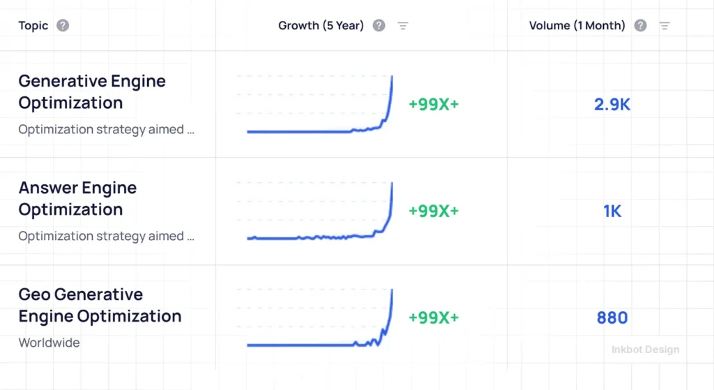
Your layout must be semantically clear. This means your H1, H2, and H3 tags shouldn’t only be for styling; they must also define the entity relationships within your content.
A “GEO-ready” layout utilises structured data (Schema.org) and a clear information architecture to help AI agents accurately scrape and cite your content.
If an AI can’t parse your site’s purpose in under 200ms, you don’t exist in the future of search.
The Human-AI Handoff Protocol
In 2026, your website isn’t just a brochure; it’s a workspace for the user’s AI Co-pilot. “Agentic UI” requires designing clear visual states for when an AI is processing data versus when a human needs to intervene.
- The “Thinking” State: Don’t Just Use a Spinner. Use “Explainability on Demand”—a UI pattern that lets users click to see what the AI is analysing (e.g., “Scanning pricing table…”).
- The “Validation” State: Before an agent executes a purchase or booking, the design must present a clear, high-contrast “Confirm” modal that breaks the flow to prevent “Autonomy Drift.”
Technical Tip: Use the aria-live="polite" attribute to announce AI status updates to screen readers without interrupting the user’s flow.
2. The Death of the “Above the Fold” Obsession
For years, designers lived in fear of “the fold.” In 2026, we know that users are conditioned to scroll, thanks to the infinite feeds of social media.
The principle has shifted from “cramming everything at the top” to “Visual Continuity.”
Instead of a cluttered hero section, use a “Scroll Cue” or a “Peeking Element” that suggests more content lies below.
Data from NN/g (Nielsen Norman Group) shows that while the top of the page still gets the most attention, engagement is higher on pages that encourage a narrative flow.
3. Interaction to Next Paint (INP) as a Design Priority
Core Web Vitals are no longer “optional SEO tasks.” They are core design constraints. INP measures how quickly your site responds to user interactions (like clicking a menu).
If your design relies on heavy third-party scripts or poorly optimised GeneratePress child theme functions, your INP will suffer.
We now design with “Optimistic UI” patterns—showing a loading state or a partial transition immediately so the user never feels the “lag” of the server.
Technical excellence in 2026 requires mastery of CSS Containment and Priority Hints.
Beyond just setting image dimensions, you must use the fetchpriority=”high” attribute for your LCP (Largest Contentful Paint) element to tell the browser what to render first.
Furthermore, implementing content-visibility: auto allows the browser to skip the rendering of off-screen elements, drastically reducing the initial TTI (Time to Interactive).
If your design isn’t prioritising the “Critical Rendering Path” at the code level, it is technically obsolete.
4. Variable Typography and Performance
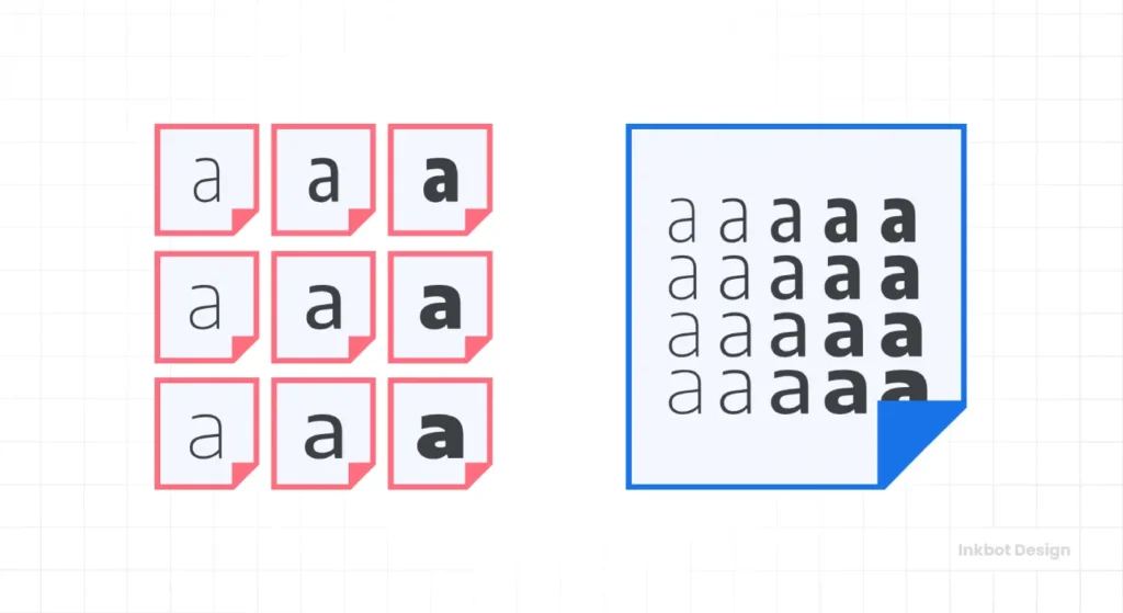
The days of loading five different weights of a single font are over. It’s a performance killer. Modern website design principles dictate the use of Variable Fonts.
A single variable font file allows you to adjust weight, width, and slant using CSS, reducing HTTP requests and improving LCP (Largest Contentful Paint).
From a design perspective, this allows for more fluid hierarchy without the “FOUT” (Flash of Unstyled Text) that plagues amateur builds.
5. Cognitive Load Minimisation
Your users are tired. They are bombarded with information. A successful design in 2026 is one that requires the least amount of “thinking” to navigate.
This is achieved through Hick’s Law: the more choices you give someone, the longer it takes them to make a decision.
I often see service pages with 15 different call-to-actions. That’s not a strategy; that’s a panic attack. We recommend a single, primary goal per page.
If you are building a UK services page for a branding agency, don’t ask them to subscribe to a newsletter, follow you on X, and book a call all at once. Ask them to do the one thing that matters.
From a commercial perspective, applying these principles is a direct strategy for Reducing Decision Fatigue. In an era of infinite choice, the “Conversion Moat” is simplicity.
By adhering to Hick’s Law and Miller’s Law (which suggests the human brain can only hold about seven items in working memory), you are essentially lowering the “Cognitive Tax” on your customers.
This leads to a higher Average Order Value (AOV) and a lower Cost Per Lead (CPL), as users can navigate the path to purchase without psychological friction.
| Feature | Amateur Approach (The “Fluff” Way) | Professional Approach (The Inkbot Way) |
| Images | Large JPEGs, “Lazy Load” only. | WebP/Avif, Specific “Fetch Priority” for LCP. |
| Typography | 4-5 Google Font weights. | 1 Localised Variable Font. |
| Navigation | Mega-menus with 50+ links. | Intent-based, tiered architecture. |
| Code Base | Heavy Page Builder (Elementor/Divi). | Lightweight (GeneratePress + Blocks). |
| Accessibility | Added as a plugin (Overlay). | Built-in semantic HTML and ARIA. |
6. Micro-Interactions as Feedback Loops
Design is a conversation. When a user hovers over a button or submits a form, the site should “speak” back.
Micro-interactions—small animations or colour shifts—provide the feedback necessary to confirm an action has been taken.
However, by 2026, these must be CSS-based, rather than JavaScript-heavy. Over-animating leads to “interaction fatigue.” Use them sparingly to highlight the “Path of Least Resistance” toward your contact page.
7. The Myth of the “Three-Click Rule”
I mentioned this earlier, but it deserves its own section.
The idea that a user should be able to find anything in three clicks is a relic of the early 2000s. It leads to shallow, wide navigation menus that overwhelm the brain.
Instead, we use “Information Scent.” If a user feels they are getting closer to their answer with every click, they will click 10 times without frustration.
Use clear, descriptive anchor text and avoid “Click Here” or “Learn More.”
8. Accessible Design by Default
In 2026, accessibility is no longer a “nice to have” or a mere legal checkbox; it’s a ranking factor and a moral imperative.
Following the Web Accessibility Guidelines (WCAG 2.2) ensures that your site is usable by the 1 in 5 people with a disability.
This includes:
- Contrast Ratios: Minimum 4.5:1 for normal text.
- Focus States: Ensuring keyboard users can see their current position on a page.
- Alt Text: Not just for SEO, but for context. “Image of a logo” is useless. “Inkbot Design logomark in blue and white” is useful.
Neuro-Adaptive Interfaces (The “Focus Mode”)
Accessibility in 2026 goes beyond screen readers. It includes Cognitive Accessibility for neurodivergent users (ADHD, Autism, Dyslexia). Modern principles suggest offering a “Neuro-Adaptive Toggle” in your settings:
- Focus Mode: Strips away decorative images and animations.
- Bionic Reading: Bold the first few letters of words to guide the eye (proven to aid ADHD reading retention).
- Reduced Motion: Automatically respects the
prefers-reduced-motionCSS media query to stop parallax effects that trigger vestibular disorders.
9. Mobile-First vs. Screen-Agnostic
We’ve moved past “Mobile-First.” We are now in the era of Screen-Agnostic Design. With the rise of foldable phones, ultra-wide monitors, and even AR/VR interfaces, your site must be fluid.
Using CSS Grid and Container Queries (rather than just Media Queries) allows elements to change based on the size of their container, not just the viewport.
This is a technical nuance that distinguishes a professional responsive web design from a generic template.
10. Social Proof as a Design Element, Not a Footer Thought
Reviews and testimonials are often relegated to a slider at the bottom of the page. In 2026, social proof must be integrated into the “Decision Points” of the layout.
When explaining a service, place a relevant testimonial directly next to the service description.
Use “Entity-Rich” social proof—including the person’s name, job title, and company logo—to build E-E-A-T (Experience, Expertise, Authoritativeness, and Trustworthiness).
The State of Website Design in 2026
The last 18 months have seen a massive shift away from “Clean Minimalism” toward “Functional Maximalism.”
Users are tired of sites that look like every other SaaS startup. They want character, but they won’t sacrifice speed for it.
We are also seeing a major crackdown on “Dark Patterns”—design choices intended to deceive users (such as hidden “Unsubscribe” buttons).
The UK’s Competition and Markets Authority (CMA) and Google’s latest algorithms now penalise sites that use deceptive UX. Ethical design is finally becoming profitable.
11. Content-First Wireframing
The biggest mistake I see? Designing a “cool” layout and then trying to “fit the content in.” This is why sites end up with awkward gaps or truncated text.
Always start with the message. Wireframing in web design should be done with real copy, not placeholder text like “Lorem Ipsum.” If you don’t know what you’re saying, you don’t know how to design the megaphone.
12. Predictive Visual Hierarchy
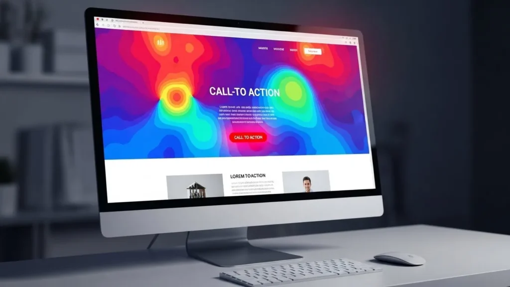
We utilise F-Patterns and Z-Patterns, but in 2026, we will also incorporate AI Heatmaps into the design phase to predict where a user’s eye will naturally land.
By using “Visual Weight”—adjusting the size, colour, and density of elements—we can guide the user through a narrative.
Your primary CTA should always have the highest visual weight. If your “Contact Us” button is the same colour as your navigation links, you’re losing money.
13. Zero-Layout Shift (CLS) Mandate
Nothing destroys trust faster than a page that jumps around while loading.
This usually happens because images or ads don’t have defined dimensions.
Professional website design principles require setting width and height attributes on all media and using aspect-ratio in CSS.
This reserves the space so the content doesn’t “jitter.” It’s a small technical detail with a massive impact on UX and SEO rankings.
14. Hyper-Localised GEO-Tagging
For UK agencies like Inkbot Design, design principles must extend to how we handle local entities.
This isn’t just about putting a map in the footer.
It’s about using locally specific schema and ensuring the design reflects the cultural nuances of the target market.
15. The “Privacy by Design” Principle
With the death of third-party cookies, design must now handle first-party data collection elegantly.
Consent banners shouldn’t be an intrusive afterthought; they should be a seamless part of the brand experience that builds trust rather than annoyance.
16. Semantic HTML for Entity Clarity
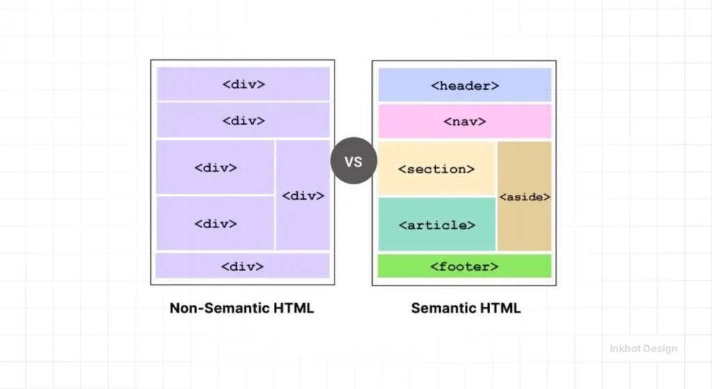
In the world of UX vs. UI design, semantic HTML serves as the bridge. Using tags like <main>, <article>, <section>, and <aside> correctly tells search engines exactly what each part of your page is.
This is crucial for ranking in 2026, as Google’s “Small Personal Site” and “Helpful Content” updates look for clear, human-centric structures.
The llms.txt Standard
You have a robots.txt for Googlebot, but do you have an llms.txt for ChatGPT and Perplexity?
In 2026, this text file is mandatory for GEO.
It provides a stripped-down, markdown-formatted version of your core content specifically for Large Language Models.
By placing this file at your root domain, you allow AI agents to consume your pricing, services, and bio without parsing heavy HTML/CSS.
It is the “Fast Lane” for Generative Engine Optimisation.
17. Sustainable and Green Web Design
The internet accounts for about 3.7% of global greenhouse gas emissions. In 2026, “Green Design” is a competitive advantage. This means:
- Reducing Asset Sizes: Smaller images, fewer scripts.
- Dark Mode Support: Saves battery life on OLED screens.
- Server Location: Hosting your site closer to your users (e.g., UK servers for UK clients) to reduce “Data Travel.”
18. Frictionless Forms
Every field you add to a form reduces your conversion rate by roughly 10%. Modern design principles suggest using “Multi-step Forms” for complex queries, as they reduce “Initial Friction” and use the “Progress Principle” to keep users engaged.
19. Consistent Branding Across Micro-Moments
Your logo shouldn’t just be in the header. Your brand’s “DNA”—its colours, its tone, its “vibe”—should be present in your 404 pages, your loading states, and your success messages. This consistency builds a “Mental Model” of your brand in the user’s mind.
20. Continuous Optimisation Cycles
A website is never “done.” The final principle is Iterative Design. Use tools like Microsoft Clarity or Hotjar to observe how users actually interact with your site. If they are all clicking an unclickable image, make it a link. If they are bouncing at the same point on a landing page, fix the friction.
A frequent “Trust-Killer” in modern UX is the Ghost Click—where a user taps a button just as a late-loading element shifts the page, causing them to click the wrong link.
The solution is the CLS (Cumulative Layout Shift) Guardrail, which defines explicit Aspect Ratio Boxes for every media element and ad unit.
By ensuring a “Zero-Jitter” load experience, you provide a “Tactile Trust” signal that confirms your site is a professional, high-performance tool rather than a fragile template.
The Evolution: Web 2.0 vs. The Agentic Web (2026)
| Primary User | Human clicking links | Human + AI Agent scanning data |
| Core File | robots.txt | llms.txt + robots.txt |
| Layout | Mobile-First | Screen-Agnostic (Container Queries) |
| Accessibility | WCAG 2.1 Checkbox | WCAG 3.0 “Bronze” Outcome |
| Interactivity | JavaScript Animations | CSS Micro-interactions |
| Trust Signal | Footer Badges | Entity-Rich Schema & WSG Score |
The Verdict
Modern website design principles in 2026 are a sophisticated blend of psychology, technical performance, and semantic SEO.
The “pretty” website is a commodity; the “high-performance” website is a strategic asset.
If your current site feels like a brochure from 2019, you aren’t just behind the curve—you are invisible to your future customers.
Stop guessing and start engineering your digital presence. Whether it’s fixing your website maintenance checklist or a full technical overhaul, the rules have changed.
Ready to stop losing money on bad design?
Request a Quote from Inkbot Design, and let’s audit your digital strategy for 2026.
Frequently Asked Questions (FAQ)
What are the core website design principles for 2026?
The focus has moved from purely visual rules to a blend of Technical SEO (INP, CLS), Semantic Architecture (GEO), and Cognitive Psychology. A site must now solve for “Entity Clarity” so that both humans and AI agents can process its value instantly.
Why is “Accessibility by Default” a business requirement?
Under the Equality Act 2010, UK businesses are required to ensure that their digital services are accessible. In 2026, WCAG 2.2 compliance will also be a primary signal for search engine rankings and brand reputation, as it demonstrates that your site is built on high-quality, semantic code.
How does “Interaction to Next Paint” (INP) affect my design?
INP measures how fast your site reacts to a user’s click. Modern design principles require “Optimistic UI” patterns—using CSS-based feedback and lightweight code (like GeneratePress) to ensure there is no perceived “lag” during user interactions.
What is “Generative Engine Optimisation” (GEO) in design?
GEO is the process of structuring your layout so AI search engines (like Perplexity or SGE) can easily scrape and cite your content. This involves using Schema.org markup and clear, hierarchical HTML headings to define your brand’s “Entity” status.
Is the “Three-Click Rule” still relevant?
No. It has been replaced by the “Information Scent” principle. Users don’t mind extra clicks as long as they feel they are making progress toward their goal. Clarity of the path is more important than the quantity of clicks.
What are “Variable Fonts” and how do they help speed?
Variable fonts allow you to use multiple weights and styles (Bold, Light, Italic) in a single, small file. This reduces HTTP requests, improves your LCP (Largest Contentful Paint) score, and ensures a consistent visual hierarchy without the bloat.
How do I reduce “Cognitive Load” on my landing pages?
Apply Hick’s Law: limit the number of choices you give the user. Every unnecessary button or link increases “Decision Fatigue.” Focus on one primary call-to-action (CTA) per page to maximise conversion rates.
What is the “CLS Guardrail”?
It is a technical design principle that prevents content from jumping around while loading. By defining explicit width and height attributes for all images and videos, you ensure the page remains stable, which is a key Core Web Vitals metric.
What is the difference between “Mobile-First” and “Screen-Agnostic” design?
Mobile-first focuses on the phone. Screen-Agnostic design uses CSS Grid and Container Queries to ensure the site looks and functions perfectly on any screen, from a 1-inch smartwatch to an 8K ultra-wide monitor.
How does “Social Proof” influence visual hierarchy?
In 2026, social proof shouldn’t be hidden at the bottom. It should be placed at “Decision Points”—near prices or CTAs. Utilise “Entity-Rich” proof (including name, job title, and company logo) to establish the E-E-A-T required for ranking in competitive niches.
Why is “Semantic HTML” important for branding?
Semantic tags (like <article> or <nav>) tell search engines exactly what each part of your page represents. This ensures your most important content is prioritised by crawlers and AI agents, strengthening your brand’s “Topical Authority.”
What is “Privacy by Design”?
As third-party cookies disappear, your site must handle first-party data collection (such as newsletter sign-ups) effectively. Consent banners should be a seamless and trust-building part of the brand experience, not intrusive pop-ups.
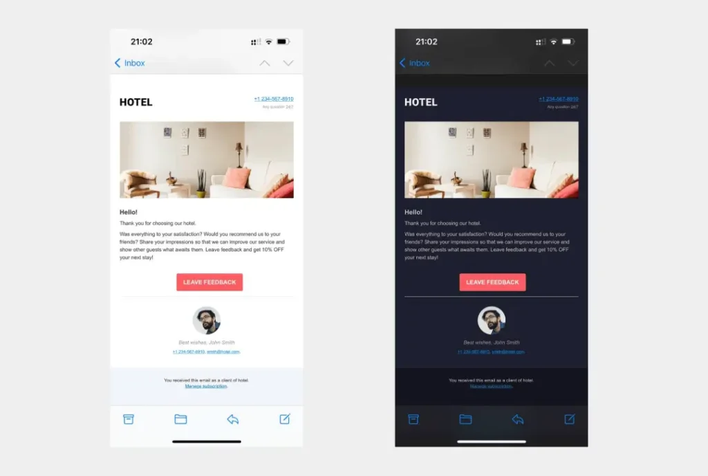
How does “Dark Mode” support sustainability?
Dark Mode reduces power consumption on OLED screens, which are common on modern smartphones. Supporting “Dark Mode” is part of Green Web Design, which reduces your site’s carbon footprint while enhancing user comfort.
What is a “Micro-Interaction”?
These are small visual responses—like a button changing colour when hovered. They provide the “Feedback Loop” necessary to confirm a user’s action. In 2026, these should be purely CSS-driven to avoid slowing down the site with JavaScript.
How do I measure the success of my design principles?
Don’t just look at aesthetics. Use Heatmaps and Scroll Depth tools (like Microsoft Clarity) to watch how users interact with your layout. If your data shows users are missing your primary CTA, your “Visual Hierarchy” has failed.
What is the llms.txt file, and do I need one?
Yes. An llms.txt file is a Markdown document hosted on your server that provides AI crawlers (such as OpenAI or Perplexity) with a clean, code-free summary of your site’s content. It improves your chances of being cited in AI Search results (GEO).
How does Agentic UI differ from traditional UX?
Traditional UX guides a human to click a button. Agentic UI structures data so that an AI agent can perform the task on behalf of the human. Visually, this means designing “Handoff States” where the user approves the AI’s proposed actions.