UI and UX Design: Creating Intuitive Digital Experiences
User interface (UI) and user experience (UX) design focus on crafting intuitive and pleasing digital experiences. UI/UX has become critical in product development and customer satisfaction as more businesses go digital. This comprehensive guide will explore what UI and UX design entail, why they matter, and how to execute them effectively.
Defining UI and UX Design
UI and UX are related but distinct disciplines. Here’s a quick overview of each:
User Interface Design
UI design centres on a product’s front end’s look, feel, and interactivity. It determines how users will interact with the product.
- Focuses on visual design – layouts, colours, typography, etc.
- Dictates button sizes, placements, animations, micro-interactions
- Establishes navigation and information architecture
The core ingredients of user interface design include:
- Buttons
- Icons
- Microinteractions
- Navigation menus and dialogs
- Forms and data entry fields
- Information Architecture
- Visual design and layout
Good UI provides an easy-to-use product that users understand instinctively. It should optimise usability and meet user expectations.
User Experience Design
Unlike UI design’s emphasis on visual components, UX design takes a big-picture view focused on users’ overall perceptual, emotional, and value-based experience. UX designers consider things like:
- How easy or pleasing is it for users to accomplish critical tasks?
- How readily can users find essential pages or features?
- Is the tone of voice used in interfaces appropriate for the target audience?
- Are pain points within digital journeys identified and resolved?
By focusing on the complete picture, UX design smooths interactions for enhanced user adoption and satisfaction.
Critical Differences Between UI and UX
UI and UX design work in tandem but approach product development from different perspectives. Some key differences include:
UI
- Visual design
- Front-end development
- Interaction with specific screens and touchpoints
UX
- Research, testing, prototyping
- User feedback analysis
- Evaluating overall user journey holistically
UI design homes in on individual UI elements and moments, while UX design connects dots between disparate touchpoints to optimise the whole experience ecosystem.
Why UI/UX Design Matters
UI and UX design are crucial in the era of the empowered consumer. In a sea of digital options, products must meet user expectations and stand out from competitors.
Increased User Expectations
Today’s users have high standards shaped by the best and worst products they’ve used. They expect:
- Intuitive navigation and interfaces
- Seamless interactions
- Contextual feedback and guidance
- Delightful micro-interactions
Products that lack these qualities quickly lose user trust and adoption.
Business Impact
UI/UX investment also brings quantifiable business results:
- Increased conversion rates – Clear calls-to-action and frictionless buying journeys convert more users.
- Improved productivity – Intuitive tools keep users focused on productive tasks.
- Higher retention – Pleasant experiences develop habit-forming product relationships.
- Reduced support costs – Less one-on-one support is necessary when products are easy to use.
In the long run, prioritising UI/UX saves money over frustrating users with poorly designed products.
Brand Perceptions
A product’s look and feel shapes brand perceptions. For users, the product is the brand. UI/UX is, therefore, inseparable from branding.
Products with polished UI/UX signal that a company values:
- Putting users first
- Sweating product details
- Investing in innovation
As such, UI/UX establishes brand quality and influences purchase decisions.
UI/UX Best Practices
How can you put UI/UX principles into practice? Here are vital guidelines:
User Research
Great UI and UX start with understanding target users. Empathise with their needs through:
- Interviews – Speak directly with potential users
- Surveys – Collect input from a wider demographic
- Analytics Review – Study behaviour metrics of current users
- Personas – Create fictional representations of significant user segments
These methods reveal user motivations, pain points, and product requirements.
Information Architecture (IA)
Before visual design, IA outlines the product content and navigation. This includes:
- Sitemaps – Diagrams of pages and content grouping
- Wireflows – Connects sitemap pages to user flows
- Card sorting – How users group and label content
Effective IA produces intuitive navigation that users can grasp quickly.
Interface Design Principles
With IA established, apply essential interface design principles:
- Consistency – Maintain uniform UI patterns and behaviours
- Feedback – Keep users informed of results and errors
- Familiarity – Draw on UI patterns they know while adding delight
- Responsiveness – Craft adaptable experiences for any device
- Clarity – Use straightforward language and visuals
- Efficiency – Optimise workflows to accomplish user goals
These fundamentals prevent confusion and aid usability.
Design systems are your best mate when it comes to keeping things consistent. Think of them as your UI toolkit that everyone can use.
A proper design system includes component libraries with reusable elements. Buttons, forms, navigation bars – all standardised so your team isn’t reinventing the wheel every time.
The atomic design approach breaks this down nicely:
- Atoms – Basic elements like buttons and input fields
- Molecules – Simple groups like search bars with buttons
- Organisms – Complex sections like headers or product cards
Design tokens are the secret sauce here. They define colours, spacing, and typography values that work across all platforms. Change one token, and it updates everywhere automatically.
Mobile-First Design Principles
Look, mobile-first isn’t just a trendy buzzword. It’s how most people actually use the internet now.
Start with the smallest screen first. If your design works on mobile, scaling up is straightforward.
Key breakpoints to remember:
- 320px – Small phones
- 768px – Tablets
- 1024px – Desktops
Touch targets need to be at least 44px square. Anything smaller and users struggle to tap accurately.
Think about thumb zones too. The bottom third of the screen is easiest to reach. Put your important navigation there, not at the top where people have to stretch.
Bottom navigation bars work brilliantly for this. Gesture controls like swiping are natural on mobile – use them wisely.
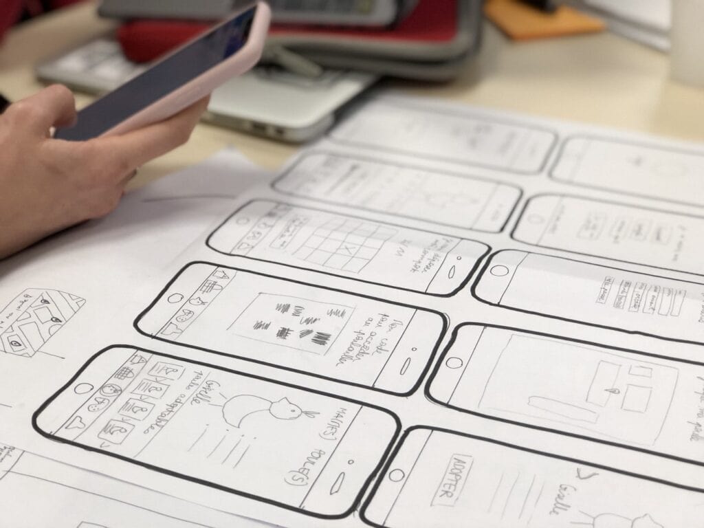
Prototyping and Testing
Prototype UI ideas to demonstrate and test concepts:
- Low-fidelity – Simple wireframes for getting feedback
- High-fidelity – Interactive prototypes that look and function like the product
- A/B testing – Compare which prototype better accomplishes user goals
Continuous testing refines the design and identifies usability issues before launching.
Right, here’s the thing about usability testing – you don’t need massive budgets or fancy labs.
Moderated testing means you’re there watching and asking questions. Unmoderated lets users complete tasks on their own time.
Think-aloud protocols work brilliantly. Ask users to narrate their thoughts whilst using your product. You’ll hear exactly where they get confused.
Task-based testing is straightforward. Give users specific goals like “find the checkout button” or “create an account”. Time them and watch where they struggle.
Guerrilla testing is my personal favourite. Grab people from coffee shops or libraries. Five to eight participants usually uncover most usability issues.
Optimising Interactions
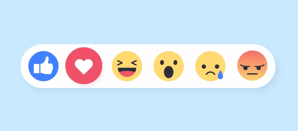
Crafting excellent micro-interactions is an art that greatly enhances UX. These are brief visual and auditory responses to user input:
- Button pushes
- Toggle switches
- Process notifications
When done well, micro-interactions:
- Provide real-time feedback
- Give a sense of direct manipulation
- Add delightful details
Follow these best practices for slick micro-interactions:
- Use appropriate animations – Favour subtle, seamless effects
- Make them fast – React immediately to input
- Include sound – Sonic cues clarify responses
- Allow control – Give users control over any interruptions
With care and iteration, micro-interactions elevate products beyond the functional to create joy.
Performance Impact on UX
Speed kills conversion rates. Well, lack of speed does anyway.
Users expect pages to load in three seconds or less. Go beyond that and you’re losing people fast.
Core Web Vitals are Google’s way of measuring user experience:
- LCP (Largest Contentful Paint) – How quickly main content loads
- FID (First Input Delay) – How fast your site responds to clicks
- CLS (Cumulative Layout Shift) – How much content jumps around whilst loading
Every second of delay can reduce conversions by 7%. That’s real money walking out the door.
Bounce rates skyrocket when pages take too long. People simply won’t wait around.
Collaboration Between UI and UX
Appropriately done, UI and UX design reinforce each other:
- UX identifies objectives and behaviours
- UI brings this understanding to life visually
- UX tests UI execution with users
- UI iterates based on UX findings
This collaboration requires alignment through stages:
Discovery
- User Research – Interviews, personas
- Requirements gathering
Definition
- Information Architecture
- Interaction design – User flows
- Wireframing
Development
- Visual design – Branding, style guides
- Prototyping
- Usability testing
Delivery
- Iteration and refinement
- Final validation testing
This mutual understanding between specialities produces excellent outcomes.
Specialist UI/UX Roles
Given the diverse competencies UI/UX requires, larger teams feature specialised roles. Some key positions:
- UX Researcher – Plans and conducts user research studies
- UX Designer – Focuses on interaction and experience design
- UI Designer – Concentrates on visual styling and branding
- Interaction Designer – Prototypes ideas and micro-interactions
- UX Writer – Crafts succinct microcopy and user guidance
For smaller teams, individuals may cover multiple responsibilities. But it takes a range of skills to craft outstanding products.
UX Writing Essentials

One underappreciated area that shapes user experiences is UX writing – the words that appear in products. These include:
- Interface labels
- Menu options
- System messages and alerts
- Emails
- Chatbot conversations
- Help documentation
Skilled UX writers enhance experiences by:
- Using clear, concise language
- Writing conversationally, like a helpful assistant
- Balancing brevity with providing critical information
- Anticipating and answering user questions
- Adopting the user’s vocabulary and avoiding jargon
- Testing content regularly with users
Since every word contributes to perceptions, thoughtful UX writing removes obstacles to understanding.
Creating a Content Style Guide
To produce consistent messaging, UX writers create content style guides covering:
- Voice and tone – The product’s communication style, from formal to casual
- Terminology – Defined terms and meanings for all words used
- Label standards – Rules for menus, buttons, and navigation
- Punctuation and grammar – Standards for abbreviated text
- Inclusive language – Sensitivity readers assess potentially problematic terms
These guides align writers while giving them creative latitude. They evolve through testing and iterations.
UX Design Frameworks and Models
Various design frameworks and mental models reinforce user-centricity throughout the end-to-end design cycle. Common frameworks adopted by UX teams include:
The 5 Planes of UX
- Strategy
- Scope
- Structure
- Skeleton
- Surface
The User-Centred Design Cycle
- Understand
- Specify
- Design
- Evaluate
AARRR ‘Pirate’ Framework
- Acquisition
- Activation
- Retention
- Referral
- Revenue
Depending on project scope and objectives, UX teams select fitting frameworks to maintain alignment on user needs.
Accessible Design Practices
UI and UX teams have an ethical obligation to support users with disabilities. Otherwise, products exclude segments of the population.
Some best practices include:
- Add alt text for images – Describes non-text content
- Structure pages semantically – Uses proper HTML elements and heading order
- Provide captions and transcripts – Alternatives for audiovisuals
- Support screen readers – Allows navigation without a pointing device
- Accommodate colour blindness – Don’t convey meaning through colour alone
- Allow keyboard access – Enable use without a mouse
- Design for common adaptations – Test with magnifying glasses, grab sticks, etc.
WCAG 2.1 sets the standard for web accessibility. There are three compliance levels – A, AA, and AAA.
AA compliance is what most businesses aim for. It covers the majority of accessibility needs without being overly restrictive.
Colour contrast ratios are non-negotiable. Normal text needs 4.5:1 contrast against its background. Large text can get away with 3:1.
Section 508 compliance matters for government work in particular. It ensures federal agencies can’t exclude people with disabilities.
Inclusive design benefits all users by forcing teams to focus on clarity and experience fundamentals.
UX Design Tools and Programs
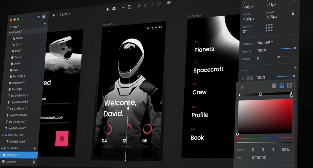
UX designers utilise a vast toolkit of programs to research, ideate, prototype, and test product concepts. Some essential applications include:
User Research
- Optimal Workshop – Surveys, card sorting
- FullStory – Session recordings and analytics
Wireframing
- Figma – Collaborative design and prototyping
- Adobe XD – Interface and interaction mocks-ups
- Sketch – Popular Mac wireframing tool
Prototyping
- InVision – Interactive clickable prototypes
- Marvel – Simple prototype builder
- Principle – Creates animated transitions and micro-interactions
Testing
- UserTesting – Facilitates remote usability tests
- Validately – Unmoderated panel testing
- Hotjar – Heatmaps, recordings, and more
Collaboration Tools
- Miro – Digital whiteboarding for workshops and brainstorming
- FigJam – Figma’s collaborative ideation space
Design Handoff
- Zeplin – Bridges design and development with specifications
- Avocode – Extracts CSS and assets from design files
Version Control
- Abstract – Git for designers, tracks design file changes
- Plant – Version control specifically for Sketch files
New tools emerge continually, so designers must stay current with industry innovations.
UX Salaries and Growth
The rising strategic importance of UX is reflected in high salaries and job growth. According to recent data:
- The average UX designer earns $95,000 annually
- Entry-level positions start around $70,000
- Lead, or executive roles exceed $150,000
And UX roles are increasing quickly:
- 33% faster growth than the market average
- Over 1.1 million new UX jobs by 2030
With demand outpacing talent, those looking to enter the field have bright prospects after earning experience and specialised certifications.
Getting Started in UI/UX Design
For those aiming to become UI/UX pros, common first steps include:
- Using design tools to improve visual and technical chops
- Building an appealing portfolio from Concepts and internships
- Networking with designers on Twitter and industry events
- Volunteering for nonprofits to gain experience
- Enrolling in coding boot camps to expand competencies
- Studying industry standards and best practices
- Specialising in an area like interaction design or research
- Staying on top of design trends and innovations
New designers can break into this dynamic, creative field with diligence and continued learning.
Required Skills for UI/UX Designers
UI/UX is highly multidisciplinary, synthesising both art and science. Leading practitioners blend analytical, technical and creative expertise:
- User empathy – Understanding user contexts, behaviours, emotions
- Design psychology – Leveraging mental models, memory, attention, perception
- Systems thinking – Identifying relationships, patterns and flows
- Data fluency – Analytics, quantitative and qualitative research
- Creativity – Ideating solutions and possibilities
- Storytelling – Crafting narratives that engage and inspire users
- Aesthetics – Applying visual, motion and interaction styling
- Collaboration – Cooperating across teams and receiving critiques
- Technology – Grasping possibilities and constraints of engineering
This combination enables the creation of interfaces Users Love.
Specialised UI/UX Design Roles
Given the field’s breadth, UI/UX has spawned specialised sub-disciplines:
Information Architect
Structures, labels and improves findability in information systems. Focuses on organisation, navigation and search.
Interaction Designer
Maps relationships and ideal interactive flows between users and products. Concentrates on sequences over time.
Visual Designer
Determining look-and-feel of interfaces and brand. Attentive to aesthetics, media usage and style guides.
Interface Designer
Constructs specific screens and functions that users engage. Masters patterns, inputs and micro-interactions.
UX Researcher
Probes behaviours, emotions and psychology through user observations, interviews and testing. Informs design decisions.
UX Writer
Crafts microcopy and interface language that educates and engages users. Uplifts product experiences.
Key UI/UX innovations on the horizon include:
- VR/AR interfaces
- Gesture and voice control
- AI-generated experiences
- Brain-computer interfaces
- Assistive/accessible functionality
- Real-time emotion detection and response
- Biometric user identification
Ultimately, future interfaces will feel less like hardware the user operates and more like a cooperative experience between the user and product flow state. UI/UX designers are only beginning to tap technology’s potential to deepen human-computer symbiosis through creatively blending cutting-edge tools, and timeless design principles centred on understanding users’ latent needs and easing their burdens through quality digital experiences.
Conclusion
UI and UX design serves a profound purpose – to uplift lives by empowering more meaningful and satisfying interactions between humans and the products transforming our societies. It draws upon art and science to solve ever-evolving challenges. While constantly changing, at its core, UI/UX has always been about crafting solutions centred on understanding people more deeply through design. This resiliency suggests UI/UX design will only continue rising in strategic importance so long as problems need solving and design hearts yearn to solve them.
Key Takeaways and Next Steps
Some critical lessons for crafting excellent UI and UX:
- Obsess target users and cater experiences to their needs
- Perfect information architecture before visual design
- Apply interface design principles thoughtfully
- Iterate through prototyping and testing
- Carefully polish micro-interactions
- Foster collaboration between specialities
- Don’t neglect inclusive design
- Utilise modern tools to speed processes
For business leaders, focusing on UI/UX today delivers handsome dividends through improved usage, satisfaction, conversion rates, and brand quality.
On a personal level, honing UX skills opens doors to a fulfilling, creative career where practitioners directly impact product success.
Hopefully, this overview has piqued your interest in exploring UI and UX further. Please reach out with any questions!
FAQs
What are some common UI/UX pitfalls?
Overwhelming users with too many optionsu003cbru003eDense, complex information flowsu003cbru003eInconsistency across interfacesu003cbru003eViolating expected platform conventionsu003cbru003eLack of supportive feedback cues
What is the #1 rule of good UI/UX?
Putting end user goals, contexts and needs first – the fundamental principle of human-centred design. Without grasping these, products risk feeling burdensome.
How do you become a UI/UX designer?
Most follow educational programs focused on UI/UX or related HCI fields. Solid portfolios demonstrating user empathy and interface design skills are essential.
What is a typical entry-level UI/UX salary?
In 2024, average entry-level salaries range from $65,000 – $75,000 depending on skills and employer. With 5+ years experience, salaries may exceed $150,000.
How long does effective UI/UX design take?
There are no hard-and-fast rules. Simple iterative improvements can be measured in days or weeks. More complex enterprise products often undergo continual refinement spanning months or years across versions until retirement. The key is maintaining a focus on user value over time.

