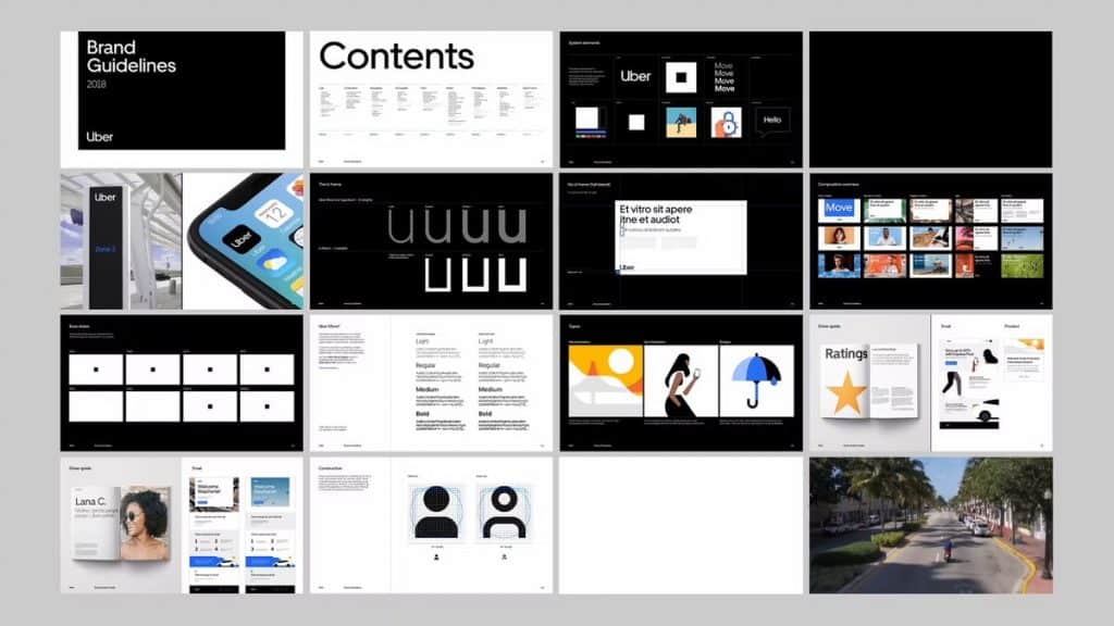
The Uber Logo: A Masterclass in How (and How Not) to Build a Brand
The evolution of the Uber logo is a famous case study in brand identity, tracking its journey from a simple initial badge to a controversial reinvention and back to basics.
The most notable shift was the 2016 “bits and atoms” rebrand, which replaced the recognisable “U” with an abstract symbol and was widely seen as a branding misstep.
This was reversed in 2018 by introducing a clean, custom wordmark—a return to clarity and recognition that now defines the global ride-sharing giant’s visual identity.
- Uber’s logo evolved through four phases: UberCab, the iconic “U”, the 2016 “bits and atoms” debacle, and the 2018 wordmark return to clarity.
- The 2016 rebrand was driven by CEO ego and a pretentious “bits and atoms” story, causing user confusion and immediate backlash.
- The “U” succeeded because of stark simplicity and excellent app-icon recognisability, building massive brand equity over six years.
- The 2018 wordmark by Wolff Olins restored clarity, flexibility, and confidence, leveraging the company’s most valuable asset: its name.
- Five lessons: prioritise recognition, test app icons, avoid ego-driven design, fix business issues first, and favour simplicity.
The Four Faces of Uber: A Timeline of Identity Crisis
To understand the mess, you have to see it unfold. Uber’s visual identity has had four distinct phases, each telling a different story about the company.
- The UberCab (2009): The brash, slightly garish startup mark.
- The “U” (2010-2016): The accidental icon that built an empire.
- The “Bits and Atoms” (2016-2018): The baffling, ego-driven catastrophe.
- The Wordmark (2018-Present): The grown-up, clean, confident solution.
We will dissect each one because the mistakes and triumphs hold potent lessons for your brand.
Phase 1 (2009-2010): The “UberCab” – Brash, Functional, and a Bit Tacky
Back in 2009, Uber wasn’t a verb. It was “UberCab,” a niche service for booking a premium black car in San Francisco. Its audience was tech-savvy people with money to spend.
The logo reflected this perfectly. It was a stylised “UC” in red, with “UBERCAB” spelt out in a blocky, impactful font. It looked like a logo for a security firm or energy drink brand.
It was bold, aggressive, and a little tacky.
But it worked.
For its intended audience, it communicated exclusivity and modernity. It didn’t need to be timeless; it needed to catch the eye of a specific group of early adopters.
The Lesson: Your first logo does not need to be a masterpiece. It needs to be “good enough” for your starting line. Too many founders waste months agonising over a perfect logo when they should be focused on getting their first 10 customers. UberCab’s logo worked, and the company moved on when needed.
Phase 2 (2010-2016): The “U” – Building an Accidental Icon
After dropping the “Cab” from its name (partly due to pressure from regulators), Uber needed a new mark. What they landed on between 2010 and 2012 was a simple, confident, slab-serif “U.”
This is the logo that most of the world came to know. This “U” was on the phone of every early adopter, every student looking for a cheap ride home, and every city official who saw the company as a threat.
This logo was the workhorse. It was powerful for several reasons.
It was starkly simple, usually rendered in black and white. This gave it a confident, almost utilitarian feel. It wasn’t trying to be clever; it was just Uber.
Most importantly, it was a perfect app icon.
In a sea of colourful, complex icons on a smartphone screen, Uber’s bold, monochromatic “U” was instantly findable. That single letter became a beacon for “get me a ride.” This is an incredibly valuable piece of real estate, and Uber owns it.
Over six years, the company poured hundreds of millions of dollars into marketing and operations worldwide, and every single interaction built recognition for that “U.” This is called brand equity. It’s the intangible value of a recognised brand mark. Uber had built a mountain of it.
And then, they decided to set it on fire.
Phase 3 (2016-2018): The “Bits and Atoms” Debacle
In February 2016, Uber users woke up to find the familiar “U” gone from their phones. In its place was a strange, backwards-facing “C” in a circle, set against a confusing teal geometric pattern.
The backlash was immediate and brutal. People couldn’t find the app. They didn’t know what the symbol meant. Many compared it to the logo for Chase Bank.
This wasn’t just a failed redesign but a self-inflicted wound born from pure corporate hubris. To understand this disaster, you must look at the flawed thinking that produced it.
The CEO as Chief Designer: A Recipe for Disaster
This rebrand was the pet project of then-CEO Travis Kalanick. He was reportedly deeply, personally involved, working directly with the in-house design team. This is almost always a red flag.
A passionate CEO is a great thing. A CEO who thinks their passion for the business makes them a qualified graphic designer is a liability. Kalanick wasn’t designing for the customer but to express his grand vision for the company. Pet Peeve #1 is the CEO who can’t stay in their lane. The result was a logo that served an internal philosophy instead of an external audience.
Deconstructing the Nonsense: What Were “Bits and Atoms”?
The official justification for the new logo was embarrassingly pretentious. The company released a lengthy blog post explaining that the new design represented “bits” (the technology) and “atoms” (the human, physical side of their service).
The square in the centre of the design was the “bit.” The surrounding patterns and colours were the “atoms.”
This is the kind of over-intellectualised nonsense that gives branding a bad name. No user trying to get home at 2 AM cares about a visual metaphor for bits and atoms. They care about finding the button that makes a car appear.
If your logo requires a 1,000-word essay to explain its meaning, it has failed its primary mission. A logo must communicate instantly and intuitively. This one was a puzzle, and nobody was in the mood to solve it. This is Pet Peeve #2 in action: a complex story is not a substitute for a clear mark.
The Practical Failures: A Logo That Actively Confused Customers
Beyond the philosophical absurdity, the 2016 logo was a functional disaster.
- It was unrecognisable. It abandoned six years of brand equity for a generic shape.
- It was inconsistent. The plan was to have unique colours and patterns for every country Uber operated in—over 65 at the time. This is the opposite of building a strong, unified global brand. It’s a recipe for a fragmented and confusing identity.
- It was a terrible app icon. This was the most unforgivable sin. By drastically changing the icon, Uber created friction for its most loyal users. They broke a seamless user experience for an internal vanity project. For a mobile-first company, this is malpractice.
The “Bits and Atoms” era is one of the great case studies in rebranding failure. It shows what happens when a company gets lost in its own mythology and forgets who it’s serving.
Phase 4 (2018-Present): The Return to Sanity with a Simple Wordmark
By 2018, Uber was a different company. Kalanick was out, and new CEO Dara Khosrowshahi was in, tasked with cleaning up a toxic corporate culture and steering the company toward maturity and an IPO.
The company needed to signal a clean break from the chaos of the past. It needed to look stable, reliable, and straightforward.
They hired the renowned branding agency Wolff Olins, and the solution they landed on was brilliantly, almost shockingly, simple: the word “Uber” in a clean, custom sans-serif font.
That was it—no weird shapes. No bits, no atoms. Just the name.
Why This Simple Solution Is So Powerful
The 2018 wordmark works because it finally accepts the truth: Uber’s greatest brand asset is its name. The word “Uber” is a globally recognised verb. The job of the logo is to present that name with confidence simply.
- Clarity: It is instantly recognisable and requires zero explanation. It says “Uber.” Job done.
- Flexibility: This simple wordmark provides a perfect foundation for a coherent brand architecture. Now, “Uber Eats,” “Uber Freight,” and “Uber Health” all look like part of the same family. The system is clean and scalable.
- Confidence: The design is mature. It has shed the tech-bro affectations of the previous logo. It looks less like a disruptive startup and more like a global public utility, precisely how the company wants to be perceived now. It’s the grown-up in the room.
The Masterstroke: Owning Your Own Typeface
Alongside the new logo, Uber introduced its custom typeface, “Uber Move.” It’s a sans-serif font inspired by classic transportation signage, designed for maximum legibility on screens of all sizes.
Creating a custom font is an advanced move. It’s not for every business. However, for a company of Uber’s scale, it’s a masterstroke.
It ensures absolute brand consistency across every app, website, and ad in every country. It gives them total control over their visual voice and signals authentic market leadership.
5 Brutal Lessons from Uber’s Branding Rollercoaster
Uber’s chaotic journey from “U” to “backward C” and back to basics offers some brutally clear lessons for any entrepreneur or business owner. They spent the money, so you don’t have to.
Lesson 1: Don’t Confuse Your Ego with Your Brand
The 2016 rebrand was an ego trip. It was designed to satisfy a founder’s vision, not to serve the customer. Your logo is a tool for your audience. It should be designed with their recognition and ease of use as the number one priority. Leave your personal philosophy out of it.
Lesson 2: Recognition Trumps Cleverness—Every Time.
The old “U” wasn’t particularly clever but instantly recognisable. The “Bits and Atoms” logo was dripping with a “clever” backstory, but it was completely obscure.
A logo that people remember is always more valuable than one that needs to be explained. Never sacrifice clarity at the altar of a clever concept.
Lesson 3: Your App Icon Is Your Most Important Logo
If you run a digital or mobile-first business, your app icon is your logo in its most critical application. It’s your front door.
It must be instantly findable on a crowded screen. Test it. Test it again. If users have to hunt for it, you have failed.
Lesson 4: A New Logo Can’t Paper Over a Bad Reputation
The 2016 rebrand happened while Uber was mired in scandals. A new visual identity did nothing to fix the underlying problems; it felt like a cosmetic distraction.
The 2018 rebrand, however, worked because it accompanied real internal change under new leadership. Your brand is your reputation. Your logo merely reflects it. Fix the business first.
Lesson 5: Simplicity Is the Ultimate Sign of Confidence
Uber’s journey ended at the simplest possible destination: their name. A clean, well-crafted wordmark is often the strongest, most enduring solution.
It’s confident, it’s clear, and it’s versatile. It trusts that the power of the brand is in the name itself, not in a decorative symbol.
Getting this right is the foundation of a great visual identity and is a core focus of any professional logo design project.
The Uber Logo’s Final Destination
The Uber logo’s story perfectly represents the company’s adolescence. It lurched from functional to iconic, to bafflingly abstract, and finally, to a state of mature clarity.
They threw away millions in brand equity chasing a philosophical story nobody asked for, only to spend millions more to return to the most obvious answer: their name.
The ultimate lesson is simple and powerful. Your brand is not the complex story you want to tell about yourself. It’s the simple, clear reputation you earn with your customers. Your logo should serve that reputation, not obscure it in a fog of bits, atoms, and bad ideas.
Frequently Asked Questions About the Uber Logo
How many logos has Uber had?
Uber has had four prominent, distinct logos throughout its history: the original “UberCab” logo (2009), the iconic “U” logo (2010-2016), the controversial “Bits and Atoms” or “Glyph” logo (2016-2018), and the current wordmark logo (2018-present).
Why did Uber change its logo in 2016?
The 2016 change was driven by then-CEO Travis Kalanick’s vision to create a more flexible identity that reflected the company’s expansion beyond just car services. The official justification was to represent the combination of technology (“bits”) and the physical world (“atoms”).
What was wrong with the 2016 Uber logo?
The primary criticisms were that it was unrecognisable, abandoning years of brand equity built by the “U” logo. It was also confusing to users, who often compared it to a bank logo, and the app icon was challenging to find on a phone screen.
Who designed the current Uber logo?
The current Uber wordmark logo, introduced in 2018, was created by the global branding agency Wolff Olins in collaboration with Uber’s in-house brand team.
What font does the Uber logo use?
The current logo uses a custom-made typeface called “Uber Move.” It was designed for the company to be highly legible on screens and create a consistent visual identity across all its products.
What did the old “U” Uber logo represent?
The “U” logo was a simple, literal representation of the first letter of the company’s name. Its strength was not in a deep meaning but in its bold simplicity and instant recognisability as an app icon.
Why did Uber switch to a wordmark logo?
Uber switched to a simple wordmark in 2018 to signal a new corporate maturity and stability era under new leadership. The wordmark is clear, confident, and highly flexible, allowing for a more unified brand system across services like Uber Eats and Uber Freight.
Was the Uber rebrand expensive?
While Uber has never released official figures, major corporate rebrands of this scale, involving a global design agency and implementation across apps, websites, and marketing materials worldwide, are understood to cost millions of dollars.
What can a small business learn from the Uber logo?
The key lessons are: prioritise recognition over cleverness, ensure your logo works in its most crucial context (like an app icon or social media profile), don’t let personal ego drive design decisions, and understand that simplicity is often the most powerful and effective solution.
Is a wordmark better than a symbol logo?
Neither is inherently “better,” but a wordmark is often a strong choice when a company’s name is its most valuable asset, as is the case with Uber. It is direct, hard to misinterpret, and provides a solid foundation for branding. A symbol can be powerful, but requires time and marketing spend to build recognition.
Uber’s story proves that a logo isn’t just decoration; it’s a critical piece of business infrastructure. Getting it wrong creates confusion, but getting it right provides the clarity needed to grow.
If your brand’s visual identity feels more like a complicated puzzle than a clear statement, it might be time to find a more straightforward, robust solution.
Explore how a strategic logo design can bring clarity to your business, or request a quote to start the conversation today.


