The 10 Trust Signals Your Website Is Missing Right Now
You can pour all the money you want into Facebook ads, SEO, and fancy marketing funnels, but if your website looks even slightly dodgy, you’re just paying to send potential customers to a dead end.
Traffic is a vanity metric if nobody trusts you enough to stick around.
The default setting for any new visitor is “no.” They land on your page with their hand hovering over the back button, actively looking for a reason to leave.
Your website’s first and only job is to give them a reason to stay. To convince them you’re not a fly-by-night operation run from a teenager’s bedroom.
This isn’t about secret tricks or flashy gimmicks. It’s about building a foundation of credibility so solid that visitors feel stupid for even questioning it. These are the ten signals that do the heavy lifting for you.
- Website design is crucial; a professional look builds trust instantly and represents your brand identity.
- Authentic social proof, like detailed testimonials, effectively reassures potential clients of your credibility.
- Accessibility is key; a visible contact page emphasises openness and willingness to engage with customers.
- Clear, transparent pricing fosters trust; hiding prices suggests deceit and may drive potential customers away.
Trust Isn’t a Tactic, It’s an Outcome
Here’s where most people get it wrong. They see a list like this and treat it like a shopping list. Add a testimonial here, a security badge there, and—poof—instant trust.
That’s nonsense.
Trust signals aren’t decorations you hang on your website. They result from being a competent, transparent, and professional business. You can’t fake them. At least, not for long. A visitor can smell a fake a mile off.
Think of it as a trust ecosystem. Each signal supports the others. Fantastic customer reviews are worthless if your website looks like a hostage note. A slick design means nothing if your contact form is a black hole where messages disappear forever.
Your weakest link doesn’t just weaken the chain; it poisons the whole well. So, as we go through this, don’t just ask “Do I have this?” Ask, “Is this element genuinely reinforcing the idea that we are the real deal?”
The 10 Signals Your Visitors Are Desperate to See
1. A Design That Doesn’t Look Like It Was Made in 2003
Your website is your digital handshake. Before a visitor reads a single word, they judge you on your design. It takes about 50 milliseconds for them to form an opinion. You don’t get a second chance.
An amateur website with clashing colours, inconsistent fonts, a chaotic layout, and low-quality images screams “amateur business.” It suggests you don’t care about the details. If you can’t be bothered to present yourself professionally online, why should anyone trust you with their money or project?
This isn’t about being the flashiest site on the block. It’s about clarity, professionalism, and consistency. It’s about having a coherent brand identity that communicates who you are without you saying a word. A clean layout, readable text, and a professional logo aren’t luxuries; they are the absolute minimum cost of entry to be taken seriously in 2025.
If your website looks dated, you look dated. Simple as that. A solid, professional design is the foundation for every other trust signal. Without it, you’re building on sand.
Poor design can kill credibility before you even get a chance to state your case. You’re fighting an uphill battle if your brand identity feels disjointed or amateurish. Getting that foundation right is everything.
2. Social Proof That Isn’t Your Mum Pretending to Be a Customer
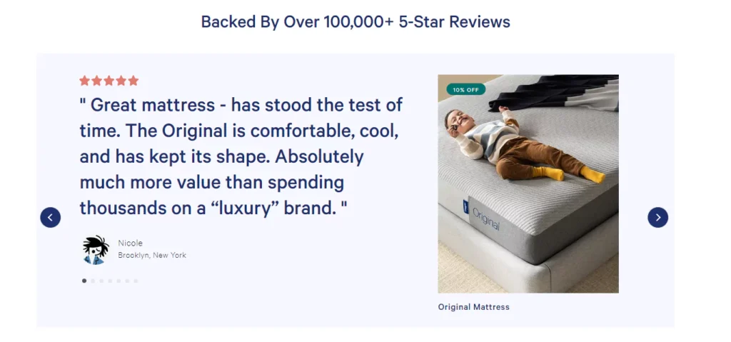
Humans are herd animals. When we’re uncertain, we look to others for clues on how to act. This is called social proof, and it’s one of the most powerful tools of persuasion you have.
But there’s a catch. It has to be real.
Vague, anonymous testimonials are worse than useless. “Great service, A++ would use again! – John S.” is garbage. It sounds fake. It provides no value. It might as well say, “My cousin wrote this for me.”
A powerful testimonial is specific. It tells a story. It has a full name and, ideally, a photo or company name. It should follow a simple arc:
- Here was the specific problem I had.
- Here is how this business solved it.
- Here is the specific, positive result I got.
I once worked with an IT consultant whose testimonials were a joke. All fluff. I told him to call his three best clients and ask them one question: “Can you describe the moment you realised our service was different from others you’ve used?” The answers he got were pure gold. They were specific, emotional, and told a real story. We put those on the homepage, and his lead quality shot up almost overnight.
Don’t be shy. Ask your best customers for detailed feedback. Use services like Google Reviews or Trustpilot to gather verifiable public proof. Let your happy customers do the selling for you.
3. A Contact Page That Wants Me to Contact You
This is one of my biggest pet peeves. When a business makes it a bloody scavenger hunt to find their contact information, it sends a clear message: “We don’t want to talk to you.”
It’s an immediate red flag. Why are you hiding? What are you afraid of?
A trustworthy website makes it ridiculously easy to get in touch. Your contact details shouldn’t be buried three clicks deep in the footer. They should be obvious.
Here’s the checklist. It’s not complicated.
- A dedicated “Contact” link in your main navigation.
- A phone number. Yes, an actual phone number.
- An email address. It is not just a form but a clickable mailto link.
- A physical address (if you have one). It adds a tremendous amount of legitimacy. It shows you exist in the real world.
- A simple contact form. Don’t ask for their life story. Name, email, message. That’s it.
Making yourself accessible shows confidence. It says you stand by your business and are ready to answer questions. Hiding suggests you have something to hide.
If a potential client is ready to talk, the last thing you want is to put an obstacle in their way. Make it effortless.
4. An ‘About Us’ Page With Actual Humans
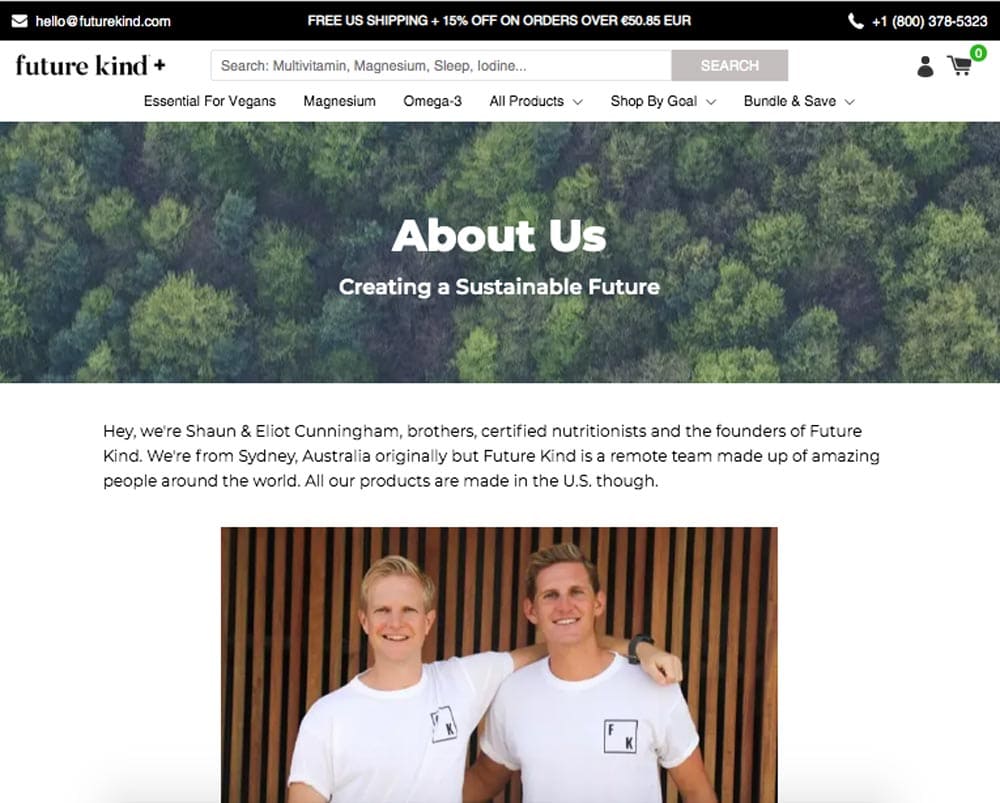
Nobody connects with a corporation. People connect with people. Yet most ‘About Us’ pages are filled with the most appalling corporate jargon imaginable.
“We are a paradigm-shifting, synergistic solutions provider dedicated to leveraging our core competencies to achieve impactful results.”
It’s meaningless drivel. It communicates nothing except that you know how to use a thesaurus. It actively pushes people away.
Your ‘About Us’ page is your chance to tell a story.
- Who are you? Show photos of the actual people behind the business. Not those soulless stock photos of impossibly happy models in a boardroom. Real people.
- Why did you start this business? What was the problem you saw that you wanted to fix? What’s your mission, in plain English?
- What do you believe in? What are your values when it comes to your work and your customers?
Be authentic. Be a little vulnerable. People trust businesses they feel they know. Ditch the corporate mask and show the real faces behind the logo. It’s far more compelling than pretending to be a faceless entity.
5. Proof You’ve Done This Before (Case Studies & Portfolios)
Telling me you’re great is one thing. Showing me is another. A portfolio or a set of case studies is the ultimate proof of your competence. It’s the evidence that you can deliver on your promises.
A portfolio isn’t just a pretty gallery. It’s a demonstration of your skill. For designers, developers, or photographers, this is obvious. But it applies to almost any business.
- A consultant can show case studies of client results.
- A tradesperson can show before-and-after photos of their work.
- A software company can show logos of businesses that use their product.
A great case study is a story. It follows the same structure as a good testimonial, but with more detail:
- The Client & The Problem: Who were they, and what was their specific pain point?
- The Solution: What exactly did you do to solve that problem? Detail your process.
- The Results: What was the measurable outcome? “Increased sales by 35%,” “Reduced staff turnover by half,” “Generated 500 new leads in three months.”
Complex numbers and specific results build immense credibility. It moves you from “a person who does X” to “a person who achieves Y for people like me.”
6. The Little Padlock That Stops People Panicking (SSL/HTTPS)
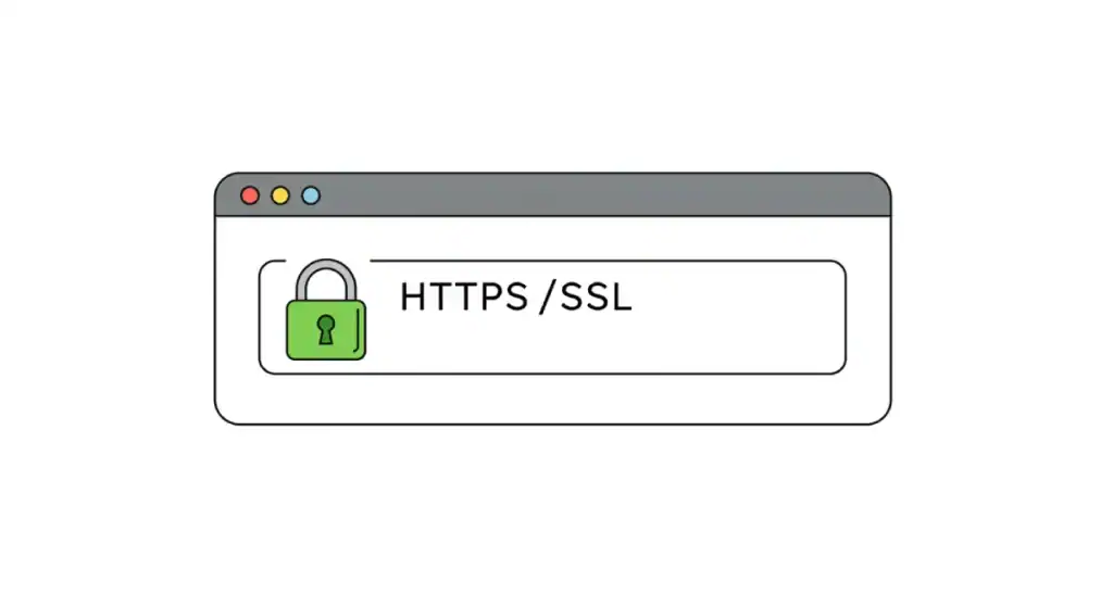
This one is simple. It’s technical, but the impact is purely emotional. It’s the padlock icon next to your browser URL.
An SSL certificate encrypts the data passed between your website and the visitor. It turns your address from http:// to https:// (the ‘s’ stands for ‘secure’).
In 2025, this is non-negotiable. It’s a basic standard of digital hygiene.
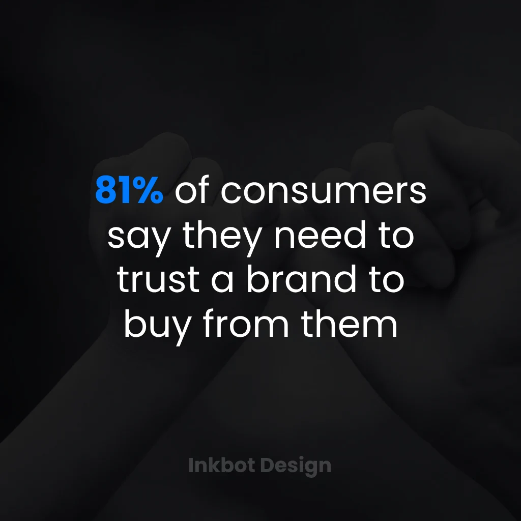
For years, browsers like Google Chrome have flagged sites without HTTPS as “Not Secure.” Seeing that warning message next to your business name is a trust killer. According to a study, 82% of users will leave a site that isn’t secure. You lose eight out of ten potential customers before seeing your homepage.
It doesn’t matter if you’re not selling anything directly. The perception of security is what counts. Getting an SSL certificate from your hosting provider is usually free or cheap. There is no excuse not to have one. It’s the easiest win on this entire list.
7. A Guarantee That Takes the Risk Off the Table
Every purchase, big or small, comes with perceived risk for the customer.
- “What if it doesn’t work?”
- “What if I don’t like it?”
- “What if it’s not what I expected?”
A powerful trust signal is to meet that fear head-on and remove it. This is called risk reversal. You, the business owner, absorb the risk so the customer doesn’t have to. The most common way to do this is with a strong guarantee.
- Money-back guarantees: The classic. “If you’re not 100% satisfied within 30 days, we’ll give you a full refund.”
- Free trials: Let them experience the value before they commit.
- Clear and simple return policies: Make it hassle-free. Amazon built an empire on this.
Offering a strong guarantee does two things. First, it reduces the customer’s fear. But second, and more importantly, it signals immense confidence in your product or service. You say, “We are so sure you will love this that we are willing to bet our money on it.” That confidence is contagious.
8. Borrowed Credibility (Awards, Certifications, Media)

You don’t have to build all your credibility from scratch. You can borrow it from others who are already trusted.
You must shout about your business if a respected third party recognises it. This can take many forms:
- “As Seen In” Logos: If you’ve been featured in Forbes, The Guardian, or even a well-known industry blog, put their logo on your site.
- Industry Awards: Did you win “Best Local Plumber 2024”? Display that badge proudly.
- Client Logos: If you provide B2B services, showing the logos of companies you’ve worked with is powerful social proof.
- Certifications: Are you certified by a professional body? That’s a mark of quality.
A word of caution: this has to be legitimate. Don’t invent an award for yourself or use a logo from a publication that just republished your press release on a back page nobody reads. People will check. But if you’ve earned the recognition, using it is one of the fastest ways to signal that you are a serious and respected player in your field.
9. Pricing That Doesn’t Require a Detective
Few things create more friction and suspicion than vague or hidden pricing. When visitors can’t find out what something costs, they don’t think, “Oh, it must be a bespoke, premium service.” They think, “They’re going to try and rip me off.”
They assume the price is hidden because it’s terrifyingly high, or because you charge different people different amounts based on what you think you can get away with.
Even if your services are complex and require a custom quote, you can still be transparent.
- Provide pricing packages: “Bronze, Silver, Gold” tiers work well.
- Give a “Starting at…” price: This manages expectations from the outset.
- Show examples: “A recent project like this one cost around £5,000.”
- Explain your process: If you can’t give a number, explain precisely how you arrive at one.
Hiding behind a “Contact Us for a Quote” button with zero context is weak. It puts all the work on the potential customer and creates a barrier of uncertainty. Be upfront. It shows respect for their time and signals that you have nothing to hide.
| Bad Pricing Page | Good Pricing Page |
| “Contact us for a quote.” | Basic Package: £500 (Includes X, Y, Z) |
| Vague list of services with no prices. | Pro Package: £1500 (Includes everything in Basic, plus A & B) |
| No information at all. | “Custom projects typically start at £3,000. Here’s how we quote…” |
10. A Website That Simply… Works

This might be the most critical signal because it underlies everything. Your website has to provide a flawless User Experience (UX). You are communicating incompetence if it’s slow, buggy, or confusing.
Think about it. A broken link, a page that takes ten seconds to load, and a menu that’s impossible to navigate on a mobile phone aren’t just minor annoyances. They are fractures in your credibility. They cause frustration and kill trust instantly.
According to research from the Nielsen Norman Group, users are brutally impatient. A Google study found that 53% of mobile users will abandon a site that takes longer than three seconds to load.
Your website must be:
- Fast: Optimise your images. Use good hosting.
- Mobile-Friendly: It must look and work perfectly on a phone. No excuses.
- Easy to navigate: A clear, logical menu structure.
- Free of Errors: No broken links, missing images, or 404 errors.
A smooth, fast, intuitive experience signals that a professional is at the helm. A clunky, slow, broken experience suggests the opposite. Your UX is the ultimate, unspoken testament to your attention to detail and respect for your visitor.
The Biggest Mistake: Treating These as a Checklist
So, there you have it. Ten signals. But if you’ve just skimmed this and are about to paste a “satisfaction guaranteed” badge on your broken website, you’ve missed the entire point.
You cannot have world-class testimonials on a site that looks like a ransom note and expect it to work. You cannot have a beautiful design that leads to a hidden contact page.
These signals don’t work in isolation. They weave together to create an overall feeling. An impression. When they all align, they make an overwhelming sense of legitimacy. The visitor stops looking for reasons to leave and starts looking for reasons to engage. They go from sceptic to potential customer because every touchpoint on your site has reinforced the same message: “This is a real, professional, trustworthy business.”
Stop Decorating. Start Communicating.
Your website is not a digital brochure. It’s not a piece of art to be admired. It’s a communication tool, constantly conversing with your visitors whether you like it or not.
The only question is, what is it saying?
Is it communicating professionalism, clarity, and credibility? Or is it communicating chaos, neglect, and incompetence?
Go and look at your website right now. Be brutally honest. Don’t look at it as its owner; look at it as a sceptical first-time visitor with a dozen other tabs open. Would you trust yourself? If the answer is anything less than an immediate, resounding “yes,” you know you have work to do.
Frequently Asked Questions (FAQs)
What are website trust signals?
Trust signals on a website help build credibility and make visitors feel safe and confident in doing business with you. They include professional design, customer reviews, secure (HTTPS) connections, and clear contact information.
Why are trust signals so important for a small business?
They’re crucial because small businesses often don’t have the established brand reputation of larger companies. Trust signals level the playing field by quickly demonstrating professionalism and legitimacy to skeptical new visitors, essential for converting traffic into customers.
What is the single most crucial trust signal?
While they all work together, a professional, modern web design is arguably the most foundational. It’s the first thing a visitor judges, and a poor design can undermine all other trust signals before they are even seen.
How do I get good customer testimonials?
Don’t just ask for a “review.” Instead, ask your best customers specific questions like, “What was the biggest problem we solved for you?” or “What was the measurable result of our work together?” This prompts them to give detailed, story-driven testimonials that are far more powerful.
Is an SSL certificate (HTTPS) necessary if I don’t sell online?
Yes, absolutely. Modern web browsers flag any site without HTTPS as “Not Secure.” This warning label will scare visitors away, regardless of whether you collect payments. It has become a basic standard of professionalism and security for all websites.
Do I need to show a physical address?
If you have a physical location for your business, showing it is a powerful trust signal. It proves you exist in the real world and isn’t just an anonymous online entity. A city/region of operation can still add a layer of legitimacy for purely online businesses.
Can I have too many trust badges on my site?
Yes. While relevant badges (like security seals or industry awards) are good, cluttering your site with dozens of generic, meaningless “100% Trusted” badges can look desperate and spammy, having the opposite of the intended effect. Use them sparingly and strategically.
How does website speed affect trust?
A slow website signals neglect and a lack of professionalism. Visitors are impatient and associate slowness with untrustworthy or low-quality sites. A fast, responsive site provides a smooth experience, showing you care about the user and their time.
What’s the biggest mistake people make with their ‘About Us’ page?
Filling it with vague corporate jargon and using stock photos. The purpose of the page is to build a human connection. Use real pictures of your team and tell the genuine story of why your business exists in simple, plain language.
Is transparent pricing always a good idea? What if my competitors see it?
Yes, it’s almost always a good idea. The trust you build with potential customers by upfront far outweighing the risk of competitors seeing your prices (which they can likely find out anyway). Hidden pricing creates suspicion and friction for the user.


