The 10 Best City Logos from Around the World
The world’s best city logos are more than just symbols; they are strategic branding systems designed to attract tourism, talent, and investment by capturing a unique civic identity.
This includes timeless icons like Milton Glaser’s “I ❤ NY” rebus, the dynamic, multifaceted ‘M’ for Melbourne, and Porto’s bold, tile-inspired typography.
Unlike generic designs, these successful marks are built on an authentic story and function as adaptable systems across digital and physical applications, creating actual economic value.
- The best city logos are strategic branding tools that reflect a city's unique identity and attract tourism and investment.
- Successful logos tell authentic stories, are deceptively simple, and function as flexible systems for various applications.
- Great branding requires courage to be bold, tell your true story, and create an identity built for the future.
The Top 10: City Logos That Get It Right
Here are the cities that understood the assignment. Each one offers a masterclass in branding that any entrepreneur would be wise to study.
10. Glasgow: The Brand is a Statement
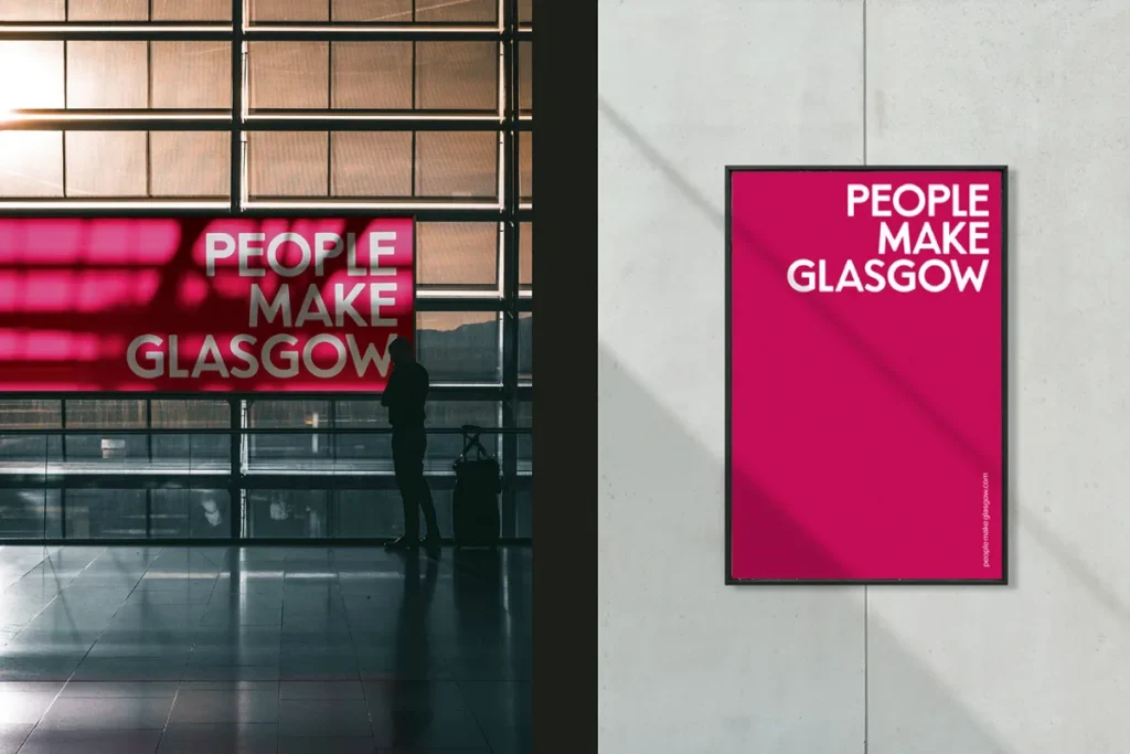
Glasgow’s brand isn’t a symbol; it’s a slogan. “People Make Glasgow,” born from a public campaign, became the city’s official identity. The branding, developed by agency Brand Oath, is built around this human-centric idea.
The visual identity is secondary to the core message. It’s a powerful strategy because it’s not about architecture or geography; it’s about the spirit of the people. It’s participatory and proud, turning every citizen into a brand ambassador.
Business Takeaway: Your brand isn’t just your logo; it’s your core promise. Start by defining what you stand for in a simple, powerful sentence. The visuals should serve that promise, not the other way around.
9. Oslo: Modernising a 700-Year-Old Story
For centuries, Oslo’s coat of arms depicted a complex scene featuring its patron saint, St. Hallvard. It was detailed, historic, and completely unusable in a digital format.
In 2019, the city launched a new identity that didn’t erase this history but clarified it. The new logo is a radically simplified depiction of St. Hallvard, distilled to its essential elements. It’s a brilliant example of honouring your heritage while adapting for the future. They resisted the urge to replace their unique story with a generic swoosh.
Business Takeaway: Modernise your brand, don’t abandon its core story. Look into your company’s history for unique elements. Can you simplify an old idea to make it powerful for today’s market?
8. Helsinki: The Power of Pure Simplicity
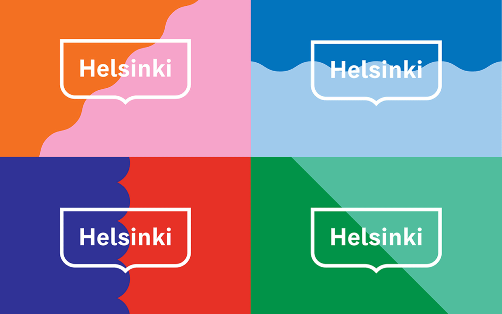
There is immense confidence in a logo that is nothing more than the city’s name. The Helsinki wordmark, designed by Werklig, is clean, balanced, and unapologetically simple.
It avoids all the usual municipal clichés. There’s no boat, no building, no leaf. The custom typeface is distinctive enough to be ownable, and its simplicity makes it incredibly versatile. It works everywhere, on everything, positioning Helsinki as a modern, design-forward city. It’s the visual equivalent of a firm, confident handshake.
Business Takeaway: A strong, well-chosen font can be more powerful than a complex symbol. Never underestimate the impact of world-class typography. Sometimes, the strongest statement is just saying your name clearly and confidently.
7. Bologna: The Logo as a Living System
Bologna’s brand is less of a logo and more of an open-source project. The “È Bologna” (“It’s Bologna”) identity, developed by Matteo Bartoli and Michele Pastore, is designed to be a framework that local businesses, artists, and institutions can adapt and make their own.
The core wordmark is a constant but an anchor for a vibrant and ever-changing visual language. This approach reflects the city’s culture of collaboration and creativity. It’s a brand that doesn’t dictate; it invites participation.
Business Takeaway: Consider how your audience can interact with and co-own your brand. Creating a flexible brand framework can foster a stronger community than rigid rules.
6. Porto: A Mosaic of Identity
Porto’s identity is a masterclass in building a brand from a city’s unique DNA. Designer Atelier Martino&Jaña drew inspiration from the city’s ubiquitous blue Azulejo tiles.
They deconstructed the patterns on these tiles into a grid of simple, icon-like symbols. These 70+ icons can be reconfigured to create endless patterns, telling stories about every facet of the city—from food and wine to architecture and people. The result is an identity that is unified and recognisably “Porto” yet infinitely flexible.
Business Takeaway: A strong brand system provides consistency without being repetitive. Identify the core visual elements of your business and build a flexible toolkit, not just a static logo. This is a core part of a truly professional logo design process.
5. Mexico City: Cleverness as a Brand
When Mexico City rebranded as “CDMX” (Ciudad de México), it needed a logo that was as dynamic and complex as the city itself. The winning design is a brilliant ambigram—a typographic design that reads the same when viewed from different orientations.
The abstract mark evokes the trajectory of a taxi on a map, the wings of the Angel of Independence, and the patterns of Aztec art. It’s intelligent, modern, and packed with meaning without being literal or cluttered. It’s a logo that makes you think, and in doing so, it becomes incredibly memorable.
Business Takeaway: A clever concept makes your brand memorable and shareable. Don’t just show what you do; find an intelligent way to represent your core idea. Wit is a powerful branding tool.
4. Tokyo: The Repetition is the Point
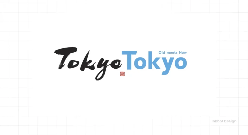
At first glance, the “Tokyo Tokyo” logo seems almost comically simple. But its brilliance lies in that simplicity. Designed by Hakuhodo, the identity uses the city’s name twice.
The first “Tokyo” is rendered in a thick, brush-stroke style font, representing the city’s deep traditions and Edo-period history. The second “Tokyo” is in a sleek, modern sans-serif font, representing the futuristic, high-tech side of the city. Past and future, side-by-side. The repetition acts like a chant, making it catchy and easily recognised.
Business Takeaway: Repetition builds recognition. State your name clearly and confidently. If your brand has a dual nature—like tradition and innovation—find a simple way to express that contrast.
3. I ♥ NY: Selling an Emotion, Not a Place
Technically, it’s a logo for New York State, but its heart and soul belong to New York City. Designed by the legendary Milton Glaser in the back of a taxi in 1976, this logo is arguably the most successful place branding in history.
Its power comes from what it doesn’t show. There’s no skyline, no Statue of Liberty, no yellow cab. Instead, it sells a pure, universal emotion: love. It transformed a city perceived as gritty and dangerous into a place for which people felt deep affection. It’s a testament to the power of a simple idea.
Business Takeaway: The most powerful brands connect on an emotional level. Stop selling features and start selling feelings. What is the core emotion you want customers to associate with your business?
2. Amsterdam: Turning a Stigma into a Strength
Amsterdam’s three vertical crosses are instantly recognisable. The “XXX” symbol has been part of the city’s coat of arms since the 1500s, representing the St. Andrew’s Crosses.
Of course, in the modern world, “XXX” has other connotations. A lesser city, terrified of controversy, would have run for the hills and rebranded with a safe, boring tulip or canal bridge. Amsterdam did the opposite. They leaned in. By embracing their historic mark, they created a brand that feels authentic, rebellious, and effortlessly cool. They owned their story.
Business Takeaway: Your brand’s “weird” feature might be its greatest strength. Don’t hide the quirks and unique parts of your story. That is where your true competitive advantage lies.
1. Melbourne: The Corporate Powerhouse
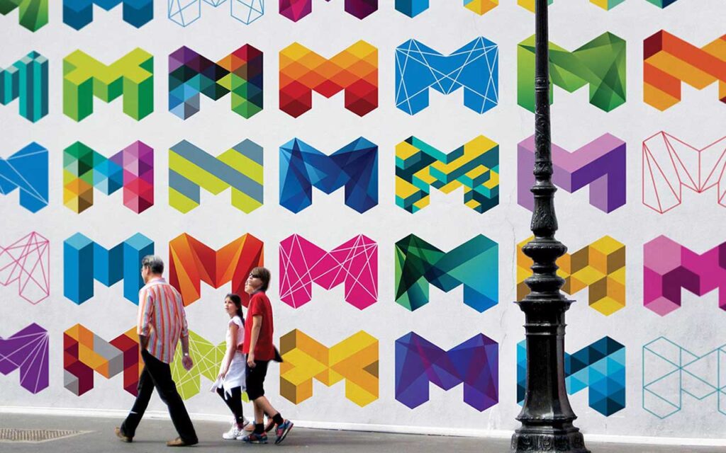
Topping the list is Melbourne. Designed by Landor Associates in 2009, this logo is the epitome of a modern, hard-working brand identity. It’s bold, vibrant, and unapologetically corporate.
The sharp, layered “M” is designed to be a dynamic container for colour, patterns, and images, reflecting the city’s energy and creativity. It doesn’t rely on history or a single story. Instead, it positions Melbourne as a forward-thinking, global hub for business and culture. It’s a strategic tool designed to attract investment and talent and does its job flawlessly. It’s confident, versatile, and built for business.
Business Takeaway: Your brand must be a hard-working asset that drives your goals. It needs to be a flexible, functional system that communicates your ambition and professionalism at every touchpoint.
What Separates a Great City Logo from a Waste of Money?
“Best” isn’t about what’s prettiest. It’s about what’s most effective. A great logo delivers on five key principles, whether for a city of 10 million or a business of one.
It Tells an Authentic Story
A logo should be a condensed version of your most compelling truth. It must be rooted in something tangible—your history, your purpose, your unique point of view. A generic mark tells a generic story, which is no story at all.
It’s Deceptively Simple
The most powerful logos are often the simplest. Think of Nike or Apple. Simplicity makes a logo easy to recognise, remember, and reproduce. It takes absolute confidence to remove elements, not add them.
It’s a Flexible System, Not Just a Static Mark
In the modern world, a logo has to live everywhere—from a giant billboard to a tiny favicon. The best brands aren’t single, rigid logos. They are flexible identity systems that can adapt to any context while remaining consistent.
It’s Memorable and Distinctive
Does it stand out in a crowded market? It has failed if your logo could be mistaken for a dozen others. The goal is to be instantly recognisable. This requires avoiding clichés and having the courage to be different.
It Aims for Timelessness, Not Trends
Chasing the latest design trend is a fool’s errand. A great identity should feel as relevant in 20 years as today. This means focusing on solid fundamentals like typography, concept, and composition, not fleeting fads like gradients or drop shadows.
What Your Business Can Learn from the Best City Logos
Looking at these 10 examples, a clear pattern emerges. The best brands aren’t created by committees trying to please everyone. They result from a clear vision and the courage to make a choice.
The lesson is simple: Be bold. Tell your true story. Build a flexible system that can grow with you. And above all, dare to be simple.
Branding is not an expense you can afford to get wrong; it’s a strategic investment in your future. Getting this right requires a clear strategy, not just a design tool. It’s the core of what we do in our logo design process.
Frequently Asked Questions About City Logos & Branding
What is the primary goal of a city logo?
The main goal of a city logo is to create a recognisable, unified identity that helps attract tourism, business investment, and talented residents. It functions as a strategic tool for economic and cultural development.
Why are so many city logos ineffective?
Many city logos are ineffective because they are designed by committee. This process often leads to safe, generic designs that try to please everyone but fail to communicate a unique or compelling message about the city’s character.
What is the difference between a logo and a brand identity system?
A logo is a single mark or symbol. A brand identity system is a comprehensive toolkit that includes the logo, colour palettes, typography, imagery guidelines, and patterns. A system is more flexible and ensures consistency across all applications, as seen with Melbourne and Porto.
How much does a city rebrand typically cost?
The cost of a city rebrand can range from tens of thousands to millions, depending on the scope. This includes research, strategy, design, and implementation across all city assets (signage, vehicles, websites, etc.).
What makes a logo timeless?
A timeless logo avoids fleeting design trends. It relies on strong, simple concepts, classic typography, and a balanced composition. The “I ♥ NY” logo is a perfect example of timeless design.
Can a city brand be just a slogan?
Yes. “People Make Glasgow” shows that a brand can be built around a powerful slogan or core message. In this case, the visual identity supports and amplifies the central idea.
How important is a city’s history in its logo design?
A city’s history is a powerful source of authentic stories and symbols. The best city brands, like Amsterdam and Oslo, find ways to reference their heritage in a modern, relevant way rather than ignoring it.
What is a typographic logo?
A typographic logo, or wordmark, is a logo that consists only of text—usually the name of the entity. Helsinki and Tokyo are excellent examples where the style and arrangement of the letters create a distinctive identity.
Should a logo be literal or abstract?
Either can be effective, but abstract logos are often more memorable and versatile. An abstract mark like Mexico City’s CDMX logo can hold more meaning and is less likely to feel dated than a literal depiction of a building or landmark.
What is the most critical business lesson from these city logos?
The most important lesson is that courage is the key ingredient in great branding. The courage to be simple, the courage to be different, and the courage to tell your authentic story instead of copying others.
If you’re tired of blending in and ready to build a brand that works as hard as you do, it’s time to stop thinking like a committee. Let’s create an identity that makes a statement.
Request a quote from Inkbot Design today, and let’s build something memorable.

