Top 10 Iconic Band & Music Logos for Design Inspiration
In our visually-driven world, a killer logo is essential for any band or musician looking to stand out. It's more than just some fancy graphic; it's the core of your brand identity. The proper logo makes you instantly recognisable and helps forge that deep connection with fans.
Think about it – can you imagine The Rolling Stones without those iconic luscious lips? Or Metallica minus that menacing, scratchy thing? Of course not! Their logos are burned into our brains, representing the essence of the music and attitude.
A top-notch logo isn't just eye candy, either. It's a powerful branding tool that increases merchandise sales, draws people to your shows, and amplifies your online and offline presence. Fans want to represent their favourite artists by wearing tees and slapping stickers everywhere, you name it.
So, let's dive in and look at 10 of the most unforgettable, era-defining band logos ever. Get ready to be inspired!
- #10 - AC/DC's electrifying musical prowess
- #9 - Pink Floyd's Legendary Prism
- #8 - Iron Maiden's Demonic Eddie Mascot Logo
- #7 - Nirvana's X-Eye Smiley Face Logo
- #6 - The Beatles' Drop-T Logo
- #5 - The Chaotic, Loveable Slipknot Logo
- #4 - Misfits' Crimson Ghoul: Punk Perfection
- #3 - Metallica's Heavy Artillery Icon
- #2 - Motörhead's Charismatic Skull
- #1 - The Rolling Stones' Luxurious Lips
- Other Notable Music Logos
- Conclusion
- FAQs on Music Logos
#10 – AC/DC's electrifying musical prowess
The AC/DC logo brilliantly captures the essence of the band's electrifying name. Designed to resonate with the concepts of energy and power, the logo features an emblematic lightning bolt between the letters “AC” and “DC.”
This graphic element is more than just decorative; it symbolises voltage and electricity, directly reflecting the band's dynamic name.
The font choice further enhances the intense, high-voltage theme. Known for its sharp, geometric precision, the typeface effectively conveys a sense of edginess and movement, mirroring the band's energetic and rebellious spirit.
Overall, the logo's visual components, from its electric motifs to its striking typography, combine to effectively communicate AC/DC's electrifying musical prowess.
#9 – Pink Floyd's Legendary Prism
Our next entry needs no introduction: the iconic Pink Floyd prism logo, as trippy as their spacey prog rock jams.
The Meaning Behind the Madness
George Hardie designed the simple prism triangles to refract light into its visible spectrum – red, blue, indigo, etc. It's a symbolic representation of the band's signature exploration of philosophical themes and metaphysical concepts.
Like their music sent audiences on mind-bending journeys, the prism distorts our view of reality by breaking light into its components. Deep stuff, right?
Yet, at the same time, the clean vector graphic has a minimalist beauty that feels modern and aesthetically pleasing. It triggers our imagination while still being accessible. It embodies all the fascinating contradictions within Pink Floyd's artsy yet famous brand.
Infinite Imprint
You've seen this prism insignia everywhere: shirts, posters, CD covers, you name it. Over 50 years later, it remains one of the most recognised and reproduced logos ever created.
Why such an enduring appeal? For one, the design is daringly simple yet distinct – it stands out while still allowing our minds to fill in the blanks. Its striking visual quality makes it highly adaptable and versatile for endless merch.
More importantly, though, it captures the spirit of Pink Floyd's cerebral, psychedelic rock that still intrigues listeners of all ages. This prism may bend light, but its iconic status will never be distorted.
#8 – Iron Maiden's Demonic Eddie Mascot Logo
When you think of heavy metal logos, Iron Maiden's zombie-fied “Eddie” mascot is probably one of the first images to pop into your head. And for good reason – this maniacal creation is the stuff of nightmares!
Birth of a Beast
Created by artist Derek Riggs in 1979, Eddie made his debut on Iron Maiden's debut album cover, where he was featured as a ghoulish corpse waving from the grave—chilling stuff.
From there, the undead mascot took many twisted forms across their iconic album covers – a cyborg on Somewhere in Time, a mummy on Powerslave, and even a killer alien on The Final Frontier! Each one is more gloriously disturbing than the last.
Metal to the Bone
So, what makes this such a perfect heavy-metal mascot? For starters, the detailed, macabre depictions of Eddie are like something ripped straight out of a horror movie – precisely the kind of dark imagery their music evokes.
But more than that, Eddie embodies the rebellious, aggressive attitude at the core of Maiden's sound and spirit. He's like the inflatable monster personification of their bone-crushing riffs and anti-authority themes.
Just think how many metalheads, outcasts, and misfits found a kindred spirit in this iconic mascot. Eddie wasn't some silly gimmick to those fans – he was a statement of individuality in the face of conformity. Truly metal to the bone.
#7 – Nirvana's X-Eye Smiley Face Logo
Nirvana's iconic X-Eye Smiley Face, now a staple on T-shirts and memorabilia, traces its roots back to the band's creative mind.
It debuted as part of Nirvana's “Nevermind” album release party invitation. This quirky design, featuring a playful smiley with Xs for eyes and its tongue cheekily poking out, is credited to Kurt Cobain himself, who sketched it in a moment of inspiration.
Its creation didn't just stay on an invitation. It quickly became synonymous with the band's identity and alternative music scene. The simplicity and edginess of the design captured the ethos of an era that celebrated both rebellion and playfulness.
Adding to its distinctive appeal, the lettering associated with Nirvana frequently uses the Poster Bodoni Compressed font, lending a sharp, clean look that contrasts with the whimsical nature of the logo. This typeface choice is shared with other major brands, underscoring its versatility and broad appeal.
In summation, the X-Eye Smiley Face is more than a logo—it's a glimpse into the creative spirit of Kurt Cobain and a lasting symbol of Nirvana's impact on music and culture.
#6 – The Beatles' Drop-T Logo
The Beatles' iconic logo, often called the Drop-T, was the brainchild of Ivor Arbiter, a talented drum designer and versatile instrument entrepreneur.
Tasked with creating an emblem for the band's drum kit, Arbiter quickly crafted this unique design that would become synonymous with The Beatles' image.
Distinctive Characteristics
- Asymmetrical Design: One of the standout features of the Drop-T logo is its asymmetry. The letter ‘B' stands prominently, overshadowing the rest of the text with its towering presence.
- Unique Typography: The most eye-catching element is the letter ‘T', which appears to be lowered or “dropped.” This alteration differentiates it from other letters and gives the logo a distinctive look.
- Customised Font: The entire font is explicitly tailored for The Beatles, showcasing a creative flair to capture the audience's attention and leave a lasting impression.
The Drop-T logo became integral to The Beatles' visual identity, combining simplicity with a distinct design twist that remains iconic today.
#5 – The Chaotic, Loveable Slipknot Logo
While many band logos aim for a cohesive vibe, Slipknot's frantic, scratchy logo is intentionally all over the place. But hey, that kind of visual anarchy perfectly suits the nine-man force of nature that is Slipknot!
Art Meets Mayhem
Designed by the band's percussionist Shawn “Clown” Crahan and covered in ritualistic iconography, there's a primal, improvisational quality to the sloppy lettering and rough-edged graphics.
It's meant to symbolise the raw intensity, aggression, and energy pouring out of this juggernaut of a band. Where most logos strive for sleekness, Slipknot wanted a chaotic visual representation of their live performances' sweat, noise, and madness.
Fan Connection
Yet, for all its brash abrasiveness, there's something undeniably tribal and community-driven about Slipknot's signature emblem. Both the lettering and images resemble graffiti left by some post-apocalyptic cult.
And the members themselves play into this underworld imagery through their haunting masks and jumpsuit attire. It's all part of forging a unique group identity that rabid “maggot” fans fiercely rallied behind.
By distancing themselves from the mainstream through this disorderly iconography, Slipknot cultivated a devout following that felt part of something delightfully grotesque and ugly together. Not bad for a bunch of jarring letters and symbols, eh?
#4 – Misfits' Crimson Ghoul: Punk Perfection
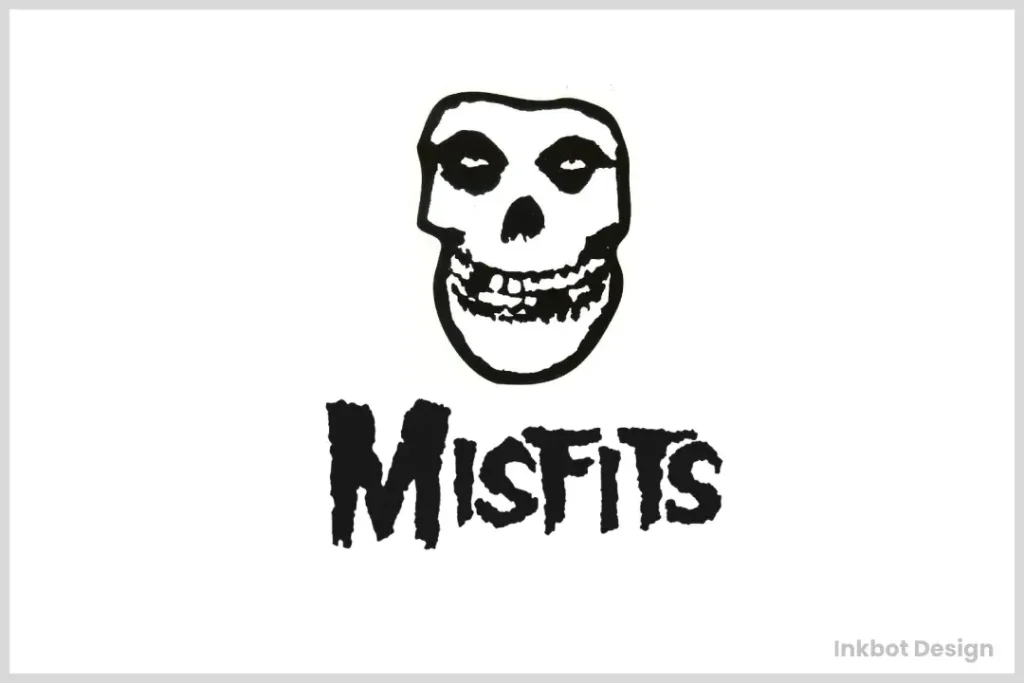
You don't get more punk than the viciously sharp-toothed ghoul face that serves as horror punk trailblazer the Misfits' eternal logo. Simple yet impactful as hell, it hits hard like a killer hook.
Birth of a Monster
Born from founding singer Glenn Danzig's love of vintage monster movies and serial killer culture, the crimson skull with piercing eyes and fangs first appeared on the Misfits' 1979 album Static Age. An instant icon was born.
Like Slipknot's scribbles, the purposefully crude, amateurish design lent itself to the band's bold, defiant, DIY spirit. Danzig supposedly created it with a pen on a napkin, driven by punk's snarling and animalistic rawness. And it showed – with each gnashing, vengeful line.
The Perfect Package
As iconic images go, the Misfits ghoul logo is about as lean and mean as they come. Those glaring eyes and gaping maw connote volatile anger and alienation, the driving fuel of early punk rage.
It's deliberately devoid of nuance beyond a primitive scream, capturing a garbled “Now I wanna fucking tear you'll apart!” vibe. And that visceral, straightforward animal aggression made the Misfits, and punk itself, so electrifying.
Of course, the ghoul image also represented punk culture's embrace of old-school horror schlock and “digging up the bones” of nostalgia. But at its essence, this whittled-down death face just looks imposing and ready to shatter propriety itself. Now that's the snarling heart of punk spirit in a single deathless image!
#3 – Metallica's Heavy Artillery Icon
Metallica has been known for decades as one of the greatest, hardest-hitting metal bands ever. Is it any wonder their logo looks like an explosive artillery blast of pure molten wreckage?
Weaponised Branding
Meticulously designed by putting real-life texts through machine lettering, the now-signature scrawled lettering has a menacing quality like shrapnel or warped heavy artillery smoke.
Mission freaking accomplished – this is about the most aggressive, battle-ready branding imaginable. With all those jagged points and fiery outlines, it looks poised to mow down anyone silly enough to oppose its sonic onslaught!
A Cut Above
But wait, there's more brutality on display. At the heart of the name sits a sharpened, clenched fist embellished into the letters, subtly symbolising the band's toughness, unity, and determination always to conquer.
These compact details elevate the design into something more profound than your average heavy metal logo. It's not just meant to look like smouldering debris; it's the explosive visual embodiment of Metallica's music and essence as one of the planet's heaviest, least compromised bands.
After 40+ years of Metallica reigning supreme, it's clear those gnarled letters fused with aggression became more than an emblem – it's a declaration of dominance over all others. Bow down or be crushed by the unforgettable logo!
#2 – Motörhead's Charismatic Skull
Motörhead's cranium and spikes logo is in your face, just like Lemmy Kilmister's gloriously grizzled crew. But what makes this officially the second-greatest band logo of all time is its sheer personality…and awesomeness.
A Craggy Classic
Designed by artist Joe Petagno in 1977, Motörhead's skull graphic bursts with character thanks to its charmingly crude, hand-drawn touches. Look at those ornery, downward-slanted eyes and crooked teeth! The dude looks like a grumpy badass with a penchant for wild living.
Just imagine this mug bleary-eyed at 3 am, chugging another cold one while smashing stuff up. The skull's wrinkles and cracks practically tell his sordid life story – all coloured in what was meant to be a sickly combination of life and death greens.
Petagno created the ultimate rock ‘n roll antihero through a scrappy sketch. Then he exited the chaos with metal spikes erupting from its jack-o-lantern grin, embodying the unrestrained danger in Motörhead's gloriously reckless sound.
The True Spirit of Rock
Because that's what this icon nails: the unruly, free-wheeling id of rock music. While other bands got sterile corporate logos, Motörhead stubbornly clung to this hilariously ugly, tough-looking S.O.B. design as their figurehead.
Those missing teeth, drunk eyes, and crazed ‘do perfectly personified the deliciously slovenly, anti-authority ethos Kilmister and crew celebrated in their whiskey-soaked anthems. It was vibrant, alive, and, most importantly, impossible to ignore or stop head-banging.
Even though the graphic now feels timelessly badass, it was always meant to be an irreverent F.U. to the bloated mainstream music industry. How fitting for the loudest, filthiest, most electrifying rock ‘n roll band that ever lived?
#1 – The Rolling Stones' Luxurious Lips
Would anything else top this list? The Rolling Stones and their luscious lips emblem are the first that comes to mind when you think of iconic band logos. And rightfully so – it's simply the greatest of all time.
Brimming With Attitude
They first appeared on the Stones' 1971 Sticky Fingers album. The roots of the ubiquitous logo trace back to lead singer Mick Jagger's penchant for wearing a shirt featuring the Hindu goddess Kali's lips and tongue sticking out.
When conceptual artist John Pasche was commissioned to design a logo, he drew inspiration from Jagger's Kali top and the band's subversive anti-authority spirit. Thus, the lips were born – a symbol of decadence, rebellion, and Paul Simonon's bird.
Big Lips, Bigger Impact
And what an impact it's had on pop culture, forever altering the world's perspective of the Rolling Stones' brand. With just a few devilishly pouty curves, the protruding lips transformed the band's image from scruffy blues rockers into svelte, stylish icons of dangerous sexuality.
Suddenly, their swaggering lyrics and Jagger's exaggerated pelvic movements took on extra salacious overtones – all filtered through those luscious, tantalisingly open lips. It perfectly captured the Stones' hedonistic spirit and insatiable appetite for indulgence.
From a pure design standpoint, the punch-you-in-the-face simplicity made the lips undeniably eye-catching and instantly burned into your brain. Yet the straightforward vector outline felt artsy and high-fashion enough to adorn pricey merch and skyrocket the band's glamorous appeal.
The Greatest Of All Time
Above all, though, those plump lips just looked defiantly cool. They oozed rock star attitude without trying too hard – the visual equivalent to Jagger's iconic strut and sneer. After witnessing them numerous times, you couldn't help but think, “Yeah, those guys are the biggest, baddest, sexiest motherf*****s around.”
And really, isn't that the whole point of branding? To condense the raw essence of who you are into one defining, supremely self-assured symbol? Well over 50 years later, The Rolling Stones logo perfectly embodies their uncompromising spirit and status as the greatest f*****g rock ‘n' roll band.
Long live the lips – rock's most powerful and iconic logo that will never be topped!
Other Notable Music Logos
Red Hot Chili Peppers logo
Lead singer Anthony Kiedis spontaneously created the Red Hot Chili Peppers logo. In an urgent need to provide a symbol to their record label, Kiedis quickly sketched an asterisk, a design he whimsically named “The Angel's A-hole.” This icon has since become emblematic of the band's identity.
Encircling the red asterisk is text in Franklin Gothic, a bold sans-serif font that complements the simplicity and boldness of the symbol itself.
Unlike many other bands, they chose not to hire professional graphic artists to design their logo. Instead, the group took a DIY approach, crafting a distinctive emblem that reflects their unique style and energy.
The Buzzcocks' logo
Malcolm Garrett, an art student from Manchester Metropolitan University, crafted the Buzzcocks logo at the time. This marked Garrett's debut professional project.
Utilising the Compacta font, Garrett introduced a distinctive creative flair by arranging the two “Z” letters to mirror the shape of a lightning bolt evocatively. This design has since become an iconic symbol for the band.
Blur Logo Design
Blur's logo is distinctively characterised by its text-centric design, where the letters are seamlessly connected to form a unified silhouette.
This cohesive structure is achieved by eliminating spaces between the characters, creating a flowing, uninterrupted appearance.
The logo is predominantly displayed in monochrome, either in black or white, which enhances its simplicity and versatility.
The Oasis Logotype
The iconic logo of the band Oasis features a distinct font choice that contributes to its recognisability. The font used is Helvetica Black Oblique, a variant of the classic Helvetica typeface. Known for its bold and slanted style, Helvetica Black Oblique conveys a strong and dynamic presence.
The letters in the logo are presented in lowercase and framed within a simple rectangle. This design choice emphasises the band's straightforward yet impactful aesthetic, making the logo easy to identify and memorable. Combining the bold font and the minimalist design creates a striking visual that captures the essence of Oasis's brand identity.
Conclusion
There you have it – 10 of the most searing, unforgettable band logos that masterfully distilled complex styles and personalities into single unified images. From horror to superheroes to grotesque monsters, each one nailed the essence of their respective artist.
A successful logo isn't just some random scribbles or vectors. It's the heart and soul of your artistic identity made tangible through bold visuals and emotional storytelling. Because the greatest logos, like the most incredible songs, transcend language to capture intangible feelings and forge enduring connections.
So whether you're a rising band looking for a new symbol or just a passionate fan, take inspiration from these indelible emblems. Let them serve as a reminder that when it comes to branding, nothing beats taking creative risks and pouring your most authentic self into every snarling line. Who knows – your scratchy sketch or half-baked doodle could become the next era-defining icon!
FAQs on Music Logos
What makes a great band logo?
A great band logo captures the artist's essence, energy, and attitude through simple yet impactful visuals. It should be instantly eye-catching and recognisable yet open to creative interpretation by fans.
Why are band logos so important?
Logos are the foundation of a band's brand identity. An iconic emblem helps forge a stronger connection with listeners, amplifies an artist's presence across all mediums, and boosts valuable merchandise sales. It separates a beloved act from the pack.
What was the inspiration for some famous band logo designs?
Many legendary logos were born out of improvised doodles or subversive influences, like The Rolling Stones' Kali-inspired lips or Metallica's militaristic dismantling of typography. True creativity often strikes unexpectedly!
Can you change or update your band logo?
It's possible but highly inadvisable to dramatically alter an iconic logo that fans deeply associate with your band's brand and legacy. Minor refreshes are OK, but a complete overhaul would likely create more confusion than excitement.
Do you need expensive designers to create an excellent logo?
Definitely not! Band members created many of the most unforgettable logos showcased here through scrappy, DIY means before being finessed by professionals. What matters most is distilling the creative essence into an iconic mark.
