
Print Advertising Isn’t Dead: A Guide for Businesses
The endless debate about whether print advertising is “dead” is a waste of breath.
It’s a lazy conversation, usually championed by digital-only evangelists who don’t understand the medium or, worse, by businesses looking for an excuse for their own failed campaigns.
Print isn’t dead. It never was.
But your approach to it is.
For decades, small businesses have been burning cash on flyers, magazine spots, and newspaper ads that were doomed from the start.
Badly written, poorly designed, and aimed at everyone and no one. They produce nothing but silence and a lighter bank account.
The problem isn’t the paper or the ink. It’s the lack of thinking. It’s the absence of a coherent strategy. It’s treating print as a box to be ticked instead of a powerful communication tool.
This isn’t about print versus digital. It’s about effective versus ineffective. And most print advertising is hopelessly, unforgivably ineffective.
- Print advertising remains relevant, but requires strategic thinking rather than a lazy, generic approach.
- Effective print ads focus on a clear objective, target audience, and compelling call-to-action.
- Utilising high-quality design and materials enhances credibility and reinforces brand messaging.
- Tracking response through unique codes or dedicated URLs allows measurement of print ad effectiveness.
- Tangibility and trust make print a powerful medium in a digital-dominated landscape.
Why Most Print Ads Are a Colossal Waste of Money

We must dissect what goes wrong before discussing how to do it right. I see the same mistakes week in and week out. It’s a cycle of wasted potential fuelled by bad advice and wishful thinking. Businesses fail with print because they are sold a dream and forget to ask about the reality.
The ‘Spray and Pray’ Fantasy
The most common justification for a weak ad is “we just want to get our name out there.” This is the marketing equivalent of throwing a bottle into the ocean and hoping a millionaire finds it. It’s not a strategy; it’s a lottery ticket.
Business owners get seduced by a publication’s circulation numbers—”50,000 readers!”—and imagine 50,000 people poring over their advert. The reality is that most of those people won’t even notice it. They’re flicking through pages, looking for the article they wanted to read. Your ad is an interruption.
Focusing on vanity metrics like ‘potential reach’ instead of actual, measurable engagement is the fastest way to convince yourself you’re doing something useful while achieving nothing.
Design by Committee and Other Creative Sins
Ever seen an ad that looks like a hostage negotiation note? Multiple fonts, starbursts, a dozen bullet points, and three phone numbers? That’s the work of a committee.
The owner wanted to mention the new service, the marketing manager insisted on including the social media icons, and someone’s nephew, who “knows Photoshop”, put it all together.
The result is a cluttered mess with no central message. It screams desperation. It’s an ad that tries to say everything and ends up communicating nothing.
I saw a flyer for a local restaurant recently. It had a picture of their pizza, a picture of their curry, a list of their opening hours, a map, their TripAdvisor rating, and a plea to follow them on Instagram. What was the offer? What was I supposed to do? I had no idea. It went straight into the bin, a perfect waste of ink and opportunity.
The Lie of the ‘Premium’ Placement
Here’s a piece of advice that sales reps for glossy magazines won’t give you: the magazine’s quality does not guarantee the quality of your results.
Placing a poorly conceived, generic ad in a high-end, expensive publication is like putting lipstick on a pig. A very expensive pig. You feel good about being seen in a prestigious place, but the phone doesn’t ring. Why? Because the ad itself was fundamentally weak.
A brilliant, direct-response ad in a free local newspaper will outperform a vague, corporate ad in a national glossy nine times out of ten. The medium lends credibility, but cannot create a compelling message for you. Don’t let the prestige of the placement lull you into creative laziness.
The Real Power of Print: Tangibility and Trust
So if it’s so easy to get wrong, why bother? Because what print does well, it does incredibly well. In a world of fleeting digital noise, print offers two things that are becoming increasingly rare and valuable: tangibility and trust.

Something You Can Hold
A digital ad exists for a second on a screen and then vanishes. A piece of print media is a physical object. A potential customer can pick up your flyer, fold your direct mail piece, or tear your ad out of a magazine. It occupies physical space in their world, even for a moment.
This isn’t just fluffy sentiment. Studies have shown that physical media leaves a deeper footprint in the brain.
A 2015 study by the US Postal Service found that physical advertisements were more memorable, processed more quickly, and triggered a stronger emotional response than their digital counterparts. You’re not just buying space but a moment of focused, physical attention. That’s a powerful edge.
The Credibility Signal
In ten minutes, anyone can spin up a Facebook ad with a stolen credit card. It takes commitment, planning, and capital to execute a print campaign. That very fact sends a powerful signal to your market. It says you’re serious. It says you’re stable. It says you’re here to stay.
Being present in a respected industry journal or a well-regarded local magazine aligns your business with the credibility of that publication. It’s an implied endorsement. You are borrowing their authority. In a world full of scams and fly-by-night operations, this tangible proof of investment builds trust that a pop-up ad simply cannot replicate.
The Foundations: Before You Spend a Single Penny
Effective print advertising is 90% thinking and 10% execution. No clever design or witty copy will save you if you think wrong. You must have these four foundations before considering calling a designer or a publication.

Rule #1: What Is the Point? (Your Objective)
Every ad must have one, and only one, primary job. Are you trying to get the phone to ring tomorrow, or are you trying to build your brand’s reputation over the next two years? These are two completely different goals.
- Direct Response: This is about provoking an immediate action. “Call now for a free quote.” “Bring this coupon in for 20% off.” “Visit our website to download the guide.” The success of this is easy to measure. Did they do the thing or not?
- Brand Building: This is about creating an impression, associating your company with a certain quality or feeling. Patek Philippe doesn’t expect you to see their ad and immediately buy a £50,000 watch. They are reinforcing their message of legacy and craftsmanship. The ROI is long-term loyalty and pricing power.
Trying to do both in one ad results in a muddled message. Be brutally clear: what is the most important outcome you want from this specific ad?
Rule #2: Who Are You Talking To?
“Our target audience is everyone.” No, it’s not. That’s the fastest route to bankruptcy. You need to know precisely who you want to reach. And “males aged 25-54” is not an audience; it’s a statistic.
Think deeper. What are their problems? What are their aspirations? What do they secretly worry about? What kind of humour do they appreciate? And crucially, what do they read?
If you’re a high-end landscape gardener, your audience isn’t reading the free-sheet newspaper full of fast-food coupons. They might read a regional lifestyle magazine or the local golf club’s newsletter. Placing your ad is about finding where your specific audience congregates, not spraying your message as widely as possible.
Rule #3: The One Thing You Want Them to Do (The CTA)
I am still astonished by the number of ads that seem to forget this. They talk about themselves, show a nice picture, list their address, and then… nothing. They don’t ask the reader to do anything.
Your Call-to-Action (CTA) needs to be simple, clear, and compelling. It should be the logical conclusion to the ad’s message.
- Weak CTA: “Feel free to contact us.”
- Strong CTA: “Call David on [Number] before 5 pm Friday for a no-obligation quote.”
- Weak CTA: “Visit our website.”
- Strong CTA: “Visit https://www.google.com/search?q=MyWebsite.com/Offer to claim your free sample.”
Tell them exactly what to do, how, and why they should do it now.
Rule #4: What’s the Budget? (And Sticking to It)
Be realistic. The cost of a print ad isn’t just the fee you pay the magazine. It’s the complete package:
- Placement Cost: The fee for the ad space itself.
- Design Cost: The fee for a professional designer to create the ad.
- Printing Cost: If you’re creating flyers or direct mail.
Here’s the rub: cheaping out on design is a false economy. You can spend £2,000 on a full-page ad in a great magazine, but if you only budget £50 for the design, you’ve guaranteed that your £2,000 is wasted. A great designer isn’t a cost; they are an investment in ensuring the placement fee pays off.
The Anatomy of a Print Ad That Works
Once your strategic foundation is solid, it’s time to build the ad. A successful print ad is a machine with several critical, interlocking parts. If one part fails, the whole machine grinds to a halt.
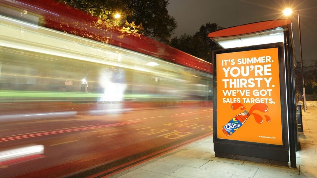
The Headline: Your Ad’s 80% Paycheck
The legendary ad man David Ogilvy famously stated that on average, five times as many people read the headline as the body copy. When you have written your headline, you have spent eighty cents out of your dollar.
Its only job is to grab the right person by the collar and force them to read the first sentence. It must promise a benefit, deliver news, or provoke powerful curiosity.
- “They Laughed When I Sat Down At the Piano But When I Started to Play!—”
- “At 60 miles an hour, the loudest noise in this new Rolls-Royce comes from the electric clock.”
- “How to Win Friends and Influence People.”
These are classics for a reason. They don’t sell the product; they sell the story. They make you want to know what happens next. Stop writing headlines that just state your company name and what you do. Start writing headlines that your ideal customer cannot ignore.
The Visual: One Image to Rule Them All
The temptation to show everything you sell is strong. Resist it: one product, one person, one concept. A single, powerful image that communicates your core idea at a glance is infinitely more effective than a collage of mediocre photos.
Your visual should tell a story or create a mood. It should work in perfect harmony with the headline. If the headline is the hook, the image is the bait. Don’t use generic stock photos. Invest in professional photography or illustration that reflects the quality of your brand. A cluttered ad is a confused ad. A simple, confident visual says you know exactly what you’re about.
The Copy: Say It Simply, Then Shut Up

If the headline and visual have done their job, you’ve earned a few seconds of the reader’s attention. Don’t waste it with jargon, clichés, or long, rambling paragraphs.
Use the AIDA model as your guide:
- Attention: The headline and visual did this.
- Interest: Build on the headline’s promise. Give them a fascinating fact or expand on the core benefit.
- Desire: Paint a picture of how their life will be better with your product or service. Focus on the transformation, not the features.
- Action: Your clear, unmissable Call-to-Action.
Write like you speak. Use short sentences. Use simple words. Read it aloud. Does it sound like a real human being? If not, write it again. Ruthlessly edit every word that doesn’t contribute to the core message.
The Layout: A Masterclass in Breathing Room
White space is not your enemy. It is the most essential element of a clean, high-end design. It gives your message room to breathe. It guides the reader’s eye from the headline, to the visual, to the copy and finally to the call-to-action.
This is called visual hierarchy. A good designer will control what the reader sees and in what order. If everything is bold and massive, then nothing stands out. A confident layout uses space to create focus and calm, signalling to the reader that this is a considered, professional message.
The Brand: Your Unmistakable Fingerprint
Your ad doesn’t exist in a vacuum. It’s a representative of your entire business. This means it must be consistent with your overall brand identity. That’s not just about slapping your logo on it. It’s about ensuring the tone of voice, the choice of typeface, the colour palette, and the style of photography all feel like they come from the same place.
Consistency builds recognition and trust. A customer should be able to cover your ad’s logo and still know it’s from you.
The Paper: Don’t Undermine Yourself with Flimsy Stock
This is one of my biggest pet peeves. It applies mainly to flyers and direct mail, but the principle is universal. You spend time and money crafting a message for your premium, high-quality service… and then you print it on the thinnest, cheapest paper imaginable.
The tactile experience is part of the message. When someone holds your flyer, the weight and texture of the paper communicate something about your brand before they’ve even read a word. Cheap, flimsy paper says, “I cut corners.” A heavy, textured stock from a quality supplier like G.F. Smith or a well-produced piece from a service like MOO signals quality and attention to detail. Don’t let your materials sabotage your message.
Tracking and Measurement: Proving It Wasn’t a Fluke
People believe print doesn’t work because they have no idea how to measure it. They throw money into the void and hope for the best. This is not marketing; it’s gambling. If you can’t measure it, you can’t improve it.

Stop Guessing. Start Tracking.
Asking new customers, “Did you see our ad?” is useless. People misremember, or they want to be helpful, or they have no idea what prompted their call. You need complex data. Luckily, it’s not difficult to get.
- Unique Offer Codes: This is the simplest method. The ad contains a specific code like “PRINT20” or “SUMMERSALE”. You simply count how many times that code is used.
- Dedicated URLs/Landing Pages: Don’t send people to your homepage. Create a specific, hidden page on your website, like yourcompany.com/offer. The only way people can get to this page is through the ad. You can then track the traffic to that page with absolute certainty.
- Call Tracking Numbers: Services like CallRail can provide a unique phone number to your main line. You put this unique number on the ad, and the service tracks precisely how many calls it generated.
The QR Code: Use It or Abuse It?
Ah, the QR code. The symbol of lazy “integrated” marketing. Too often, it’s slapped on an ad as an afterthought, leading to a company’s homepage that isn’t even optimised for mobile. This is worse than useless; it’s frustrating for the user.
A QR code is a bridge, not a destination. Use it correctly:
- It must lead somewhere valuable: Send them to the dedicated landing page, a video demonstration, or an instant download. Give them a reason to scan it.
- Make it easy to scan: Don’t make it tiny or place it over a complex background.
- The destination MUST be mobile-first: If they scan a code and have to pinch and zoom, you’ve failed.
A QR code done well can seamlessly connect your physical and digital worlds. A bad QR code tells your customer you don’t care about their experience.
Calculating a Basic ROI
Once you’re tracking your responses, you can calculate a basic Return on Investment (ROI). The formula is straightforward:
(Revenue Generated from Ad – Total Cost of Ad) / Total Cost of Ad
So, if you spent £1,000 on an ad (including design) and it generated £3,000 in sales, your ROI is (£3,000 – £1,000) / £1,000 = 2, or 200%.
Be honest with yourself, though. This works best for direct response. If you’re brand building, the value is less tangible. It might be about staying top-of-mind, which leads to a sale six months later. But you should still be tracking what you can.
Case Studies in Excellence (And What You Can Steal)
Theory is one thing. Seeing it in action is another. You don’t need to reinvent the wheel; you just need to learn from the masters.
The Iconic: Volkswagen’s “Lemon”

In the 1960s, Volkswagen ran an ad with a picture of a Beetle and a single word headline: “Lemon.” The copy underneath explained that this car was rejected because of a tiny chrome blemish. The message was clear: VW’s standards were absurdly high.
What you can steal: Brutal honesty. The ad acknowledged a “problem” to showcase a much greater strength. It had the confidence to be self-deprecating, which created immense trust. What’s the one thing your customers would love to know that you’re obsessive about?
The Punchline: Specsavers
The “Should’ve gone to Specsavers” campaign is a masterclass in consistency. Every ad has been built around the same simple, repeatable joke format for years: a blurry situation, a comical misunderstanding.

What you can steal: A robust, repeatable framework. You don’t need a new “big idea” for every ad. Find a core concept that works for your brand and stick to it. Consistency builds memory.
The Workhorse: The Effective Local Ad
Brilliance isn’t always clever. Sometimes, it’s just brutally effective. Imagine a flyer from a local emergency plumber. It’s printed on a thick, magnetic card. The design is simple:
Headline: LEAKING PIPE? Visual: A simple icon of a dripping tap. Copy: “24/7 Emergency Call Out. No Call Out Fee. Call Mark Directly.” CTA: A vast, unmissable phone number.
This ad is a tool. It’s not trying to win awards. It’s designed to be stuck on a boiler or a fridge and used at the exact moment of need. It solves a specific problem for a particular person at a specific time. That is genius in its own right.
Final, Honest Advice
So, is print advertising right for your business? Maybe. Maybe not.
It is not a magic wand. It is a craft that demands thought, strategy, and an investment in quality. It’s a tool for businesses that are confident in their message and clear on their objectives.
If you’re not prepared to think deeply about your audience, offer, and desired outcome, please save money. Spend it on something else.
But if you are willing to approach it with intelligence and respect for the reader’s attention, print can be one of your marketing arsenal’s most powerful and profitable tools. So, ask yourself: Is your current advertising lazy? Are you just ticking boxes? Or are you ready to do the work required to create something that gets a response?
If this kind of direct thinking about building a brand is what you’ve been missing, you’ll find more of it on our blog. If you want this thinking applied directly to your business, that’s what our brand identity services are for.
Ready to talk specifics about your project? Request a quote here.
FAQs about Print Advertising
Is print advertising still effective in 2025?
Yes, but only if it’s done well. Its effectiveness comes from tangibility and trust, powerful differentiators in a cluttered digital world. A strategic, well-designed print ad for the right audience can be highly effective.
How much does print advertising cost?
Costs vary dramatically based on the publication’s circulation, the ad size, and whether it’s colour or black and white. A local newspaper ad might cost a few hundred pounds, while a full page in a national magazine could be tens of thousands. Remember to also budget for professional design.
What are the main advantages of print over digital?
The key benefits are tangibility (a physical object), higher trust and credibility, less consumer ad fatigue, and a longer shelf life (a magazine can sit on a coffee table for weeks).
How do I write a good print ad headline?
Focus on the reader’s self-interest. A great headline should promise a benefit, offer news, or create intense curiosity. It should be clear, direct, and make the reader want to know more. It’s the most essential part of the ad.
How can a small business measure the ROI of print ads?
Use tracking mechanisms. The best methods are unique discount codes (e.g., “PRINT15”), dedicated website landing pages (e.g., yoursite.com/offer), and unique call-tracking phone numbers. This allows you to attribute sales or leads to a specific ad directly.
What is the biggest mistake to avoid in print advertising?
The biggest mistake is a lack of a clear Call-to-Action (CTA). Not telling the reader precisely what you want them to do next is a guaranteed way to waste your investment.
Should I use flyers or magazine ads?
It depends on your goal and audience. Flyers are excellent for highly-targeted local promotions and direct offers. Magazine ads are better for reaching specific interest groups (e.g., photography enthusiasts) and building brands.
How do I make my print ad not look cheap?
Invest in professional design, a single strong visual, and generous use of white space. A clean, uncluttered layout signals confidence and quality. If it’s a flyer, use high-quality paper stock.
What makes a good call-to-action (CTA)?
A good CTA is clear, specific, and urgent. Instead of “Contact us,” try “Call before Friday to book your free consultation.” It tells the reader what to do, how, and why they should do it now.
Do QR codes in print ads work?
They work only if they provide real value and a seamless experience. The code must lead to a mobile-optimised page that offers something useful, like a discount, a video, or an exclusive guide. A QR code leading to a standard, non-mobile-friendly homepage wastes space.
What is the AIDA model?
AIDA stands for Attention, Interest, Desire, Action. It’s a simple framework for structuring your ad’s copy. Grab their attention (headline/visual), build their interest (expand on the benefit), create desire (show them the transformation), and call them to action (tell them what to do).
How important is the choice of paper for flyers or brochures?
Extremely important. The physical feel of the paper is the first impression your brand makes. Flimsy, cheap paper undermines a message of quality, while a heavy, textured stock reinforces it. The tactile experience is part of your brand’s communication.
