Why the PayPal Logo is Both a Genius Move and a Boring Mess
You don’t love the PayPal logo.
You don’t hate it, either. You probably don’t think about it at all. You see it, you recognise it, you click it. Job done.
And that, right there, is the entire story. It’s a story about a logo that achieved something far more important than beauty or design awards: it achieved invisibility. It became a pure utility—a trusted button.
This isn’t just a history lesson for design geeks. It’s an autopsy of a tech titan’s identity, performed for the benefit of entrepreneurs and business owners.
We will look at the good, the bad, and the painfully bland to see what real-world lessons are hiding in plain sight.
- PayPal's logo evolved to achieve trust and recognition, focusing on utility over aesthetics.
- Consistency in branding builds trust, even with a "boring" logo.
- Rebranding should be purposeful, driven by strategic business shifts instead of whimsy.
Before the Double P: The Wild West of X.com and Confinity
Before PayPal was the default online checkout button, it was a messy fusion of two different companies with two very different ideas about the future of money.
The X.com Anomaly (1999)
Remember 1999? The dot-com bubble was at full boil. Every other startup had a name that sounded like a sci-fi convention. And then there was Elon Musk’s X.com.
The name itself was the peak of that era’s ambition. The logo was a stark, stylised ‘X’ with a 3D effect, looking like it belonged on the side of a spaceship in a low-budget film.
It wasn’t a logo for a friendly payment service. It was a logo for a financial revolution. It screamed “we are the future,” with all the subtlety of a car alarm. It was bold, a bit cold, and ultimately, a branding dead end.
The Confinity Palm Pilot Logo (1999-2000)
Meanwhile, Peter Thiel’s Confinity had a much more grounded approach. Their business was letting people beam money to each other using Palm Pilots.
Their logo? The word “Confinity” next to a stylised hand holding a Palm Pilot with radio waves coming out of it.
It wasn’t pretty. It wasn’t clever. But you knew exactly what it did. It was a visual instruction manual for a new, slightly confusing technology that was precisely what was needed.
For a startup, clarity trumps cleverness every single time. Your first logo might just need to explain what the hell you do. Get to market, make money, and you can pay a fancy designer to make it “artistic” later.
The Merger and the First “Real” PayPal Logo (2000-2007)
When X.com and Confinity merged, they wisely dropped the “X.com” name and focused on Confinity’s most popular product: PayPal. They needed a logo that could build trust from scratch.
A Marriage of Convenience
The new company was called PayPal. The latest mission was to become the de facto currency of the internet. They couldn’t do that with a logo resembling a sci-fi prop or a diagram from a user manual.
They needed something that looked… safe. Something that looked like a bank.
Deconstructing the “Serious” Blue Box
So, that’s what they made. The first widely used PayPal logo was brutally simple: the word “PayPal” in a heavy, no-nonsense sans-serif font. The “Pay” part was dark, serious blue; the “Pal” part was slightly lighter, friendlier blue.
It was boring.
Let’s not mince words. It was as dull as a bank statement. It had all the personality of an office printer.
And it was the perfect strategic move.
In the early 2000s, people were still terrified of putting their credit card details online. The biggest hurdle for PayPal wasn’t competition; it was fear. This logo didn’t try to be cool. It tried to be trustworthy.
The solid, blocky letters and the classic “corporate blue” palette were designed to soothe nerves. It whispered, “Don’t worry, we’re a proper financial institution, just… on your computer.”
The eBay Years: Stagnation and the 2007 “Refresh”
After being acquired by eBay in 2002, the PayPal logo entered a long period of quiet dominance. It was everywhere. It became part of the internet’s furniture.
If It’s Not Broken…
This is a lesson many businesses fail to learn. The 2000 logo wasn’t a masterpiece, but through sheer repetition, it built immense brand equity. It became one of the most recognised symbols in e-commerce.
Consistency creates assets. Even a “boring” logo, when applied consistently over the years, becomes a powerful symbol of reliability. Customers learn to trust it implicitly. Messing with that for no good reason is an act of self-sabotage.
The 2007 Tweak: A Lighter Shade of Mediocrity
In 2007, PayPal decided it was time for a change. Sort of.
They tweaked the logo. The font became thinner and more spaced out. The colours got a bit brighter. The result was a logo that was marginally different but functionally identical.
The press release probably talked about being more “modern” and “approachable.”
Let’s call it what it was: fiddling. It was a change for the sake of change. It didn’t alter the brand’s perception in any meaningful way. It was like repainting a garden shed a slightly different shade of beige and calling it a renovation. It made no real difference to anyone who mattered—the customer.
The Big One: Fuseproject and the 2014 Monogram Revolution
By 2014, the world had changed. The iPhone was king. Mobile payments were the new frontier. And PayPal was preparing to split from eBay and stand on its own two feet.
The old, blocky, “internet bank” logo wouldn’t cut it. It looked dated on a smartphone screen. It didn’t speak the language of a dynamic, modern tech company. A fundamental change was needed.
The Real Reason for Change: Mobile First
This is the most critical lesson in rebranding: rebrand with purpose. PayPal’s 2014 redesign wasn’t born from boredom. It was driven by a fundamental shift in their business strategy.
They needed an identity that was more than just a wordmark. They needed a symbol. An icon. Something that could work as a tiny app logo on a phone screen and still be instantly recognisable.
Enter the “Starchitect” Designer
To pull this off, they didn’t just hire any design firm. They hired Fuseproject, led by the design world’s equivalent of a rock star, Yves Béhar. When you bring in a name like that, you’re signalling you want more than a refresh. You want a revolution.
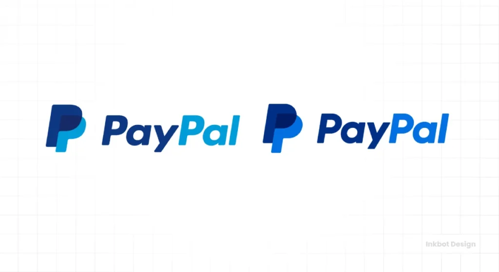
The “Double P” Monogram: Genius or Generic?
The result was the logo we know today. A new, softer, more rounded wordmark is set in the Gotham typeface, accompanied by a new monogram: the overlapping Double P.
The monogram was the star of the show. It was designed to be transparent, scalable, and friendly. The overlapping shapes symbolise “connection” and the “humanity” of transactions.
Of course, the design-speak that came with it was almost unbearable. They discussed “forwardness” in italics and “transparency” in the overlapping colours.
It’s two Ps. One P is slightly on top of the other. It looks good. It works well as an icon. That’s it. All the extra fluff is for the marketing department and nervous executives. Your customers do not care about the “collaborative synergy” represented by your overlapping shapes. They just want to know it’s you.
The Colour Story: A Tale of Two Blues
The colours were also updated. The old, staid blues were replaced with a more vibrant “PayPal Blue” and “Clarity Blue.” The goal was to look more like a modern tech brand (think Facebook, Twitter) and less like a traditional bank.
This was a conscious shift from “security” to “simplicity and connection.” It was a smart move. Colour and form choices are the bedrock of a professional brand identity, dictating perception before a single word is read. A successful logo nails this language. Professional logo design isn’t an expense for businesses looking to get this right; it’s a foundational investment.
The 2022 “Sharpening”: The Subtle Shift Nobody Asked For
When you thought they were settled, PayPal tweaked the logo again in 2022.
Another Tweak, Another Press Release
The changes were subtle. The corners of the monogram were made slightly sharper. The colours were more high-contrast and less saturated.
The official reason? To create a more “confident” and “dynamic” brand expression that performed better on high-resolution screens. It was about improving legibility and impact in a crowded digital space.
The 2024 Pentagram Rebrand
So, what happened in this latest rebrand?
PayPal brought in the big guns: Pentagram. You expect a revolution when you hire an agency with The Rolling Stones and Microsoft on its client list.
What PayPal got was a slight sharpening.
The official line is that the new identity is meant to “update PayPal’s look while staying true to its roots.” It’s a classic case of trying to have your cake and eat it.
The Updated Monogram
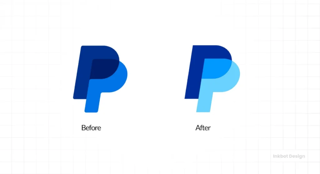
The headline change is in the logo itself. Once soft and rounded, the overlapping ‘PP’ monogram has had its corners sharpened.
The colours have been fiddled with, too. Brighter blues, deeper tones. All the usual adjustments to create more “dimension” for our high-resolution screens.
The result is a technically cleaner logo. Sharper. But it’s also more sterile. It’s the visual equivalent of tidying your desk by throwing everything into one sterile-looking box.
But here’s the real kicker. The bit that makes no sense.
The italicised ‘PP’ monogram, with its legacy feel, now sits next to a completely different, non-slanted wordmark. They share nothing. Not the font, not the style, not the weight.
They look like two strangers forced to stand beside each other for a photograph. There’s no connection. It’s a fundamental design mismatch, plain and simple.
The New Typeface: PayPal Pro
As part of the package, they also commissioned a custom typeface.
It’s called PayPal Pro.
It’s based on Futura, which in the world of typography is like ordering a Margherita pizza. It’s a classic. It’s safe. Nobody will complain, but nobody will be excited either.
The goal was to create a modern font that works well across digital platforms. This is hardly a revelation; it’s the minimum requirement for a global tech brand in 2025. They even made a version for smaller text. Groundbreaking.
My Take: The Corporate Blandness Creep
This, for me, is the final stage in the logo’s journey: optimisation into oblivion.
Is the 2024 version technically “better”? Perhaps. Is it sharper? Yes. Does it stand out more? Marginally.
Is it more interesting? Absolutely not.
This is the sanding down of the last remaining edges of personality. The 2014 logo had a certain softness and friendliness. The 2024 version feels more sterile, more corporate. It’s a logo that feels like the legal department approved it. It’s been optimised for a favicon and lost a tiny bit of its soul.
You can’t afford to have too much personality when your goal is to be a global utility. You have to be everything to everyone, which often means being nothing in particular.
What Small Business Owners Can Learn From the PayPal Logo Saga
Forget the design theory. Here are the practical lessons from PayPal’s 30-year identity crisis.
Lesson 1: Your First Logo Doesn’t Have to Be Forever
Confinity’s logo was a diagram. It was functional, not beautiful. It did its job of explaining a new service, and then it was wisely discarded. Don’t spend six months and £10,000 on the “perfect” logo when you don’t even have a proven product. Get something that works and get to market.
Lesson 2: Consistency Builds Trust (Even With a “Boring” Logo)
The 2000-2014 logo worked because it was a constant. For over a decade, it symbolised “safe online payment.” Its visual power came not from its design brilliance, but from its relentless consistency. Before you change your logo, ask yourself if you’re throwing away years of accumulated trust.
Lesson 3: Rebrand with Purpose, Not on a Whim
The 2014 rebrand was successful because it was strategically necessary. The business was moving to mobile and splitting from its parent company. The brand identity had to evolve. The 2007 and 2022 tweaks, however, felt far less critical. Don’t change your logo because you’re bored with it. Change it when your business has changed direction or outgrown its old clothes.
Lesson 4: Beware the “Humanising” Jargon
PayPal’s logos work because they are simple, recognisable, and backed by a reliable service. They do not work because of some guff about “connection” or “forwardness.” Focus on what your logo does for your brand recognition. Be clear. Be consistent.
You need an honest conversation if you need straight talk about what your brand identity needs, not just a load of fluff about synergy and empowerment. Requesting a quote is about starting that conversation to get to the core of your business needs.
Conclusion
The history of the PayPal logo isn’t the story of a design masterpiece. It’s the story of a tool.
It started as a functional diagram, became a boring-but-trustworthy box, and has now evolved into a hyper-optimised, globally recognised, and slightly soulless monogram. At every stage, the logo was a tool designed to do a specific job for the business at that particular time.
It was never about art. It was always about money.
So, look at your logo. Is it a tool that’s working for your business, or is it just a pretty decoration you’re fond of? The answer might be uncomfortable.
Analysing giants like PayPal offers a crash course in brand strategy. If these observations resonate, you’ll find more brutally honest analysis across our blog.
Our services come in when you’re ready to move from observation to action. We build logos that are tools, not just decorations. Explore our logo design services to see the foundation of a brand built with purpose.
Frequently Asked Questions (FAQs)
What was the very first PayPal logo?
Before the merger, PayPal was a Confinity product, and its logo featured the Confinity wordmark next to a stylised hand holding a Palm Pilot, indicating its function of “beaming” money between devices.
Who designed the current PayPal logo?
The current PayPal logo, featuring the “Double P” monogram, was created in 2014 by the renowned design agency Fuseproject, led by Yves Béhar.
Why did PayPal change its logo in 2014?
The 2014 redesign was a significant strategic move driven by the company’s planned split from its parent, eBay, and the critical shift towards a mobile-first world. They needed a stronger, more versatile identity with a scalable icon for app screens.
What do the overlapping Ps in the PayPal logo mean?
According to the designers, the overlapping Ps symbolise connection, communication, and the collaborative relationship between the buyer and seller. However, its primary design function is to be a simple, recognisable monogram.
What font does the PayPal logo use?
Since the 2014 redesign, the PayPal wordmark has used a modified version of the popular sans-serif typeface, Gotham.
Has the PayPal logo always been blue?
Blue has been a consistent colour in PayPal’s branding since its first widely recognised logo in 2000. The shades of blue have been updated to appear more modern and vibrant, moving from a corporate, bank-like blue to a brighter, tech-focused blue.
What was the X.com logo?
The X.com logo, from Elon Musk’s pre-PayPal company, was a stark, futuristic, stylised ‘X’ with a double horizontal line. It reflected the brand’s ambitious, all-encompassing “financial superstore” concept.
Did the PayPal logo change after leaving eBay?
Yes, the major 2014 redesign was planned and executed in anticipation of PayPal’s split from eBay in 2015. The new identity was crucial for establishing PayPal as a strong, independent brand.
What was the most recent change to the PayPal logo?
In 2022, PayPal subtly “sharpened” its logo. The changes included making the angles of the monogram slightly less rounded and adjusting the colours for higher contrast and better performance on high-resolution digital screens.
What’s the main takeaway for a small business from the PayPal logo’s history?
The most important lesson is to rebrand strategically, not just for aesthetic reasons. A fundamental business pivot drove PayPal’s most significant logo change. For a small business, consistency builds trust, and your first logo should prioritise clarity over cleverness.

