Top 14 Organic Logos: Unleashing the Power of Nature
Have you ever stopped to appreciate the intricate beauty of a leaf’s veins or the mesmerising patterns in a piece of driftwood?
Nature is a boundless source of inspiration, and many brands have tapped into this organic well to create visually striking logos and resonate with our innate connection to the natural world.
In this comprehensive guide, we’ll take you through the top 14 organic logos that have left an indelible mark on the design landscape.
From the harmonious curves of the Pepsi logo to the vibrant, leaf-inspired Tropicana emblem, these logos have masterfully harnessed the power of nature’s forms and textures to create unforgettable brand identities.
So, let’s dive in and explore the captivating world of organic logos, where art and nature intertwine to create design magic.
Why Organic Logos Matter
Organic logos offer a refreshing and grounding connection to the natural world, which is increasingly dominated by technology and artificial constructs. They remind us of nature’s inherent beauty and complexity, evoking a sense of authenticity and warmth that can be challenging to achieve with purely geometric or abstract designs.
Moreover, organic logos often possess a certain timeless quality. Unlike trends that come and go, the forms and patterns found in nature have been around for aeons and are likely to remain relevant and visually appealing for years. This longevity can be valuable for brands seeking to establish a lasting and recognisable identity.
- Organic logos evoke authenticity and warmth, connecting brands to nature amid an increasingly digital world.
- Natural forms like curves, leaves and animal silhouettes provide timeless, recognisable visual identities.
- Effective organic design balances aesthetic complexity with simplicity for scalability and cross‑media use.
- Periodic, subtle refinements keep organic logos fresh while preserving core recognisable elements.
1 – Pepsi: The Harmony of Curves
Kicking off our list is the iconic Pepsi logo, a true masterclass in organic design. Introduced in 2008, this logo features a series of fluid, wave-like curves that evoke the gentle undulations of a river or the ripples on a still pond.
The Design Story
The Pepsi logo’s organic form was a deliberate departure from the brand’s previous, more angular, geometric designs. The designers sought to create a more dynamic, youthful, and refreshing logo – qualities that perfectly complement the brand’s positioning as a lively and energetic beverage.
Design Elements at Play
- Curves: The logomark’s defining feature is its fluid, organic curves. These curves mimic the natural world and create a sense of movement and energy, reflecting the brand’s vibrant personality.
- Negative Space: The clever use of negative space within the curves adds depth and dimensionality to the design, making it visually captivating and memorable.
- Colour: The iconic Pepsi blue hue is a crucial element of the logo, lending it a cool and refreshing vibe that complements the organic form perfectly.
The Pepsi logo is a true masterpiece of organic design that seamlessly blends organic shapes with carefully crafted negative space and a bold colour palette.
2 – Tropicana: A Burst of Citrus Radiance
The Tropicana logo celebrates nature’s vibrant hues and organic shapes, perfectly encapsulating the brand’s essence as a purveyor of fresh, juicy citrus fruits.
The Design Story
Tropicana’s logo has undergone several evolutions over the years, but the current iteration, introduced in 2009, is a true triumph of organic design. The logomark features a stylised orange slice or wedge with a leaf-like stem and a burst of juicy segments.
Design Elements at Play
- Organic Shape: The primary logomark is a highly stylised yet recognisable representation of an orange slice, instantly connecting the brand with its core product offerings.
- Leaf-like Stem: Adding a leaf-like stem further reinforces the organic and natural qualities of the logo, evoking images of freshly plucked citrus fruits.
- Burst of Segments: The radiant burst of orange segments adds a dynamic and energetic element to the logo, capturing the essence of Tropicana’s juicy and refreshing products.
- Colour Palette: The vibrant orange hue, accented by shades of green, creates a visually striking and delicious colour combination that perfectly aligns with the brand’s citrus-centric offerings.
The Tropicana logo is a true standout in organic design with its delightful blend of organic shapes, vibrant colours, and natural motifs.
3 – Dove: The Grace of Natural Simplicity
The Dove logo is a beautiful expression of organic design, perfectly communicating the brand’s core values of gentleness, peace, and purity with a simple, beautifully crafted form.
The Design Story
Originally designed by Ian Brignell, the graceful bird silhouette is a direct visual representation of the brand’s name. It was created to symbolise the mildness and caring nature of its products, establishing an immediate emotional connection with consumers seeking gentle and nurturing personal care.
Design Elements at Play
- Organic Silhouette: The logomark is the instantly recognisable silhouette of a dove in flight. Its form is composed entirely of soft, natural curves that suggest gentleness and serenity.
- Fluid Motion: The shape of the bird suggests upward movement and grace, creating a feeling of lightness and positivity that aligns with the brand’s calming and uplifting image.
- Minimalist Execution: The logo features a solid, single-colour silhouette, lending it a timeless and highly versatile quality. This simplicity reinforces the brand’s message of purity and honesty in its ingredients.
- Colour Symbolism: While often rendered in gold or blue, the organic shape is the primary element. The common gold hue adds a touch of quality and warmth to the natural form.
Through its masterful use of a simple organic silhouette, the Dove logo has become a powerful symbol of care and gentleness, resonating with a global audience.
4 – Starbucks: A Siren’s Timeless Allure
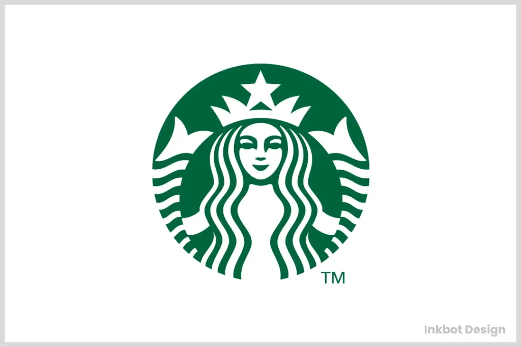
The iconic Starbucks logo is a prime example of how an organic design can evolve while retaining its essence and timeless appeal.
The Design Story
The Starbucks logo is rooted in a woodcut illustration of a two-tailed siren or mermaid, which was initially used on the brand’s first store in Seattle’s Pike Place Market. Over the years, the logo has undergone several refinements, but the central figure of the siren has remained a constant, lending the brand an air of mystery and allure.
Design Elements at Play
- Organic Form: The siren’s flowing hair, curvy body, and intricate details are a masterful representation of organic, natural forms, evoking a sense of fluidity and grace.
- Woodcut Inspiration: The logo’s woodcut-inspired style lends a rustic, handcrafted feel, perfectly complementing the brand’s artisanal coffee roots.
- Green Colour Palette: A rich, earthy green hue further reinforces the logo’s connection to nature and organic elements, creating a warm and inviting visual identity.
By seamlessly blending an organic, figurative design with a timeless, artisanal aesthetic, the Starbucks logo has become a true icon of organic design, transcending trends and resonating with coffee lovers worldwide.
5 – Lululemon: Unleashing Inner Strength
The Lululemon logo is a powerful representation of organic design principles, perfectly encapsulating the brand’s philosophy of cultivating physical and mental well-being through yoga and mindfulness.
The Design Story
Designed by a local Vancouver graphic designer, the Lululemon logo features a stylised “A” or omega symbol inspired by the company’s name and its connection to the concept of “the truth of the path.” The logomark’s fluid, organic lines and curves reflect the graceful movements and poses of yoga.
Design Elements at Play
- Organic Lines and Curves: The logo’s smooth, flowing lines and curves evoke a sense of fluidity and motion reminiscent of yoga’s graceful movements and poses.
- Symbolic Meaning: The omega symbol at the heart of the logo represents the brand’s commitment to personal growth, inner strength, and mindfulness – qualities deeply rooted in the practice of yoga.
- Colour Palette: The bold, energetic red hue lends the logo a sense of vibrancy and passion, perfectly complementing the brand’s active and wellness-focused identity.
By seamlessly blending organic forms with symbolic meaning and a bold colour palette, the Lululemon logo is a powerful representation of the brand’s ethos and a testament to the enduring appeal of organic design principles.
6 – Lacoste: Eternal Elegance from Nature’s Realm
The Lacoste logo is a prime example of how organic design can infuse a brand with a sense of timeless elegance and sophistication.
The Design Story
Inspired by the iconic French tennis player René Lacoste’s famous nickname, “The Crocodile,” the Lacoste logo features a stylised representation of the reptile. The logomark’s organic curves and textures capture the essence of the crocodile’s powerful yet graceful form.
Design Elements at Play
- Organic Textures: The crocodile’s scales are meticulously rendered, lending the logo a sense of depth and dimensionality that perfectly captures the animal’s natural texture.
- Fluid Lines: The crocodile’s overall form is composed of smooth, flowing lines that evoke a sense of movement and grace, reflecting the brand’s sporty and athletic origins.
- Minimalist Approach: Despite its organic inspiration, the Lacoste logo maintains a clean and minimalist aesthetic, ensuring a timeless and versatile visual identity.
- Colour Palette: The classic green hue used in the logo is a nod to the brand’s association with tennis while also evoking a sense of nature and freshness.
By masterfully blending organic textures and fluid lines with a minimalist approach and a harmonious colour palette, the Lacoste logo has become a timeless icon of elegance and sophistication, perfectly capturing the brand’s blend of athleticism and style.
7 – The North Face: The Call of the Wild Summit
The North Face logo is a striking example of organic design, drawn directly from one of nature’s most imposing formations, and embodies the spirit of exploration and resilience.
The Design Story
Designed in 1971 by David Alcorn, the logo is a stylised drawing of the Half Dome, a famous granite monolith in Yosemite National Park. This choice directly connects the brand to its origins in mountaineering culture, while the name itself refers to the coldest and most challenging side of a mountain.
Design Elements at Play
- Geographic Inspiration: The logo is a direct, simplified representation of a natural landform. This grounds the brand in real-world adventure and the formidable challenges of the outdoors.
- Bold, Organic Lines: The quarter-circle shape is depicted using thick, confident lines, conveying strength, durability, and reliability – all key attributes of the brand’s high-performance gear.
- Negative Space: The design cleverly utilises negative space to form the three distinct lines that represent the Half Dome’s sheer face, creating a memorable and graphically powerful image.
- Colour Contrast: The typical red or white logo set against a black background creates a stark, high-contrast appearance that is visually arresting and symbolises the harsh yet beautiful environments for which the brand’s products are built.
By drawing inspiration from a real and formidable piece of nature, The North Face logo serves as a powerful and authentic badge for adventurers everywhere.
8 – Corona: Capturing the Essence of Tropical Bliss
The Corona logo celebrates organic design, transporting viewers to idyllic tropical settings with its vibrant colours and natural motifs.
The Design Story
Inspired by the brand’s Mexican roots and the warm, sunny climates where its beer is enjoyed, the Corona logo features a stunning representation of a crown or corona (the Spanish word for “crown”), adorned with organic shapes and elements reminiscent of tropical foliage.
Design Elements at Play
- Organic Leaf Shapes: The logomark’s crown comprises stylised leaf shapes, immediately evoking a sense of lush, tropical vegetation and natural beauty.
- Vibrant Colour Palette: Using bright, sun-drenched hues, such as yellow, orange, and green, creates a vivid and inviting visual identity that perfectly captures the brand’s carefree and relaxed essence.
- Symmetry and Balance: Despite its organic inspiration, the Corona logo maintains a sense of symmetry and balance, lending it a harmonious and aesthetically pleasing quality.
By masterfully blending organic leaf shapes with a vibrant colour palette and a balanced composition, the Corona logo transports viewers to sun-drenched tropical paradises, perfectly encapsulating the brand’s carefree and refreshing spirit.
9 – Chiquita: A Delightful Banana Companion
The Chiquita logo is a delightful and playful representation of organic design, showcasing the brand’s commitment to providing fresh and delicious bananas to consumers worldwide.
The Design Story
Introduced in the 1960s, the Chiquita logo features a charming and stylised representation of a banana woman with a vibrant red dress, a blue hat, and a bright yellow smile. The logomark’s organic curves and shapes perfectly capture the essence of the brand’s core product – the humble yet beloved banana.
Design Elements at Play
- Anthropomorphic Design: The logomark’s anthropomorphic representation of a banana adds a whimsical and playful element to the design, instantly capturing the viewer’s attention.
- Organic Curves: The banana woman’s form is composed of smooth, flowing curves that mimic the natural shape and texture of the fruit, creating a seamless connection between the logo and the product it represents.
- Vibrant Colour Palette: The use of bold, primary colours like red, blue, and yellow lends the logo a sense of energy and vibrancy, perfectly complementing the brand’s fun and approachable personality.
With its delightful blend of anthropomorphic design, organic curves, and a vibrant colour palette, the Chiquita logo has become a beloved and instantly recognisable icon, capturing the hearts of banana lovers worldwide.
10 – Oakley: Rugged Elegance from Nature’s Inspiration
The Oakley logo is a powerful representation of how organic design can infuse a brand with a sense of rugged elegance and adventure.
The Design Story
Inspired by the brand’s commitment to providing high-performance eyewear and apparel for outdoor enthusiasts, the Oakley logo features a stylised representation of an oak leaf. The logomark’s organic curves and textures capture the essence of the leaf’s natural form while lending the design a sense of strength and durability.
Design Elements at Play
- Organic Textures: The logomark’s leaf-like shape is rendered with intricate veins and textures, perfectly capturing the intricate details found in nature.
- Bold Lines: The logo’s overall form is composed of bold, confident lines that evoke a sense of ruggedness and resilience, reflecting the brand’s focus on high-performance products.
- Minimalist Approach: Despite its organic inspiration, the Oakley logo maintains a clean and minimalist aesthetic, ensuring a versatile and timeless visual identity.
- Colour Palette: The classic black hue in the logo lends a sense of sophistication and elegance while also evoking a sense of understated power and strength.
By masterfully blending organic textures and bold lines with a minimalist approach and a harmonious colour palette, the Oakley logo has become a true icon of rugged elegance, perfectly capturing the brand’s blend of outdoor adventure and high-performance design.
11 – BP: The Helios of Modern Energy
The BP logo is a prominent example of corporate branding embracing organic forms to reshape its public identity, utilising nature to symbolise a forward-looking vision.
The Design Story
Introduced in 2000, the “Helios” mark was a centrepiece of a major rebranding for British Petroleum. Named after the Greek sun god, this sunflower-like emblem was designed to represent the company’s new focus on being a more environmentally conscious energy provider, signalling a move beyond just oil and gas.
Design Elements at Play
- Biomimicry: The logo directly mimics the form of a sunflower, an organic shape universally associated with the sun, nature, and renewable energy. The interlocking “petals” create a sense of life and activity.
- Layered Complexity: The overlapping, translucent layers of the petals give the logo depth and a feeling of multifaceted operation, reflecting the complex nature of the global energy industry.
- Colour Gradient: The use of bright greens and yellows creates a fresh, optimistic appearance. The green links the brand to environmental themes, while the yellow represents the sun and its energy.
- Symmetrical Form: Despite its organic inspiration, the logo is built on a foundation of geometric symmetry. This lends it a feeling of balance, stability, and corporate reliability.
The BP logo is a calculated and ambitious use of organic design, harnessing the positive connotations of nature to project a modern and responsible corporate image.
12 – Lucky Strike: Nature’s Organic Flair
The Lucky Strike logo is a prime example of how organic design can infuse a brand with a sense of natural charm and timeless appeal.
The Design Story
Inspired by the brand’s association with the great outdoors and its commitment to providing a premium smoking experience, the Lucky Strike logo features a stylised representation of a bullseye or target adorned with organic shapes and elements reminiscent of nature’s intricate patterns.
Design Elements at Play
- Organic Shapes: The logomark’s bullseye is composed of intricate, organic shapes that mimic the patterns found in nature, such as ripples on water or the veins of a leaf.
- Earthy Colour Palette: The use of warm, earthy tones like brown, beige, and green creates a sense of natural harmony and authenticity, perfectly complementing the brand’s outdoor-inspired identity.
- Symmetry and Balance: Despite its organic inspiration, the Lucky Strike logo maintains a sense of symmetry and balance, lending it a harmonious and aesthetically pleasing quality.
By masterfully blending organic shapes and patterns with an earthy colour palette and a balanced composition, the Lucky Strike logo transports viewers to the great outdoors, capturing the brand’s commitment to providing a premium and nature-inspired smoking experience.
13 – Subway: Fresh, Organic Simplicity
The Subway logo is a testament to the power of organic design in conveying a sense of freshness, simplicity, and natural goodness.
The Design Story
Inspired by the brand’s commitment to providing fresh, healthy sandwiches and salads, the Subway logo features a stylised representation of two organic shapes – a curved line and a pair of arrows. These elements combine to form a simple yet memorable logomark that evokes the brand’s freshness and forward-thinking core values.
Design Elements at Play
- Organic Curves: The logomark’s curved line and arrow shapes are composed of smooth, flowing lines that mimic the organic curves found in nature, creating a sense of fluidity and movement.
- Minimalist Design: The Subway logo embraces a minimalist aesthetic, using only a few simple elements to convey its message of fresh, healthy food.
- Colour Palette: A bright, vibrant green hue lends the logo a sense of freshness and vitality, perfectly complementing the brand’s focus on healthy and natural ingredients.
By masterfully blending organic curves with a minimalist design approach and a vibrant, fresh colour palette, the Subway logo has become a highly recognisable and beloved icon, capturing the brand’s commitment to providing fresh, healthy, and delicious food options.
14 – Animal Planet: The Essence of the Animal Kingdom
The Animal Planet logo captures the spirit of the natural world with a simple yet powerful organic form, celebrating the majesty and energy of its subjects.
The Design Story
The 2018 logo redesign introduced a leaping elephant silhouette, marking a significant strategic shift for the brand. This emblem was created to be more mobile-friendly and globally recognisable, using a literal animal form to symbolise a forward leap and a renewed focus on the wonder of the animal kingdom.
Design Elements at Play
- Animal Form: At its core, the logo uses the silhouette of an elephant, a majestic and universally respected animal. Portraying it mid-leap infuses the static design with a sense of energy, freedom, and joy.
- Organic Silhouette: The design features a clean, fluid silhouette that captures the powerful shape of the elephant without intricate details, making it highly scalable and lending it a modern feel.
- Symbolic Representation: The elephant represents strength, intelligence, and a powerful connection to the wild, perfectly encapsulating the channel’s dedication to exploring the natural world and its inhabitants.
- Blue Colour Palette: The choice of a bright, hopeful blue feels contemporary and optimistic. It can represent both the sky and the ocean, two of the largest habitats on Earth, tying the brand to the entire planet.
With its energetic and emblematic design, the Animal Planet logo successfully uses a single organic form to convey a world of adventure and natural wonder.
Conclusion: Embracing Nature’s Organic Beauty
As we’ve explored the top 14 organic logos, it’s clear that nature’s boundless beauty and intricate forms have inspired some of the most iconic and memorable brand identities in the design world.
From the fluid curves of the Pepsi logo to the vibrant, leaf-inspired Tropicana emblem, these logos have successfully harnessed the power of organic shapes, textures, and colours to create visually striking and emotionally resonant identities.
But the appeal of organic logos goes beyond mere aesthetics. They tap into our innate connection with the natural world, evoking a sense of authenticity, warmth, and timelessness that can be challenging to achieve with purely geometric or abstract designs.
In an increasingly digital and artificial world, organic logos offer a refreshing and grounding connection to the beauty and complexity found in nature.
As designers and brands continue to explore new frontiers in visual identity, it’s clear that the organic design approach will remain a powerful and enduring force, capable of captivating audiences and leaving a lasting impression for years to come.
FAQs
What are the benefits of using an organic logo design?
Organic logo designs offer several advantages: authenticity, warmth, and timelessness. They tap into our innate connection with the natural world and can evoke emotions and associations that are difficult to achieve with purely geometric or abstract designs. Additionally, organic logos often have longevity and versatility that can be valuable for brands seeking to establish a lasting and recognisable identity.
Can organic logos be used effectively across different industries?
Absolutely! While organic logos may be particularly well-suited for sectors such as food and beverage, health and wellness, or outdoor and adventure brands, their versatility and timeless appeal make them effective choices for a wide range of industries. From fashion and beauty to technology and finance, organic logos can add a touch of natural elegance and warmth to any brand identity.
How can designers strike a balance between organic elements and brand recognition?
While organic logos can be visually captivating, striking a balance between organic forms and brand recognition is crucial. Designers often achieve this by incorporating recognisable brand elements or motifs into the organic design. For example, the Starbucks logo retains the iconic siren figure while rendering it with organic, flowing lines. Finding this sweet spot ensures that the logo remains aesthetically appealing and instantly recognisable to consumers.
Are there any potential drawbacks to using an organic logo design?
While organic logos offer many advantages, there are a few potential drawbacks. Organic designs can sometimes appear too complex or busy, making them difficult to reproduce consistently across various media. Additionally, organic logos may be less well-suited for specific industries or brands prioritising a more modern, minimalist, or technical aesthetic. As with any design approach, it’s essential to carefully assess the brand’s personality and goals before committing to an organic logo.
How can brands maintain the freshness and relevance of their organic logos over time?
To ensure that an organic logo remains fresh and relevant, brands may need to consider periodic updates or refinements to keep it current and up-to-date. However, it’s crucial to approach these updates thoughtfully, preserving the core organic elements that make the logo recognisable and appealing. Subtle tweaks to colour palettes, texture, or minor design elements can keep the logo feeling contemporary without sacrificing its organic essence.
Can organic logos be effectively translated into digital and interactive mediums?
Absolutely! While organic logos draw inspiration from the natural world, they can be effectively translated into digital and interactive mediums through careful design and execution. Modern design software and techniques allow for seamless rendering of organic shapes, textures, and animations, ensuring the logo maintains its visual appeal and organic qualities across various digital platforms.
How can organic logos successfully be integrated into a brand’s visual identity?
Integrating an organic logo into a brand’s visual identity requires careful consideration and consistency. Designers should extend the organic elements and aesthetic principles used in the logo into other brand assets, such as packaging, marketing materials, and digital platforms. This cohesive approach ensures that the brand’s visual identity feels harmonious and authentic to its organic roots, creating a seamless and memorable experience for consumers.


