How the Mastercard Logo Earned Its Wordless Status: A Case Study
The Mastercard logo looks inevitable.
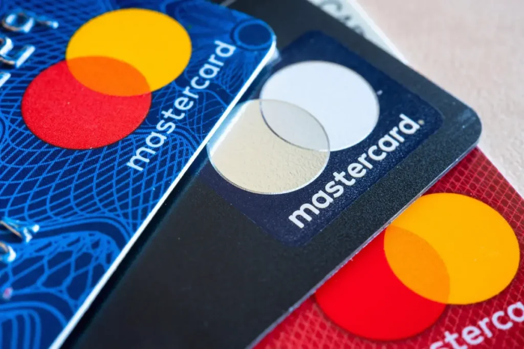
Two overlapping circles. One red, one yellow. A sliver of orange in the middle.
It looks simple. So simple, you feel like you could have designed it.
That “simplicity” is a lie.
It’s not simplicity. It’s simplification. Brutal, strategic, and expensive simplification that took over 50 years to achieve. It’s the result of relentless, painful subtraction.
For an entrepreneur or small business owner, the history of the mastercard logo is one of the most valuable case studies in branding. It teaches you the one thing most new businesses get wrong, and it teaches it in a single word:
Patience.
This is a story about how to build an icon, not by adding, but by taking away.
- Mastercard’s iconic two overlapping circles evolved from a practical Venn-diagram representing banks and consumers, not a flash of artistic genius.
- The brand’s red and yellow palette came from a Japanese member bank and was later post-rationalised with symbolic meanings.
- Decades of disciplined iteration—avoiding radical reinvention—built recognition; consistency, not trends, created equity.
- Pentagram’s simplifications (1996, 2016) removed clutter, restored the pure overlap, and optimised the mark for digital use.
- By 2019 Mastercard “earned” a wordless symbol: patience, subtraction, and long-term investment made the circles globally recognisable.
The Origin: Why Two Circles? (1966-1968)
Great logos are rarely born from a flash of artistic genius. They’re often forged from a dull, practical business need.
Mastercard’s logo is no different. It wasn’t art; it was a diagram.
1966: Before Mastercard, There Was “Master Charge”
In the mid-1960s, Bank of America’s “BankAmericard” (which would later become Visa) was dominating the new credit card market.
A group of competing California banks—United California Bank, Wells Fargo, Crocker National Bank, and the Bank of California—were getting hammered. They decided to form their own alliance to compete.
They called this new group the Interbank Card Association (ICA).
In 1966, they launched their card: “Master Charge: The Interbank Card.”
The first logo was exactly as clunky as the name. It featured the two overlapping circles, but with the words “Master Charge” plastered right across the intersection.
Those circles weren’t abstract. They had a dead-simple, functional meaning. They were a Venn diagram representing the entire business model:
- One circle was the member banks.
- The other circle was the consumer.
- The intersection was the “interbank” system that connected them.
It wasn’t pretty. It was just clear. And for a new brand, clear beats clever every single time.
1968: The Japanese Influence and the Birth of an Identity
The ICA quickly expanded, and the brand needed to be stronger and more unified. They officially acquired the “Master Charge” name.
But where did the iconic red and yellow come from?
It wasn’t a $500,000 focus group about “passion” and “warmth.
It was a pragmatic business decision. A Japanese bank, a key member of the new ICA, already had an identity that used two overlapping circles in red and yellow. The ICA saw it, liked its vibrancy, and adopted it.
This is the part that entrepreneurs miss. Your “perfect” brand elements—your colours, your name, your icon—often come from contingency, practicality, and just making a smart, fast decision.
The marketing-speak about what the colours “mean” (Red for passion! Yellow for vitality! Orange for connection!) was all written after the fact.
The lesson: Pragmatism builds brands. Post-rationalisation sells them.
The Evolution: Building Equity (1979-1990)
For the next two decades, the brand focused on one thing: growth. The logo’s job was to become familiar, and it did so by iterating, not detonating.
1979: A New Name, A Familiar Face
By the end of the 70s, “Master Charge” sounded dated. It was a name for a different era. The brand had global ambitions.
In 1979, “Master Charge” was officially renamed “MasterCard.”
It was a brilliant move. “Charge” sounds like debt. “Card” is functional and neutral. The “Master” part retained all the brand equity.
The logo was updated to match. It was a significant cleanup.
The two circles became the undisputed hero. The clunky text over the top was gone. Instead, the name “MasterCard” was placed in a bold, rounded, confident font between the two circles.
This is the single most important lesson for any business that’s 5-10 years old.
MasterCard iterated, they didn’t detonate.
They kept the core visual equity (the circles) that they had spent a decade building and simply updated the name and typography. They didn’t panic, they didn’t throw the baby out with the bathwater, and they didn’t hire an agency to “totally reinvent” them.
They had the discipline to stick with what worked.
1990: The “Comet” and 90s Design Clutter
This is my favourite part of the story because it shows that even a $400 billion brand can get logo design wrong.
It was the 1990s. More was more. Computers were here, and “dynamic” was the word of the day.
MasterCard, like many brands, got nervous. Their logo looked a bit flat. A bit “70s.”
So, what did they do? They “added value.”
The simple, clean orange overlap—the entire point of the original Venn diagram—was replaced with 23 interlocking horizontal “teeth.”
This was a classic case of design by committee. You can almost hear the meeting: “We need to show interconnection! We need to look more high-tech! Like a comet! Or a zipper!”
The result was a disaster.
It cluttered the core idea. It made the logo instantly dated. It was a nightmare to reproduce on faxes, on low-resolution screens, and in small print. It was a fussy, nervous update that screamed, “Look at us, we’re technical, too!”
It was a mistake. It was a step backward. It was a brand adding when it should have been subtracting.
The Pentagram Era: The Great Simplification (1996-Present)
After six years of living with its 90s-era mistake, MasterCard did what smart companies do: they hired the best to fix it.
They hired the legendary design agency Pentagram.
What followed was a 20+ year partnership that produced one of the greatest simplification stories in modern branding.
1996: Pentagram Cleans Up the Mess
In 1996, Pentagram was tasked with updating the brand for the new millennium.
Crucially, they didn’t start over. They looked at the 1990 logo and began the process of subtraction.
They identified the core equities:
- The circles.
- The colours.
- The name.
And they identified the clutter:
- The 23 messy “teeth.”
- The dated typography.
- The awkward placement of the name.
The 1996 redesign was a strategic masterpiece of refinement:
- They simplified the “teeth” from 23 down to a cleaner, more graphic 11. Still a compromise, but a vast improvement.
- They added a drop shadow. Another 90s/00s trend, but it served a functional purpose: helping the logo “pop” off the complex, photo-realistic backgrounds on credit cards.
- They updated the typography to a custom, more serious italic sans-serif.
- They made one, crucial move: They moved the name below the circles.
This was the most important decision in the logo’s history.
For the first time in 30 years, the two circles were allowed to breathe. They were finally a symbol, a brandmark, with the name acting as a lockup, not a label.
This was the logo that built the modern Mastercard. It was the workhorse. For 20 years, this logo was on every card, every storefront, and every website. It built the massive global recognition that made the next steps possible.
2016: The Masterclass from Michael Bierut
Fast-forward 20 years. It’s 2016.
The world is not just “digital”; it’s digital-first. The new battlefield isn’t a plastic card in your wallet. It’s a 16×16 pixel app icon on your phone.
That 1996 logo, with its drop shadow, italics, and interlocking lines, looked ancient. It was fussy, complex, and scaled terribly.
Mastercard went back to Pentagram. This time, the project was led by design partner Michael Bierut.
The brief was simple: Simplify for the digital age, but do not lose 50 years of brand equity.
The solution was the single greatest act of brutal simplification in the brand’s history.
Bierut and his team didn’t just “clean up” the 1996 logo. They tore it down to its absolute, essential components.
- The 11 “teeth” are GONE. Finally. After 26 years of clutter, the original 1968 idea—a pure, simple Venn diagram overlap—was restored.
- The drop shadow is GONE. The logo is now flat. This makes it infinitely more flexible, modern, and readable at all sizes.
- The colours are brightened. The slightly muted red and yellow were optimized for screens, making them more vibrant and pure.
- The typography is changed to a modern, geometric sans-serif called FF Mark.
- The name is now all lowercase: “mastercard.” This was a huge psychological shift. “MasterCard” (with a capital C) is a formal, corporate monolith. “mastercard” is an accessible, human, digital-first partner.
The genius of this redesign is that it’s not a “new” logo.
It is the original 1968 idea, finally perfected. It’s what the logo always wanted to be, finally free of the trends, compromises, and committee-driven clutter it had collected over 50 years.
2019: Earning the Right to Be Wordless
The 2016 redesign was so successful, so pure, that it unlocked one final, ultimate move.
Just three years later, in 2019, Mastercard dropped the name.
Today, in most applications, the brand is represented by nothing but the two circles.
Why could they do this?
Because they earned the right.
After 53 years of relentless consistency, a reported 80% of consumers could identify the brand by the two interlocking circles alone.
This is the holy grail of branding. It’s the same club occupied by Nike’s swoosh, Apple’s… apple, and McDonald’s golden arches.
And this is the hard lesson for every entrepreneur. You do not get to do this on day one. You earn the right to be a wordless symbol by spending decades and billions of dollars plastering your name and your symbol together until they become one and the same in the public’s mind.
Stop asking your designer for a “symbol-only” logo. You haven’t earned it yet.
What Entrepreneurs Must Learn from the Mastercard Logo
This entire history is a practical, actionable blueprint for any business owner. Here are the real-world lessons.
Lesson 1: Your First Idea Isn’t Your Final One
Mastercard started as “Master Charge” with a clunky, literal logo. It was fine. It did the job.
Your business’s first logo is a starting point, not a life sentence.
Its job is to be clear, not perfect. Its job is to build initial recognition while you focus on the real work: building a product and making sales.
Don’t spend six months in “logo paralysis,” agonizing over the perfect shade of blue. Get a solid, professional version 1.0, and get to work. You can refine it later, just as Mastercard did.
Lesson 2: Simplicity is Subtraction (And It’s Hard)
The Mastercard logo got better every single time they removed something.
- 1990: Added “teeth” -> Worse.
- 1996: Reduced “teeth” -> Better.
- 2016: Removed “teeth” -> Great.
- 2016: Removed drop shadow -> Great.
- 2016: Removed capital ‘C’ -> Great.
- 2019: Removed the entire name -> Iconic.
Perfection in design is achieved not when there is nothing more to add, but when there is nothing left to take away.
Your job as a business owner is to fight the urge to add “just one more thing.” Resist the committee. Your logo is not a suitcase. Stop trying to cram everything your business does into it.
A great logo is not what you can add, but what you can no longer take away.
Lesson 3: Equity is Built in Decades, Not Days
The only reason the 2019 wordless logo works is 50+ years of relentless consistency.
Even when the design was bad (the 1990s), they never abandoned the core concept: two overlapping circles, red and yellow.
Consistency is the engine of brand equity.
This is why chasing logo design trends is a fool’s errand. This is why rebranding your company every three years is a catastrophic waste of money.
Pick a strong, simple concept and stick with it. Show it to people, over and over, next to your name, on your great product, for years. That is how you build an icon.
Lesson 4: A Logo is a Container, Not the Content
This is the pet peeve of every designer.
Those two circles are meaningless. They are geometry.
They have value only because they are a container for the meaning, trust, and performance of the $400+ billion global payment system they represent.
The logo doesn’t make the company great. The great company makes the logo mean something.
If Mastercard’s system failed every day, those two circles would be a symbol of failure and frustration. But it works. It’s secure. It’s instant. It’s global.
So, when we see the circles, we feel security. We feel access.
Focus 90% of your effort on making your product or service so good that people are happy to see your logo. The logo is just the shortcut.
The Bottom Line: Stop Chasing ‘Perfect’
The Mastercard logo is a 50-year lesson in patience.
It’s the story of a brand growing confident enough to get quieter.
First, it had to shout (“Master Charge!”). Then it spoke (“MasterCard”). Then it introduced itself (“mastercard”). Now, it just winks.
Your brand needs to earn that. The journey doesn’t start with a wordless, “iconic” symbol. It starts with a solid, professional logo that clearly communicates who you are and what you do.
It starts with a foundation built for the long haul.
If you’re ready to start that journey with a logo built on strategy, not just trends, that’s what we do. Take a look at our logo design process.
The Mastercard logo isn’t just two circles. It’s a 50-year history of meetings, decisions, risks, and refinements.
It’s a testament to the power of a simple idea, relentlessly protected and simplified.
Your logo won’t be the next Mastercard logo. But you can use the principles that built it: Start clear. Be consistent. And have the courage to subtract.
Frequently Asked Questions (FAQs) about the Mastercard Logo
What is the meaning of the Mastercard logo?
It represents the intersection of two core elements: the banks/merchants and the consumer. The orange overlap signifies their connection and the value created by the network.
Why did Mastercard remove its name from the logo?
They removed it in 2019 because they had “earned it.” A global study found that over 80% of consumers could identify the brand by the two interlocking circles alone.
When did the Mastercard logo change?
The logo had major changes in 1968 (color adoption), 1979 (name change to MasterCard), 1990 (interlocking ‘teeth’ added), 1996 (refinement by Pentagram), 2016 (major simplification by Pentagram), and 2019 (wordmark removed).
What were the original Mastercard logo colors?
The very first “Master Charge” logo from 1966 was black and white. The iconic red and yellow colour palette was adopted in 1968, influenced by a Japanese member bank’s existing identity.
Who designed the new Mastercard logo?
The 2016 redesign and the 2019 wordless version were both designed by Michael Bierut and his team at the legendary design agency Pentagram.
What font does the Mastercard logo use?
The 2016 redesign uses a custom version of the font FF Mark. It is a geometric sans-serif font, chosen for its clarity and modern feel.
What is the old Mastercard logo called?
The original brand from 1966 was called “Master Charge: The Interbank Card.” This was officially shortened and renamed “MasterCard” in 1979.
What is the difference between the 1996 and 2016 Mastercard logos?
The 1996 logo had 11 interlocking ‘teeth’ in the center, a drop shadow, and the name “MasterCard” (with a capital C) below. The 2016 logo is flat, removes the ‘teeth’ for a pure orange overlap, and uses the all-lowercase “mastercard” name in the font FF Mark.
Can my small business have a logo with no name?
You can, but it is almost always a very bad idea. Brands like Mastercard and Nike spent decades and billions in marketing to build that recognition. A new business needs its name front and center to build brand equity.
What do the two circles in the Mastercard logo represent?
They represent a connection. Originally, this was the “interbank” partnership—the connection between the member banks. Today, it’s more broadly seen as the seamless connection between consumers, banks, and merchants.
Why is the Mastercard logo red and yellow?
The colours were adopted in 1968 from a Japanese member bank’s logo. While their origin was a practical business decision, they’ve since come to signify passion (red) and warmth/wealth (yellow).
How much did the Mastercard logo redesign cost?
Mastercard has never disclosed the cost of the 2016 Pentagram redesign. However, high-level corporate identity projects of this scale, including global research, strategy, and implementation, typically run from the high six-figures into the millions of dollars.
Looking at this history, you can see that a logo is never really ‘finished.’ It’s an asset that grows and evolves with your business.
If you’re at the starting line and need a strong foundation, or if you’re 10 years in and need a simplification like Mastercard’s, we can help. A logo is a strategy, not just a picture.
Explore our logo design services to see how we build brands that last. Or, if you’re ready to start, request a quote today. You can also keep browsing our blog for more no-fluff branding advice from Inkbot Design.


