10 Famous Logos That Broke Design Rules and Won
There’s a whole cottage industry built on “logo design rules.”
You’ve heard them. Keep it simple. Make it timeless. Ensure it works in black and white.
It’s a tidy little checklist that promises a “good” logo if you just colour inside the lines.
Most design rules are just guardrails for the creatively timid. They summarise what’s worked before, packaged as unbreakable commandments.
Following them will likely get you something inoffensive. Something… fine. But it will rarely get you something iconic.
The truth? The brands you remember and the logos seared into your brain often got there by setting the rulebook on fire.
But—and this is the crucial part—they didn’t do it for kicks. They did it with surgical intent. They broke a specific rule for a particular, strategic reason.
This isn’t a list of pretty logos. This is an autopsy of ten strategic rebellions that paid off handsomely.
- Successful logos break design rules with strategic intent, creating iconic brands rather than inoffensive designs.
- Breaking rules can differentiate a brand in a crowded market, reflecting its unique personality and mission.
- Intention and execution are crucial; thoughtful disruptions can enhance brand identity and storytelling.
First, Let’s Acknowledge the “Rules” (And Why They Usually Make Sense)
Let’s give the rules their due before we start swinging the wrecking ball. They exist for a reason. They’re the foundation of functional design, born from decades of figuring out how people see and process information.
The Gospel of Good Logo Design
Think of these as the greatest hits of design theory:
- Simplicity: A logo should be easily recognisable at a glance. The brain shouldn’t have to work to figure it out.
- Memorability: It should be unique enough to stick in someone’s head after viewing.
- Scalability: It must look good on a giant billboard and as a tiny favicon on a browser tab.
- Appropriateness: It should feel right for its industry. A law firm shouldn’t have a logo in Comic Sans. Probably.
- Timelessness: A great logo shouldn’t look dated in five years. It avoids fleeting trends.
- Colour & Contrast: It must work in a single colour and reverse (white on a dark background).
These aren’t bad ideas. They are the scaffolding. They prevent outright disasters. But they don’t guarantee genius. Now, let’s look at the ones who kicked the scaffolding over.
The Autopsy: 10 Famous Logos that Broke Design Rules
Here’s where it gets interesting. Each brand considered a core design principle and decided it didn’t serve their mission.
1. Google: The Rule of Unchanging Consistency
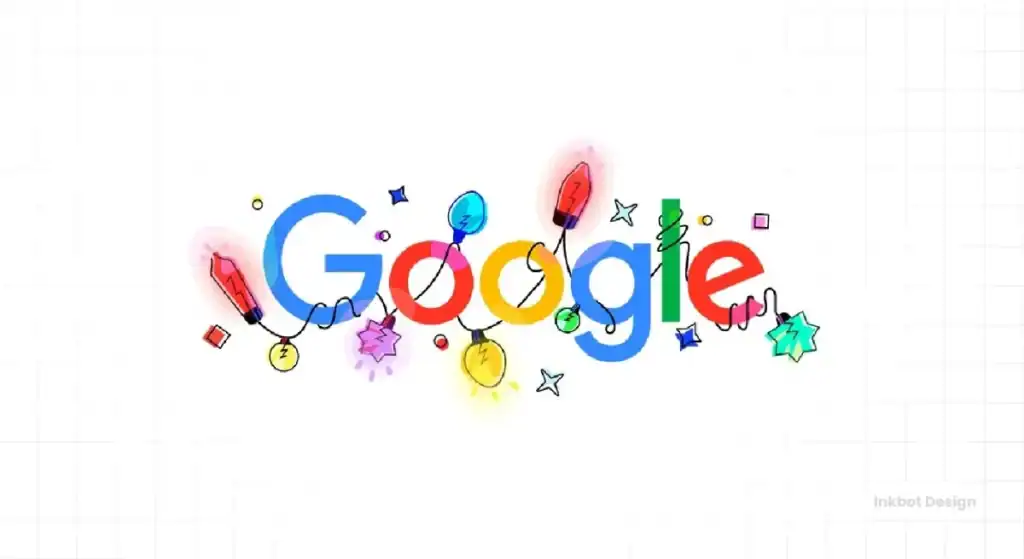
The Rule Broken: A logo must be a static, consistent, and unchanging mark. Its strength comes from repetition.
The Analysis: Google’s core logo is simple, sure. But its true genius lies in its refusal to be static. The Google Doodle concept is a masterstroke. The logo might be altered on any given day to celebrate a holiday, a historical figure, or a scientific breakthrough.
This breaks the rule of consistency most spectacularly. Instead of diluting the brand, it strengthens it. It positions Google not as a faceless corporation, but as a dynamic, intelligent, and culturally aware entity. The logo became a daily destination. It says, “We’re not just a tool; we’re part of the world’s conversation.” It traded rigid consistency for perpetual relevance.
2. London 2012: The Rule of Immediate Legibility
The Rule Broken: A logo must be instantly clear and easily read.
The Analysis: The design community collectively spat out its tea when this logo was unveiled. It was jagged, abstract, and looked like a mess. People complained you couldn’t read “2012.” Some saw crude images. It cost £400,000, and the public outcry was deafening.
And it was brilliant.
This logo was never about quiet, polite legibility. It was designed to be an event. It was punk rock. It was jarring. It was pure energy. The controversy it generated was worth more in media value than any “nice” logo could ever have achieved. It refused to be ignored. Years later, it’s still instantly recognisable. It didn’t win by being beautiful; it won by being unforgettable.
3. MTV: The Rule of the Fixed Form
The Rule Broken: A logo’s shape, colours, and form are sacred and must be protected.
The Analysis: In the 80s, MTV took its blocky “M” and television-shaped “TV” and treated it not as a static badge, but as a window. A canvas. It was filled with static, spray paint, animation, cartoons, and cosmic landscapes. The logo was never one thing; it was a frame for a thousand things.
This completely defied the idea of a fixed brand mark. The genius was that the brand’s identity was its mutability. It reflected the fast-paced, ever-changing world of music and youth culture. The logo didn’t represent the channel; it was the channel.
4. Slack (Original): The Rule of Simplicity and Single-Colour Viability
The Rule Broken: A great logo must be simple and work effectively in a single colour.
The Analysis: Remember the original Slack logo? The multi-coloured hashtag, or octothorpe? It used 11 different colours and was a nightmare to reproduce consistently. It lost its essence entirely if you put it in a single colour. It broke fundamental rules of scalability and simplicity.
But here’s what it did: in a sea of corporate, soulless, blue-and-grey software logos, it was a splash of chaotic fun. It looked like people working together—a little messy and complicated, but vibrant and connected. It perfectly reflected the product’s promise of making work less drab. It chose personality over technical perfection.
5. Zara: The Rule of Comfortable Kerning
The Rule Broken: Letters in a logo need adequate spacing (kerning) to be legible and visually pleasing.
The Analysis: Look at the Zara logo. The letters are uncomfortably close. They’re practically on top of each other. Traditional typography would call this a catastrophic failure of kerning. It feels cramped, tense, and a bit aggressive.
And that’s why it’s perfect.
It’s not meant to be friendly and legible from a distance. It’s intended to look like it belongs on a high-fashion magazine cover. The tight spacing creates a sense of urgency and chic exclusivity. It’s a bit rude. It’s a bit cramped. It’s not “easy” to look at. In short, it’s haute couture in four letters. It chose a specific feeling over a general rule.
6. Mailchimp: The Rule of “Serious” B2B Design
The Rule Broken: Business-to-business (B2B) brands must appear professional, corporate, and serious to be trusted.
The Analysis: Freddie the Chimp. A playful, winking chimpanzee as the face of an email marketing platform. In the early 2010s, this was absurd. Business software was supposed to be sterile, clad in blues and greys, and speak in acronyms.
Mailchimp chose a different path. Freddie made the brand feel friendly, human, and accessible. It disarmed users who were likely intimidated by the technical aspects of email marketing. It suggested the company didn’t take itself too seriously, ironically making customers trust it more. They broke the B2B mould and built a fiercely loyal following because of it.
7. FedEx: The Rule of Obviousness
The Rule Broken: This is a subtle one. The rule isn’t “be obvious,” but rather that a logo’s primary job is simple identification. Clever tricks are secondary.
The Analysis: Everyone knows about the arrow hidden between the ‘E’ and the ‘x’ in the negative space. It’s a legendary piece of design. But the logo’s brilliance isn’t just the arrow; it’s the confidence to not shout about it.
The logo is just the company’s name in a clean font. It’s brutally simple. The arrow is a reward for the observant. It communicates forward motion, speed, and precision without a swoosh or graphic cliché. It breaks the “rule” that a logo needs a distinct graphical element to be special. Its graphic element is hidden in plain sight, a quiet nod to its efficiency.
8. Airbnb: The Rule of Avoiding Awkward Interpretations
The Rule Broken: A logo should be unambiguous and avoid resemblances to… other things—specifically, human anatomy.
The Analysis: When Airbnb launched its new logo, the “Bélo,” the internet had a field day. The comparisons were immediate, widespread, and anatomical. By any traditional metric, this was a design disaster.
But Airbnb didn’t flinch. They had built a powerful story behind the symbol, representing people, places, and love. They owned the conversation. The initial snickering generated massive, free publicity. Once the dust settled, their story was stronger than the jokes. They proved that a brand with a strong enough narrative can overcome—and even benefit from—a bit of controversy.
9. Metallica: The Rule of Symmetrical Balance
The Rule Broken: A logo needs visual harmony and balance to appeal.
The Analysis: The Metallica logo is anything but balanced. It’s a weapon. The first and last letters are extended into sharp, aggressive points. It feels unbalanced, dangerous, and raw. It looks like it could cut you.
It is a perfect sonic translation of the brand. It captures the aggressive, high-speed, anti-establishment energy of their music. A balanced, symmetrical, “well-designed” logo would have been a lie. This logo has a pure, unadulterated attitude, and it has become one of the most iconic marks in music history precisely because it’s so jarring.
10. Apple (1976): The Rule of… Well, Everything
The Rule Broken: Simplicity. Scalability. Memorability. Single-colour viability. You name it, this logo broke it.
The Analysis: The first Apple logo wasn’t the sleek icon we know today. It was a hyper-detailed, pen-and-ink drawing of Sir Isaac Newton sitting under an apple tree, complete with a flowing banner and a quote from Wordsworth. It was more of a miniature woodcut than a logo. It was completely unusable in a practical sense.
This is the exception that proves all the other rules. It “won” by being so spectacularly wrong that it had to be changed. It lasted about a year before being replaced by the iconic bitten apple. Its victory is as a lesson: it shows the critical importance of evolution and the realisation that your first idea, no matter how romantic, might be rubbish. It failed so hard that it forced the creation of a masterpiece.
So, You Want to Be a Rebel? A Checklist
Feeling inspired to toss the rulebook? Hold on. Breaking rules works when it’s strategic, not when it’s sloppy. It’s the difference between a Jackson Pollock and a toddler’s finger painting. Before you go rogue, ask yourself these four questions.
Question 1: Does It Serve Your Brand’s Soul?
Are you breaking a rule to express your brand’s unique personality better? Mailchimp’s playfulness worked because their brand is about making things tech-friendly. Metallica’s aggression works because they’re a heavy metal band. If your “rebellious” design choice doesn’t connect deeply to your core identity, it’s just noise.
Question 2: Are You Disrupting a Sea of Sameness?
Look at your competitors. Are they all using the same corporate blue? The same safe, sans-serif fonts? Breaking a rule can be a powerful way to differentiate yourself. The original Slack logo was a firework in a grey room. A strategic zag can put you on the map if everyone in your industry zigs.
Question 3: Is It Intentional, Not Just Incompetent?
Zara’s tight kerning is intentional. It creates a specific high-fashion feel. If your kerning is bad because you don’t know how to do it properly, you look like an amateur, not a visionary. You must understand the rule intimately to know how and why you’re breaking it.
Question 4: Can You Defend It?
When the London 2012 logo dropped, the designers had to defend it. When Airbnb’s Bélo was mocked, the company had to stand by it with a strong narrative. If you break a primary rule, you will get pushback. If you don’t have the conviction and a solid strategic reason to back up your decision, you’ll fold under pressure.
The Real Takeaway: Intention is Everything
The rules of logo design are a safety net. They’re there to catch you from creating something truly awful. But they will also prevent you from creating something truly spectacular.
The difference between a rule-breaking masterpiece and an amateurish mess comes down to one word: intention.
These ten brands didn’t succeed by accident. They made calculated decisions to sacrifice a conventional design principle for a more powerful brand expression. They chose personality over perfection, energy over legibility, and narrative over neutrality.
So by all means, learn the rules. Understand why they exist. And then, dare to ask if they’re serving you. Sometimes, the most brilliant move is the one that breaks them.
Ready to build a brand that stands out?
Observing what works is one thing. Applying it is another. If this kind of strategic thinking resonates with you, you might find our other blog posts on branding and design useful.
Let’s discuss whether you want to apply this intentional, rule-aware thinking to your brand. A great logo isn’t about following a checklist. It’s about building a symbol that works. That’s the thinking we bring to our logo design services.
Feel free to request a quote, and we can start the conversation.
Frequently Asked Questions About Breaking Logo Design Rules
What is the most critical rule of logo design?
If there’s one “unbreakable” rule, it’s scalability. A logo that can’t be recognised when small or reproduced is fundamentally broken from a practical standpoint. Most other “rules” are more like strong suggestions.
Is a complex logo always a bad logo?
Not always, but it’s a massive risk. The original Apple logo was complex and flawed. A complex crest for a university or a detailed emblem for a football club can work because the context allows for it. The key is whether the complexity serves a purpose and doesn’t hinder recognition.
How many colours are too many for a logo?
There’s no magic number. The old rule was 2-3 colours for printing cost reasons. The original Slack logo used 11, which worked for them in a digital-first context. The real question is: does every colour have a job? Or is it just a rainbow mess?
Why is kerning so crucial in a logo?
Kerning—the space between letters—affects readability and mood. Good kerning is invisible. Bad kerning makes text feel cheap, unbalanced, or hard to read. As the Zara example shows, “bad” kerning can be used intentionally to create a specific, edgy feeling.
Can my logo be my company’s name in a font?
Absolutely. This is called a logotype or wordmark. Google, FedEx, and Zara are all logotypes. The “design” is in the font choice, the customisation of the letters, the colour, and the spacing. It’s often a more timeless and confident choice than a complex symbol.
Should I avoid logo design trends?
Mostly, yes. Trends, by definition, become dated. Designing your core brand identity around a fleeting trend (like the overly-simplified “blanding” trend) is a recipe for a costly rebrand in a few years. It’s better to build on a timeless foundation.
How do I know if breaking a rule is right for my brand?
Ask yourself if the rule you want to break gets in the way of expressing your brand’s core personality. If your brand is rebellious, energetic, and disruptive, a clean, quiet, “correct” logo might be the worst choice. The break must serve the brand’s story.
What’s the difference between breaking a rule and just bad design?
Intention and execution. Breaking a rule works when it’s a conscious, strategic choice to achieve a specific effect. Bad design is usually the result of ignorance, lack of skill, or carelessness. A master understands the rules so well that they know how to break them effectively; an amateur doesn’t know the rules exist.
My logo is getting negative feedback. Does that mean it’s a failure?
Not necessarily. The London 2012 and Airbnb logos initially received tremendous negative feedback. The important thing is why it’s getting that feedback. If it’s because it’s illegible or technically flawed, that’s a problem. If it’s because it’s provocative and challenging, you might be onto something, provided you have the brand story to back it up.
Is designing a logo that breaks the rules more expensive?
The cost of a logo is based on the strategic thinking and design time involved, not whether it follows rules. Creating a strategically brilliant “rule-breaking” logo requires a higher level of expertise than creating a safe, formulaic one, and should be valued accordingly.


