A Guide to Logo Design File Formats (JPG, PNG, SVG & EPS)
You’ve got a logo. You reviewed the concepts, picked the perfect colours, and signed off on the final design. Congratulations.
Now for the real question: what files did you get?
If the answer is “a JPG,” or “a PNG,” or even “I don’t know, a picture of it,” I have some bad news. You didn’t buy a logo. You purchased a picture of a logo. And you probably got robbed.
The design is the idea. The files are the actual, tangible, usable assets. Without the correct set of files, your logo is a digital ghost—trapped, inflexible, and practically useless for anything beyond your website’s header.
This guide will fix that. We will cut through the jargon and give you a simple understanding of logo design file formats.
By the end, you’ll know exactly what you need, why, and how to tell if a designer is giving you the keys to your brand or just a key to the glovebox.
- The two main logo file types are Vector and Raster; understanding this distinction is essential for proper usage.
- Always request key vector formats: AI, EPS, and SVG for comprehensive branding and scalability.
- Use PNG for digital uses, as it allows for transparent backgrounds, while JPGs are rarely suitable for logos.
- Check for file completeness upon delivery; expect a professional package with colour variations and formats for print and web.
The Only Concept You Need to Understand: Vector vs. Raster
Forget all the acronyms for a minute. EPS, SVG, PNG, and JPG all fall into one of two simple categories: Vector or Raster.
Grasp this one concept, and everything else clicks into place.
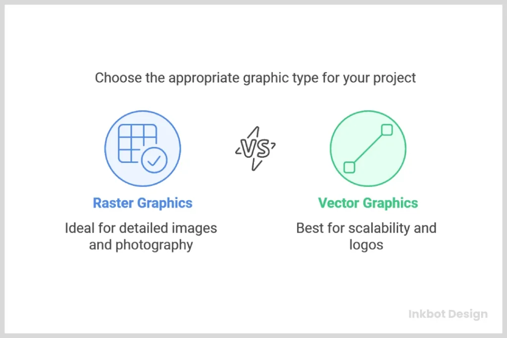
Vector Files: The Master Blueprint
Imagine your logo isn’t a picture, but a set of instructions. A recipe. It’s a series of mathematical equations that say, “draw a line from point A to point B, make it this thick, and fill the resulting shape with this specific colour.”
That’s a vector file.
A vector logo is infinitely scalable because it’s based on mathematical paths, not pixels. You can stretch it to fit a billboard or shrink it to fit a business card, and it will never lose quality. The lines will remain perfectly crisp and sharp. This is the master DNA of your logo.
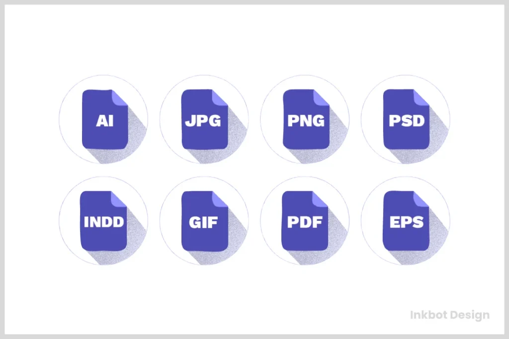
- Key Vector Formats: AI, EPS, SVG, PDF (sometimes).
- Primary Use: The master source files for everything. Use them for professional printing, signage, vehicle wraps, apparel embroidery, and any other application where quality and scalability are paramount.
Raster Files: The Digital Snapshot
Now, imagine taking a photograph of your logo. You get a grid of thousands of tiny coloured squares called pixels. This is a raster file (also called a bitmap image).
It’s a static snapshot. It looks great at its intended size, but when you try to enlarge it, the computer has to guess how to fill in the new grid.
The result? The edges get fuzzy, the image becomes blurry, and it looks horribly unprofessional. This is called pixelation.
Raster files live and die by their resolution, measured in Dots Per Inch (DPI) for print and Pixels Per Inch (PPI) for screens.
- Key Raster Formats: JPG, PNG, GIF.
- Primary Use: Digital applications where file size and fixed dimensions are a priority. Use them for websites, social media profiles, email signatures, and digital advertisements.
The golden rule is this: Always create a logo as a vector. You can easily make a perfect raster copy from a vector master, but you cannot go the other way. Turning a low-resolution raster file back into a clean vector is a painful, expensive, and often impossible task.
The Non-Negotiable Files Your Logo Designer MUST Give You (The Vector Trio)
If your logo package doesn’t include these three vector formats, it’s incomplete. Full stop. These are the master keys to your brand identity, allowing you to work with any vendor or designer in the future.
AI (Adobe Illustrator File) – The Absolute Original
The AI file is the native, source file created in Adobe Illustrator, the industry-standard software for logo design. Think of it as the original layered Photoshop file, but for vectors. It contains all the paths, points, and colour information in a fully editable format.
You may be unable to open this file yourself without Adobe Illustrator. That’s fine. It’s not for you. It’s for the next professional designer, printer, or sign maker you hire. Providing the AI file signifies an experienced designer who isn’t trying to hold your brand hostage.
EPS (Encapsulated PostScript) – The Universal Translator
The EPS file is a legacy format, but it’s still the workhorse of the professional design world. It’s a self-contained vector file, arguably the most widely compatible format across different design software and production equipment.
Think of it as the universal donor for vector graphics. While you might use an AI file for designer-to-designer handoffs, the EPS is often the file you’ll send to a print shop like Vistaprint or a local screen printer for your company t-shirts. They can almost certainly open and use an EPS file without any issues.
SVG (Scalable Vector Graphics) – The Web Powerhouse
The SVG is the modern vector format built for the digital world. While EPS is for printers, SVG is for screens. Its primary job is to display your logo with perfect sharpness on your website, no matter the device.
Why is it so good?
- Pin-Sharp on All Screens: An SVG logo will look incredibly crisp on a standard monitor, a 4K display, or the latest high-resolution “Retina” phone screen. A PNG, by contrast, can look soft or blurry on high-PPI displays.
- Tiny File Size: SVGs are just code, so their file sizes are often much smaller than a comparable PNG or JPG, which helps your website load faster.
- Interactive: Because of its code, developers can manipulate SVGs with CSS and JavaScript, allowing for cool animations and interactive effects.
Your website logo should be an SVG. There are very few exceptions to this rule.
The Everyday Workhorses: Your Raster File Kit
Once you have your vector masters, you need copies for everyday digital use. These are your raster files. A professional designer will export these from the master AI file, saving you the trouble.
PNG (Portable Network Graphics) – The Transparency King
The most critical feature of a PNG file is its ability to have a transparent background.
This is absolutely critical. It means you can place your logo on a coloured background, a photograph, or any other design element without having an ugly white box around it. If you’ve ever seen a company’s logo with a white box on their website, they’re incorrectly using a JPG instead of a PNG.
Use a PNG for your website (if you can’t use an SVG), your email signature, your social media posts, and in presentations. You should receive a high-resolution version.
JPG (Joint Photographic Experts Group) – The Old Reliable
JPGs are fantastic for compressing photographs and complex images with millions of colours into small files. They achieve this by using “lossy” compression, which means they discard some image data to shrink the file.
When should you use a JPG for your logo? Rarely.
The only real-world scenario is when your logo is part of a larger, photo-based graphic, like a Facebook ad or a website banner. Even then, you’d place a transparent PNG of your logo on top of a JPG background image.
A standalone JPG logo is a red flag because it will always have a solid background (usually white), and its compression can create ugly artefacts around the edges of your design.
A Quick Word on GIFs and Favicons
You might also see a GIF (Graphics Interchange Format). GIFs are only useful for two things today: simple, low-colour animations and memes. They are a poor choice for a static logo.
A “Favicon” is the tiny icon in a browser tab next to your website’s name. This is typically a 16×16 or 32×32 pixel image, often generated from a high-resolution PNG file. Your web developer will handle this.
“But My Designer Sent a PDF. Is That Right?”
This is a common point of confusion because a PDF (Portable Document Format) is a chameleon. A PDF can be either a vector file or a raster file.
A PDF created and saved correctly from Adobe Illustrator can be a perfect vector container. It will hold all the scalable paths like an AI or EPS file. Many printers love receiving vector PDFs because they are self-contained and lock the design in place.
However, someone can save a low-quality JPG inside a PDF wrapper.
How to check: Open the PDF and zoom in as far as possible. Zoom in 1000% or more. If the edges of your logo remain perfectly sharp and clean, it’s a vector PDF. If they become a blurry, pixelated mess, it’s just a raster image inside a PDF, not a master file.
A vector PDF is a great file to have. A raster PDF is just a JPG in a fancy suit.
Export Logo Design File Formats 10x Faster
Stop wasting hours on the most boring part of your job. This is the machine that does it for you. It automatically generates over 200 perfectly named and organised logo files in minutes. Charge for a premium package without the mind-numbing work.
Colour Codes: Why You Need More Than Just “Blue”
Getting the right file formats is only half the battle. You also need those files in the correct “colour space” for different applications. A vibrant colour on your screen can look dull and muddy when printed using the wrong colour space.
RGB (Red, Green, Blue) – For Screens
Digital screens create colour by mixing light. This “additive” process uses red, green, and blue light combinations. RGB is the colour space for anything viewed on a screen.
Your website logos, social media graphics, and digital ad files should all be in RGB.
CMYK (Cyan, Magenta, Yellow, Key/Black) – For Print
Printers create colour by mixing ink on paper. This is a “subtractive” process. As ink is added, light is absorbed (subtracted), and the colour gets darker. CMYK is the standard colour model for any full-colour physical printing.
Your files for business cards, brochures, flyers, and packaging must be in CMYK.
Pantone (PMS) – For Colour Perfection
Pantone is a standardised colour matching system, essentially a universal ink-colour recipe book. Each colour has a specific number (e.g., PANTONE 286 C). This system ensures that your brand’s shade of blue looks precisely the same, whether printed on a business card in London or a tradeshow banner in Tokyo.
Using Pantone colours is more expensive, but it’s the only way to guarantee absolute colour consistency across different printers, materials, and locations. Your designer should provide the exact Pantone colour codes for your brand colours.
The Anatomy of a Professional Logo Package
When you hire a professional designer, you’re not just buying one file. You’re investing in a comprehensive kit of assets that will serve your business for years. Anything less is short-changing you.
Here is a clear checklist of what you should receive in a final logo handover:
- Master Files (Vector):
- Logo-Master.ai
- Logo-Master.eps
- Logo-Master.svg
- Logo-Master-Vector.pdf
- Web-Ready Files (Raster):
- A folder of high-resolution PNG files with transparent backgrounds (in full colour, all-black, and all-white).
- A folder of high-resolution JPG files with white backgrounds (for the rare cases you need them).
- Colour Variations:
- Your primary, full-colour logo.
- An all-white version (often called a “knockout” or “reverse” version) to use on dark backgrounds.
- An all-black version.
- Colour Space Versions:
- Folders clearly labelled “For Print (CMYK)” and “For Web (RGB).”
- A Simple Brand Guide (PDF):
- At a minimum, this one-page document should show your final logo and specify the exact CMYK, RGB, and Pantone colour codes, along with the names of any fonts used.
This level of organisation is the hallmark of a professional. It’s what you can and should expect from a dedicated service like the logo design services at Inkbot Design.
Red Flags: How to Spot an Amateur Designer by Their File Handover
Now that you know what’s right, it’s easier to spot what’s wrong. If you encounter any of the following, it’s a massive red flag.
- They only send a JPG or PNG. This is the number one sign of an amateur. They either don’t know how to create a vector file or deliberately withhold it.
- They refuse to provide the AI or EPS file. Some designers claim the source file is their intellectual property. This is nonsense. You paid for the logo; you own the master files required to use it.
- They created the logo in Photoshop or Canva. Photoshop is a raster program. Canva is a fantastic tool for creating social media graphics, not for creating professional logos. A logo born as a raster file is fundamentally flawed from the start.
- They don’t know what CMYK or Pantone means. If your designer can’t have a basic conversation about print vs. web colours, they are not a professional logo designer.
- They charge extra for different file formats. A professional logo design quote includes the creation of all necessary files. Charging extra to export an EPS is like a car dealership charging you extra for the wheels.
Your Brand’s Future Is in Those Files
Your logo is an investment in your business’s identity. That investment is only as good as the files you have in your possession.
Having the complete, professional package gives you freedom. The freedom to print banners, embroider shirts, wrap vehicles, and work with any web developer or vendor you choose, all without returning to your original designer. It puts you in control.
So don’t just approve the design. Inspect the deliverables. The future of your brand depends on it.
Let’s Build a Brand That Lasts
Understanding your logo files is the first step toward actual brand ownership. The next step is building an identity that connects with your audience and stands the test of time.
If you’re ready to invest in a professional logo backed by a complete set of usable, versatile files, explore the logo design services at Inkbot Design. We provide everything you need to build your brand with confidence. If you have a project in mind, you can request a quote here.
FAQs About Logo Design File Formats
What are the three main logo files I need?
At a minimum, you need an AI (or EPS), an SVG, and a PNG. This gives you a master editable vector, a scalable web vector, and a high-quality raster file with transparency for general use.
Can I use a PNG for professional printing?
You shouldn’t. While a high-resolution (300 DPI) PNG might look okay for small items, it’s not a vector file. It lacks the scalability and the CMYK colour information needed for high-quality, professional printing. Always provide a vector file (EPS, AI, or vector PDF) to a printer.
Why can’t I open an AI or EPS file on my computer?
AI and EPS files are professional graphics formats that require specialised software like Adobe Illustrator or Affinity Designer to open and edit. You don’t need to open them; you just need to have them to provide to other professionals.
Is a PDF a vector file?
It can be, but it isn’t always. A PDF saved from Adobe Illustrator can contain all the vector data, making it a perfect master file. However, a PDF can be a container for a low-quality raster image. Zooming in closely to see if it pixelates is the only way to be sure.
What is the best logo file format for a website?
SVG (Scalable Vector Graphics) is the best format for a website logo. It remains perfectly crisp on all screen resolutions, has a tiny file size, and can be animated. If you cannot use an SVG, a high-quality PNG with a transparent background is the next best choice.
My logo looks blurry when I make it bigger. Why?
Your logo is blurry because you are using a raster file (like a JPG or PNG) and trying to enlarge it beyond its original dimensions. You need to use the vector version of your logo (AI, EPS, SVG), which can be scaled to any size without losing quality.
My designer created my logo in Canva. Is that a problem?
Yes, it is a significant problem. Canva is primarily a raster-based tool. While it has some vector export options (like SVG or PDF), the creation process is not optimised for professional logo design. You may end up with a logo that is difficult to edit, scale, or use for professional printing applications.
What does “knockout” or “reverse” logo mean?
This refers to an all-white version of your logo. It’s designed to be used on dark-coloured backgrounds where your standard full-colour or all-black logo wouldn’t be visible. It’s a critical part of a complete logo package.
Why do my brand colours look different on screen versus on my printed business cards?
This is due to the difference between the RGB (for screen) and CMYK (for print) colour models. Your designer should provide both colour versions of your logo files to ensure consistency. The RGB version is for your website, and the CMYK version is for your printer.
What’s the difference between DPI and PPI?
DPI stands for Dots Per Inch and refers to the resolution of a printed image. The standard for high-quality print is 300 DPI. PPI stands for Pixels Per Inch and refers to the resolution of a digital screen. The web standard has traditionally been 72 PPI, though this is less relevant now with high-resolution displays.
Can’t I use an online converter to turn my JPG into a vector?
While these tools exist, they are not reliable for professional use. They use an automated “tracing” process that often creates messy, inaccurate paths with jagged edges and imperfections. It’s not a substitute for having the original, properly constructed vector file.
What file format should I use for my email signature?
A small, optimised PNG is the best choice for an email signature. It supports transparency, so it will look good against any email background, and can be compressed to a small file size to avoid cluttering recipients’ inboxes.

