History of the Amazon Logo: How Strategy Created an Icon
The Amazon logo isn’t just a logo. It’s a commercial weapon disguised as a friendly smile. It sits on billions of packages, graces countless screens, and has embedded itself into the global consciousness.
Most analyses of this logo miss the point entirely. Writers drone on about colour theory and “hidden meanings.” They treat it like a painting in a museum. They are wrong.
The story of the Amazon logo isn’t about art. It’s about ruthless commercial efficiency. It’s a masterclass in how a brand identity should evolve to meet the brutal demands of the market. This isn’t a history lesson for designers; it’s a strategic breakdown for entrepreneurs who need their brand to do one thing: work.
Forget the fluff. We will deconstruct the Amazon logo’s history to extract the practical, no-nonsense lessons you can apply to your business.
- Amazon’s logo evolved from literal to strategic, prioritising commercial function over artistic cleverness.
- The 2000 “smile” arrow communicates dual promises: vast selection (A to Z) and customer satisfaction.
- Design follows essentialism: every element must serve a specific commercial purpose, not decoration.
- Brands must be willing to evolve and rapidly respond to public perception and legitimate design issues.
Before the Smile: The Awkward Early Years (1994-1997)
Every iconic brand has an awkward phase. For Amazon, this phase was defined by a name that sounded like a dead body and a logo that was a visual cliché. Everyone conveniently forgets the part of the story, but it holds the most important lesson: your first idea is probably wrong.
It All Started as “Cadabra, Inc.”
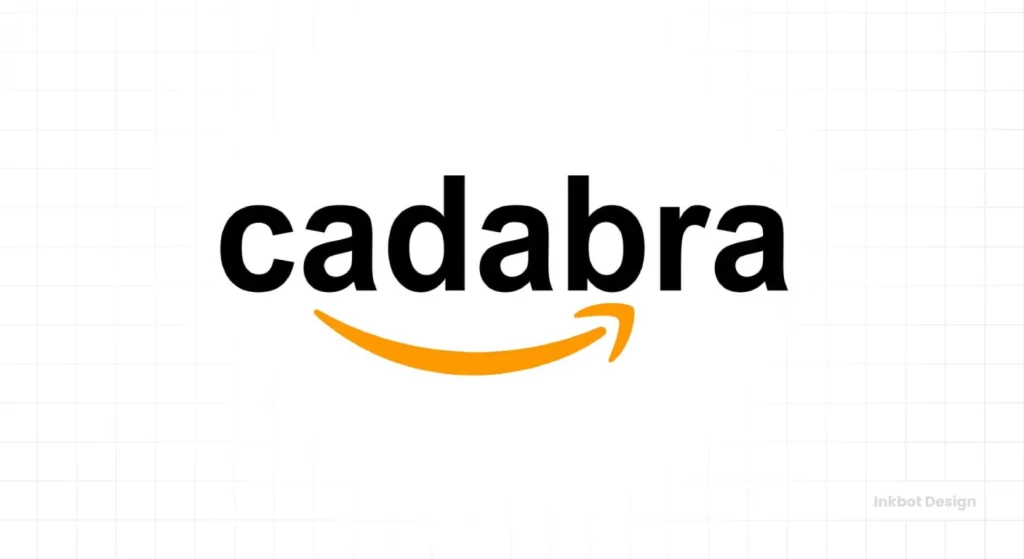
In 1994, Jeff Bezos founded his company as “Cadabra, Inc.,” as in “abracadabra.” It was meant to sound magical. The problem? Over the phone, his own lawyer misheard the name as “cadaver.”
That was the end of Cadabra.
Bezos quickly realised that a name that could be so easily confused with a corpse was a commercial non-starter. He reportedly scanned a dictionary for words starting with “A” and landed on “Amazon” – the world’s largest river. The scale was ambitious, and the name was clear.
The first lesson is the most basic: clarity trumps cleverness. If your brand name or logo can be misheard, misinterpreted, or requires explanation, it’s broken.
The 1995 Logo: The Abstract ‘A’ and the River of Clichés
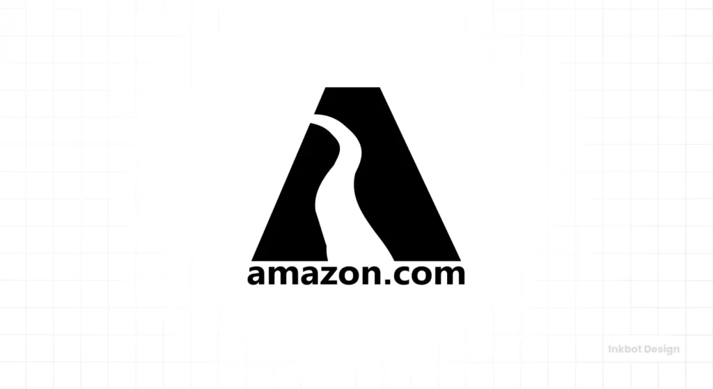
The first official Amazon logo debuted in 1995. It featured a large, stylised ‘A’ with a blue, river-like path winding through the middle.
Let’s be blunt: it was a weak logo.
It was painfully literal. The company is named Amazon, so the logo is a river. This is the most basic level of creative thinking. It described the name, not the value. It told you nothing about what the company did or why you should care.
The design was also visually complex, making it difficult to reproduce at small sizes—a critical flaw for a company that would eventually live on tiny digital screens. This early logo is a perfect example of a typical startup mistake: creating a mark about the founder’s story, not the customer’s benefit.
The Transition Phase: Searching for an Identity (1997-1999)
By 1997, Amazon had grown fast, and the “river” logo felt amateurish. The company entered a transitional phase, experimenting with its visual identity and trying to find a more professional and scalable mark.

A Flurry of Wordmarks
For a brief period, Amazon dropped the symbol entirely. The company cycled through several wordmark-only logos. These were simple, featuring the “amazon.com” name in different fonts and cases. One prominent version used a lowercase serif font, while another introduced a larger, contrasting orange “O” in the middle.
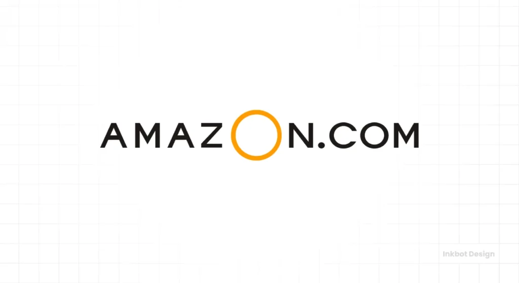
These were improvements in professionalism but still lacked a soul. They were just labels. They established the company’s name but communicated no core idea, promise, or emotion. It was the visual equivalent of a business card with only a name and an address. Functional, yes. Memorable? Absolutely not.
The “Swish” Logo: Closer, But No Cigar
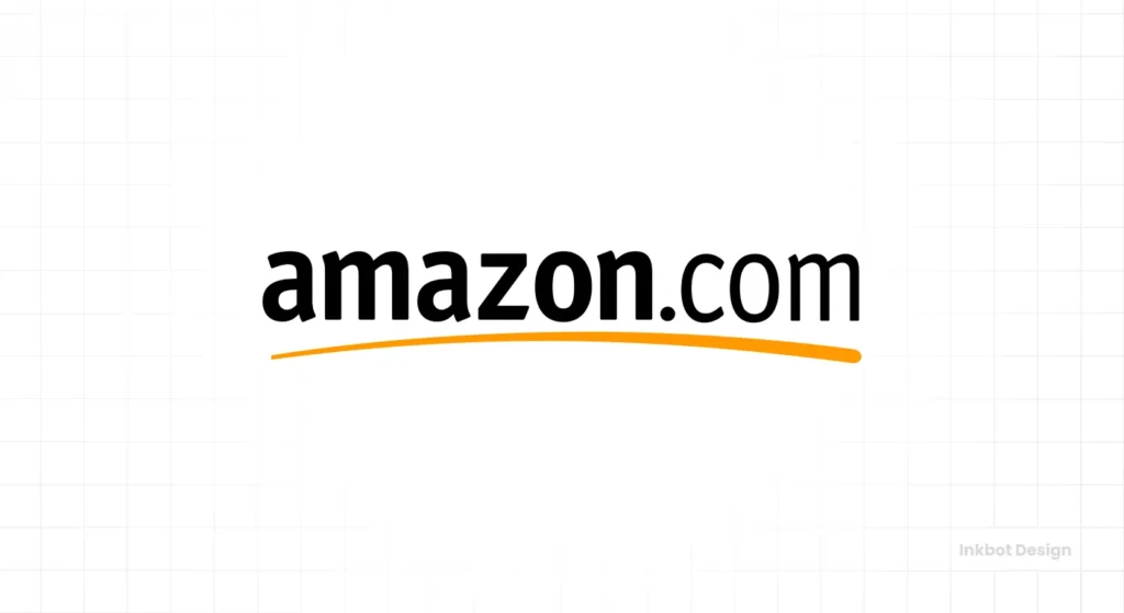
In 1998, things got more serious. Amazon hired the now-famous design agency Turner Duckworth to create a more robust identity. The result was the direct predecessor to the logo we know today.
This version featured the “amazon.com” name in a clean, lowercase sans-serif font. Underneath it was a simple, slightly curved orange line, often called the “swoosh” or “swish.”
This was a significant step forward. The lowercase type felt approachable and less corporate. The introduction of the colour orange added a touch of warmth and energy. The swoosh itself implied momentum, progress, and a path forward.
But it still wasn’t quite right. The swoosh was a generic corporate cliché, used by countless other brands to signify “dynamism.” It was better, but it wasn’t unique. It lacked a specific, ownable message related to Amazon’s core business proposition.
2000: The Year Everything Changed — The Birth of the “Smile”
By the turn of the millennium, Amazon was no longer just “Earth’s biggest bookstore.” It rapidly became “The Everything Store,” selling music, electronics, toys, and more. The brand identity needed to catch up with this vastly expanded mission.
The Strategic Brief: We Sell More Than Books
The challenge handed back to Turner Duckworth and designer Anthony Biles was immense. They needed to create a logo that could accomplish several Herculean tasks simultaneously:
- Communicate Vast Scope: The logo had to signal that Amazon sold everything, not just books.
- Embody Customer-Centricity: The company’s obsessive focus on customer satisfaction must be reflected.
- Be Infinitely Scalable: It had to work on a massive shipping box, a tiny favicon, and everything in between.
- Be Simple and Memorable: It needed to be instantly recognisable without a single word.
The old swoosh was too vague to do any of this. A new, more intelligent symbol was required.
Deconstructing a Masterpiece of Commercial Art
The solution that emerged in 2000 is one of modern history’s most effective pieces of commercial design. The team at Turner Duckworth took the existing swoosh and infused it with two layers of clear, undeniable meaning.
This isn’t about some “hidden message” you have to squint to see. That’s the kind of nonsense that annoys actual business owners. The Amazon logo’s power comes from the fact that its meaning is blindingly apparent. It has two distinct commercial functions.
Function 1: The ‘A to Z’ Arrow. The orange line is no longer just a swoosh but an arrow. It starts at the letter ‘a’ and points directly to the letter ‘z’. This is the logistical promise. It is a direct, unambiguous visual statement of inventory scope: “We sell everything from A to Z.” It brilliantly solved the problem of communicating the “Everything Store” concept without words.
Function 2: The Customer Smile. The shape of the arrow is also a smile. The arrow’s dimples at each end clearly represent customer happiness. This is the emotional promise. It speaks directly to the desired outcome of every transaction: “You will have a good experience with us.” It turned a faceless e-commerce giant into a friendly, customer-focused brand.
This dual-function design is the logo’s core genius. It communicates the what (vast selection) and the why (customer satisfaction).
Why Officina Sans Was the Perfect Choice
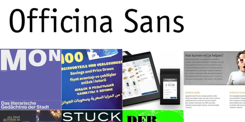
The wordmark, set in a modified version of the font Officina Sans, is just as deliberate. It’s not a trendy typeface. It’s a workhorse.
Officina Sans is clean, highly legible, and feels straightforward and unpretentious. It’s friendly without being childish, and professional without being stuffy. The font choice doesn’t scream for attention; it quietly does its job of being transparent and accessible, reinforcing the overall brand ethos of efficiency and ease of use.
The Real Lesson: Forget Minimalism, It’s Essentialism
Here is where most commentators get it wrong. They lazily label the Amazon logo as “minimalist.” It’s not. There’s a critical difference.
Minimalism is an aesthetic. It’s about removing elements to achieve a particular look or feel, often for the sake of simplicity itself.
Essentialism is a strategy. It’s about ruthlessly removing elements until only that which serves a core function remains.
The Amazon logo is a masterclass in essentialism. Every single element has a commercial job to do.
- The Wordmark (“Amazon”): Provides name recognition. Its job is identification.
- The Arrow (from A to Z): Communicates the vast scope of inventory. Its job is to convey selection.
- The Curve (the Smile): Communicates the emotional benefit. Its job is to convey customer satisfaction.
Nothing is decorative. Nothing is there just to “look nice.” If you were to remove any one of these elements, the message would be fundamentally weakened. This is the most crucial takeaway for any business owner. Look at your own logo. Does every line, shape, and colour have a specific job? Or is it just taking up space?
If an element doesn’t have a purpose, fire it.
A Modern Hiccup: The 2021 App Icon Kerfuffle
For two decades, the smile logo reigned supreme without issue. But in the hyper-aware landscape of the 21st century, even the most robust brands can stumble.
In early 2021, Amazon updated its mobile app icon. The new design featured the signature smile below a small blue strip of “packaging tape” on a brown “cardboard box” background. Almost immediately, online observers noted that the jagged edge of the blue tape, when positioned above the smile, bore an unfortunate resemblance to the toothbrush moustache of Adolf Hitler.
The comparison went viral.
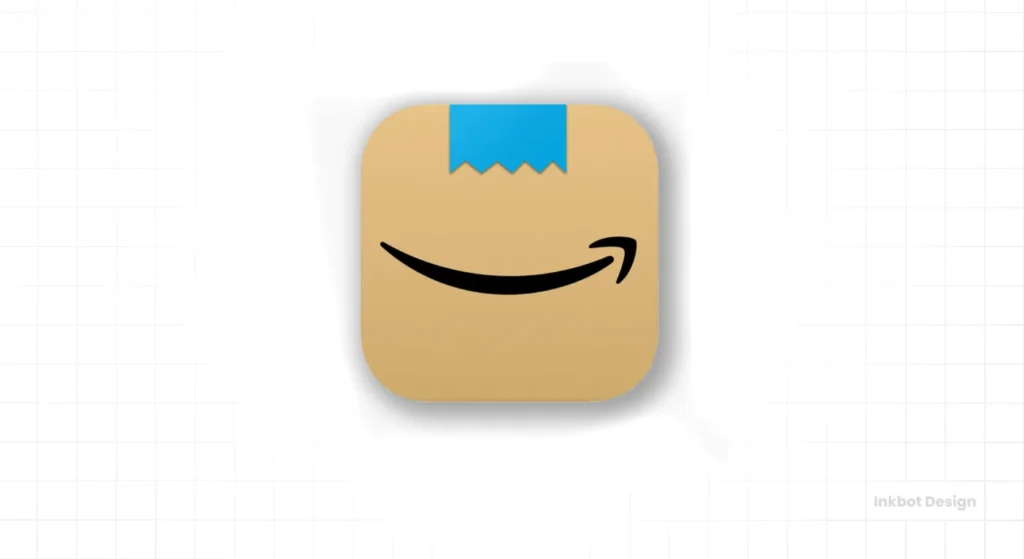
To Amazon’s credit, its response was swift and decisive. There was no defensive press release. No corporate ego. Within weeks, they quietly updated the icon again, changing the jagged tape to a straight-edged piece with one corner folded over. The problem was solved.
The lesson here is vital for any modern business. Your brand’s perception is not entirely in your control. In the age of social media, the public can and will assign their own meanings to your designs. The key is not to create something impossible to misinterpret, but to be humble and agile enough to listen and react when a legitimate issue arises.
What Your Business Must Steal From Amazon’s Playbook
The history of the Amazon logo is not an academic exercise. It is a practical, actionable playbook for building a powerful brand. Here are the rules you should steal.
Rule 1: Your First Idea Is Probably Wrong. Amazon’s first logo was weak and cliché. They weren’t precious about it. They recognised it wasn’t working and moved on. Too many founders fall in love with their first logo, clinging to it for sentimental reasons even when it’s holding the business back. Be willing to evolve.
Rule 2: Communicate a Promise, Not a Product. The old ‘river’ logo simply described the company’s name. The ‘smile’ logo represents the customer experience and the core value proposition. Your logo shouldn’t just say who you are but what you promise to do for your customer.
Rule 3: Function Over Fashion, Always. Your logo is a business tool, not a piece of art for your portfolio. Before you ask, “Is it beautiful?” ask, “Does it work?” Is it legible at all sizes? Does it communicate your core message in under three seconds? Is it distinct from your competitors?
Rule 4: Aim for Essentialism. Audit your own logo with brutal honesty. Is there anything on it that is purely decorative? Can you remove a shape, a line, or a colour without losing the core message? If you can, you should. This is the ruthless clarity we bring to every logo design project at Inkbot Design, ensuring that every element serves a strategic purpose.
The Everything Store
You use Amazon, but you only see the storefront, not the empire-building machine behind it. This book cracks open the black box. It’s the definitive, investigative deep dive into the relentless ambition and secretive culture Jeff Bezos used to build the ‘everything store’ and change the world forever.
As an Amazon Partner, when you buy through our links, we may earn a commission.
Conclusion
The journey from a clunky, literal river to a globally recognised smile is more than just a branding facelift. It’s a story about strategic evolution. The Amazon logo’s history is a masterclass in shedding the irrelevant to focus on what truly matters: a clear, dual promise of vast selection and customer happiness, delivered with a smile.
It stands today as the ultimate proof that the most effective logos aren’t the ones that are the most clever or the most artistically complex. They are the ones who do their job with brutal, simple, and undeniable efficiency.
Now, look at your own brand. What is the one core promise your business makes, and does your logo communicate it with the same brutal efficiency?
Frequently Asked Questions (FAQs)
What was the very first Amazon logo?
The first Amazon logo, used from 1995 to 1997, featured a stylised letter ‘A’ with a path designed to look like a river running through it, reflecting the company’s name.
Who designed the current Amazon Smile logo?
The current “smile” logo was created in 2000 by the in-house team at Amazon, with significant contributions from designer Anthony Biles, as part of a larger brand identity project led by the agency Turner Duckworth.
What is the meaning of the arrow in the Amazon logo?
The orange arrow in the Amazon logo has a dual meaning. First, it points from the a ‘ to the ‘z’ in “Amazon,” signifying that the company sells everything from A to Z. Second, the arrow represents a customer’s smile, indicating customer satisfaction.
What font does the Amazon logo use?
The Amazon logotype uses a modified version of the Officina Sans font. It was chosen for its clean, legible, and approachable appearance, which aligns with the brand’s focus on user-friendliness and efficiency.
Why did Amazon change its logo from the original design?
Amazon changed its original “river” logo because it was too literal, visually complex, and failed to communicate the company’s value proposition. As Amazon expanded beyond books, it needed a more versatile and meaningful logo representing its mission to become “The Everything Store.”
When was the Amazon smile logo introduced?
The Amazon Smile logo was officially introduced in 2000. It marked a major strategic shift in the company’s branding to emphasise its vast product range and customer-centric philosophy.
What was the controversy with the Amazon app icon in 2021?
In 2021, Amazon updated its app icon to a design featuring the smile logo under a piece of blue tape on a brown background. Some observers noted that the jagged edge of the tape resembled a toothbrush moustache, drawing comparisons to Adolf Hitler. Amazon quickly modified the design to a folded piece of tape to resolve the issue.
What is the difference between a minimalist and an essentialist logo?
A minimalist logo focuses on aesthetics, removing elements to achieve a clean, simple look. An essentialist logo focuses on function, removing any element that does not serve a specific, strategic purpose in communicating the brand’s core message. The Amazon logo is a prime example of essentialism.
What can small businesses learn from the Amazon logo’s history?
Small businesses can learn several key lessons: be willing to evolve your brand as your business grows, focus on communicating a customer promise rather than just your company name, prioritise function over fashion in your design, and strive for essentialism where every design element has a purpose.
Why is the Amazon logo considered so adequate?
The Amazon logo is highly effective because it communicates two powerful brand promises (vast selection and customer happiness) in a simple, memorable mark. It is infinitely scalable, instantly recognisable, and perfectly aligned with the company’s core business strategy.
Your logo is the sharpest tool in your toolbox—or it should be. It needs to work hard, communicate clearly, and make a promise you can keep. It might be time for a conversation if you’re ready to move beyond aesthetics and build a brand identity with ruthless efficiency.
Explore our logo design services to see how we build brands that perform. If you’re ready to get started, you can request a quote here. For more insights, browse the resources on the Inkbot Design blog.

