25 Famous Green Logos and What They Actually Mean
Let’s be honest. Green is the most lazily used colour in branding.
It’s the default setting for any company that wants to whisper “healthy,” “natural,” or “eco-friendly” without doing any real strategic thinking. The result is a sea of bland, forgettable logos that all look like they came from the same design template.
But here’s the thing: green is also one of the most psychologically versatile colours you can build a brand around. It can signify billion-dollar stability, cutting-edge technology, or rebellious energy. It’s not the colour’s fault, it’s being used poorly.
We will dissect 25 famous green logos to see the strategy—or lack thereof—behind the colour choice. This isn’t just a gallery. It’s an analysis of what works, what doesn’t, and what you, as a business owner, can learn from the biggest brands in the world.
- Green is often misused in branding, leading to generic and forgettable logos.
- The psychology of green varies; it can denote freshness, heritage, or rebellion.
- Successful branding requires a specific green shade to stand out and be memorable.
- Brands must align their colour choice with their operational practices to avoid greenwashing.
The Psychology of Green in Branding: Beyond the Obvious
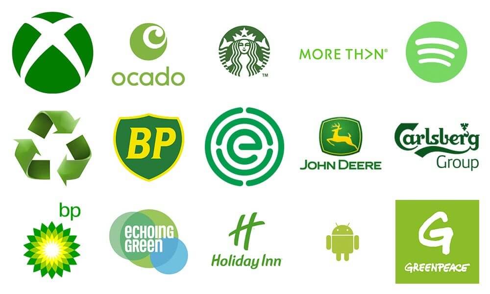
Everyone knows the basic associations. Green means nature, health, and money. It’s the colour of renewal, harmony, and growth. That’s branding 101.
But the real power comes from the nuances. A bright, acidic green can signal energy and rebellion. A deep, dark hunter green evokes heritage and prestige. A muted sage green feels calm and balanced. And a vibrant, digital lime green screams technology.
My biggest pet peeve is the “Eco-by-Default” syndrome. Slapping a green leaf on your packaging doesn’t make your supply chain sustainable. Modern customers can smell greenwashing from a mile away. If your brand promises “green,” your operations had better back it up. The colour isn’t a solution; it’s a signal.
Let’s see how the pros use it.
Green Logos in Food & Beverage: The Fresh, The Bold, and The Rebellious
This sector is the biggest offender of using green as a cliché for “fresh.” But some brands manage to break the mould.
1. Starbucks
The Starbucks Siren is globally recognised. The specific shade, a deep “Starbucks Green,” was chosen to evoke coffee’s fresh, natural origin while establishing a sense of warmth and community. It’s aspirational and comforting, a clever balance that avoids the typical “earthy” tropes.
Takeaway: A unique shade of a standard colour can become a powerful, ownable brand asset.
2. Whole Foods Market
Whole Foods built its empire on the promise of natural and organic products. Their logo, with its leafy “O,” is a direct and unambiguous representation of that promise. While arguably predictable, it’s effective because the entire brand experience validates the logo’s message, from the store layout to the product sourcing.
Takeaway: If you’re going to use a direct cliché, your business must be the absolute embodiment of that cliché.
3. Heineken
Heineken’s green is iconic. Paired with the red star, the green bottle has been a mark of the brand for over a century. It communicates heritage, quality, and a refreshing taste. The colour isn’t just on the logo; it is the product’s packaging, making it inseparable from the brand itself.
Takeaway: Integrate your brand colour into your product and packaging to create an immersive brand world.
4. Tic Tac
The light, minty green of the Tic Tac logo is all about the flavour and feeling: fresh breath, lightness, and a little lift. The colour choice is purely product-focused. It doesn’t try to be anything else, and its simplicity is its strength.
Takeaway: Sometimes, the most effective colour choice is the one that directly represents the product’s function or flavour.
5. Monster Energy
Here, green is twisted on its head. This isn’t the calming green of a yoga studio. Monster’s neon, acidic green claw mark is rebellious, chemical, and full of aggressive energy. It rejects the “natural” association and instead leans into something artificial and powerful.
Takeaway: Subvert expectations. Using a colour in a way that defies its traditional meaning can create a powerful and memorable brand.
Green in Technology & Media: Signifying Connection and Entertainment
In tech, green often symbolises growth, access, and connection. It’s a departure from the sea of blue logos (looking at you, IBM, Meta, and Twitter/X) and helps these brands stand out.
6. Android

The “bugdroid” is playful and accessible. The specific shade of green was reportedly chosen for its high visibility against a dark background and to represent growth and vibrancy. It feels modern and fresh, setting the Android OS apart from its competitors’ more sterile, corporate feel.
Takeaway: Green can make technology feel more human and approachable.
7. Spotify

“Spotify Green” is instantly recognisable. This vibrant, electric shade is modern, energetic, and completely tied to digital entertainment. It feels fresh and exciting, perfectly aligning with the brand’s purpose of music discovery. They chose a colour that feels like a ‘Go’ button for music.
Takeaway: A bold, unique colour choice can make your brand feel distinctive in a crowded digital landscape.
8. WhatsApp

WhatsApp’s green is all about communication and connection. The colour is tied into the app’s user interface, from the send button to the notification icon. It’s a functional colour that has become synonymous with a quick, reliable message. The green speech bubble is universally understood.
Takeaway: Your logo’s colour should align with your user experience for a cohesive brand feel.
9. Nvidia

Known for its powerful graphics processing units (GPUs), Nvidia’s green is distinctly digital. It evokes the look of circuit boards and old-school monochrome monitors. This shade of green is about technology, power, and performance—a perfect fit for a brand at the heart of the gaming and AI industries.
Takeaway: Tap into your industry’s historical or physical associations to create a colour story with deeper meaning.
10. Xbox

Like Monster Energy, Xbox uses a bright, acidic green to signify energy, excitement, and a touch of the unnatural. This “gamer green” is electric and futuristic. It established a strong visual identity that was completely different from Sony’s blue and Nintendo’s red, carving out its space in the console wars.
Takeaway: Use colour as a competitive weapon to differentiate yourself from major rivals.
Green in Finance & Services: The Colour of Stability and Trust
No surprises here. Green is the colour of money, making it a go-to for financial institutions. But the best brands use it to imply more than just wealth; they use it to signal growth, security, and trust.
11. TD Bank
TD Bank uses a simple green square to affect the situation significantly. The colour implies wealth and growth, but the straightforward, solid shape communicates stability and security. The branding is consistent across their physical branches, making the green a beacon of reliable banking.
Takeaway: Combine your colour choice with simple, strong shapes to reinforce messages of stability and trust.
12. H&R Block
H&R Block’s plain green square is a no-nonsense mark for a no-nonsense service: tax preparation. The green directly relates to money and tax refunds. There’s no fancy design, just a simple, solid block. It communicates that they are straightforward and dependable.
Takeaway: A simple, unpretentious logo can communicate efficiency and reliability for a service-based business.
13. Fidelity Investments
Fidelity uses a more muted, serious pyramid in its branding, often paired with green. The colour reinforces the financial nature of the business—growth on investments, wealth management—while the overall design feels professional and trustworthy. It’s a conservative use of green for a conservative industry.
Takeaway: The shade of green you choose matters. A more subdued green can feel more serious and trustworthy than a bright, loud one.
Heavy Industry & Automotive: Land, Heritage, and Controversy
Green is a natural fit for brands tied to the land and heavy machinery. It speaks of the earth they work on and the power they wield.
14. John Deere
This is the most famous use of industrial green. John Deere’s specific shades of green and yellow are legally protected trademarks. The green represents the fields their equipment works on, and it has become a globally recognised symbol of durability, agriculture, and American heritage.
Takeaway: When your brand is deeply connected to a specific environment, owning a colour combination can be incredibly powerful.
15. Land Rover
Land Rover’s deep Brunswick Green is tied to its heritage and vehicles’ off-road capabilities. It evokes the British countryside, exploration, and ruggedness. It’s a classic, premium colour that separates the brand from the flashy metallics of many luxury SUV competitors.
Takeaway: Colour can be a powerful way to communicate a brand’s heritage and country of origin.
16. BP (British Petroleum)
The BP “Helios” logo is one of the most controversial examples of green branding. Introduced in 2000, the green and yellow sunburst was designed to reposition the oil giant as a more environmentally friendly energy company. To its critics, it’s the ultimate symbol of greenwashing, especially after major environmental incidents.
Takeaway: Your actions must align with your branding. A green logo can’t fix a business model that customers perceive as harmful to the environment. It can even create backlash.
Green in Retail & Lifestyle: Quality, Wellness, and Tradition
From hotels to apparel, green can communicate many messages, including comfort, quality, and a connection to the outdoors.
17. Holiday Inn
The Holiday Inn script logo has used green for decades. It feels inviting, familiar, and dependable. The colour choice suggests a restful and reliable place to stay, a refreshing stop for a traveller. It has become a landmark of roadside hospitality.
Takeaway: Consistency over time builds trust. Sticking with a core colour can make your brand feel like a reliable institution.
18. Roots
The Canadian lifestyle brand Roots uses a beaver logo and a pleasant, earthy green to signify its connection to the Canadian wilderness and nature. The colour feels authentic, comfortable, and outdoorsy, perfectly matching its product line of casual apparel.
Takeaway: Use colour to connect your brand to a specific geographic identity or lifestyle.
19. Lacoste
The green Lacoste crocodile is a mark of preppy, sportswear prestige. The green connects to the tennis courts where founder René Lacoste earned his nickname, “The Alligator.” It’s a classic, aspirational colour that speaks of leisure and quality.
Takeaway: A great brand story can give your colour choice a meaning beyond simple psychology.
20. Garnier
Garnier uses a bright, vibrant green to communicate natural ingredients and freshness in its hair and skin products. The leaf-like shape of its logo reinforces this. It’s a straightforward but effective visual identity in the crowded personal care aisle.
Takeaway: A clear and straightforward message (green = natural ingredients) can cut through the noise in a competitive retail environment.
21. Girl Scouts
The green trefoil logo emulates growth, nature, and community. The Girl Scouts have been associated with this colour for generations, from their uniforms to their cookie boxes. The green represents their commitment to the outdoors and personal development.
Takeaway: When your brand is a cultural institution, its colour symbolises its values and history.
Green in Sports, Energy & More: Prestige, Power, and Planet
This final group shows green’s range, from the hallowed grounds of a golf course to the forward-looking world of sustainable energy.
22. The Masters Tournament

The “Masters Green” of the iconic blazer is one of the most coveted symbols in all sports. The green logo, shaped like the continental US, represents the lush, perfectly manicured grounds of Augusta National. It is the ultimate symbol of prestige, exclusivity, and tradition in golf.
Takeaway: Colour can create an aura of exclusivity and aspiration.
23. Greenpeace
For this non-governmental environmental organisation founded in 1971, the use of green is a mission statement. It’s a bold, activist green. Paired with stark black or white text, it’s not meant to be gentle; it’s meant to be a call to action. The colour is the cause.
Takeaway: A brand can use a colour change to signal a significant shift in its business strategy or values.
24. Animal Planet

The walking elephant logo, often rendered in a bold green, is a simple and effective mark. The green connects directly to the channel’s subject: the natural world, wildlife, and the planet. It’s an intuitive and fitting choice.
Takeaway: Don’t overthink it. Sometimes the most logical colour choice is correct, as long as the execution is strong.
25. Acer
The Taiwanese tech company uses a calm, light green. In a market dominated by blues, blacks, and silvers, Acer’s green helps it stand out on the shelf. The colour feels fresh and slightly different, suggesting innovation without being overly aggressive.
Takeaway: Sometimes, the primary benefit of a colour is simply being different from your direct competitors.
How to Use Green Without Looking Like Everyone Else
Looking at these 25 examples, a few clear principles emerge for any business owner considering branding.
- Strategy First, Colour Second: Don’t start by saying, “We need a green logo.” Start by defining your brand’s core message. Is it stability? Rebellion? Heritage? Freshness? You can find the right colour once you know what you need to say.
- Own a Shade: Don’t just be “green.” Be “John Deere Green,” “Spotify Green,” or “Starbucks Green.” A specific, consistent shade is far more memorable and defensible than a generic one.
- Context is King: A green logo for a bank communicates something entirely different from a green logo for an energy drink. Consider your industry and your competitors. Use green to stand out, not to blend in.
- Back It Up: This is the most important rule. If you use green to signal that your brand is sustainable, ethical, or natural, your business practices must validate that message. If they don’t, your green logo isn’t just ineffective—it’s a liability.
Is a Green Logo Right for Your Business?
The answer has nothing to do with trends and everything to do with your brand’s unique story and strategic goals. Green is a powerful tool, but it’s not a one-size-fits-all solution.
Choosing a colour is one of the most critical decisions in the branding process. Discovering the right visual identity is central to professional logo design. It requires introspection, competitive analysis, and a deep audience understanding.
So before you default to that safe, leafy green, ask yourself: what am I trying to say?
Green can be the colour of lazy, generic branding. Or it can be the colour of a legendary, world-changing company. The difference is strategy.
Let’s talk if you’re ready to build a brand with a deliberate, powerful identity. You can request a quote here.
Frequently Asked Questions About Green Logos
What does a green logo say about a company?
A green logo can convey many meanings, including growth, nature, health, wealth, stability, and technology. The specific message depends heavily on the shade of green, the industry context, and the logo’s design.
Why do so many tech companies use green logos?
Tech companies like Spotify, Android, and Xbox use green to stand out from the traditional “corporate blue.” Vibrant shades of green can communicate freshness, growth, energy, and a modern, accessible feel.
Is green a good colour for a financial logo?
Yes, green is a prevalent and effective colour for financial brands. It has a direct psychological link to money, wealth, and prosperity. It can also create a sense of trust, stability, and growth.
Can a green logo be considered “greenwashing”?
Absolutely. If a company with poor environmental practices uses a green logo to appear eco-friendly, consumers may label it “greenwashing.” The brand’s actions and policies must align with the message its colour sends.
What colours go well with green in a logo?
Green pairs well with several colours. White and black create a clean, high-contrast look. Yellow can create an earthy or energetic feel (like John Deere or BP). Blue can evoke a sense of calm and nature (sky and earth).
What is the most famous green logo?
While subjective, the Starbucks Siren, the John Deere leaping deer, and the Heineken bottle are among the most globally recognised and iconic green brand marks.
Does the shade of green matter in a logo?
Yes, immensely. A bright, neon green (like Monster Energy) conveys high energy and rebellion, while a dark forest green (like Land Rover) suggests heritage and quality. The shade is just as important as the colour itself.
Why is Starbucks’ logo green?
The “Starbucks Green” was chosen to represent freshness and the natural origins of coffee beans while creating a feeling of warmth, community, and invitation that sets it apart from utilitarian coffee brands.
What industries should avoid using a green logo?
No industry must avoid green, but businesses in sectors oversaturated with green logos (like organic foods or wellness) must work much harder to differentiate themselves. The key is to find a unique shade or design concept.
How do I choose the right shade of green for my brand?
Start with your brand’s personality. Is it energetic and modern (lime green)? Is it trustworthy and traditional (hunter green)? Is it calm and natural (sage green)? Test different shades against your competitors to see what stands out.
