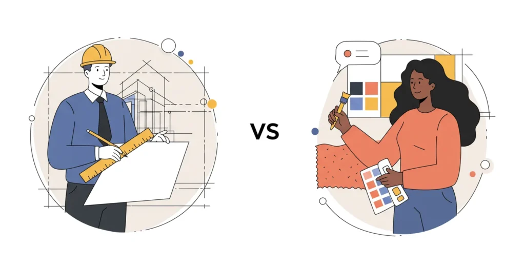
UX vs UI Design: The Practical Difference and Why It Matters
The “UX vs UI” debate is among the design industry’s most tiring, pointless arguments. It’s a circular conversation that completely misses the point and wastes everyone’s time.
For you, the entrepreneur or small business owner, it’s even more dangerous. This confusion is actively costing you money.
You’re told you need “great UI/UX,” so you hire someone who delivers a beautiful website. It looks incredible. You show it to your friends. But six months later, you’ve got high bounce rates, zero conversions, and a sinking feeling in your stomach.
You’ve been sold a pretty picture, not a business tool.
UX and UI are not enemies. They aren’t even competitors. It’s not “versus,” it’s “and.” One is the strategy, the other is the execution. If you get the strategy wrong, the most beautiful execution in the world is worthless.
- UX is the strategic architect: research, structure, wireframes, and testing to solve user problems and ensure effortless journeys.
- UI is the visual craft: colour, typography, layout, interactions and design systems that make the UX appealing and trust-worthy.
- They are complementary and sequential: UX (strategy) must come first, then UI (execution); both are essential for business results.
- For businesses, choose based on problem: fix UX for poor conversions; refresh UI for outdated branding or inconsistent visuals.
Let’s Kill the Jargon: A Simple UX vs UI Analogy
Forget the technical definitions for a moment. Think about building a house.
User Experience (UX) Design is the architect.
The architect doesn’t pick out paint colours or doorknobs. They focus on the foundation and the flow. They conduct research by asking: How many people will live here? How do they live their lives? Does the layout make sense? Can you get from the kitchen to the dining room without walking through a bedroom? Is the structure sound? The architect delivers the blueprint—a master plan for a functional, livable space.
User Interface (UI) Design is the interior designer and the painter.
They take the architect’s solid blueprint and bring it to life. They choose the colour palette, the textures of the walls, the style of the light fixtures, the finish on the floors, and the feel of the furniture. They make the functional space aesthetically pleasing, emotionally resonant, and enjoyable.
A flawed blueprint cannot be fixed with a fresh coat of expensive paint. A beautiful house that is fundamentally frustrating to live in is a failure. Likewise, a perfect blueprint with no walls, paint, or furniture is just an idea on paper.
You need both in the correct order.
What is UX (User Experience) Design, Really?

User Experience Design is the invisible process of making a product, service, or website effective, efficient, and satisfying for a human to use.
It has almost nothing to do with colours or fonts. It’s about strategy, structure, and solving a user’s problem with the least friction. It’s about the feeling someone gets when they use your product. Do they feel competent, or frustrated and confused?
A UX designer’s job is to be the user’s advocate. They answer: “How can we make this work in the simplest, most logical way possible?”
Core UX Responsibilities
The work of a UX designer is grounded in research and analysis. Their primary tasks include:
- User Research: Conduct interviews, run surveys, and create user personas to understand the needs and pain points of the target audience.
- Information Architecture (IA): Organising and structuring all the content on a website or app so that it’s logical and easy to navigate. This is the science of not making people think.
- Wireframing: Creating low-fidelity, black-and-white layouts—essentially blueprints. These focus purely on structure, placement, and flow, without visual distraction.
- Prototyping & Testing: Building clickable, interactive (but still visually basic) product models. They then watch real users attempt tasks to find points of confusion before a single pound is spent on visual design.
Example of Great UX: Google Maps
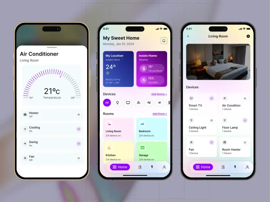
Google Maps is a masterclass in UX. Its primary goal is simple: get you from Point A to Point B. The UX is relentlessly focused on making that process effortless.
It anticipates your needs with real-time traffic data, offers alternative routes, and shows you nearby petrol stations or cafes. The core function is so intuitive that you don’t think about it. That feeling of seamless, invisible help? That is the product of excellent UX.
And What About UI (User Interface) Design?
User Interface Design is the craft of creating the product’s look, feel, and interactivity. If UX is the science of the journey, UI is the art of the destination.
This is where aesthetics come into play. UI is the visual translation of the brand and the tangible layer that the user sees, touches, and interacts with. It’s the bridge that makes the UX designer’s strategic blueprint accessible and appealing to a human being.
A UI designer’s job is to be the brand’s advocate. They answer: “How can we make this functional journey visually beautiful, on-brand, and intuitive to interact with?”
Core UI Responsibilities
UI design is about creating a cohesive and attractive visual language. Its primary tasks include:
- Visual Design: Establishing the colour palette, typography, iconography, and overall visual style that aligns with the brand’s identity.
- Layout: Arranging all the elements on each screen, ensuring visual balance, hierarchy, and a pixel-perfect finish.
- Interaction Design: Defining how elements behave when a user interacts with them—the subtle animation when you click a button, the smooth transition between screens.
- Design Systems: Building a comprehensive library of reusable components and guidelines to ensure visual consistency across the entire product.
Example of Great UI: Apple’s iOS

The interface of an iPhone is an iconic example of UI design. Apple is famous for its clean layouts, consistent icons, crisp typography, and fluid animations.
This visual polish does more than just look good. It creates a feeling of quality, reliability, and ease of use. It makes the underlying technology (the UX) feel premium and trustworthy. You know an Apple product when you see it and feel it. That is the product of excellent UI.
The “Versus” Myth: Why It’s a Partnership, Not a Fight
The most successful products in the world excel at both. One discipline lays the foundation; the other builds upon it. Here’s how they differ and, more importantly, how they connect.
| Feature | UX Design (The Strategy) | UI Design (The Execution) |
| Focus | The overall user journey and problem-solving | The visual look, feel, and interactivity |
| Goal | To make the product effective and easy to use | To make the product beautiful and delightful to interact with |
| Process | Analytical, research-based, structural | Creative, artistic, detail-oriented |
| Deliverables | Personas, user flows, wireframes, prototypes | Mockups, style guides, design systems, icons |
| Analogy | Architect’s Blueprint | Interior Design & Finishes |
How They Work Together in a Project
The process is sequential and collaborative.
- UX Leads: The project begins with UX research to define the user, the problem, and the core solution. This leads to wireframes and prototypes that map out the user’s journey.
- UI Executes: The UI designer takes the approved, tested wireframes and applies the visual layer. They turn the black-and-white blueprint into a full-colour, pixel-perfect, and emotionally engaging design.
- Collaboration is Constant: It’s a feedback loop. A UI designer might notice that a button placement from the wireframe feels awkward visually, prompting a discussion with the UX designer. The process is a dialogue, not a dictation.
The Payoff: Airbnb

Airbnb is the poster child for a perfect UX and UI partnership.
The UX is brilliant. Searching for a location, filtering by dates and amenities, reading reviews, and booking a stay is incredibly simple and linear. The site builds trust at every step, making the scary prospect of staying in a stranger’s home feel safe and logical.
The UI is equally masterful. It uses large, beautiful photography, clean typography, and a simple, airy layout to make the experience feel aspirational and trustworthy. The interface is inviting, not intimidating.
The result? A company valued at tens of billions of pounds, built on a foundation of making a complex process feel simple (UX) and look beautiful (UI). Getting this partnership right is the core of effective web design services.
As a Business Owner, Which One Do You Need?
You need both. Always.
The better question is, “What is my most immediate problem?” Your answer determines who you need to focus on right now. Data shows that 88% of online consumers won’t return to a site after a bad experience. You can’t afford to get this wrong.
You Need a UX Focus When…
- You are launching a brand-new product or website and must validate your ideas.
- Your website analytics show high traffic but very low sign-ups or sales.
- You receive customer feedback using words like “confusing,” “clunky,” or “I couldn’t find…”
You Need a UI Focus When…
- Your website works fine, but looks dated and no longer reflects your brand’s quality.
- Your branding is inconsistent across different pages, creating a disjointed experience.
- You have already completed the UX process and have clear, tested wireframes to be brought to life.
Be wary of the “UI/UX Designer” title. While some talented individuals can handle both, most professionals specialise. A designer who excels at deep user research is rarely the same person who obsesses over pixel-perfect typography. Know what problem you’re solving before you hire.
The Bottom Line: Stop Saying “UI/UX”
Using “UI/UX” as a single, interchangeable concept is a red flag. It shows a fundamental misunderstanding of the value each discipline brings.
They are separate crafts. Both are essential. One is not more important than the other.
So, think in sequence the next time you’re planning a project.
First, strategy: Who is this for? What problem does it solve? How will it work in the simplest way possible? That’s your UX.
Second, execution: How can we make this functional journey beautiful, on-brand, and delightful? That’s your UI.
A pretty website that doesn’t solve a problem is an expensive hobby. A functional, strategic webpage that looks and feels incredible is a powerful business asset. Choose the asset.
Your website isn’t just a digital brochure; it’s your hardest-working employee. If it’s confusing customers or failing to convert, it’s not a design problem—it’s a business problem. Understanding the difference between the blueprint (UX) and the paint job (UI) is the first step to fixing it.
If you’re ready to build a website that doesn’t just look good, but actually works, take a look at our approach to web design. Or, if you have a project in mind, you can request a quote, and we can talk strategy.
Frequently Asked Questions (FAQs)
What is the simplest difference between UX vs UI?
UX (User Experience) is about the overall feel and effectiveness of the journey. UI (User Interface) is about the look and function of the individual screens and touchpoints. Think blueprint (UX) vs. interior design (UI).
Which is more critical, UX or UI?
Neither. It’s a trick question. A great-looking car with a terrible engine (good UI, bad UX) is useless. A great engine in a car with no steering wheel or seats (good UX, bad UI) is also meaningless. They are both critical and depend on each other.
Does a UX designer need to know how to code?
No, a UX designer does not need to be a developer. However, a basic understanding of what is technically feasible helps them create more practical and effective designs.
Does a UI designer need to be an artist?
A UI designer needs a strong command of visual design principles like colour theory, typography, and layout. While artistic talent is a huge plus, their primary skill is applying these principles to create a clear, usable, and aesthetically pleasing interface.
Can one person be both a UX and a UI designer?
Yes, some designers have skills in both areas and are often called “Product Designers.” However, it’s rare for one person to be a true expert in both the deep research of UX and the pixel-perfect craft of UI. For complex projects, it’s often better to have specialists.
What comes first in the design process, UX or UI?
UX always comes first. You cannot effectively design the visual interface (UI) until you understand the user journey and the underlying structure (UX). Strategy precedes execution.
What are the primary tools for a UX designer?
UX designers often use tools for research, diagramming, and prototyping. Examples include Figma, Sketch, Adobe XD, Miro, and UserTesting.com.
What are the primary tools for a UI designer?
UI designers primarily use vector-based design software to create high-fidelity mockups. The most popular tools are Figma, Sketch, and Adobe XD, often supplemented by Adobe Illustrator and Photoshop for asset creation.
How does good UX design impact business goals?
Good UX directly impacts the bottom line. It improves customer satisfaction, increases conversion rates, and enhances loyalty. A seamless experience makes users more likely to buy, sign up, or return.
What is a “Design System”?
A design system is a collection of reusable components (like buttons, forms, and icons) and clear standards that guide their use. Created by UI designers, it ensures consistency and allows teams to build and scale products more efficiently.
Is UX only for websites and apps?
No, UX principles apply to any product or service a person interacts with. This includes physical products (like a well-designed kettle), services (like checking into a hotel), and digital interfaces.
How do I know if my website has bad UX?
Common signs include high bounce rates, low conversion rates, abandoned shopping carts, and direct user feedback about confusion or frustration. If users can’t find what they’re looking for quickly, you likely have a UX problem.