How to Create a Perfect Logo Design in 10 Steps
The concept of a “perfect” logo is a myth. It’s a fantasy sold by cheap design contests and clueless marketing gurus.
What you’re actually searching for is a powerful logo.
A powerful logo isn’t a piece of art judged on personal taste. It’s a strategic business tool, engineered to identify your business, communicate a message, and function flawlessly across every medium for years.
Most businesses get this wrong. They fall into the “Design Anarchy” trap—a chaotic process driven by the founder’s personal preferences, vague feedback from their cousin, and a desperate attempt to copy the latest trend. The result is always the same: a weak, forgettable mark that costs more in the long run.
The antidote is a disciplined, strategic framework. This 10-step process removes subjectivity. It forces clarity, builds confidence, and creates a hard-working business asset.
- Strategy before style: define your mission, target audience, and competitive positioning before any design work.
- Research broadly: gather mood boards, keywords, and cross-industry inspiration to find original visual metaphors.
- Sketch extensively: start on paper, produce 50+ ideas, then refine the top 3–5 concepts.
- Prioritise simplicity and memorability: ensure recognisability, single-colour viability, and an ownable silhouette.
- Deliver a usable system: provide vector files, responsive variations, and clear brand guidelines for consistent use.
Step 1: Lay the Foundation (Strategy Before Style)

A logo built on a weak foundation will crumble. Before pushing a pixel, you must define the strategy to guide every design decision. This is the most-skipped and most-critical step.
Define Your “Why”: Mission and Vision
Define your “why” by distilling your business’s core purpose into a single sentence. Why does your company exist beyond making money? What problem do you solve? Amazon’s smile-arrow from A to Z isn’t just a smile; it communicates the company’s mission to sell everything. That’s a strategy made visible.
Profile Your Target Audience, Not Yourself
Your logo is for your customers, not for you. You might love the colour orange, but if you’re selling high-end financial services to retirees, it’s probably the wrong choice. Get specific. Create a profile of your ideal customer: their age, values, and aspirations. Your logo needs to speak their language.
Analyse Your Competitors (To Be Different)
Look at your top three competitors. Note their logo styles, colours, and typography. Your goal is not to copy them but to deliberately position yourself differently. If they all use bold, blue, blocky logos, you can stand out with something refined, green, and elegant. This is about finding a visual gap in the market and owning it.
In this stage, you must also resist the single biggest destroyer of good design: the committee. Gathering feedback from everyone you know doesn’t lead to a better logo. It leads to a compromised, beige-coloured mess designed to offend no one and, as a result, impress no one. A logo needs a singular vision.
Step 2: Gather Intelligence (Research & Inspiration)
With a clear strategy, you can now gather visual intelligence. This isn’t about finding logos you like; it’s about collecting images, textures, colours, and fonts that evoke the feeling your brand needs to project.
Create a Mood Board That Isn’t Just Logos You Like
A mood board should capture a feeling. If your brand strategy calls for “rugged and dependable,” your board might include images of weathered leather, mountain landscapes, and vintage industrial machinery. It sets the emotional tone for the design work to follow.
Use Keyword Association to Find Visual Metaphors
Brainstorm keywords that describe your brand (e.g., “speed,” “security,” “growth”). Now, what are the visual metaphors for those words? Speed could be a lightning bolt, a cheetah, or an arrow. Security could be a shield, a lock, or an interlocking pattern. This exercise expands your visual vocabulary beyond the obvious.
Look Outside Your Industry for Unique Ideas
The best way to create a generic logo is to only look at logos in your industry. A tech company looking for inspiration in architecture, or a coffee shop studying the typography of old books, will find much richer and more original ideas.
Step 3: Start on Paper (Ideation & Sketching)
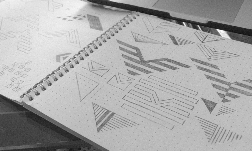
Resist the urge to jump straight onto a computer. The constraints of digital tools can kill creativity in its early stages. A pencil and paper are your best friends for generating raw ideas.
Why Analogue Beats Digital for Initial Concepts
Sketching is fast, fluid, and free from the distractions of software. It allows you to explore dozens of concepts without getting bogged down in details like font choice or perfect curves. The goal is to get the core idea down in its simplest form.
Focus on Quantity, Not Quality (The 50-Sketch Rule)
Challenge yourself to sketch at least 50 different logo ideas. Don’t judge them. The first 10 will be generic. The next 20 will be better. The exciting concepts often emerge after you think you’ve run out of ideas. Most will be rubbish. That’s the point.
Isolate the 3-5 Strongest Concepts
From your 50+ sketches, select the 3 to 5 that best align with your strategy from Step 1. These are the concepts you will take forward to refine digitally. They should be simple, distinct, and conceptually sound.
Step 4: Choose Your Weapon (Selecting the Right Logo Type)
Not all logos are built the same. The format you choose significantly impacts how your brand is perceived. The right choice depends on your business name, industry, and strategic goals.
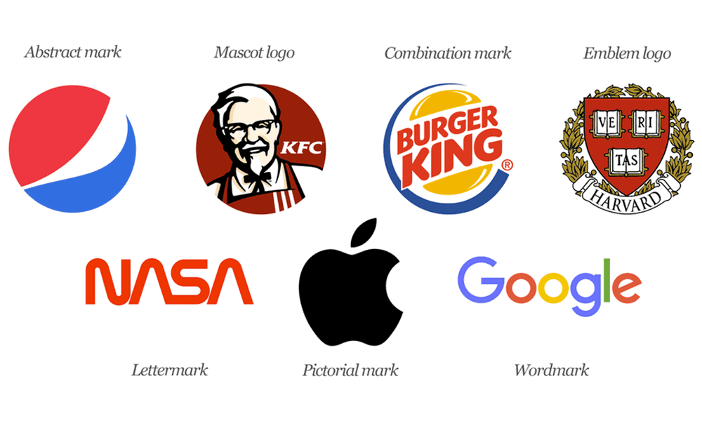
Wordmarks & Lettermarks (e.g., Google, NASA)
A wordmark is a logo based on the company’s full name (Google, Coca-Cola). A lettermark or monogram uses the company’s initials (NASA, IBM). These are excellent for new businesses that need to build name recognition.
Pictorial Marks & Abstract Marks (e.g., Apple, Pepsi)
A pictorial mark is a literal, recognisable image (the Apple logo, the Twitter bird). An abstract mark is a conceptual geometric shape representing the brand (the Pepsi circle, the Chase octagon). These are powerful, but can take longer to build an association without the company name present.
Combination Marks (e.g., Burger King, Doritos)
This is the most common type of logo, combining a wordmark with a pictorial or abstract mark. It offers the best of both worlds: the name is clear, and a visual icon is established. This is a safe and practical choice for most businesses.
Emblems (e.g., Starbucks, Harley-Davidson)
An emblem encases the company name within a shape or icon. Think of a crest or a seal. They can feel traditional and established, but sometimes lose detail at smaller sizes.
Step 5: Embrace Simplicity (The Reduction Test)
The most powerful logos in the world are breathtakingly simple. Complexity is the enemy of recognition. A great logo is easily identified and recalled after just a single glance.
A Great Logo is Recognisable at a Glance
If your logo requires explanation, it has failed. Its meaning and form should be immediately apparent. Think of the world’s most iconic logos, essentially simple shapes.
Does It Work in a Single Colour?
This is a critical test. A strong logo doesn’t rely on colour gradients or fancy effects to work. It must be just as powerful in solid black and white. If it fails this test, the underlying concept is too weak.
Example: The Nike Swoosh
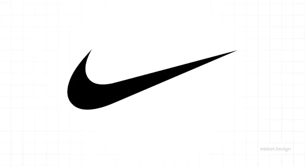
The Nike Swoosh is the pinnacle of simplicity. It’s a single, fluid shape that conveys movement and energy. It’s instantly recognisable, works in any colour, and is timeless. It needs no name attached to it. That is the goal.
Step 6: Engineer Memorability (Making it Stick)
A simple logo is good. A simple and memorable logo is excellent. Memorability is what separates a decent mark from an iconic one. It’s about creating a unique visual hook lodged in the viewer’s brain.
Create a Unique and Ownable Shape
Your logo’s silhouette is its most important feature. Can you recognise it if it’s blurred or seen from a distance? Apple’s Apple and McDonald’s golden arches are ownable, unmistakable shapes, even without detail.
The Power of Cleverness: Using Negative Space
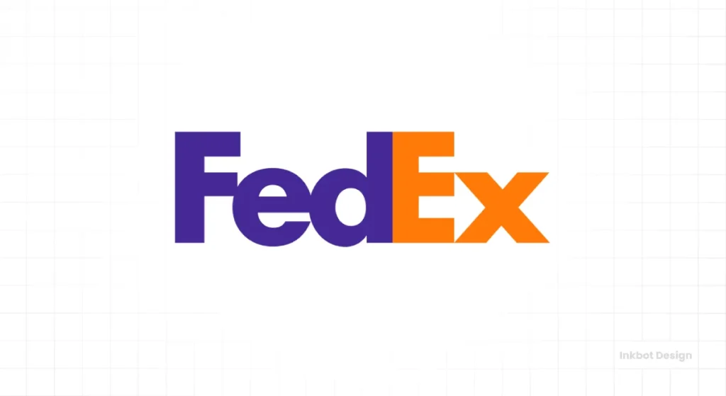
Cleverness, used sparingly, can make a logo unforgettable. The most famous example is the hidden arrow in the FedEx logo, formed by the negative space between the ‘E’ and ‘x. It’s a brilliant nod to their business of moving things forward.
This is where you must avoid the obsession with embedding a dozen hidden meanings. One subtle, clever element, like the FedEx arrow, is genius. Trying to make the ‘O’ look like a globe containing a book and a dove is a recipe for a convoluted mess. Clarity is always more important than complexity.
Step 7: Design for Decades, Not Days (The Timelessness Principle)
Chasing design trends is the fastest way to make your brand look dated. A logo is a long-term investment. The goal is to create something that will look as good in 20 years as today.
Why Chasing Trends is a Costly Mistake
Remember the wave of bubbly, Web 2.0 logos from the mid-2000s? Or the current plague of bland, geometric sans-serif logos used by every new tech startup? They are visual clichés. Adopting a trend is like giving your brand an expiration date. When the trend dies, your logo looks ancient.
Focus on Classic Principles, Not Fleeting Fads
Timeless design is built on solid principles of typography, spacing, and balance. It doesn’t rely on gimmicks like drop shadows or 3D effects. It is confident in its simplicity.
Example: The London Underground Roundel
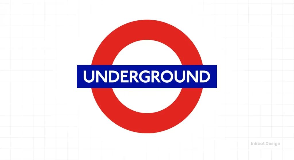
The core design of the London Underground logo—the red circle with a blue bar—was created in 1908. It has been refined over the century, but the fundamental concept remains unchanged. It is a masterclass in timeless, functional design.
Step 8: Master the Psychology (Colour & Typography)
Colour and typography are not decorations; they are the primary communicators of your brand’s personality. They carry immense psychological weight and must be chosen with strategic intent.
Colour Theory is Business Strategy, Not Decoration
Colour is the first thing a customer will notice. Blue often communicates trust and stability (common in finance). Red conveys energy and passion (common in food and entertainment). Green relates to health and nature. Your choice is a strategic signal about your brand’s values.
Serif vs. Sans-Serif: What Your Font Choice Communicates
Typography is the voice of your brand.
- Serif fonts (with small feet on the letters, like Times New Roman) feel traditional, established, and authoritative.
- Sans-serif fonts (without the feet, like Helvetica) feel modern, clean, and direct.
The specific font you choose says even more. A custom typeface can become a unique brand asset.
Limit Your Palette to 1-3 Core Colours
Don’t go crazy. A strong brand identity is built on a simple, consistent colour palette. Choose one or two primary colours and one accent colour. This ensures consistency and makes your brand easier to remember.
Step 9: Plan for Reality (Versatility & Scalability)
A logo doesn’t live in a vacuum. It must function perfectly across dozens of applications, from the tiny to the enormous. A failure in versatility is a failure of the design itself.
Your Logo Must Work on a Pen and a Billboard
This is the ultimate scalability test. Can your logo be embroidered on a shirt? Can it be reduced to a tiny 16×16 pixel favicon for a browser tab? Can it be scaled up to fit the side of a building? Intricate details will disappear at small sizes, so a simple, bold design is essential.
Creating a Responsive Logo System (Variations)
Modern branding requires a logo system, not just a single static image. This means having variations of your logo: a primary version, a simplified icon-only version, and a horizontal or vertical lockup. This ensures the logo looks its best in any context, from a mobile app to a website header.
The Absolute Necessity of Vector Files (SVG, AI, EPS)
Your final logo must be delivered as a vector file. Unlike pixel-based files (like JPG or PNG), vectors are built with mathematical equations, allowing them to be scaled to any size without losing quality. If a designer only gives you a PNG, they haven’t done their job. Getting these technical details right is non-negotiable. It’s a core part of any professional logo design process.
Step 10: Formalise the Rules (Finalisation & Brand Guidelines)
The design process isn’t over when the logo is approved. You must now create the tools and rules to ensure everyone uses them correctly and consistently.
Preparing the Final Logo Package (File Types)
A professional logo package should include the final design in multiple formats for different uses:
- Vector: SVG, AI, EPS (for all professional printing and scaling)
- Raster: PNG (with transparent backgrounds for web), JPG (for general use)
- Colour Profiles: Full-colour versions are available in both CMYK (for print) and RGB (for screens), and solid black and white versions.

What Are Brand Guidelines and Why You Need Them
Brand guidelines are the instruction manual for your visual identity. This document dictates exactly how the logo should be used. It specifies the official colour codes (Pantone, CMYK, RGB, HEX), the typography, the minimum size, and the “clear space” required around the logo to ensure other elements don’t crowd it.
Protecting Your Asset: Usage Rules and Clear Space
The guidelines also define what not to do. They provide rules against stretching, distorting, re-colouring, or placing the logo on busy backgrounds. This prevents the dilution of your brand and ensures it is always presented professionally.
A powerful logo isn’t born from a moment of inspiration. It’s the result of a rigorous strategic process. It’s not about finding something you “like.” It’s about engineering a tool that works.
By following this framework, you move beyond personal taste and into professional brand-building. You create not just a picture, but a valuable, hard-working asset that will represent your business with clarity and power for years.
Perfect Logo Design FAQs
What is the most crucial step in the logo design process?
Step 1: Strategy. A logo without a clear strategy is just a pretty picture with no business value. Defining your audience, mission, and competitive positioning must come before any design work.
How much should a professional logo design cost?
Costs vary widely, from a few hundred to tens of thousands of pounds. The price reflects the depth of the strategic process, the designer or agency’s experience, and the deliverables’ scope (like brand guidelines). Avoid anything that seems too cheap to be true.
What’s the difference between vector and raster files?
A vector file (AI, EPS, SVG) uses mathematical paths and can be scaled to any size without losing quality. A raster file (JPG, PNG, GIF) is made of pixels and will become blurry or jagged if enlarged. Your primary logo must be a vector file.
How many logo concepts should I expect from a designer?
Quality over quantity. A good designer will do the heavy lifting in the sketching phase and present you with 2-3 highly refined, strategically sound concepts rather than dozens of mediocre ideas.
What is the difference between a logo and brand identity?
The logo is the visual cornerstone, the face of the company. The brand identity is the entire visual system built around it, including the colour palette, typography, photography style, and tone of voice.
How do I know if my logo is “timeless”?
A timeless logo is simple, avoids trendy effects or fonts, and is built on solid design principles. Ask yourself: if I saw this logo 10 years ago, would it have looked good? If I see it in 10 years, will it still look good?
Should my logo explain what my company does?
Not necessarily. The Apple logo doesn’t show a computer. The Nike logo doesn’t show a shoe. The job of the logo is to identify, not to describe. Memorability and distinction are more critical than being literal.
Can I design my own logo using an online tool?
You can, but it’s generally a bad idea for a serious business. Logo makers often produce generic, non-unique designs that cannot be trademarked and lack the strategic thinking required to create a powerful brand asset.
What are the most common logo design mistakes?
The most common mistakes are being too complex, following trends, using raster files, designing by committee, and having poor scalability.
What are brand guidelines?
Brand guidelines are a document that sets the rules for how your logo and other visual identity elements should be used. It ensures consistency across all marketing materials, crucial for building brand recognition.
Why do I need a logo in black and white?
A logo must be able to work in a single colour for applications like engraving, embossing, or use on single-colour documents. If a logo relies on colour to be effective, its core design is weak.
What is negative space in a logo?
Negative space is the empty or “blank” area around and within a logo. Clever designers use this space to create secondary images or meanings, like the famous arrow in the FedEx logo.
You’ve Read the Strategy, Now See the Execution.
Understanding the process is the first step. The next step is putting that knowledge into the hands of professionals who live and breathe this framework daily. A powerful logo is an investment, not an expense.
If you’re ready to build a brand identity as serious as your business, look at our logo design services. Or, if you know what you need, you can request a quote directly. See more of our work and thinking at Inkbot Design.
