
Financial Services Branding: 7 Examples of Great Brands
Most financial services firms don’t have a branding problem. They have a brand courage problem.
The relentless pursuit of “safe” – navy blue, conservative serif typefaces, handshake iconography, vague language about “partnering with clients to achieve their goals” – produces brands so similar to competitors that the only remaining differentiator is price.
Price competition in professional financial services is slow-burning commercial suicide.
The evidence is uncomfortable. Research from Brandspeak found that 37% of consumers place a provider’s reputation above product features and price when selecting a financial services firm. Reputation is built on perception.
Perception starts with brand. If your brand cannot be distinguished from three competitors within thirty seconds, you have already lost a share of every new business conversation before a word is spoken.
This is not an argument for gimmicks. It is an argument for intentional brand identity design -the kind that builds commercial credibility rather than simply mimics the category.
The seven firms examined here each solved a different version of that problem. Their approaches are instructive precisely because they are not interchangeable.
- Build brand on a specific, verifiable business truth; consistent design and messaging make positioning legible instantly, as Vanguard demonstrates.
- Match visual and tonal signals to client needs: earned authority, restraint, and transparency beat challenger aesthetics for HNW and institutional clients, as Starling shows.
- Treat brand as commercial infrastructure: transparency, superior digital touchpoints, and clear communication raise fees, win rates, and reduce sales cost, as Wise proves.
What Is Financial Services Branding?
Financial services branding is the strategic use of visual identity, messaging, and market positioning to build client trust, support premium fee positioning, and differentiate a firm in a sector where most competitors are near identical.

Key components:
- Trust architecture – the deliberate design of visual and verbal signals that communicate stability, expertise, and reliability to the target client
- Positioning clarity – a defined market position that makes the firm’s unique angle legible without requiring explanation
- Commercial coherence – alignment between what the brand promises and what the business actually delivers
Financial services branding uses visual identity, messaging, and positioning to build client trust and differentiate a firm from nearly identical competitors.
Why Financial Services Branding Is Harder Than It Looks
Every sector has a visual language that signals “we belong here.”
Financial services has one of the most codified looks in business: dark navy, muted gold or teal, conservative serif typography, imagery of glass-fronted offices and confident professionals, and language that is simultaneously formal and deliberately vague.
This language exists for a reason. After the 2008 financial crisis, trust in the sector collapsed. Firms retreated to visual conservatism as a form of reassurance. The logic was sound: look like an institution, feel like an institution, get trusted like one.
The problem is that everyone made the same decision at the same time.
By 2026, the result is a category where genuine differentiation through conventional means is nearly impossible. A wealth management firm’s website, rebrand deck, and pitch materials can be swapped with a competitor’s with minimal visible difference.
When a brand is indistinguishable from the next firm on a Google results page, the only thing a prospect uses to choose is familiarity, which defaults to the incumbent, or price, which defaults to the cheapest.
This is the category convention trap. It feels safe. It actively undermines commercial performance.
The Trust Tax
Firms with weak brand equity pay a hidden cost: a disproportionate investment in sales and business development to compensate for work that a stronger brand should be doing automatically.
Every new business meeting that begins with “let me explain who we are and why we’re different from other firms like us” is one that a stronger brand would have started from a better position.
According to Edelman’s 2025 Trust Barometer, financial services globally achieved a trust score of 64% – progress compared to the sector’s post-crisis nadir, but still toward the lower end of the 17 industries measured.
That deficit is not distributed uniformly. Edelman’s 2025 data shows a 12-point trust gap between low-income and high-income respondents.
Brand strategy targeting affluent professional clients operates in a different trust environment than mass-market retail. However, the gap still exists – and firms that cannot articulate their difference carry higher trust costs into every conversation.
The financial services firms that compete hardest for new business are frequently those with the weakest brand equity. Strong brand positioning does not eliminate business development effort – it redirects it from building basic credibility to demonstrating specific expertise.
The difference in conversion rate, average fee, and pipeline velocity is measurable. The firms that treat brand as a cost rather than an asset pay that cost twice: once in the budget they decline to spend, again in the revenue they fail to convert.
7 Financial Services Brands That Got It Right
1. Monzo – Making the Invisible Visible
Before Monzo launched its coral debit card in 2015, UK consumer banking operated on the assumption that financial products were functionally invisible – that the brand of a current account made no meaningful difference to customer behaviour. Monzo proved this wrong with a single design decision.
The coral card was not an accident. It was a deliberate act of category disruption: a visual identity so distinct from every other bank card in a wallet that it functioned as a conversation starter.

Monzo extended this principle across every touchpoint – the app’s flat, accessible interface; the direct and occasionally dry in-app copy; the push notifications written as if from a person rather than a compliance department.
The brand’s register was consistent across every interaction: we are not a traditional bank, and if you want transparency, immediacy, and a product that does not require a branch visit, we were built for you.
By 2024, Monzo had acquired over nine million current account customers in the UK – one of the fastest-growing financial brands in British banking history. The brand did meaningful commercial work. It made Monzo’s positioning legible at a glance, without a single word of explanation.
The lesson for professional financial services is not “use bold colours.” The lesson is sharper than that: your brand needs to make your firm’s positioning clear at a glance.

Monzo’s coral card told you everything about who the brand was for before you opened the app. Most wealth managers cannot answer the same question about their own pitch deck cover page.
Monzo’s brand worked because it solved a communication problem, not a design problem. The coral card was a positioning statement rendered in physical form. Every financial services firm has an equivalent positioning statement that it is failing to render visually. That gap is precisely where a competitor walks through the door.
2. Vanguard – Purpose as Positioning
Vanguard’s brand is built on a structural fact: it is owned by its funds, which its investors own.
This ownership structure eliminates the conflict of interest inherent in most asset management businesses – the tension between generating profit for external shareholders and generating returns for clients. Most asset managers treat this as a compliance footnote. Vanguard built a brand around it.
The Vanguard voice is characterised by restraint, directness, and a consistent refusal to use market volatility as a sales prompt.
During the 2020 Covid sell-off, during the 2022 rate shock, Vanguard’s communications consistently told investors to do less rather than more. That contrarian discipline reinforced the brand’s central promise: your interests come first. Not sometimes. Not when it is convenient. Structurally, by design.
The commercial outcome has compounded over decades. Vanguard manages assets of significant scale globally and maintains client retention rates that consistently outperform industry averages.
A brand built on structural purpose, communicated consistently over time, produces the kind of loyalty that marketing spend alone cannot replicate.
The principle for UK professional financial services firms is precise: purpose-driven positioning only works when the purpose is structural, not aspirational. “We are committed to putting clients first” is an aspiration. “We are legally structured so that our revenue is not generated by recommending products” is a structural fact. One is a claim. The other is a brand asset.
Purpose-driven branding in financial services works only when the purpose is verifiable. A competitor cannot copy Vanguard’s investor-owned structure without changing their fundamental business model – that is what makes it a genuine competitive asset rather than a marketing claim. When your brand promise can be confirmed in the company’s legal structure, it is no longer marketing. It is architecture.
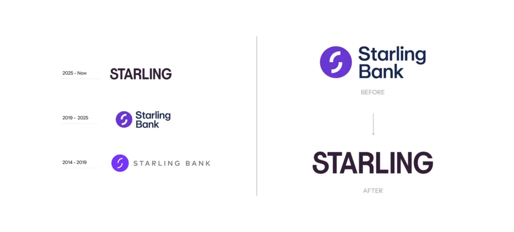
3. Starling Bank – Clarity as a Brand Strategy
Starling Bank’s brand positioning centres on one idea: banking that does not obscure itself. No hidden fees. No complex product architecture layered with introductory rates that expire quietly. No language is designed to obfuscate rather than explain.
Where Monzo pursued visual distinctiveness, Starling pursued operational transparency as its signature.
The Starling tone – direct, specific, unusually candid about the limits of its own product – built credibility with a segment of the UK market that had developed deep scepticism of traditional banking communications.
That scepticism was earned. Starling’s brand acknowledged it without making a fuss.

Starling won the Moneyfacts Best British Bank award four consecutive years running between 2018 and 2021. It achieved profitability faster than most UK challenger banks – a milestone its brand communications were candid about pursuing.
The brand never overpromised.
That discipline, sustained consistently through a period when many fintech brands were making claims they could not support, meant Starling’s credibility was compounded while competitors’ eroded.
For B2B professional services firms in financial services, the Starling model is instructive: clarity about what you do, who you do it for, and what you will not claim to be is a more durable brand asset than aspirational positioning.
An IFA or wealth manager whose client-facing communications are precise – this is what we do, these are our fees, these are the circumstances where we are not the right choice – is building brand equity every time a client reads a document.
A financial services brand built on specificity outperforms one built on aspiration. Aspirational claims are indistinguishable between competitors – every firm claims to put clients first. Specific, verifiable promises, held consistently over time, build the kind of brand equity that justifies premium fees and reduces client attrition. The discipline required is less creative than it is editorial: saying what is true, clearly, every time.
4. Rothschild & Co – Heritage as a Living Asset
Rothschild & Co’s brand challenge is the inverse of most financial services firms: not insufficient heritage, but too much. A name with over 200 years of history carries extraordinary equity – and extraordinary baggage.
Family banking dynasties are not uniformly viewed sympathetically in 2026, and the association with wealth concentration is, commercially speaking, not a simple asset to deploy.
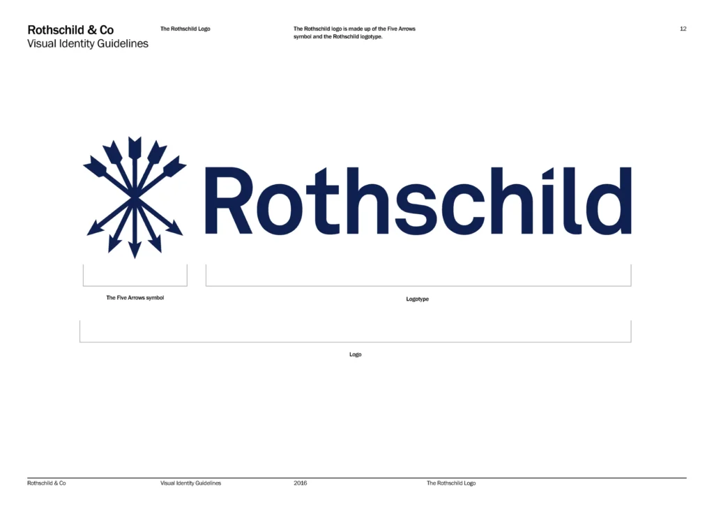
Rothschild’s brand response has been to make the heritage precise rather than vague. The firm does not trade on nostalgia or use the family name as a general status signal.
Its communications focus on specific expertise – independent financial advisory, particularly in M&A and restructuring – and on the firm’s structural independence from the major integrated investment banking houses.
That independence is positioned as a feature, not a footnote: no proprietary balance sheet, no conflicting lending relationships, no underwriting pressure.
The visual identity reflects this positioning: conservative enough to signal institutional weight, refined enough to signal contemporary relevance. The typography and layout are deliberate – this is not a mass-market institution, it is a specialist advisory firm with a clearly defined client in mind.

For UK professional services firms with established track records, Rothschild’s approach illustrates a principle that most misapply: heritage is not brand equity until it is connected to a specific, contemporary value proposition.
A twenty-year-old accountancy firm that markets itself on “decades of experience” is not using heritage as a brand asset. Rothschild connects its history to a specific, verifiable claim: independence and specialist expertise in complex transactions. The years become evidence for the claim, not the claim itself.
Heritage brands in financial services face a distinctive risk: they conflate longevity with positioning. The firms that extract genuine commercial value from their history connect that history to a specific, verifiable capability – not to the passing of time. Years in business are not a brand asset. Expertise built over years, applied to a defined client problem, documented with named outcomes, is.
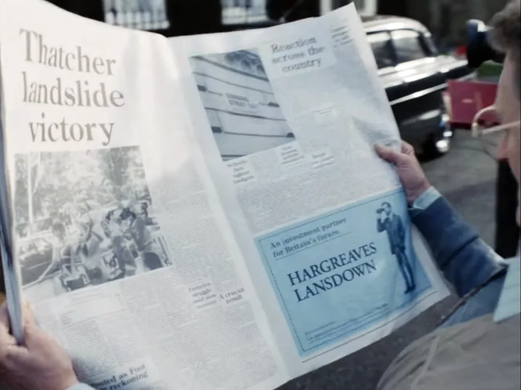
5. Hargreaves Lansdown – Accessibility as Differentiation
When Hargreaves Lansdown launched in 1981, investment platforms were structurally inaccessible to most UK retail investors. The product was complex, the minimum investment was prohibitive, and the language was – whether by design or habit – exclusionary.
Hargreaves Lansdown’s brand was built around dismantling these barriers: plain English communications, low minimum investments, and an approach designed for people who did not have a wealth manager and had never been expected to.

That positioning was genuinely ahead of its time. As the retail investment market democratised through the 2000s and 2010s, HL was already positioned as the trusted gateway for first-time entrants.
The brand’s visual identity has never been adventurous. The HL logo, green palette, and conservative layout are, in most respects, category-conventional. What the brand does exceptionally well is the writing.
HL’s investment commentary, market updates, and product explanations are written for a financially literate but non-expert audience. The voice is authoritative without being condescending. The content assumes the reader wants to understand – not simply to follow instructions.
This matters for professional financial services: brand is not only visual. An IFA or wealth manager whose client communications are clear, specific, and written for the reader rather than for compliance is building brand equity at every touchpoint.
HL built a market capitalisation exceeding £4.5 billion in part on the quality of its written brand, sustained consistently across three decades.
Brand equity in professional financial services accumulates in the spaces clients interact with most – statements, reports, email updates, and review documents. A distinctive visual identity is the starting point. The compounding asset is the quality of communication across every touchpoint where a client forms a judgement about whether the firm genuinely understands their situation.
6. Lemonade – Mission-Led Positioning in Insurtech
Lemonade’s brand premise rests on a structural critique of the insurance market: traditional insurance companies profit when they deny claims, creating a fundamental conflict of interest between insurer and insured.
Lemonade’s model – a flat fee taken upfront, unclaimed premiums directed to causes the policyholder nominates – is designed to remove that conflict structurally.

This is not a marketing claim. It is a business model. And Lemonade’s brand makes it legible in every interaction.
The visual identity is deliberately anti-institutional: pink and black, playful illustration, copywriting pitched to under-35s with no prior positive experience of an insurance brand.
According to Lemonade’s published documentation, the onboarding process takes minutes. Claims resolution uses AI to settle straightforward cases quickly. Every brand touchpoint reinforces the same message: this is structurally different from the insurance company you already distrust.
Lemonade went public in 2020 with a valuation exceeding $1.6 billion – the brand’s success in making a genuinely different business model legible was a material factor in that outcome.
The caveat for UK professional financial services firms is significant. The Lemonade model is built for consumer insurance, where switching costs are low, and the brand proposition can be tested in a single interaction.

For a wealth management firm serving HNW clients across relationships spanning decades, Lemonade’s aesthetic approach would actively undermine the trust signals clients require. The lesson is the underlying principle, not the execution: build your brand around a structural truth about your business. The way that truth is communicated depends entirely on your client.
Lemonade’s brand works because it makes a genuine structural difference from competitors’ legible – not a claimed one. The financial services firms that build durable, mission-led brands share one characteristic: their brand promises are independently verifiable. An unverifiable mission statement is marketing filler. A verifiable structural difference – in ownership, in fee model, in regulatory approach – is a brand asset. The former requires constant marketing effort to sustain—the latter compounds.
7. Wise – The Transparency Brand
Wise, formerly TransferWise, launched in 2011 on a single premise: international money transfers were expensive, opaque, and the opacity was deliberate. Banks charged exchange rate margins and fees structured to be invisible to customers who did not know what to look for.
TransferWise showed its working from day one. The brand published exactly what it charged, exactly what the mid-market exchange rate was, and exactly what the banks were charging in comparison. That radical transparency was not only a marketing strategy – it was the product itself. The brand and the service were inseparable.

The 2021 rebrand from TransferWise to Wise reflected a strategic expansion beyond transfers into a broader multi-currency financial platform. The new name simplified the positioning: this is a company built on financial transparency across its services, not a single product.
The name change attracted criticism – considerable brand equity in “TransferWise” was retired – but the strategic rationale held. The original name was limiting the brand’s ability to credibly extend into adjacent services.
Wise was listed on the London Stock Exchange in July 2021 at a valuation of £8.8 billion – one of the largest UK technology listings on record at that point. The brand’s transparency positioning was central to investor communications, not incidental.
Wise had built a business valuable enough to list publicly on the strength of a brand promise – honesty about what something costs – that most financial services firms treat as an afterthought.
For UK professional services firms, Wise illustrates the commercial value of radical honesty as a positioning strategy.
In a sector historically defined by opacity, firms that make their value proposition entirely legible – fee structures published before a client asks, service parameters stated clearly, the circumstances where the firm is not the right choice acknowledged plainly – acquire a trust advantage that no amount of rebrand investment can replicate.
Wise built its brand – and a multi-billion pound valuation – on a single refusal: the refusal to obscure what it charged. In a sector historically rewarded for opacity, that transparency was simultaneously the product and the positioning. Financial services firms that apply the same principle to their own fee structures and service architecture acquire a trust advantage that a competitor cannot simply outspend.
The Myth That Is Harming UK Financial Services Brands in 2026
Challenger Aesthetics Are Not the Gold Standard – They Are the Wrong Standard for Most of the Sector
Between 2015 and 2022, the financial services brand story was written almost entirely by challengers. Monzo, Starling, Revolut, Robinhood, Lemonade – disruptive aesthetics, bold colour, informal tone, mobile-first experience.
The financial media and brand press treated this as the template for modern financial services branding. It was genuinely good advice for consumer fintech targeting customers who wanted banking to get out of their way.
For B2B professional financial services in the UK – wealth managers, IFAs, boutique investment managers, corporate finance advisers – it was, and remains, actively damaging advice.
The reason is not aesthetic preference. It is signal theory. Consumer fintech targets clients whose primary emotional driver is convenience and low friction. Challenger aesthetics communicate “fast, modern, and not like the institutions that failed you.” That signal is appropriate for those clients.
Wealth management, investment advisory, and professional financial services target clients making consequential decisions with significant capital over long time horizons. Their primary emotional driver is not convenience – it is certainty.
The client needs to believe this firm is stable, expert, and trustworthy enough to manage something that materially affects their financial security.
A neon palette and casual copywriting communicate “fast and modern” to a client who needs to hear “careful and experienced.” The signal mismatch erodes trust before a conversation begins.
The abrdn rebrand of 2021 – when Standard Life Aberdeen removed the vowels from its name in an effort to modernise its brand – illustrates the failure mode in its purest form.
The rebrand attracted near-universal ridicule from the UK financial press, existing clients, and the broader market. The firm was signalling modernity to a client base for whom the signal was inappropriate. The brand renovation was, in commercial terms, a destruction of equity.
The replacement directive is specific: UK professional financial services firms should build on earned authority aesthetics. Refined typography. Restrained, considered colour. Specific, credentialed language.
Visual choices that signal experience rather than disruption. Not because creativity is off limits, but because the signal must match the client’s actual emotional need.
A wealth manager with HNW clients is not competing with Monzo. The clients are different. The decision horizon is different. The brand must reflect that difference.
The most expensive brand mistake a UK wealth manager or IFA can make in 2026 is building a brand to impress a peer group rather than a client group. Challenger aesthetics signal category disruption. Most professional financial services clients are not evaluating disruption – they are evaluating competence, stability, and whether this firm specifically understands their situation. The brand must answer that question directly, not the current trend in fintech design.
Financial Services Branding in 2026: What the Data Shows

The sector is navigating a period of genuine tension between improving trust scores and unresolved differentiation problems.
Trust in financial services globally reached 64% in 2025, according to Edelman’s Trust Barometer – a figure that represents continued recovery but still places the sector toward the lower end of the 17 industries measured.
The trust deficit is not evenly distributed. Edelman’s 2025 data highlights a 12-point gap in trust between low-income and high-income groups in financial services.
Brand strategy targeting affluent professional clients operates in a meaningfully different trust environment than mass-market retail. However, the gap still exists – and firms that cannot articulate their differentiation clearly carry higher trust costs into every new business conversation.
The 2025 ABA/Morning Consult survey found that 50% of US adults identified banks as the entity they trust most to protect them from fraud, far ahead of healthcare providers and fintech payment providers, both at 8%.
The same survey found that 89% of Americans with a bank account were satisfied with their primary bank, and 95% rated customer service as excellent, very good, or good.
This data reframes the brand challenge for 2026. In retail banking, trust is actually high. The problem is not rebuilding broken trust from zero – it is differentiating within a market where baseline satisfaction is broadly adequate.
Clients who are satisfied with their existing provider do not switch on trust alone. They switch when a compelling alternative makes a better, more specific case.
Four directions are now shaping financial services brand strategy across the UK:
Digital-first experience design. The brand is no longer primarily the logo and the brochure. It is the client portal, the onboarding flow, the automated reporting, and the mobile app. Firms whose digital experience contradicts their brand positioning create cognitive dissonance that erodes trust faster than any single marketing misstep. A wealth manager whose visual identity signals premium sophistication but whose client portal resembles mid-2000s internet banking has a brand alignment problem – not merely a technology one.
Transparency as competitive differentiation. Driven partly by MiFID II disclosure requirements, partly by Consumer Duty’s focus on demonstrable client outcomes, and partly by a generation of clients who arrived in the market expecting Wise-style honesty, transparency in fee structure, investment rationale, and performance reporting has moved from “aspirational good practice” to commercial table stakes for brand credibility.
AI-driven personalisation at scale. Firms are deploying AI to personalise client communications, reporting, and recommendations at a scale previously impossible. The brand challenge here is maintaining a human, expert voice across automated touchpoints. The firms doing this well treat AI personalisation as a channel for their brand, not a replacement for it.
Clearer client communication is a brand asset. Consumer Duty’s focus on demonstrable client outcomes is driving a quiet change in how UK firms write. Compliance language has historically been the enemy of brand building – mandatory disclosures, cautionary caveats, legal boilerplate no client reads. Firms treating clearer communication as a brand opportunity rather than a compliance obligation are building genuine differentiation against the peer group.
A 2025 report on financial services design noted that nearly 94% of a customer’s first impression of a financial brand is based on design, not content. If accurate, that figure underscores how much visual identity work commercial clients must do before a client reads a single word of copy.
For professional services firms whose brand communications lead with text – website, PDF proposal, credentials deck – the quality of the visual design is doing far more commercial work than most partners appreciate.
Building a UK Financial Brand
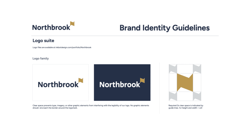
I worked with Northbrook at a point where the firm was, by any objective measure, excellent at what it did. The service quality was genuine. The expertise was there. The problem was that none of that was visible from the outside.
Their brand had the specific failure mode I see repeatedly with UK professional services firms: a visual identity that looked expensive in the wrong way. Formal to the point of feeling cold.
Corporate in the broadest sense – the kind of design that signals “we are a business” rather than “we are a business that understands your specific problem.” The logo, typography, and palette all communicated category membership. Not a competitive distinction.
The mistake was not spending too little on the brand. It was spent on the wrong brand.
The identity had all the expected components – proper logo, corporate stationery, a professional website – but generically assembled them.
In a trust-led sector, generic is more damaging than unconventional, because it gives the prospect no reason to prefer you. Generic says: We are one of many. Unconventional at least creates a reaction.
We repositioned Northbrook in a direction I call “Modern Classic”: refined rather than merely formal, warm rather than cold, and confident rather than defensive.
The typography stayed authoritative but became more considered. The palette moved from generic corporate to something more precise and distinctive. The language shifted from passive and hedged to direct and specific.
The outcome was immediate. Northbrook secured early-stage partnerships before its new website officially launched because its physical materials provided a different starting point for those conversations.
Partners arrived already prepared to engage with the firm as a credible, premium provider. The brand was qualifying prospects before the meeting started.
The directive is the same for every professional financial services firm: if your brand makes you look like everyone else in your peer group – and if you are honest with yourself about whether it does – it is costing you money.
Not abstractly. In converted pitches, in the fee level, and in the calibre of client you attract.
Brand Strategy Decision Points: Right vs Wrong
| Decision Point | The Wrong Way | The Right Way | Why It Matters |
| Visual identity reference point | Copy the category convention: navy, serif, handshake imagery | Define what makes your firm specifically distinct, then design to communicate that | Generic signals produce generic results – the prospect cannot distinguish you from three competitors on the same page |
| Brand voice for B2B advisory | Aspirational and vague: “We help clients achieve their goals” | Specific and credentialed: “We advise owner-managed businesses on M&A transactions between £5M–£50M” | Vague positioning requires every conversation to start from scratch |
| Fee communication | Bury the fee structure in documentation after client engagement begins | Publish fee structures clearly, before the client asks | Proactive transparency builds trust faster than explanation after the fact |
| Challenger aesthetic adoption | Apply fintech visual language – bold colour, casual tone – to wealth management | Match visual language to the client’s actual emotional need: certainty over modernity | Signal mismatch destroys credibility before a conversation begins |
| Heritage communication | “30 years of experience” as a standalone positioning claim | Connect heritage to specific, verifiable expertise applied to a defined client problem | Longevity is not positioning – expertise demonstrated over time, applied to specific outcomes, is |
| Digital brand touchpoints | Treat the client portal as a technology decision, not a brand one | Audit every digital interaction against the same brand standard as physical materials | Client perception is formed at every touchpoint, not only in marketing materials |
| Response to competitor rebrand | Match the competitor’s new aesthetic because “they must know something” | Build brand position from your client’s need, not your competitor’s latest decision | Following competitors reinforces category convergence – precisely the trap you are trying to escape |
The Verdict
The financial services firms in this piece – Monzo, Vanguard, Starling, Rothschild, Hargreaves Lansdown, Lemonade, and Wise – do not share a visual language, tone of voice, client type, or size.
They share one thing: each brand is built around a specific, verifiable truth about the business, communicated with enough discipline and consistency that clients grasp the positioning without explanation.
That is the standard. Not bold versus conventional. Not challenger versus heritage. Specific, honest, and coherent over time.
The sector’s compulsion toward safe visual choices does not produce safety. It produces invisibility. Invisible brands in professional financial services force a race to the bottom on fees that no firm wins comfortably – and that no amount of sales effort fully compensates for.
Every pitch your brand loses before you get to speak, every client who chose a competitor that “just felt more professional,” every fee discount you gave to close a hesitant prospect: those are the returns you are not collecting on brand equity you have not built.
The firms that understand this treat brand investment as commercial infrastructure. Not a marketing expense. Not a vanity exercise. A structural asset that determines what clients you attract, what fees you command, and what position you occupy when a prospect is making a decision and your firm’s name comes up.
If your brand currently looks like everyone else in your sector, the cost is running every day.
The Brand Equity Audit™ is a structured diagnostic that identifies exactly where your brand is losing commercial ground and what to do about it specifically.
Not a rebrand proposal. Not a creative pitch. A precise commercial diagnosis – built for partners at professional financial services firms who know the brand is not working as hard as the business deserves.
Frequently Asked Questions
What is financial services branding?
Financial services branding is the strategic application of visual identity, messaging, and market positioning to build client trust, differentiate a firm from competitors, and support premium fee positioning. It encompasses every touchpoint at which a client forms a judgement about the firm’s credibility, expertise, and suitability – from the first Google result to the final review document.
Why is branding more difficult in financial services than in other sectors?
Financial services firms operate under strict regulatory constraints on marketing communications, in a sector where trust is the primary purchase driver and where clients make consequential, long-term decisions with significant capital. Brand strategy must balance regulatory compliance, trust signal optimisation, and commercial differentiation simultaneously – a combination that most sector-generic brand advice fails to address adequately.
How does branding affect fee positioning in professional financial services?
A brand that communicates expertise, specialisation, and premium service clearly gives clients a framework for accepting premium fees. A brand indistinguishable from competitors forces the conversation to price, because there is no brand justification for the premium. Research from Brandspeak found that 37% of consumers prioritise reputation over features and price when selecting a financial provider, and reputation starts with brand perception.
Should UK wealth managers and IFAs follow the trend toward the challenger bank aesthetic?
For B2B professional financial services serving HNW or institutional clients, challenger aesthetics typically contradict the client’s actual emotional need, which is certainty and expertise, not modernity or disruption. Consumer fintech brands like Monzo serve a client with entirely different drivers. UK professional services firms should build brand on earned authority signals – refined, specific, credentialed – not on category disruption.
What is the difference between a brand identity and a brand strategy?
A brand identity is the visual and verbal expression of a firm: logo, typography, colour, tone of voice. A brand strategy is the commercial framework that determines what the firm stands for, who it serves, and how it communicates its distinct position. Identity without strategy produces aesthetically coherent but commercially directionless brands. Strategy without identity exists only in documents, not in the market.
How long does it take to build meaningful brand equity in financial services?
Brand equity in professional financial services builds over three to five years of consistent, coherent communication – faster for firms with genuinely distinctive market positions, slower for those building from category-conventional foundations. Inconsistency – visual, verbal, or experiential – effectively resets the accumulation. Firms that rebrand every 2 to 3 years without a clear strategic rationale accumulate virtually no equity.
What role does regulation play in financial services brand strategy?
FCA financial promotions rules, Consumer Duty requirements, and MiFID II disclosure obligations constrain what firms can claim and how they can make those claims. These constraints are not incompatible with strong brand building – they demand greater precision. Consumer Duty’s focus on demonstrable client outcomes is, for firms that embrace it rather than merely comply, an opportunity to build a transparency-led brand positioning that distinguishes them from competitors who merely meet compliance minimums.
Is a rebrand ever the right answer for a professional financial services firm?
A rebrand is the right answer when a firm’s existing brand actively misrepresents its current positioning, client type, or capability level – or when the visual identity has become so generic that it is failing to differentiate in competitive situations. A rebrand is the wrong answer when deployed to address a business development problem rooted in service delivery, pricing, or targeting rather than brand. The diagnostic question is: are we losing pitches because of the brand, or despite it?
How should a financial services firm measure brand equity?
Practical measurement for professional services firms includes: unprompted awareness in the target client segment, brand recall among referred prospects before first contact, win rate in competitive pitches, average fee achieved relative to peer group, and client retention rate. Share of Search – branded search volume as a proportion of category search – is an increasingly useful proxy for brand presence, particularly as AI-assisted search grows in relevance for professional services discovery.
What makes Monzo’s brand successful, and is it applicable to B2B financial services?
Monzo’s brand succeeded by making a precise positioning – banking for people who want transparency and modern UX – visible and legible at a glance. The principle applies to B2B: make your specific positioning visible and legible without explanation. The execution for a professional services firm must reflect different client requirements, specifically the trust and credibility signals that HNW or institutional prospects use to qualify a firm before they agree to a first meeting.
When should a financial services firm prioritise brand over direct marketing?
Brand investment compounds over time; direct marketing generates immediate returns but minimal lasting equity. Professional financial services firms with long client relationships and high average transaction values should weigh brand heavily, because the quality of clients attracted, the ease of conversion, and the fee level achieved are all brand-dependent. Even firms reliant on transactional volume benefit from brand equity: client-acquisition costs decline as brand recognition grows.
What does “earned authority” mean in financial services brand strategy?
Earned authority is brand positioning built on demonstrable expertise, verifiable track record, and credentialed communication – as distinct from challenger positioning (disruption) or aspirational positioning (vague claims of client transformation). For UK professional financial services, earned authority signals align with what HNW and institutional clients are actually evaluating: can this firm be trusted with a consequential decision? Brands built on earned authority answer that question before the conversation begins.
