Estée Lauder Logo Design: Elevate Your Brand’s Elegance
Ever stood in front of a beauty counter, mesmerised by the sheer opulence of those little golden jars and bottles? 💄✨
I have. And let me tell you, it’s not just the promise of youthful skin that’s got you reaching for your wallet. It’s the power of branding, my friend.
Now, I’m not here to sell you overpriced face cream. But as someone who’s built a branding agency from the ground up (hello, Inkbot Design!), I can’t help but marvel at the masterclass in logo design that is Estée Lauder.
You see, back when I was just starting, I made the classic newbie mistake of thinking a logo was just… well, a pretty picture. Oh, how wrong I was. 🤦♂️
It wasn’t until I dug into the giants of the industry that I realised a genuinely great logo is a silent ambassador for your brand. It’s working overtime, even when you’re fast asleep.
And few do it better than Estée Lauder.
We’re about to dive deep into the world of luxury beauty branding. By the end of this post, you’ll see logos in a new light – and maybe, just maybe, you’ll be inspired to give your brand the glow-up it deserves.
Let’s get started, shall we?
🔰 TL;DR: Estée Lauder’s logo embodies timeless elegance and brand recognition. This post dissects its design elements, evolution, and impact on the beauty industry. We’ll explore how to apply these principles to your brand, regardless of size or budget. Spoiler: It’s not about copying but understanding what makes a logo resonate.
| Attribute | Details |
| Founded | 1946 |
| Founder | Estée Lauder and Joseph Lauder |
| Headquarters | 767 Fifth Avenue, New York, NY, USA |
| Estimated Value | Approximately $16 billion (2023) |
| Industry | Cosmetics and Beauty |
| Key Products | Makeup, Skincare, Fragrance, Hair Care |
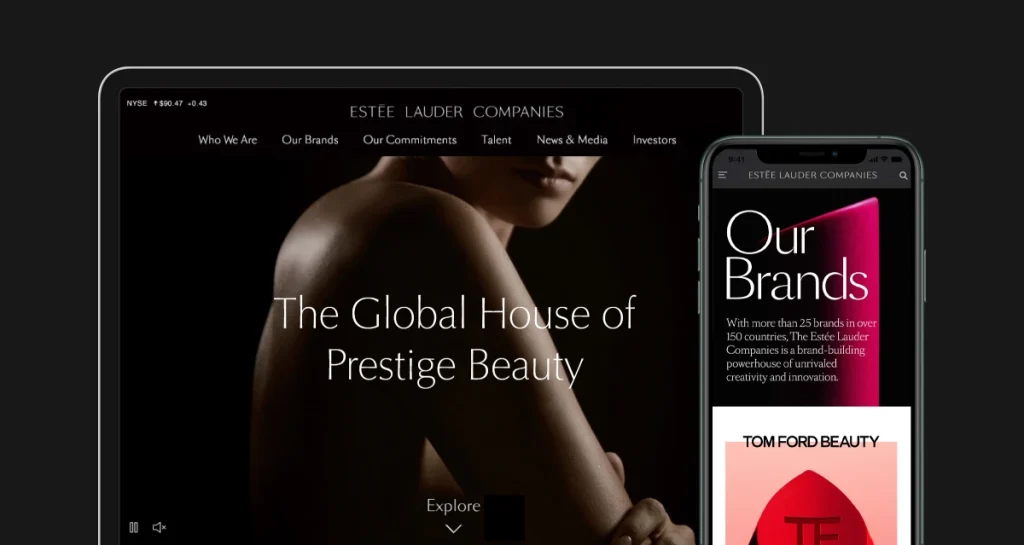
| Major Brands | Estée Lauder, Clinique, MAC, La Mer, Jo Malone |
| Global Reach | Operates in over 150 countries |
| Employees | Approximately 62,000 |
| Public Listing | NYSE: EL |
- Estée Lauder's logo exemplifies timeless elegance, enhancing brand recognition and resonating with consumers globally.
- The logo's simplicity and consistency build trust and loyalty, essential for luxury branding.
- Investing in professional design shapes effective branding, reflecting a brand's values and storytelling.
The Birth of a Beauty Empire
Before we dissect the logo, let’s set the stage. After all, context is everything in branding.
The Estée Lauder Story: More Than Just a Pretty Face
Estée Lauder wasn’t born into luxury. Far from it. Josephine Esther Mentzer was born in Corona, Queens, and was the daughter of Hungarian Jewish immigrants. Not exactly the pedigree you’d expect from a beauty mogul, right?
But here’s the kicker: Estée had something more valuable than a silver spoon. She had hustle.
She began selling creams to beauty salons and beach clubs, starting with her uncle’s skincare formulas. Her secret weapon? The personal touch. Estée believed in the power of direct contact with customers, often giving free demonstrations and samples.
“I have never worked a day in my life without selling. If I believe in something, I sell it, and I sell it hard.”
Estée Lauder
This philosophy? It didn’t just build a company. It built an empire.
The Brand’s Evolution: From Kitchen Table to Global Powerhouse
1946: Estée Lauder, the company, was officially born. The logo? Simple text. Nothing fancy.
1960s: The brand explodes in popularity. Department stores can’t get enough.
1970s: Estée Lauder goes international. The logo starts to take on more importance.
1990s-2000s: Acquisitions galore. The company gobbles up brands like MAC, Bobbi Brown, and Jo Malone.
Today: A multi-billion dollar conglomerate with a portfolio of prestige brands.
But here’s the thing: one thing remained constant through all this growth and all these changes. The logo.
Well, it’s mostly constant. But we’ll get to that.
Deconstructing the Estée Lauder Logo
Right, let’s roll up our sleeves and get into the nitty-gritty. What makes the Estée Lauder logo tick?
The Typography: Elegance in Every Curve
The Estée Lauder logo uses Optima. Now, I know what you’re thinking. “Serif? Isn’t that a bit… old-fashioned?”
Hold your horses there, champ. In the world of luxury branding, serifs aren’t old. It’s timeless.
The serifs here are delicate, almost imperceptible at smaller sizes. They add a touch of refinement without screaming, “I’M FANCY!” (Trust me, no one likes a logo that shouts.)
The ‘E’ in Estée is exciting. It’s slightly larger than the other letters, with a more pronounced curve. It’s like the logo equivalent of a perfectly arched eyebrow. It is subtle but oh-so effective.
The Colour Palette: Gold Standard
Estée Lauder’s primary logo colour? Gold. Surprised? You shouldn’t be.
Gold has been associated with luxury and prestige since, well, forever. It’s the colour of wealth, of achievement, of precious things.
But here’s where Estée Lauder gets clever. They don’t just slap a gaudy gold on everything and call it a day. No, their gold is subdued, almost understated. It whispers luxury rather than shouting it.
And when they’re not using gold? Black. Classic, timeless, goes-with-everything black.
The Overall Design: Simplicity is the Ultimate Sophistication
Here’s where I see a lot of budding brands go wrong. They try to cram their entire company history, mission statement, and great-aunt Mildred’s cookie recipe into their logo.
Estée Lauder? They keep it simple.
There are no fancy symbols. No intricate designs. Just the name in that beautifully crafted typeface.
It’s a masterclass in the “less is more” philosophy. And let me tell you, in a world of sensory overload, a clean, simple logo stands out like a perfectly applied red lip.
The Evolution of the Estée Lauder Logo
Now, you might be thinking, “Wait a minute. You just spent all this time telling us how perfect the logo is. Are you saying they changed it?”
Well, yes and no. Let’s take a little trip down memory lane, shall we?
The Early Days: Keeping It Simple
When Estée Lauder first started, the logo was… well, just the name. It’s simple text, nothing fancy. But even then, you could see the seeds of what it would become.
The focus was always on the name. After all, Estée Lauder wasn’t just the company name – it was a person—a real, living, breathing embodiment of the brand.
The Refinement: Subtle Changes, Big Impact
Over the years, the logo has undergone some tweaks. But blink, and you might miss them.
The most noticeable change? The introduction of that custom typeface we talked about earlier. It gave the logo a more polished, sophisticated look.
They also played around with the spacing between letters (kerning, for you, design nerds out there). It might seem minor, but good kerning can distinguish between a professional logo and one that looks like it was thrown together in MS Paint.
The Modern Era: Consistency is Key
In recent years, Estée Lauder has doubled down on consistency. Whether you see the logo on a tiny lipstick tube or a massive billboard, it’s instantly recognisable.
They’ve also introduced some variations. There’s the primary logo (the complete “Estée Lauder” in gold or black), but you’ll also see just “Estée” used in some applications.
It’s a smart move. It keeps the brand fresh and adaptable without losing that core identity.
The Impact of the Logo on Estée Lauder’s Brand Identity
All right, let’s get real for a second. A logo is more than just a pretty picture. It’s the face of your brand. And in Estée Lauder’s case, it’s a face that’s aged like fine wine.
Recognition and Recall: The Power of Consistency
How can you spot a McDonald’s from a mile away? That’s the power of consistent branding. Estée Lauder has achieved the same thing in the beauty world.
That elegant script is instantly recognisable, whether in gold on a navy background or embossed on a cream compact. It’s like a secret handshake for the beauty-obsessed.
And here’s the kicker: according to a 2024 study by Statista, Estée Lauder’s brand value increased by 15% last year, reaching $5.4 billion. Coincidence? I think not.
Positioning in the Market: Luxury You Can Touch
The Estée Lauder logo doesn’t just say “beauty”. It screams “luxury beauty”.
Think about it. When you see that golden script, you’re not thinking about picking up a quick lipstick at the drugstore. You’re thinking about treating yourself. You’re thinking about investment pieces for your beauty routine.
It’s aspirational. It’s something to save up for, to look forward to.
And in a market saturated with beauty brands, that positioning is gold. (Pun intended.)
Brand Extension: A Logo That Plays Well With Others
Here’s where Estée Lauder shows its branding chops. Remember how I mentioned they’ve acquired a ton of other brands?
Their logo is strong enough to stand independently but flexible enough to play nice with others. Whether paired with the edgy styling of MAC or the minimalist chic of Bobbi Brown, the Estée Lauder logo holds its own.
It’s like the cool kid in school who can hang with any clique. Impressive, right?
Lessons for Your Brand: It’s Not About Copying, It’s About Understanding
I can almost hear you thinking, “That’s great, but I’m not running a multi-billion dollar beauty empire. How does this apply to me?”
I’m glad you asked. Let’s break it down.
Simplicity is Your Friend
Remember how we talked about the Estée Lauder logo being essentially just text? There’s a lesson there.
You don’t need a complex symbol or intricate design to make an impact. Sometimes, the most straightforward logos are the most effective.
When I started Inkbot Design, I was tempted to go all out with a fancy logo. But you know what? A clean, simple wordmark has served us just fine. It’s versatile, easy to reproduce, and looks good at any size.
Consistency is Key
Estée Lauder didn’t change their logo every other Tuesday. They stuck with a core design and refined it over time.
Consistency builds recognition. Recognition builds trust. Trust builds loyalty.
So before you rebrand every time the mood strikes, think about the long game. What elements of your brand can you commit to for the long haul?
Your Logo Should Tell Your Story
Estée Lauder’s logo, with its elegant script, tells a story of luxury and sophistication. What story does your logo tell?
Maybe you’re all about innovation – could your logo incorporate elements that suggest forward movement or technology?
Or is your brand all about sustainability? Could you use natural, organic shapes or colours?
Your logo should be a visual shorthand for your brand’s core values and personality.
It’s Not Just About Looking Pretty
Yes, aesthetics matter. But a truly great logo goes beyond just looking nice.
Think about functionality. Will your logo work in different sizes, from a tiny favicon to a massive billboard? Will it look good in black and white as well as in colour?
And most importantly, does it resonate with your target audience?
Invest in Professional Design
Look, I get it. When you’re just starting, it’s tempting to whip up a logo in Canva and call it a day. But if there’s one thing the Estée Lauder story teaches us, investing in your brand pays off in the long run.
A professional designer (ahem, like those of us at Inkbot Design) can help you create a logo that’s not just pretty but strategic. One that will grow with your brand and stand the test of time.
The Future of Logo Design: Lessons from Estée Lauder
As we wrap up our deep dive into the Estée Lauder logo, let’s take a moment to look forward. What can this iconic design teach us about the future of branding?
Adaptability is Everything
Adaptability is key in a world where your logo needs to look good on everything from a smartwatch to a billboard. Estée Lauder’s simple yet elegant design works across all platforms.
The lesson? Think beyond the business card. How will your logo look on a YouTube thumbnail? As an app icon? As an AR filter?
Timelessness Trumps Trends
Sure, it’s tempting to jump on the latest design trend. But Estée Lauder’s longevity proves that a classic design can outlast any fad.
That doesn’t mean your logo can’t be modern. But aim for a modern classic, not a modern flash-in-the-pan.
Brand Experience Matters
In 2025, a logo isn’t just a static image. It’s part of a broader brand experience. How does your logo animate? How does it interact with other elements of your brand identity?
Estée Lauder has mastered this, creating a cohesive brand experience across all touchpoints. Your logo should be the starting point of a broader visual language for your brand.
Wrapping Up: The Estée Lauder Logo Legacy
So, there you have it—a deep dive into one of the most iconic logos in the beauty industry. But more than that, it is a masterclass in branding that transcends industry boundaries.
The Estée Lauder logo isn’t just about looking pretty (though it certainly does that). It’s about embodying the values of a brand. It’s about creating recognition and trust. It’s about standing the test of time.
As you think about your brand, remember that your logo is more than just a design. It’s the face of your company. It’s the first impression you make on potential customers. It’s a promise of what they can expect from you.
So, take a page out of Estée Lauder’s book. Keep it simple. Keep it consistent. Make it meaningful. And above all, make it uniquely yours.
Be day, that’s what great branding is all about. It is not copying the giants but learning from them to create something authentically and unmistakably you.
Ready to give your brand the Estée Lauder treatment? Maybe it’s time to talk to a professional. After all, your brand deserves nothing but the best.
And hey, if you’re looking for a team to help you create a logo that stands the test of time (without the Estée Lauder price tag), why not drop us a line at Inkbot Design? We might not be able to make you look 20 years younger, but we can certainly make your brand look like a million bucks.
Remember, in branding, you’re not just creating a logo. You’re building a legacy. Make it count.
FAQs
Why is the Estée Lauder logo so simple?
The simplicity of the logo allows for versatility and timeless appeal. It’s easily recognisable and can be applied across various mediums without losing its impact.
Has the Estée Lauder logo ever changed?
While the core design has remained consistent, the logo has undergone subtle refinements over the years, particularly in its typography and spacing.
Why does Estée Lauder use gold in its logo?
Gold represents luxury, prestige, and sophistication – all values that align with the Estée Lauder brand identity.
Can I use a similar font for my logo?
While you can draw inspiration from Estée Lauder’s typography, it’s best to create a unique identity for your brand. Consider working with a professional designer to develop a custom typeface.
How important is a logo for a beauty brand?
A logo is crucial for any brand, particularly in the beauty industry, where visual appeal and brand recognition play significant roles in consumer choice.
Does Estée Lauder use different versions of its logo?
Yes, Estée Lauder has variations of its logo, including a version that only uses “Estée”. This flexibility allows for adaptability across different applications.
How does the Estée Lauder logo compare to other luxury beauty brands?
Like many luxury brands, Estée Lauder opts for a simple, elegant design. However, its script-style font sets it apart from more minimalist competitors.
Can a small business learn from Estée Lauder’s branding?
Absolutely! The principles of simplicity, consistency, and brand storytelling apply to businesses of all sizes.
How often should a company update its logo?
There’s no set rule, but major rebrands typically occur every 7-10 years. However, subtle refinements can be made more frequently if needed.


