The Top 10 Esports Logos: Competitive Branding
When you see the Nike ‘Swoosh,’ you don’t just see a shoe—you feel an entire philosophy of performance. In the high-stakes arena of esports, team logos carry that same weight. They aren’t just graphics; they are the digital flags under which millions of fans rally.
In 2026, an elite esports logo is a masterclass in versatility. Whether it’s pinned as a tiny social avatar, embroidered on a premium streetwear jersey, or pulsing on a 4K broadcast, it has to remain undeniable. We’re moving past the era of ‘just another mascot’ and into the era of the Lifestyle Icon.
Whether you’re a veteran fan or a brand leader looking to enter the space, understanding the architecture of these symbols is key to grasping the industry’s massive ROI. Let’s break down the designs that are currently defining the game.
- Versatility: 2026 esports logos must read at tiny sizes and work across social avatars, merchandise, and 4K broadcasts.
- Monogram Focus: Successful brands use simple, recognisable monograms that pass the Shrink Test at 16x16 pixels.
- Narrative Silhouette: Outlines and negative space tell stories and hide "Easter eggs" that deepen fan connection.
- Responsive Palette: Two hero colours plus a high-contrast neutral, designed with Dark Mode as the default.
- Lifestyle Pivot: Minimalist, streetwear-friendly marks boost merchandise sales and attract premium sponsorships.
The Anatomy of a 2026 Esports Brand: Beyond the Mascot
In 2026, a logo is no longer just a “cool drawing” of a predator; it is a multi-platform identity system.
The shift from aggressive mascots to lifestyle monograms has been driven by the need for apparel that fans actually want to wear in their daily lives, not just at a tournament.
When we look at the anatomy of a modern mark, three components are non-negotiable.
1. The Core Monogram
The most successful brands of this decade—think G2 Esports or Astralis—rely on a central monogram. This is a simplified, typographic mark that survives the “Shrink Test.” If you cannot identify the brand at 16×16 pixels on a mobile notification, the design has failed. The geometry often uses Golden Ratio principles to ensure balance, making the mark feel “correct” to the human eye even if the viewer isn’t a designer.
2. The Narrative Silhouette
Every logo must tell a story through its outline. For Team Liquid, the horse isn’t just an animal; it’s a silhouette of speed and heritage. In 2026, designers use Negative Space to hide “Easter eggs” for the community—like the hidden ‘Z’ in the FaZe Clan emblem. This builds a deeper connection with the fanbase, turning a graphic into a riddle they’ve already solved.
3. The Responsive Palette
Gone are the days of five-colour gradients that turn into a muddy mess on a jersey. The modern palette is restricted to two primary “hero” colours and a high-contrast neutral. We now design with Dark Mode as the default. If your logo relies on a white background to “pop,” it is effectively invisible on 90% of modern gaming UIs and broadcast overlays.
Pro Tip: When commissioning a brand, ask for a “Social-First” variant. This is a version specifically designed to fit perfectly inside the circular crop of platforms like X (formerly Twitter) or Discord without losing the edges of the design.
The Best Esports Logos (Ranked)
10. FaZe Clan
Starting our countdown at number ten is the blazing logo of a notable esports organisation named FaZe Clan. This iconic design was created in 2010 but still looks incredibly modern and relaxed after over a decade.
Sharp angles and a fiery hue make the flaming red “F” letter hard to miss. However, on closer inspection, one may notice a “Z” monogram hidden within the negative space of this symbol. Such an element adds intricacy to the overall look without drawing too much attention.
FaZe began in 2010 as a Call of Duty sniping crew on YouTube, then exploded into a full esports and creator brand. The emblem unites an F and a Z into a single angular monogram, so the silhouette stays fierce at any size. Red, black, and white remain the core palette across kits and apparel.
Regarding pure graphic design aesthetics, few things can beat the FaZe logo’s visual impact, combined with its simplicity achieved through negative space. It manages to be both fierce-looking and inviting – quite an achievement indeed.
What sets this brand apart is how well its visual identity reflects its dynamic, youth-driven culture, centred on pushing boundaries through gaming. You could almost hear it shouting, “Let’s get wild!” just by looking at those glowing embers.
9. SK Gaming
For the #9 spot, I’m giving props to the iconic SK Gaming winged logo. This is a long-standing classic in the esports scene, dating back to 1997 when these guys were gaming pioneers.
SK Gaming started in Germany in 1997 as “Schroet Kommando,” which explains the SK initials that stuck for decades. The clean monogram became a constant while rosters and titles rotated. That consistency is why the mark reads fast on badges, streams, and social.
The SK design is elegant and understated compared to some showier logos on this list—a simple white text treatment on a black background. But whoa, those winged flourishes on each side ultimately elevate this thing!
The wings add so much dramatic flair and energy to the letters. The wings are ushering in a new era of esports…and it also makes me think of Red Bull for some reason. That may be why this brand looks so intense and powerful.
Either way, the SK Gaming winged logo has stood the test of time as a clean, confident emblem representing one of the oldest multigame esports teams. Long Live the wings!
8. Natus Vincere (Na’Vi)
Weighing in at #8, we’ve got the menacing logo for Ukrainian esports juggernaut Natus Vincere – or just Na’Vi for short. This beast of a design looks like it was forged from pure flames and brimstone down in the pits of esports hell itself.
“Natus Vincere” translates from Latin to “Born to Win,” and the squad’s roots are Ukrainian. Yellow and black have been the calling card through several lockups and refreshes. Even stripped to a single spot colour, the Na’Vi identity still bites.
The Na’Vi logo shreds, with those gnarly shapes creating an intense, almost tribal vibe. I see hints of savage animals and maybe an alien monster face in the abstract letterforms. Either way, the deep black and burning yellow/orange scheme is downright ferocious.
From an artistic perspective, huge props to the designer for creating so much dynamic energy and movement out of just basic shapes and colours. It fits with Na’Vi’s reputation as a relentless esports force that shows no mercy to opponents.
Fair warning, though – you might need to shield your eyes when this logo flashes across the screen during a tournament. The sheer intensity of those fiery designs could potentially burn your retinas into smithereens. But it’d be so worth it.
7. Team Liquid
Okay, let’s cool down with the #7 entry – the mesmerising horse-inspired logo from legendary Team Liquid. This unique emblem perfectly combines ferocity, grace, and slick graphic design.
Team Liquid’s crest frames a stylised horse head inside a shield, a smart nod to heritage and speed. Navy and white variants dominate kits, with clear separation against broadcast blues. That disciplined palette means the mark pops on both light and dark feeds.
The concept of a striking horse figurine immediately conveys power, athleticism and, well…liquidity. It aptly represents one of the most accomplished esports pro teams, flowing between games like a raging river.
But the best part is how designers updated the classic horse logo with those hypnotic gradient waves and colours. The deep blues flow into the rich pinks and purples in an almost psychedelic manner. It’s like this beast has evaporated into pure liquid form.
I also love the minimalism and balance at play here. Despite the trippy colour shifts and abstract splashes, there’s still a clear focus on that core horse icon at the centre. Emblematic of Team Liquid’s precise, strategic mindset amidst the chaos of esports warfare.
6. OpTic Gaming
Powering in at #6, we’ve got the slick, jagged logo from OpTic Gaming. This bad boy screams pure speed and aggression from the moment it blasts onto the screen. You can sense it wants to dominate the entire battlefield completely.
Founded in 2006, OpTic’s identity is welded to “The GreenWall,” the fanbase that paints arenas neon. The intertwined O and G carry a radioactive green that lifts off black backdrops. Even in one-colour white, the silhouette still reads as pure OpTic attitude.
Right off the bat, those blazing green streaks feel like brilliant shards of radioactive energy piercing forward. The vibrant neon tone is a power move – instantly searing itself into your eyeballs and memory.
Then you’ve got the custom “OG” letterforms, which create another layer of jagged edges and shapes. The overlapping outlines add wicked depth and intensity. Overall, it feels rugged and masculine enough to fit the OpTic brand persona.
Speaking of which, it’s crazy how this abstract design still clearly evokes the scope optics and flaming muzzles of military weaponry…you know, for all your gaming warfare purposes. The negative spaces leave just enough to the imagination, too.
So, in summary, the OpTic Gaming logo is the Incredible Hulk of esports symbols – muscular, glowing with radioactive energy, and ready to smash everything in its path. You’ve been warned.
5. G2 Esports
Let’s pause momentarily with the #5 pick to appreciate the stylish simplicity of G2 Esports’ emblem. This minimalist gem practically oozes Euro swagger and eSports “cool factor” from every angle.
I’m talking about buttery smooth curves and letter shapes. That sleek sans-serif font choice. A monochromatic black-and-white colour scheme that never goes out of style. It all comes together in a clean, unfussy way that feels modern and timelessly vintage.
It is impressive how the G2 logo says SO much with such little visual information. Those tight letter counters create a lowkey arrowhead shape, suggesting precision and power. And that subtle sideways angle gives it a nonchalant, kicked-back edginess.
At the same time, there’s a surprising amount of dimensionality for such a flat, typographic design. The unique letter outlines have an almost robotic or mechanical quality that hints at gaming’s digital roots.
However, the G2 emblem is highly versatile for merchandising and looks sexy printed on anything. Esports has evolved into a high-fashion phenomenon, and this sophisticated logo reflects that stylish transition.
4. Cloud9
Get ready for inter-dimensional mind-warping with Cloud9’s iconic logo at #4! This far-out design bombards your senses with abstract shapes and ethereal blue colouring that beckons you into…the clouds?
Upon first glance, this emblem is a tangled mess of intersecting lines and forms. But let your eyes soak it in, and you’ll start detecting images within images – like some sort of cosmic Rorschach test.
The negative spaces create a striking symbol that depicts a snarling beast’s side profile…AND the numeral nine swirling through misty cloud layers. Mind = blown, right?
The Cloud9 logo embodies the team’s “blueshifting” mantra of limitless possibility. It twists your perceptions as you try deciphering the hidden meanings contained in those seemingly chaotic azure streaks.
And let’s talk about that colour for a second. The glowing, almost fluorescent blue tone is borderline supernatural – like a portal swirling open into another dimension of raw competitive energy. It’s simultaneously bold yet calming, much like the team’s playstyle.
So, while it may appear convoluted, Cloud9’s wildly inventive emblem is a masterclass in compact visual storytelling. It’s the sign you’ve entered a higher metaphysical plane of esports, far beyond the normal realms of existence.
3. FunPlus Phoenix (FPX)
Emerging from the scorching fires, our #3 pick goes to FunPlus Phoenix’s majestic bird of paradise logo. This exotic creature is equal parts elegant and ferocious – a combo as unique as the FPX brand itself.
Let’s start with the obvious: does this falcon/phoenix figure look highly detailed? The textured feather layers and patterns are intricate, creating wicked depth and shading. It appears ready to burst forth from a towering blaze in radiant high-def.
But beyond the photorealistic stylings, you’ve got to appreciate the sheer triumphant presence of this mighty bird stretching its wings. The FPX emblem evokes the image of an undaunted mythological force rising from the ashes, more glorious than before. Talk about an excellent metaphor for the competitive fighting spirit!
Speaking of fighting, notice how the bird’s intense eyes, beak, and talons are slightly angled to the side – giving it a sense of forward momentum and aggression. Yet the overall posture is one of regal glory and confidence.
So, in one compact icon, the FunPlus Phoenix deftly captures opposing themes of beauty/danger, rebirth/victory, and ancient lore/modern gaming. It’s the type of awe-inspiring logo you’d expect adorning castle gates or megachurch stained glass. Esports has truly become an art form.
2. Fnatic

Climbing up to the #2 spot, we’ve got the sinister logo from esports titans Fnatic. This Vector-inspired hellscape is a masterwork of brutal, graphic design – merging the ancient with the modern in one apocalyptic punch.
Let’s start with that savage “F” letterform. The angular, forceful strokes immediately put you in a fighting mind. But there’s also an unmistakable medieval flare like the mark of some demonic blacksmith cult is branding you.
Now, focus on that snarling monster face ingrained in the negative space behind the letter. That’s one pissed-off ancient creature staring back at you! Glowing yellow eyes, vicious fangs, and horns of fury – this thing is the real deal.
You have a gnarly dichotomy between the raw letterform and monstrous iconography that raises many epic questions. Is the “F” controlling the beast or becoming the beast itself? Is this a holy symbol from the future or an unholy insignia dredged up from medieval hell?
And that’s precisely why I love the Fnatic logo so damn much. It blends hyper-modern gaming fearlessness with ferocious mystical lore. You can practically smell the fire, brimstone, and shards of broken keyboards every time it flashes on screen.
1. TSM (Original/Classic)
After an insane battle across multiple dimensions, there can only be one logo ruling them all: the original, iconic, and undefeated crest representing the legendary TSM brand!
I’m talking about the classic Team SoloMid badge from back in the day – not their current design. This OG emblem was ingrained into our eyeballs as one of the first truly iconic symbols of competitive esports glory.
Let’s start with the raw craftsmanship and artistry behind the image. That brilliant, almost neon red and black colour scheme perfectly balances aggressiveness and sophistication. The illustrative details of the warlord character and the dramatic crossguard swords demonstrate accurate painterly skills.
And let’s not overlook how those two letters, “TSM”, are ingeniously woven into the negative spaces between the swords and warlord silhouette. It’s an optical illusion that only reveals itself after studying the shapes – a clever nod to the strategic esports mindset.
More than any other logo, though, TSM’s original crest masterfully captured the raw emotion and intensity surrounding early competitive gaming. The dramatic imagery channelled those adrenaline-fueled battles and the glory of being crowned a true esports champion.
So, while many incredible logos have emerged over the years, none will quite replicate that iconic trailblazing spirit of the classic TSM design. It was the first rallying sign heralding esports’s arrival as the next extraordinary cultural phenomenon.
The Business of Branding: ROI and the Lifestyle Pivot
Why does an organisation like 100 Thieves spend six figures on brand development? Because in 2026, esports is a fashion and media industry as much as a competitive one. The ROI of a logo is measured in Merchandise Conversion Rates.
The “Jersey to Streetwear” Pipeline
If a logo looks too much like a “gamer” graphic—full of jagged lightning bolts and aggressive eyes—it fails as a lifestyle product. Fans in 2026 are hesitant to wear “loud” gaming gear in a café or at a university. However, a minimalist mark like the Fnatic “F” or the G2 mask fits seamlessly into a streetwear aesthetic.
We’ve seen that teams who pivot to a “Minimalist-First” identity see an average increase of 25–40% in non-event apparel sales. The logo becomes a badge of belonging that transcends the game itself. It’s the difference between a “gaming shirt” and a “designer piece.”
Sponsorship Integration
A clean, well-architected logo also makes you more “sponsor-friendly.” Global brands like Nike, BMW, and Red Bull prefer to sit alongside professional, balanced marks. A cluttered, amateurish logo can actually lower the perceived value of a sponsorship slot, making the entire jersey look “busy” and less premium.
When Team SoloMid (TSM) simplified their original crest, it wasn’t just for looks—it was to create a more versatile asset for multi-million-pound partnerships.
Other Notable eSports Logos
Virtus Pro
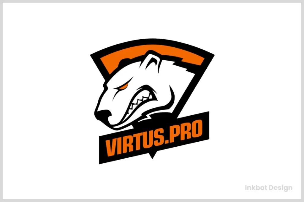
Virtus Pro’s logo cleverly uses animal symbolism, featuring a fierce polar bear that captures the essence of strength and resilience. This choice is significant in e-gaming logos, where animals often symbolise team traits. The polar bear’s expression of anger or intensity embodies the aggressive and competitive spirit crucial in the gaming arena.
In terms of colour, the logo incorporates a striking orange hue. This unconventional choice stands out in the e-gaming industry, where more standard colours like blue or red often dominate.
Orange is energetic and vibrant, effectively aligning with the dynamic competitive gaming environment and evoking associations with enthusiasm and determination. This combination of unique elements helps to set the team apart and resonate with audiences, enhancing brand identity and recognition.
Evil Geniuses
Evil Geniuses’ logo exemplifies the power of simplicity in design. The logo achieves a clean and memorable impact by focusing on a single, streamlined symbol. This simplicity lets viewers quickly recognise and remember the brand, enhancing its presence in a crowded market.
Key elements of its design include:
- Unified Letters: The logo cleverly merges two distinct letters into one cohesive design. This integration simplifies the logo and enhances its aesthetic appeal, making it eye-catching and easy to interpret.
- Balanced Design: The parallel arrangement in the logo ensures clarity and readability, essential for conveying the brand’s identity effectively.
In summary, the minimalist approach of Evil Geniuses’ logo makes it visually appealing and reinforces the brand’s identity by making it instantly recognisable. This simplicity is a strategic choice that contributes significantly to its branding success.
Houston Outlaws
The Houston Outlaws’ logo is rich with symbolism, reflecting the city’s spirit and identity. Here’s a closer look at the elements featured:
- Bull: This symbol pays homage to Houston’s longstanding association with cattle ranching, a nod to the city’s deep-rooted ties to this industry.
- Dual Pistols: The crossed guns invoke the local culture, where carrying firearms is part of a broader historical context associated with the city.
- Star: This element mirrors the star found on Houston’s flag, symbolising pride and unity within the community.
Each symbol is carefully selected to emphasise Houston’s character and heritage.
Astralis
Astralis rides with a razor-sharp red star that carves an A through negative space. Minimal geometry, instant read, zero fluff, perfect for Counter-Strike on dark HUDs. The Danish organisation’s Major-winning run cemented that star as a shorthand for control and precision.
Ninjas in Pyjamas
Ninjas in Pyjamas spin a shuriken built from interlaced curves, a clever compass-like wheel. Gold and black have been staples, giving the mark a premium, stealthy edge. One-colour versions still hold the motion, which is why it works from jersey patch to favicon.
100 Thieves
100 Thieves keep it raw with a hand-drawn 100T script. Red, black, and white do the heavy lifting on both streetwear and broadcast. The casual script style, backed by tight geometry, makes the mark wildly merch-friendly and unmistakable.
Design Psychology: Winning Before the Game Starts
The human brain processes images 60,000 times faster than text. In the high-pressure environment of a Major Final, the shapes on a player’s chest send immediate psychological signals to both the audience and the opponent.
- Triangles and Sharp Angles: Brands like Natus Vincere and OpTic Gaming use sharp, upward-pointing angles. In psychology, these represent action, aggression, and “the spearhead.” It tells the opponent: “We are the aggressors.”
- Circles and Ovals: Used by Cloud9 and Evil Geniuses (Legacy). Circles represent unity, community, and “the endless loop.” These brands often have the most loyal, “cult-like” fanbases because their shapes imply an inclusive, unbreakable circle.
- Symmetry vs Asymmetry: Symmetrical logos (Astralis) suggest stability, discipline, and a “perfect machine” playstyle. Asymmetrical logos (such as FaZe Clan’s) suggest chaos, unpredictability, and individual flair.
By aligning your logo’s shape language with your team’s playstyle, you create a cohesive brand narrative that feels “authentic” to the fans.
FAQs About Esports Logos
What is the ‘Shrink Test’ for esports logos?
It’s a design check where you scale your logo down to 16×16 pixels. If the core shapes merge or become unrecognisable, the logo is too complex for modern mobile-first gaming platforms.
How much should a professional esports logo cost in 2026?
For a serious amateur team, expect to pay £500–£2,000 for a custom vector mark. For professional Tier-1 organisations, full branding packages (including motion graphics and sub-brands) often range from £20,000 to £150,000+.
Should I use a mascot or a monogram for my team?
If your goal is merchandise and “lifestyle” branding, a monogram is superior. If you are building a community-focused brand for a younger demographic, a mascot provides a more relatable “character” for fans to rally behind.
Are AI-generated logos legal for professional use?
While you can use AI for brainstorming, you cannot currently copyright AI-generated art in many jurisdictions (including the US and parts of the UK). To own your IP and protect it from “clones,” you must have a human designer refine and “vectorise” the work.
What is the best file format to send to a Jersey printer?
Always send an AI (Adobe Illustrator) or EPS file. These are vector formats that ensure the lines stay sharp on fabric. Never use a JPEG for physical printing.
Why did so many teams move to ‘flat’ design in 2026?
Flat design (no 3D effects or shadows) is easier for the eye to process on small screens and cheaper to produce on merchandise like embroidery or screen-printed hoodies.
How do I check if my logo name is already trademarked?
In the UK, use the Intellectual Property Office (IPO) online search tool. Globally, check the WIPO Global Brand Database to ensure you aren’t infringing on an existing gaming brand.
What are ‘Secondary Marks’ in an esports brand kit?
These are simplified versions of your logo (e.g., just the ‘horse head’ without the ‘Liquid’ text) for small spaces, like profile pictures or sleeve patches on jerseys.
Which colours have the highest visibility on the stream?
Neon greens (OpTic), vibrant yellows (Na’Vi), and “Hot” Pinks (V1/G2) have the highest “luminance” on digital displays, making them stand out against the typical dark-grey backgrounds of most games.
Can I use a free logo maker for a pro team?
It is not recommended. Free logo makers use “stock icons” that hundreds of other teams are already using. You cannot trademark these designs, meaning anyone can legally copy your brand.


