Top 10 Electronics Logos: Iconic Company Logo Design
In a world drowning in noise, the whisper of a great logo cuts through.
These aren’t just pretty pictures. They’re silent ambassadors, carrying the weight of billion-dollar brands in a few elegant strokes.
The best electronics logos don’t just identify — they ignite. They spark recognition, kindle emotion, and fan the flames of consumer desire. Instantly, they tell a story of innovation, reliability, or cutting-edge cool.
But what separates the icons from the also-rans? What makes some logos electrify while others short-circuit?
Let’s plug into the power of great design and explore ten electronics logos that have wired themselves into our collective consciousness. These aren’t just trademarks — they’re cultural touchstones, each with a lesson for anyone bold enough to leave their mark on the world.
Ready to flip the switch?
- Great logos are silent ambassadors, encapsulating brand identity in a few elegant strokes and fostering trust and emotion with consumers.
- Well-designed logos adapt to digital platforms, ensuring recognisability on everything from smartphones to billboards, reflecting simplicity and meaning.
- Logos carry potential for the future, with possibilities of integration into AR and VR, evolving alongside technology and consumer expectations.
1. Apple: The Bite That Changed the World
If you hear about electronic labels, Apple Inc.’s icon of a bitten apple may be the first that comes to mind. The word “minimalist” can’t describe it enough: this is simplicity, symbolising groundbreaking ideas and slick technologies every time.
The Icon’s Growth
Though now we see only a clean white apple sign on our gadgets, it wasn’t always like this. Initially, it was an intricate picture of Sir Isaac Newton sitting under an apple tree. What a transformation!
Simplicity Is Key
The current version of the logo (introduced in 1977) has undergone minor changes throughout its existence. This versatility makes using it for different products and advertising materials possible.
2. Samsung: The Oval of Innovation
The logo of Samsung may not be as easily identifiable as Apple’s, but it has made a name for itself in the world of electronics branding.
Taking Apart the Blue
Trustworthiness, dependability, and global perspective represent the blue oval with white letters. This symbol has stayed relevant over time, similar to the many different types of products they offer.
Concealed Messages
“Samsung” translates to “three stars” in Korean — did you know? Although they aren’t present in their most recent emblem redesign, one can see where their interstellar aspirations lie.
3. Sony: The Power of Typography
Sony’s logo is a lesson in the power of type. These uncomplicated, heavy letters have altered little since 1957.
Stability Amid Flux
Sony’s consistent logo design points to its abiding visibility and trustworthiness in a business characterised by relentless change.
The ‘S’ Curve
The slight bend in the ‘S’ gives a bit of character to what would otherwise be an unadorned design, suggesting the brand’s imagination and ingenuity.
4. Microsoft: Windows to the Digital World
Microsoft logo has changed many times, with the present version combining the company’s history and future in a single design.
Four rectangles, endless possibilities
Each of the four coloured squares represents one of Microsoft’s many products, such as Windows or Xbox.
Simplified by Fluent Design
This logo is simple because it follows a Fluent Design System, which wants things to be straightforward on any screen or device.
5. LG: Life’s Good in Logo Form
LG’s logo is an excellent example of how electronics brands can incorporate personality into their visual identities.
The Smiling Face
The ‘L’ and ‘G’ are positioned together to create a winking face, representing the motto ‘Life’s Good’ adopted by the corporation.
Colour Psychology at Play
Red denotes energy and passion, while the circular shape implies wholeness and balance.
6. Dell: Tilting Towards the Future
Dell’s logo may appear uncomplicated, but there is more to it than meets the eye.
The Iconic Tilted ‘E’
The italicised ‘E’ in Dell’s logo is not just a whimsical design decision. It stands for the company’s unorthodox attitude towards invention.
Stability Meets Dynamism
The stable sans-serif typeface implies dependability; meanwhile, the slanted letter injects futuristic vigour into the mix.
7. Intel: It’s What’s Inside That Counts
Intel’s symbol is found on computers worldwide as often as its chips are produced.
The ‘e’ Dropped Down.
The lowered ‘e’ in Intel’s logo is a slight reference to their emphasis on the interior parts of our gadgets.
Branding With Blue Chips
Blue was used in the logo to reinforce Intel’s status as a blue-chip technology company.
8. Panasonic: Electrifying Simplicity
Panasonic’s logo is a testament to the potency of simple design in the electronics industry.
Bold and Blue
Strength and reliability are communicated through bold, capitalised lettering in a dark blue hue.
Hidden Electricity
If you examine closely enough, you will see that the top of the ‘A’ looks like an electric wave – a gentle nod to their primary business.
9. Philips: Shielding Innovation
Philips’ shield logo is the electronics world’s oldest and most widely recognised emblem.
A Trustworthy Shield
The shape of a shield stands for defence and dependability, which are essential characteristics for any electronic brand.
Outstanding Stars
The stars within the shield stand for excellence and the spark of ideas – appropriate for a corporation associated with many breakthroughs in lighting systems and medical equipment.
10. HP: The Tech Wheel of Life
The emblem of Hewlett-Packard is a circle that indicates simplicity and significance. It is the yin-yang symbol for tech.
Letters at an Angle
It’s not just trendy — the slanted ‘hp’ in the logo stands for forward thinking. It’s like the type itself is leaning into tomorrow!
A Talking Logo
You can think of the ‘hp’ as two people talking to each other. This is a quiet reference to the company’s emphasis on communication and collaboration.
The Power of Visual Identity in Electronics
These ten best electronics logos are more than attractive designs – they are firm representatives of brands that never rest in their effort to communicate complicated ideas through simple and memorable shapes.
Over and above outward appearance
Logos that are well-made do more than just attract attention. They foster trust, communicate beliefs and establish deep emotional ties with customers.
Adjusting to the Information Era
In this day and age of digitalisation, where we engage with businesses on various online platforms, these logos have shown how adaptable they can be by looking equally great on a mobile phone’s screen or an enormous advertisement billboard.
The Psychology Behind Electronics Logos
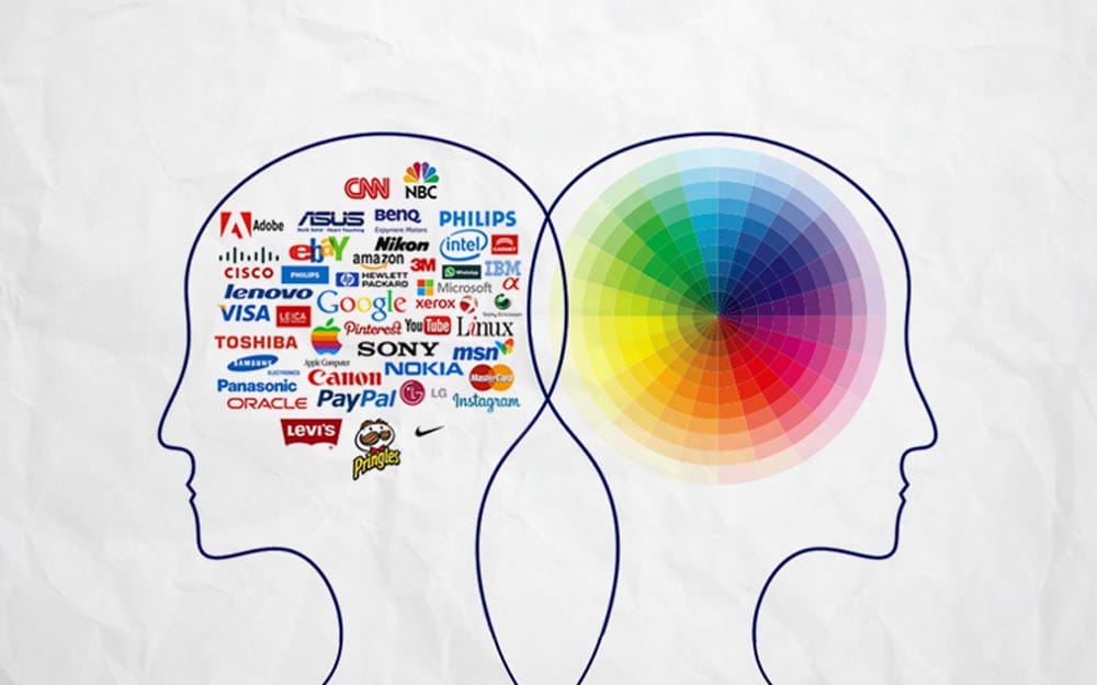
The best electronic logos utilise the psychology of success for a lasting impact.
Importance of Colour
For technology companies, trust and reliability are everything. Commonly used in these logos, blue symbolises that.
Symbols and Shapes
LG’s and Samsung’s round designs indicate wholeness, while Microsoft’s angular logo implies accuracy and effectiveness.
Trends in Electronics Logo Design
As technology advances, the visual identities of the companies that drive it are bound to change, too.
Less is More
Numerous companies are now embracing minimalism in their logo designs. This involves using simpler graphics that look great on all screens and platforms.
Versatility
Logos that can be easily modified or animated for different purposes are growing popular in this digital era.
The Future of Electronics Branding
What can be done about electronic logos to keep them up with technological advancements?
Integration of AR and VR
When augmented reality (AR) and virtual reality (VR) become more common, logos might be made to be interactive or immersive.
Logos created by AI
Some logos have already been designed using artificial intelligence (AI). So, will this trend continue?
The Impact of Logos on Consumer Behaviour
A powerful logo can affect how consumers see and engage with a brand.
Loyalty to Brands by Image
Easily identifiable logos can spark positive thoughts, fostering loyalty towards a brand and leading to repeat business.
The Apple Brand
Apple’s logo is so strong that some will pay extra for an electronic device with the bitten apple.
Logos in the Age of Social Media
In this digital world, logos must do more work to catch people’s eyes as they scroll through busy social media feeds.
Quick Identification
While users are scrolling rapidly, logos must be identifiable at a glance, even when small.
Designs that Work with Hashtags
Certain brands have started using parts of their logos as custom hashtags or emojis. This way, their visual identity extends into social media discussions.
The Role of Typography in Electronics Logos
Many top electronics logos rely heavily on typography to convey their brand message.
Font Matters
The choice of font can significantly impact how a brand is perceived. Sony’s bold, sans-serif font projects strength and modernity.
Custom Typography
Some brands, like Coca-Cola (though not an electronics company), have created custom typefaces that are instantly recognisable.
Colour Psychology in Tech Branding
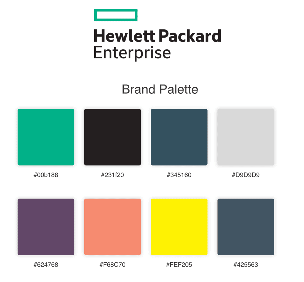
Electronics logos’ colours are selected deliberately to bring about certain feelings and connections.
Blue means Trust
Trust, stability, and professionalism are usually associated with blue, which Samsung, Intel, and Dell, among others, use.
Red means Energy
The red in the LG or Toshiba logos connotes energy, passion or excitement.
The Importance of Versatility in Logo Design
Logos must work across various applications in the electronics industry, from tiny smartphone icons to massive billboards.
Scalability is Key
The best electronics logos look great, whether tiny favicons or enormous storefront signs.
Monochrome Matters
A truly versatile logo should work just as well in black and white as in colour.
Conclusion: The Lasting Power of Great Design
More than being excellent designs, the top 10 electronics logos we’ve looked at are potent tools that helped build the most prominent tech brands in the world. These symbols have become synonymous with innovation, trustworthiness and cutting-edge technology, from Apple’s bitten fruit to Toshiba’s rising sun.
The best electronic logos are visually simple but still packed with meaning – they create an identity that can be recognised instantly while remaining full of depth. They have changed with the digital age and kept their essence; this shows us great design is timeless.
In a fast-moving industry with fierce competition, these logos are anchors for consumers who need stability among all the changes around them. They are not just symbols but promises about quality, creativity and trust that millions across borders make daily.
It would be interesting to see how these legendary brands evolve through their logos over time as technology advances. Will AR or VR come into play? What role could AI play in future versions? No one knows yet, but we do know that within consumer electronics, there has never been such a need for memorable branding as now in our rapidly growing global marketplace.
FAQs
Why are electronic logos usually so simple?
They often make them simple since such emblems are more versatile and memorable. These can be used with icons ranging from a small app logo to giant billboards.
How frequently do businesses change their logos?
Although there is no fixed interval, major revamps hardly ever take place. Most companies prefer making slight changes over radical ones to keep brand recognition.
What makes the Apple logo iconic?
The Apple logo became iconic because of its simplicity, versatility, and story behind it (the bite representing the bite of knowledge).
Are there any hidden meanings in the Samsung logo?
In earlier versions of the design, ‘Samsung’ meant ‘three stars’ in Korean, but this is not obvious in the current design.
Why do many electronic logos have blue in them?
Blue is associated with trustworthiness, reliability and professionalism, all of which are essential traits for tech companies.
How vital is a logo for a tech startup?
A good one could make or break it. It has to be eye-catching enough to differentiate itself from others within an already congested market while still being able to communicate professionalism and trustworthiness to potential customers.
Can bad logos hurt sales for companies?
Yes – if poorly designed, they may not resonate with consumers or, even worse, create negative associations with brands themselves.
What steps do electronics firms take so that their logotypes work well on products?
They ensure that these designs have versatility at heart by making sure they look great regardless of whether they are displayed in different sizes, colours or materials used during manufacturing.
Are there any legal matters involved when creating a logo?
Absolutely! One must always check whether such symbols could infringe upon existing trademarks, and its ability to get trademarked itself should also be considered seriously enough!
How might AR/VR affect how we see branding through graphic identities like company badges, etc.?
With the emergence of augmented reality/virtual technologies, we may witness logos becoming more interactive or even three-dimensional ones that can be experienced within spatial environments provided by these platforms.
Do people from different cultures interpret logos in other ways?
Yes, they do. For this reason, global brands need to consider that colours and symbols may have diverse meanings across various societies worldwide; hence, their design should reflect such diversity appropriately without offending targeted audiences.
How does one measure whether a logomark has been successful or not?
This is usually done by conducting surveys on brand recognition, carrying out sentiment analysis among consumers and monitoring shifts in how people perceive given brands over time.

