CPG Branding Strategy: A Guide to Dominating the Shelf
Let’s start with a number that should make any entrepreneur nervous: between 80% and 95% of new Consumer Packaged Goods (CPG) fail. They burn through cash, get delisted from stores, and quietly disappear.
Why? It’s usually not a bad product. It’s not always a flawed business model.
The killer, more often than not, is invisible. It’s bad branding.
Specifically, it’s what I call “Portfolio-First Branding.” It’s the branding that looks achingly beautiful in a PowerPoint presentation. It wins design awards. It makes the founder and the investors feel clever. But on a crowded supermarket shelf at 4 PM on a Tuesday, it’s utterly, commercially useless.
This is a guide about the alternative. It’s about a brutally pragmatic approach I call the Shelf-First Mentality. It’s not about creating the prettiest brand; it’s about making the brand that gets noticed, understood, and bought in the three seconds you have to stop a distracted shopper in their tracks.
Forget everything you think you know about “brand storytelling” for a moment. This is about survival.
- 80% to 95% of new CPG products fail primarily due to poor branding, not product quality or business model.
- The Shelf-First Mentality prioritises attention-grabbing branding over aesthetic appeal to drive purchases swiftly.
- CPG branding encompasses a strategic system of visuals, identity, packaging, and messaging focused on capturing shopper attention.
- Successful branding relies on a clear strategy, distinct visual identity, effective packaging, and compelling messaging.
- Avoid designing in a vacuum; constant real-world testing is essential for effective CPG branding.
What CPG Branding Actually Is (And What It Isn’t)
Most people hear “branding” and think “logo.” That’s the first mistake.
In the world of CPG, your brand isn’t your logo. It isn’t your clever Instagram bio or your founder’s mission statement.
CPG branding is a complete system of visual, verbal, and structural signals designed to achieve one goal: to win a split-second war for attention and trigger a purchase.
It’s not an art project. It’s a commercial weapon.
This system includes your brand strategy, visual identity, packaging structure, and on-pack messaging. If any one of those components is weak, the entire structure collapses. The product sits on the shelf, and you go out of business. It’s that simple.
The Only Rule That Matters: The Shelf-First Mentality
If you take one thing away from this article, make it this: you must reverse-engineer your entire brand from the point of purchase.
The Shelf-First Mentality means that every single decision—from the name of your product to the thickness of the cardboard you use—is filtered through the lens of the real-world retail environment.
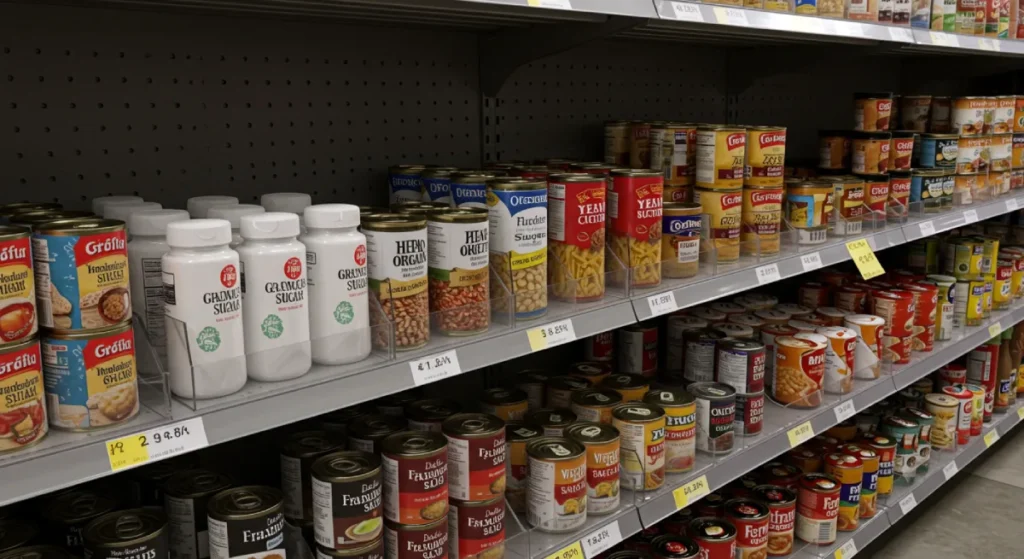
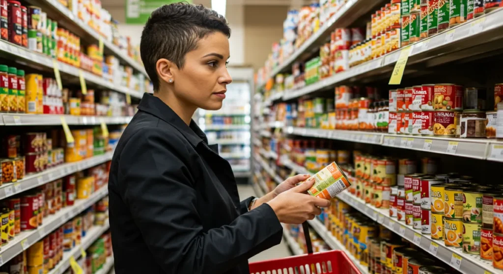
The Physical Shelf
Imagine a tired parent pushing a wobbly trolley, a toddler demanding attention, and a shopping list they can’t find. They are scanning the aisle for pasta sauce. There are 40 different jars. They are not reading. They are pattern-matching.
Their brain is subconsciously asking:
- Which one looks familiar?
- Which one looks like what I need?
- Which one is the right price/quality?
You may have three seconds to provide an answer. In this environment, subtlety dies. Cleverness gets ignored. Minimalist aesthetics become invisible. Only bold, clear, and distinctive brands survive this test.
The Digital Shelf
The same rules apply online, perhaps even more harshly. The “digital shelf” is an Amazon search results page or a DTC website category grid. It’s a sea of tiny, competing thumbnails.
Your packaging must communicate everything it needs from a 150×150 pixel image. Can a shopper tell if your product is a bag of coffee or a box of dog treats from that tiny square? If not, you’ve already lost the click.
The Shelf-First Mentality isn’t a suggestion; it’s the only way to compete.
The Four Pillars of CPG Branding That Actually Sells
Building a brand that thrives on the shelf isn’t magic. It’s a structured process built on four pillars. Miss one, and the whole thing wobbles.
Pillar 1: Strategy – The Unsexy Work You Can’t Skip
This is the thinking before the making. It’s the least glamorous part, which is why so many people rush through it. Don’t. A beautiful design built on a weak strategy is like building a house on a swamp.
- Defining Your Position: You must be able to state, in a single sentence, who you are and why anyone should care. Chobani didn’t just launch another yoghurt. They launched a thick, high-protein Greek yoghurt into a market full of sugary, watery products. Their position was clear: a healthier, more substantial alternative.
- Understanding Category Codes: Every product category has an unspoken visual language. Ice cream tubs look a certain way. Cleaning products use specific colours and symbols. You must first understand these “codes.” Only then can you consciously decide to either conform to them (to be easily understood) or break them (to stand out).
- Breaking the Codes (Intelligently): Liquid Death is the masterclass in breaking category codes. Water is supposed to be serene, pure, and blue. They made it look like a can of heavy metal beer. The result? It’s impossible to ignore in a cooler full of Evian and Dasani. They broke the codes to attract a specific audience tired of the status quo.
Pillar 2: Identity – Your Unmistakable Visual Signature

This is where the visual design begins, but the strategy always guides it. The goal here is distinctiveness, not just beauty.
- The Logo’s Real Job: Your logo’s primary function on a package is recognition. That’s it. It doesn’t need to tell your entire life story. Can it be read from a distance? Is it simple and memorable? An overly complex or delicate logo will become an indecipherable smudge from ten feet away.
- Colour as a Weapon: The single most powerful tool for recognition on a shelf is colour. Owning a specific, bold colour can create a “brand block”—a section of the aisle that your eye is immediately drawn to. Think of the purple of Cadbury, the red of Coca-Cola, or the orange of Tide. They use colour relentlessly and consistently.
- Typography That Works From 10 Feet Away: This is one of my biggest pet peeves. Designers choose a delicate, trendy font that looks great on their monitor. But on a real package, under bad lighting, it’s completely illegible. Always perform the “shelf-back test”: print your design, stick it on a real product, place it on a shelf, and step back ten feet. Can you still read the brand name and what the product is? If not, your typography has failed.
Pillar 3: Packaging – The Silent Salesperson on the Front Line
For a CPG brand, the package is the marketing. It’s your billboard, TV ad, and salesperson, all rolled into one. It is, without question, the most critical pillar. If your brand identity is the face, the packaging is the entire outfit.
- Information Hierarchy: A shopper’s brain needs information in a specific order. You must control that order. For most products, it is:
- Brand: Who made this?
- Product: What is it? (e.g., Ketchup, Dog Food)
- Variant: Which version is it? (e.g., Spicy, Chicken & Rice)
- Benefit/Reason to Believe: Why should I buy it? (e.g., “Organic,” “20g Protein”)
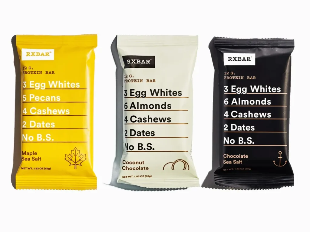
- RXBAR is the absolute champion of this. Their hierarchy is brutalist and effective. The ingredients are the biggest things on the front: “3 Egg Whites, 6 Almonds, 4 Cashews, 2 Dates.” The brand name is secondary. They knew their customer cared about “no B.S.” ingredients above all else, so they made that the hero of the pack.
- Structural Design: The physical shape, material, and texture of your packaging are powerful brand signals. A heavy glass jar signals premium quality, while a flexible pouch suggests convenience. Graza, the olive oil brand, uses a squeezy bottle, a structure typically associated with sauces. This single-handedly repositions their product as a user-friendly, everyday condiment rather than a precious, “special occasion” oil.
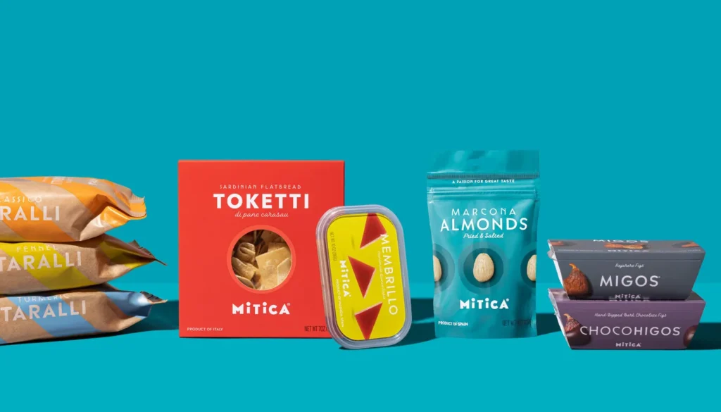
- The System: You aren’t designing one package but planning a family. How do your different flavours or variants look side-by-side? A strong brand system creates that powerful brand block effect and makes the product line easy for the consumer to navigate.
Pillar 4: Messaging – The Words That Get You in the Basket
Once the visuals have grabbed their attention, the words have to close the deal. And they have to do it fast.
- The Name: A good name is easy to say and remember, and hints at what the product is or does. A bad name is confusing, hard to pronounce, or legally indefensible.
- Tagline & On-Pack Copy: This is not the place for poetry. It is the place for brutal clarity. Your goal is to tell the shopper what the product is and why it’s better than the one next to it. Avoid abstract, aspirational nonsense. A bag of coffee should say “Dark Roast” or “Smooth & Balanced,” not “Awaken Your Potential.”
- Voice and Tone: This is where personality comes in. Are you serious and scientific? Fun and irreverent? Oatly built an empire on a quirky, conversational, and slightly self-aware tone. Their copy feels like it was written by a human, not a marketing committee, which stands out in the typically bland dairy aisle.
The Graveyard of Good Intentions: 3 CPG Branding Mistakes to Avoid at All Costs
If you want to see where CPG brands go to die, look for these common, fatal errors.
Mistake #1: Designing in a Digital Vacuum
This is the number one killer. A team works away for months, perfecting a design on-screen. It’s approved. It looks incredible. Then it hits the shelves and vanishes. The colours are muted, the text is too small, and it blends into the competition.
The Fix: Prototype relentlessly. Print your designs on cheap paper and wrap them around existing products. Take them to a real store and place them on the shelf (discreetly!). Take a photo. See how they stack up. This five-minute, low-cost exercise will teach you over a hundred hours of on-screen pixel-pushing.
Mistake #2: Generic “Premium” Cues
“We want to look premium.” This is a phrase that launches a thousand bad branding projects. For many, “premium” has become a lazy shorthand for a specific aesthetic: matte black or white packaging, a simple sans-serif font, and maybe a touch of gold foil.
The problem? Everyone is doing it. When everyone is “premium,” no one is. Your minimalist black box of chocolates looks precisely like the black box of coffee and the black box of candles next to it. You haven’t created a brand; you’ve made expensive camouflage.
The Fix: Define what “premium” means for your category customer. Is it craftsmanship? Is it ingredient purity? Is it efficacy? Use design to signal that specific value, not just a generic sense of expense.
Mistake #3: Abandoning Your Core Assets (The Tropicana Catastrophe)
In 2009, Tropicana threw away its iconic “orange with a straw” packaging for a clean, modern, private-label look. They abandoned decades of brand equity—the visual cues shoppers instantly used to find their product.
The result was a catastrophe. Sales plummeted by 20% in two months, costing the company over $30 million. They quickly reverted to the old design.
The Fix: Understand what your core brand assets are. These are the visual elements your customers recognise and trust. It might be a colour, a logo, a specific character, or a unique package shape. You can modernise and evolve these assets, but abandon them at your peril. Never trade recognition for “modernity.”
Is Your CPG Brand Built to Win? A Final Checklist
Ask yourself these brutally honest questions.
- The 10-Foot Test: Can a shopper identify your brand and what your product is from 10 feet away?
- The 3-Second Test: Can a shopper understand your primary benefit in under three seconds?
- The Billboard Test: If your package were a billboard with no other text, would it still be recognisable as your brand?
- The Family Test: Do your different product variants look like they belong to the same family and create a strong brand block?
- The Thumbnail Test: Does your packaging work as a tiny, 150×150 pixel image on a digital shelf?
- The Distinction Test: Are you genuinely different from your top three competitors, or are you just a slightly different shade of the same idea?
It’s Not About Being Pretty. It’s About Selling.
Building a successful CPG brand requires a fundamental shift in mindset. You must stop thinking like an artist and start thinking like a general fighting for territory on the most competitive battlefield in business: the retail shelf.
Every choice must serve the ultimate goal of getting your product off that shelf and into a shopping basket. The Shelf-First Mentality isn’t just a design philosophy; it’s a survival strategy.
Your brand doesn’t need to be universally loved or admired for its beauty. It needs to be unignorable, instantly understood, and easy to choose.
If you’ve read this far and realised your brand was designed for a quiet gallery instead of a chaotic supermarket, it might be time for a different conversation. At Inkbot Design, we build brands for the real world.
Explore our brand identity services to see how we approach the challenge, or request a quote if you’re ready to build a brand that sells.
FAQs about CPG Branding
What is CPG branding?
CPG (Consumer Packaged Goods) branding is the complete strategic and design process for creating a brand for products sold frequently and at a relatively low cost. It heavily emphasises packaging as the primary marketing tool to capture consumer attention in a crowded retail environment.
What is the most critical part of CPG branding?
Packaging. While strategy, identity, and messaging are crucial, the physical (or digital) package is the single point of contact where the sale is won or lost. It’s the silent salesperson doing all the work at the moment of decision.
How is CPG branding different from DTC (Direct-to-Consumer) branding?
While there’s significant overlap, CPG branding is ruthlessly optimised for the physical or digital shelf against direct competitors. DTC branding has more control over the environment (its own website) and can rely more heavily on storytelling, web design, and the unboxing experience to build its brand. However, as DTC brands move into retail, they must adopt CPG principles to survive.
What are “category codes” in CPG?
Category codes are the unwritten visual rules and cues of a product aisle. For example, green and brown often signify “natural” or “organic” in the food aisle, while blue and white are common for dairy products. Successful brands either adhere to these codes for easy identification or break them strategically to stand out.
How much does professional CPG branding cost?
Costs vary dramatically based on the scope and agency. A complete CPG branding project (strategy, identity, packaging for multiple SKUs) from a professional agency can range from £10,000 to well over £100,000. It is a significant investment because it is the most critical factor in a product’s success.
Why is the “shelf-back test” so important?
The shelf-back test (viewing your product on a shelf from 10+ feet away) simulates how a consumer actually sees your product. It immediately reveals flaws in legibility, colour contrast, and overall visual impact that are impossible to spot when designing on a computer screen.
What is a “brand block”?
A brand block is a visual effect created when multiple products from the same brand are shelved together. A strong, consistent design system (especially with a dominant colour) makes a large, unified “block” on the shelf highly visible and draws the shopper’s eye.
Can a great product succeed with bad branding?
It’s doubtful in the long term. A great product might get some initial traction, but without effective branding, it won’t be able to compete for attention. New customers won’t discover it, and existing customers may have trouble finding it again. Bad branding suffocates even the best products.
What are some examples of great CPG brands?
Brands like RXBAR, Liquid Death, Chobani, and Oatly are often cited as excellent examples. They each demonstrate key principles: RXBAR’s clarity, Liquid Death’s category disruption, Chobani’s market repositioning, and Oatly’s unique brand voice.
What’s the biggest mistake a CPG startup can make with branding?
The biggest mistake is treating branding as a decorative last step (“making it look pretty”) rather than a core part of the business strategy from day one. A close second is designing the brand in a vacuum without constant, real-world testing on a mock shelf.


