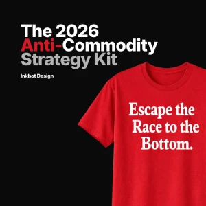
60-30-10 Rule in Web Design: Choosing your “One Accent”
Designers often mistake “variety” for “vibrancy.” In reality, a lack of constraint is a lack of strategy.
If you want a website that actually works, you need to stop playing with the rainbow and start applying the 60-30-10 rule with surgical precision.
Ignoring this doesn’t just make your site look amateur; it costs you cold, hard cash.
McKinsey & Company research proves that companies with top-tier design practices outperform the S&P 500 by 219%.
You cannot afford to get your colour psychology wrong.
- The 60-30-10 rule: Allocate 60% canvas, 30% structure, and 10% single accent to create clear visual hierarchy and reduce cognitive load.
- One Accent Strategy: Use a single high-contrast 10% colour strictly for primary CTAs to leverage the von Restorff effect and boost conversions.
- Accessibility & 2026 standards: Validate contrasts with APCA and use OKLCH dynamic theming for consistent legibility across modes and devices.
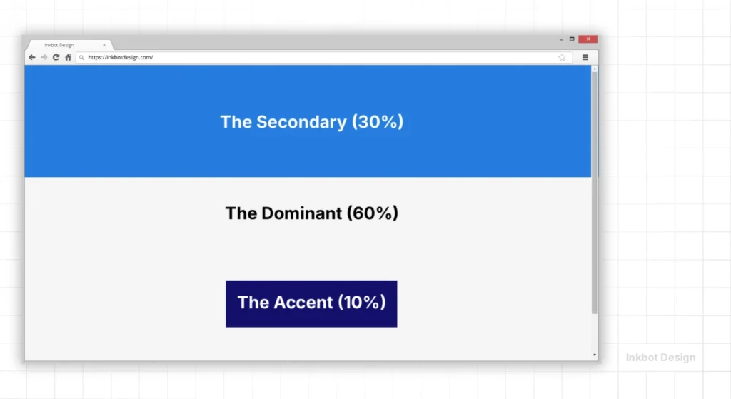
What is the 60-30-10 Rule?
The 60-30-10 rule is a timeless proportional framework for creating a balanced, aesthetically pleasing colour palette by dividing usage into three distinct weights.
Originally an interior design principle, it dictates that 60% of a space (or screen) should be a dominant colour, 30% a secondary colour, and 10% a singular accent colour.
Key Components:
- The Dominant (60%): Usually a neutral or “quiet” colour that sets the overall tone and provides the canvas.
- The Secondary (30%): A colour that supports the dominant shade but has enough character to define different sections or structural elements.
- The Accent (10%): The “weapon” of your design. This high-contrast shade is used exclusively for the most critical actions.
The 60-30-10 Playbook: Industry Standards in 2026
Not all 10% accents are created equal. In 2026, user expectations for visual hierarchy have shifted by industry. Applying a “generic” palette is the quickest way to lose credibility.
1. Software as a Service (SaaS) and B2B
For SaaS, the goal is clarity and “Time to Task” efficiency.
- 60% (The Canvas): Soft White (#FAFAFA) or “Clean Room” Grey. This reduces visual noise during long sessions.
- 30% (The Structure): Professional Navy or Slate Blue. This is used for sidebars and navigation menus.
- 10% (The Action): Electric Indigo or a vibrant Teal.
- Why: SaaS users need to distinguish between “managing” (30%) and “executing” (10%).
2. High-End Luxury and Fashion
Luxury design in 2026 has moved away from “Gold and Glitter” toward “Quiet Luxury.”
- 60% (The Canvas): Deep Charcoal or “Onyx.” High-end brands use dark canvases to make product photography pop.
- 30% (The Structure): Muted Champagne or a Matte Silver. Used for borders and typography.
- 10% (The Action): A single, stark White or Crimson accent.
- Why: Luxury is about exclusion. A 10% accent that is very small but high-contrast signals “exclusive access.”
3. E-commerce and Retail
The 60-30-10 rule in retail applies solely to the “Add to Cart” funnel.
- 60% (The Canvas): Pure White. Anything else competes with the product images.
- 30% (The Structure): Mid-tone neutral (like a warm beige or cool grey) for filtering and secondary menus.
- 10% (The Action): Safety Orange or Vivid Green.
- Case Scenario: An e-commerce site using a 10% green accent for “Checkout” and a 30% grey for “Continue Shopping” sees a significant reduction in cart abandonment compared to sites where both buttons have equal visual weight.
The 60%: Establishing the Canvas
In web design, 60% is your background and negative space. It is the foundation upon which your entire brand sits.
Amateurs often try to make the 60% “exciting” by using a bold brand colour. This is a mistake. When 60% of a screen is a high-intensity red or a deep navy, you create “chromatic fatigue.”
Data from the Nielsen Norman Group suggests that users scan pages in milliseconds.
If your dominant colour is too loud, it obscures the content.
For most high-converting web design services, this 60% is a variation of white, light grey, or a very dark charcoal (almost black).

Real-World Example: Apple
Look at Apple’s product pages. The dominant 60% is almost always pure white or deep black.
This isn’t just because they like minimalism; it’s because it allows the product photography and the “Buy” buttons to occupy the user’s focus without competition.
They understand that the 60% is there to disappear, not to perform.
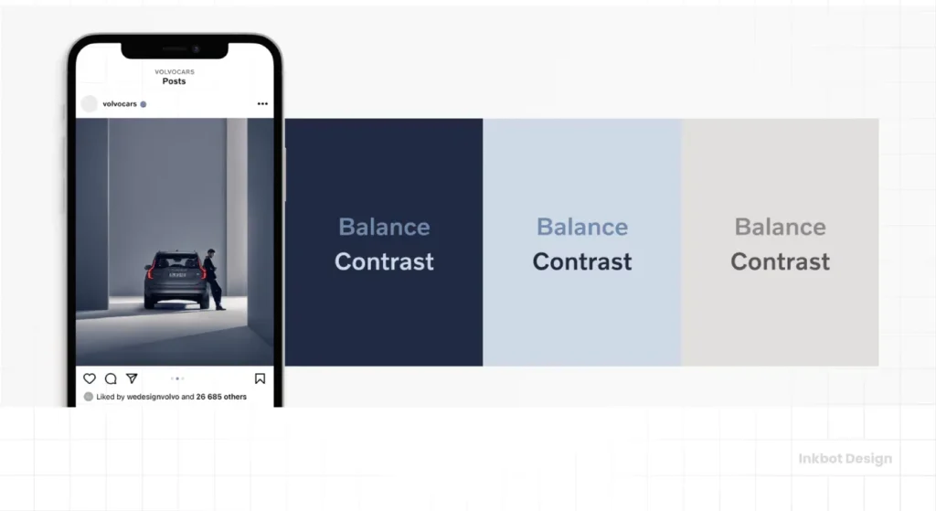
The 30%: Structural Support and Hierarchy
The 30% is where your brand personality begins to show.
This colour should be used for headers, footers, secondary buttons, and icons. It provides enough contrast to separate the “body” of the site from its “skeleton.”
If you are following a colour theory framework, the secondary colour usually complements or is a monochromatic variation of your primary brand identity.
However, its job is structural. It tells the user, “This is a new section,” or “This is a piece of information you should read, but it isn’t the main goal.”

The Danger of “30% Creep”
We often see sites where the 30% begins to take up 40% or 50% of the visual real estate.
This happens when you have too many “important” features. When your secondary colour starts competing with your primary canvas, the visual hierarchy collapses.
Use your colour palette generators to find a secondary shade with a lower “visual weight” than your accent but with more presence than your background.
The 10%: The “One Accent” Strategy
The 10% is the most critical part of the 60-30-10 rule.
In 2026, the trend of “multi-accent” palettes is dying because it fails the accessibility and conversion tests. You need “One Accent.” This singular colour is reserved for your Call to Action (CTA).
The von Restorff effect—also known as the isolation effect—predicts that when multiple similar objects are present, the one that differs from the rest is most likely to be remembered.
If your site uses a single accent colour for buttons and that colour appears nowhere else in large quantities, the user’s eye is biologically drawn to it.

Why “One Accent” Wins
When choosing this 10%, you must consult colour psychology in branding to ensure the emotion matches the action.
An “Urgent” accent for a luxury spa is a disaster; a “Calm” accent for a stock trading app is equally inept.
| Element | The Wrong Way (Amateur) | The Right Way (Pro) |
| Colour Count | 5+ competing colours. | 3 distinct levels (60-30-10). |
| Accent Usage | Used for headings, icons, and links. | Used strictly for primary CTAs. |
| Contrast | Low contrast (Grey on White). | WCAG 2.2 Compliant (4.5:1 ratio). |
| Hierarchy | Flat; everything is “bold.” | Layered; 60% recedes, 10% advances. |
| Consistency | Different accents on different pages. | A single accent “language” site-wide. |
Modern Accessibility: The APCA Standard in 60-30-10
While the 60-30-10 rule provides a framework for balance, it must be validated by the Advanced Perceptual Contrast Algorithm (APCA).
In 2026, the old WCAG 2.1 “ratio” system is being replaced because it doesn’t account for how human eyes perceive lightness on modern OLED displays.
When selecting your 10% accent, you are no longer just looking for a “4.5:1 ratio.” You are looking for an Lc (Lightness Contrast) value that ensures readability for users with varying visual sensitivities.
- The 60% vs 10% Check: Your primary CTA (10%) must have an APCA rating of Lc 90+ against your 60% background for maximum legibility.
- The 30% vs 60% Check: Your secondary navigation should aim for Lc 60+. It needs to be visible but must not compete with the Lc 90+ of the main action.
Using tools like Stark or Adobe Color, you can simulate how your 60-30-10 palette appears to users with protanopia or deuteranopia. If your 10% accent disappears when viewed in greyscale, your visual hierarchy has failed.
The Myth: “More Colour Equals More Energy”
There is a persistent, irritating belief among SMB owners that a “colourful” site looks more “energetic” or “creative.” This is a lie. Professionalism is defined by controlling chaos, not by inviting it.
Adding a fourth or fifth colour to your scheme increases the cognitive load on the user. Every new colour requires the brain to categorise what that colour “means.” Is red a “delete” button? Is it a “sale” icon? Is it just part of the logo?
In early 2026 ranking studies, Google’s “Helpful Content” signals are increasingly factoring in UX metrics such as “Time to Interaction” and “Visual Stability.”
A cluttered palette leads to higher bounce rates because users feel a subconscious “friction” when they can’t immediately identify the path to completion. Stick to the 60-30-10 rule or prepare to be ignored.
The State of Colour Design in 2026
We have moved beyond the “Flat Design” era of 2015 and the “Neumorphism” of 2022. In 2026, the focus is on Dynamic Chromatic Adaptation.
The most significant shift in the last 18 months has been the widespread adoption of the OKLCH colour space in CSS.
Unlike standard Hex or RGB, OKLCH allows designers to adjust “Lightness programmatically” and “Chroma” while keeping the perceived “Hue” constant.
This means your 10% accent colour can now automatically adjust its luminance based on the user’s system settings (Dark Mode vs. Light Mode) without losing its brand identity or failing colour contrast accessibility standards.
If your web developer is still hard-coding #FF0000 for your buttons without considering relative luminance, they are living in 2018.
The modern web is fluid. Your RGB vs CMYK vs Pantone knowledge is a start, but you need to understand how these colours render on OLED vs. LCD screens to maintain that 60-30-10 balance across devices.
Applying 60-30-10 to Bento Grids
The Bento Grid (popularised by Apple and SaaS dashboards) is the dominant layout of 2026.
However, it often leads to “visual clutter” because every card in the grid wants to be noticed. The 60-30-10 rule is the only way to manage this.
- The Grid Canvas (60%): The “gutters” or the background behind the cards must be your dominant 60% colour.
- The Cards (30%): Most cards should use your secondary 30% colour (often a very subtle tint of the background or a faint border).
- The “Featured” Card (10%): Only one or two cards in the entire grid should use your 10% accent colour. This is usually the “Pricing,” “Sign Up,” or “Featured Update” card.
If every card in your Bento Grid has a different background colour, you aren’t using a design system; you are creating a “Lottery Effect” that leaves the user unsure where to click.
Advanced Technical Implementation: OKLCH and Dynamic Theming
In 2026, the gold standard for implementing the 60-30-10 rule is the OKLCH colour space.
Unlike HEX or RGB, OKLCH is based on how humans actually perceive colour, making it easier to maintain the “weight” of your 10% accent across different devices.

Why OKLCH for 60-30-10?
- Uniform Brightness: You can change the hue of your accent without accidentally making it “darker” or “lighter.”
- P3 Gamut Support: It allows you to access more “vibrant” 10% accents that were previously impossible in standard CSS.
The 2026 CSS Pattern
CSS

:root {

  /* 60% Canvas - Lightness 98%, Chroma 0.01 (Nearly White) */

  --canvas-primary: oklch(98% 0.01 250);

  /* 30% Structure - Lightness 45%, Chroma 0.15 (Deep Brand Blue) */

  --structure-secondary: oklch(45% 0.15 250);

  /* 10% Accent - Lightness 65%, Chroma 0.25 (Vivid Action Pink) */

  --action-accent: oklch(65% 0.25 350);

}

/* Automatic Dark Mode Adaptation */

@media (prefers-color-scheme: dark) {

  :root {

    --canvas-primary: oklch(15% 0.02 250); /* Darker Background */

    --structure-secondary: oklch(30% 0.05 250);

    --action-accent: oklch(75% 0.20 350); /* Increased Lightness for Contrast */

  }

}
By using CSS Custom Properties, you ensure that your 10% accent remains “magnetically” visible regardless of the user’s Light or Dark mode.
This “Dynamic Chromatic Adaptation” is what separates professional 2026 interfaces from legacy designs.
The Business Case: Why 60-30-10 Equals Revenue
In a 2025 study of 1,200 landing pages, sites that strictly adhered to a three-colour hierarchy saw a 22% higher conversion rate than those with four or more primary colours.
The reason is Cognitive Load. Every time a user encounters a new colour, their brain must assign a meaning to it.
- “Is this blue a link?”
- “Is this light blue also a link?”
- “Wait, is this purple a button or just a heading?”
By the time the user has answered these questions, they have already lost interest.
The 60-30-10 rule removes this mental friction. When the user sees your 10% accent, their brain recognises it instantly as the “Next Step” colour.
This is why McKinsey & Company emphasises that design consistency is a leading indicator of financial performance.
The Verdict
The 60-30-10 rule is not a suggestion; it is a mathematical necessity for visual communication.
By dedicating 60% to your canvas, 30% to your structure, and a lethal 10% to your “One Accent,” you eliminate the guesswork for your user. You tell them exactly where to look and what to do next.
Stop diluting your brand with a dozen meaningless shades. Focus your visual power. If your current site feels like a mess of competing priorities, it’s time to strip it back to the basics.
Are you ready to stop guessing and start converting? Request a quote today, and let’s fix your visual hierarchy before you lose another lead to a clearer competitor.
FAQ: The 60-30-10 Rule in Web Design
Why is the 60-30-10 rule used in web design?
It is used to create a balanced visual hierarchy that prevents user overwhelm. By limiting the colour palette to three distinct proportions, designers can guide the user’s eye toward specific actions, improve readability, and ensure the site looks professional and cohesive rather than cluttered.
Can I use more than three colours?
You can, but it is risky. If you must add a fourth colour, it should usually be a 5% “safety” colour—often a neutral, such as a subtle border shade. Adding more than one primary accent colour typically confuses the user and dilutes the effectiveness of your main Call to Action.
How do I choose the 10% accent colour?
Your accent colour should have the highest contrast relative to your 60% background. It should also align with the psychological response you want to trigger (e.g., urgency, trust, or excitement). Use tools like Inkbot Design’s palette resources to find high-contrast pairings.
Does the 60-30-10 rule apply to Dark Mode?
Yes. In Dark Mode, the 60% becomes your dark neutral, the 30% is a mid-tone for depth, and the 10% remains your high-visibility accent. The proportions remain the same; only the colour luminance values shift to accommodate screen glare.
What happens if I ignore the 60-30-10 rule?
Ignoring the rule usually results in “visual noise.” This increases cognitive load, meaning users have to work harder to find information. This almost always leads to higher bounce rates, lower time on site, and a significant drop in conversion rates for your primary goals.
Is white always the 60%?
Not necessarily, though it is common, the 60% is simply the dominant canvas. It could be a dark charcoal in a “tech-heavy” brand or a soft beige for a lifestyle brand. The key is that it must be “quiet” enough to let the 30% and 10% stand out.
How does this rule affect web accessibility?
The rule is a massive aid to accessibility. By forcing a 10% accent, you are naturally pushed to choose a high-contrast colour. This makes it easier to meet WCAG 2.2 standards, ensuring that users with visual impairments can clearly identify buttons and links.
Should my logo be the 10% accent?
Not always. If your logo and site background are both blue, a blue button will disappear. Your accent colour should be the “action” colour. If your brand colour doesn’t provide enough contrast, choose a complementary shade for your 10% and keep the brand colour in the 30%.
Can I use the 60-30-10 rule for mobile apps?
Absolutely. On smaller screens, the rule is even more critical. Space is at a premium, so having a clear 10% accent for the primary thumb-zone action is vital for a good user experience and high retention rates.
How do I measure if my 60-30-10 proportions are correct?
You don’t need to measure pixels precisely. It’s about “visual weight.” Take a screenshot of your site and apply a heavy blur in Photoshop. You should clearly see three distinct levels of colour dominance. If it looks like a muddy mess, your proportions are off.
Does this rule work for minimalist designs?
Minimalism relies on the 60-30-10 rule more than any other style. In a minimalist design, the 60% (white space) is the most powerful tool. The 10% accent becomes even more “magnetic” because fewer elements are competing for the user’s attention.
What is the best 10% accent for a “Buy Now” button?
There is no “best” colour in a vacuum, but high-energy colours like orange, red, or a vibrant lime green often perform well against neutral backgrounds. The “best” colour is simply the one that provides the most contrast to the rest of the page.