The 10 Best Wine Logos That Actually Sell Wine
Walk down any wine aisle. Go on, I’ll wait.
You’ll see a wall of visual noise—a sea of sameness. You’ll see elegant, unreadable script fonts that all blur together.
You’ll see endless lazy sketches of French châteaus, a cliché so overused it’s lost all meaning. You’ll see grapes on vines. So many grapes on vines.
Most wine branding is rubbish. It’s decoration, not communication. It’s a pretty label stuck on a bottle in the vague hope that someone finds it charming enough to spend £20 on.
But a great wine logo is different. It’s not an ornament; it’s a tool. It’s a silent salesperson working tirelessly on a crowded shelf. It grabs a customer by the collar and says, “This one. This is for you.”
This isn’t a list of the prettiest labels. This is a breakdown of the 10 most effective wine logos on the market—logos that build brands, command price points, and sell wine. Pay attention to the principles. You can steal them for your own business.
- Effective wine logos grab attention, tell a story, and hint at price and quality, transcending mere aesthetics.
- Successful branding starts with strategic questions, ensuring logos communicate a clear brand vision and stand out.
- The logos featured exemplify how distinctiveness and creativity can transform a wine bottle into a compelling selling tool.
What Separates a Great Wine Logo From a Generic Label?
Before we get to the list, let’s be clear on the criteria. A successful wine logo does three things exceptionally well, and “looking nice” is a byproduct, not the goal.
First, it must grab attention. It must act as a pattern interrupt against the hundreds of other bottles surrounding it.
Second, it must tell a story. It has to communicate something about the wine’s personality, origin, or attitude in a single glance.
Third, it has to hint at the price and quality. A great logo helps the customer self-select, signalling if this is an affordable weeknight bottle or a serious weekend investment.
The logos below aren’t just successful because of clever graphic design. They work because they are the execution of a sharp, focused brand strategy.
The List: 10 Wine Logos That Master the Art of the Sell
1. The Prisoner: The Art of Category Disruption
Look at a bottle of The Prisoner, and instantly know it’s not like the others. The logo is Francisco Goya’s etching, “Le Petit Prisonnier,” a dark, brooding, and intense piece of fine art.
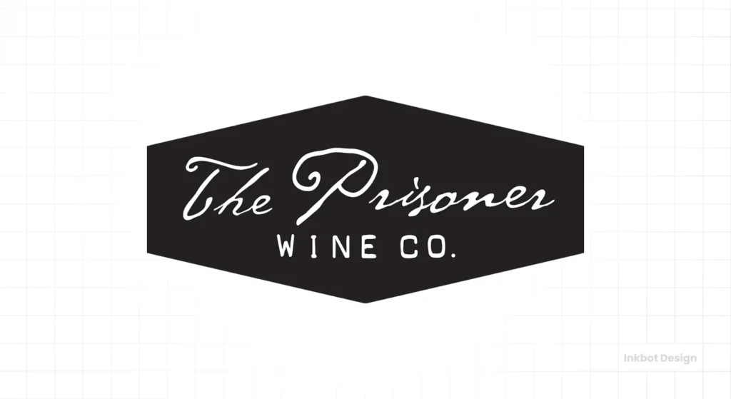
Principle: Pattern interrupt. The Prisoner is a punch in the face in an aisle filled with delicate scripts and watercolour landscapes. It’s unapologetically bold and artistic. This visual disruption immediately signals that the wine inside is just as unconventional, justifying its premium price tag before you even know what grape it is. It creates immense curiosity.
2. Yellow Tail: The Masterclass in Mass-Market Simplicity
Yellow Tail is at the opposite end of the spectrum—a bright, colourful label with a simple, graphic kangaroo silhouette between the two words.
Principle: Simplicity and recognisability. The logo is straightforward to spot from across a supermarket. The name is simple, the icon is memorable, and the colours are vibrant and approachable. It’s a masterclass in branding for the new or casual wine drinker intimidated by complex labels. It doesn’t scream heritage; it screams “fun and easy.”
3. 19 Crimes: The Logo as an Interactive Story
The branding for 19 Crimes is built around the sepia-toned mugshots of real convicts transported to Australia. The typography is gritty and stencil-like, evoking a sense of history and rebellion.
Principle: Engagement. This logo does more than just sit there. It’s a gateway to a story. Using an augmented reality app, the criminals on the labels come to life and tell their tales. This turns the bottle from a simple product into an interactive experience, creating a memorable connection that few brands can match.
4. Veuve Clicquot: Weaponising a Single Colour
It’s just an anchor symbol and a name in a classic serif font. On its own, the logo is simple. But it’s never on its own. It’s always paired with that iconic, unmistakable shade of yellow-orange (officially PMS 137 C).
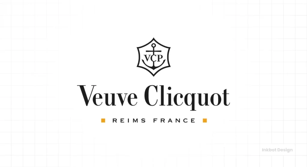
Principle: Colour ownership. Veuve Clicquot has so effectively owned its signature colour that the colour is the brand. You can spot it in an ice bucket from across a crowded room. It’s a beacon of celebratory luxury, proving that a logo system is often more powerful than a standalone mark.
5. Penfolds: The Icon of Unshakeable Authority
Penfolds’ logo is brutally simple: the brand name is in a bold, stately, red stencil-style font, with no frills, icons, or nonsense.
Principle: Timelessness and heritage. This logo communicates pure confidence. It has remained unchanged for decades, building a visual legacy of trust and supreme quality. While lesser brands feel the need to use gold foil as a crutch for a weak concept, Penfolds’ power comes from its stark simplicity. It doesn’t need to shout about being premium; it just is.
6. Mollydooker: Injecting Personality and Fun
Mollydooker’s branding is a delightful collection of quirky, cartoonish illustrations and playful typography. Each wine has its own character and story, from “The Boxer” to “The Violinist.”
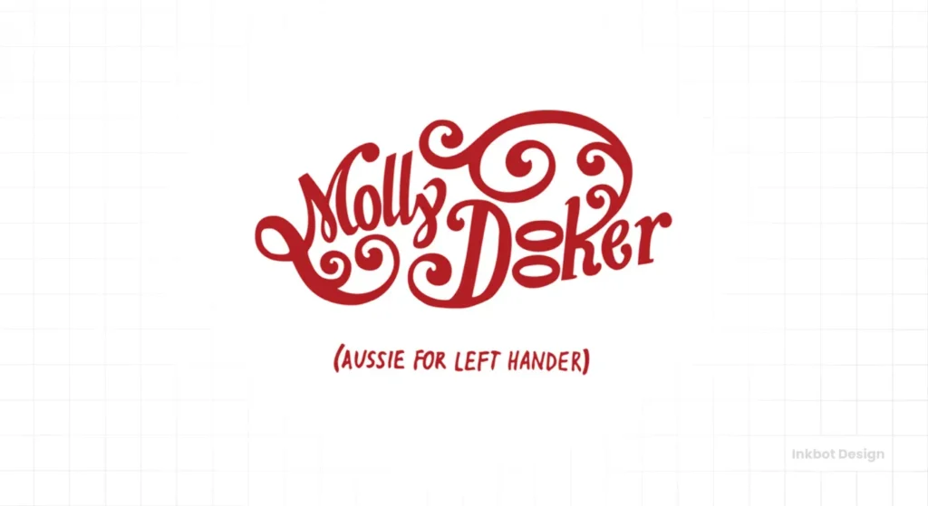
Principle: Brand personality. Wine is so often a stoic and serious category. Mollydooker stands out by being whimsical, charming, and full of life. It’s a reminder that a brand can have a distinct personality and a sense of humour, attracting customers who want a story, not just a status symbol.
7. Orin Swift: The Power of Avant-Garde Imagery
Orin Swift, much like The Prisoner, rejects traditional wine label aesthetics. Winemaker Dave Phinney uses striking, often unsettling, high-concept photography and collage as the brand’s core visual. Look at the label for ‘Papillon’—a raw, close-up shot of a man’s hands.
Principle: Creating intrigue. The imagery is so unconventional that it forces you to stop and question it. It doesn’t give you straightforward answers. This approach appeals directly to a modern, confident consumer intrigued by art, mystery, and bold statements. It feels more like a record cover or a book jacket than a wine label.
8. Schramsberg: When Typography is the Hero
Schramsberg’s logo is a masterfully crafted script, but unlike the illegible scrawls that plague the industry, this one is balanced, legible, and exudes class. It’s paired with a simple, traditional layout.
Principle: Typographic excellence. This is how you do an “elegant” script logo correctly. It proves you don’t need a symbol or an illustration when the wordmark is a piece of art. The precision and grace of the typography perfectly communicate the quality of the sparkling wine inside. It feels established, expensive, and utterly trustworthy.
9. Mouton Rothschild: The Label as Collectable Art
Since 1945, this legendary Bordeaux estate has commissioned a different world-famous artist—from Picasso and Chagall to Warhol and Hockney—to create the art for its label each year.
Principle: Exclusivity and cultural capital. This is the ultimate flex in wine branding. The logo system positions the wine not merely as a beverage but as a piece of fine art. Each vintage becomes a unique, limited-edition collector’s item. It elevates the brand to a level of cultural significance that almost no other product can touch.
10. La Crema: Nailing “Accessible Elegance”
La Crema’s logo is a flowing, stylised wordmark that feels handcrafted and refined. The colour palette of cream, black, and subtle gold accents reinforces its name and creates a soft, premium feel.
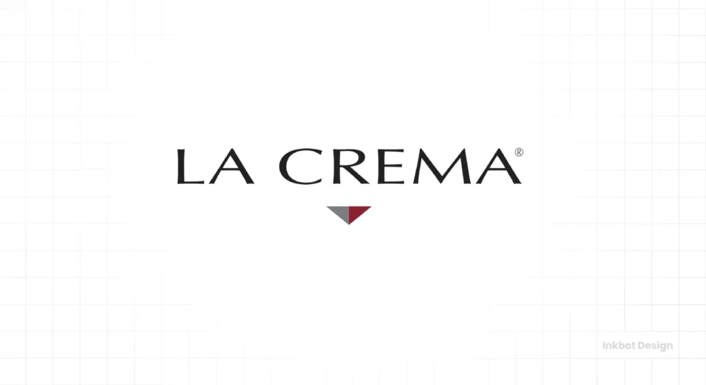
Principle: Balance. La Crema’s branding is the epitome of accessible elegance. It looks and feels high-quality without being intimidating or unapproachable like some ultra-luxury brands. It perfectly signals its market position: a reliable, delicious, and sophisticated choice for an everyday moment of luxury.
The Common Thread: Strategy Before Aesthetics
What do all ten of these logos have in common? None started with the question, “What would look nice on a bottle?”
They all began with strategic questions: Who are we? Who are we trying to sell to? What story do we want to tell? How can we stand out in a ridiculously crowded market?
The final design—whether it’s a gritty mugshot or a simple kangaroo—is just the answer to those questions. This strategic thinking is the foundation of any effective logo design process. Without it, you’re just decorating.
Stop Decorating, Start Communicating
A logo is your brand’s most compact, hard-working asset. In the wine world, it’s everything. The ten brands above prove that success on the shelf comes from having a clear point of view and the courage to express it visually.
They avoid the clichés and instead build a memorable identity that connects with a specific tribe of drinkers. They understand that their logo isn’t just there to look pretty. It’s there to sell.
So, look at your own brand’s logo. Does it just sit there, or does it sell?
Frequently Asked Questions About Wine Logos
What is the most essential element of a wine logo?
The most crucial aspect is distinctiveness. In a saturated market, a logo’s primary job is to be memorable and easily distinguishable from the hundreds of other options on the shelf.
Should a wine logo include grapes or a vineyard?
Generally, no. Unless your vineyard has a truly iconic and unique visual feature, using generic grape or vineyard imagery is a cliché that will make your brand blend in, not stand out.
What fonts are best for wine logos?
There is no single “best” font. The choice depends on the brand’s personality. A modern, bold brand might use a clean sans-serif, while a heritage brand might use a classic, legible serif. The key is that the typography must be readable and match the brand’s story. Avoid overly ornate, illegible scripts.
How much does a professional wine logo cost?
Costs can vary widely, from a few hundred pounds for a basic design to many thousands for a comprehensive brand identity from a top agency. The investment reflects the strategy, research, and creative exploration level involved.
Does the colour of a wine label matter?
Yes, tremendously. Colour psychology plays a huge role. Deep reds and blacks often signal a bold, full-bodied red wine. Whites, creams, and light blues can suggest a crisp white wine. As Veuve Clicquot proves, a unique colour can become a powerful brand asset.
How can a new winery create a logo that stands out?
Focus on your unique story. What makes your winery, your process, or your philosophy different? Build the logo concept around that core truth instead of copying what established wineries are doing. Dare to be different.
Is a modern or traditional logo better for a wine brand?
This depends entirely on your target audience and price point. A conventional logo can communicate heritage and quality, while a modern logo can appeal to younger consumers and signal innovation. The right choice is the one that aligns with your brand strategy.
Should my logo be a symbol or just the winery name?
Both can be effective. A strong symbol (like Yellow Tail’s kangaroo) is easily recognisable. A beautifully crafted wordmark (like Schramsberg’s) can convey elegance and class independently. The choice depends on the brand name and the desired personality.
Can I design my own wine logo?
While technically possible, it’s rarely advisable. A professional designer brings objectivity, strategic thinking, and technical skill to the process. An amateur logo often looks unprofessional and can devalue the product before it’s tasted.
How important is the paper and printing technique for a wine label?
Extremely important. The texture of the paper, the use of embossing, or the finish of the foil can elevate a great design. These tactile elements contribute to the perception of quality and luxury. However, remember that fancy printing can’t save a flawed design concept.
Your brand is more than just a product; it’s a story waiting to be told. A great logo is the cover of that story.
If you’re tired of blending in and ready to build a brand that gets noticed, perhaps it’s time to talk. We focus on creating logos that are not only beautiful but are powerful business assets.
Explore our logo design services or request a quote to see how we can tell your story.


