A Designer’s Guide to the 25 Best Fonts for a Website
You’re wasting time looking for the “best” font.
You’ve likely spent hours scrolling through endless lists, comparing the curve of a ‘g’ in one font to the x-height of another. This is called analysis paralysis. It’s a form of procrastination that feels productive but achieves nothing.
The perfect font doesn’t exist. But a functional, fast, and appropriate font absolutely does. Your website’s typography isn’t a piece of art to be admired; it’s a tool to get a job done. That job is to communicate a message clearly and quickly.
Forget subjective nonsense like “finding a font with personality.” Instead, use a simple framework. Filter every choice through these three questions:
- Clarity: Can someone read it effortlessly without even noticing it?
- Performance: Is it a modern, lightweight file that won’t cripple your page speed?
- Purpose: Does its general tone match what you’re selling?
This guide gives you 25 fonts that already pass this test. Pick one, implement it correctly, and get back to work on what actually matters: your business.
- Choose functional, readable fonts — typography is a communication tool, not an artwork.
- Prioritise clarity: body fonts should be invisible, with generous x-heights and distinct characters.
- Obsess over performance: use WOFF2, self-host fonts, and prefer variable fonts to reduce payload.
- Respect licensing: use reputable sources or buy web licenses to avoid legal risk.
3 Non-Negotiable Rules for Choosing a Font
Violate these rules, and it doesn’t matter which of the 25 fonts you choose. You’ll have already failed.
Rule 1: Prioritise Relentless Clarity Above “Personality”
Your body font’s only job is to be invisible. If a user notices your body font, it’s because it’s hard to read.
This is the difference between legibility (how easily you can distinguish one letter from another) and readability (how easily you can scan entire lines of text). A quirky display font might be legible, but a whole paragraph is unreadable.
Your body copy needs to be utterly dull and ruthlessly functional. It should have a generous x-height, clear letterforms, and unambiguous characters (e.g., the number ‘1’, the capital ‘I’, and the lowercase ‘l’ should look distinct).
Save the “personality” for a single, impactful heading if necessary. Choose a workhorse for 95% of your site that is body text.
Rule 2: Obsess Over Performance
A beautiful font that takes three seconds to load is a business liability. In the world of web performance, every kilobyte counts.
Use fonts in the WOFF2 (Web Open Font Format 2.0) format. It offers the best compression and is supported by all modern browsers. A typical WOFF2 font file for a single weight should be around 15-30KB. Your entire font payload for a page should ideally be under 100KB.
And please, stop unthinkingly copying the <link> tag from Google Fonts. When you do that, your user’s browser must make an extra trip to Google’s servers to fetch the font files, which slows down your site. The professional approach is to self-host your fonts: download the WOFF2 files and serve them from your server. It’s faster and better for privacy.
Also, use variable fonts when possible. They package multiple weights and styles into a single, highly efficient file, giving you design flexibility without the performance penalty.
Rule 3: Understand Your License
That “free font” you downloaded from a sketchy aggregator site is very likely not free for commercial use. A font is software; using it without the correct license on your business website is theft.
Foundries are actively cracking down on unlicensed usage. The legal risk is not worth the few pounds you might save.
Stick to reputable sources. Google Fonts are open source and free for commercial use under the SIL Open Font License. Adobe Fonts are included with a Creative Cloud subscription. If you need something more exclusive, buy a proper web license directly from a digital foundry. It’s a one-time business expense that prevents a future legal headache.
The Workhorses: 14 Best Sans-Serif Fonts for Ultimate Readability
Sans-serif fonts are the default for the web for a reason. Their clean, simple lines render crisply on screens of all resolutions, making them the perfect choice for user interfaces, body text, and modern headings.
Inter

- Type: Neo-grotesque Sans-Serif
- Best For: UI, Body Text, Headings
- Key Trait: Designed specifically for computer screens.
- Why it Works: Inter is arguably the king of UI fonts. It’s incredibly readable at small sizes, has a massive range of weights and features in its variable font version, and is entirely neutral. It gets out of the way and lets your content speak.
Poppins

- Type: Geometric Sans-Serif
- Best For: Headings, General Use
- Key Trait: Clean, circular letterforms.
- Why it Works: Poppins is friendly and modern without being distracting. Its geometric construction gives it a clean, stable look that works brilliantly for headings and subheadings. It’s a favourite for tech startups and SaaS companies.
Lato

- Type: Humanist Sans-Serif
- Best For: Body Text, Corporate Websites
- Key Trait: A semi-rounded style that feels warm and serious.
- Why it Works: Lato was designed for corporate use and is perfectly balanced between friendly and professional. The subtle rounding on the letterforms makes it feel less sterile than other sans serifs, making it excellent for long-form reading.
Open Sans
- Type: Humanist Sans-Serif
- Best For: Body Text, Mobile Apps
- Key Trait: Optimised for legibility on all screen sizes.
- Why it Works: Open Sans is a true workhorse. It was one of the first high-quality web fonts from Google and remains one of the most popular for its excellent readability and neutral, friendly appearance. You cannot go wrong with it.
Montserrat
- Type: Geometric Sans-Serif
- Best For: Headings, Branding
- Key Trait: Inspired by old posters and signs from Buenos Aires.
- Why it Works: Montserrat has a distinct, slightly wider character set that gives it a strong presence. It’s fantastic for bold, impactful headlines that need to capture attention. Use it for H1S and H2S, pair it with a more neutral body font.
Roboto

- Type: Neo-grotesque Sans-Serif
- Best For: UI, Body Text (especially on Android)
- Key Trait: A mechanical skeleton with friendly, open curves.
- Why it Works: This is Android’s system font. Google designed Roboto to be a flexible, highly readable font that works in any context. It blends the best traits of geometric and humanist fonts, making it a safe, modern, and predictable choice.
Figtree
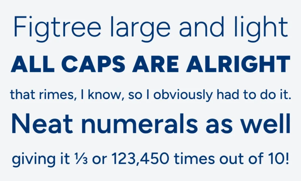
- Type: Geometric Sans-Serif
- Best For: UI, General Use, Branding
- Key Trait: Clean, simple, and slightly quirky.
- Why it Works: Figtree is Google’s brand font and was recently added to Google Fonts. It’s a more characterful and refined version of Poppins. It’s modern, highly functional, and a great alternative if you want something fresh but still a workhorse.
Nunito Sans
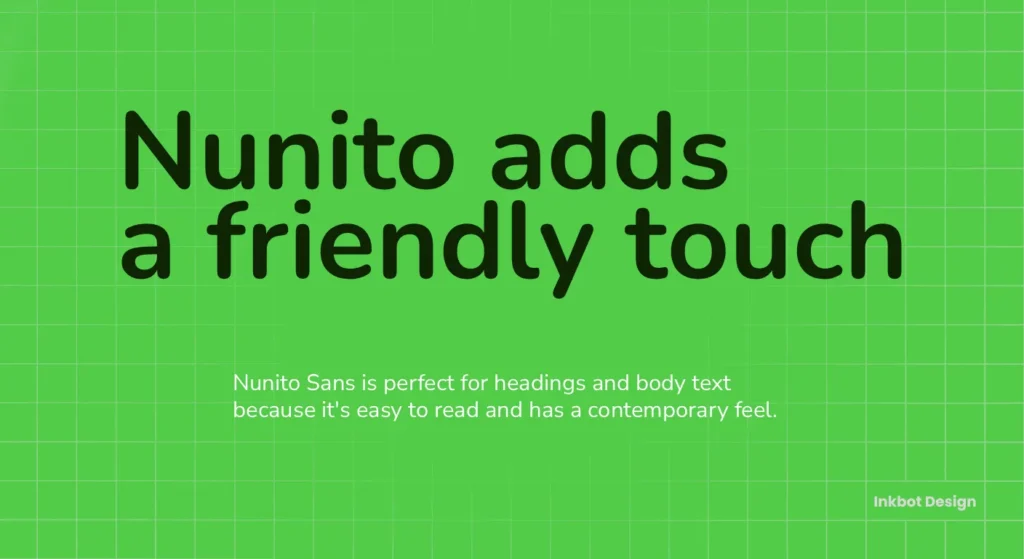
- Type: Humanist Sans-Serif
- Best For: Body Text, Headings
- Key Trait: Rounded terminals that give it a soft, friendly feel.
- Why it Works: If you want a clean sans-serif but find others too “sharp” or corporate, Nunito Sans is the answer. The rounded letter endings make it feel approachable and warm, perfect for brands that want to appear friendly and accessible.
Work Sans
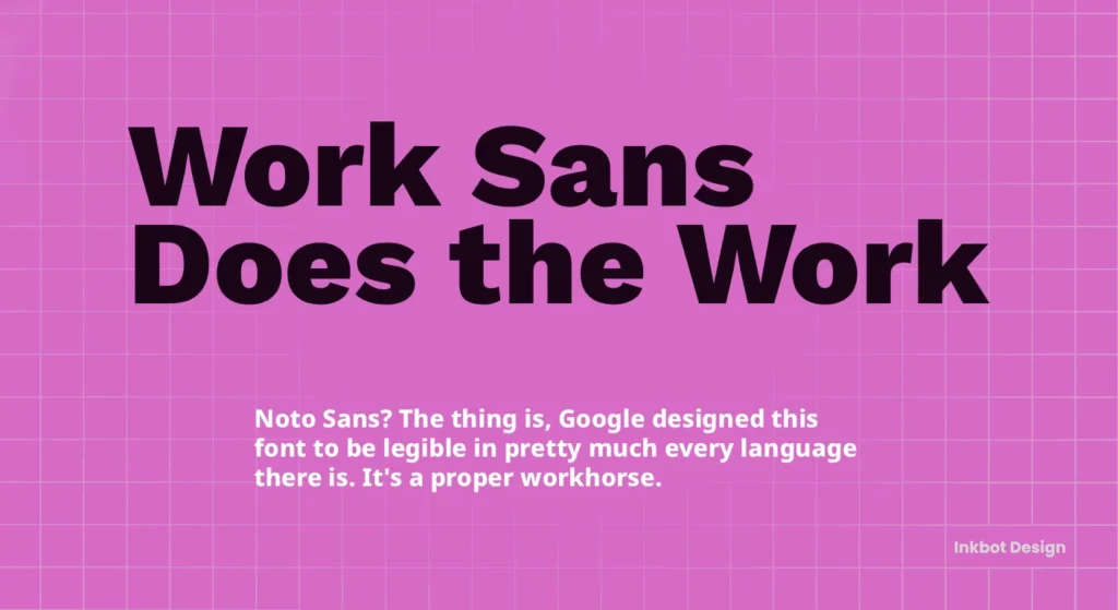
- Type: Grotesque Sans-Serif
- Best For: Headings, General Use
- Key Trait: Optimised for on-screen use, with varying weights for different sizes.
- Why it Works: Work Sans is a versatile family. Its lighter weights are clean and modern, while the heavier weights become expressive and powerful for headlines. It’s a great choice if you want one font family to do everything.
DM Sans

- Type: Geometric Sans-Serif
- Best For: Body Text, UI
- Key Trait: Low contrast and designed for smaller text sizes.
- Why it Works: Commissioned by Google from Colophon Foundry, DM Sans is derived from Poppins but adapted for better legibility in body copy. It’s clean, compact, and performs exceptionally well on mobile screens.
Source Sans Pro

- Type: Humanist Sans-Serif
- Best For: UI, Long-form Reading
- Key Trait: Adobe’s first open-source typeface.
- Why it Works: Source Sans Pro was designed with user interface clarity in mind. It has a slightly more corporate and serious feel than Lato or Open Sans, making it a solid choice for professional services, tech documentation, or any site that values clarity above all.
Raleway
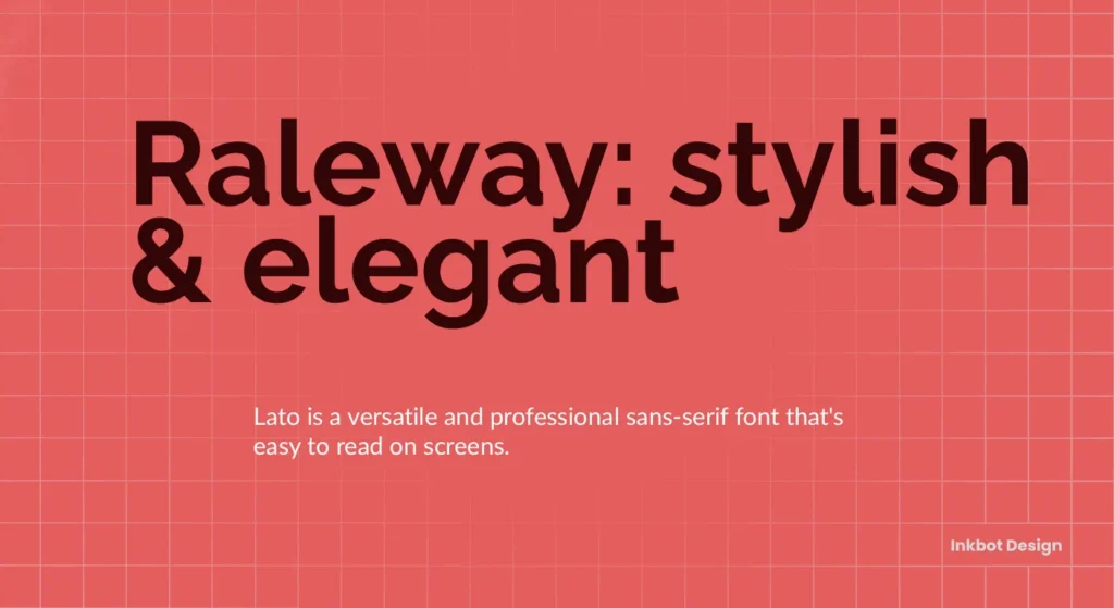
- Type: Geometric Sans-Serif
- Best For: Headings, Display
- Key Trait: Stylish, with distinctive characters like the ‘W’.
- Why it Works: Raleway is elegant and has a touch of class. While it can work for body text, it shines as a display font for large headings where its unique character shapes can be appreciated. It adds a sophisticated touch without being overly decorative.
Rubik

- Type: Geometric Sans-Serif
- Best For: Headings, UI
- Key Trait: Slightly rounded corners for a softer feel.
- Why it Works: Rubik is a solid, confident font. The subtle rounding on its corners makes it feel less aggressive than blocky sans serifs. It’s great for tech sites, apps, and any brand that wants to feel modern and robust.
Public Sans

- Type: Grotesque Sans-Serif
- Best For: UI, Government/Institutional Websites
- Key Trait: Based on Libre Franklin, designed for neutrality.
- Why it Works: Developed for use by the U.S. government, Public Sans defines a neutral, functional typeface. It’s designed to be clear, accessible, and authoritative without any stylistic flair—an excellent choice for sites that need to convey trust and impartiality.
The Classics: 8 Best Serif Fonts for Trust and Elegance
With their small decorative strokes, Serif fonts convey tradition, authority, and trustworthiness. They are excellent for editorial content, professional services like law or finance, and luxury brands. Be careful, though—a poor choice can look dated on screen.
Merriweather
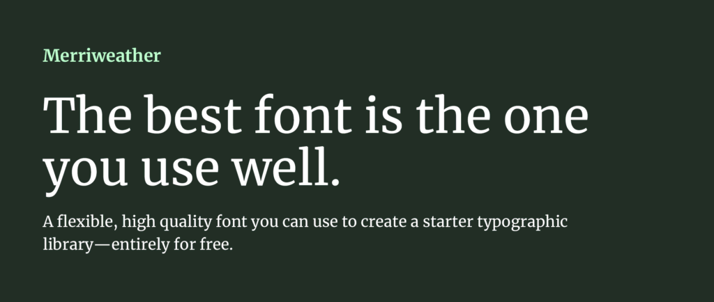
- Type: Serif
- Best For: Body Text
- Key Trait: Designed to be a pleasure to read on screens.
- Why it Works: Merriweather is the best serif font for web reading. It has a large x-height, condensed letterforms, and sturdy serifs that hold up well at any size. It’s the Open Sans of the serif world.
Lora

- Type: Contemporary Serif
- Best For: Body Text, Storytelling
- Key Trait: Well-balanced with calligraphic roots.
- Why it Works: Lora has moderate contrast, making it excellent for long text passages. It feels artistic and elegant without compromising readability, making it perfect for blogs, online magazines, and brands with a narrative focus.
Playfair Display

- Type: Transitional Serif
- Best For: Headings
- Key Trait: High-contrast, delicate hairlines.
- Why it Works: Playfair Display is pure elegance. 18th-century letterforms inspire it and are perfect for fashion, luxury, or editorial headlines. Do not use it for body text. Its delicate lines will fall apart at small sizes.
PT Serif

- Type: Transitional Serif
- Best For: Body Text, General Use
- Key Trait: Designed for use alongside PT Sans.
- Why it Works: PT Serif is a highly practical and readable serif. It was designed to serve the people of the Russian Federation, so it has excellent character support and was built for clarity—a very safe and solid choice for body copy.
Source Serif Pro

- Type: Transitional Serif
- Best For: Body Text
- Key Trait: The serif companion to Source Sans Pro.
- Why it Works: Source Serif Pro is built for clarity and extended reading like its sans-serif counterpart. It’s a balanced, highly legible typeface that works exceptionally well for content-heavy websites.
Cormorant Garamond

- Type: Garamond-style Serif
- Best For: Headings, Display
- Key Trait: Extremely elegant and delicate.
- Why it Works: Cormorant is a beautiful display version of the classic Garamond typeface. Its graceful curves and sharp serifs are perfect for adding a touch of luxury and sophistication to headings. Again, avoid it for body text.
Bitter

- Type: Slab Serif
- Best For: Body Text, Headings
- Key Trait: A contemporary slab serif designed for reading.
- Why it Works: Slab serifs have thick, blocky serifs. Bitter was designed with a large x-height and consistent stroke thickness to make it comfortable for reading on screens. It feels both modern and traditional at the same time.
EB Garamond
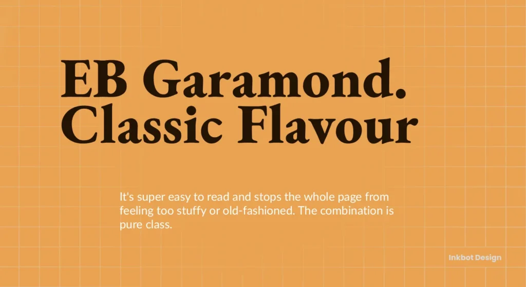
- Type: Classic Serif
- Best For: Body Text, Editorial
- Key Trait: An open-source revival of the classic Garamond.
- Why it Works: Garamond has been a gold standard for book printing for centuries. EB Garamond brings that timeless readability to the web. It’s a fantastic choice for academic sites, publishers, or any brand wanting to project intelligence and tradition.
The Specialists: 3 Display & Monospace Fonts (Use Sparingly)
These fonts are built for specific, high-impact jobs. They are not all-rounders. Use them with intention and restraint.
Oswald (Display)
- Type: Grotesque Sans-Serif
- Best For: Headings, Navigations
- Key Trait: A condensed, bold style.
- Why it Works: Oswald is designed to fit in tight spaces. Its narrow and bold nature makes it perfect for impactful headlines, navigation bars, and anywhere you need to say a lot with a bit of space. It’s the font equivalent of a bold statement.
DM Serif Display (Display)

- Type: Transitional Serif
- Best For: Headings, Short Phrases
- Key Trait: High-contrast and designed for larger sizes.
- Why it Works: The display is a companion to DM Sans. It’s sharp, elegant, and full of character. Use it for your main page title (H1) to create an immediate sense of style and pair it with a simple sans-serif font for everything else.
Space Mono (Monospace)
- Type: Monospace
- Best For: Code Blocks, Technical Info, Stylistic Effect
- Key Trait: Every character occupies the same horizontal width.
- Why it Works: Monospaced fonts originated with typewriters and are now primarily used to display code. You can also use Space Mono to create a technical or retro feel for specific labels or callouts on a website.
How to Pair Fonts Without Making a Mess
Font pairing is where most people get into trouble. You don’t need to be a master typographer. Just follow one of these foolproof rules.
- Rule 1: Use a Superfamily. Some fonts are designed as part of a larger family that includes both serif and sans-serif versions, like Source Sans Pro and Source Serif Pro. They are guaranteed to work together perfectly.
- Rule 2: Create Obvious Contrast. The most common mistake is pairing two fonts that are too similar. Instead, pair a strong, geometric sans-serif heading (like Montserrat) with a neutral, humanist serif body (like Lora). The contrast creates a clear visual hierarchy.
- Rule 3: Just Use One Font Family. This is the safest, fastest, and often most professional option. Pick a versatile font with many weights, like Inter or Work Sans. Use the Bold or Black weight for headings, Regular for body text, and Italic for emphasis. It’s clean, performant, and impossible to mess up.
Getting this right is a core part of effective web design. If you’re building a site and are going in circles on typography, it’s often a sign that a foundational part of the design strategy is missing. Our team at Inkbot Design focuses on this from day one in our web design services.
Where to Get Quality Fonts (That Won’t Get You Sued)
Don’t wander into the wilderness of sketchy font websites. Stick to the pros.
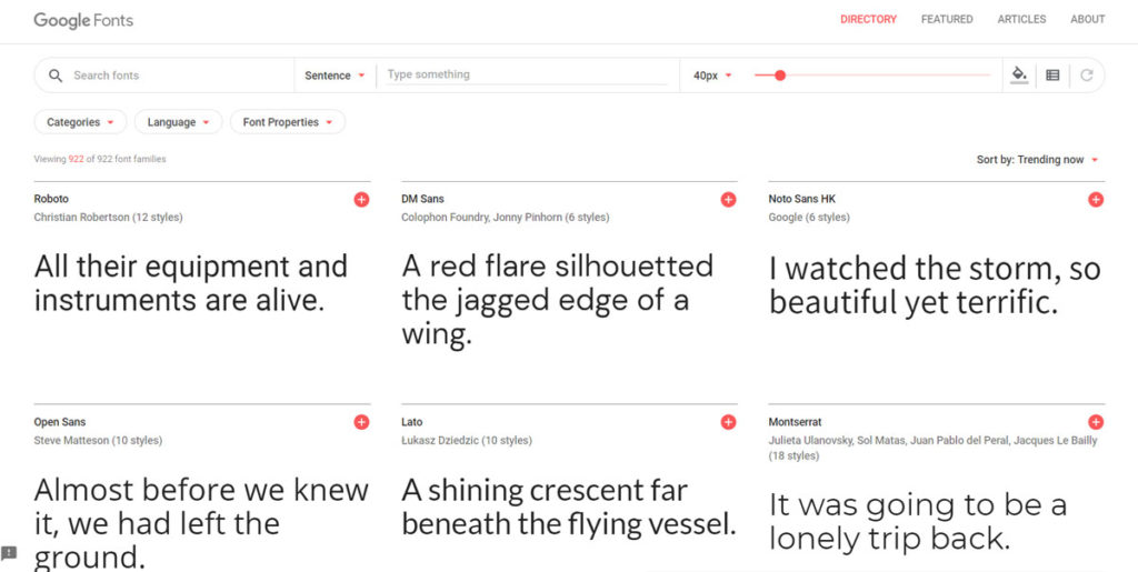
Google Fonts (The Obvious Choice, With a Caveat)
Google Fonts has the most extensive collection of high-quality, open-source fonts. They are all free for commercial use. The caveat: always download the WOFF2 files and host them on your own server for better performance. Don’t use the provided <link> code.
Adobe Fonts
If you have an Adobe Creative Cloud subscription, you already have access to a massive library of premium fonts. They are licensed for web use and easy to implement. It’s a huge value-add to the subscription.
Reputable Foundries
Buy a unique or premium typeface directly from the foundry that created it. This is the gold standard. You’re supporting the designers directly and will get a rock-solid font file with a clear commercial license.
A Final Word: Stop Searching, Start Building
You now have a list of 25 excellent fonts and a simple framework for choosing one. There is no hidden “perfect” font out there that will magically transform your business.
The best font is chosen quickly, implemented correctly, and then forgotten by your users. It’s a functional tool, not a centrepiece.
Pick a font from this list. Set it up correctly on your website. Then, get back to the work that actually grows your business.
Ready to build a website where every element, from the fonts to the code, is designed to perform? At Inkbot Design, we handle the technical details so you can focus on your business. Request a quote today, and let’s build something practical.
Our Best Fonts for a Website (FAQs)
What is the most popular font for websites?
Historically, fonts like Arial and Helvetica were dominant. In the modern era of web fonts, Open Sans, Roboto, and Lato from Google Fonts are incredibly popular due to their excellent readability and neutral design.
What is the difference between a serif and a sans-serif font?
Serif fonts have small decorative strokes (called serifs) at the end of the main lines of a letter. Sans-serif fonts do not (“sans” is French for “without”). Serifs are often seen as more traditional, while sans serifs are viewed as more modern and clean.
How many fonts should I use on a website?
Ideally, one or two. The simplest and often best approach is to use a single versatile font family with different weights (e.g., Light, Regular, Bold) for hierarchy. If you use two, make sure they have a strong contrast. Never use more than three.
Are Google Fonts free for commercial use?
Yes. All fonts listed on Google Fonts are open source and licensed in a way that allows you to use them for any project, commercial or personal.
What is the best font size for website body text?
The standard for desktop is now between 16px and 18px. This ensures comfortable reading for the majority of users. Anything smaller can cause eye strain. Headings should be proportionally larger to create a clear hierarchy.
What is a variable font?
A variable font is a single file containing a continuous range of design variations, such as weight, width, or slant. This is more efficient than loading separate font files for Regular, Bold, Italic, etc., leading to better site performance.
Should I self-host my fonts or use a service like Google Fonts?
For the best performance and privacy, you should self-host your fonts. Download the WOFF2 font files from a service like Google Fonts and upload them to your own server, then use CSS to load them. This avoids an extra request to an external server.
What makes a font “web-safe”?
The term “web-safe fonts” traditionally referred to fonts pre-installed on most operating systems (like Arial, Georgia, Times New Roman). Today, with modern web font technology (@font-face), any properly licensed font can be embedded and “safe” to use on your website.
How do I choose a font that matches my brand?
Think about the adjectives you use to describe your brand. A classic serif like EB Garamond makes sense if you are a “traditional, trustworthy, authoritative” law firm. A geometric sans-serif like Poppins or Figtree is a better fit if you are a “modern, clean, innovative” tech startup.
Can I just use the default font in my website theme?
You can, but many default theme fonts are chosen for aesthetic neutrality, not optimal performance or readability. It’s always worth spending 30 minutes to replace a generic default with a high-quality workhorse font like Inter or Merriweather.
