5 eCommerce Marketing Design Hacks That 10x Conversions
You’ve got an online shop. Great products. Decent traffic. But your sales aren’t exactly setting the world on fire. Sound familiar?
Truth be told, having brilliant products is just half the battle. The other half? Getting your eCommerce marketing design spot on. Not just good, properly brilliant.
- Bad UX design costs eCommerce $1.42 trillion annually due to high cart abandonment rates.
- iOS users convert 20-30% more than Android users; brands must adapt design for iOS uniquely.
- 47% of buyers expect live chat during purchases, but few brands offer integrated chat solutions.
- 70% of consumers demand personalisation; AI-driven dynamic layouts are crucial for effective targeting.
The 2025 eCommerce Marketing Design Revolution
1. The $1.4 Trillion UX Tax
Statistic: Bad UX design drains $1.42 trillion annually from the eCommerce industry due to a 75.6% cart abandonment rate.
Implication: This isn’t just about clunky checkouts—it’s a systemic failure to align design with neurocognitive buying triggers. Brands treating UX as a “cost centre” are haemorrhaging revenue, while those using AI-driven heatmaps and biometric feedback tools are capturing abandoned carts.
Pattern: The gap between “good enough” and “neuro-optimised” design is between profit and collapse. Most brands still prioritise aesthetics over conversion psychology.
2. The iOS Conversion Heist
Statistic: iOS users convert 20-30% higher than Android users in mCommerce, yet most brands still design for Android-first compatibility.
Implication: From Safari’s privacy-focused tracking to one-click payments, Apple’s ecosystem creates a frictionless buying environment. Brands ignoring ios-specific design optimisations (e.g., Safari CSS hacks, Apple Pay prominence) are leaving millions on the table.
Pattern: Platform-specific design is becoming as critical as mobile responsiveness was in 2020.
3. The Live Chat Lifeline
Statistic: 47% of buyers now demand live chat assistance during purchases, yet under 15% of mid-market brands offer AI-enhanced, design-integrated chat.
Implication: The “help me now” expectation has shifted from nice-to-have to conversion-critical. Brands embedding chat UIs directly into product pages (not just footers) see 2x cart recovery rates.
Pattern: Customer service is no longer a post-purchase function—it’s a design element baked into the buying journey.
4. The Personalisation Paradox
Statistic: While 70% of consumers demand personalisation, most brands still rely on basic recommendation engines. The real game-changer? AI-driven dynamic layouts that rearrange entire page structures based on user intent signals in real-time.
Implication: Static “personalised” product grids are dead. Winners use session-behaviour AI to alter CTAS, imagery, and checkout flows mid-session.
Pattern: Personalisation is evolving from content curation to complete design morphing.
5. The AR Revenue Mirage
Statistic: AR drives $120 billion in mCommerce sales, yet adoption remains below 8% for SMBS due to poor design integration.
Implication: AR isn’t failing—brands are shoehorning it into generic product pages instead of rebuilding layouts around 3d interaction models.
Pattern: AR will soon require dedicated “try-on” pages with gesture-controlled UI, not just pop-up viewers.
The Psychology Behind Shopping Cart Abandonment
Before jumping into our conversion-boosting hacks, let’s talk about why shoppers flee at the last minute. About 70% of online shopping carts end up abandoned. That’s a proper headache for any business owner.
Shopping cart abandonment doesn’t happen by chance. It’s often triggered by specific design flaws that create friction in the user journey. When potential customers hit these roadblocks, they’re quick to click away.
Common reasons include unexpected costs, complicated checkout processes, and dodgy websites. Would you hand over your credit card details to a site that looks like it was built in 2003? Didn’t think so.
The good news? These problems can be fixed with smart eCommerce marketing design changes that build trust and smooth out the buying process.
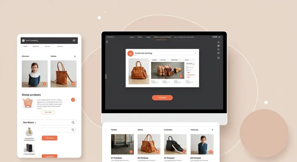
Hack #1: Create Product Pages That Sell

Your product pages aren’t just digital shelves—they’re your virtual salespeople working around the clock. And just like in a physical shop, presentation matters enormously.
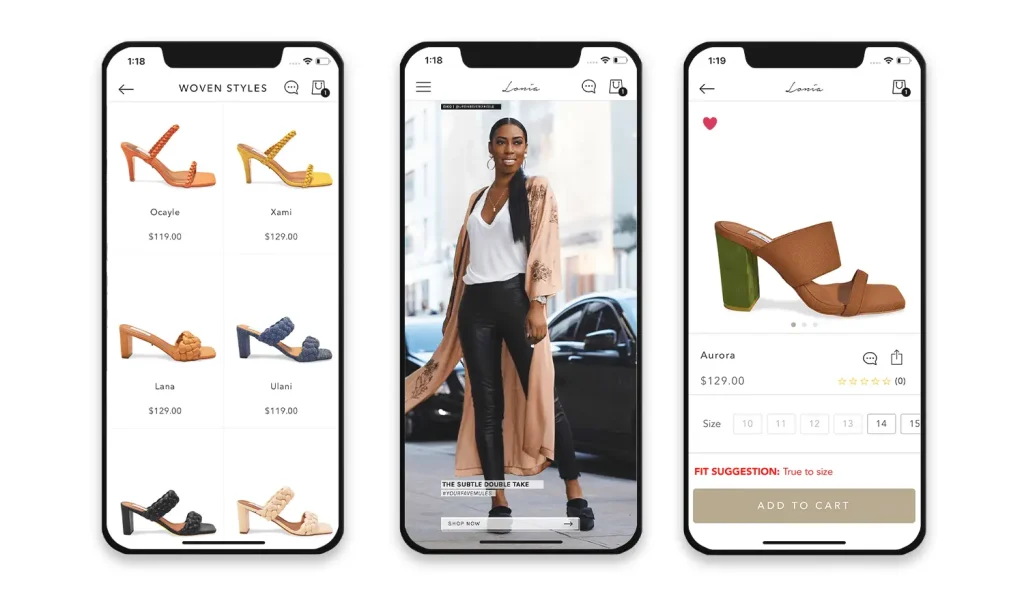
The Power of High-Quality Product Photography
First things first: your product images need to be top-notch. Blurry, poorly lit photos scream “amateur” and erode customer confidence faster than you can say “declining conversion rates.”
Professional product photography isn’t just a luxury—it’s essential. Studies show that 83% of online shoppers consider product images the most influential factor in purchasing decisions.
- Use multiple angles (5-7 is ideal)
- Show products in context (how they’re used in real life)
- Include zoom functionality for detailed inspection
- Add lifestyle images showing real people using the product
Product photography best practices aren’t just about making things look pretty—they’re about answering questions before customers even ask them.
Compelling Product Descriptions That Convert
Great, so you’ve got cracking photos. What about your product descriptions?
Too many online stores treat product descriptions as an afterthought. “It’s a black t-shirt; what more is there to say?” Plenty.
Your product description needs to:
- Address the pain points your product solves
- Highlight unique selling points
- Use sensory language that helps customers imagine using the product
- Include specific details that matter to buyers (materials, dimensions, care instructions)
A well-crafted product description doesn’t just inform—it sells. It bridges the gap between seeing a product online and experiencing it in person.
Social Proof: Reviews and Ratings
Nothing builds confidence like seeing other people’s positive experiences. Customer reviews and ratings are gold dust for eCommerce conversion rates.
Make your review system:
- Prominent on the page (don’t hide it)
- Easy to filter and sort
- Include photos from real customers
- Show verified purchase badges
Research from BrightLocal found that 87% of consumers read online reviews for local businesses before purchasing. For online-only companies, that number is likely even higher.
Hack #2: Streamline Your Checkout Process

The checkout process is where many eCommerce sites fumble the ball. Every extra click, form field, or moment of confusion increases the likelihood of abandonment.
The Single-Page Checkout Revolution
Multi-page checkouts are increasingly seen as conversion killers. Each new page is another opportunity for customers to reconsider or get distracted.
Single-page checkouts condense the process into one seamless experience. They show customers exactly what’s happening and how far along they are.
Key components of an effective single-page checkout:
- Clear progress indicators
- Collapsible sections that expand as needed
- Address lookup tools to speed up form completion
- The persistent order summary is always visible
Brands like ASOS have seen conversion improvements up to 50% after implementing streamlined single-page checkouts. That’s not incremental improvement—that’s transformation.
Guest Checkout Options
“Create an account to complete your purchase.”
Few phrases trigger more abandonments than forced account creation. When someone’s ready to buy, the last thing they want is to fill out yet another registration form.
Always offer guest checkout options. You can still invite customers to create an account after purchase when they’re feeling positive about their experience with your brand.
Payment Options Diversity
Different customers prefer different payment methods. The more options you provide, shoppers have fewer reasons to abandon their carts.
Beyond standard credit cards, consider:
- Digital wallets (Apple Pay, Google Pay)
- Buy Now, Pay Later services (Klarna, Clearpay)
- PayPal and similar services
- Local payment options are popular in your target markets
Each additional payment method can capture a segment of customers who might otherwise abandon their purchase.
Hack #3: Mobile-First Design That Works
Mobile commerce isn’t the future—it’s the present. Over 70% of eCommerce traffic comes from mobile devices, and that percentage keeps climbing.
Yet many online stores still treat mobile as an afterthought, with clunky interfaces that frustrate mobile shoppers.
Thumb-Friendly Navigation
Have you ever tried using a desktop-designed website on your phone? Pinching, zooming, and accidentally clicking the wrong tiny buttons? Not exactly a pleasant shopping experience.
Thumb-friendly navigation means designing your interface around how people hold and use their phones.
Essential elements should be within easy reach of the thumb zone—typically the middle and lower portions of the screen. Critical buttons like “Add to Cart” and “Checkout” should be prominent and easy to tap accurately.
Speed Optimisation for Mobile Users
Mobile users are often on slower connections than desktop users. Every second your site takes to load costs you money. Literally.
Research from Portent found that conversion rates drop by an average of 4.42% for each additional second of load time between seconds 0-5.
For mobile optimisation:
- Compress images without sacrificing quality
- Implement lazy loading for content below the fold
- Minimise CSS and JavaScript files
- Use a content delivery network (CDN)
Google’s PageSpeed Insights offers free analysis of your site’s mobile performance, along with specific recommendations for improvement.
Simplified Forms for Small Screens
Long forms are conversion killers on any device, but they’re especially problematic on mobile. Nothing makes a potential customer abandon faster than facing a 20-field form on a smartphone.
For mobile forms:
- Use single-column layouts
- Implement auto-fill wherever possible
- Show appropriate keyboard types (numeric for phone numbers, email keyboard for email addresses)
- Break long forms into logical steps
- Only ask for essential information
Every field you remove from your forms increases your conversion rate. Ask yourself: “Do I need this information right now to make the sale?”
Hack #4: Personalisation That Doesn’t Feel Creepy

Personalisation in eCommerce marketing design walks a fine line. Done well, it makes customers feel understood and valued. Done poorly, it feels intrusive and unsettling.
Smart Product Recommendations
Amazon attributes up to 35% of its revenue to its recommendation engine. That’s the power of showing customers products they will likely want based on their browsing and purchase history.
Effective recommendation systems:
- Show recently viewed items for easy return
- Suggest complementary products (“Frequently bought together”)
- Highlight what similar customers purchased
- Present personalised deals based on browsing patterns
The key is making recommendations feel helpful rather than stalker-ish. Focus on adding genuine value to the shopping experience.
Abandoned Cart Recovery Emails
When a customer abandons their cart, all is not lost. A well-designed cart recovery email can bring them back and close the sale.
Elements of effective cart recovery emails:
- Clear images of abandoned items
- Prominent “Return to Cart” button
- Gentle, friendly tone (not pushy or desperate)
- Potential incentive (small discount or free shipping)
- Review highlights or guarantees to address potential concerns
Timing matters, too. The first recovery email should be sent within an hour of abandonment when the shopping intent is fresh.
Moosend’s research shows that abandoned cart emails have an average open rate of 45% and a conversion rate of around 10%, making them one of the most effective types of marketing emails.
Hack #5: Trust Signals That Build Confidence

In the physical world, we use countless subtle cues to determine whether a business is trustworthy. Online, those signals must be deliberately designed into your eCommerce experience.
Security Badges That Matter
Security badges reassure customers that their personal and payment information is safe. But not all badges are created equal.
The most effective trust badges include:
- SSL certificates (visible through the HTTPS padlock)
- Payment processor security logos (Visa Secure, Mastercard SecureCode)
- Third-party security certifications (Norton, McAfee)
Place these badges prominently near checkout buttons and payment information fields where customers feel most vulnerable about their data.
Money-back guarantees and Return Policies
Uncertainty about returns is a major conversion killer. A clear return policy becomes crucial when customers can’t try products before buying.
Make your guarantees:
- Visible on product pages
- Written in straightforward language
- Genuinely customer-friendly
- Easy to understand at a glance
Good return policies don’t just prevent abandonment—they actively encourage purchases by reducing perceived risk.
Customer Service Accessibility
Nothing builds trust like knowing help is available if something goes wrong. Make your customer service options obvious throughout the buying journey.
Effective approaches include:
- Live chat widgets that follow the user
- Displayed contact information
- Estimated response times for inquiries
- FAQS addressing common concerns
Exceptional customer service transforms one-time buyers into loyal brand advocates—and it starts with accessible, responsive support options designed into your eCommerce experience.
Putting These Hacks Into Action
These eCommerce marketing design hacks don’t exist in isolation—they work together as part of a cohesive customer experience. The best approach is to implement them systematically, measuring results as you go.
Start with an audit of your current eCommerce experience. Where are customers dropping off? Which pages have high bounce rates? Use tools like Google Analytics and Heatmap software to identify trouble spots.
Then, prioritise your improvements based on potential impact. Often, the checkout process offers the quickest wins, followed by product page enhancements and mobile optimisation.
Remember that testing is crucial. A/B tests your changes to ensure they improve metrics, not just the user experience.
FAQ: eCommerce Marketing Design
How important is site speed for eCommerce conversion rates?
Extremely important. Even a one-second delay in page response can reduce conversions by 7%. Mobile users are susceptible to speed issues, with 53% abandoning sites that take longer than three seconds to load.
Should I prioritise desktop or mobile design for my online store?
While both matter, mobile should be a priority in 2025. Mobile commerce now accounts for more than 70% of all eCommerce traffic, and Google uses mobile-first indexing for search rankings.
How many product images should I include on a product page?
Research suggests that 5-7 images from different angles provide the optimal balance between information and page performance. Always include at least one lifestyle image showing the product in use.
Do customer reviews impact sales that much?
Absolutely. Products with reviews have conversion rates up to 270% higher than products without reviews. Even negative reviews can be beneficial, as they establish authenticity and help set accurate customer expectations.
What’s the ideal number of steps in a checkout process?
Single-page checkouts generally perform best, but if you need multiple steps, keep it to a maximum of three. Every additional step typically reduces conversion rates by 10%.
How can I reduce cart abandonment rates?
The most effective strategies include transparent pricing with no surprise fees, offering guest checkout options, providing multiple payment methods, and implementing exit-intent popups with incentives to complete the purchase.
Should I use video on product pages?
Yes, when appropriate. Product videos can increase conversions by up to 80%, particularly for complex products that benefit from demonstration or explanation.
How do I know if my eCommerce design is working?
Track key metrics, including conversion rate, average order value, cart abandonment rate, bounce rate on product pages, and time spent on site. Compare these against industry benchmarks and your historical data.
Is it worth investing in professional product photography?
Almost always. High-quality product images are consistently rated as the most essential factor in purchase decisions. The ROI on professional photography is exceptionally high for eCommerce businesses.
How often should I update my eCommerce site design?
Minor optimisations should be ongoing based on data and testing. For major redesigns, every 18-24 months is typical to keep up with evolving user expectations and technologies.
eCommerce Marketing Design: Where Art Meets Science
Great eCommerce marketing design isn’t just about making things look pretty. It’s about understanding customer psychology and creating experiences that guide visitors naturally toward purchase decisions.
The five hacks we’ve explored—optimising product pages, streamlining checkout, embracing mobile-first design, personalising thoughtfully, and building trust—form the foundation of high-converting eCommerce experiences.
By implementing these strategies systematically and measuring their impact, you can transform your online store from an also-ran into a conversion powerhouse. And in today’s competitive eCommerce landscape, that’s not just nice to have—it’s essential for survival and growth.
Remember: eCommerce marketing design isn’t a one-and-done effort. It’s an ongoing process of refinement based on data, testing, and customer feedback. Keep optimising, keep measuring, and keep looking for opportunities to create shopping experiences that don’t just satisfy customers—they delight them.
Your competitors are just a click away. Ensure your eCommerce design gives customers every reason to stay, shop, and return for more.
The Bottom Line
eCommerce design is no longer about making things “look nice”—it’s a high-stakes behavioural science experiment. Brands clinging to 2020-era best practices (e.g., responsive templates, basic personalisation) will join Blockbuster in the graveyard. The winners? Those treating every pixel as a psychological lever to pull.
For those ready to act: Start redesigning for AI-driven adaptability now, or prepare to be outmanoeuvred by startups with no legacy systems to hold them back. The future belongs to the paranoid optimisers.


