An Expert’s Take on Brand Logos: How Do You Pull Them Off?
Your brand logo is not a piece of art. It’s not a therapy session for your creative side.
And it is certainly not a complex visual summary of your entire company history, mission, and the name of your first pet.
Most entrepreneurs get this wrong. Dead wrong.
They burn thousands of pounds and countless hours trying to create something they like. They treat designers like a pair of hands to execute their vague, subjective whims. They ask their spouse, their neighbour, and their barista for feedback.
This approach always, without fail, leads to a weak, dysfunctional logo that actively harms the business.
The problem is a fundamental misunderstanding of the job. You’re asking the logo to be a masterpiece when you should ask it to be a hammer. It’s a tool. A functional piece of equipment designed for one particular purpose.
And until you understand that purpose, you’re just gambling.
- A logo's primary role is to identify your business quickly and reliably, acting as a mental shortcut for customers.
- Creating a successful logo requires a clear brief and avoiding design by committee to prevent diluted results.
- Logos must adhere to five principles: simplicity, memorability, versatility, timelessness, and appropriateness to function effectively.
What Is a Logo’s Real Job?
A logo has one primary job: to identify your business. That’s it.
Its job is to be a simple, visually distinct mark that allows a customer to recognise your company quickly and reliably. It must be a mental shortcut in a packed market, busy street, or fast-scrolling social media feed.
It doesn’t need to explain what you do. The Nike swoosh doesn’t say “we sell athletic apparel and footwear.” The Apple logo doesn’t say “we design and sell premium consumer electronics and software.”
They are empty vessels. The meaning is filled by the brand’s actions, products, and reputation over time.
A good logo provides a hook for those memories and associations to hang on. Look at Amazon. The arrow points from A to Z, signifying they sell everything. It also doubles as a smile, indicating customer satisfaction.
It’s clever, but more importantly, it’s obvious. The meaning is accessible in less than a second.
Your logo’s job is to be an identifier. Fast. Reliable. Unambiguous. Anything else is a bonus.
The 7 Types of Logos (And Why This Isn’t Just Semantics)
Knowing the basic categories isn’t about passing a design quiz. It’s about having a clear language when briefing a designer or evaluating concepts. Choosing a lane helps you focus your efforts.
The Wordmark (or Logotype)
This is a font-based logo that focuses on the business name itself. Think Google, Coca-Cola, or VISA. The typography is the star. Use a wordmark if you have a distinct name around which you want to build recognition.
The Logomark (or Brand Mark)
This is an icon or graphic-based logo. It’s a symbol. Apple’s apple, Nike’s swoosh, the Twitter bird (before it was X’d out of existence). This works best for brands that are already well-established, as the symbol needs to earn its meaning.
The Combination Mark
This is a mix of a wordmark and a logomark. Think Lacoste or Rolex. It’s the most popular choice for a reason: it’s versatile. The symbol and the text can be used together or separately, giving you more options.
The Abstract Mark
This specific type of logomark uses an abstract geometric form to represent the brand. The Pepsi circle or the Chase Bank octagon aren’t pictures of anything. They’re unique shapes that become linked to the brand.
The Mascot
Mascots are illustrated characters that act as brand ambassadors. The Michelin Man or KFC’s Colonel Sanders are classic examples. Mascots are great for creating a friendly, approachable feel, particularly for family-oriented brands.
The Emblem
An emblem is a font inside a symbol or icon, like a badge, seal, or crest. Starbucks and Harley-Davidson use emblems. They often have a traditional, established feel, but can be challenging to read when scaled down.
The Letterform (or Monogram)
Letterform logos consist of the initials of a brand. HBO (Home Box Office) and NASA (National Aeronautics and Space Administration) are prime examples. It’s a solid choice for businesses with long names.
The 5 Unbreakable Principles of a Logo That Actually Works
Your logo can work effectively if it adheres to these five principles. These aren’t suggestions; they are the laws of functional design.
Principle 1: Strive for Simplicity
A complex logo is a failed logo. It must be digestible in a fraction of a second. The most iconic logos are brutally simple. A swoosh. A bitten apple. Three parallel bars.
When Apple started, its logo was a detailed etching of Isaac Newton under a tree. It was unusable. They simplified it to the apple silhouette we know today because simple is easy to recognise and remember.
Principle 2: Make It Memorable
Simplicity is the direct path to memorability. Here’s a simple test: show someone your logo for five seconds, then ask them to sketch it from memory an hour later.
If they can capture the fundamental essence, you have a memorable mark. If they can’t, you have a problem.
Principle 3: Build for Versatility (And a Tiny Screen)
This is where most logos fail. A designer presents a beautiful, full-colour logo on a 27-inch screen, and the client falls in love.
They completely forget that the logo will spend 99% of its life as a tiny favicon, a social media profile icon, or embroidered on a shirt.
A versatile logo must work:
- In one colour (black or white).
- At a massive scale (on a billboard).
- At a minuscule scale (on a business card).
- On a light background and a dark background.
It is not a functional logo if it relies on gradients or fine detail to be legible.
Principle 4: Aim for Timelessness, Not Trends
Design trends come and go. Remember the swooshes and glows of the early 2000s? The ultra-thin, geometric “hipster” logos of the 2010s? Chasing trends guarantees your logo will look dated in 3-5 years.
The Coca-Cola script has been in use for over a century. It has been tweaked, but its core has remained the same. It doesn’t scream “1880s,” it just screams “Coca-Cola.” That’s the goal. Good design ignores fleeting fads.
Principle 5: Keep It Appropriate
Your logo must align with the expectations of your industry and audience. A law firm using a whimsical, cartoonish font would feel unprofessional.
A toy company would feel cold and out of place using a stark, corporate serif font. This isn’t about being cliché; it’s about meeting your audience where they are. The design should feel appropriate for the service being offered.
The 3 Costliest Mistakes Entrepreneurs Make with Logos
I see these same three mistakes sink businesses over and over. They are traps that feel productive but lead to a weak brand identity.
Mistake #1: You’re Obsessed with Hidden Meanings
Everyone points to the arrow hidden in the FedEx logo. “I want something clever like that!” they say.
Here’s the hard truth: the FedEx arrow is a cool party trick, but it’s not why the logo is successful. The logo works because the colours are bold and the typography is clean and legible on the side of a truck going 70 mph. The arrow is a bonus, discovered by a tiny fraction of their audience.
For a new business, clarity beats cleverness every single time. Wasting time trying to embed three obscure symbols into a mark nobody will ever decipher is a waste of resources. Be clear first. Be clever later, if at all.
Mistake #2: You Design by Committee
The founder has an opinion. Their partner has an opinion. The marketing intern has an opinion. The more people you involve in subjective feedback, the more you water down the result.
Design by committee inevitably produces a “camel“—a horse designed by a committee. It’s a mishmash of compromised ideas that pleases no one and stands for nothing.
The final design becomes a bland, safe, and utterly forgettable mark. Design is a strategic process led by a clear vision, not a democratic vote.
Mistake #3: You Confuse Your Logo with Your Entire Brand
“We need a new logo to fix our brand.” No, you don’t.
A logo is a symbol for your brand. It’s an avatar. Your brand, however, is the total of every interaction, experience, and perception a customer has with your company. It’s your customer service, product quality, reputation, and tone of voice.
A great logo on a terrible business is just lipstick on a pig.
A weak logo on a fantastic business can still succeed (though it’s making its life harder). The goal is to align a strong, functional logo with a strong, well-executed business.
They are two separate things. Building an authentic brand identity is all about focusing on the complete picture.
A Simple, No-Nonsense Process for Getting a Logo
If you avoid mistakes and stick to the principles, the process becomes more straightforward and effective.
Step 1: The Brief
This is the most critical step. A designer can only produce good work from a good brief. If you provide garbage input, you will get garbage output. Your brief must clearly define your audience, primary competitors, unique value proposition, and the core feeling you want to evoke.
Step 2: Research & Mood Boarding
Gather visual inspiration. Look at your competitors’ logos. What works? What doesn’t? Look at logos from other industries that you admire. A mood board isn’t for copying; it’s for establishing a general aesthetic direction for colours, fonts, and styles.
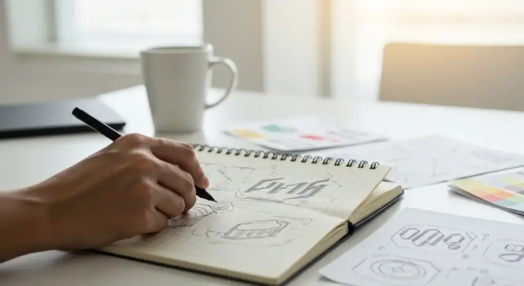
Step 3: Sketching & Conceptualisation (The Messy Part)
This is where ideas are born. A good designer will start with pencil and paper, quickly exploring dozens of different concepts. The goal here is quantity over quality. Get all the ideas out, good and bad, without judgment.
Step 4: Digital Execution & Refinement
The strongest 2-3 sketches are brought into design software like Adobe Illustrator. This is where they are refined into clean, vector-based graphics. Colours are explored, typography is perfected, and the composition is balanced.
Step 5: Stress Testing
Before finalising anything, the logo must be tested. Put the chosen design into real-world mockups. How does it look on a website header? As a tiny app icon? On the side of a van? Printed on a pen? This step often reveals functional weaknesses that weren’t apparent on a clean white background.
What About Redesigns? A Word of Warning
The urge to “refresh” a logo is powerful, especially when you’re tired of looking at it. However, redesigning is a risky and expensive exercise that should be cautiously approached.
In 2010, GAP abruptly changed its classic serif logo to a bland Helvetica wordmark with a generic blue square. The public backlash was so swift and severe that they reverted to the old logo in less than a week. It was a multi-million dollar lesson in why you don’t fix what isn’t broken.
More recently, the shift from the iconic Twitter bird to a generic “X” jettisoned over a decade of brand equity. It was a statement, but forced an entire global user base to relearn a visual cue.
Before you consider a redesign, ask one critical question: Is your current logo functionally failing in some way (e.g., it’s too detailed for digital use, it has a negative association), or do you just have aesthetic fatigue? Leave it alone and focus on your business if it’s the latter.
Final Thought: Stop Asking If You ‘Like’ It
Your personal taste is irrelevant. Whether you “like” your logo is the wrong question. It’s a dangerous question that leads to arbitrary decisions.
Start asking the right questions.
Is it simple? Is it memorable? Is it versatile? Is it timeless? Is it appropriate?
Does it work?
A brand logo is a tool, not a trophy. Treat it that way, and you’ll be miles ahead of the competition.
Ready to build a brand identity that actually functions?
The difference between a pretty picture and a hard-working brand asset is strategy.
If you’re tired of the guesswork and want to build a logo and visual identity that does its job, then it might be time for a proper conversation.
You can see our approach to branding services or request a quote if you’re ready to get serious.
Frequently Asked Questions About Brand Logos
What is the difference between a brand logo and brand identity?
A logo is a single visual mark. Brand identity is the entire visual system, including the logo, colour palette, typography, photography style, and other graphical elements that consistently represent the brand.
How much should a professional logo design cost?
Costs vary wildly, from a few hundred pounds for a junior freelancer to tens of thousands for a whole agency process. For a small business, a budget of £1,500 – £7,500 is a realistic range for a professional, strategy-led logo design process.
What file formats do I need for my logo?
You need vector files (like AI, EPS, and SVG) for scalability and raster files (like PNG, JPG) for web and general use. A professional designer will provide a complete package with files for every application.
Can I just use an online logo maker?
You can, but it’s a short-term solution. Logo makers often use generic icons and fonts, meaning your logo will look like thousands of others and not be unique or legally protectable. It’s a cheap starting point, but not a long-term brand asset.
How many concepts should a designer show me?
Quality over quantity. A good process doesn’t present you with 20 random options. It presents 2-3 well-researched, strategically sound concepts that solve the brief differently.
Should my logo explain what my company does?
No, that’s the job of your tagline and marketing copy. A logo’s job is to identify, not explain. A stylised tooth image is fine for a dentist, but it’s not a requirement.
How do I know if my current logo is good enough?
Test it against the five principles: Simplicity, Memorability, Versatility, Timelessness, and Appropriateness. It may be time to consider an update if it fails on one or more of these, especially versatility.
What is a vector logo?
A vector logo is created using mathematical equations, not pixels. This means it can be scaled to any size—from a postage stamp to the side of a building—without losing quality. It is the master file format for any professional logo.
How many colours should be in a logo?
Typically, 1-3 colours are best. The most versatile logos are designed to work effectively in just one colour. The more colours you add, the more complex and expensive it becomes to reproduce.
Do I need to trademark my logo?
If you consider your logo a significant business asset you want to protect from competitors, you should look into trademarking it. This legal process protects your unique mark within your industry classification.

