
The Ultimate Brochure Design Guide for Entrepreneurs
Effective brochure design is a strategic process for creating tangible sales collateral that captures attention and drives action.
Success hinges on a strong visual hierarchy, compelling copywriting, and a clear call-to-action (CTA), presented within a structured grid layout.
Careful consideration of paper stock, print finishes, and folding methods (like trifold or Z-fold) enhances the tactile experience, transforming a simple handout into a powerful brand communication tool.
Before we start, let's clear the air. My perspective comes from 15+ years of seeing the same mistakes. These are my biggest frustrations.
- The “Kitchen Sink” Brochure. You cannot and should not try to cram every service, product, your company history, and team bios into six small panels. It’s a brochure, not your autobiography.
- Using Web Images for Print. That 72 DPI logo you pulled from your website will look like a pixelated mess in print. All images must be 300 DPI. No exceptions.
- No Clear Hierarchy. When everything is bold and a different colour, nothing stands out. The reader's eye jumps around in confusion, and then they give up.
- The Missing Call to Action (CTA). I’ve seen £5,000 print jobs without a phone number, email, or website. What is the reader supposed to do? Use telepathy?
- Forgetting the Feel. I once had a client, a high-end luxury spa, insist on the cheapest, thinnest paper possible. It felt like a takeaway menu. Their “luxury” brand message was destroyed by touch before a single word was read.
If we can agree to avoid these five simple things, you’re already 90% ahead of your competition.
- Define the brochure’s single “job” first — format, content, and CTA must serve that specific purpose.
- Design a 5-second cover: clear brand, pain-focused headline, and a selfish reason to open it.
- Use professional production: 300 DPI images, CMYK colour mode, correct bleed, trim and safety margins.
- Make the CTA unambiguous and prominent — back panel destination with a specific, urgent action and contact.
Step 1: Strategy Before Design (The ‘Job-to-be-Done' Framework)
Stop thinking “I need a brochure.”
Start thinking, “I need a tool that does [JOB].”
A brochure is a physical tool. Like a hammer or a screwdriver, it has a specific function. If you use the wrong tool for the job, you'll fail.
What is your brochure's one primary job?
- Is it a “Leave-Behind”?
- Job: To reinforce a sales pitch after you’ve left the room.
- Design Implication: Can be more detailed. It should summarise your core value propositions and give a direct contact for the next step. It needs to feel high-quality, as it will sit on a decision-maker's desk.
- Is it a “Point-of-Sale (POS)” Display?
- Job: To be grabbed from a counter by a customer who is already in your environment.
- Design Implication: The cover is everything. It must have a single, compelling question or offer (“Tired of X?”, “Get 20% Off Y”). The content must be scannable in 30 seconds.
- Is it a “Direct Mailer”?
- Job: To survive a trip through the post and capture attention from a “cold” audience.
- Design Implication: Must be designed to the postal service size and weight specifications. The outer panel is the envelope—it needs to create massive intrigue to avoid being binned with the other junk mail.
- Is it a “Trade Show Handout”?
- Job: To quickly explain what you do to someone walking by, and capture their interest long enough to start a conversation or get them to your stand.
- Design Implication: Visually bold. Massive headline. Minimal text. The goal isn't to close the sale, it's to start the conversation.
Your choice here dictates everything that follows: the format, the amount of text, the imagery, and the CTA. This is the first and most important step in all brochure marketing—without a “job,” you're just designing wallpaper.
Step 2: The 5-Second Test (Does Your Cover Actually Work?)
The front panel of your brochure is not “Page 1.” It's a billboard.
You have, at most, five seconds to pass the “Is this for me?” test. In that time, the reader must be able to answer three questions:
- Who is this from? (Your logo/brand)
- What is it about? (The topic/offer)
- Why should I open it? (The core value proposition)
Most businesses fail at #3. They put their logo and a pretty picture on the front.
Weak Cover:
- [Our Company Logo]
- [A generic stock photo of a building]
- “Company Brochure”
Strong Cover:
- [Our Company Logo]
- “Stop Wasting 50% of Your Ad Budget.”
- “Our 3-step audit finds wasted ad spend in 48 hours. See how inside.”
The strong cover identifies a pain point and promises a solution. It gives the reader a selfish reason to open it.
Action: Write your cover headline. Show it to someone for five seconds. If they can't tell you what you do and why they should care, it's a failure. Go back and rewrite it.
Step 3: Choose Your Weapon (Brochure Format vs. Business Goal)
The fold of your brochure is a storytelling tool. It dictates the pace and order in which information is revealed. Don't just pick a trifold because it's “standard.” Pick the format that matches the job.
Here’s a simple breakdown.
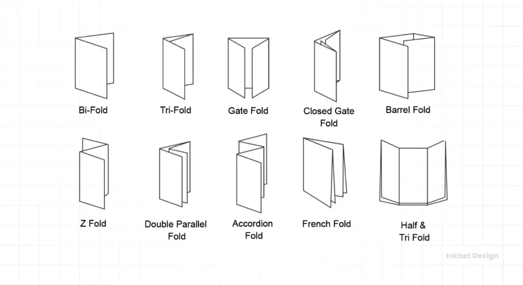
Brochure Format vs. Business Goal
| Format | Visual | Best For… | Common Mistakes to Avoid |
| Bifold (Half-Fold) | A single sheet folded in half. (4 panels total) | Simple presentations. Product showcases, event schedules, and menus. When you have one strong A-to-B message. | Cramming a 20-page document into four panels. It's not a book. Respect the white space. |
| Trifold (Roll Fold) | A single sheet folded in on itself. (6 panels) | The most common format. Good for sequential info, step-by-step guides, service summaries. Reveals info panel by panel. | Putting critical, time-sensitive info on the inner flap (the one that gets folded inside). It’s often the last thing read, if at all. |
| Trifold (Z-Fold) | A single sheet in a “Z” shape. (6 panels) | Timelines, maps, large graphics, or a big reveal. It can be designed as one large, continuous image when opened. | Not aligning the design across the panels. It looks disjointed and broken when the user opens it up. |
| Gate Fold (Inward) | Two outer panels fold inwards to meet in the middle. (6/8 panels) | High-impact reveals for luxury products or “wow” moments. Builds anticipation for what's inside. | A weak central image. The entire point of the fold is the big reveal. If the inside is boring, the effect is ruined. |
| Booklet (Saddle-Stitched) | Multiple sheets folded and stapled on the spine. (8+ pages) | Company profiles, annual reports, product catalogues. For deep information, when a simple folder won't do. | Using cheap paper or binding. For a booklet, the substance and quality of the physical object are paramount. |
Your choice of format creates the user experience. A Z-fold that opens to a massive, beautiful photograph feels different from a text-heavy bifold. Match the feeling to the brand.
Step 4: The Core Elements of Professional Brochure Design
This is the “design” part. But notice it comes after strategy and structure. Now we're just filling in the blueprint we've already built.

1. Hierarchy & Layout (The Grid is Your Friend)
Hierarchy is the visual “volume” of your content. It tells the reader what's most important, second most important, and so on.
- Headlines (H1): The most important thing. Big, bold.
- Subheadlines (H2/H3): Break up text and group ideas.
- Body Copy: The readable text.
- Captions/Quotes: Small, often italicised, to add flavour.
Without this, your brochure is a wall of text.
The best way to enforce hierarchy is with a grid. A grid is the invisible skeleton that holds your design together. It dictates your margins, the space between columns, and where you place images.
It's not restrictive—it's professional. It's the difference between a high-end magazine and a cluttered local newspaper.
White Space: Do not be afraid of it. White space (or negative space) is not “empty.” It's a design tool. It gives your content room to breathe. It signals confidence and luxury. Clutter signals “cheap” and “desperate.”
2. Typography (The Voice of Your Brand)
Typography is not “picking fonts.” It's the art of dressing your words. The fonts you choose have a personality, and that personality must match your brand.
- Serif Fonts (e.g., Garamond, Times New Roman): Have “feet.” Feel traditional, established, trustworthy, authoritative.
- Sans-Serif Fonts (e.g., Helvetica, Montserrat): No “feet.” Feel modern, clean, approachable, and direct.
Rules for sanity:
- Limit yourself to 2-3 fonts. A headline font, a body font, and maybe an accent font.
- Ensure readability. Body copy should almost never be a complex script font. It should be clean and clear, typically between 9-12pt.
- Watch your spacing. Leading (space between lines) and Tracking (space between letters) can make a huge difference in readability.
Your typography is a massive part of your brand identity. Using Comic Sans for a law firm is as damaging as using flimsy paper for a spa.
3. Imagery & Visuals (Stop Using Bad Stock)
Humans are visual. We see pictures before we read words. Your imagery sets the entire tone.
Please, I'm begging you, stop using the “diverse team smiling at a laptop” stock photo. We all see it. It's fake, and it makes your brand look lazy.
- Professional Photography: The best money you will ever spend. Period. If you sell a physical product, you need professional photos. If you run a service, get professional headshots and photos of your actual team working.
- “Good” Stock: If you must use stock, use sites like Unsplash, Pexels, or paid sites like Stocksy that focus on authentic, non-corporate-looking images. Choose photos that match your brand's colour palette and mood.
- Icons & Illustrations: Excellent for explaining complex services or concepts without a single word. They must be in a consistent style (e.g., all “line art” or all “flat colour”).
Real-World Example: I had a B2B tech client who A/B tested their trade show brochure. Version A was text-heavy, explaining their software. Version B cut 60% of the text, used a massive, high-quality diagram of their workflow, and a huge QR code to a demo video. Version B generated three times the qualified leads.
4. Colour Palette
Stick to your brand guidelines. That's it.
Your brochure is not the place to “get creative” and try that new neon green you like. It's an extension of your brand.
- Use the 60-30-10 Rule:
- 60% Primary brand colour (dominant).
- 30% Secondary brand colour (supports the primary).
- 10% Accent colour (for CTAs, highlights, and “pop”).
- Critical Technical Note: Your screen uses RGB (Red, Green, Blue) light. A printing press uses CMYK (Cyan, Magenta, Yellow, Black) ink. You must design in CMYK colour mode. If you design in RGB, your bright, vibrant screen colours will look dull and muddy when printed.
Step 5: Writing Copy That Actually Gets Read
Your brochure is not a novel. Nobody is going to “curl up” with it. They are scanning it for information.
Write for scanners, not readers.
- Headlines are Hooks: They don't describe what's in the section. They sell the reader on reading the section.
- Use “You,” Not “We”:
- Weak (We): “We provide innovative solutions for our clients.”
- Strong (You): “You get more leads without increasing your ad spend.”
- Bullet Points are Your Friend: They break up text and are easy to scan.
- Short Sentences. Short Paragraphs. No paragraph should be longer than 3-4 lines.
- Kill Adjectives, Use Verbs:
- Weak: “Our work is high-quality and very dependable.”
- Strong: “Our process eliminates errors and delivers on time.”
Your copy’s job is to move the reader to the next step. Which brings us to…
Step 6: The Unmissable Call to Action (CTA)
I’ve left this for its own section because it’s the most common and most costly mistake.
Every single brochure you print must tell the reader exactly what to do next.
If you don't ask, you don't get.
Don't hide it on the back panel in 8pt font. Make it a destination. The back panel is often the perfect place for a strong, singular CTA.
- Weak CTA:
- “Contact us”
- “Learn more”
- [Just a list of 5 social media icons]
- Strong, Specific CTA:
- “Call Today for Your Free 15-Minute Strategy Session: 0800 123 456″
- “Scan This QR Code to Watch the 2-Minute Demo Video”
- “Visit YourSite.com/Consult to Book Your Appointment”
- “Bring this brochure to our store for 10% Off Your First Purchase“
A strong CTA is specific, urgent (uses verbs like “Call” or “Visit”), and offers clear value.
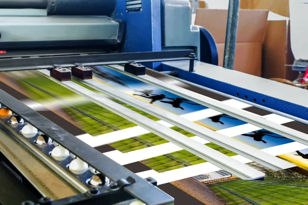
Step 7: From Screen to Print (The Technical Execution)
You can have the world's best design, but if you send the wrong file to the printer, you've wasted all your money. This is where amateurs get caught.
Do not send a Word doc, a PowerPoint, or a 72 DPI JPG. You must provide a “print-ready” PDF.
Here are the three non-negotiable concepts you must understand:
1. Bleed, Trim, and Safety
Imagine a stack of 1,000 brochures. A giant industrial blade cuts them. This blade is not 100% accurate. “Bleed” is the built-in margin of error.
- Safety (Margin): The “safe zone.” All your important text and logos must live inside this line (e.g., 1/8 inch or 3-5mm inside the edge of your page). If it's outside this, it risks being cut off.
- Trim (Cut Line): This is the final, finished size of your brochure. This is where the printer aims to cut.
- Bleed: This is the extra image or background colour that extends beyond the trim line (e.g., 1/8 inch or 3-5mm outside the edge). If your background image stops at the trim line and the blade cuts 1mm too wide, you'll get an ugly white sliver on the edge. The bleed ensures that even with a slight mis-cut, your colour goes all the way to the edge.
2. Resolution: 300 DPI
- DPI = Dots Per Inch.
- Screens are 72 DPI. This is low-resolution.
- Print is 300 DPI. This is high-resolution.
- You cannot take a 72 DPI image and “save it as” 300 DPI. That's like enlarging a passport photo to a poster—it just makes the pixels bigger. You must start with high-resolution images.
3. Colour Mode: CMYK
As mentioned before, you must design and export your file in CMYK colour mode. If you send an RGB file, the printer's software will convert it, and the colours will shift, often looking dull and flat.
Your Final Print-Ready Checklist
Use this before you send anything to a printer.
| Category | Why It Matters |
| Proofreading | Did you proofread it twice? |
| Proofreading (Again) | Did you have someone else proofread it? A fresh pair of eyes is essential. |
| File Format | Is it a high-resolution PDF? |
| Colour Mode | Is the file in CMYK, not RGB? |
| Resolution | Are all images 300 DPI at their final printed size? |
| Bleed | Have you added a 3-5mm (1/8″) bleed on all sides? |
| Safety | Is all important text inside the safety margin? |
| Folds | If it's a trifold, are the panels the correct sizes? (The inner panel must be slightly shorter to fold in). |
| CTA | Is the call to action clear, visible, and correct? (Test the phone number/URL!) |
If you are intimidated by this list, that's normal. This is what graphic designers are for. It is almost always cheaper to hire a professional than it is to pay for a 5,000-copy reprint. If you're stuck, request a quote and get it done right the first time.
Conclusion: A Tool, Not an Ornament
Your brochure is a physical piece of your brand. It’s a sales tool. It's a conversation-starter. It is not an afterthought.
Treat it with the same strategic respect you'd give your website or your email marketing.
Define its job. Choose a format that serves that job. Design with a clear hierarchy, professional imagery, and on-brand typography. And for goodness' sake, tell the reader what to do next.
Do this, and you won't just have a brochure. You'll have a lead-generating machine you can actually be proud of.
Your Next Step
All this technical and strategic work is what separates a professional design from a DIY attempt. It's the core of building a brand that feels cohesive, from your website right down to the paper you print on.
If you're in the process of building a brand from scratch and want to ensure all your materials—digital and print—work together, take a look at our brand identity services.
If you want to read more about how this fits into your overall sales funnel, our guide to Brochure Marketing is the logical next step.
Or, you can just browse the Inkbot Design blog for more no-fluff advice on building a better business.
Brochure Design FAQs
What is the most common brochure format?
The most common is the Trifold (a 3-panel, 6-sided layout on A4 or Letter-sized paper). It's popular because it's economical to print and folds down to a convenient size (like a DL envelope).
What’s the difference between a Roll Fold and a Z-Fold?
Both are trifolds, but they open differently. A Roll Fold has one panel that “rolls” inside the others, so the panels must be slightly different sizes. A Z-Fold opens like an accordion, and all panels can be the same size, making it great for a large, continuous design.
What paper weight (GSM) should I use?
130-170 GSM: Good for mass-market handouts, flyers, or mailers. It's thin but professional.
200-250 GSM: A solid, “premium” feel. Great for high-end service brochures or leave-behinds.
300-400 GSM: Very thick, like a postcard or business card. Excellent for luxury brands or durable covers.
What's the difference between coated (gloss/silk) and uncoated paper?
Coated (Gloss/Silk): Has a coating that makes photos and colours look sharp and vibrant. Gloss is shiny; Silk (or Matte) is smooth and non-reflective.
Uncoated: Has a natural, raw paper texture. It's more absorbent, so colours can look softer or more muted. Great for an earthy, rustic, or “intellectual” brand feel.
How much text should I put in my brochure?
As little as possible. Your brochure is a billboard, not a book. Use punchy headlines, bullet points, and short paragraphs. Let your imagery and white space do the talking. If you have a lot to say, use a QR code to link to a “Learn More” page on your website.
Do I really need a professional for brochure design?
If you have to ask, the answer is probably yes. A professional designer doesn't just “make it pretty”; they handle the strategy, layout, typography, and complex technical prep (bleed, CMYK, etc.) to ensure your £1,000 print run isn't a £1,000 mistake.
What is “bleed” in brochure design?
Bleed is the 3-5mm (1/8 inch) of extra background colour or image that extends beyond the final trim edge of your design. It's a margin of error for the cutting blade, ensuring you don't have ugly white slivers on the edge of your finished brochure.
What resolution should my images be for print?
300 DPI (Dots Per Inch) at the final printed size. Images from your website (which are 72 DPI) will look pixelated and blurry.
What's more important: images or copy?
They are a team. But a compelling image stops the reader, and a compelling headline makes them read. Most people see the images first, so your visuals carry the heavy burden of “first impression.”
Where is the best place for the Call to Action (CTA)?
The back panel is prime real estate. Think of it as the “destination” of the brochure. It's the last thing they see and the perfect place to give a single, clear, unmissable instruction (e.g., “Call Today,” “Visit Our Site”).

