The Real Reason Iconic American Brands Refuse to Die
The average brand lifecycle is shrinking faster than a cheap t-shirt. Yet, names like Levi’s and Ford endure. We’re dissecting how iconic American identities leverage design to outlast the hype cycle.
- Heritage Branding wins in 2026 because consumers prefer predictability and comfort over ephemeral "disruption."
- Visual Anchors like colour or logos create Cognitive Fluency, enabling instant recognition and trust across contexts.
- Maintaining heritage needs governance: DAMs, pattern libraries and automated compliance prevent brand drift.
- Human-crafted imperfections and narrative continuity beat AI trend-chasing, turning consistency into pricing and retention advantages.
Why Heritage Branding Matters in 2026
We’ve reached a weird point in design history.
Everyone is obsessed with “disruption,” but nobody can remember the name of the startup they saw an ad for yesterday.
The recent retrospective on America’s most iconic brands (USA Today, 2026) isn’t just a trip down memory lane. It’s a wake-up call for anyone trying to build something that actually lasts.
In a world where you can spin up a brand identity in thirty seconds using a generative prompt, these “dinosaurs” are actually the most sophisticated players in the room. They understand something the Silicon Valley crowd doesn’t: trust isn’t built on novelty.
It’s built on the stubborn refusal to change just because some marketing consultant got bored.
The current economic climate—as of early 2026—has pushed consumers back toward “comfort brands.” When the world feels unstable, you don’t want a “revolutionary” toothpaste. You want the one your dad used. That’s the power of brand equity.
Why Our Brains Seek Heritage
With generative AI capable of launching a fully-realised “competitor” brand in a matter of hours, the consumer’s primary defensive mechanism has become Cognitive Fluency.
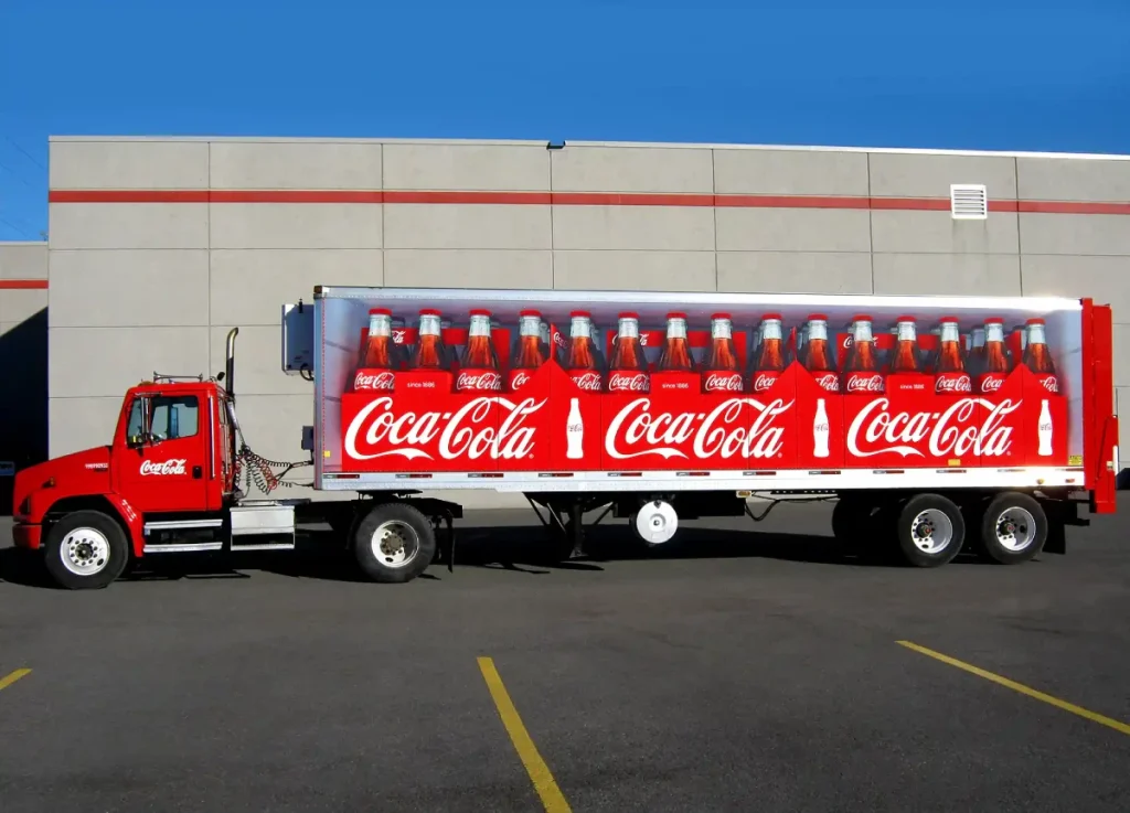
This is the ease with which our brains process information. When you see the Coca-Cola red or the Nike Swoosh, your brain doesn’t have to work. It accesses a “pre-approved” file of trust built over decades.
Newer brands—often born from data-driven algorithms—frequently fail because they lack “autobiographical memory.”
Consumers don’t just buy Levi’s because they are durable; they buy them because they represent a consistent thread through their own lives.
In a 2025 study by the Edelman Trust Barometer, 74% of consumers stated they are more likely to trust a brand that has existed for more than 30 years over a “disruptive” newcomer, specifically citing “predictability” as a key factor.
This “Heritage Moat” is built on three pillars:
- Visual Permanence: The refusal to follow seasonal design trends.
- Narrative Continuity: A story that remains stable even as the product evolves.
- Relational Depth: The brand acts as a cultural landmark, not just a service provider.
Decoding the DNA of Brand Longevity

The “Blanding” Crisis: When Modernisation Goes Wrong
Between 2018 and 2024, the design world fell into a trap known as “blanding.”
Driven by the need for high-resolution legibility on mobile screens, iconic brands began stripping away their unique characteristics.
We saw Burberry, Saint Laurent, and even US tech giants adopt near-identical, geometric sans-serif logos. The result? A “sea of sameness” that eroded brand equity.
However, 2026 has ushered in The Great Reversion. Leading design houses like Pentagram and Chermayeff & Geismar & Haviv are seeing a surge in requests to “restore the soul.”
| Brand Approach | The “Blanding” Era (2018-2024) | The Heritage Reversion (2026) |
| Typography | Geometric Sans-Serif (Helvetica/Gotham) | High-contrast Serifs and Custom Scripts |
| Colour Palette | “Digital Blue” and Neon Accents | Earthy, archival tones and “Ownership” hues |
| Logo Form | Simplified, abstract, flat | Illustrated, textured, asymmetrical |
| Ideal Use Case | App icons and UI buttons | Physical packaging and immersive AR |
The lesson of 2026 is clear: if you look like everyone else, you are a commodity.
If you look like yourself, you are an icon. The NASA “Worm” logo is the perfect example. It was replaced by the “Meatball” for years, but in the 2020s it saw a triumphant return.
Why? Because it captured a specific, optimistic futurism that a generic circle simply couldn’t replicate.
Case Study: Levi Strauss & Co. and the 150-Year Moat
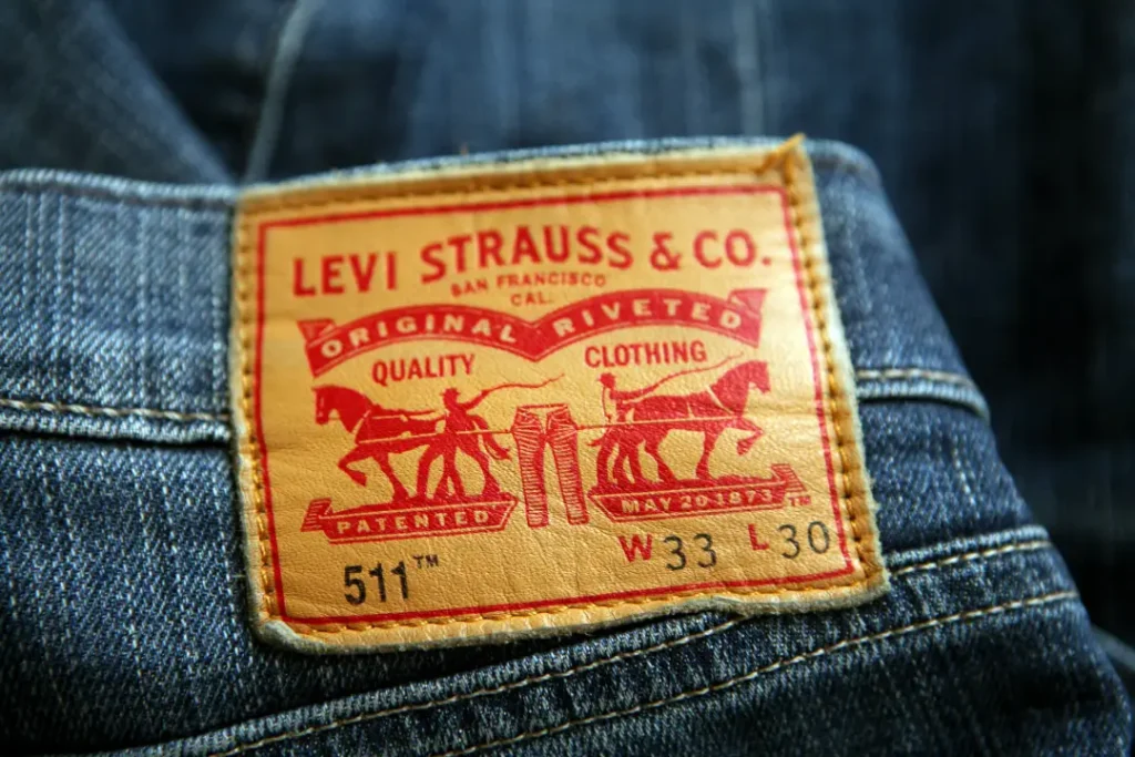
Levi’s provides the ultimate blueprint for American brand longevity. In 2023, they celebrated the 150th anniversary of the 501® jean. Their strategy isn’t to innovate for the sake of it, but to “Edit the Icon.”
- The Red Tab: A tiny piece of fabric that provides 100% brand recognition. Levi’s has aggressively protected this in court, ensuring it remains an exclusive visual marker.
- The Two-Horse Pull: This logo was designed initially for illiterate customers who could only recognise the “Two-Horse Brand.” Today, it serves as a “Visual Anchor” of durability that resonates globally.
- The 2026 Pivot: Instead of chasing fast-fashion trends, Levi’s invested in “Re-commerce,” launching a platform to buy and sell vintage 501s. This reinforces the idea that their product is an investment, not a disposable garment.
By leaning into their history, Levi’s turned their age from a liability into their most significant competitive advantage. They proved that in a world of “fast” everything, “slow and steady” is the ultimate flex.
Owning the Spectrum: The Legal Power of Heritage
Iconic American brands don’t just own their logos; they own entire wavelengths of light.
United Parcel Service (UPS) famously “owns” Pullman Brown. Tiffany & Co. has a trademark on “Tiffany Blue” (PMS 1837), and John Deere has spent decades in court protecting its signature green and yellow combination.
This isn’t just vanity; it’s a strategic asset.
- Distance Recognition: Can you identify the brand from 100 yards away?
- Low-Resolution Resilience: Does the brand work in a 16×16 pixel favicon or a blurred AR environment?
- Counterfeit Protection: Unique colour and typographic quirks make it harder for AI-generated knock-offs to pass as the real thing.
For business owners in 2026, the goal is to find your “Unused Colour.” If your industry is a sea of “SaaS Blue,” your heritage play is to adopt an archival forest green or a mid-century orange.
You aren’t just choosing a colour; you’re staking a claim on a piece of the consumer’s visual cortex.
Managing a Legacy: The 2026 Tech Stack
Maintaining a heritage brand across 50 countries requires more than just a PDF style guide. In 2026, the “Brand Bible” has become a living, breathing software ecosystem.
Legacy titans use a combination of Digital Asset Management (DAM) and Creative Operations tools to prevent “brand drift.”
Comparison of 2026 Brand Governance Tools:
| Tool | Best For | Key Heritage Feature |
| Adobe Experience Manager | Global Enterprises | AI-powered “Compliance Check” for legacy assets. |
| Frontify | Mid-to-Large Brands | Living “Pattern Libraries” that sync directly to Figma. |
| Bynder | Marketing-Heavy Brands | Version control for “Vintage” vs “Current” campaign assets. |
| Brandfolder | Creative Agencies | Ease of use for external partners to access “Visual Anchors.” |
The Workflow for a 2026 Heritage Audit:
- Archive Extraction: Use tools like Figma to digitise 20th-century physical assets.
- Semantic Mapping: Define the “Visual Anchors” (e.g., the specific curve of the Nike Swoosh).
- Global Distribution: Centralise assets in a DAM so a designer in Tokyo doesn’t use the wrong hex code for “Ford Blue.”
- Consistency Monitoring: Use automated crawlers to ensure third-party retailers aren’t using “blanded” or outdated versions of the logo.
A Thought in Progress
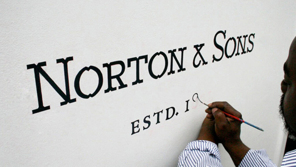
We have officially reached “Peak AI.” In response to the flood of mathematically perfect, AI-generated imagery, 2026 has seen a radical return to the “Human Hand.”
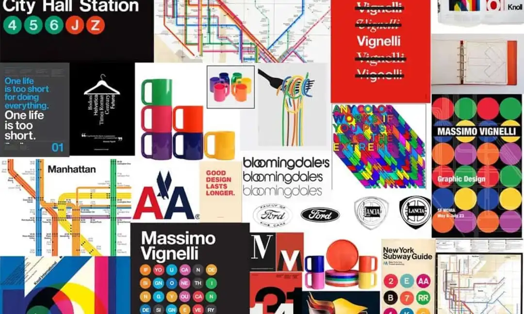
This movement celebrates what the legendary Massimo Vignelli called “intellectual elegance”—designs that feel crafted by a person with an opinion, not an engine with a prompt.
Designers are now intentionally re-introducing:
- Analogue Imperfections: Slight ink bleeds and woodblock textures in digital assets.
- Asymmetrical Balance: Moving away from the “perfect” grids of the 2010s to create more dynamic, organic layouts (think of the Starbucks Siren’s asymmetrical face).
- Custom Typography: Brands like Ford are doubling down on their historic lettering to distinguish themselves from the generic fonts used by electric vehicle startups like Rivian or Lucid.
The “Human Hand” isn’t about being old-fashioned; it’s about being intentional. It’s the difference between a mass-produced plastic chair and a hand-carved Eames lounge. In 2026, the “carved” brand wins.
The Creative Verdict
If you’re a business owner or a designer, the lesson from these American icons is simple: stop chasing the “now” and start building for the “next decade.”
At Inkbot Design, our workflow for heritage-style projects doesn’t start in Figma. It begins in the archives. We look for the “Visual Anchor”—that one element (a curve, a specific shade of navy, a typographic quirk) that can survive a rebrand.
My professional judgment? Most “modern” branding is cowardly.
It’s designed to be inoffensive. But iconic brands are often quite weird when you look at them closely. The Starbucks Siren is asymmetrical. The Nike Swoosh was bought for $35.
These things work because they were given time to breathe.
If you’re constantly pivoting your visual identity, you’re not building a brand; you’re just running a series of failed experiments.
Stick to your guns. Find a lane and stay in it until the world recognises your silhouette.
Strategic Takeaways
Graphic Designers: Study the history of typography—specifically 19th-century woodblock and mid-century Swiss—to understand how to build shapes that survive low-resolution screens and high-end print alike.
Business Owners: Your logo isn’t a fashion statement; it’s a contract with your customer. Changing it too often tells the world you don’t know who you are.
The ROI of the Unchanging: Why Consistency is Profitable
It is a common mistake to view branding as a “cost centre.” In reality, brand equity is a primary driver of market valuation. In 2026, companies with “High Heritage Scores” (as measured by Interbrand) trade at a 20-30% premium over their peers.
How Heritage Drives Revenue:
- Lower Customer Acquisition Cost (CAC): You don’t have to explain who you are. The logo does the heavy lifting.
- Pricing Power: Consumers are willing to pay a “Trust Premium” for brands like Tiffany & Co. or Ford when compared to generic alternatives.
- Employee Retention: Iconic brands attract top-tier talent who want to be part of a “Legacy” rather than a “Project.”
When IBM’s Paul Rand logo was introduced in 1972, it didn’t just look modern; it signalled stability during a period of massive technological shift.
Today, IBM remains a powerhouse not because it has the best “now” technology, but because it is the “Safe Choice.” As the old saying goes: “Nobody ever got fired for buying IBM.”
FAQs
How do I tell the difference between a brand that is “Classic” and one that is just “Old”?
A “Classic” brand remains culturally relevant by evolving its context while keeping its core. Nike is a classic because it stays at the centre of sports culture while the Swoosh remains unchanged. An “Old” brand has stopped communicating with its audience and relies solely on the past, with no modern utility.
Does a brand have to be old to be “iconic”?
No. Look at Tesla or Airbnb. They’ve achieved iconic status by being radically consistent and owning a specific visual vibe. But it’s much harder to do it quickly. Heritage is just consistency plus time.
Should I use AI to design my legacy brand?
AI is a powerful tool for iteration, but a poor tool for laying foundations. Use AI to test how your logo looks in 500 different environments or to generate colour palettes based on archival data. However, the core “Visual Anchor” should be a human-driven decision, as it requires a level of cultural intuition that algorithms currently lack.
Is it possible to “manufacture” heritage for a new startup?
You can’t manufacture history, but you can manufacture permanence. By choosing a unique “Visual Anchor,” avoiding design trends, and committing to a 10-year visual plan from day one, a startup can build “Provisional Heritage” much faster than a brand that pivots its look every eighteen months.
What’s the most essential element of a legacy brand?
Colour. Hands down. You can recognise a UPS truck or a Tiffany box from a mile away just by the hue. If you don’t own a colour, you don’t own a brand.
Are “Trends” always bad?
Not always, but they’re dangerous. If you follow a trend, you’re basically admitting you want to look like everyone else for the next eighteen months. That’s fine for a pop-up shop. It’s suicide for a legacy business.
How does sustainability affect heritage branding in 2026?
Sustainability has become a new pillar of heritage. Consumers now view “durability” as a form of eco-friendliness. Iconic brands like Patagonia or Levi’s leverage their heritage to show that their products aren’t designed for a landfill, but for a lifetime.
What is the “Visual Anchor” in brand design?
A Visual Anchor is the one element of your identity that must never change. For Starbucks, it’s the Siren. For UPS, it’s the colour brown. For Apple, it’s the bite in the apple. Everything else—the typography, the photography style, the website layout—can evolve, but the Anchor remains static to hold the consumer’s trust.


