Mobile App Design Done Right: 5 Best UX Strategies
A pretty app that doesn’t convert is an expensive hobby.
Good mobile app design isn’t about “superior design”; it’s about building a profit-generating machine.
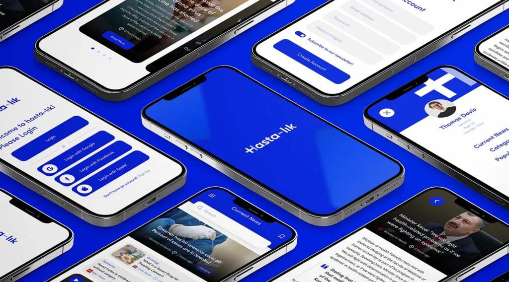
Achieving seamless mobile app UI consistency and patterns is one of the foundational principles that ensures users find the app intuitive and trustworthy from the moment they open it.
While your competitors are focused on aesthetics, you can be engineering a frictionless user journey that increases your conversion rate.
This isn’t a list of “best practices.” It’s a strategic breakdown of the five essential strategies that turn an app from a cost centre into a profitable asset.
- Consistency in mobile app design enhances user trust and reduces confusion, leading to higher engagement.
- Clarity and simplicity ensure user-friendly interfaces, making navigation intuitive and reducing memory load.
- Touch optimisation improves user experience by accommodating different motor skills and common usage patterns.
- Responsive layouts maintain usability across various devices, ensuring a cohesive experience regardless of screen size.
- Prioritising accessibility broadens the user base and aligns with ethical standards, improving reputation and loyalty.
The Importance of Consistency in Mobile App Design
All screens must be consistent when a mobile app is designed to provide a smooth user experience.
This means uniformly aligning typography, colours, icons, and layout patterns.
It does occur all through the app interface.
User familiarity develops through consistent UI components, and efficient navigation increases with reduced cognitive load.
For example, a button style or icon for an action on one screen should behave the same way on all screens.
Consistency fosters professionalism as well as creates a cohesive feel plus trust.
When elements are standard, confusion goes down, and users abandon apps that seem disorganised or unpredictable.
Mobile interfaces effectively leverage recurring UI patterns, as influential design libraries like Mobbin present.
They offer direction, acting as good guides for steady app design.
Clarity and Simplicity: Keeping Interfaces User-Friendly
One of the cardinal rules in mobile app design is to keep interfaces more uncluttered, clearer, and cleaner.
Users should quickly grasp app function basics.
Users should not have to wrestle against complex layouts or excessive features.
To achieve simplicity, remove any unnecessary UI elements, prioritise more critical content, and then take action.
Good design reduces the memory load for users.
Navigation controls should appear in the locations users expect, like back buttons and menus, which eases more intuitive movement between those screens.
Users can quickly scan information due to a clear visual hierarchy and ample white space.
For many users, the app feels accessible because of a simple, elegant interface.
That interface drives higher engagement with satisfaction.
Designing for Touch: Optimise for Mobile Interaction
Unlike desktops, mobile apps depend entirely on touch input, requiring special design consideration.
Interactive elements like buttons, links, and sliders must be generally spaced and sized at least 7-10 mm for finger comfort.
This averts annoying mis-taps so users with diverse motor skills can access more easily.
Designers should also consider common usage patterns, such as one-handed use, plus critical controls must be within easy reach of thumbs.
Highlighting buttons upon tap is subtle feedback. We ensure that we recognise users ‘ input.
From these touch-friendly practices come happier users with smoother interactions.
These practices translate well.
Responsive and Adaptive Layouts for Diverse Devices
Mobile devices vary enormously in resolutions as well as screen sizes.
An app with good design must adapt fluidly across both smartphones and tablets.
It must also adapt fluidly across foldables.
Elements of the UI rearrange and resize to optimally suit the screen.
Design techniques of response ensure this optimal fit.
Adaptive layouts can employ a set of pre-defined screen sizes to adjust interface details.
Usability with aesthetics should be maintained regardless of device or approach.
For designers, this responsiveness is supported through media queries, scalable vector icons, and flexible grids.
Users of less common devices in those orientations risk alienation by apps that fail to adapt.
Prioritising Accessibility to Broaden Reach
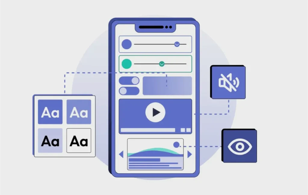
Creating an inclusive app makes it benefit everyone while expanding the user base.
For visual impairments, colour contrast, and readability, scalable font sizes are accessibility considerations.
Also, support for screen readers is part of accessibility.
Keyboards or voice commands should allow sufficiently large touch targets and app navigation.
Help is readily available and precise, and clear error messages reduce user frustration and abandonment.
When apps are accessible, they align with ethical standards and regulatory requirements, thus improving reputation and user loyalty.
Providing Feedback and Managing Errors Gracefully
A sense of control comes from an app that responds clearly and promptly to actions.
Visual cues like progress bars or button animations show input registered or a request being processed in the app.
Friendly, instructive messages are vital when errors happen.
These messages are intended to guide users in resolving issues without any ambiguity.
If error handling is abysmal, that can surely sour the user experience, and drop-offs occur.
Feedback mechanisms that are considerate do elevate the perceived app quality, and users continue using it.
Conclusion
A sense of control comes from an app that responds clearly and promptly to actions.
Visual cues like progress bars or button animations show input registered or a request being processed in the app.
Friendly, instructive messages are vital when errors happen.
These messages are intended to guide users in resolving issues without any ambiguity.
If error handling is poor, that can surely sour the user experience and drop-offs occur.
Feedback mechanisms that are considerate elevate the perceived app quality, and users continue using it.
FAQs: Mobile App Design Done Right
What’s the most critical UX strategy I should focus on first?
Speed to value. Period. Get the user from “What is this?” to “Aha, I get it!” as soon as possible. Everything else—fancy animations, slick gradients—is a distant second. If a user can’t experience the core promise of your app in under 30 seconds, you’ve already lost them. Don’t make them work for it.
Should I copy the UX of a successful app like Uber or Instagram?
Wrong question. You’re trying to copy the final exam answers without taking the class. You see their solution, but you don’t understand their problem. Instead of copying their buttons, study their principles. Why is their navigation so simple? How do they reduce friction at checkout? Steal the thinking, not the pixels. Your problem isn’t their problem.
How much user information should I ask for during signup?
As little as humanly possible. Think of it as a transaction. You haven’t provided any value yet, so you have zero leverage to ask for their data. Let them use the app. Let them win. Only ask for information when it’s absolutely required for them to get more value, not for you to build a database. Every field you add is a reason for them to quit.
My app is a little slow to load, but the features are great. Is that really a UX issue?
It’s THE UX issue. A slow app is a broken app. It’s like having the world’s best sales pitch, but you mumble it so no one can hear you. Performance isn’t a feature; it’s the foundation. All the brilliant design in the world means nothing if the user stares at a loading spinner. Fix the speed first.
My app has so many great features. How do I show users everything it can do?
You don’t. You’re trying to sell them the whole buffet when they only want a single plate. Your job is to make the main thing obvious and easy to do. Every screen should have one primary job. You failed if a user has to think about where to tap next. Ruthlessly hide or eliminate anything that doesn’t serve the core purpose. Constraint creates clarity.
Are animations and microinteractions just ‘nice-to-haves’?
No. They’re communicating. They aren’t decoration; they’re the feedback that tells the user “I got it,” “I’m working on it,” or “You did it.” A button that visually responds when you tap it builds confidence. A smooth transition between screens provides context. It’s the difference between a conversation with someone who nods along and someone who stares at you blankly.
How do I actually know if my UX is working?
Stop guessing. Look at the data. The two most important metrics are Task Completion Rate and User Retention. Can people successfully do what they came to your app to do? And after they do it, do they come back? If both of those numbers are going up, your UX is working. If they’re not, it isn’t. Everything else is just opinion.
How do I ‘personalise’ the app experience for users?
Personalisation isn’t just sticking $FirstName at the top of the screen. That’s a gimmick. True personalisation is about anticipation. The app should get smarter with every use. It should surface relevant content, predict the user’s next move, and remove irrelevant options. The goal is to make users feel like the app was built specifically for them. Anticipate, don’t just decorate.
What’s the best way to handle user errors?
First, assume it’s your fault, not theirs. A user error is almost always a design error. Second, make the fix dead simple. Don’t just say “Invalid input.” Say “Please enter a 5-digit zip code.” Be clear, helpful, and immediately guide them back to the correct path. Never make them feel stupid for making a mistake you could have prevented.
Should I A/B test all my design decisions?
No. You’ll test yourself into paralysis. You only test when the potential upside is massive or when you have two equally strong, opposing hypotheses. You should make decisions based on established UX principles and qualitative feedback for most things. A/B testing is a tool for optimisation, not a replacement for thinking. Use a sledgehammer for demolition, not for tapping in a nail.
Is it better to have a simple app that does one thing perfectly or a complex app that does many things?
Do one thing so well that people would pay for it. Then, and only then, earn the right to ask them to do a second thing. Trying to be everything to everyone makes you nothing to anyone. Win your first game before you try to play in a tournament.

