Minimal Logo Design: It’s Not Art, It’s a Business Weapon
Most people get minimal logo design wrong.
They think it’s about taking things away. They see a simple shape, a clean font, and think, “Easy. I could do that.”
They couldn’t be more mistaken.
Minimalism isn’t subtraction for the sake of it. It’s distillation. It’s the brutal, painstaking process of boiling a brand to its absolute, undiluted essence. It’s about finding the one thing that needs to be said and saying it with ferocious clarity.
Getting to the simple is the most complicated work there is.
- Minimal logo design distills a brand to its essence, prioritising clarity over mere simplicity.
- A successful logo serves as a versatile tool that effectively communicates a brand's core message.
- Creating a minimal logo involves rigorous strategic planning, ensuring it stands the test of time amidst trends.
You’re Probably Thinking About Minimalism All Wrong
Before we go any further, we need to clear the air. Two fundamental misunderstandings about logos cause entrepreneurs to waste thousands on branding that doesn’t work.
The Great Deception: Simple vs. Simplistic
A simple logo is the result of deep thought. It’s intelligent, deliberate, and conceptually rich. Think of the Nike swoosh. It’s just a checkmark, right? Wrong. It’s movement, it’s victory, it’s a wing of the Greek goddess of victory. It’s a story told in a single, fluid gesture. That’s simple.
A simplistic logo is the result of no thought. It’s a generic shape from a logo maker, a trendy font someone saw on Pinterest. It’s lazy. It’s a circle, a square, a bland sans-serif font spelling out a name. It says nothing because there was no idea behind it.
The market is drowning in simplistic logos. And they are utterly useless.
Your Logo Isn’t a Decoration; It’s a Tool
Here’s the rub: Your logo isn’t for you.
It’s not meant to hang on your wall. It’s not meant to satisfy your personal aesthetic preferences. Clients tell me, “But I don’t like the colour orange.” I don’t care. Your target customer might.
A logo is a tool for business. Its sole purpose is to instantly identifying your company and communicate a core message to your audience. It’s a piece of strategic communication equipment. If it doesn’t do that job effectively, it has failed.
Choosing a logo based on what you like is like a carpenter choosing a hammer because it’s a pretty shade of blue. It’s madness.
The Strategic Case for Saying More with Less
So why go through all this trouble to achieve minimalism? Why is it the holy grail for many of the world’s strongest brands? It’s not an aesthetic choice. It’s a hard-nosed business decision.
Reason 1: A Busy World Demands a Quiet Logo
Your customers are bombarded with thousands of brand messages every single day. Their attention is fragmented. A complicated, fussy logo is just more noise. It asks for too much cognitive load. The brain, seeking efficiency, simply ignores it.
A minimal logo cuts through the static.
Its clarity makes it instantly recognisable. In a fraction of a second, your customer can see, process, and connect it to you. That speed is a massive competitive advantage. McDonald’s Golden Arches. The Target bullseye. You don’t read them; you absorb them.
Reason 2: It Works Everywhere (Without a Fuss)
A great logo has to be a workhorse. It must look sharp as a tiny favicon on a browser tab, an embroidered shirt icon, a massive sign on a building, and a social media profile picture.
Complex logos fall apart at scale. The delicate lines, gradients, and multiple colours that look fine on a big screen turn into an unreadable smudge when shrunk down.
A minimal logo is versatile by nature. Its bold forms and simple construction ensure it remains legible and impactful, regardless of size or medium. It’s practically bomb-proof.
Reason 3: It Lasts. Trends Don’t.
Remember the 2010s trend of swooshes, globes, and glossy “web 2.0” effects? They look painfully dated now. Chasing design trends is a fool’s errand. It guarantees you’ll have to redesign your logo in five years, confusing your customers and costing you a fortune.
True minimalism is timeless.
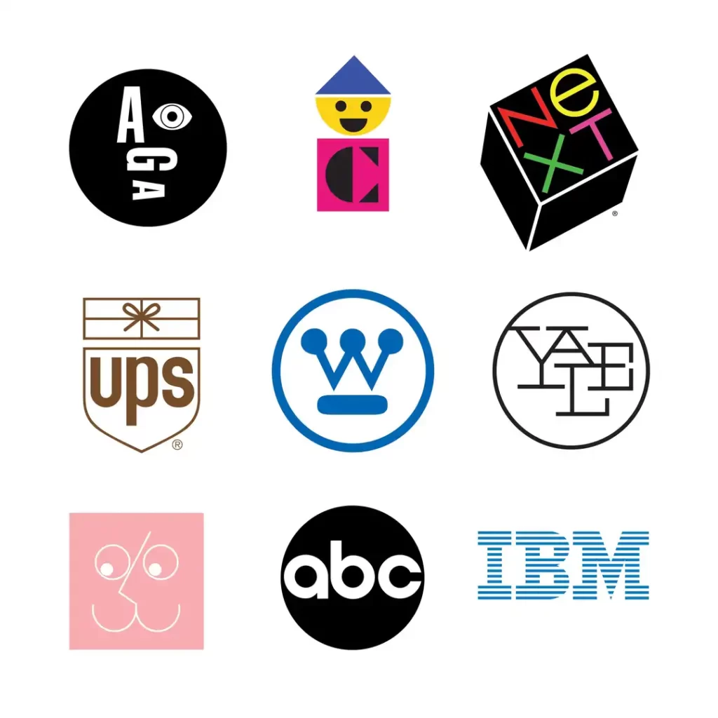
The work of masters like Paul Rand (IBM, UPS, ABC) or Saul Bass (AT&T, United Airlines) from 50 years ago still looks modern and practical today. Why? Because they weren’t based on fleeting styles.
They were based on fundamental shape, idea, and human perception principles. A well-designed minimal mark can serve a business for decades.
The One Time Minimalism Might Be a Mistake
Let’s be fair. Is it always the right choice? Almost.
I’d caution against pure minimalism when a brand’s core identity is built around richness, heritage, or intricate craftsmanship.
Think of a whiskey brand that wants to convey a century of tradition, or a boutique hotel that sells a lavish, opulent experience. A more detailed or illustrative mark might be more appropriate in these cases.
But even then, the principles of clarity and focus still apply.
The Anatomy of a Powerful Minimal Logo
A minimal logo isn’t just a random shape. It’s a carefully engineered machine where every part has a critical function. If you remove a single piece, the whole thing breaks. These are the core components.
Element 1: The One-Second Shape
The human brain is wired to recognise and remember simple geometric shapes. Circles, squares, triangles, lines. A strong minimal logo is built on clean, confident forms. It should be so distinct that you could draw it in the sand with your finger and someone would still recognise it.
This isn’t about being boring; it’s about being primal. The Apple logo isn’t just an apple; it’s a perfectly balanced collection of circles. The Mastercard logo is just two overlapping circles. The simplicity is what makes it unforgettable.
Element 2: Typography That Speaks Volumes
If your logo includes your company name (a logotype), the font isn’t just a font. It’s your brand’s tone of voice.
- A bold, geometric sans-serif (like Futura or Helvetica) can feel modern, objective, and strong.
- A classic serif font (like Garamond) can suggest tradition, authority, and reliability.
- A custom-made typeface shows ultimate brand ownership and personality.
In minimalism, the typeface often does the heavy lifting. It must be perfectly legible at all sizes and have just enough character to be distinctive without being distracting. The choice is never arbitrary.
Element 3: A Ruthlessly Limited Colour Palette
Colour creates emotion and aids memory. But too many colours create chaos.
A minimal logo typically uses one or two colours at most. This deliberate constraint achieves several things:
- It builds a strong association. Think Tiffany Blue, Coca-Cola Red, or Cadbury Purple.
- It’s practical. It keeps printing costs down and ensures consistency across all applications.
- It’s confident. It doesn’t need a rainbow to get your attention.
Choosing that one colour is one of the most critical decisions in the branding process, rooted in psychology and strategy.
Element 4: The Genius of What’s Not There (Negative Space)
This is where true mastery comes into play. The most brilliant minimal logos use the empty, negative space to create a second layer of meaning. It’s a hidden reward for the observant viewer.
The most famous example, of course, is the FedEx logo. Look between the ‘E’ and the ‘x’. See the arrow?
Once you see it, you can’t unsee it. That arrow perfectly communicates the brand’s business: moving forward, speed, and delivery. It’s a stroke of pure genius, hidden in plain sight. Using negative space turns a simple logo into a clever, engaging puzzle.
The “Just Use Canva” Myth… and Other Expensive Mistakes
The accessibility of design tools has been both a blessing and a curse. It’s empowered people, but has flooded the world with appallingly bad design masquerading as professional.
My Pet Peeve: The Plague of Genericism
My biggest frustration is the “Canva effect.” It’s the endless stream of businesses using the same pre-made templates. A watercolour circle with a script font. A mountain range in a hexagon. A geometric animal head.
You get the picture.
These logos are the visual equivalent of stock music. They’re hollow. They have no connection to the business, no story, no strategy. They might look “nice” and “clean,” but they are utterly forgettable.
By choosing a template, you are choosing to make your brand look exactly like thousands of others. You’re paying to be invisible.
Mistake #1: Designing for Yourself
I mentioned this earlier, but it bears repeating. The process breaks down when the founder becomes the sole arbiter of taste.
I once worked with a tech startup founder who was building a platform for financial advisors. He was adamant that the logo had to be green because, I quote, “it’s the colour of money and it’s my favourite colour.”
The problem? Green was also the primary colour of his top three competitors. Using it would have been an act of strategic self-sabotage, making him blend in when he needed to stand out.
We had to have a difficult conversation. The logo isn’t about your favourite colour. It’s about owning a visual space in your customer’s mind.
Mistake #2: Confusing ‘Empty’ with ‘Minimal’
A few years ago, a client came to me with a logo they’d designed for their consulting business. They were proud of it. It had a little icon for each of their five service areas—a cog for operations, a graph for finance, a lightbulb for strategy, and so on.
They thought it was comprehensive. I told them it was a hostage note.
It was cluttered, desperate, and impossible to understand. It screamed, “We do everything, so we’re masters of nothing.” The process wasn’t about finding a better way to draw five icons.
It was about having the courage to remove them all. We worked to distil their one core promise—”clarity”—and represented that with a single, sharp, elegant mark.
That’s the difference. Minimal design isn’t empty space; it’s focused space.
Mistake #3: Ignoring the Concept
The single biggest failure of DIY and budget logo design is the complete absence of a core concept. A logo is an idea, visualised. Without an idea, it’s just a shape.
What is the one thing your business does better than anyone else? What is the core emotion you want your customers to feel? What is your story?
The answer to those questions is where a great logo begins. A professional designer spends most of their time on this strategic work before making a single sketch. If you’re just picking shapes and fonts you like, you’re not designing a logo; you’re just decorating your business name.
This conceptual work is difficult. It requires an objective, outside perspective. It’s the most valuable part of the process, and you’re paying for it. It’s the difference between a pretty picture and a powerful business asset.
Here’s the thing: If you recognise that your brand needs a powerful concept, not just a decoration, it might be time to bring in a professional. Getting this right is foundational. Our logo design services are built around this strategic process—finding the core idea first.
How a Real Minimal Logo Is Forged
It doesn’t happen in an afternoon. It’s a rigorous, often frustrating process of exploration and elimination.
It Doesn’t Start with a Sketch. It Starts with a Question.
The first step is never “what should it look like?” The first step is “Who are we, and who are we for?”
A real design process begins with a deep dive:
- Who is the exact customer? What do they value?
- What is the competitive landscape? What do their logos look like, and how can we be different?
- What is the brand’s personality? (e.g., Challenger, Sage, Jester)
- What is the single most important message we need to convey?
This is 80% of the work. It’s all strategy.
The Brutal Act of Distillation
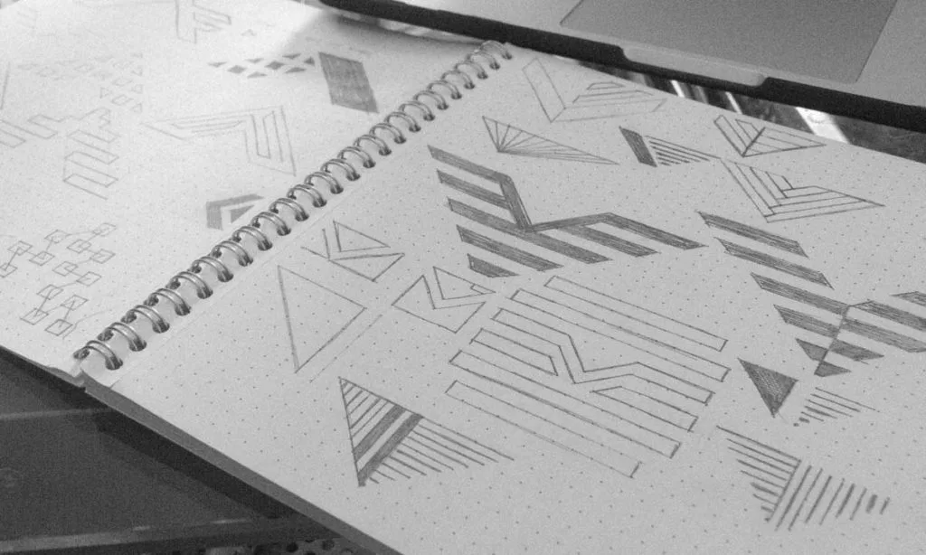
Once the strategy is clear, the ideation begins. This isn’t about finding one perfect idea. It’s about generating hundreds of bad ones, sketching, brainstorming, word-mapping, and exploring every possible visual angle.
Then, the culling begins.
Ideas are tested against the strategy. Is it too complex? Is it too generic? Does it accidentally look like something else? Is the concept clear? 99% of ideas end up in the bin. What’s left are a few promising conceptual directions.
The Agony of Refinement
A single concept is then chosen and refined with obsessive precision. This is where craft comes in—kerning the letters so the spacing is optically perfect.
Adjust the bezier curves of a shape by fractions of a millimetre to get the balance right. Testing dozens of shades of a single colour to find the one that works perfectly in print and on screen.
This final 1% of the work separates a decent logo from an exceptional one. It’s an invisible quality that the average person won’t notice consciously, but they will feel it. They’ll perceive it as professional, stable, and trustworthy.
Are You Brave Enough for a Truly Minimal Brand?
Choosing minimalism isn’t just a design decision. It’s a business philosophy. It requires two things that many entrepreneurs struggle with.
It Requires Trust
A minimal logo is confident. It doesn’t feel the need to shout about all its features and benefits. It trusts that its core message is enough.
It trusts its audience to be smart enough to understand it. As a business owner, you have to trust in the power of a single, well-executed idea. You have to resist the urge to add more.
It Demands Clarity
You cannot create a minimal logo for a fuzzy business. If you don’t know what you stand for, if your value proposition is muddled, the design process will expose it. Stripping away the non-essential forces you to confront the question: “What is our one thing?”
If you can’t answer that question, you’re not ready for a minimal logo. But if you can, it can become your most powerful tool.
The Bottom Line
Don’t mistake simple for easy.
A minimal logo isn’t the cheap option. It’s not the quick option. It results from intense strategic rigour, conceptual exploration, and meticulous craftsmanship. It’s an investment in clarity.
In a world full of noise, the most unmistakable voice wins.
If you’re tired of the noise and ready for clarity, let’s talk. See our other articles for more observations on branding, or if you’re ready to forge a real brand mark, request a quote for our logo design services. We can explore if a minimal approach is the right weapon for your business.
Frequently Asked Questions About Minimal Logo Design
What is minimal logo design?
It’s a design philosophy focused on distilling a brand’s identity to its most essential elements. It uses simple shapes, limited colour palettes, and innovative use of space to create a mark that is instantly recognisable, memorable, and versatile.
Why are minimalist logos so popular?
They cut through the clutter of a visually noisy world. Their simplicity makes them easy to remember and recognise. They are also efficient, scaling effectively from a tiny app icon to a large billboard without losing impact.
Is a minimalist logo right for my small business?
For most small businesses, yes. It communicates professionalism, clarity, and confidence. It’s also a practical choice that will work across all your marketing materials. The only exception might be if your brand identity is intentionally complex, rich, or ornate.
What are the key elements of a good minimal logo?
A strong, memorable shape or form; carefully chosen typography that is legible and has character; a minimal colour palette (often just one or two colours); and, in many great examples, the clever use of negative space to add another layer of meaning.
How is a minimal logo different from a generic logo?
A minimal logo results from a deep strategic process to find a unique, core idea. A generic logo results from using standard templates or shapes without any underlying concept, making it forgettable. Minimalism is about maximum meaning with minimum means; genericism is a lack of ideas.
Can I design my minimal logo using an online maker?
You can create a simplistic logo, but making a truly effective minimal logo is very difficult. Online makers provide generic assets without the strategic discovery process needed to create a unique and meaningful mark. You risk creating a logo that looks like thousands of others and fails to represent your business correctly.
How much does a professional minimal logo cost?
The cost varies widely, but you are not paying for the simplicity of the final image. You are paying for the strategic process, research, conceptual development, and expert refinement required to arrive at that simple solution. It’s an investment in a critical business asset.
What are some famous examples of minimal logos?
Classic examples are Nike, Apple, Target, McDonald’s, and FedEx. They all use simple forms, distinct colours, and a powerful core concept to create timeless and instantly recognisable brand marks.
Should my logo follow current design trends?
No. Chasing trends is a recipe for a logo that will look dated in a few years. The goal of good minimal design is to be timeless. Focus on strong, fundamental design principles, not fleeting styles.
What’s the most common mistake in minimal logo design?
Ignoring the concept. A minimal logo without a strong, unique idea behind it is just an empty shape. The “why” behind the design is more important than the “what.”

