Top 10 Coffee Shop Logos: Brewing Brand Identity
Today, we’re diving into the coffee branding, and I don’t mean some lame logos. We are talking about ten gold-standard, eye-catching, business-exploding visual designs that will make you say, “I want a triple shot espresso.”
Your logo is not just a cute picture; it’s the face of your brand in a hugely competitive market! It makes someone walking along the street stop and look at your shop, thinking, “Wow, I have to check this out.” If you take your logo for granted, you miss out on tons of money.
So get ready because we will go over ten coffee shop logos that are killing it right now. These aren’t just lovely designs – they’re strategic marketing tools designed specifically to attract customers.
We’ll explain why these logos work so well together and how you can steal their ideas (just kidding!) and bring them back home as inspiration for your business.
Are you ready to turn your logo into an irresistible magnet that attracts people and generates profits? Let’s do this!
- Your logo is crucial for brand identity in a competitive coffee market, influencing customer attraction and recognition.
- Clever logo design uses elements like colour psychology, iconic symbols, and wordmarks to convey brand identity and values.
- Memorable logos can generate emotional connections and trigger customer loyalty, making them vital for market success.
- Refined logo designs reflect brand evolution, adapting to consumer preferences and trends while maintaining relevance.
The Art of Coffee Shop Branding

Let’s appreciate the creativity behind coffee shop logos before we get into our list.
These small wonders represent businesses and are often the first thing potential customers see. These logos are silent storytellers that instantly convey a shop’s vibe, values, and vision.
Why Coffee Shops Should Care About Their Logos
You may be thinking, “But it’s only coffee?” However, when you have a market as saturated as second-brewed espresso drinks, you must find ways to stand out!
A well-designed logo can make all the difference between someone walking through your doors and passing by without even glancing at them – that initial visual meeting says, “Hey there! We understand each other.”
Engaging Coffee Consumers Through Clever Logo Design
In a crowded coffee market, brands must craft unique identities to captivate their audience, and a robust logo design is instrumental in this endeavour. Here’s how renowned coffee companies effectively engage their target audience:
1. Showcasing Brand Identity: Many coffee brands start with wordmarks that mirror their essence. Whether it’s a nod to their heritage, a splash of creativity, or a touch of luxury, these carefully chosen fonts and typesetting convey a brand’s story and ethos at a glance.
2. Utilising Colour Psychology: Colors aren’t just about aesthetics; they evoke emotions and create connections. Coffee companies strategically select colours to resonate with their target market’s emotions. Warm, earthy tones suggest comfort and reliability, while vibrant colours evoke excitement and energy.
3. Incorporating Iconic Symbols: Some brands integrate memorable symbols or mascots that personify their brand. For instance, widely recognized mascots capture consumers’ imaginations and foster brand loyalty, serving as a constant reminder of the coffee experience offered.
Each of these elements plays a strategic role in differentiating a brand from the competition, ensuring it remains memorable in the minds of coffee lovers around the globe.
What Makes A Great Cafe Logo?
What does it take for a coffee shop logo to pop?
Simplicity plus memorability combined with something extra unique makes one want to grab some hot chocolate mint mocha latte cappuccino or whatever sounds good right now. These elements come together beautifully in top-notch designs like:
- Imagery related directly towards caffeine (of course!)
- Intelligent utilisation of negative space
- Colours that evoke warmth and energy while still being inviting
- Typography matching the store personality perfectly
In the world of coffee branding, colour psychology plays a pivotal role. Many cafes opt for colour palettes that catch the eye and resonate emotionally, connecting with patrons through hues that suggest comfort and vitality. Think earthy browns, vibrant greens, or rich reds that echo the warmth of a fresh brew.
Then there are the mascots—iconic symbols that become synonymous with the brand. Whether a serene mermaid or a playful animal, these characters create an instant connection with consumers. They help brands stand out in a crowded market, serving as memorable ambassadors that reflect the brand’s story and values.
By combining these elements, coffee companies craft visually appealing and engaging logos, turning a simple design into a powerful tool for brand connection and differentiation.
Now, let’s get down to business! Here are our ten favourite coffee shop logos from around the world.
1 – Starbucks: The Siren’s Call
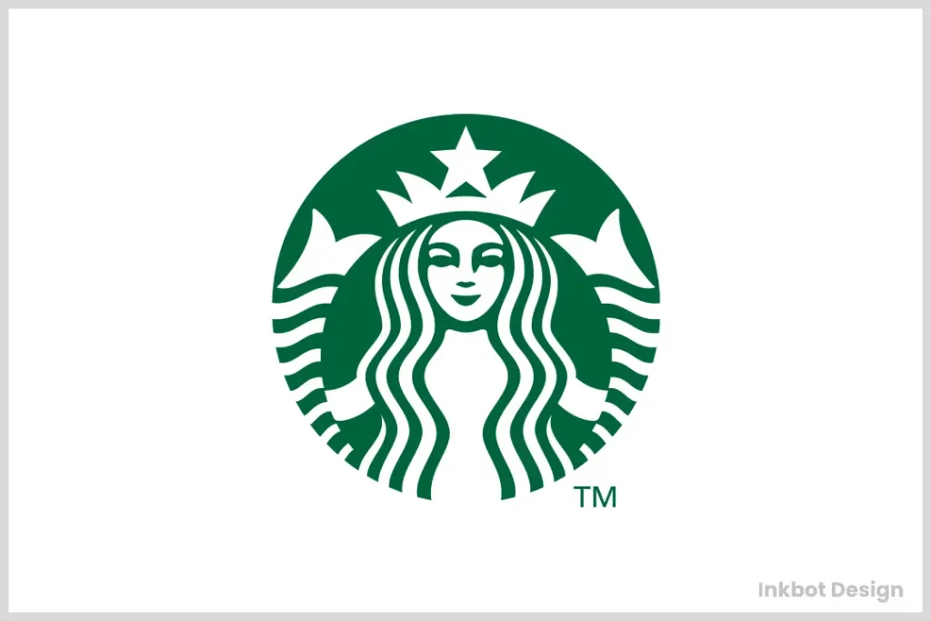
Starbucks’ logo game is unbeatable whether you love or hate them. The green mermaid has become just as recognisable as the golden arches.
Starbucks has changed its logo many times since it started in 1971.
Each change, from a brown, more detailed mermaid to today’s simplified version, reflects how much the company has grown and where it is located worldwide.
The Starbucks siren is mysterious, alluring, and slightly nautical, which makes sense because the company was founded in Seattle, a port city.
Its simple design allows for easy reproduction on everything from cups to storefronts, allowing for consistent branding worldwide.
2 – Costa Coffee: A Berry Good Design
Costa’s logo is a study of minimalism and colour theory. Those dark maroon coffee beans can be found on high streets worldwide.
Costa’s rich, berry-like logo colour isn’t just attractive but also strategic. It elicits warmth, luxury, and comfort – all things desirable in a coffee shop.
Costa’s emblem works brilliantly for horizontal or vertical layouts, making it suitable for different uses. Those beans always pop, whether displayed on a storefront or a takeaway cup.
3 – Caribou Coffee: Wild at Heart
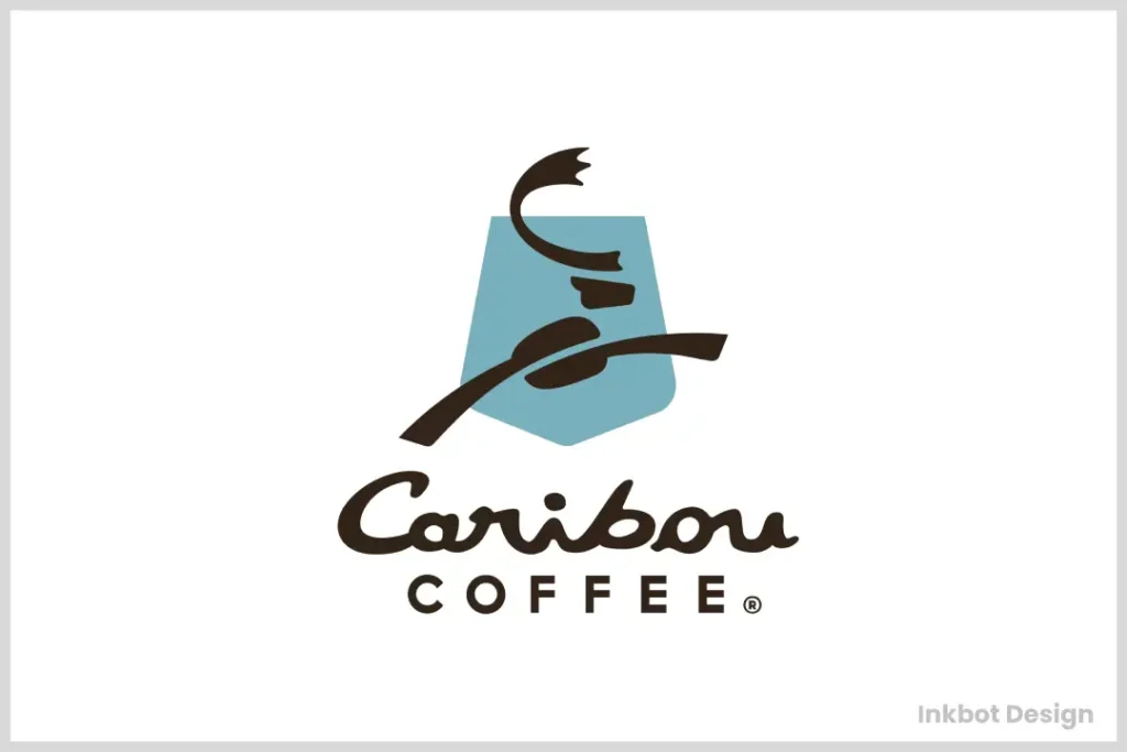
Caribou Coffee’s logo adds some wilderness to your everyday grind. It features an abstract caribou silhouette that catches your attention among all the coffee cups and bean icons.
The caribou isn’t just random – it connects with the company’s origin story, inspired by a trip through Alaska. This is a storytelling logo.
Combining an active caribou with the stable, sturdy wordmark creates an energising yet dependable logo like great coffee.
4 – Dunkin’ (Formerly Dunkin’ Donuts): A Bold Rebrand
During a rebranding campaign, Dunkin’ dropped the word ‘donuts’ from its iconic logo. This is proof that brands can evolve.
Dunkin’s simplified its logo and name, showing us that sometimes more straightforward is better. It also makes it easier for people to recognise the brand.
Much like Dunkins’, other coffee giants have refined their logos to enhance appeal and brand recognition:
- Nescafe: This brand has embraced a sleek sans-serif font, adding a distinctive touch with an elongated vertical line on the ‘N’ and a small red element above the ‘e’. These subtle tweaks keep the logo fresh and engaging.
- Starbucks: Known for its iconic green and white palette, it has streamlined its logo over the years. This evolution, crafted by various graphic designers, aims to captivate a younger audience while maintaining its classic charm.
- Stumptown: This brand opts for a bold, serif font in black on a white background, underscoring simplicity and elegance. Such changes ensure the logo remains relevant yet timeless.
By continually refining their visual identities, these brands adapt to consumer preferences and market trends, proving that thoughtful design evolution is key to staying relatable and memorable.
The company used their signature colours, orange and pink, which was a great decision since they are strongly tied up with the brand’s identity and bring warmth and energy to our minds when we see them.
The Purpose of Wordmarks in Coffee Brand Logos
Wordmarks play a crucial role in coffee brand logos by embodying the essence and character of the brand. These carefully crafted text-based designs serve several key purposes:
- Highlighting Brand Heritage: For many coffee companies, the wordmark is a nod to their history and tradition. They can tell a story of their origins and long-standing expertise by incorporating unique fonts or stylistic elements.
- Conveying Creativity and Innovation: Some brands utilise distinctive lettering to reflect their innovative spirit. A creatively designed wordmark can signal to customers that the brand is forward-thinking and fresh.
- Evoking Luxury and Quality: Premium coffee brands often use elegant and sophisticated typography to suggest luxury. The choice of font and design can instantly communicate a sense of quality and exclusivity, appealing to customers who seek the finer things in life.
These approaches make wordmarks an integral visual tool for connecting with their audience, creating a memorable impression, and differentiating themselves in a competitive market.
5 – Peet’s Coffee: A Nod to Tradition

Peet’s logo mixes old and new styles beautifully. It gives the impression of being both freshly made and well-established – something that is not easy to do.
The script ‘Peet’s’ against the bold P emblem draws visual interest.
In a world where colourful coffee logos abound, Peet’s stands out with its stark black-and-white design. This design is refined, ageless, and posh.
6 – Blue Bottle Coffee: Minimalism at Its Finest
Blue Bottle’s logo exemplifies how straightforward designs can have the most significant impact. It is a work of minimalist branding.
The intelligent use of negative space to form a bottle shape is stylish and unforgettable. This logo deserves a second glance.
Due to its simplicity, Blue Bottle’s logo can be applied in many different ways. A paper coffee bag or a large shop front sign will suit it equally well.
7 – The Coffee Bean & Tea Leaf: A Classic Reimagined
This logo is clean and attractive but also has a lot of information. It is a beautiful example of how one logo can represent many different product lines.
In this logo, coffee and tea are equally represented and balanced.
Over the years, The Coffee Bean & Tea Leaf’s logo has been revised several times. However, its primary idea has remained the same, which has helped it become widely recognised as a brand.
8 – Philz Coffee: Personality in a Cup
Philz Coffee’s logo is not unique but embodies the brand’s essence. It is an excellent example of how a logo can represent company values.
The Philz logo looks like it was drawn by hand, which reflects their dedication to offering customised and handmade coffee experiences.
In the coffee industry, teal is an unusual choice for colour. This helps Philz differentiate itself from other brands that use earthy colours typical of most coffee companies.
9 – Intelligentsia Coffee: Smart Design
The logo of Intelligentsia is clever, easy to remember and matches its name perfectly. This design is the best example of conceptual logo design.
The wing motif cleverly incorporates a coffee cup silhouette representing intelligence (think “taking flight”) and coffee.
To make this symbol stand out, it uses bold red and white colours for the brand to be noticeable on a coffee bag or a barista’s t-shirt.
10 – Death Wish Coffee: Dangerously Good Design
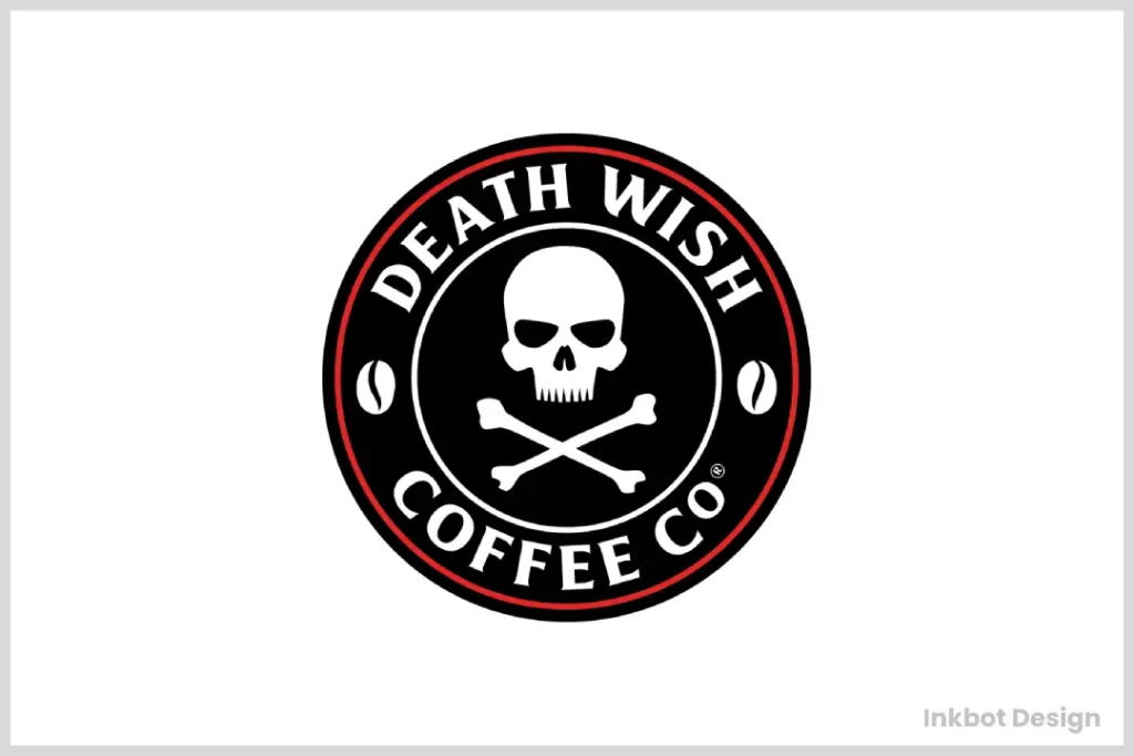
The last on our list is the brave logo of Death Wish Coffee. It shows that even skulls can be deliciously branded in the proper context.
This coffee shop’s skull and crossbones design may not work everywhere, but it fits well with a brand boasting “the strongest coffee in the world.”
You won’t forget this logo whether you love it or hate it. In an oversaturated market, such influence is priceless.
The Impact of a Great Logo
Let’s look at some cool designs and discuss why having an awesome logo is important for coffee shops.
Generating Brand Recognition
Your logo is a short form of your whole brand. Customers immediately know what to expect when seeing that mermaid or maroon beans.
Creating Emotional Connections
A logo can trigger feelings and memories. Before entering the store, well-designed logos can make consumers feel safe, excited, or like they belong.
Making Your Mark in a Competitive Market
There’s a coffee shop on every street corner, so standing out with a unique logo is critical. It’s the visual hook – that makes customers do a double-take!
What is the Design Research Process for Evaluating Coffee Logos?
The design research process for evaluating coffee logos is a comprehensive exploration to identify the industry’s most innovative and practical designs.
Step 1: Exploration and Collection
- Online Research: We scan the digital landscape to identify standout coffee logos making waves. This involves analysing various online platforms where creative designs are displayed.
- Industry Engagement: Engaging with coffee brands and design agencies provides valuable insights. By reaching out, we access exclusive design perspectives that might not be publicly available.
Step 2: Evaluation Criteria
- Innovation and Trends: An outstanding coffee logo must be visually appealing and align with the latest design trends. Staying current ensures the logo remains relevant and catches consumer attention.
- Impact and Functionality: Logos should convey the essence of the coffee brand they represent. A successful design will communicate the brand’s story and core values at a glance while remaining versatile across various mediums.
- Brand Recognition: Ultimately, the logo must be memorable. It should help the brand make a lasting impression in a competitive market.
Step 3: Recognition and Acknowledgment
Designs that excel in these areas may be featured in hallmark showcases, garnering accolades that set them apart. The top performers have the potential to be honoured with awards, signifying their exceptional contribution to coffee brand identity.
This methodical approach ensures that only the most compelling coffee logos enter the spotlight, driving brand success through thoughtful design.
The Global Influence of Renowned Coffee Brands
Coffee’s influence in the modern world is undeniable, and famous coffee brands’ power drives it. These recognisable logos have become a staple of our daily routines, permeating supermarkets and grocery aisles and even appearing in local cafes. But what exactly is their impact?
Cultural and Economic Touchstones
- Cultural Integration: Coffee has evolved beyond being just a beverage—it’s a cultural experience. Brands like Starbucks, Nespresso, and Dunkin’ have defined how coffee is brewed and consumed, influencing everything from the café culture to the flavours people expect. They shape trends, popularise new brewing methods, and play a role in the social activities of millions.
- Economic Influence: Coffee ranks the most popular drink worldwide, with a staggering two billion cups consumed daily. This isn’t just a testament to people’s love for the drink—it reflects the enormous economic engine driven by coffee brands. These companies generate billions in revenue and create jobs, support agriculture in coffee-growing regions, and drive innovation in food service.
- Sustainability and Innovation: Leading coffee brands are at the forefront of promoting sustainable practices. They’ve increased awareness about ethical sourcing and fair trade, pushing for better treatment and pay for farmers. By introducing recyclable or compostable packaging, they also encourage environmentally friendly habits among consumers.
An Expanding Industry
The coffee industry continues to grow as new players enter the market, eager to make their mark. This competition fosters innovation, compelling established brands to continuously elevate their offerings from unique blends to advanced brewing technologies.
Ultimately, famous coffee brands do more than quench our caffeine cravings—they shape societal norms, drive economic advancement, and promote sustainable practices. As their influence extends globally, these brands help mould the consumer landscapes of today and tomorrow.
Wrapping Up: The Lasting Power of Great Design
From the Starbucks siren known worldwide to the skull of Death Wish Coffee, these ten coffee shop logos highlight how vast and powerful design can be in this industry.
They are not simply attractive pictures but a brand’s identity visually distilled and its values and promises made towards customers.
Remember that an excellent logo resembles a beautiful cup of coffee: it has to be bold, leave behind lasting impressions, and make you want more.
If you own a café looking to rebrand or appreciate design as an art form, there is always something new within the realm of coffee shop logos.
Next time when sipping your favourite brew, take some time appreciating that little piece of art on top of your cup because it tells quite a story.
Frequently Asked Questions
How often should a coffee shop change its logo?
There isn’t an exact number to follow, but every 5 to 10 years can guide your brand refresh. Make sure you get customer feedback before making significant changes.
Can small independent coffee shops compete with large chain logos?
Yes! Customers often look for something real and different from corporate brands, so having a unique local-inspired logo may draw them in.
Which colours are best suited for coffee shop logos?
This question has no definite answer, even though earth tones like brown and deep red are commonly used. The ideal colour depends on your brand’s personality and your target audience.
Does my coffee shop need an image related to coffee in its logo?
Not necessarily! Although many successful cafes use some imagery depicting caffeine, other elements representing their values or stories work fine.
How crucial is hiring professional designers when creating a new logo for my café?
While anyone can design one themselves, professionals have experience designing flexible graphics which will look good on all items associated with your business.
Can having a well-designed emblem impact how successful my café becomes?
It won’t guarantee success, but if done correctly, potent, memorable symbols increase awareness towards brands, leading to loyal customers over time.
What steps should I take to ensure originality during the creation process behind my cafes?
Research competitors, brainstorm ideas reflecting individual brand narratives, and then involve designers capable of bringing fresh viewpoints into play.
Must I create something equally appealing both ways – colourful & monochrome versions alike?
Absolutely! Your emblem needs versatility, working well under different formats, including single-hue applications such as black-and-white prints.
In what ways can I determine whether or not my cafe’s LOGO works effectively?
After showing them different sizes, gather opinions from potential buyers and ask if they remember seeing anything specific about it later.

