Dark Mode: Implementing Dark UI in Your Web Design Strategy
Dark Mode in UI/UX refers to a design aesthetic where the interface features predominantly dark colours, as the name suggests.
This web design trend offers a viable alternative to light-themed user interfaces. Implementing dark UI in your web design involves crafting websites or applications with darker backgrounds and lighter text or elements, enhancing visual comfort for users.
This trend has gained immense popularity due to its sleek look and potential to reduce eye strain, especially in low-light environments. Websites, apps, and operating systems have embraced dark UI, providing users with an option that’s both stylish and functional.
So, understanding the rising demand for dark-themed interfaces can significantly impact your web design strategy. With a firm grasp of it and its perks, you can leverage dark UI to enhance user experience and broaden the appeal of your digital offerings.
Modern websites now have the ability to detect a user’s system preferences regarding dark mode. The prefers-colour-scheme CSS media feature allows sites to automatically adapt to user preferences set at the operating system level. This means your website can switch between light and dark themes based on what users have configured on their devices, without requiring them to toggle settings manually on your site.
The feature is supported by all major browsers, including Chrome, Firefox, Safari, and Edge. Implementing this detection creates a more intuitive experience as users won’t need to adjust settings for each website they visit. The site simply respects their global preference.
Here’s the beauty of it: this smart adaptation happens instantly when users visit your site. Those who’ve set dark mode on their operating system will see your dark UI version right away, while others will see the standard light version. This level of responsiveness to user preferences shows attention to detail and user-centricity in your design approach.
- Dark Mode enhances user experience by reducing eye strain and improving readability, especially in low-light conditions.
- Responsive design supports user preferences through automatic theme switching with the CSS media feature.
- Implementing a strategic approach with thoughtful colour choices and design consistency is vital for effective dark UI.
Understanding the Impact of Dark UI
In web design, few trends, approaches, and philosophies gain this much traction without tangible benefits. This is the case for dark UI, too; it does offer sleek aesthetics, but that’s far from its fundamental appeal. More importantly, dark UI holds several impactful benefits that significantly influence user experience:
- Its accessibility advantages are noteworthy, particularly for users with visual impairments or sensitivity to bright light. The contrast between light text and dark backgrounds enhances readability and can accommodate individuals with varying visual needs.
- The reduction of eye strain stands as a primary advantage. Dark UI lessens the strain on users’ eyes by minimising the contrast between the screen and the surrounding environment. This reduction in eye fatigue can contribute to prolonged screen engagement without discomfort, especially in low-light settings. In this sense, too, implementing dark UI in your web design directly enhances UX.
- Implementing dark UI can lead to improved power consumption and extended battery life. This is particularly true for devices with OLED or AMOLED screens. Dark backgrounds require less power to display than bright ones, resulting in potential energy savings and prolonged battery endurance. This perk is highly notable where battery life is increasingly crucial for users.
The power savings from dark UI on OLED screens aren’t just theoretical; they’re quite substantial. On OLED displays, each pixel emits its own light, and black pixels are completely turned off, consuming zero power. This contrasts with LCD screens, where black pixels still require backlighting.
Tests conducted by Google have shown that displaying a black image on an OLED screen uses approximately 63% less power than displaying a white image at maximum brightness. Even at lower brightness settings, the savings remain significant.
A study from Purdue University found that switching from light to dark mode can reduce smartphone power consumption by 30-60%, depending on screen brightness. At 100% brightness, the most common apps in dark mode used an average of 42% less power than in light mode.
For users who spend hours on digital devices daily, these savings add up. A typical smartphone user might gain 30-45 extra minutes of battery life per day simply by using apps and websites with dark interfaces. This makes dark UI not just an aesthetic choice, but a practical energy-saving feature.
In brief, dark UI has a substantial impact on UX. It helps ensure better accessibility and more comfortable navigation with less strain on user devices. Its aesthetic appeal is the cherry on top, as it primarily enhances usability and practicality.
Implementing Dark UI in Your Web Design Strategy
Implementing dark UI cannot be done haphazardly. As with all things web design, it requires a strategic approach with an eye on context.
Choosing the Right Colour Palette
First, selecting the right colour palette is fundamental. Initially, opt for a mix of dark hues that complement each other while ensuring text and elements remain easily readable.
Dark backgrounds should harmonise with lighter text and graphics, maintaining clear contrast for legibility.
As you do, consider using shades that align with your brand’s identity and evoke the desired mood or atmosphere. Finally, test different combinations to ensure they maintain readability across various devices and screen sizes.
Remember, the choice of colours impacts not only the visual appeal but also the usability of your website. A well-chosen colour palette in dark UI design can enhance the user experience, making navigation and content consumption seamless and engaging.
Consistency in Design Elements
Second, consistency in design elements is always crucial. So, ensure uniformity across all elements like typography, buttons, and icons to maintain a cohesive visual experience. Consistent styling in dark mode helps users navigate seamlessly as they become familiar with the layout and functionalities.
At the same time, remember to use similar design principles and shapes to retain recognisability and avoid confusion. Employ a consistent approach to spacing, sizing, and alignment, ensuring elements are positioned predictably for users.
Consistency enhances the overall aesthetics and enhances user confidence and ease of use. It creates a unified and intuitive interface that encourages user interaction and fosters a positive experience.
Contrast and Readability
Third, achieving optimal contrast and readability is pivotal when implementing dark UI in your web design strategy. Ensure a clear distinction between text and background by using contrasting colours that don’t strain the eyes.
Lighter text on darker backgrounds or vice versa improves legibility. Consider font size and type to maintain readability, ensuring text remains easily discernible in varying lighting conditions.
Adequate contrast doesn’t just enhance aesthetics but also supports users in effortlessly consuming content. Please pay attention to the readability of interactive elements, like buttons or links, ensuring they stand out against the background for easy navigation.
Striking the right balance between contrast and readability in dark UI significantly contributes to a positive user experience. The last thing you should want would be a dark UI hamper since they’re both pillars of effective web design.
Tools and Resources for Designing in Dark Mode

Utilising suitable tools and resources is essential for crafting designs in dark mode. As with all things web design, a good designer can only shine with good tools.
Design software like Adobe Photoshop, Sketch, or Figma offers functionalities that facilitate creating and editing elements specifically for dark UI. These tools provide features enabling designers to seamlessly preview and adjust designs in light and dark themes. They can make implementing dark UI in your web design a breeze.
Additionally, accessing dark UI templates and themes significantly expedites the design process. Platforms like Dribbble and Behance, or even marketplaces like ThemeForest and Creative Market, offer many pre-designed templates and themes tailored for dark mode, easing the workload and inspiring creative direction.
These resources often come with customisable components, icons, buttons, colour schemes, and streamlined implementation.
Leveraging these tools and resources can enhance productivity and ensure the efficiency and effectiveness of your endeavours. With them in hand, you’ll be able to quickly create visually captivating and user-friendly interfaces.
Design Software for Dark UI
Many solutions like those mentioned above can help immensely if you use design software. Many present an array of functionalities that streamline the creation and manipulation of elements tailored for dark UI designs. Adobe Photoshop, Sketch, and Figma offer features to enhance the visibility and aesthetics of dark-themed interfaces. For instance:
- Colour Contrast Tools: These solutions provide built-in tools to test and adjust colour contrast, ensuring readability and visual hierarchy in dark UI elements. Users can easily modify contrasts to maintain the legibility of text or icons against dark backgrounds.
- Layer Blending Modes: They also offer a variety of blending modes that enable designers to experiment with how different layers interact. In turn, this allows for seamless integration of elements within a dark interface and helps achieve depth and enhance visual appeal.
- Customisable Dark UI Templates: Many software applications provide pre-designed templates tailored explicitly for dark UI, easing the initial design process. You can use these templates to implement dark UI in your web design and customise it accordingly.
- Real-time Preview and Prototyping: Figma, in particular, offers real-time collaboration and prototyping features, allowing designers to preview dark UI designs instantly. This facilitates quick adjustments and iterations to ensure the effectiveness of the interface.
- Adjustable Interface Elements: Finally, these design tools offer customisable interfaces where users can adjust the brightness, contrast, and overall appearance of the software. This option is conducive for designing in low-light settings while focusing on dark UI elements.
These design software packages can be a boon for dark UI designs. They equip designers with an arsenal of tools and features tailored to streamline the creation, editing, and optimisation of elements.
Dark UI Themes and Templates
Next, you can use platforms such as Dribbble and Behance or marketplaces like ThemeForest and Creative Market. If so, they are rich repositories offering many pre-designed templates and themes finely attuned for dark mode interfaces. These platforms host an extensive array of resources, including:
- UI Kits and Components: Dribbble and Behance showcase numerous UI kits and individual components explicitly crafted for dark mode designs. These kits encompass various elements like buttons, icons, and navigation bars, expediting design by providing ready-to-use assets.
- Specialised Design Inspirations: Designers frequently share their dark UI creations on these platforms, serving as a wellspring of inspiration. These designs exhibit innovative approaches, encouraging creativity and guiding designers to explore unique directions for their projects. They’re a great place to be if you’re implementing dark UI in your web design.
- Marketplace Themes: ThemeForest and Creative Market offer many themes and templates tailored for various platforms with dark UI preferences. These come with customisable elements, layouts, and colour schemes, providing a solid foundation for creating captivating and functional dark-themed interfaces.
- Diverse Design Styles: From minimalist to futuristic, these platforms host an assortment of design styles within dark mode themes. As such, they can cater to a broad spectrum of preferences and project requirements.
These platforms and marketplaces can alleviate the workload by offering readily available templates and themes. At the same time, they can serve as fertile ground for igniting creativity and guiding designers in crafting compelling and functional dark UI designs.
Optimising WordPress for Dark Mode
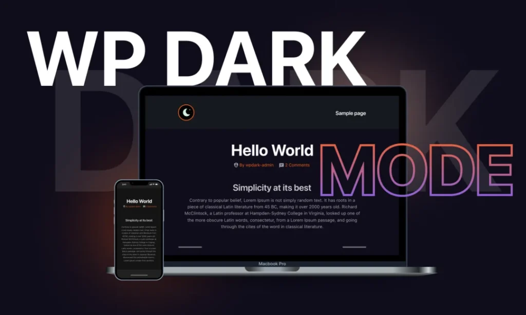
WordPress offers an array of assets and resources to best leverage dark UI. Optimising WordPress for dark mode involves leveraging plugins, themes, and customisation options tailored to support this design aesthetic.
Some specific plugins and themes explicitly support dark UI, offering a seamless transition for your WordPress website. These plugins often provide easy-to-use settings, allowing you to enable dark mode effortlessly.
You can also explore the customisation options within WordPress itself. Some themes come with built-in dark mode features or provide settings to toggle between light and dark modes.
Moreover, WordPress offers various customisation tools, allowing you to adjust colours, fonts, and other elements to align with your preferences. You can effectively implement and optimise dark mode for your WordPress site by utilising these plugins, themes, and customisation options.
Implementing Dark UI on Your WordPress Site
With the basics in order, implementing dark UI in your web design for WordPress involves a straightforward process. This includes enabling dark mode through a step-by-step guide from your plugins or themes. These guides typically include installing and activating a plugin or selecting a dark mode option within a theme’s settings.
Once enabled, you can customise various dark UI elements to suit your website’s aesthetics and brand identity. Customisation options often include adjusting colours, typography, and other visual elements to ensure consistency and readability in dark mode. Some plugins or themes also offer additional features like toggling between light and dark modes based on user preferences or time of day.
Previewing Your WordPress Website Before Going Live
Next, preview your WordPress website before going live and check if everything looks good. This will ensure a polished and error-free presentation to your audience. WordPress provides built-in preview options that allow you to see how changes will appear on your site before making them live. This feature lets you review themes, layouts, or content modifications without affecting the live site. You can navigate through various pages, check alignment, and verify functionality.
Third-party tools such as browser extensions or online services offer more comprehensive previews. These tools simulate how your website will appear across different devices and screen sizes, providing a more detailed assessment. They enable you to identify potential issues or inconsistencies, ensuring a consistent user experience.
Monitoring Your WordPress Website’s Performance
Finally, after implementing a dark UI on your WordPress website, monitoring its performance is crucial. Doing so helps ensure optimal functionality and user experience. Thankfully, utilising tools like the WordPress dashboard and Google Analytics can help in this endeavour:
- WordPress Dashboard Insights: WordPress itself offers valuable performance insights through its dashboard. Plugins like WP Performance Score Booster or Query Monitor help monitor loading times and resource usage and identify potential bottlenecks. If you implement dark UI in your web design, you will want to watch these metrics.
- Google Analytics Tracking: Integrating Google Analytics provides a comprehensive overview of website traffic, user behaviour, and engagement. It offers insights into how users interact with the dark UI, including bounce rates, session durations, and conversion rates. As such, it can significantly aid in assessing user satisfaction and site effectiveness.
- Page Speed Analysis Tools: Tools like Google’s PageSpeed Insights or GTmetrix analyse website speed, offering improvement suggestions. They evaluate how efficiently your site loads on desktop and mobile devices, which is crucial for a smooth cross-platform experience.
- Performance Monitoring Plugins: Finally, installing plugins like New Relic or Pingdom allows continuous website performance monitoring, tracking uptime, downtime, and responsiveness. These plugins often provide detailed reports and alerts for performance issues needing immediate attention.
Regularly monitoring these metrics post-dark UI implementation ensures the website maintains optimal performance. Addressing any issues promptly helps uphold user satisfaction and provides a seamless experience.
While implementing dark mode, several performance pitfalls can arise. Theme switching can cause layout shifts and flashes of unstyled content (FOUC) if not handled properly. These issues can disrupt the user experience and make your site feel unprofessional.
To prevent the dreaded “flash of incorrect theme” when the page loads, consider embedding necessary theme CSS directly in the <head> of your document. This ensures the correct theme is applied before the page renders.
For smoother transitions between themes, use the requestAnimationFrame method rather than applying changes immediately:
function toggleTheme() {
  requestAnimationFrame(() => {
    document.documentElement.classList.toggle('dark-mode');
  });
}
Another performance consideration involves images. Having separate image assets for dark and light modes can double your image payload. Instead, consider using CSS filters to adapt images dynamically:
.dark-mode img:not([src*="-dark"]) {
  filter: brightness(0.8) contrast(1.2);
}
For icons and UI elements, SVGs with currentColor values will automatically adapt to your theme without requiring duplicate assets. This approach keeps your site fast while maintaining visual harmony across both themes.
Coding Dark UI: Best Practices
Following best practices is vital when implementing dark UI in your web design through coding.
Utilising variables for colours within CSS and using media queries to adapt to user preferences ensures a consistent and adaptable interface. It’s also crucial to optimise your code for various devices and screen sizes. Employ responsive design principles, like flexible grids and scalable elements, to guarantee your dark UI remains visually appealing and functional across different devices, from mobiles to desktops.
Furthermore, meticulous attention to detail ensures a consistently pleasant user experience. Consistent font sizes and spacing ensure a consistent experience, regardless of the device used. Finally, testing your code on different devices and screen resolutions helps identify potential issues and provides a smooth experience.
Such best practices may feel bare, but that’s precisely why they bear noting. They’re the foundation for a compelling and universally accessible dark UI implementation in web design.
Coding Dark UI: Advanced Practices
That said, coding a sophisticated dark UI is a challenging task. It involves employing advanced practices and techniques to ensure an elegant and efficient design implementation:
- Optimised Colour Schemes: Utilise colour variables and mixins to manage colour schemes efficiently. Employ contrasting colours for text and background while ensuring accessibility standards are met. For instance, use colour contrast checkers to ensure readability.
- Customised Theme Switching: Implement a theme switcher that seamlessly allows users to toggle between light and dark modes. Use CSS and JavaScript to create a smooth transition, considering user preferences and system settings for a consistent experience. You must maintain UX consistency if you implement dark UI in your web design.
A practical JavaScript implementation for theme toggling involves three key components: a toggle button, user preference storage, and system preference detection. Here’s how to build a complete solution:
First, create a simple toggle button in your HTML.
Next, write JavaScript that adds or removes a class from the document body:
const themeToggle = document.getElementById('themeToggle');
const prefersDarkScheme = window.matchMedia('(prefers-color-scheme: dark)');

// Function to set the theme
function setTheme(theme) {
  if (theme === 'dark') {
    document.body.classList.add('dark-mode');
    localStorage.setItem('theme', 'dark');
  } else {
    document.body.classList.remove('dark-mode');
    localStorage.setItem('theme', 'light');
  }
}

// Check for saved user preference, or use the system preference
const savedTheme = localStorage.getItem('theme');
if (savedTheme) {
  setTheme(savedTheme);
} else {
  setTheme(prefersDarkScheme.matches ? 'dark' : 'light');
}

// Toggle theme when button is clicked
themeToggle.addEventListener('click', () => {
  if (document.body.classList.contains('dark-mode')) {
    setTheme('light');
  } else {
    setTheme('dark');
  }
});

// Listen for changes in system preferences
prefersDarkScheme.addEventListener('change', (e) => {
  if (!localStorage.getItem('theme')) {
    setTheme(e.matches ? 'dark' : 'light');
  }
});
This code does three important things: it checks for a saved preference in localStorage, falls back to the system preference if none exists, and updates the theme when the user clicks the toggle button. It also listens for changes in system preferences, updating the theme accordingly unless the user has explicitly set a preference.
- Dynamic Element Styling: Employ CSS variables and dynamic styling techniques to allow for easy adjustment of UI elements. This enables flexibility in modifying the interface’s colours, shadows, or other design attributes.
- Reduced Animation Strain: Opt for subtle and purposeful animations to prevent strain on the user’s eyes in dark mode. Use CSS animations or transitions judiciously to enhance user interactions without overwhelming the interface.
- Accessibility and Contrast: Prioritise accessibility by ensuring sufficient contrast between elements. Use techniques like pseudo-elements or outlines to maintain visibility without compromising the aesthetic appeal.
- Optimised Images and Icons: Compress images and icons appropriately for dark UI to maintain clarity while reducing file sizes. Employ SVG or icon fonts for scalability and ensure they align with dark-themed aesthetics.
Employing these advanced coding practices ensures a refined and user-friendly dark UI implementation. Balancing aesthetics with functionality and accessibility is crucial for creating a visually appealing and seamlessly functional dark-themed interface.
CSS Implementation Techniques for Dark Mode
When coding dark mode for your website, CSS custom properties (variables) offer a powerful approach. They allow you to define colour themes centrally and apply them consistently throughout your site.
Start by defining your light theme variables in the root selector:
:root {
  --background-color: #ffffff;
  --text-color: #333333;
  --heading-color: #222222;
  --link-color: #0066cc;
}
Then, create a dark theme variant that overrides these variables. You can apply this either through a class or using the prefers-colour-scheme media query:
/* Using class-based approach */
.dark-mode {
  --background-color: #121212;
  --text-color: #e0e0e0;
  --heading-color: #ffffff;
  --link-color: #6699ff;
}

/* Using media query approach */
@media (prefers-color-scheme: dark) {
  :root {
    --background-color: #121212;
    --text-color: #e0e0e0;
    --heading-color: #ffffff;
    --link-color: #6699ff;
  }
}
Apply these variables throughout your CSS:
body {
  background-color: var(--background-color);
  color: var(--text-color);
}

h1, h2, h3 {
  color: var(--heading-color);
}

a {
  color: var(--link-color);
}
For semi-transparent elements, use rgba() values to ensure proper blending in both themes. This is particularly important for shadows, overlays, and modals:
.card {
  background-color: var(--background-color);
  box-shadow: 0 4px 8px rgba(0, 0, 0, 0.1);
}

.dark-mode .card {
  box-shadow: 0 4px 8px rgba(0, 0, 0, 0.3);
}
This approach allows for clean, maintainable code while providing flexibility to expand your colour schemes in the future.
Addressing Common Challenges in Dark UI Implementation

Challenges can emerge throughout the process. Such challenges will depend on various factors, from your goals to your approach. Still, let us cover the three main types of challenges with implementing dark UI in your web design before concluding.
Compatibility Issues
One of the common challenges in implementing dark UI is dealing with compatibility issues across different browsers and devices. Specific browsers or older versions may not fully support dark mode, leading to inconsistencies in your website’s display.
To address this, ensure you thoroughly test your dark UI design across various browsers and devices to identify compatibility issues. Using vendor prefixes in CSS for specific properties and employing fallback options for unsupported features can help mitigate these challenges. Staying updated with the latest web standards and considering progressive enhancement techniques can also prove helpful.
Ensuring Accessibility Standards
Ensuring accessibility standards in dark UI implementation can also pose a significant challenge. Dark backgrounds with lighter text can enhance readability for some, but might cause contrast issues for others. This is particularly true for those with visual impairments, and it can lower their accessibility.
To address this challenge, adhere to WCAG (Web Content Accessibility Guidelines) by maintaining sufficient contrast ratios between text and background colours. Consider allowing users to switch between light and dark modes or adjustable contrast settings.
Additionally, focus on font sizes, typefaces, and spacing to ensure user readability. Testing with screen readers and conducting usability tests with diverse user groups can also help identify and rectify accessibility issues.
Testing Dark UI for User Experience
An ever-present challenge in web design is testing for UX, and implementing dark UI in your web design is no exception. As with all such efforts, you will want a consistent and reliable way to gauge effectiveness.
Usability testing methods, such as A/B testing or task-based assessments, allow you to compare the effectiveness of your dark UI against other versions or competitors’ designs. These methods help identify areas for improvement, highlighting what works well and what needs adjustment.
Additionally, gathering user feedback through surveys, interviews, or feedback forms enables direct insights into users’ experiences and preferences. Understanding user perspectives, concerns, and suggestions is invaluable for refining your dark UI design to better meet their needs. User feedback is a compass, guiding improvements and enhancements that can elevate the overall user experience.
Conclusion
Implementing dark UI in your web design strategy offers a powerful blend of style and functionality. It’s much more about the latter than the former, of course. Its rise in popularity stems from its ability to reduce eye strain, enhance readability, and create an appealing visual experience. It’s not without challenges, as most design efforts aren’t.
Embracing dark mode requires thoughtful consideration of colour palettes, consistency in design elements, and ensuring optimal contrast and readability. Challenges such as compatibility issues and accessibility standards also demand attention to ensure accessibility and a seamless device experience. Still, the effort is well worth it.
By navigating these challenges and prioritising user experience, dark UI adds visual allure and fosters a user-friendly environment that aligns with evolving user preferences and expectations.

